10,000 search results
(0.03 seconds)
- Mind Boogie by Bogstav,
$16.00 Get your feet on the dance floor, and make those funky moves that you do so well! Or, you could just use this handmade all-caps font and make your designs look like it is dancing! :) Yes, it's a handmade font - and I've added 6 different versions of each letter + multilingual support!
 - FF Matinee Gothic by FontFont,
$41.99 American type designer Jim Parkinson created this display FontFont in 1996. The font is ideally suited for advertising and packaging, festive occasions, film and tv as well as poster and billboards. FF Matinee Gothic provides advanced typographical support with features such as ligatures and stylistic alternates. It comes with proportional lining figures.
 - Cristhyna Signature by Namara Creative Studio,
$12.00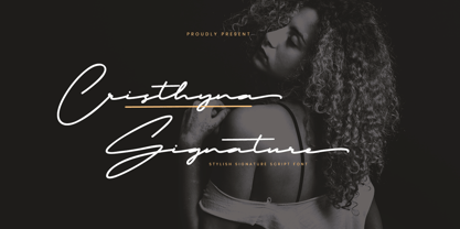 Cristhyna Signature is a modern handwritten script font with natural and stylish flow, this Typeface is an incredible addition to your font library. Perfect for business branding, wedding invitation, cosmetics, fashion, signature logo, magazine cover, advertising and these typefaces work well for many different aesthetics. Features : Stylish & Modern Font Alternates, Ligatures & Multilingual Support
 - Marky Marker NF by Nick's Fonts,
$10.00Here's a nifty single-stroke marker font based on the work of Mike Stevens, long-time contributor to Signcraft magazine. Clean, crisp and stylish, it's the perfect choice for appealing subheads. This font contains the complete Latin language character set (Unicode 1252) plus support for Central European (Unicode 1250) languages as well. - East Coast Frolics NF by Nick's Fonts,
$10.00A rollicking fun face based on lettering on a poster for Britain's LNER steamship lines, which featured a piano-playing mouse and a dancing goose. The Postscript and Truetype versions contain a complete Latin language character set (Unicode 1252); in addition, the Opentype version supports Unicode 1250 (Central European) languages as well. - FF Studio by FontFont,
$41.99 French type designer Albert Boton created this display FontFont in 2002. The font is ideally suited for advertising and packaging, music and nightlife as well as sports. FF Studio provides advanced typographical support with features such as ligatures, alternate characters, and case-sensitive forms. It comes with proportional lining and proportional oldstyle figures.
 - Helvetica by Linotype,
$42.99 With the name Helvetica (Latin for Swiss), this font has the objective and functional style which was associated with Swiss typography in the 1950s and 1960s. It is perfect for international correspondence: no ornament, no emotion, just clear presentation of information. Helvetica is still one of the best selling sans-serif fonts.
 - Attaboy by Hanoded,
$15.00 Attaboy is a posh word for ‘well done’. It was made with a broken marker pen to give it that ‘eroded’ look. It is an all caps typeface, but upper and lower case can be mixed. Attaboy comes with stylistic alternates for the lower case glyphs and all the diacritics you need.
 - FF Imperial by FontFont,
$41.99 Dutch type designer Donald Beekman created this display FontFont in 2000. The family contains 4 weights and is ideally suited for logo, branding and creative industries, music and nightlife as well as poster and billboards. FF Imperial provides advanced typographical support with features such as ligatures. It comes with proportional lining figures.
 - Rigo by Katatrad,
$33.00 Rigo™ is a flexible family of modern sans serif. Rigo is characterized by some humanistic characteristics, its open part of negative space and its overall width make it highly legible and readable at small to large size. The openness helps Rigo to be a good performer on the screen as well.
 - FF Metamorph by FontFont,
$41.99 Austrian type designer Markus Hanzer created this display FontFont in 1994. The font is ideally suited for advertising and packaging, music and nightlife as well as poster and billboards. FF Metamorph provides advanced typographical support with features such as ligatures, alternate characters, and case-sensitive forms. It comes with proportional oldstyle figures.
 - Koloss CT by CastleType,
$39.00 A well-designed bold art deco font. Very chunky. Uppercase, lowercase, numerals and punctuation. CastleType additions to the Koloss family include Koloss Bold Condensed and Koloss Bold Wave. The latter was used beautifully in the wonderful children's book The Leaf Men (and the Brave Good Bugs) written and illustrated by William Joyce.
 - Labyrinthus Rounded by Cerri Antonio,
$30.00 Labyrinthus Rounded is a multiline decorative font that works very well for identity logos, posters and 3D-works. It continues the tradition of the precedent Labyrinthus but with a softer rounded impact. It's interesting to note that with it it's possible to play with the multiline concept to create endless overlapping geometric creations.
 - Kasih Putih by Tigade Std,
$15.00 Kasih Putih is a modern calligraphy font. It supports common international characters and comes with a set of alternates and ligatures. It is suitable for multiple projects from printed to digital products. It is nice to be printed on billboards, bottles or cups as well as for logos or design for apparel.
 - Loopkin by Ben Burford Fonts,
$25.00 Loopkin is a new display font from Ben Burford Fonts. It's a stylistic take on the classic modern serif font that has been a staple in high fashion publications for decades. This OpenType font comes with a full set of characters as well as ligatures and alternative characters using the stylistic sets.
 - Adagio by Monotype,
$15.99 Adagio is a spontaneous, casual kind of font but don’t be fooled into thinking just because it’s all uneven and painted that it’s a pushover. There’s a bold brush pen at the heart of the design as well as a full set of alternate lowercase characters if you’re looking for something extra.
 - Cocosignum by Zetafonts,
$39.00 Cocosignum takes inspiration from the typography of the italian thirties. The imperial uppercase with its propaganda deco overtones is softened by a cursive lowercase geometric script in the Corsivo Italico version. It comes in two styles and five weights, covering over forty languages using latin alphabet, as well as Greek and Cyrillic.
 - Bugbear by Hanoded,
$15.00 A Bugbear is a kind of hobgoblin, comparable to the Bogeyman. No tablets or gizmos were involved in the creation of this font. It was made entirely by hand, using an old-fashioned roller ball pen and a sheet of paper. Use Bugbear for your children’s book covers, party posters and product packaging.
 - Vianova Serif Pro by Elsner+Flake,
$59.00 The font superfamily Vianova contains each 12 weights of Sans and Slab and 8 weights of the Serif style. The design from Jürgen Adolph dates back into the 1990s, when he studied Communication Design with Werner Schneider as a professor at the Fachhochschule Stuttgart. Adolph started his carrier 1995 at Michael Conrad & Leo Burnett. He was responsible for trade marks as Adidas, BMW, Germanwings and Merz. He has been honored as a member of the Art Directors Club (ADC) with more than 100 awards. On February 26, 2014, Jürgen Adolph wrote the following: “I was already interested in typography, even when I could not yet read. Letterforms, for instance, above storefronts downtown, had an irresistible appeal for me. Therefore, it is probably not a coincidence that, after finishing high school, I began an apprenticeship with a provider of signage and neon-advertising in Saarbrücken, and – in the late 1980s – I placed highest in my field in my state. When I continued my studies in communications design in Wiesbaden, I was introduced to the highest standards in calligraphy and type design. “Typography begins with writing” my revered teacher, Professor Werner Schneider, taught me. Indefatigably, he supported me during the development of my typeface “Vianova” – which began as part of a studies program – and accompanied me on my journey even when its more austere letterforms did not necessarily conform to his own aesthetic ideals. The completely analogue development of the types – designed entirely with ink and opaque white on cardboard – covered several academic semesters. In order to find its appropriate form, writing with a flat nib was used. Once, when I showed some intermediate designs to Günter Gerhard Lange, who occasionally honored our school with a visit, he commented in his own inimitable manner: “Not bad what you are doing there. But if you want to make a living with this, you might as well order your coffin now.” At that time, I was concentrating mainly on the serif version. But things reached a different level of complexity when, during a meeting with Günther Flake which had been arranged by Professor Schneider, he suggested that I enlarge the offering with a sans and slab version of the typeface. So – a few more months went by, but at the same time, Elsner+Flake already began with the digitilization process. In order to avoid the fate predicted by Günter Gerhard Lange, I went into “servitude” in the advertising industry (Michael Conrad & Leo Burnett) and design field (Rempen& Partner, SchömanCorporate, Claus Koch) and worked for several years as the Creative Director at KW43 in Düsseldorf concerned with corporate design development and expansion (among others for A. Lange & Söhne, Deichmann, Germanwings, Langenscheidt, Montblanc.”
 - Vianova Slab Pro by Elsner+Flake,
$59.00 The font superfamily Vianova contains each 12 weights of Sans and Slab and 8 weights of the Serif style. The design from Jürgen Adolph dates back into the 1990s, when he studied Communication Design with Werner Schneider as a professor at the Fachhochschule Stuttgart. Adolph started his carrier 1995 at Michael Conrad & Leo Burnett. He was responsible for trade marks as Adidas, BMW, Germanwings and Merz. He has been honored as a member of the Art Directors Club (ADC) with more than 100 awards. On February 26, 2014, Jürgen Adolph wrote the following: “I was already interested in typography, even when I could not yet read. Letterforms, for instance, above storefronts downtown, had an irresistible appeal for me. Therefore, it is probably not a coincidence that, after finishing high school, I began an apprenticeship with a provider of signage and neon-advertising in Saarbrücken, and – in the late 1980s – I placed highest in my field in my state. When I continued my studies in communications design in Wiesbaden, I was introduced to the highest standards in calligraphy and type design. “Typography begins with writing” my revered teacher, Professor Werner Schneider, taught me. Indefatigably, he supported me during the development of my typeface “Vianova” – which began as part of a studies program – and accompanied me on my journey even when its more austere letterforms did not necessarily conform to his own aesthetic ideals. The completely analogue development of the types – designed entirely with ink and opaque white on cardboard – covered several academic semesters. In order to find its appropriate form, writing with a flat nib was used. Once, when I showed some intermediate designs to Günter Gerhard Lange, who occasionally honored our school with a visit, he commented in his own inimitable manner: “Not bad what you are doing there. But if you want to make a living with this, you might as well order your coffin now.” At that time, I was concentrating mainly on the serif version. But things reached a different level of complexity when, during a meeting with Günther Flake which had been arranged by Professor Schneider, he suggested that I enlarge the offering with a sans and slab version of the typeface. So – a few more months went by, but at the same time, Elsner+Flake already began with the digitilization process. In order to avoid the fate predicted by Günter Gerhard Lange, I went into “servitude” in the advertising industry (Michael Conrad & Leo Burnett) and design field (Rempen& Partner, SchömanCorporate, Claus Koch) and worked for several years as the Creative Director at KW43 in Düsseldorf concerned with corporate design development and expansion (among others for A. Lange & Söhne, Deichmann, Germanwings, Langenscheidt, Montblanc.”
 - Vianova Sans Pro by Elsner+Flake,
$59.00 The font superfamily Vianova contains each 12 weights of Sans and Slab and 8 weights of the Serif style. The design from Jürgen Adolph dates back into the 90th, when he studied Communication Design with Werner Schneider as a professor at the Fachhochschule Stuttgart. Adolph started his carrier 1995 at Michael Conrad & Leo Burnett. He was responsible for trade marks as Adidas, BMW, Germanwings and Merz. He has been honoured as a member of the Art Director Club (ADC) with more than 100 awards. On February 26, 2014, Jürgen Adolph wrote the following: “I was already interested in typography, even when I could not yet read. Letterforms, for instance, above storefronts downtown, had an irresistible appeal for me. Therefore, it is probably not a coincidence that, after finishing high school, I began an apprenticeship with a provider of signage and neon-advertising in Saarbrücken, and – in the late 1980s – I placed highest in my field in my state. When I continued my studies in communications design in Wiesbaden, I was introduced to the highest standards in calligraphy and type design. “Typography begins with writing” my revered teacher, Professor Werner Schneider, taught me. Indefatigably, he supported me during the development of my typeface “Vianova” – which began as part of a studies program – and accompanied me on my journey even when its more austere letterforms did not necessarily conform to his own aesthetic ideals. The completely analogue development of the types – designed entirely with ink and opaque white on cardboard – covered several academic semesters. In order to find its appropriate form, writing with a flat nib was used. Once, when I showed some intermediate designs to Günter Gerhard Lange, who occasionally honored our school with a visit, he commented in his own inimitable manner: “Not bad what you are doing there. But if you want to make a living with this, you might as well order your coffin now.” At that time, I was concentrating mainly on the serif version. But things reached a different level of complexity when, during a meeting with Günther Flake which had been arranged by Professor Schneider, he suggested that I enlarge the offering with a sans and slab version of the typeface. So – a few more months went by, but at the same time, Elsner+Flake already began with the digitilization process. In order to avoid the fate predicted by Günter Gerhard Lange, I went into “servitude” in the advertising industry (Michael Conrad & Leo Burnett) and design field (Rempen& Partner, SchömanCorporate, Claus Koch) and worked for several years as the Creative Director at KW43 in Düsseldorf concerned with corporate design development and expansion (among others for A. Lange & Söhne, Deichmann, Germanwings, Langenscheidt, Montblanc.”
 - Eskapade by TypeTogether,
$53.50 The Eskapade font family is the result of Alisa Nowak’s research into Roman and German blackletter forms, mainly Fraktur letters. The idea was to adapt these broken forms into a contemporary family instead of creating a faithful revival of a historical typeface. On one hand, the ten normal Eskapade styles are conceived for continuous text in books and magazines with good legibility in smaller sizes. On the other hand, the six angled Eskapade Fraktur styles capture the reader’s attention in headlines with its mixture of round and straight forms as seen in ‘e’, ‘g’, and ‘o’. Eskapade works exceptionally well for branding, logotypes, and visual identities, for editorials like magazines, fanzines, or posters, and for packaging. Eskapade roman adopts a humanist structure, but is more condensed than other oldstyle serifs. The reason behind this stems from the goal of closely resembling the Fraktur style to create harmony in mixed text settings. Legibility is enhanced by its low contrast between thick and thin strokes and its tall x-height. Eskapade offers an airy and light typographic colour with its smooth design. Eskapade italic is based on the Cancellaresca script and shows some particularities in its condensed and round forms. This structure also provided the base for Eskapade Fraktur italic. Eskapade Fraktur is more contrasted and slightly bolder than the usual darkness of a regular weight. The innovative Eskapade Fraktur italic, equally based on the Cancellaresca script previously mentioned, is secondarily influenced by the Sütterlin forms — an unique script practiced in Germany in the vanishingly short period between 1915 and 1941. The new ornaments are also hybrid Sütterlin forms to fit with the smooth roman styles. Although there are many Fraktur-style typefaces available today, they usually lack italics, and their italics are usually slanted uprights rather than proper italics. This motivated extensive experimentation with the italic Fraktur shapes and resulted in Eskapade Fraktur’s unusual and interesting solutions. In addition to standard capitals, it offers a second set of more decorative capitals with double-stroke lines to intensify creative application and encourage experimental use. The Thin and Black Fraktur styles are meant for display sizes (headlines, posters, branding, and signage). A typeface with this much tension needs to keep a good harmony between strokes and counters, so Eskapade Black has amplified inktraps and a more dynamic structure seen in the contrast between straight and round forms. These qualities make the family bolder and more enticing, especially with the included uppercase alternates. The Fraktur’s black weights are strident, refusing to let the white of the paper win the tug-of-war. It also won’t give away its secrets: Is it modern or historic, edgy or amicable, beguiling ornamentation or brutish presentation? That all depends on how the radically expanded Eskapade family is used, but its 16 fonts certainly aren’t tame.
 - The Anfalas font, crafted by the talented Bill Roach, is a captivating typeface that breathes life into any text it graces. Its design is a mesmerizing blend of elegance and whimsy, making it a versa...
- Roundhand BT by ParaType,
$30.00 Roundhand was created by Matthew Carter in 1966 on the basis of handwriting by Charles Snell, an English calligrapher of XVII-XVIII known in particular by his "The Pen-man's Treasury Open'd" written in 1694. The typeface has continuous cursive shapes with oval aspect, high contrast emphasized by abrupt transitions from thin to thick and regularity of slope. Its capitals are often used as initials in combinations with other typefaces. The current digital version of the typeface has 3 styles of different weights. Roundhand is clear and easy to read and is well-suited for medium size texts and headlines. It will work well in invitations, menus, packaging, and advertising accentuating elegance and the subtle nature of the content. The Cyrillic version was developed by Vladimir Yefimov and Isabella Chaeva. Released by ParaType in 2013.
 - SK Paragrapher by Shriftovik,
$10.00 SK Paragrapher™ is a monumental geometric typeface whose structure was inspired by the paragraph glyph. The entire typeface is built on a rhythmic composition and a black-to-white balance. Each character corresponds to a grid, and all its characters are monospaced, so the typeface looks harmonious and complete, despite the complexity of perception of its appearance. This typeface has both uppercase and lowercase letters, as well as a capital! The typeface supports a multilingual layout that includes: extended Latin and Cyrillic characters, additional characters, and Hebrew. This typeface also includes more than 10 currency symbols, as well as 4 fonts: Solid, Outline, Rounded, Sharp! As a result, SK Paragrapher is a multilingual, monospaced geometric monumental typeface that contains almost 1000 glyphs for your any design work, be it a poster or a website!
 - Bruno Ace Pro Rounded by Stiggy & Sands,
$29.00 Auto-Techno-Motive Stance in a softer package. Bruno Ace Rounded Pro is a fresh derivative of our Bruno Ace Pro typeface. It draws its inspiration from modern automotive logotypes. This geometric sans-serif has a wide stance with a tall x-height for a strong look and appeal, as well as ease of legibility. The SmallCaps and extensive figure sets offer a more extensive range of use as well as a more intense vibe. Bruno Ace Rounded Pro has an obviously softer feel to it compared to the original. See the 5th graphic for a comprehensive character map preview. Opentype features include: - SmallCaps. - Full set of Inferiors and Superiors for limitless fractions. - Tabular, Proportional, and Oldstyle figure sets (along with SmallCaps versions of the figures). - Stylistic Alternates for Caps to SmallCaps conversion.
 - Umba Sans by TypeThis!Studio,
$29.00 UMBA Sans is a contemporary typeface designed by Anita Jürgeleit. The wide shaped curves show a new aesthetic appeal in an unexpected pleasant way. Umba Sans fulfills your corporate design needs as well as your editorial demands and helps to push your design to the next level. Thirty styles from thin to bold and matching italics - as well as small caps and alternates - help you create a contemporary design. Umba Sans provides a wide range of variations. Your design may have many faces but it all matches together. Separate styles for alternate and small caps will show up in your font menu, making sure that you stay aware of the wide range of possibilities your new favourite typeface provides. If you like our fonts, you might want to sign up at: www.typethis.studio
 - Utily Sans by Latinotype,
$39.00 Utily Sans emerges from the question: "What would the world be like if Paul Renner had had greater inclination towards humanism rather than geometry?" Utily Sans glyph proportions and shapes make it suitable for long-form text. This typeface shows geometric simplicity with humanist shapes. It looks like Futura, but has a feel closer to Garamond. Utily Sans is composed of 6 weights with their matching italics, an alternate character set that brings it back to its geometric origin, uppercase discretionary ligatures for expressive titles, as well as small caps, lining figures and old style numbers. These features make the font well-suited for large and small sized compositions, for short or long text. Utily Sans is the first Latinotype font with Cyrillic support, additional to the usual support for over 200 Latin-based languages.
 - FF Daxline by FontFont,
$83.99 German type designer Hans Reichel created this sans FontFont in 2005. The family has 14 weights, ranging from Thin to Black (including italics) and is ideally suited for advertising and packaging, book text, editorial and publishing, logo, branding and creative industries, poster and billboards, small text as well as web and screen design. FF Daxline provides advanced typographical support with features such as ligatures, small capitals, case-sensitive forms, fractions, super- and subscript characters, and stylistic alternates. It comes with a complete range of figure set options – oldstyle and lining figures, each in tabular and proportional widths. As well as Latin-based languages, the typeface family also supports the Cyrillic and Greek writing systems. This FontFont is a member of the FF Dax super family, which also includes FF Dax and FF Dax Compact.
 - Fornire by Jehoo Creative,
$20.00 The Fornire family of typefaces grew out of a desire to provide a font that has a bold yet simple impression. For this reason, Anwar Patihan drew designs with a high foundation as letters based on humanist shapes and proportions. The letters are kept narrow to enhance the look, and the spacing between characters is narrowed for boldness. While the opentype Fornire feature has an alternate "A B E F P R" letter that looks very striking and easy to recognize, making the Fornire family very suitable for use on Posters, Cover designs, magazines, Banners, packaging designs, design considerations that he put into the Fornire family as well allowing it to perform well in a variety of other design environments. Fornier has a variety of weights ranging from Light, Regular, Medium, Bold
 - Bogdan by ParaType,
$30.00 An original script font designed by Victor Kharyk and licensed by ParaType in 2006. Based on Ukrainian Skoropis (fast handwriting) of 16-17th centuries. The font was named after Ukrainian Getman Bogdan Khmelnitsky, because the main sources and inspirations for the project were taken from collection of handwriting Universals (decrees) of that time -- the middle of 17th century. The shape of letters imitates flat nib quill handwriting with stress, bringing them informal liveliness. The Bogdan font character set contains Cyrillic, Old Slavonic , Glagolitic, Latin and Greek alphabets in two variants: Rejestrowy (Regular) and Siczowy (Alternate). The font is for use in display typography, but can work quite well for short text setting. Bogdan type is well suited for historical and cultural texts associated with Europe of 15-17th centuries
 - TradaSans by Hoftype,
$49.00 TradaSans is a new addition in the range of Univers and Helvetica. It represents a fresh face in this ongoing strong category of sans serif typefaces. TradaSans slightly squarish tendency, and its technical and neutral look create an objective and factual appearance. TradaSans is an ideal typeface for universal use. It offers high reading qualities with longer text applications and its sophisticated design details make it a distinctive headline typeface. TradaSans consists of 20 well tuned weights and is well equipped for advanced typography. It comes in OpenType format with extended support for up to 80 languages. All weights contain small caps, ligatures, superior characters, proportional lining figures, tabular lining figures, proportional old style figures, lining old style figures, matching currency symbols, fraction- and scientific numerals, matching arrows and alternate characters.
 - Kelimajaroe by Luhop Creative,
$24.00 Kelimajaroe is a bold vintage style serif font beautiful and soft, fonts in a contemporary style that can make your design projects look modern, elegant and luxurious. Made with many alternative characters to make it easier for you to do various design projects and give you fun while typing. Kelimajaroe is a great typeface for contemporary graphic design with that certain feeling of familiarity. It works well on them to designs like social media posts, logos, merchandise, book covers, posters, video content thumbnails, quotes, landing pages, wedding, or any display use, as well as in headlines or shorter texts. and one more font recommendation that you should apply in your work, (Silk Display) Features: Uppercase Lowercase Numeral Punctuation Multilingual Alternates Opentype Features & PUA Encoded Ligatures and Discretionary Ligatures Thanks :)
 - MFC Vice Monogram by Monogram Fonts Co.,
$19.95 The source of inspiration for Vice Monogram is an Art Deco letterset (capitals only) from a 1915 publication by Cartier-Bresson of Paris containing classic and modern monogram patterns for embroidery. This Art Deco monogram style has been redrawn, balanced, and brought into the digital age for your type-setting use and enjoyment. Vice Monogram can create one-, two-, or three-letter monograms as well as basic headline and titling settings. By default, Vice Monogram types in a horizontal format, but by utilizing Opentype Contextual Alternates, you can typeset in a three smallcap or smallcap-Capital-smallcap diagonal format as well! It is a refined vintage look that is perfect for a wide array of classic personalization settings. Download and view the MFC Vice Monogram Guidebook if you would like to learn a little more.
 - Scriptissimo by Wiescher Design,
$39.50 Scriptissimo is, as the name says, very much of a script! It is in the best American tradition. A script that could have served for writing the Constitution with, if only they would have had computers at that time. Scriptissimo consists of three different scripts that are meant to be used together. One is the script with the more or less plain characters. Two is the version for characters to start a word with. Three is the cut that has the characters for the end of a word. Ligatures is used for, well, ligatures and some glyphs like Ltd., GmbH, and so on. Scriptissimo is a very elegant and versatile script. It can be used for chocolate bars as well as stock certificates. I really enjoyed designing it. Yours scriptissimo, Gert Wiescher
 - Crox Rounded by NumidiaType,
$25.00 Crox™ Rounded is a sans-serif professional typeface created using Crox™ family curves that comes in 14 harmonic weights plus 2 poster styles with upright and italic variants, as well as a maximum x-height for great optical reading. All styles have over 25 professional OpenType features and a wide range of Western languages coverage. with a variety of styles and substitute characters: sets 1, 2, 4, 10, 11. Furthermore, operational styles 6 and 7 for the fit-derived SI units format and pricing styles: sets 5, 8, and 9 for business and marketing, ADS and web design, branding, or products design, as well as other OpenType features such as ligatures, old-style numerals, ordinals, swashes,... Specimen Crox™ is a trade mark of Yassine Abdi.
 - Pardner by Stiggy & Sands,
$29.00 Our Pardner font finds its inspiration from the title screens of the 1965 film “West and Soda”, an animated Italian film that was a parody on American Westerns. Director Bruno Bozetto claimed in an interview that he was in fact the originator of the Spaghetti Western, not Sergio Leone. This offbeat and animated serif typeface has characters of varying width and weighting incorporated into opentype scripting as well as numerous alternates to give a lot of fun and frolicking play in typesetting. You can type with just as much diversity as the titling themselves. Opentype features include: - 6 Stylistic Alternate Sets. - A collection of ligatures as well as programming to automatically alternates between Caps and Lowercase. - Full set of Inferiors and Superiors for limitless fractions. - 731 characters of pure joy.
 - DIN 2014 Rounded by ParaType,
$40.00 DIN 2014 Rounded is an extension of the industrial sans serif DIN 2014. It combines the softness and friendliness of the rounded endings with the seriousness and stability of the original typeface. Not a typical childish rounded font. DIN 2014 Rounded works well for medical or architectural topics, headings on the web or in periodicals, brand identity, packaging, and, thanks to the DIN proportions, for signage. DIN 2014 Rounded includes six styles ranging from extra light to extra bold, corresponding to the upright styles of DIN 2014, as well as a variable version. The typeface supports all European languages based on Latin, Cyrillic, and Asian Cyrillic (Tatar, Kazakh, Kyrgyz and other languages). Isabella Chaeva and Alexander Lubovenko worked on the rounded version. The typeface was released by Paratype in 2021.
 - Arpona Sans by Floodfonts,
$49.00 Arpona Sans is a contemporary sans serif family inspired by the work of Edward Johnston and Eric Gill for London Underground. As well as its serif companion Arpona it is a symbiosis of different design concepts. Arpona Sans combines the esthetics of a geometric Sans with the usefulness of the humanist concept and the calm of the modernist proportions. Arpona Sans is a good choice for editorial design, branding, app design and web design – a workhorse well readable even in running text on screen. The family has nine weights, ranging from Thin to Black plus corresponding italics. Each style includes 590 glyphs supporting all western-, eastern- and central-european languages including four sets of figures and various currency symbols. If you want to go into details visit the microsite: https://www.floodfonts.com/arponasans
 - Point by Ndiscover,
$29.00 Point™ aims to be an epitome of the Geometric Style. Inspired by intemporal classics such as Futura, Avant Garde or Avenir, passing through more contemporary approaches of the same style; ignited by the overarching narrative of the Modernity (Perfect Geometric Shapes) and careful design decisions, Point™ is a font that references the past as well as projects itself to the contemporaneity. With a total of 10 weights, with respective hand adjusted obliques, Point™ has a total of 20 styles with Extended Latin support as well as Cyrillic, all with the most needed Opentype features, such as fractions, tabular and oldstyle figures, alternates, case sensitive forms, etc. Point™ has a superb versatility and can be used in almost every circumstance, try it for yourself and see what point Point™ makes.