10,000 search results
(0.034 seconds)
- Seminary by Solotype,
$19.95This began life as a European font that was copied in the United States by Bruce's Type Foundry in 1885. It was caps only and had a fine line "three-D" shadow. We scrapped the shadow, added a lower case, and voila! - Julietta Messie by Ghuroba Studio,
$19.00 The Julietta Messie is an elegant brush script. It has an elegant feel and is perfect for adding a luxurious touch to your designs. It�s perfect for branding, wedding invitations, poster designs, business cards, newsletters, stationary, logos, packaging, designs and more.
 - Deltany Signature by Typebae,
$15.00 Deltany Signature Font is a mesmerizing handwritten signature script font that exudes elegance and charm. Each letter is meticulously crafted, showcasing the seamless flow and impeccable balance, making it a perfect choice for adding a touch of class to any design project.
 - Tangy Cream by Bogstav,
$18.00 Tangy Cream is handmade with a slightly geometric look. And to break the geometry, just a little bit, I have added 3 different versions of each lowercase letters. These automatically cycles as you type, leaving your text even more lively and organic looking!
 - 2009 Primitive by GLC,
$38.00 This is not an historically accurate font but rather one intended capture the spirit of ancient Roman manual type. It was inspired by various patterns used in documents and books created by Latin scribes between the second and fourth centuries. They used either calamus and ink on papyrus, or a pointed metal stick on wax tablets. We have created the font for contemporary use; distinguishing between U and V, I and J, which had no meaning for ancient Latin scribes, and adding thorn, Oslash, Lslash, W, Y and common accented characters that did not exist at the time. A lot of titlings and contextual alternates complete the set. Available only in TTF and OTF format.
 - Timeout by DearType,
$35.00 Timeout is a fresh, casual script paired with a bold, impactful sans and lots of goodies. It is modern, stylish and it comes in two variations for easy use: - Timeout - long ascenders, descenders and caps - for more impact. - Timeout B - short ascenders, descenders and caps - for easy stacking. The combo between the script and the headline-style sans works perfectly for various applications such as logos, posters, fashion photos, ads, postcards, branding, T-shirts, web images, product packaging and basically for anything you need to look sexy, interesting and informal. The script has some sweet ligatures, stylistic alternates and swashes that will make your designs stand out and capture attention, especially paired with some of the goodies.
 - Bomr by Typodermic,
$11.95 The graffiti on freight trains inspired Bomr. The large top left serifs add flair and sparkle. For added effect, use capitals in the midst of a word or go completely crazy and mix upper and lower case. Some letter combinations in OpenType-savvy programs are automatically substituted with custom letter/number pairs for an intriguing effect. Most Latin-based European writing systems are supported, including the following languages. Afaan Oromo, Afar, Afrikaans, Albanian, Alsatian, Aromanian, Aymara, Bashkir (Latin), Basque, Belarusian (Latin), Bemba, Bikol, Bosnian, Breton, Cape Verdean, Creole, Catalan, Cebuano, Chamorro, Chavacano, Chichewa, Crimean Tatar (Latin), Croatian, Czech, Danish, Dawan, Dholuo, Dutch, English, Estonian, Faroese, Fijian, Filipino, Finnish, French, Frisian, Friulian, Gagauz (Latin), Galician, Ganda, Genoese, German, Greenlandic, Guadeloupean Creole, Haitian Creole, Hawaiian, Hiligaynon, Hungarian, Icelandic, Ilocano, Indonesian, Irish, Italian, Jamaican, Kaqchikel, Karakalpak (Latin), Kashubian, Kikongo, Kinyarwanda, Kirundi, Kurdish (Latin), Latvian, Lithuanian, Lombard, Low Saxon, Luxembourgish, Maasai, Makhuwa, Malay, Maltese, Māori, Moldovan, Montenegrin, Ndebele, Neapolitan, Norwegian, Novial, Occitan, Ossetian (Latin), Papiamento, Piedmontese, Polish, Portuguese, Quechua, Rarotongan, Romanian, Romansh, Sami, Sango, Saramaccan, Sardinian, Scottish Gaelic, Serbian (Latin), Shona, Sicilian, Silesian, Slovak, Slovenian, Somali, Sorbian, Sotho, Spanish, Swahili, Swazi, Swedish, Tagalog, Tahitian, Tetum, Tongan, Tshiluba, Tsonga, Tswana, Tumbuka, Turkish, Turkmen (Latin), Tuvaluan, Uzbek (Latin), Venetian, Vepsian, Võro, Walloon, Waray-Waray, Wayuu, Welsh, Wolof, Xhosa, Yapese, Zapotec Zulu and Zuni.
 - Marion by Typodermic,
$11.95 Step back in time with Marion, the transitional serif typeface that exudes a nineteenth-century flair. With its classic structure reminiscent of Century Roman, Marion stands out with a stroke treatment that’s closer to the timeless elegance of Baskerville. The inspiration for Marion comes from a diverse array of old metal typefaces, resulting in a design that’s uniquely historic and fascinating. One of the most distinctive features of Marion is the hammer claw shape of the serifs, adding a touch of industrial charm and a smokestack vibe. The font is available in Regular, Italic, Bold, and Bold Italic, allowing for a range of possibilities when it comes to design. With old-style numerals and standard f-ligatures, Marion offers the perfect balance between historical design and modern-day functionality. Additionally, it includes some eccentric discretionary ligatures and chirpy swash letters, adding a whimsical touch to your graphic design projects. Take your design to the next level with Marion. Its historically inspired design and unique features are sure to add a touch of elegance and sophistication to any project, making it the perfect choice for designers looking to create something truly remarkable. Most Latin-based European, Vietnamese, Greek, and most Cyrillic-based writing systems are supported, including the following languages. Afaan Oromo, Afar, Afrikaans, Albanian, Alsatian, Aromanian, Aymara, Azerbaijani, Bashkir, Bashkir (Latin), Basque, Belarusian, Belarusian (Latin), Bemba, Bikol, Bosnian, Breton, Bulgarian, Buryat, Cape Verdean, Creole, Catalan, Cebuano, Chamorro, Chavacano, Chichewa, Crimean Tatar (Latin), Croatian, Czech, Danish, Dawan, Dholuo, Dungan, Dutch, English, Estonian, Faroese, Fijian, Filipino, Finnish, French, Frisian, Friulian, Gagauz (Latin), Galician, Ganda, Genoese, German, Gikuyu, Greenlandic, Guadeloupean Creole, Haitian Creole, Hawaiian, Hiligaynon, Hungarian, Icelandic, Igbo, Ilocano, Indonesian, Irish, Italian, Jamaican, Kaingang, Khalkha, Kalmyk, Kanuri, Kaqchikel, Karakalpak (Latin), Kashubian, Kazakh, Kikongo, Kinyarwanda, Kirundi, Komi-Permyak, Kurdish, Kurdish (Latin), Kyrgyz, Latvian, Lithuanian, Lombard, Low Saxon, Luxembourgish, Maasai, Macedonian, Makhuwa, Malay, Maltese, Māori, Moldovan, Montenegrin, Nahuatl, Ndebele, Neapolitan, Norwegian, Novial, Occitan, Ossetian, Ossetian (Latin), Papiamento, Piedmontese, Polish, Portuguese, Quechua, Rarotongan, Romanian, Romansh, Russian, Rusyn, Sami, Sango, Saramaccan, Sardinian, Scottish Gaelic, Serbian, Serbian (Latin), Shona, Sicilian, Silesian, Slovak, Slovenian, Somali, Sorbian, Sotho, Spanish, Swahili, Swazi, Swedish, Tagalog, Tahitian, Tajik, Tatar, Tetum, Tongan, Tshiluba, Tsonga, Tswana, Tumbuka, Turkish, Turkmen (Latin), Tuvaluan, Ukrainian, Uzbek, Uzbek (Latin), Venda, Venetian, Vepsian, Vietnamese, Võro, Walloon, Waray-Waray, Wayuu, Welsh, Wolof, Xavante, Xhosa, Yapese, Zapotec, Zarma, Zazaki, Zulu and Zuni.
 - Molto by TypeTogether,
$49.00 Xavier Dupre’s Molto font family is a tonal master, creating tenderness in a slab serif and tempering toughness with flourishes. Slab serifs created their original niche by their ability to grab attention and overwhelm, which caused them to be seen as strong, dominant, and desired fonts, especially in advertising. Slab serifs are the result of placing defined edges on something meant to take up an inordinate amount of space, rather than meant to be graceful. Molto updates this concept to allow a greater, and gentler, range in the lighter weights. Molto’s nine weights are defined by their intended use. The two extreme weights (Hair and Fat) act as display partners for magazines, titles, and posters. The Hair weight is runway ready with its sturdy serifs, breathy internal space, and stable lettershapes that were designed both to perform and impress. Molto’s Fat weight packs maximum punch in a believable way. Its wide and deliberate curves contrast against thin connections and landing strip stems. Molto can be put to perfect use in a fashion magazine using swashy Hair headlines set against its darkest weight. Molto’s seven intermediate weights, with their classic and legible shapes, are meant for texts of all sizes. The notches on diagonals, distinct numerals, and acute terminals grant benefits from caption sizes up to headings. Molto’s refined light weights and punchy heavy weights set the stage for a swashy surprise — alternate capital letters act as refined garments laid atop its concrete skeleton. The Molto font family rejects saving space in favour of intensifying shapes, placing maximum weight on the edges for better legibility and impact. Latin-based digital and printed designs will benefit from Molto’s design voice and breadth. This means UI, video, and online text, and print materials like dictionaries, packaging, advertising, and branding can all put Molto’s robust forms to multipurpose use. Molto successfully creates balance in a slab serif design: an opinionated and striking type family, stalwart in captions and exuberant in display, thanks to swashes which add some originality to the slab category.
 - Bfrika by Holland Fonts,
$30.00Bfrika is an 'Africa inspired' typeface and a contribution for the typographic issue 'National Typographica' of I-Juici Magazine, in South Africa. This geometrical decorative design represents bold simplicity, directness and rythm. The name evolved from text for the spread in the magazine. The B replaces the A. Africa be free. Bfrika. The concept behind Bfrika is to generate an unpredictable visual rhythm in an attractive decorative presentation. Filling up the white space around the letters accentuates form over function, thus creating an interference of visual impressions with its legibility. This visual rhythm is amplified by its redundancy in a text, only pausing at a break or a word space. Based on the concept of separate printing forms in letterpress, Bfrika Two Tone and Bfribat Two Tone separate the letter from the outside form in two fonts. Placing two text frames exactly on top of each other and assigning each part of these font to a frame in a different color, offers a quick way to add color. Originally Bfrika was designed for I-Jusi magazine #17, National Typografika, South Afrika 2001. Bfribat and both two tone fonts were created for Building Letters, a fund raiser for orphanages in Kenya and Uganda (www.buildingletters.org) and are also available for Mac and PC at www.hollandfonts.com and will be distributed in 2004 through associated foundries. - Noyh by Typesketchbook,
$55.00 Noyh is a modern geometric font family that is based on research of similar typefaces of the 1990s and 2000s. Based on that research, font designer Chatnarong Jingsuphatada created a design whose main purpose is to perform equally well in as many environments as possible. Noyh offers a geometric structure with smooth corners, giving it great legibility and making it clean and friendly. As a result, Noyh works well both in print and on screen; it can be used freely for e-books and mobile applications and is perfect for headlines, banners, posters, web-sites, magazines, etc. Perhaps the greatest advantage of Noyh is the stunning number of fonts it includes. There are no less than 72 fonts, each containing over 350 glyphs. The family has 4 formats – Normal, Rounded, Slim and Slim Rounded. Each format is supplied in 9 weights – from Hairline to Black with their respective italics. The individual fonts work very harmoniously with one another, giving the potential user a variety of options. The Noyh font family was created by Thai designer Chatnarong Jingsuphatada and is released by the Typesketchbook type foundry. Chatnarong intends to add an additional member to the family – Noyh A – that will include ornaments, undoubtedly making the Noyh family even more versatile and multi-functional. In the meantime, please take a look at his other typographical projects: Delm, Mairy, Tolyer, Abula.
 - Rusty Forest by Mans Greback,
$69.00 Rusty Forest is a typeface that takes you back to the days of golden design, when travel and adventure were celebrated in striking posters. This font's rustic appearance, created by its brush-style strokes, evokes images of a cabin in the woods, surrounded by the beauty of nature. It's as if you can smell the campfire smoke and hear the rustling of leaves in the wind. This font is perfect for designers looking to add a touch of vintage charm to their projects, whether it be a poster for a national park or a logo for a wilderness-themed brand. Its 1950s-inspired style will transport viewers back in time to a simpler era, where the call of the wild was all one needed to feel free. The Rusty Forest family includes Bold, Italic, Bold Italic, and Regular, offer a range of options to suit different design needs. The font is built with advanced OpenType functionality and has a guaranteed top-notch quality, containing stylistic and contextual alternates, ligatures and more features; all to give you full control and customizability. It has extensive lingual support, covering all Latin-based languages, from Northern Europe to South Africa, from America to South-East Asia. It contains all characters and symbols you'll ever need, including all punctuation and numbers.
 - Thicker by Zetafonts,
$39.00 Thicker is a type-family designed for Zetafonts by Francesco Canovaro with Andrea Tartarelli. A geometric sans typeface on steroids, it was first designed in the muscular Extrablack weight with the aesthetics of high-power dynamic typefaces used in sports communication, and then developed in the lighter weights where the shapes show some vintage-inspired proportions and the slightly squared look that nods to Novarese famous Eurostile, eponymous with retro-futurism. With these diverse influences the typeface allows for both impressive display use and effective logo design as well as more fine-tuned editorial use in body text - with a natural inclination for effective and powerful advertising. Sports typography usually uses italics to add dynamism and impact, and Thicker complies with this by offering a choice of three alternate italic forms with different slant, made even more customizable by the inclusion of variable font technology that allows fine tuning of the weight range as well as precise choice of typeface slant. In each of the 44 weights of the typeface family (as well as in the all-in-one variable type solution) Thicker offers a extended charset of over 900 latin, Cyrillic and Greek glyphs, covering over two hundred languages and including useful Open Type features (Alternate forms, Positional Numerals, Small Caps and Case Sensitive Forms) for flawless typesetting.
 - Rondalia by Scholtz Fonts,
$21.00Rondalia is a timeless yet modern font in which the strokes vary in thickness. It is highly readable yet has an informality combined with a quiet elegance. Above all else, Rondalia is well-behaved, ladylike, and can be expected to behave correctly and make the right impression in a wide range of situations. Rondalia is clean and rounded with a slightly Byzantine flavor. It is extremely versatile, equally effective for magazine design, movie posters and cosmetic ads, and for invitations, greeting cards and company profiles. The fact that there is very little difference in height between upper and lower case letters creates a calm, peaceful impression. The font is letterspaced and kerned and has a complete character set (all upper and lower case, numerals and mathematical symbols and a complete set of accented and special characters). - Boyscout by Canada Type,
$24.95Digitized from the handwriting of Simone Wilkie's son, Boyscout is a font that demonstrates a mix between the power of learning and individual creative development of a seven year old child. The struggle to conform with observation appears in most letters, while the creative streak shows clearly in letters like the swashed N, the single-stroke Q, the high T, and the charmingly odd, calligraphic z. - Refhdisav by Twinletter,
$17.00 Regards! Get to know Refdisav, a classic serif font that’s ready to add a magical touch to your design projects! With an elegant classic modernism theme, this font is the perfect choice to give any creation a timeless, classic feel. Rephdisav comes with an alluring elegance and a captivating serif style. Each letter is designed with great attention to detail and perfect proportions, creating an impressive and professional impression. In every project, Rephdisav is able to exude a classic modernist charm that is so charming. Not only that but Rephdisav is also equipped with great features such as ligatures and alternative characters that give flexibility in experimenting with interesting and unique letter combinations. You can easily create designs that are creative and different from the others. Apart from that, Rephdisav also supports multilingualism, allowing you to easily reach an international audience and broaden the scope of your designs. Whatever language you use, Rephdisav will be a loyal partner who is ready to give beauty and perfection to every design. With Refdisav, you can create works that depict the luxury and timelessness of classic modernism. Show an elegant, professional, and classic style in every touch of your design. Don’t miss the chance to own this eye-catching classic serif font. Rephdisav will be a bridge to satisfaction and beauty in your design projects. What’s Included : File font All glyphs Iso Latin 1 Alternate, Ligature Simple installations We highly recommend using a program that supports OpenType features and Glyphs panels like many Adobe apps and Corel Draw so that you can see and access all Glyph variations. PUA Encoded Characters – Fully accessible without additional design software. Fonts include Multilingual support
 - Evanston Alehouse by Kimmy Design,
$10.00 Evanston Alehouse is the first font in a larger collection of typefaces inspired by years leading up to the American prohibition. For the past two years I was living in Evanston, IL, a suburb of Chicago. After learning it was one of the birthplaces of the prohibition movement, I set out to learn more about it, and decided to develop a type collection that captures the dynamic era in our nation’s history. In the century that prefaced the ratification of the 18th amendment, saloons, taverns and alehouses boomed as the American working class enjoyed beer and discovered whiskey and gin. At the same time, the Temperance League was forming and gaining strength. By the turn of the century, these temperance societies were common in the culture of the country, with individual towns and states already on the move to abolish alcohol consumption. However, it was undeniable that by this time in history, America loved to drink. This font is inspired by the signage seen outside such drinking establishments. Back to the modern era, Evanston Alehouse is a 25 font family that includes 3 weights, 4 widths and 3 heights. It has special features that add depth to the font, with discretionary ligatures and stylistic alternatives. It also includes a complementary set of ornaments, including line breaks, frames, borders, and laurels. Here’s a snapshot of what you get with Evanston Alehouse: 2 Styles/Postions: Sharp (regular) and Round 3 Weights: Light, Medium and Black 4 Widths: 1826 (condensed), 1858 (narrow), 1893 (wide) and 1919 (expanded) 3 Heights: Capitals, lowercase and small caps 2 Alternatives: Discretionary Ligatures and Stylistic Alternatives 1 Ornament font with over 100 graphic extras
 - BD Gitalona Moxa by Balibilly Design,
$19.00 This is an Experimental typeface, a direct descendant of the BD Gitalona font family, which has a supermassive family with Variable technology. However, this version is more on the aesthetic aspect, which is experimental and exploratory. It complements the beauty of the primary typeface that we released separately. If you are a fan of Effectiveness and flexibility, please learn more about BD Gitalona and BD Gitalona Variable! Inspiration The world of entertainment moves non-stop. One by one, figures appeared and left. We expect to create something to entertain previous trends with packaging more relevant to the present. More specifically, we admire and are inspired by some of the world's leading and top singers with a segmented nature. We imagine so many figures that can affect every viewer. However, each artist or singer has a segment because almost all of them have characteristics. The Design The basic design of this typeface begins with a transitional serif shape with sharp, shapeless corners. Then in the middle of the invention, there was an opportunity to explore it further from the readability side by adding an optical variable that can adjust the serif thickness when used together between large, medium to paragraph text sizes for editorials. The shift from serif to sans-serif with the contrast initiated by the shift of the serif family form as a different variable also makes this font richer in terms of the features it contains. Parts are expected to add to the user satisfaction with the complexity of this font. The Features BD Gitalona consists of one sub-family intended for body text with nine weights from Thin(100) to Black(900) and four other display sub-families such as Display serif, Flick, Harmony Sans and Contrast Sans. Each consists of four weights Thin(100), Regular Weight(400), Bold(700), and Black(900). And again, there are also retailed separately; the BD Gitalona Variable font, which is designed to accommodate all Subfamily in 1 font file, and BD Gitalona Moxa, an experimental typeface. A total of 700+ glyphs in each style. Advanced OpenType features functionally and aesthetically, such as Case-sensitive forms, small caps, standard and discretionary ligatures, stylistic alternates, ordinals, fractions, numerator, denominator, superscript, subscript, circled number, slashed zero, old-style figure, tabular and lining figure. Supports multi-languages including Western Europe, Central Europe, Southeast Europe, South America, and Oceania.
 - Bodoni Highlight by Image Club,
$29.99Giambattista Bodoni (1740-1813) was called the King of Printers; he was a prolific type designer, a masterful engraver of punches and the most widely admired printer of his time. His books and typefaces were created during the 45 years he was the director of the fine press and publishing house of the Duke of Parma in Italy. He produced the best of what are known as modern" style types, basing them on the finest writing of his time. Modern types represented the ultimate typographic development of the late eighteenth and early nineteenth centuries. They have characteristics quite different from the types that preceded them; such as extreme vertical stress, fine hairlines contrasted by bold main strokes, and very subtle, almost non-existent bracketing of sharply defined hairline serifs. Bodoni saw this style as beautiful and harmonious-the natural result of writing done with a well-cut pen, and the look was fashionable and admired. Other punchcutters, such as the Didot family (1689-1853) in France, and J. E. Walbaum (1768-1839) in Germany made their own versions of the modern faces. Even though some nineteenth century critics turned up their noses and called such types shattering and chilly, today the Bodoni moderns are seen in much the same light as they were in his own time. When used with care, the Bodoni types are both romantic and elegant, with a presence that adds tasteful sparkle to headlines and advertising. This version of Bodoni was done by Morris Fuller Benton for American Typefounders between 1907 and 1911. Although some of the finer details of the original Bodoni types are missing, this family has the high contrast and vertical stress typical of modern types. It works well for headlines, logos, advertising, and text." - Cooper Nouveau by House Industries,
$33.00 Few fonts reach cult status. Despite its ubiquity—and perhaps because of its lack of subtlety—for a hundred years Cooper continues to draw the faithful. It’s even come to define an entire typographic genre and recently starred in its own documentary. Cooper Nouveau is Dave West’s imaginative contribution to the Cooper oeuvre. Drawn in 1966, Nouveau refreshes Oswald Cooper’s original italic with an energetic pitch, simplified contours, and a plump friendly figure. Uniform strokes and generous curves push the font’s playful personality and springy silhouette even further. A selection of swashed characters and ligatures offers options for lively logos and strong captions. While Cooper Nouveau looks laid-back and easy-going, it’s more than capable of pulling it’s own typographic weight. Put it to work where relaxed needs to project confident. Set Nouveau large for eye-magnet posters, packaging, and advertisements. Maximize its youthful energy for kids’ themes, craft action, and apparel bounce. Or set it alongside a master like Benguiat Buffalo or Chalet to show how Cooper Nouveau can communicate on paper and screens with an inherent ability to speak the language of style in many tongues. But like any cult icon: beware! Cooper has a way of setting the needle, and Nouveau just may become your go-to design fix. FEATURES ALTERNATES: Cooper Nouveau contains several alternate characters, which add flair to your designs and can help solve spacing issues LIGATURES: Many letter combinations in Cooper Nouveau form a ligature to solve spacing issues and produce more pleasing designs. COOPER NOUVEAU CREDITS Typeface Design: Dave West Digitization: Dave Foster Typeface Direction: Ben Kiel, with Ken Barber Like all good subversives, House Industries hides in plain sight while amplifying the look, feel and style of the world’s most interesting brands, products and people. Based in Delaware, visually influencing the world.
 - Fontazia Christmas Tree 2 by Deniart Systems,
$24.00 Add more flair to the holiday season with Fontazia Christmas Tree 2 featuring 62 elegantly simple tree illustrations. These stylish tree motifs are sure to add elegance to all your holiday designs.
 - FS Siena by Fontsmith,
$80.00 Eclectic FS Siena is a typeface with history, and not just in the sense of having its origins in classical Roman lettering. Fontsmith founder Jason Smith first committed it to tracing paper while still at college, instinctively redrawing letterforms based on Hermann Zapf’s Optima according to ‘what felt right’. When Krista Radoeva took up the challenge to edit and extend the typeface, she and Jason were determined to preserve its subtly nonconformist and eclectic spirit. Like a great dish, there are individual components throughout the character set that all add flavour, and need to be balanced in order to work together. The smooth connection of the ‘h’ ‘m’ ‘n’ and ‘r’ contrasts with the corners of the ‘b’ and ‘p’. The instantly recognisable double-storey ‘a’ – the starting point of the design – contrasts with the single-storey ‘g’ and the more cursive ‘y’. And only certain characters – ‘k’, ‘w’, ‘v’ and ‘x’ in the lowercase and ‘K’, ‘V’, ‘W’, ‘X’ and ‘Y’ in the caps – have curved strokes. Transitional FS Siena is a contrasted sans-serif typeface, blending classical elegance and modern simplicity. Its construction and proportions are descended from classical broad-nib calligraphy and humanist typefaces, with a high contrast between the thick and thin strokes. The angle of the contrast, though, is vertical, more in the character of pointed-nib calligraphy and modernist typefaces. This vertical stress helps to give FS Siena a strong, cultured presence on the page. Idiosyncratic italics The italics for FS Siena were developed by Krista to complement the roman upper and lower-case alphabets first drawn by Jason. Many of the letterforms are built differently to their roman counterparts: there’s a single-tier ‘a’, a looped ‘k’ and connections more towards the middle of stems, such as in the ‘m’, ‘n’ and ‘u’. These distinctions, along with generally much narrower forms than the roman, give the italics extra emphasis within body copy, where the two are side-by-side. In editorial, especially, the combination can be powerful. To cap it all… In his original draft of the typeface, Jason found inspiration in Roman square capitals of the kind most famously found on Trajan’s Column in Rome. In keeping with those ancient inscriptions, he intended the capitals of FS Siena to also work in all-upper-case text, in logotypes for luxury consumer brands and property developments, for example. A little added space between the upper-case letters lets the capitals maintain their poise in a caps-only setting, while still allowing them to work alongside the lower-case letterforms. The caps-only setting also triggers a feature called case punctuation, which adapts hyphens, brackets and other punctuation to complement the all-caps text.
 - Stay Love by Din Studio,
$29.00 It can be a tough challenge to find a visually best font for your project as an inappropriate font may ruin the project and make it seem unprofessional and careless. Therefore, Stay Love, through which your project will be outstanding, is here for your perfect font to show lovely nuances and displays leaving the best impressions to your project. Stay Love designs are beautifully crafted to look as similar as the artistic humans’ handwritings for unique, interesting displays. The letters, which connect to each other to create continuity and consistency, have high contrasts to show clear differences between the thick and the thin parts of the letters for stronger and more legible writings. Moreover, the swinging letter ends can add feminine touches and elegant beauty to your designs, which you can use in big text sizes for a legibility reason. In addition, you may indeed enjoy the available features here. Features: Alternates Ligatures Multilingual Supports PUA Encoded Numerals and Punctuations Stay Love fits best for any design projects requiring artistic, elegant displays such as wedding invitations, greeting cards, merchandise designs, and more. For such artistic and elegant displays, this script font is also applicable for logo designs, posters, and packaging. Find out more ways to use this font by taking a look at the font preview. Thanks for purchasing our fonts. Hopefully, you have a great time using our font. Feel free to contact us anytime for further information or when you have trouble with the font. Thanks a lot and happy designing.
 - Letterpress Illustrations JNL by Jeff Levine,
$29.00 Letterpress Illustrations JNL is another collection of dingbats, cartoons, catch words, embellishments and ad helpers all re-drawn from vintage source material.
 - Qualico by Jonahfonts,
$30.00 A semi-serif font in vogue in the 1970s. Usage recommendations include captions, packaging, cards, posters, ads, book jackets, manuals, and menus.
 - LHF Advertisers Square by Letterhead Fonts,
$33.00 This easy to read, versatile letterstyle was inspired by Al Imelli's "Advertiser's Square" (circa 1920's). Modifications were made and alternates added.
 - Baro B by Our House Graphics,
$15.00 Baro is a powerful, fun and expressive font, great for loud, cheerful and super-fat headlines and packaging for odd novelty toys. With its bold and distinctive stylized geometric forms, it is ideal for logos, heavy machinery and wacky party invites. Baro had its beginning in a handful of rigidly geometric uppercase letters from an unidentified 1960�s or 70�s era press-down lettering font, which in turn was possibly a revival of a 20�s era Art Deco font. The exercise quickly expanded into a complete typeface with 300+ characters, including several catch words (word glyphs), stylistic alternates, discretionary ligatures, multilingual support and both lining and old style numerals. Baro maintains much of the characteristic geometric rigidity of the original handful of letters, but � With the addition of just a little bit of flare, a bit of cheerfulness breaks through, like a wink and a smile on the face of a fat and otherwise stern policeman.
 - Brekgu by Twinletter,
$17.00 Brekgu is ideal for projects that require a futuristic, sci-fi, or high-tech atmosphere. This typeface has a unique, modern appearance and includes features such as ligature, alternative, and multilingual support. Brekgu allows you to give your designs a bold, dynamic, and attractive style. The letters’ unusual and futuristic shape will make your project stand out from the crowd. Brekgu, when combined with ligatures and alternates, will aid in the creation of incredibly unique and eye-catching designs. Brekgu is bilingual and adaptable to different languages, allowing you to utilize it for a wide range of worldwide design projects. Don’t pass up the opportunity to use this powerful and stylish font for your creations! What’s Included : - File font - All glyphs Iso Latin 1 - Alternate, Ligature - Simple installations - We highly recommend using a program that supports OpenType features and Glyphs panels like many Adobe apps and Corel Draw so that you can see and access all Glyph variations. - PUA Encoded Characters – Fully accessible without additional design software. - Fonts include Multilingual support
 - Adelle Mono by TypeTogether,
$36.00 The Adelle family continues its stylistic expansion with the release of Adelle Mono and Adelle Mono Flex by Veronika Burian and José Scaglione. Monospaced typefaces are the default choice for developers and programmers and are also an aesthetic choice for many designers and communicators. The Adelle Mono font family has two widths to serve both breeds and a variable font for the flexible spectrum in between. Monospaced typefaces are born of necessity rather than purely aesthetic values. Each glyph is constrained to a strict box, making the naturally smaller ones the same width as the naturally wider ones. While this serves the functional purpose of keeping text aligned in vertical and horizontal rows, it is completely unnatural in terms of readability. A monospaced ‘l, i’ are overblown compromises while ‘m, w’ become compressed mutations. The Adelle Mono family was therefore designed with both the developer and the aesthete in mind. Adelle Mono respects its necessary constraints while still being visually appealing and easily read. Activate it for use in Sublime, Swift, Terminal, or your IDE of choice and see how well it performs. Clarity will lead to less developer mistakes, and its aesthetic appeal will make your work enjoyable. Adelle Mono Flex is the proportional width version that works for any kind of normal text reading or a design intended to invoke “system or information aesthetics”. Opposite the demands of the monospace family, Flex is reader friendly and intended for branding, annual reports, paragraphs, UI, logos, posters, screens, tables, captions, and more. Employ the Mono version where monospace is needed and the Flex version where reading or coherence is priority. Adelle Mono’s experimental 20-style design explores the space between proportional and monospaced types. It boosts creativity and coherence by providing flexible options in the same family, including italics and the variable font format with an axis of weight and a spectrum axis between multi-width and monospaced characters. Combining Adelle Mono with either Adelle or Adelle Sans adds more layers and adaptability to your work.
 - Sixty Niners by Putracetol,
$24.00 Introducing Sixty Niners - a retro display font that draws inspiration from unique typography and lettering found in vintage magazines, combined with modern typography styles. This font features modern ligatures that allow you to create beautiful lettering and artwork. With its open type features, including a variety of alternates and end swashes, Sixty Niners provides ample options for customization and creativity. Sixty Niners is perfect for a wide range of design purposes, including logotypes, headings, covers, posters, logos, quotes, product packaging, headers, merchandise, social media posts, greeting cards, and more. Its distinctive retro style adds a touch of nostalgia and elegance to your designs, making them stand out and capture attention. To access the alternate glyphs in Sixty Niners, you can use design programs that support OpenType features, such as Adobe Illustrator CS, Adobe Photoshop CC, Adobe InDesign, and Corel Draw. This allows you to easily switch between uppercase and lowercase letters, apply alternates and ligatures, and create unique and customized lettering compositions that suit your design needs. In your zip package, you'll find the Sixty Niners font files in otf, ttf, and woff formats, providing versatility for different design projects. The font includes uppercase and lowercase letters, numerals, punctuation, and symbols, ensuring that you have all the elements you need for your designs. Sixty Niners also offers multilingual support, making it accessible for designers around the world to create designs in different languages. Whether you're designing for English, Spanish, French, or any other language, Sixty Niners has got you covered. In summary, Sixty Niners is a retro display font that combines vintage and modern typography styles, providing a unique and elegant look to your designs. With its open type features, multilingual support, and versatile design options, Sixty Niners is perfect for various design purposes. So, elevate your designs with Sixty Niners and create stunning artwork that captures attention and stands out from the crowd! Thank you for choosing Sixty Niners from our collection. Happy designing!
 - Anface by Andfonts,
$17.00 Anface is a bold, square font with a playful, creative letters. This font is unique because of its bold and strong letterforms that evoke a feeling of confidence and strength. The square shapes add a modern, geometric element that gives it a cool and contemporary look. In terms of functionality, Anface offers a range of styles, including regular and bold, as well as a full character set that supports multiple languages. Its special features include a full range of punctuation and symbols, making it a versatile choice for a variety of design projects. The design concept behind Anface was to create a font that was both bold and playful, making it perfect for a variety of creative projects: headlines, logos, and other design elements that required a strong and confident visual impact. Its unique square shape and bold letterforms make it a fresh and exciting addition to any designer's toolkit. Here are a few ideas for where Anface could be used: Tech companies: The geometric design of Anface could be a good fit for technology or software companies, as it has a modern and futuristic feel. Sports teams: The bold, strong letterforms of Anface could be used for sports team logos, jerseys, and other branding materials. Its square shape gives it a sporty and athletic look. Architecture firms: The clean, modern lines of Anface make it a great choice for architecture firms or any businesses related to construction or design. Art and design studios: Anface's playful, creative design would be well-suited for art and design studios, or any business related to the creative industries. Music industry: Anface's bold, attention-grabbing design could be used for music album covers, posters, or other promotional materials. Cafes and restaurants: Anface's square shape and bold design could be a good fit for cafes or restaurants that want to create a modern and unique brand identity. Its playful and creative look could help businesses stand out and create a unique visual identity.
 - Mundial by TipoType,
$24.00 Mundial translates as “Worldwide”, this name is a statement: the idea of synthesizing characteristics from different traditions in a single typographic style. Here and there you can see gestures that are clearly associated with different eras and cultures, but not to be confused: the main characteristic of Mundial is the summary, the cohesion and the sum that results in more than each individual part. Mundial is a typeface for this time in which individual identity marks, are the best aid to build a world together.
 - Urban Grotesk by Suitcase Type Foundry,
$75.00 Urban Grotesk attempts to follow the best of traditions of Grotesk typefaces: rounded arches, slightly thinner connecting strokes and a vertical shadowing axis, where outstrokes are terminated strictly in perpendicular to the stroke direction. The primary characteristics are the connection of the rounded stroke to the stem, a round dot, lower and more thrifty uppercase, and generous numerals. The width proportions of characters is almost unified, the text colour creates a unified grey area on a page. An airy metric aids good legibility in shorter texts.
 - Structia by Typodermic,
$11.95 As you consider the words you need to convey, it’s clear that you’re looking for something that feels just as precise and intentional as the message you’re promoting. Structia is a typeface that does not shy away from its influence—it leans into the hard edges and geometries that are typically associated with brutalist architecture. And yet, even as it draws inspiration from an austere and somewhat daunting aesthetic, Structia also possesses a sense of control and discipline that is undeniably alluring. At the core of Structia’s appeal is its mechanical precision. Every line, every curve, is carefully calculated and crafted to create a sense of mathematical accuracy that is difficult to resist. There is no room for error or imperfection in Structia—every stroke is sharp and precise, with chamfered corners that add an extra layer of texture and visual interest. This is not a typeface that allows for ambiguity—it demands clarity and specificity, and it delivers both with remarkable consistency. But Structia is more than just a collection of angular shapes and precise lines. It is a typeface that conveys a sense of scientific accuracy and chilly logic—a kind of elegance and refinement that is unexpected. There is a beauty in the way that Structia balances the hard-edged geometries of brutalism with a sense of control and finesse that is undeniably modern. It is a typeface that feels at once futuristic and timeless—a design that can be used in a wide variety of contexts and still feel fresh and relevant. And then there are the two effect styles—Structia Panel and Structia War—which take the basic geometry of the typeface and push it even further into the realm of science fiction. Structia Panel feels like something you might see on a spacecraft or in the architecture of an alien planet, with thin, laser-like struts that give it a futuristic edge. Structia War, meanwhile, takes the concept of Structia Panel and adds a layer of battle damage, as if the letters have been through a cosmic conflict and emerged victorious. In the end, Structia is a typeface that demands attention and respect. It is not a typeface that will fade into the background or blend in with the crowd—it is a design that is meant to be noticed and admired. And yet, even as it draws your eye with its hard-edged geometries and precise lines, it also possesses a sense of elegance and refinement that is undeniably alluring. Structia is a typeface that balances the old and the new, the hard and the soft, the mechanical and the human—and the result is something truly remarkable. Most Latin-based European, and some Cyrillic-based writing systems are supported, including the following languages. A Afaan Oromo, Afar, Afrikaans, Albanian, Alsatian, Aromanian, Aymara, Bashkir (Latin), Basque, Belarusian (Latin), Bemba, Bikol, Bosnian, Breton, Bulgarian, Cape Verdean, Creole, Catalan, Cebuano, Chamorro, Chavacano, Chichewa, Crimean Tatar (Latin), Croatian, Czech, Danish, Dawan, Dholuo, Dutch, English, Estonian, Faroese, Fijian, Filipino, Finnish, French, Frisian, Friulian, Gagauz (Latin), Galician, Ganda, Genoese, German, Greenlandic, Guadeloupean Creole, Haitian Creole, Hawaiian, Hiligaynon, Hungarian, Icelandic, Ilocano, Indonesian, Irish, Italian, Jamaican, Kaqchikel, Karakalpak (Latin), Kashubian, Kikongo, Kinyarwanda, Kirundi, Komi-Permyak, Kurdish (Latin), Latvian, Lithuanian, Lombard, Low Saxon, Luxembourgish, Maasai, Macedonian, Makhuwa, Malay, Maltese, Māori, Moldovan, Montenegrin, Ndebele, Neapolitan, Norwegian, Novial, Occitan, Ossetian, Ossetian (Latin), Papiamento, Piedmontese, Polish, Portuguese, Quechua, Rarotongan, Romanian, Romansh, Russian, Sami, Sango, Saramaccan, Sardinian, Scottish Gaelic, Serbian, Serbian (Latin), Shona, Sicilian, Silesian, Slovak, Slovenian, Somali, Sorbian, Sotho, Spanish, Swahili, Swazi, Swedish, Tagalog, Tahitian, Tetum, Tongan, Tshiluba, Tsonga, Tswana, Tumbuka, Turkish, Turkmen (Latin), Tuvaluan, Uzbek (Latin), Venetian, Vepsian, Võro, Walloon, Waray-Waray, Wayuu, Welsh, Wolof, Xhosa, Yapese, Zapotec Zulu and Zuni.
 - Allergic to Waffles by PizzaDude.dk,
$15.00 Luckily, I am not allergic to waffles - but a guy named Ethan Tremblay is...and if you know the story about that guy, you know the name of this font is from! What can I say? A handmade font full of quirkiness and a rough outline. Comes in both Regular (outline) and Solid. Use both versions as they are, or combine them. I've added 4 different versions of each lowercase letter and multilingual support!
 - Bermula by Typehill Studio,
$25.00 Bermula is a Contemporary, Classy, and Warm Serif typeface. Bermula has a Clean and Smooth details. The design was intended to improve upon the Legibility. Bermula included 16 Fonts. Regular and matching Italic, from Light to Black weight. Also included Variable Font support. OpenType features allow for the implementation of typographic such as Ligatures. and added Latin Language support. It’s a perfect choice for Branding, Magazines, Posters, Advertising, Print, Packaging, Headlines, Logos, Web Design etc.
 - WTF Afroboy by Wasabib Type Foundry,
$11.00 Afroboy Display Font is an obese font with a simple, and modern look. Afroboy Display Font created with the vision of to attract the audience to your brand. The finest details of this typeface are methodically and mathematically created. Afroboy is created with all the tasks of a corporate font and also for the usage in a variety of projects, including branding, logos, titles, headlines, posters, screens, display, digital ads, and everything else.
 - Fabulous Sunday by Balpirick,
$15.00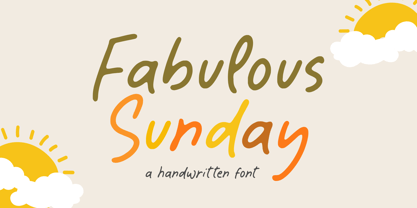 Fabulous Sunday is a Handwritten font that's perfect for adding a personal touch to your design projects! With its natural, organic feel and unique character. Crafted with care and attention to detail, this font is incredibly versatile and can be used for a range of design projects, including logos, branding, invitations, and more. Its modern, handwritten style gives it a unique character that's sure to make an impact. - also multilingual support Thank you!
 - Morthix by Lone Army,
$17.00Introducing our latest font, which features fluid and flowy curves reminiscent of liquid. This font's contemporary style makes it perfect for use in headers and futuristic designs, adding a creative touch that's sure to catch the eye. Its elegant and modern appearance creates a striking impression, making it ideal for designs that need to stand out. With this font, you can create a unique and eye-catching look that's perfect for any project. - Catapult by Jonahfonts,
$39.00 Catapult is designed based on my popular condensed versions of Cornerstone / 8 styles, Cornerstone Pro / 10 styles and Cornerstone Flair / 8 styles. Catapult / 8 styles is wider with much detail to kerning and keeping the overall color in paragraphs at a minimum. Catapult also contains extra glyphs and new alternates. https://www.myfonts.com/search/cornerstone/ Applications include Headlines, logos, ads, invitations, captions, packaging, bulletins, posters, and greeting cards as well as short texts.