10,000 search results
(0.048 seconds)
- Birthstone by TypeSETit,
$80.00 The Birthstone Family is a set of fonts that are not only diverse but perfectly compatible to interchange styles in a single block of text. There are 3 precious gems: Script, Casual, and Formal. Plus for added luster, there's Bounce (both Medium and Light weights) plus a Titling font— A truncated version that includes caps and ending swashed forms. You won't believe your eyes. All 4 styles are uniquely compatible to one another, but distinctly different. See how easily the fonts may change according to the needs of the look. The Pro version contains the three main styles: Script, Casual and Formal plus the lighter weight version of Bounce. You will also have lots of Opentype feature options.
 - László by Just My Type,
$20.00 We count three inspirations for the László font family. The upper case was inspired by Yomar Augusto’s amazing font Unity, used on last year’s German World Cup Team jerseys; the lower case from a few letters a poster for a Bauhaus show. The name László is an homage to László Moholy-Nagy, peerless Bauhaus designer and teacher. The László type family is stripped down to the typographic core, lean, clean and definitely machined, at home in either a formal or casual setting, i.e. you can take László anywhere. Inspired by watching the World Cup and the German Team’s jerseys. Very clean, simple, Bauhaus-style design, European and highly legible. Usage recommendations Automobile ads, anywhere a European feel is desired.
 - Radeil by Craft Supply Co,
$20.00 Radeil Vintage Font – A Unique Sans Serif Introduction to Radeil Vintage Radeil Vintage is a distinctive sans serif font with a timeless appeal. It blends vintage charm with modern simplicity. This font stands out with its unique stamp-style and rough texture. Design Features Radeil Vintage showcases a rough, textured look, resembling a hand-stamped imprint. Its characters have a slightly eroded appearance, adding to the vintage feel. The font maintains clean lines, typical of sans serif fonts, ensuring readability. Versatility and Usage Ideal for various design projects, Radeil Vintage is versatile. It’s perfect for logos, posters, and branding that require a retro touch. Its distinct style enhances both digital and print media.
 - Flax by Wilton Foundry,
$29.00Flax Regular lives in a somewhat unusual space... it is not a normal “handwriting” font, nor is it a formal script, or a rounded italic. Flax is a slightly more formal handwriting script that is extremely legible and useful- it can stretch from invitations to packaging, to menus, to brochures to ads. The rough hand-drawn finish gives Flax some of its unique character. This is almost unnoticeable in smaller point sizes while clearly visible in display sizes. While Flax is slightly formal, it has a very friendly presence - mainly from the unpretentious rounded characters and rough finish. Flax is available in Postscript, Truetype and Opentype for Mac and Windows. You will enjoy putting Flax to work! - Modesto Text by Parkinson,
$25.00 The Modesto Text Family is text in name only. It’s called Text because it has a Lower Case, and also to distinguish it from the rest of the Modesto clan. Modesto is a loose-knit family based on a signpainters lettering style popular in the late-19th and early-20th centuries. It evolved from the lettering I used for the Ringling Bros. and Barnum & Baily Circus Logo. The Modesto family was not planned. It just happened, a few fonts at a time over about fifteen years. In 2014 seven new Italic fonts and two Chromatic families were added. There is a downloadable MODESTO USER MANUAL PDF in the Gallery section for this family.
 - Hwaiting Sans by Konstantine Studio,
$20.00 Inspired by the emerging Korean culture that grabbing the worldwide actuation in so many realms of the industry. To bridge the vibes and to make it easier to consume, we found the gap to fill with simple things in life that are useful for it, and yes, it’s a new day it’s a new font. So without any further ado, please welcome Hwaiting Sans. 2/3 series of Korean vibes typefaces. It’s a sans-serif font with bold and strong vibes to catch up with today’s graphic design trends. Crafted with deep research about Korean traditional letters, shaped up with the approach of universal Latin letters. This is the second drop of 3 series from the Hwaiting family. So stay tuned for the upcoming release.
 - Speed Bump by Three Islands Press,
$19.00 I, uh, don't know quite what to say. I'd toiled so long over Pumpkinseed back in '96 that I guess I needed a good, wild ride to shake out the head cramps, or something. Whatever grabbed me, it forced me to sit down and design a typeface real fast directly in Fontographer (had never done that before). Took less than two hours to finish the regular character set. No way to explain it, but the exercise actually paid off -- I think. And now that there was Speed Bump, there simply had to be a companion dingbat set. (Beats the heck out of me.) So check out Speed Bump's wacky character(s) and, if you're really bored, the 200-some-odd little pictures in Speed Bump Pi.
 - Hwaiting Handwriting by Konstantine Studio,
$20.00 Inspired by the emerging Korean culture that grabbing the worldwide actuation in so many realms of the industry. To bridge the vibes and to make it easier to consume, we found the gap to fill with simple things in life that are useful for it, and yes, it’s a new day it’s a new font. So without any further ado, please welcome Hwaiting Handwriting. 1/3 series of Korean vibes typefaces. It’s handwriting-based fonts with the reference of the ancient style ink and brush strokes but make it modern. Crafted with deep research about Korean traditional letters, shaped up with the approach of universal Latin letters. This is the first drop of 3 series from the Hwaiting family. So stay tuned for the upcoming release.
 - Katarine by Suitcase Type Foundry,
$75.00From today's point of view Katarine has a rather unusual origin. Initially an all-caps display face, what was to become the Medium weight of the family was augmented with a lower case, then the character set was completed by adding all the missing glyphs. The next step was the creation of the Light and the Bold weights with matching Italics. This working method compromised the relationships between the characters across the different weights After some consideration the decision was made to start over and draw the complete family from scratch. This time the "conventional" process was followed — first the Light and Bold weights were designed. Those extremes were used to interpolate the Regular, Medium and Semibold weights. When compared to the original, the glyphs of the new fonts are slightly wider. The construction of the letters is sturdy, with an x-height that varies from the heaviest to the lightest weights. The relationship of the stem weight between the horizontal and vertical strokes is carefully balanced. Characters are open and firm; the italics have room to breathe. The original fonts included two sets of small caps — Small Caps and Petite Caps. However neither set were suited for emphasis, with the Small Caps being too tall and the Petite Caps too short. We decided to replace them both with one set of traditional small caps, slightly taller than the x-height, perfectly suited for emphasis in text usage. The original version of Katarine was partly incorporated into the new OpenType versions. Thus most of the original arrows, frames and boxes can be found in the new Katarine. Each individual weight now contains 830 glyphs, nine sets of numerals, small caps, numerous ligatures and fractions. An additional font named Numbers contains numerals in circles and squares, and is now augmented with accented caps and a number of terminal alternatives, which can easily be accessed through stylistic sets. We also added two extra variants, Experts Regular and Experts Black (in inverted form). Katarine Std preserves the solid construction and excellent legibility of the original family, but has now become a fully featured OpenType typeface. Katarine is suited for a broad range of applications, from simple layouts to intricate corporate systems. It is the typeface of choice where the cold, austere character of modern sans serifs are inappropriate, yet simple shapes and good legibility are required. - ITC Bolthole by ITC,
$29.99I fell in love at the age of twelve in Wales, recalls Bernard Philpot. "My father brought me to a small graveyard in the Welsh hills to show me two headstones carved by the great Eric Gill. I instantly fell in love with the beauty of the carving and the perfection of the letterforms. I still go back to marvel at these works of art." However, the ITC Bolthole™ design, Philpot's first commercial typographic endeavor, is quite unlike the works of Eric Gill that first captured his heart. Bolthole is a craggy sans serif with a definite grumpy attitude. It's not terribly legible, and, if more than a few words are set in the design, it's not very readable. To round out its cranky personality, Bolthole does not like to be set in small sizes. Like Cheez Whiz® and bullfights, you either love or hate this typeface. But whichever emotion dominates, there is no denying that Bolthole has a personality to be reckoned with - one with ample magnetism to ensure reader attraction. If used to set brief blocks of display copy, the typeface makes a powerful statement. Bolthole was originally designed to complement a whimsical ad for the Royal Society for the Prevention of Cruelty to Animals. As Philpot recalls, "although the ad didn't win any awards, the type attracted some very positive comments for its original look and feel." Philpot studied graphic design and typography at the London School of Printing, and soon after graduation found himself working in a large advertising agency in London. According to Philpot, "After designing type for everything from packaging to ads, I thought it time to convert one of my designs into a complete font - and Bolthole was born." ITC Bolthole could very well be the Shrek™ of typeface design - which might not be such a bad thing." - Two Sugars by Set Sail Studios,
$16.00 Introducing the Two Sugars Script Font! Two Sugars is a playful yet striking clean monoline script font, available in 2 weights and includes bonus extra stars & underlines. It's chunky, hand-drawn letterforms are guaranteed to stand out whether that be on light hearted merchandise designs or more impactful quote designs. The Two Sugars family consists of; Two Sugars Regular • A clean, connecting script font containing upper & lowercase characters, numerals, and a large range of punctuation. Two Sugars Extras • A set of 26 hand-drawn stars & underlines designed to compliment your Two Sugars script fonts. Simply install this as it's own separate font, and type any A-Z character to generate one of the extras. Two Sugars Bold & Two Sugars Extras Bold • If you're looking for a chunkier version of the Two Sugars & Two Sugars Extras fonts, simply switch to the bold versions! Alternates • Are available for lowercase descenders g, j, z, & y. These have elongated tails to add some extra flair to your text, and are accessible by switching on 'Stylistic Alternates' or via a Glyphs panel. Language Support • Two Sugars supports the following languages; English, French, Italian, Spanish, Portuguese, German, Swedish, Norwegian, Danish, Dutch, Finnish, Indonesian, Malay, Hungarian, Polish, Croatian, Turkish, Romanian, Czech, Latvian, Lithuanian, Slovak, Slovenian
 - Univers Cyrillic by Linotype,
$55.00 The font family Univers is one of the greatest typographic achievements of the second half of the 20th century. The family has the advantage of having a variety of weights and styles, which, even when combined, give an impression of steadiness and homogeneity. The clear, objective forms of Univers make this a legible font suitable for almost any typographic need. In 1954 the French type foundry Deberny & Peignot wanted to add a linear sans serif type in several weights to the range of the Lumitype fonts. Adrian Frutiger, the foundry’s art director, suggested refraining from adapting an existing alphabet. He wanted to instead make a new font that would, above all, be suitable for the typesetting of longer texts — quite an exciting challenge for a sans-serif font at that time. Starting with his old sketches from his student days at the School for the Applied Arts in Zurich, he created the Univers type family. In 1957, the family was released by Deberny & Peignot, and afterwards, it was produced by Linotype. The Deberny & Peignot type library was acquired in 1972 by Haas, and the Haas’sche Schriftgiesserei (Haas Type Foundry) was folded into the D. Stempel AG/Linotype collection in 1985/1989.
 - Sweetie Darling by Nathatype,
$29.00 Finding a perfect font for your designs may be tough work and time-consuming. Definitely, you never want to have a too plain, common font, but you have trouble finding the one to express your creativity and visions precisely. For that reason, Sweetie Darling is here to meet your needs. Sweetie Darling is a cursive-style handwriting script font. Like other cursive font designs, the letters are interconnected, but another character of this font is that the letters have high contrasts in curved edges to beautify the display. Due to the seemingly complex font style details to add the font’s legibility, it is suggested to apply this font for big text sizes. Additionally, you can enjoy the available features here. Features: Alternates Ligatures Multilingual Supports PUA Encoded Numerals and Punctuations Sweetie Darling fits best for various design projects, such as brandings, headings, magazine covers, quotes, invitations, greeting cards, printed products, merchandise, social media, etc. Find out more ways to use this font by taking a look at the font preview. Thanks for purchasing our fonts. Hopefully, you have a great time using our font. Feel free to contact us anytime for further information or when you have trouble with the font. Thanks a lot and happy designing.
 - Awardos by upirTYPO,
$6.00 Awardos is a complete solution for awards, badges and all kind of certificates. This font allows to mix various borders, laurels and icons to create a very unique badges. To quickly create an unique badge, type any number, any uppercase character and any lowercase character, for example 0Aa, 5Gk, 9Kl, 7Fr etc. To add starfield, start with a symbol (!"#$%&'()*+,). Glyphs included: 12x starfields - characters: ! " # $ % & ' ( ) * + , 16x borders - characters: 0 1 2 3 4 5 6 7 8 9 : ; < = > ? 36x laurels and outer elements - characters: A B C D E F G H I J K L M N O P Q R S T U V W X Y Z À Á Â Ã Ã Ä Å Ç È É Ê 12x crown icons - characters: a b c d e f g h i j k l 12x cup icons - characters: m n o p q r s t u v w x 12x number one digits - characters: y z à á â ã ã ä å ç è é ê It is not required to use a symbol from every category. For example only laurel with crown icon can be used, or only starfield with the cup icon. Awardos Inverse is an inversed version. The outline borders are still included, used symbols are: [ \ ] ^ _ { | } ~ ¢ £ ¤ ¥ ¦ § €
 - Koufiya by Linotype,
$187.99 Koufiya is designed by Nadine Chahine in 2003 as part of her MA project at the University of Reading, UK and later released by Linotype in 2007. It is the first typeface to include a matching Arabic and Latin designed by the same designer at the same time with the intention of creating a harmonious balance between the two scripts. The Arabic part is based on the Early Kufi style popular in the 7th to 10th century AD. It is characterized by a strong horizontal baseline, horizontal stacking order, clear and open counters, and a general open feeling. Though based on the earliest styles on Arabic manuscript, the design paradoxically appears quite modern and fresh. The Latin part of Koufiya recalls a Dutch influence in its shallow top arches and rather squarish proportions. Both Arabic and Latin parts have been carefully designed to maintain the same optical size, weight, and rhythm. However, no sacrifices were made to make them appear closer to each other. They are designed so that they work well together on the printed page, and to make sure that the two scripts are harmonious when they are mixed together even if within the same paragraph. The font includes support for Arabic, Persian, and Urdu. It also includes proportional and tabular numerals for the supported languages.
 - Estrand by Firstype Studio,
$16.00 Hello, design enthusiasts! Allow me to present "Estrand" - a distinctive Display font with a penchant for sharp angles and bold character. Estrand features an edgy and angular design, characterized by rigid corners and a slightly condensed form that exudes a sense of precision and boldness. The font is crafted with sharp angles, giving it a unique and commanding presence. Its condensed nature ensures a sleek and modern aesthetic, making it an excellent choice for designs that demand a tinge of fierceness. Key Features: Sharp Angles and Bold Character: Estrand embraces a sharp design with well-defined angles, adding a touch of assertiveness to your typographic compositions. Slightly Condensed Form: The font's condensed structure contributes to a sleek and modern look, allowing for efficient use of space in various design applications. Distinctive and Commanding: With its firm personality, Estrand stands out as a font that commands attention and leaves a lasting impression. Versatility: Whether applied to branding, logos, or any design project, Estrand's unique characteristics make it adaptable to a wide range of creative endeavors. Estrand is your go-to font for designs that demand a sharp and distinctive edge. If you have any inquiries or require further information, feel free to reach out. Your feedback is highly appreciated. Thank you for considering "Estrand" for your design endeavors.
 - Brootahh by Alit Design,
$16.00 Presenting the 🗯️💬The Brootahh Comic Typeface💬🗯️ by alitdesign. The Brootahh Comics typeface is inspired by the style of letters in comics that have less serious and fun characters. The lettering of the Brootahh font is a sans serif with distorted characters which gives a fun and design impression for children. The Brootahh font has 2 families, namely the Brootahh Blup font which has more bubble characters that can support comic characters to be cooler. The Brootahh font is perfect for creating designs with non-serious concepts, designs for children, book headers, and of course for text on comics. The Brootahh Comics typeface also gets a bonus character of 230 Comic-themed illustrations that make creating designs even easier. Simply by downloading The Brootahh Comics typeface creating a Comic and non formal themed design is very quick and easy. The Brootahh Comics typeface is perfect for magazine cover designs, brochures, flyers. Instagram ads, Canva Design and so on with comic, non-serious, pop art, game mobile and fun design. Besides that this font is very easy to use both in design and non-design programs because everything changes and glyphs are supported by Unicode (PUA). The Brootahh Comics typeface contains 618 and Brootahh Blup 498 + 230 bonus glyphs with many unique and interesting alternative options.
 - RRollie by Eurotypo,
$38.00 RRollie is a typeface family inspired on the proportions of the Roman capital in the Augusto's age, some of them can be seen in inscriptions of Pompeii; in this particular case, it has taken an inscription from a tomb of the year 15 AD. The subtlety of the serif is hardly insinuates, helping to strut the terminals of the stems. Ascenders and descenders are very short. The thickness variation is presented quite delicate, highlighting the light-dark passage and even the agile counterblocks of the typeface. These fonts can be used in many kind of graphic works by its strong personality, visual impact and readability. This font family include OpenType features: Standard and discretionary ligatures, small caps, case sensitive from, old style figures, tabular, diacritics for western languages and many others. Roberto Rollie (1935-2003) was an outstanding professional of Graphic Design, Photography and Visual Artist. He was involved in the creation of the career of Visual Communication Design at the Faculty of Fine Arts (National University of La Plata, Argentina), in the late '60s; he was a pioneer and great teacher too, who loved the Roman Capitals for its subtle and balanced design, especially for high readability and clever design. Those who, like me, knew him as a person and teacher, we are deeply grateful for having received their warmth and enthusiasm for graphic design.
 - Mistery Zero by Alit Design,
$16.00 Presenting the 🎃 The Mistery Zero Halloween Typeface 🦇 by alitdesign. The Mistery Zero Halloween Typeface is designed for the needs of design concepts themed about Halloween and events in October and November. The Mistery Zero Halloween Typeface has a horror character with a script and wet brush style, making the horror Halloween themed design concept even better and unique. The Mistery Zero Halloween Typeface also gets a bonus character of 150 Halloween-themed illustrations that make creating designs even easier. Simply by downloading The Mistery Zero Halloween Typeface, creating a Halloween themed design is very quick and easy. The Mistery Zero Halloween Typeface is perfect for magazine cover designs, brochures, flyers. Instagram ads, Canva Design and so on with halloween and dark concepts. besides that this font is very easy to use both in design and non-design programs because everything changes and glyphs are supported by Unicode (PUA). The Mistery Zero Typeface contains 587 + 150 bonus glyphs with many unique and interesting alternative options. Language Support : Latin, Basic, Western European, Central European, South European,Vietnamese. In order to use the beautiful swashes, you need a program that supports OpenType features such as Adobe Illustrator CS, Adobe Photoshop CC, Adobe Indesign and Corel Draw. but if your software doesn't have Glyphs panel, you can install additional swashes font files.
 - Rex Stephane by Mans Greback,
$79.00 Rex Stephane, designed by Mans Greback, is a striking blackletter font that artfully blends medieval influences with modern geometric shapes. Inspired by the tall stature of Gothic architecture, merged with sharpened edges, this font captures the essence of strict ruling while having an elegance of the Middle Ages. First imagined while exploring an abandoned castle, the typeface is based on ancient manuscripts adorned with calligraphic lettering. These texts became the foundation for Rex Stephane, as Mans Greback aimed to recreate the rich history and grandeur of the medieval era while adding his own contemporary twist. The font is built with advanced OpenType functionality and has a guaranteed top-notch quality, containing stylistic and contextual alternates, ligatures, and more features; all to give you full control and customizability. It has extensive lingual support, covering all Latin-based languages, from Northern Europe to South Africa, from America to South-East Asia. It contains all characters and symbols you'll ever need, including all punctuation and numbers. Mans Greback is a Swedish typeface designer with a passion for creating unique and versatile fonts. With an extensive background in design and typography, Mans has built a reputation for his meticulous attention to detail and prolific craftsmanship. His many fonts are widely used by designers around the world, making his work synonymous with creativity and innovation.
 - Corpsy by Mofr24,
$11.00 Introducing Corpsy, the horror display font with a trash style and a unique droplet touch. Its spooky design perfectly captures the essence of Halloween, nightmares, and horror. Ideal for posters, t-shirts, art crafts, unique headlines, logotypes, and many more. What makes Corpsy unique is its distinct droplet effect, adding an extra layer of fear to any design. This font also pairs well with other horror-themed families such as Ghoulish and Gruesome. Corpsy comes in various styles, including regular and bold, and boasts an extensive character set, making it versatile for any project. Its special features include ligatures, stylistic alternates, and swashes. The design concept for Corpsy was to create a font that could embody the essence of all things horror, yet still retain a unique and identifiable style. We wanted to create a font that could stand out amongst the other horror display fonts available. We created Corpsy for designers who wanted to create horror-themed designs that were more than just clichés. This font is perfect for those looking to push the boundaries of horror design and create something new and unique. Corpsy is not a revival or based on any historical design. It was created from scratch, with the goal of becoming a staple font in the horror design world. Try Corpsy today, and take your horror designs to the next level.
 - Porte by Groteskly Yours,
$18.00 - Unique Modernist Look - 590+ characters per font - Standard & Discretionary Ligatures - Multiple Stylistic Sets - Old Style Figures - Case-Sensitive Punctuation - Multilingual - Cyrillic Included - Uppercase + Lowercase Porte is an elegant sans serif font inspired by stone carving and modernist typefaces of early 20th century. While at its core Porte is a display font, it can also be used for larger bodies of text and in a variety of projects. Thanks to its unique proportions and feel Porte is reminiscent of early 20th century type, wherein aesthetic qualities often overweighed matters of practicality and applicability. Porte is at once delicate and sturdy, subtle and unyielding. Porte is very OpenType friendly, boasting an awesome selection of useful OpenType features, precise and exhaustive kerning (around 1000 pairs) and lots of discretionary ligatures to make your designs look amazing. A selection of wider and narrower alternate glyphs allow the designer to modify the rhythm of the typeface, extending its application and impact. With 590+ characters on board, Porte supports all major Latin based languages as well as a number of Cyrillic languages. Porte received its first major update in fall 2022. Not only was the character set expanded considerably, but also some glyphs were re-drawn to fix visual inconsistencies, and a large number of stylistic alternates was added. The kerning, too, was re-done to accommodate new letterforms. Trials available upon request.
 - Flintlock by CozyFonts,
$25.00 The Flintlock Font Family has a Bold personality. The 'Rough' version of the Flintlock Font has a hand-carved or hand-etched edge, carefully crafted for each of over 300 glyphs. Caps, lower case, all numbers, fractions, accents and European characters that work in over 70 languages. 'Classically Built with a Vintage Flair'. Vintage in the American West Tradition that might have been forged and implemented from the 1860s through the 1930s and consequently fresh again. Flintlock Rough can be envisioned on many things dated from 1860 to present day. The font is available in 3 basic weights as of this release date. There are other versions on the drawing board... Flintlock Rough works extremely well with Posters, Branding, Movie Titles, Invites, Stationary, Signage, Embroidery, Letterpress, Ads, Logos and anything that feels Industrial or Hand-Crafted, eg. Coffee, Breweries, Antiques, Woodcuts, Western Styles, Sports Styles, Holidays, Menus, and more. Flintlock Flat & Flintlock Flat Italic are the siblings to Flintlock Rough without the hand-carved edge but rather clean with slightly rounded corners and edges. Extremely Legible, Bold and best used in all the same application descriptions mentioned above and more, specifically contemporary uses and settings, eg. Sports, Titles, Branding, Headlines, Logos and more. Curiously the Flat & Italic versions of Flintlock work extremely well in 1960s and 1970s settings.
 - Antika by Letterara,
$12.00 Antika is a beautiful modern script font featuring flowing letters. It will add a romantic touch to any crafting project!
 - Storybook Initials NF by Nick's Fonts,
$10.00 This collection of decorative initials culled from specimen books of the late 1800s will add nostalgic charm to any project.
 - Czaristane by Typotheticals,
$5.00 A rather light humorous font that can be used for many purposes. Updated in 2022 to add further bold versions
 - Desttina by Awanstudio,
$18.00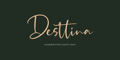 Desttina is a beautiful handwritten font with an amazing feel. It will add a smart charm to any design project!
 - Darkness by BaronWNM,
$14.00 Blackletters have a long history and appeal to the world of lettering. "Darkness" is a blackletter font, but with a contemporary style with a simple form. Darkness is very suitable for use on product labels, logos, ads, brochures, invitations, etc.
 - 4 Point Greek Fret by Deniart Systems,
$20.00 A whimsical array of pointers designed with semi-traditional Greek fret pattern (up/down/left/right) - great for adding directions or pointers to documents, maps, posters, greetings, or simply used as decorative elements. See also 4Point Deco and 4Point Florals.
 - Perdido by Scriptorium,
$12.00Perdido is a classic western-style font, with the added twist of the addition of a degenerated wood grain, so that the characters naturally look like aged and cracking wood. With the addition of an appropriate texture it's very convincing. - Propeller by Gleb Guralnyk,
$15.00 Introducing a script font named "Propeller". This font has a trendy look inspired by vintage aircraft ads. It has connected letters with smooth shape and round endings. Intersecting lines are made with a small overlay that gives a tiny volume effect.
 - Ryder Gothic Pro by Red Rooster Collection,
$60.00 A revival based on the Harry Winters design 'Roslyn Gothic' released by VGC in 1972. We've added a new light weight and several alternate glyphs. Ryder Gothic contains all the high-end features expected in a quality OpenType Pro font.
 - Storia by Letteralle,
$23.00 Introducing Storia! Storia is a contemporary script font inspired by a vintage script style. Storia has two weight options (regular & Light). Storia also include multilingual support. Storia Perfect for branding, merch, ads, social media, packaging, and many more. Thank You.
 - Blue Point by Solotype,
$19.95We began with the Victorian font Dotted, so-called because the counters of many of the letters contained a dot. We knocked out the dots, added a lowercase, and voila! a more useful type than the original without losing its charm. - MPI No. 507 by mpressInteractive,
$5.00 No. 507 is an elegant headline font with added angled flourishes. Its unique features are angled terminals, small, pointed serifs, and no contrast in stroke weight. It is similar to No. 506, designed by William H. Page & Company around 1890.
 - Compact by ParaType,
$25.00 The typeface was designed at ParaType (ParaGraph) in 1991 by Vladimir Yefimov. Based on Anons by Gennady Baryshnikov. An extra condensed sans serif. For use in advertising and display typography. The decorative styles were added in 1997 by Alexander Tarbeev.
 - Marvelo by Gian Studio,
$12.00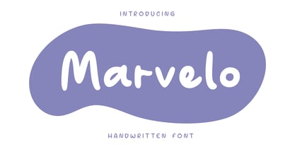 Introducing Marvelo is a comic display font that is fun adn clean. Suitable for use on quotes, displays, logos, branding, social media post, advertisements, product packaging, product designs, labels, photography, watermarks, invitations and more. Displayed fonts: Uppercase, Lowercase, Numbers, Symbols, Accents also Multilingual Support Enjoy the font, feel free to comment or feedback, send me a PM or email. Thank You!
 - Paveline by Greater Albion Typefounders,
$19.95 Paveline is a punctuated script; by which we mean it has the look and character of handwriting, but the glyphs are discrete entities to aid legibility. It is actually based on a moderately stylized adaptation of our chief designer's handwriting. Use it to give a handwritten touch to your work. Paveline works well as small handwriting or large scale poster captions.
 - Xmas by Linotype,
$29.99Christmas cookies have already slowly crept onto your local supermarket's shelves -- the Linotype Xmas Fonts just can't wait any longer! Ravishingly friendly and universally applicable: Fuenfwerken -- a design studio from Wiesbaden, Germany -- is proud to present its latest Fun Font Family. Bringing variety to the dry Christmas card genre, these fonts can also be used on posters to spread holiday cheer at home. No limits are placed on your creativity here! The family has three different fonts, each with more than 60 symbols inside: Xmas Story includes the whole figure palette necessary for a classical Christmas story. From a cute little Baby Jesus to the Three Wise Men and woolly Aramaic sheep and everything that one needs to add special flair to a letter to grandma, or to set up a Nativity Scene at home for the kids is included. Customers who aren't searching for a biblical font should check out Xmas Essentials. This font contains typical non-denominational end-of-the-year holiday ornaments, such as snowflakes, decorated Christmas trees, nutcrackers, and stars. Last but not least is the Xmas Modern font. Just as global warming poses severe risks to snowmen, this font will make recipients of your holiday and New Year's cards melt. Glyphs such as Santa Claus riding on a Vespa -- complete with iPod -- speed away from normal, stuffy holiday seriousness, and signal that the Fun Generation has arrived! The best choice, of course, is to treat yourself to all three fonts this Christmas. Then you'll be prepared for every situation. Happy Holidays! - HD Colton by HyperDeluxe,
$35.00 HD Colton is a 90-style super-sans from London Design Studio HyperDeluxe®. Using a combination of horizontal & vertical terminals along with squarish ovals, it is built with a confident structure that feels so much more than a neutral sans, it feels iconic. Engineered in 5 widths, compressed to extra wide, and in nine weights, HD Colton features a huge 90 styles that will offer your brand ultimate flexibility and variation in one font family. The black weights will help bring prominence to your brand while the light to mid weights will help you tell your story at a smaller size. HD Colton includes 1200+ glyphs per style, providing you with a workhorse sans that supports 200+ languages including extended Latin, extended Cyrillic and basic Greek. Also included are 5 stylistic sets, 2 arrow sets & numerous OpenType features (see last poster for complete list). The HD Colton complete family package comes with a single, 3-axis variable font so you'll have an infinite amount of combinations and uses for you to experiment with and add that touch of finesse to your visuals. Variable fonts are tech friendly providing smaller sizes for developers to work with, while also being responsive and used for motion design on the web. HD Colton key features: 3-Axis Variable Font. 90 Styles. 1200+ Glyphs Per Style. 5 Widths (Compressed, Condensed, Regular, Wide, Extra Wide). 200+ Languages Supported. Extended Latin, Extended Cyrillic, Greek Support. Stylistic Alternates for some key glyphs (J, Q, G, l, &, Arrows). Extensive OpenType features.