10,000 search results
(0.037 seconds)
- Mira by HiH,
$10.00 Mira is a playful, decorative Art Nouveau font, released by Roos & Jung Foundry in Offenbach AM, Germany about 1902. The exaggerated serifs and the sharp contrast between the thick and thin strokes gives the page a whimsical “salt and pepper” look that is very distinctive. Mira uses our new encoding. The Euro symbol has been moved to position 128 and the Zcaron/zcaron have been added at positions 142/158 respectively. Otherwise, MIRA has our usual idiosyncratic glyph selection, with the German ch/ck instead of braces, Western European accented letters, lower case “o” and “u” with Hungarian umlaut and our usual Hand-in-Hand symbol. In addition, black-letter-style upper case “H” and “T” characters are included. Download the PDF Type Specimen for locations.
 - Gambit Nouveau SG by Spiece Graphics,
$39.00 Sinuous but sturdy; ornate but legible - Gambit Nouveau is modern-day design created in the spirit of Art Nouveau. This delicate and natural typeface features tapered spurs, compact swashes, and spiral curling. You will find it ideally suited for announcements and invitations as well as decorative headlines. And for your convenience, Gambit Nouveau comes equipped with corner and free-standing ornaments plus a wide range of alternate characters. Gambit Nouveau is also available in the OpenType Std format. Some new features including initial forms and old style figures have been added to this OpenType version. Advanced features currently work in Adobe Creative Suite InDesign, Creative Suite Illustrator, and Quark XPress 7. Check for OpenType advanced feature support in other applications as it gradually becomes available with upgrades.
 - Argumentum by Kostic,
$40.00 In December 2013 two new weights - Thin & Ultra (with Italics) were added to the set, Small Caps included! The intention was to make a technical-looking sans with a warmer feel to it, balanced between hard geometric shapes and friendly curves with slightly narrower endings. It should be useful in a wide range of tasks, whether combining the eight weights with distinct italics for editorial design, setting multiple pages of text, making financial reports, or using the highly contrasted lights and blacks for display and packaging design. Argumentum has a character set to support Western and Central European languages, and an extended set for monetary symbols. Each weight includes small caps, ligatures, proportional lining and oldstyle numbers, tabular figures, fractions and scientific superior/inferior figures.
 - Hippie Mods by Jolicia Type,
$19.00 Hippie Mods is a font that takes you back to the psychedelic era of the 1960s and 70s. This fun and retro typeface is a true embodiment of the free-spirited movement, peace and love, capturing the essence of the countercultural revolution in its design. It is the perfect choice for projects that demand a touch of nostalgia and strong individuality. The font's flowing curves, hand-drawn feel, and vintage details evoke the spirit of a bygone era. With a natural color palette and versatile design, Hippie Mods are the perfect choice for adding a touch of nostalgia and whimsy to your creative projects. This typeface will also make your projects radiate the strong spirit of the Hippie era, whether you are creating art, posters, or branding.
 - Woonder by Khaiuns,
$15.00 Woonder Script Fonts, a handcrafted brush font! This bold, free-flowing, confident brush font is designed to be easily customized to your liking with 2 letter sets, also featuring swashes and some unique textures. Find a unique Woonder Script Font by adding a plus (+) to each letter and number and you'll have a cool letter. Woonder Script Fonts is a brush font which you can use and enjoy again and again, for anything from promotional material and handwritten quotes, to product packaging, merchandise and branding projects. Please message me if you want your language included or If there are any features or glyph requests, feel free to send me a message, I would like to update it. I hope you have a blast using Woonder Script Fonts!
 - Bodoni by ParaType,
$30.00 Designed at ParaType in 1989 by Alexander Tarbeev. A modern replica of the typeface by Giambattista Bodoni, the Italian punchcutter and typographer of the late 18th century. Bodoni was a director of printing house of Duke of Parma in Italy. His early types were based on those of Fournier and Didot, but he developed the designs to become what are now considered to be the first modern typefaces. His letters have strong vertical stress, sharply contrasting thick and thin strokes and unbracketed hairline serifs. The contrast of thick and thin in Bodoni typefaces can produce a sparkling effect on a page: should be carefully used in texts; good for headlines and display. Condensed and decorative styles were added in 1993–97.
 - Teimer Std by Suitcase Type Foundry,
$75.00Typographer and graphic designer Pavel Teimer (1935-1970) designed a modern serif roman with italics in 1967. For the drawing of Teimer he found inspiration in the types of Walbaum and Didot, rather than Bodoni. He re-evaluated these archetypes in an individual way, adjusting both height and width proportions and modifying details in the strokes, thus effectively breaking away from the historical models he used as a starting point. Teimer's antiqua has less contrast; the overall construction of the characters is softer and more lively. The proportions of the italics are rather wide, making them stand out by their calm and measured rhythm. This was defined by the purpose of the typeface, as it was to be utilised for two-character matrices. The long serifs are a typical feature noticeable throughout the complete family of fonts. In 1967, a full set of basic glyphs, numerals and diacritics of Teimer's antiqua was submitted to the Czechoslovak Grafotechna type foundry. However, the face was never cast. At the beginning of 2005 we decided to rehabilitate this hidden gem of Czech typography. We used the booklet "Teimer's antiqua - a design of modern type roman and italics", written by Jan Solpera and Kl‡ra Kv’zov‡ in 1992, as a template for digitisation. The specimen contains an elementary set of roman and italics, including numerals and ampersands. After studying the specimen, we decided to make certain adjustments to the construction of the character shapes. We slightly corrected the proportions of the typeface, cut and broadened the serifs, and slightly strengthened the hair strokes. In the upper case we made some significant changes in the end serifs of round strokes in C, G and S, and the J was redrawn from the scratch. The top diagonal arm of the K was made to connect with the vertical stem, while the tail of Q has received a more expressive tail. The stronger hairlines are yet more apparent in the lower case, which is why we needed to further intervene in the construction of the actual character shapes. The drawing of the f is new, with more tension at the top of the character, and the overall shape of the g is better balanced. We also added an ear to the j, and curves in the r have become more fluent. To emphasise the compact character of the family, the lining numerals were thoroughly redrawn, with the finials being replaced by vertical serifs. The original character of the numerals was preserved in the new set of old-style figures. To make the uppercase italics as compact as possible, they were based on the roman cut rather than on the original design. The slope of lowercase italics needed to be harmonised. The actual letter forms are still broader than the characters in the original design, and the changes in construction are more noticeable. The lower case b gained a bottom serif, the f has a more traditional shape as it is no longer constricted by the demands of two-matrice casting, the g was redrawn and is a single storey design now. The serifs on one side of the descenders of the p and q were removed, the r is broader and more open. The construction of s, v, w, x, y, and z is now more compact and better balanced. Because Teimer was designed to make optimal use of the OpenType format, it was deemed necessary to add a significant amount of new glyphs. The present character set of one font comprisess over 780 glyphs, including accented characters for typesetting of common Latin script languages, small caps and a set of ligatures, tabular, proportional, old style and lining, superscript and fraction numerals. It also contains a number of special characters, such as arrows, circles, squares, boxed numerals, and ornaments. Because of its fine and light construction, the original digitised design remained the lightest of the family. Several heavier weights were added, with the family now comprising Light, Light Italic, Medium, Medium Italic, Semibold, Semibold Italic, Bold, and Bold Italic. - Bonding by Arendxstudio,
$15.00 Bonding Font that has a distinctive character that is very thick and elegant to use Bonding is a relaxed and flowing Handwritten Font. Incredibly versatile, this font fits a wide pool of designs, elevating them to the highest levels. Add this font to your favorite creative ideas and notice how it makes them come alive! Features : • Character Set A-Z • Numerals & Punctuations (OpenType Standard) • Accents (Multilingual characters) • Ligature Multilingual Support : Afrikaans, Albanian, Asu, Basque, Bemba, Bena, Catalan, Chiga, Cornish, Danish, English, Estonian, Faroese, Filipino, Finnish, French, Friulian, Galician, German, Gusii, Icelandic, Indonesian, Irish, Italian, Kabuverdianu, Kalenjin, Kinyarwanda, Low German, Luo, Luxembourgish, Luyia, Machame, Makhuwa-Meetto, Makonde, Malagasy, Malay, Manx, Morisyen, North Ndebele, Norwegian Bokmål, Norwegian Nynorsk, Nyankole, Oromo, Portuguese, Romansh, Rombo, Rundi, Rwa, Samburu, Sango, Sangu, Scottish Gaelic, Sena, Shambala, Shona, Soga, Somali, Spanish, Swahili, Swedish, Swiss German, Taita, Teso, Vunjo, Zulu There it is! I really hope you enjoy it
 - Salty Milky by Yumna Type,
$15.00 Salty Milky is a display font in thick weights to be your best choice for showing casual, charming, fun expressions. The uneven proportions and forms of the artistic letters add more attractiveness to this font. Furthermore, Salty Milky gives you a special bonus called the clipart. Use this font for big text sizes for a legibility reason and you can make use of the interesting features available here as well. Features: Multilingual Supports PUA Encoded Numerals and Punctuations Salty Milky fits for various design projects, such as posters, banners, logos, magazine covers, quotes, headings, printed products, merchandise, social media, etc. Find out more ways to use this font by taking a look at the font preview. Thanks for purchasing our fonts. Hopefully, you have a great experience using our font. Feel free to contact us for further information when you have a problem using the font. Thank you. Happy designing.
 - Violia by HandletterYean,
$10.00 Violia from HandletterYean is a simple, elegant and authentic signature font with a contemporary feel. It will add a sophisticated spark to any design idea. This font is suitable for your creative work on greeting cards, branding materials, business cards, quotes, posters, wedding cards, logo design, blog design, stationery, marketing, magazines and more! What’s included: 1. Violia (OTF) 2. Style in this font include: Regular, Bold, Italic, Bold italic 3. Works both on Mac & PC 4. Simple installations 5. Accessible in the Adobe Illustrator, Adobe Photoshop, Adobe InDesign, CorelDraw, even work on Microsoft Word. 6. Support multilingual; ä ö ü Ä Ö Ü ß ¿ ¡ To access the alternate glyphs, you need a program that supports OpenType features such as Adobe Illustrator CS, Adobe Photoshop CC, Adobe Indesign and CorelDraw. More information about how to access alternate glyphs, check out this link ( http://goo.gl/ZT7PqK )
 - Desmo by Craft Supply Co,
$20.00 Introducing Desmo Reversed Contrast Slab Serif Font Unique Design Meet Desmo Reversed Contrast Slab Serif Font. Its reversed contrast sets it apart. Thick horizontal lines and thin verticals create a striking look. This design choice grabs attention, perfect for impactful displays Versatile Display Font Desmo shines in display settings. Whether for headlines, posters, or advertising, it stands out. Its bold features ensure readability from a distance. Moreover, its unique style makes every design engaging. Engaging Typography Desmo’s typography is designed to captivate. Its slab serifs add a touch of elegance. The font’s balanced spacing ensures clarity in every word. Therefore, it’s ideal for brands aiming to make a statement. Accessibility and Ease of Use This font is accessible to a wide range of users. Its simplicity avoids complex vocabulary. Easy to install and use, Desmo suits various design projects. Additionally, its compatibility with multiple software enhances its versatility.
 - Winner Sans by sportsfonts,
$19.00 Winner Sans™ and Winner™—Classic athletic aesthetics, finally as a versatile contemporary super family. Just when you thought there was nothing left to add to the classic sports design, we lifted it to a whole new level. Whatever you want to set in whatever space, with seven weights in seven widths both with or without serifs, you’ll definitely find the right proportions for it! Winner Sans supports not only most Latin-based languages but also Greek. Its extensive character set also contains currency signs, arrows, as well as a wide range of numerals from small figures to Roman numerals. Furthermore, its sophisticated OpenType layout features give you access to alternative letter shapes, fractions, tabular figures, and contextual alternates. With more than 24,000 glyphs in 49 fonts, Winner Sans leaves nothing to be desired. Grab Condensed Regular for free and give it a spin! (Stadium illustrations by Oskar Strauß)
 - Assuming by Arendxstudio,
$15.00 Assuming Font that has a distinctive character that is very thick and elegant to use Assuming is a relaxed and flowing Handwritten Font. Incredibly versatile, this font fits a wide pool of designs, elevating them to the highest levels. Add this font to your favorite creative ideas and notice how it makes them come alive! Features : • Character Set A-Z • Numerals & Punctuations (OpenType Standard) • Accents (Multilingual characters) • Ligature Multilingual Support : Afrikaans, Albanian, Asu, Basque, Bemba, Bena, Catalan, Chiga, Cornish, Danish, English, Estonian, Faroese, Filipino, Finnish, French, Friulian, Galician, German, Gusii, Icelandic, Indonesian, Irish, Italian, Kabuverdianu, Kalenjin, Kinyarwanda, Low German, Luo, Luxembourgish, Luyia, Machame, Makhuwa-Meetto, Makonde, Malagasy, Malay, Manx, Morisyen, North Ndebele, Norwegian Bokmål, Norwegian Nynorsk, Nyankole, Oromo, Portuguese, Romansh, Rombo, Rundi, Rwa, Samburu, Sango, Sangu, Scottish Gaelic, Sena, Shambala, Shona, Soga, Somali, Spanish, Swahili, Swedish, Swiss German, Taita, Teso, Vunjo, Zulu There it is! I really hope you enjoy it
 - Loveless by Arendxstudio,
$18.00 Loveless - Wedding Calligraphy Font that has a distinctive character that is very thick and elegant to use Loveless is a relaxed and flowing Handwritten Font. Incredibly versatile, this font fits a wide pool of designs, elevating them to the highest levels. Add this font to your favorite creative ideas and notice how it makes them come alive! Features : • Character Set A-Z • Numerals & Punctuations (OpenType Standard) • Accents (Multilingual characters) • Ligature Multilingual Support : Afrikaans, Albanian, Asu, Basque, Bemba, Bena, Catalan, Chiga, Cornish, Danish, English, Estonian, Faroese, Filipino, Finnish, French, Friulian, Galician, German, Gusii, Icelandic, Indonesian, Irish, Italian, Kabuverdianu, Kalenjin, Kinyarwanda, Low German, Luo, Luxembourgish, Luyia, Machame, Makhuwa-Meetto, Makonde, Malagasy, Malay, Manx, Morisyen, North Ndebele, Norwegian Bokmål, Norwegian Nynorsk, Nyankole, Oromo, Portuguese, Romansh, Rombo, Rundi, Rwa, Samburu, Sango, Sangu, Scottish Gaelic, Sena, Shambala, Shona, Soga, Somali, Spanish, Swahili, Swedish, Swiss German, Taita, Teso, Vunjo, Zulu
 - Juggler by Jonahfonts,
$25.00 Juggler is a medium-line font suitable for work requiring a friendly style. Ideal for packaging, also suitable for special invitations, birthday cards, posters, ads and book jackets.
 - La Rotonda by Jonahfonts,
$25.00 A single weight rounded font, similar to the popular Futura font with several new twists. Usage recommendations include captions, packaging, invitations, cards, posters, ads, book jackets, and manuals.
 - Formal Invite JNL by Jeff Levine,
$29.00 The thin, condensed serif lettering found in a 1937 magazine ad for Chris Craft boats inspired Formal Invite JNL, which is available in both regular and oblique versions.
 - Anti by Type Firm,
$39.99 If we look up the definition of the word "grotesque", we find the following: "Odd or unnatural in shape, appearance, or character; fantastically ugly or absurd; bizarre." Following this definition, the design for Anti aims to create an un-compromised version of a grotesque sans-serif – where decorative details live in balance with brutalist shapes. The result is an alphabet with a slightly modernist feeling and an eccentric touch, that work wonders at small sizes. The typeface comes with four weights – light to bold – and features a character set supporting Central and Eastern European as well as Western European languages.
 - Acrom by Inhouse Type,
$33.78 Acrom is a geometric sans serif typeface with a minimal stroke contrast. It was designed with a modern, contemporary context in mind. Acrom is not merely mechanical, it can also be recognised as a natural typeface with subtle geometric aesthetics. The humanist quality of the font aids legibility across both text and display work. Acrom’s main characteristics lie in the injection of stylistic forms that enhance its individuality without overpowering the font’s functional purpose and integrity. The font can be tamed utilising the set of alternative characters available within the typeface. Details include 500 characters, manually edited kerning and Opentype features.
 - Empty Page by PizzaDude.dk,
$16.00 A font based upon my own handwriting (when I am concentrating and making each letter legible!) Very suitable for anything that needs a handwritten feeling. I've added 4 (slightly) different versions of each lowercase letter, and that really helps making your text look more like real handwriting rather than "just a font"
 - Flimsy by Bogstav,
$17.00 Flimsy is 100% handmade, but digitally remastered. I removed some blobs here and there, but kept enough of the original handmade line in order to make the Flimsy stand out as an organic and powerful ALL CAPS font! I've also added 5 slightly different versions of each letter, along with multilingual support!
 - Betina Script by ParaType,
$30.00 The type family was designed at ParaType (ParaGraph) in 1992 by Alexander Tarbeev. Based on the handwriting of the German graphic artist Betina Kuntzsch. For use in advertising and display typography. Additional Latin letters (for the whole family) and Greek letters (for the normal style) were added by Gennady Fridman in 2006-2009.
 - Movie Matinee JNL by Jeff Levine,
$29.00 A 1926 trade ad for the silent comedy “The Nut-Cracker” starring Edward Everett Horton has the film’s title hand lettered in a decorative bold sans serif design complete with highlight lines and accent dots. This festive type face is now available digitally as Movie Matinee JNL in both regular and oblique versions.
 - Balzano by Adobe,
$29.00In 1994, John Benson designed Balzano, Alexa and Caliban, three typefaces with a similar calligraphic character. Balzano differs from the other in its vertical figures, adding a static element to the otherwise lively, flowing components. Balzano is good for short texts and headlines, anywhere in which a personal, elegant look is desired. - Wolfsburg Castle by Unitype Studio,
$29.00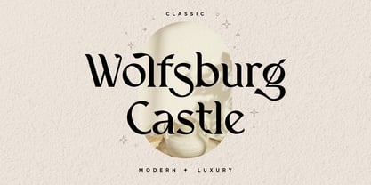 Introducing Wolfsburg Castle, a timeless Serif font that exudes classic elegance and modern sophistication. With its luxurious and stylish design, this font is perfect for adding a touch of refinement to your projects. Whether you're creating branding materials, wedding invitations, or editorial designs, Wolfsburg Castle will captivate your audience with its regal charm.
 - Laca Pro by Nova Type Foundry,
$52.99 Laca Pro now supports Greek and Cyrillic scripts. The letter shapes capture the playful spirit of Laca. The added language support brings even more usefulness for the use of Laca for branding, editorial and other projects. Communication is one of our passions, by supporting other scripts we want to create better communication.
 - Quetzal by Scriptorium,
$12.00Quetzal is a decorative font designed to look like letters formed by mosaic tiles in a Mayan or Aztec style. The font features two different character sets and customizable over-and-under decorative tails which can be added to any character to make hundreds of possible combination forms which nest together attractively. - Popular Records JNL by Jeff Levine,
$29.00 Browsing through an online edition of the Feb 29, 1960 issue of Billboard magazine, an ad was spotted for the Jamie record label of Philadelphia. The text was hand lettered in a free-form show card style, and this inspired Popular Records JNL, which is available in both regular and oblique versions.
 - Fat Nib by A New Machine,
$12.00 This hand drawn calligraphy font was made with a wide nib pen. It is all cap with different glyphs for the upper and lower case letters for mixing and matching. The Splatter family comes with extra splatter glyphs. Great for use when you need some added punch in a headline or callout.
 - Distingue by Burntilldead,
$18.00 Introducing Distingue, an elegant ligature serif font. This font is made to bring strong statement, design with bold geometric face and have swash on alternate characters to keep it look stylish and sharp. An easy & perfect choice to make your design projects; logo, branding, invitation, social media ads & website have classy looks.
 - Black Lonthe by Letterafandi Studio,
$20.00 Black Lonthe is an exquisite blackletter font that exudes timeless elegance. With its bold and ornate strokes, it captures the essence of traditional calligraphy while adding a modern twist. The sleek, sophisticated design of Black Lonthe makes it perfect for creating eye-catching titles, logos, and invitations that leave a lasting impression.
 - Pixelfy by Crumphand,
$19.00 Introducing new fonts! its called Pixelfy. Pixelfy is hand made pixel font. perfect contour, shape and square. this font its very perfect match for your project. 8bit games, chiptunes music, vaporwave design, digital ads and quotes. What's inside the fonts ? Uppercase Lowercase Numerals & Punctuation Multilinguals Support Opentype Features Stylistic Alternates Thank you!
 - Harvest Moon NF by Nick's Fonts,
$10.00The letterforms for this unusual display face were inspired by a 1930s ad for Tanguy Crepes, by an uncredited artist. Due to the ornate nature for this font, it has a limited character set, but does include all letters, numbers and punctuation for the Unicode 1252 Latin and 1250 Central European character sets. - Kartoon Kutz NF by Nick's Fonts,
$10.00These charming little cartoon figures, known in the trade as "midgets", added a little extra oomph to everything from business cards to matchbook covers from the 1920s to the 1950s. Each font contains 52 different cuts, ready and waiting to spice up your layouts, and each carefully hand drawn from authentic historical sources. - MPI Egyptian Ornamented by mpressInteractive,
$5.00 Egyptian Ornamented is a decorative font based on the shapes found in a French Clarendon. Serifs are chunky and bifurcated, and “spurs” have been added to the strokes. This font emits the feeling of Old West wanted posters, rodeo broadsides, etc. It was first introduced by William H. Page & Company in 1870.
 - Sadlyne Cyrillic by Ira Dvilyuk,
$19.00 Amazing lightness of modern calligraphic writing is reproduced in handwritten script font Sadlyne. This font consists of a pair of handwritten script font and additional font with hand-drawn flourishes and decorative elements. An outstanding feature of them is the fanciful swirls of the initial and final tails of the letters, which will add a playful elegance to your typography designs. The handwritten font itself includes all abundance of modern calligraphic font capabilities. The font pair Sadlyne is the best option for your wedding stationery and wedding monograms. Also it will be perfect for branding, logos, social media, packaging, and other projects. Sadlyne script contains a full set of uppercase letters and 5 full sets of lowercase letters, (standard, alternative, and initial, final form and flourish form). To make a needed form just type a letter with a number (such as a1, b1, c1...) and 27 ligatures - which can be used to create a handwritten calligraphy look. Sadlyne script font contains the Cyrillic glyphs too. The Cyrillic part of the font contains the uppercase letters and 3 full sets of lowercase letters, (standard, initial and final form). To make a needed form just type a letter with a number such as a1, б1, в1... After that select the word and apply the Open Type Features in programmes such as Adobe Illustrator, Photoshop, and others) Also Cyrillic part of the font contains 12 Cyrillic ligatures. To use all features of the font you need to have an access to all Opentype Features in software you work with. Sadlyne Symbols is a font with over 36 hand-drawn elements, illustrations and swashes that can help you to make your design unique and matchless. Combine and merge swashes and illustrations to create your own designs and make borders, frames, dividers, logos, and more (just use A-Z and a-z keys in the included Sadlyne Symbols font). A different symbol is assigned to each uppercase or lowercase standard character, so you do not need graphics software, just type the letter you need. Multilingual Support for 31 languages: Latin glyphs for Afrikaans, Albanian, Basque, Bosnian, Catalan, Danish, Dutch, English, Estonian, Faroese, Filipino, Finnish, French, Galician, Indonesian, Irish, Italian, Malay, Norwegian Bokmål, Portuguese, Slovenian, Spanish, Swahili, Swedish, Turkish, Welsh, Zulu. And Cyrillic glyphs support for Russian, Belorussian, Bulgarian, and Ukrainian languages.
 - Blue Signature by Mans Greback,
$69.00 Blue Signature is a playful and expressive handwriting font that exudes a wild and untamed feel. Its looping, flowing strokes and elegant curves give it a unique and authentic look that is perfect for adding a personal touch to your designs. Designed with a focus on creating a signature-like quality, Blue Signature is perfect for anything from logos and branding to social media posts and invitations. Its cute and expressive style is sure to make a lasting impression on your audience. Blue Signature comes in four styles: Regular, Italic, Bold, and Bold Italic, allowing for versatility and creativity in your designs. Use underscore _ anywhere in a word to make a swash. Example: White_sign Use multiple underscores to make different swashes. Example: Love____letters Use * to make flowers! Pink*Roses Spring***Party The font is built with advanced OpenType functionality and has a guaranteed top-notch quality, containing stylistic and contextual alternates, ligatures and more features; all to give you full control and customizability. It has extensive lingual support, covering all Latin-based languages, from Northern Europe to South Africa, from America to South-East Asia. It contains all characters and symbols you'll ever need, including all punctuation and numbers.
 - Shnixgun by Typodermic,
$11.95 In the world of graphic design, the typeface is everything. It’s the foundation on which you build your message, the first impression your reader gets of your brand. And when it comes to creating a unique and memorable brand, there are few typefaces more distinctive than Shnixgun. Based on the venerable Franklin Card Gothic, this inky, textured typeface takes inspiration from the age-old tradition of metal type, infusing it with a modern, edgy twist. Its rustic, weathered appearance is the perfect choice for anyone looking to add a touch of authenticity to their work. But Shnixgun is more than just a pretty face. Thanks to its custom letter pairs, it breaks up the monotony of repetitive letters and adds a level of nuance and sophistication to your message. With Shnixgun, your words become more than just a series of letters—they become a work of art. But what really sets Shnixgun apart is its rusty texture. This is a typeface that wears its age proudly, with every letter infused with the character and patina of a bygone era. Whether you’re designing a vintage-style poster, a hand-crafted logo, or an art magazine spread, Shnixgun is the perfect choice for anyone looking to infuse their work with a sense of warmth, authenticity, and honesty. So don’t settle for a bland, soulless typeface. Let Shnixgun’s rusty glyphs permeate your message with affection and depth, and bring your designs to life with a touch of artistic flair. Most Latin-based European writing systems are supported, including the following languages. Afaan Oromo, Afar, Afrikaans, Albanian, Alsatian, Aromanian, Aymara, Bashkir (Latin), Basque, Belarusian (Latin), Bemba, Bikol, Bosnian, Breton, Cape Verdean, Creole, Catalan, Cebuano, Chamorro, Chavacano, Chichewa, Crimean Tatar (Latin), Croatian, Czech, Danish, Dawan, Dholuo, Dutch, English, Estonian, Faroese, Fijian, Filipino, Finnish, French, Frisian, Friulian, Gagauz (Latin), Galician, Ganda, Genoese, German, Greenlandic, Guadeloupean Creole, Haitian Creole, Hawaiian, Hiligaynon, Hungarian, Icelandic, Ilocano, Indonesian, Irish, Italian, Jamaican, Kaqchikel, Karakalpak (Latin), Kashubian, Kikongo, Kinyarwanda, Kirundi, Kurdish (Latin), Latvian, Lithuanian, Lombard, Low Saxon, Luxembourgish, Maasai, Makhuwa, Malay, Maltese, Māori, Moldovan, Montenegrin, Ndebele, Neapolitan, Norwegian, Novial, Occitan, Ossetian (Latin), Papiamento, Piedmontese, Polish, Portuguese, Quechua, Rarotongan, Romanian, Romansh, Sami, Sango, Saramaccan, Sardinian, Scottish Gaelic, Serbian (Latin), Shona, Sicilian, Silesian, Slovak, Slovenian, Somali, Sorbian, Sotho, Spanish, Swahili, Swazi, Swedish, Tagalog, Tahitian, Tetum, Tongan, Tshiluba, Tsonga, Tswana, Tumbuka, Turkish, Turkmen (Latin), Tuvaluan, Uzbek (Latin), Venetian, Vepsian, Võro, Walloon, Waray-Waray, Wayuu, Welsh, Wolof, Xhosa, Yapese, Zapotec Zulu and Zuni.
 - Mr Palker by Letterhead Studio-YG,
$35.00 A slab serif Mr Palker and grotesque Mr Palkerson build one superfamily together. These are blank types. In a way even the display ones. Typefaces for newspapers, announcements, cheap advertising and police posters. Mr Palker and Mr Palkerson will turn every language into a fence. And due to six types of faces one can choose what material should the fence be made from — from Thin steel rods to the Black stone blocks. In their simplest appearance Mrs P&P are intended for the solid blank composition in victorian or industrial style. They are quite decent, a bit old-fashioned slab serif and grotesque with closed aperture. All my types have layers. Walker and Palkerson also do. Besides the standard set of symbols, they have 4 add-ons. 1. Alternate glyphs, including unicase ones. 2. Ligatures with A letter. 3. Extra tall small caps. 4. Two-storey ligatures. All this options are intended for the complex composition. The additional letters are rather eccentric as their main function here is to imitate the victorian oddities. Imitate, parody, just not repeat. There are lower-case As and Es in the set in height of small caps and uppercases. They can turn every writing into the unicase. The lower-case A (as well as uppercase and small caps version of it) has deliberately by my taste grown a ludicrous tail. To compensate it I’ve built all the possible ligatures - ад, ал, ая. There are 35 of this ligatures all together. Take a closer look at the Russian letters D, L, K, Ya from the main set as well as their alternates. The additional glyphs are one more comic than the other — on purpose to imitate (not to repeat!) the victorian set. This sets have lowercase numbers. And small caps numbers as well. What a modern typeface without them. They also have an У-letter with a generously curvy tail. As if before the WWI. The Latin of course has alternates as well. It has letters to make the perfect French sound more like the russian provincial version of it. The tails of Js and Ts can be made a little bit more open — or a little bit closed. My favorite feature here, an invention of a kind - extra tall small caps. It allows to compose logos with the small caped uppercases directly from the keyboard. The small caps of this typefaces are usually much taller than the customary ones. This is the kind of small caps that Palker and Palkerson have. More to that, the strokes’ weight and the letters width are corresponded to the uppercases. Just a ready set for making a logo a la 1913 style. With a unicase, one has to mind! One more trick with the tall small caps is a possibility to make them work like lower uppercases. Their height is just in between of lower- and uppercases. Isn’t it great to have an additional set of uppercase working ponies in stock for the case of emergency. And finally — the trademark of Palkers family, two-storey ligatures. They are made in the height of uppercases and turn every writing into an ornament or a puzzle of a kind, while at the same time making them much shorter. Each face has 90 of them. Mainly those are twins: CC, BB, DD and so on. ll this things are for the unhasty compositing, even for lettering. Which means that for the things which are not there you always should have Command+Option+O and some patience. Also — among the two storey ligatures one also can find some belvedere villas. All my types are glasses from the one kaleidoscope. The P&Ps family was preliminary part of the victorian set, which already has 1 Cents and Clarendorf - optionally one can add Costro, Gordoni, Handy, Guardy, Surplus, Red Ring, Red Square, Babaev to the list. And also Sklad, Odessa, Dreamland, Romb, Platinum - here, at Letterhead’s, every second one is victorian. All together our typefaces can allow one to set advertisement of any kind, even the trickiest one, and compose everything, from the coffee place’s menu to the antiquarian magazine.
 - Mr Palkerson by Letterhead Studio-YG,
$35.00 A grotesque Mr Palkerson and slab serif Mr Palker build one superfamily together. These are blank types. In a way even the display ones. Typefaces for newspapers, announcements, cheap advertising and police posters. Mr Palker and Mr Palkerson will turn every language into a fence. And due to six types of faces one can choose what material should the fence be made from — from Thin steel rods to the Black stone blocks. In their simplest appearance Mrs P&P are intended for the solid blank composition in victorian or industrial style. They are quite decent, a bit old-fashioned slab serif and grotesque with closed aperture. All my types have layers. Walker and Palkerson also do. Besides the standard set of symbols, they have 4 add-ons. 1. Alternate glyphs, including unicase ones. 2. Ligatures with A letter. 3. Extra tall small caps. 4. Two-storey ligatures. All this options are intended for the complex composition. The additional letters are rather eccentric as their main function here is to imitate the victorian oddities. Imitate, parody, just not repeat. There are lower-case As and Es in the set in height of small caps and uppercases. They can turn every writing into the unicase. The lower-case A (as well as uppercase and small caps version of it) has deliberately by my taste grown a ludicrous tail. To compensate it I’ve built all the possible ligatures - ад, ал, ая. There are 35 of this ligatures all together. Take a closer look at the Russian letters D, L, K, Ya from the main set as well as their alternates. The additional glyphs are one more comic than the other — on purpose to imitate (not to repeat!) the victorian set. This sets have lowercase numbers. And small caps numbers as well. What a modern typeface without them. They also have an У-letter with a generously curvy tail. As if before the WWI. The Latin of course has alternates as well. It has letters to make the perfect French sound more like the russian provincial version of it. The tails of Js and Ts can be made a little bit more open — or a little bit closed. My favorite feature here, an invention of a kind - extra tall small caps. It allows to compose logos with the small caped uppercases directly from the keyboard. The small caps of this typefaces are usually much taller than the customary ones. This is the kind of small caps that Palker and Palkerson have. More to that, the strokes’ weight and the letters width are corresponded to the uppercases. Just a ready set for making a logo a la 1913 style. With a unicase, one has to mind! One more trick with the tall small caps is a possibility to make them work like lower uppercases. Their height is just in between of lower- and uppercases. Isn’t it great to have an additional set of uppercase working ponies in stock for the case of emergency. And finally — the trademark of Palkerson family, two-storey ligatures. They are made in the height of uppercases and turn every writing into an ornament or a puzzle of a kind, while at the same time making them much shorter. Each face has 90 of them. Mainly those are twins: CC, BB, DD and so on. ll this things are for the unhasty compositing, even for lettering. Which means that for the things which are not there you always should have Command+Option+O and some patience. Also — among the two storey ligatures one also can find some belvedere villas. All my types are glasses from the one kaleidoscope. The P&Ps family was preliminary part of the victorian set, which already has 21 Cents and Clarendorf - optionally one can add Costro, Gordoni, Handy, Guardy, Surplus, Red Ring, Red Square, Babaev to the list. And also Sklad, Odessa, Dreamland, Romb, Platinum - here, at Letterhead’s, every second one is victorian. All together our typefaces can allow one to set advertisement of any kind, even the trickiest one, and compose everything, from the coffee place’s menu to the antiquarian magazine.