10,000 search results
(0.016 seconds)
- Bell by URW Type Foundry,
$35.99 Bell is a facsimile of the typeface cut originally for John Bell by Richard Austin in 1788~ using as a basis the matrices in the possession of Stephenson Blake & Co. Used in Bells newspaper~ The Oracle~ it was regarded by Stanley Morison as the first English Modern face. Although inspired by French punchcutters of the time~ with a vertical stress and fine hairlines~ Bell is less severe than the French models and is now classified as Transitional. Essentially a text face~ the Bell font family can be used for books~ magazines~ long articles~ etc.
 - Slim Chef - Personal use only

- Radioland Slim - Unknown license

- Blutter Slim - Unknown license

- Vaporbyte Slim - 100% free

- Vaporbyte Slim - 100% free

- Aphrodite Slim by Typesenses,
$57.00 Aphrodite Slim Pro is not just a lighter version of its sister Aphrodite Pro. Aphrodite Slim Pro has duplicated the quantity of characters of its partner, and that means more than 500 new glyphs, reaching a total of more than 1000. More delicate and meticulous, Aphrodite Slim Pro is once more a new typography with deep calligraphic ideals: We immersed ourselves into the world of each calligraphy ductus and each calligraphy masters by studying from decoration to lettering books. This was the key for the logic of Aphrodite Slim’s behavior. The new concept of Aphrodite Slim Pro was to join diverse styles of calligraphy in one in order to achieve an autonomous expressiveness, in fact, this is what calligraphy aims to, and we agreed to bring those ideals to the world of typography: It is justifiable to be inspired in hundred-year-old calligraphies, but it is even better if the results you obtain have a plus. A personal plus. During the creation process we were wondering whether it was possible to mix certain strokes of such rigid styles as uncial, (Li·n’s favourite style), with strokes of the copperplate, (Sav’s favourite style), and also to take and mix cualities of cancelleresca cursiva, formata and moderna; finally giving our creation a roman-transition italic look. So Aphrodite Slim takes ideals and aspects from those formal styles, following its own logic though, and emphasizing the fact of being a decorative typography. Calligraphy masters of our past are who we are in debt with. They are the cause we have lovely letters now. They have been spontaneous at the moment of creation, what differs from the type-designers of nowadays, whose spontaneity is more limited. Digital faces that we are used to see these days are a result of long hours of optical adjustments, grids, macros and inspirations of other existing typography, but without personal contributions. Aphrodite Slim wants to refute this. Its mission is to rescue de spontaneity of the artesanal lettering in order to obtain unique words; those which only calligraphy masters of our past or lettering artists of our present could give us. We have worked hard to achieve this, making Aphrodite the most universal font we could: It was necessary to study the most common words, focalizing more in the ones referring to “sensitivity”, of four of the most spoken languages in the world. Aphrodite Slim has an enormous quantity of decorative characters and special ligatures for phrases and words in English, French, Spanish and German. (See English, Français, Español, Deutsch PDF in the gallery section). We promise there is no existing type that decorates/ligates glyphs and words like Aphrodite Slim does: It is the first time a font like this really considers its purpose. -The way glyphs are ligated is insane- : Aphrodite Slim rescues some ideals of persons like Jan van den Velde (Italian cancilleresca writing of XVI Century) who understands ascenders and descenders as possibilities to beautify the lines of writing with curved strokes that seem to be dancing above and below of the words. This master also creates ascenders and descenders even where they are not necessary, on letters that do not actually need them: Aphrodite Slim takes this ideal. The font counts with a wide range of glyphs that seem not to be satisfied with its more primitive form and prefer to extreme their parts to be decorative. It also existed masters of calligraphy like José de Casanova of XVII Century, who, with a magnificant skill and a really personal mark, had the particularity of ligating words that were actually separated with spaces. This is another innovative feature in Aphrodite Slim. An investigation of the most common beginnings and endings words of the English language was done. Having that feature activated (discretionary ligatures), common words will start to ligate or to be decorated even when they are separated by spaces. Impossible to forget Francesco Periccioli of XVII Century and our experience us designers to face with works of him: His letters, that today are included in the group of cancellerescas modernas, have been a direct inspiration to the oldstyle figures and historical forms variables in Aphrodite Slim. Giovanni Antonio Tagliente (XVI Century) and his particular way of making tails and diagonals longer than usual, qualities that our creation reflects too. Finally, our adventures in Biblioteca Nacional and Barrio San Telmo, Buenos Aires, were essential for us to make Aphrodite Slim more complete and interesting: Sav did an excellent work when studying how the decorative miscellanea and swirls of early XX century were. She also investigated what particularities made those roman titling characters look antique so she could rescue some ideals for the oldstyle figures and historical forms variables. This also leaded her to create the ornaments variable in Aphrodite Slim. We are really proud of presenting Aphrodite Slim Pro, a typography that was the result of days and nights of working hard, because we do love what we do; and we are glad we are living in a present that gives us the possibility to spread this kind of art, because that is the way we consider our job: Aphrodite Slim Pro is Art. Hope you can appreciate the enormous work this type has. Features. Aphrodite Slim Pro is the most complete variable. It includes more than 1000 glyphs. Thanks to the Open-Type programming, it counts with a easy way to change/alternate glyphs if the application in which the font is used supports this. The variables contained in Aphrodite Slim Pro are also offered separately. Aphrodite Slim Text: It is the variable for lines and paragraphs. Thus it is the least ornamental and the most accurate to achieve a satisfying legibility. It has the Standard Ligatures feature in order to improve the possible conflicts some glyphs could have by others. Aphrodite Slim Contextual: It is the one that makes emphasis in decorating. It has the particularity of ligating/decorating words of common use in English, French, Spanish and German. It also has the quality of ligating common beginnings and endings of the common words in English. Aphrodite Slim Stylistic: With similar features of Slim Contextual. It includes a set of decorative numbers for a display use. Aphrodite Slim Swash: This one has special beginnings and endings to decorate words. Aphrodite Slim Endings: It makes words look as a signature. Aphrodite Slim Historical: It adds an antique look to the written word. It also has the special historical ligature function. Aphrodite Slim Titling: This one is the most decorative. Its copperplate inspired ornaments give words a special color, in order to handle the quantity of decoration, it comes with the standard ligature feature, which has the most common ligatures plus others that make decorative swirls not to be conflictive. Aphrodite Slim Ornaments: A set of 52 ornaments. Aphrodite Slim Pro includes all this features plus the Stylistic Set 1; Stylistic Set 2 and the possibility of Slashed Zero. We recommend you to check out the gallery in order to see all these features in action.
 - Askan Slim by Hoftype,
$49.00 Askan Slim has the same design features as Askan , cap-height, x-height, descenders and ascenders. It is a moderately condensed version of Askan and works superbly as an addition to Askan or as independently for space saving applications. It is the perfect complement of the Askan family. Like Askan, Askan Slim consists of 18 styles and is well equipped for advanced typography. It comes in OpenType format with extended language support. All weights contain small caps, ligatures, superior characters, proportional lining figures, tabular lining figures, proportional old style figures, lining old style figures, matching currency symbols, fraction- and scientific numerals, matching arrows and alternate characters.
 - Modern Slim by Throndsen,
$19.00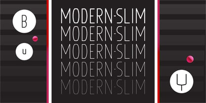
- Lust Slim by Positype,
$50.00 Check out the new Lust Pro & Lust Pro Didone to see how the series has grown and evolved. Confident and versatile, Lust is an exercise in indulgence—an attempt to create something over the top and vastly useful. If Lust Slim seems both new and familiar, that’s because it is. The series unapologetically channels Herb Lubalin, but produced with a deliberate, contemporary twist. There is an intentional slyness infused in the letterforms—the extreme thick and thin lines flow effortlessly without becoming gratuitous. It’s always just enough, not too much. What makes the type series so appealing? The curves. When asked to describe the letterforms, most people unwittingly allude to the human form, using adjectives usually reserved for describing physical traits… creating all-too-familiar comparisons. Summerour has grown to accept this as unavoidable and reasonable given his acknowledgement of its influences and has provided nuances within the letterforms to accentuate that. Intended to be set large, the typeface has both Standard (Lust, Lust Didone and a single unified Italic) and Display variants making it perfect for editorial use and a flexible solution for any display need.
 - Slim Pro by WAP Type,
$25.00 This font is stylish, clean, clear, firm and still looks luxurious. Slim Pro is a fine and all round sans serif font. No matter the topic, this font will be a genuine asset to your fonts’ library, as it has the potential to elevate any creation. Slim Pro is a modern and futuristic sans serif font. The combination of futuristic and geometric elements renders a modern design.
 - Crescent Slim by Letterhend,
$19.00 Introducing, Crescent Slim, A sophisticated ligature serif from us. This typeface has been made carefully to make sure its premium quality and luxury feel. The ligatures makes this typeface unique and stands out rather than the regular serif font, very suitable for logo, headline, tittle, and the other various formal forms such as invitations, labels, logos, magazines, books, greeting / wedding cards, packaging, fashion, make up, stationery, novels, labels or any type of advertising purpose. Features : numbers and punctuation multilingual ligatures alternates PUA encoded We highly recommend using a program that supports OpenType features and Glyphs panels like many of Adobe apps and Corel Draw, so you can see and access all Glyph variations.
 - Magie Slim by Eurotypo,
$48.00 Magie Slim is a handwritten font with a strong informal and expressive character to use together with Magie. It has the peculiarity of being able to combine uppercase and lowercase letters in the same word or in capital letters. It has OpenType features such as stylistic and contextual alternates, swashes, ligatures, initial and terminal forms, up to seven stylistic sets per letter (in uppercase and lowercase). We also include catchwords and ornaments. Imagine the amount of combinations you might do giving your text freshness and naturalness without equal! Magie Slim has a Central European language support to fit your design. This font looks beautiful on wedding invitations, greeting cards, logos, posters, labels, t-shirt designs, logos, business cards and is perfect for use in ink or watercolor works, fashion, magazines, packaging and food menus, children's books and whatever your imagination contains! Magie Slim was created to give a more youthful, expressive and casual look to your project!
 - Quan Slim by Typesketchbook,
$40.00 The typeface of Quan Slim is based on the successful Quan font family by font foundry Typesketchbook. Font designer Chatnarong Jingsuphatada created Quan Slim as a condensed version to Quan. Both type families consist of eight weights plus obliques and additional rounded versions. Quan Slim’s typeface has a clean and modern sans serif appearance. This modern geometric font is very legible and can be used for headlines as well as small and long text.
 - Slim Kim by Wiescher Design,
$39.50 Slim Kim is the sister font of Julienne. It mixes perfectly with Julienn. So whenever you need an especially slim serif font this is it! Slim Kim has very spiky serifs, so I did not want to make an extra-slim version. Enjoy this spiky font, your Gert Wiescher.
 - Slim Pickens by Dear Alison,
$19.00Have you ever seen lettering that you can connect with but have no clue where you've seen it before? It strikes a chord with certain feelings but you don't know why. Slim Pickens was inspired by the lobby card and poster titling from the 1949 Doris Day film "My Dream is Yours", and keys into the look and feel of vintage handwritten film poster titling. Something about that era in film made it easy to tie visuals with getting swept up in all sorts of emotions, good and bad. A narrow font, full of life and wonderfully hand-drawn, Slim Pickens is an accent font you'll want to have in your font collection for those tight fits, so buy it today and fill in the gaps of your designs with a little nostalgia! - Winter Bells by Attype Studio,
$10.00 Winter Bells is a delicate and incredibly distinct Christmas display font with dingbats character of bells. Perfect for christmas promotion and christmas design, Fall in love with its incredibly versatile style and use it to create spectacular designs! Winter Bells is perfect for branding, logo, invitation, stationery, social media post, product packaging, merchandise, christmas font, blog design, game titles, cute style design, Book/Cover Title and more. What's Included : - Winter Bells.otf - Winter Bells Display.otf - Beginning & Ending Dingbats - Multilingual Support --- Hope you enjoy with our font! Attype Studio
 - Bell Centennial by Bitstream,
$29.99 Designed specifically for AT&T by Matthew Carter at Mergenthaler to replace Bell Gothic with a typeface that made effective use of digital typesetting technology, Bell Centennial gets several more lines per page than Bell Gothic, reduces calls to information because of its significantly higher legibility under adverse printing conditions, saving AT&T many millions of dollars per year. Although intended for use at small sizes, Mazda UK used Bell Centennial at huge sizes to striking effect in a mid-1990s ad campaign.
 - Linotype Belle by Linotype,
$29.99Linotype Belle is a casual script face. Created in 1999 by the Swiss designer Isabelle Stutz, the letters in this design have a light, informal nature, and appear as if they were written out quickly, using a writing instrument similar to a ballpoint pen. Linotype Belle has two fonts to offer: Linotype Belle Plain and Linotype Belle Bonus. Linotype Belle Bonus contains more extravagant, swash-like capitals than Linotype Belle Plain's characters; when used together, these two fonts can create a varied, lively impression. Linotype Belle was a prizewinner in Linotype's Third International Type Design Contest. Additionally, the design is part of the innovative Take Type Library, and can be purchased as part of the Take Type 3.1 CD collection. The typeface works excellently when used to set magazine or newsletter headlines, and as text for greeting cards." - Belle Allure by JBFoundry,
$10.00 Belle Allure is a font for schools. It is based on the continuity of movement and simple paths which let a fast and easy cursive writing. It respects the French habits and leans on a wide character set and on the OpenType properties.
 - Bell Centennial by Tilde,
$39.75 - Belle Sans by Park Street Studio,
$25.00 Belle Sans is a clean, straightforward sans serif typeface family, and a very large family at that! It has seven widths, from Ultra Condensed to Extra Wide, and seven weights, ranging from Light to Black, all with Oblique companions. Belle Sans offers up great legibility for on-screen usage, and the breadth of width and weight make it very usable for text applications as well. The heavier weights, especially the Black, are exceptional for creating visual impact! Each font supports Western and Central European languages, ligatures, tabular figures, unlimited fractions, superiors & inferiors, and ordinals.
 - Southern Belle by Angie Makes,
$12.00 Southern Belle, a cute little handdrawn font with a ton of character and a slow, southern drawl, was inspired by sweet tea and southern blossoms. Its uppercase letterforms would be a great fit for logos, envelope addresses, and more! This Southern Belle font features repeating borders, and a ton of cute little doodles. (try using + + +, = = = , and _ _ _ to see borders repeat). To access all of the characters in this font, we recommend using the glyphs panel in Adobe Illustrator. This font works best in open type aware software. Comes as an .otf font file. NOTE: To access all of the cute extras in this font that are not accessible from your keyboard, you will need software with open type glyph capabilities such as ADOBE ILLUSTRATOR or ADOBE INDESIGN.
 - Bell Martellus by Chank,
$99.00 Full of texture and regal personality, Bell Martellus was derived from a book published in 1475 by Henricus Martellus entitled “Liber Insularum.” The writing style is based on the Carolingian Script created by the Emperor Charlemagne and his scribe, Alquin of York, in the 9th century A.D. This old world lettering comes with new world OpenType capabilities, including swash caps and small caps. The James Ford Bell Library at the University of Minnesota commissioned Bill Moran to develop this font as a means of introducing their amazing collection of rare books, maps and manuscripts to a wider audience. Once the historic script was fontified by Bill, it was forwarded to Chank Co, where we added some snazzy baubles for the discriminating typographer. Everybody can enjoy the antique genuine nature of Bell Martellus, but advanced OpenType users also get extra features in Adobe CS applications.
 - Xmas Bells by Hatftype,
$15.00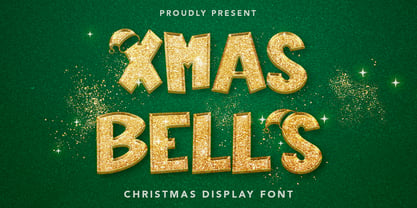 Xmas Bells - Christmas Display Font is a font with distinctive handwritten characters perfect for branding projects, logos, wedding designs, media posts, advertisements, product packaging, product designs, labels, photography, watermarks, invitations, stationery, and any project who need handwritten dishes. Features : • Character Set A-Z • Numerals & Punctuations (OpenType Standard) • Accents (Multilingual characters) • Ligature Multilingual Support : Afrikaans, Albanian, Asu, Basque, Bemba, Bena, Catalan, Chiga, Cornish, Danish, English, Estonian, Faroese, Filipino, Finnish, French, Friulian, Galician, German, Gusii, Icelandic, Indonesian, Irish, Italian, Kabuverdianu, Kalenjin, Kinyarwanda, Low German, Luo, Luxembourgish, Luyia, Machame, Makhuwa-Meetto, Makonde, Malagasy, Malay, Manx, Morisyen, North Ndebele, Norwegian Bokmål, Norwegian Nynorsk, Nyankole, Oromo, Portuguese, Romansh, Rombo, Rundi, Rwa, Samburu, Sango, Sangu, Scottish Gaelic, Sena, Shambala, Shona, Soga, Somali, Spanish, Swahili, Swedish, Swiss German, Taita, Teso, Vunjo, Zulu There it is! I really hope you enjoy it
 - Christmas Bell by Sakha Design,
$14.00 Christmas Bell is a delicate, fresh, rich, and elegant handwritten font. It is ideal for holiday-themed greeting cards and for any crafting project that requires a warm touch. It is PUA encoded which means you can access all of the glyphs and swashes with ease!
 - Bell Gothic by Bitstream,
$29.99Designed specifically for AT&T to set telephone directories by Chauncey Griffith at Mergenthaler in 1938, Bell Gothic was the standard American directory typeface for forty years. Limited in performance by linecaster matrix requirements, Bell Gothic was replaced by Bell Centennial. Furlong is a version of Bell Gothic adapted for the racing form. - Bell Gothic by Linotype,
$40.99C.H. Griffith was commissioned by the American telephone company, Bell, to design a typeface which would be particularly suited to small, compressed sentences and inferior paper quality. The font was intended for use in the company’s telephone books. Griffith had already had experience with the conception of newsprint fonts and was interested in legibility issues. In 1922 Griffith created the Legibility Group, which contained particularly legible fonts predestined for newspapers. Bell Gothic has all the typical characteristics which optimize a font’s legibility. The modern heir of Bell Gothic is Bell Centennial, designed by Matthew Carter in 1974 in celebration of the Bell Company’s 100th birthday. - Eve Bells by Senekaligrafika,
$12.00 “Eve Bells” is a playful handwriting font special for holiday dan christmas display, that puts a smile on your project and will inspire you to create something fun and memorable. “Eve Bells” will help you to create special and touching typographical design for holiday projects, for every day or the happiest day in life, happy birthday cards, baby shower, greeting card, headings, flyer, product packaging, book cover, printed quotes, logos, christmas project, and many more. It is really universal and modern font. The owner of endless possibilities!
 - Belle Script by melifonts,
$- Belle Script is the first in a new series of melifonts, created entirely digitally using a pen tablet. A hybrid of script and print, it combines structure and elegance and makes for a stylishly clear typeface. Belle Script is the perfect font for a letter to a friend, printed labels, or graphic logos.
 - Bell Centennial by Linotype,
$40.99Bell Centennial was created by Matthew Carter in 1976 for the American telephone company Bell. Its bold, clear characters make it an extremely legible and distinctive font. - Belle Helene by Studio Indigo,
$17.00 Belle Helene is a script and symbols font based on handwritten brush letters. The name is inspired by the famous french dessert with the same name (wine cooked pears with vanilla ice cream and chocolate syrup). This soft and smooth shaped font is suitable for restaurants, cafes, shops, bakeries, menus, wedding stationary or wherever a warm and informal feeling is required. It comes with open type features such as standard ligatures and alternate end/initial letters. The symbols font has 62 cute symbols to play around with to spice up your designs. Multilingual support is included for almost all European languages (Diacriticals). Please Note! Test the font in the Font Preview before purchase.
 - Bell Gothic by ParaType,
$30.00 The Bitstream version of Bell Gothic designed by Chauncey H. Griffith in 1938 for telephone directories of the Bell Telephone Company. It is a good sans serif choice for listings, catalogues and directories as its design is very space saving. The weight of the line is moderate and uniform. Being a clear and easy-to-read font, Bell Gothic is popular now for display and magazine advertising. Cyrillic version by Isabella Chaeva was released by ParaType in 1999. Italic styles added in 2009 by the same designer.
 - Jingle Bells by Girinesia,
$13.00 Hello guys... We proud presenting our new font. Jingle Bells is playfull font, display bold font. Jingle Bells would perfect for kids poster, flyer , cover children book, cartoon, comic , cristmast invitation, new year party and etc. Features: Standard glyphs Uppercase and Lowercase Numerals & Punctuations Multilanguage Works on PC & Mac
 - Cherry Bell by Good Java Studio,
$20.00 Cherry Bell is the perfect font for all your fun designs. The main font file is equipped with ordinary characters, as well as more than 350 glyphs to support most Latin-based languages. It is suitable for you to use in making t-shirt designs, quotes, labels, packaging, logo types, or long writing because we have compiled kerning and matrices that are tailored to your needs.
 - Thinna Bell by Allouse Studio,
$16.00 Proudly PresentingTinna Bell, a Bold Script Font. Tinna Bell is perfect on any tittle, product packaging, branding project, megazine, social media, wedding, or just used to express words above the background. Enjoy the font, feel free to comment or feedback, send me PM or email. Thank You!
 - Elephant Bells by BA Graphics,
$45.00 This 60's 70's design has a great nostalgic look. It appears to flourish within itself.
 - Belle Story by Creativemedialab,
$19.00 Belle Story is a beauty serif family. This hi-contrast display font Consists of 2 styles Display & Regular and each style has 10 weights from thin to black with fine lines and smooth curves to make this font perfect for luxury, classy, high-end branding, logo, and many more. Belle Story also includes a Variable style as well as multilingual support, numbers, and currency symbols, and dozens of alternates.
 - Bell MT by Monotype,
$39.00 Monotype’s hot metal Bell series from 1931 was based on original types made by the punchcutter Richard Austin for the foundry of John Bell in the 1780s. The different sizes of Monotype’s series were not all based on the same model. As type historian James Mosley wrote on Typophile, “For 18 point and above (the metal type was cut in sizes up to 36 point) Monotype’s model was a larger type [than the model used for the text sizes], the ‘Great Primer’ cut by Austin. This has greater contrast in the capitals and a flat foot to letter a.” The digital Bell closely follows the design of the hot metal 18pt version, and is therefore somewhat lighter in color than the text sizes of Monotype’s original metal face. James Mosley’s Typophile article can be found here.
 - Red Bells by Maulana Creative,
$14.00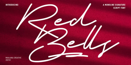 Red Bells is a unique casual signature script font. With regular mono-line stroke, fun character with some of ligatures and extra swash. To give you an extra creative work. Red Bells font support multilingual more than 100+ language. This font is good for logo design, Social media, Movie Titles, Books Titles, a short text even a long text letter and good for your secondary text font with sans or serif. Make a stunning work with Red Bells font. Cheers, MaulanaCreative


Page 1 of 250Next page