10,000 search results
(0.05 seconds)
- Glamoure Everyday by Krismagraph,
$29.00 Introducing Glamoure Everyday Serif Font Family. a variable font, 8 weights regular, and italics. Glamoure Everyday is made mainly for headlines, titles, and other short texts and is well-suited for advertising, vintage mood board, branding, logotypes, packaging, titles, editorial design, modern logos, websites, social media quotes, wedding branding, modern and vintage design.
 - Whirled Peas NF by Nick's Fonts,
$10.00In his book Showcard Alphabets, Dan X. Solo called this little gem "Whitestone Scrawl". This version is beefed up slightly and the letter proportions have been altered somewhat, but it's still LOADS of fun. The Opentype version of this font supports Unicode 1250 (Central European) languages, as well as Unicode 1252 (Latin) languages. - Crema by Hubert Jocham Type,
$39.00 With packaging in the back of my mind I created Crema only in one specific weight. But there are 3 styles from the connected Forte to the quiet Piano. You can see Schoko the other packaging scripts I designed everywhere in the supermarkets. And I am looking forward to see Crema as well.
 - Chennai Slab by insigne,
$29.00 Chennai Slab is an extension of the original Chennai. Chennai Slab is a simplified slab serif with over sixty OpenType alternates for the ball terminals, unique simplified alternates and more traditional capital forms. Use Chennai Slab when you need a fun and versatile slab serif. The sans-serif Chennai makes a great complement.
 - The Craprio by Muksal Creatives,
$12.00 The Craprio is a unique, simple, clean and well appointed display serif. It is perfect for gorgeous logos, titles, web layouts, fashion magazine and branding. It looks very nice and classy in an all-caps with a wide-set spacing, and also very beautiful on its own in capital and lowercase letters.
 - Sothardjo by Isolatype,
$15.00 Introducing! new typeface by wildan type and Isolatype Sothardjo is a delicate, elegant and flowing handwritten font. It has beautiful and well balanced characters and as a result, it matches a wide pool of designs. Sothardjo is PUA encoded which means you can access all of the glyphs and swashes with ease!
 - Turista Flaca NF by Nick's Fonts,
$10.00This Art Deco-inspired face is based on the Baltimore Type Foundry’s Tourist Extra Condensed. Graceful and elegant, this typeface’s compact design also packs a lot of information into very little space. This font contains the complete Latin language character set (Unicode 1252) plus support for Central European (Unicode 1250) languages as well. - Linotype Arab Stroke by Linotype,
$29.99Arab Stroke is an exotic typeface with an Arabian touch which makes a variety of applications possible. Whether for products from far away lands travel advertisements or anything needing a dynamic look, Arab Stroke is an excellent choice. The font is particularly eyecatching in headlines and combines well with sans serif fonts. - Mind Boogie by Bogstav,
$16.00 Get your feet on the dance floor, and make those funky moves that you do so well! Or, you could just use this handmade all-caps font and make your designs look like it is dancing! :) Yes, it's a handmade font - and I've added 6 different versions of each letter + multilingual support!
 - FF Matinee Gothic by FontFont,
$41.99 American type designer Jim Parkinson created this display FontFont in 1996. The font is ideally suited for advertising and packaging, festive occasions, film and tv as well as poster and billboards. FF Matinee Gothic provides advanced typographical support with features such as ligatures and stylistic alternates. It comes with proportional lining figures.
 - Cristhyna Signature by Namara Creative Studio,
$12.00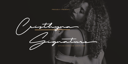 Cristhyna Signature is a modern handwritten script font with natural and stylish flow, this Typeface is an incredible addition to your font library. Perfect for business branding, wedding invitation, cosmetics, fashion, signature logo, magazine cover, advertising and these typefaces work well for many different aesthetics. Features : Stylish & Modern Font Alternates, Ligatures & Multilingual Support
 - Marky Marker NF by Nick's Fonts,
$10.00Here's a nifty single-stroke marker font based on the work of Mike Stevens, long-time contributor to Signcraft magazine. Clean, crisp and stylish, it's the perfect choice for appealing subheads. This font contains the complete Latin language character set (Unicode 1252) plus support for Central European (Unicode 1250) languages as well. - East Coast Frolics NF by Nick's Fonts,
$10.00A rollicking fun face based on lettering on a poster for Britain's LNER steamship lines, which featured a piano-playing mouse and a dancing goose. The Postscript and Truetype versions contain a complete Latin language character set (Unicode 1252); in addition, the Opentype version supports Unicode 1250 (Central European) languages as well. - FF Studio by FontFont,
$41.99 French type designer Albert Boton created this display FontFont in 2002. The font is ideally suited for advertising and packaging, music and nightlife as well as sports. FF Studio provides advanced typographical support with features such as ligatures, alternate characters, and case-sensitive forms. It comes with proportional lining and proportional oldstyle figures.
 - Helvetica by Linotype,
$42.99 With the name Helvetica (Latin for Swiss), this font has the objective and functional style which was associated with Swiss typography in the 1950s and 1960s. It is perfect for international correspondence: no ornament, no emotion, just clear presentation of information. Helvetica is still one of the best selling sans-serif fonts.
 - Attaboy by Hanoded,
$15.00 Attaboy is a posh word for ‘well done’. It was made with a broken marker pen to give it that ‘eroded’ look. It is an all caps typeface, but upper and lower case can be mixed. Attaboy comes with stylistic alternates for the lower case glyphs and all the diacritics you need.
 - FF Imperial by FontFont,
$41.99 Dutch type designer Donald Beekman created this display FontFont in 2000. The family contains 4 weights and is ideally suited for logo, branding and creative industries, music and nightlife as well as poster and billboards. FF Imperial provides advanced typographical support with features such as ligatures. It comes with proportional lining figures.
 - Rigo by Katatrad,
$33.00 Rigo™ is a flexible family of modern sans serif. Rigo is characterized by some humanistic characteristics, its open part of negative space and its overall width make it highly legible and readable at small to large size. The openness helps Rigo to be a good performer on the screen as well.
 - FF Metamorph by FontFont,
$41.99 Austrian type designer Markus Hanzer created this display FontFont in 1994. The font is ideally suited for advertising and packaging, music and nightlife as well as poster and billboards. FF Metamorph provides advanced typographical support with features such as ligatures, alternate characters, and case-sensitive forms. It comes with proportional oldstyle figures.
 - Labyrinthus Rounded by Cerri Antonio,
$30.00 Labyrinthus Rounded is a multiline decorative font that works very well for identity logos, posters and 3D-works. It continues the tradition of the precedent Labyrinthus but with a softer rounded impact. It's interesting to note that with it it's possible to play with the multiline concept to create endless overlapping geometric creations.
 - Kasih Putih by Tigade Std,
$15.00 Kasih Putih is a modern calligraphy font. It supports common international characters and comes with a set of alternates and ligatures. It is suitable for multiple projects from printed to digital products. It is nice to be printed on billboards, bottles or cups as well as for logos or design for apparel.
 - Loopkin by Ben Burford Fonts,
$25.00 Loopkin is a new display font from Ben Burford Fonts. It's a stylistic take on the classic modern serif font that has been a staple in high fashion publications for decades. This OpenType font comes with a full set of characters as well as ligatures and alternative characters using the stylistic sets.
 - Cocosignum by Zetafonts,
$39.00 Cocosignum takes inspiration from the typography of the italian thirties. The imperial uppercase with its propaganda deco overtones is softened by a cursive lowercase geometric script in the Corsivo Italico version. It comes in two styles and five weights, covering over forty languages using latin alphabet, as well as Greek and Cyrillic.
 - Another Grotesk by Aleksandrs Golubovs,
$32.00 Another Grotesk is a contemporary typeface that was inspired by the early grotesques. Upon closer inspection you will notice the terminals of some of the characters are slightly turned inwards, this detail gives Another Grotesk its distinctive and friendly personality. Another Grotesk is functional and has been crafted with a great attention to detail. It is available in 9 weights and two optical sizes with matching italics which adds up to 36 styles. Another Grotesk Text family has been carefully redesigned some of the details were removed and simplified, x-height increased, and ink traps added, but preserved the overall look and feel of the display version, to ensure a greater legibility and clarity in running text. The extensive language support allows type setting in more than 200 languages across Latin, Cyrillic and Greek scripts. Another Grotesk also includes small caps and punctuation, tabular and old-style figures, as well as case sensitive feature and offers stylistic alternates for K, a, g, and y to fulfil any creative need of a designer.
 - Gilam by Fontfabric,
$39.00 Gilam is a sans serif font with semi-condensed proportions. The typeface was based on the famous DIN but combines its popular neo-grotesque look with characteristics, such as the pointed edges in the “W” and “M” as well as the outward cut terminals, which gives a distinctive look to the modern geometric typeface. The complete set of 9 weights plus italics gives to designers the absolute freedom to create anything. Perfect layouts with blocks of text, headlines, motion graphics, logos, apps, and websites are just part of the intended usage of this versatile typeface. Features: • 765 glyphs in 18 styles; • Extended Latin, Cyrillic and Greek; • Geometric forms and low contrast; • Prominent x-height which makes it legible in a text; • Perfect for headlines and logos; • Suitable for web, print, motion graphics etc. • Semi-condensed proportion; • Advanced typographical support and OpenType features including case-sensitive forms, fractions, superscript and subscript characters, and stylistic alternates; • Complete set of figures - old style and lining figures, which come with proportional and tabular variation; Gilam means “joy of people” so that you can enjoy it!
 - Instance by preussTYPE,
$55.00 German type designer Ingo Preuss created this family between 2014 and 2016. Instance is a new classic built on the foundation of over two centuries of history. Fresh and contemporary, while feeling familiar. This typeface is a high contrast sans serif typeface family and was designed for contemporary typography, especially for use in headlines and on posters, but also for reading purposes. A flexible, medium to high contrast, sans serif less about designing a stylish decorative design and more about applying contrast onto a neo-grotesk skeleton. Instance is more than just chopping off the serifs. The classical proportions of the capitals and x-heights were maintained, but the letterforms were rebalanced for use without serifs. Contemporary modifications were made to some widths, as well as an all new Light weight was created. Please note: Instance STD Office Packages is only as TrueType (* .ttf) and Standard-Version. Also, the character set has been reduced to Standard (without OpenType-Features, SmallCaps, old style figures, etc.). Ideal for testing and for Microsoft Office applications.
 - Chinook by Unio Creative Solutions,
$9.00 Chinook has been designed as an homage to the iconic chunky look of the Italian movie titling from the 70s and 80s. Despite its vintage flair, our sturdy display font is perfectly adaptable for any contemporary context with its balanced and soft text typesetting. This project is obviously influenced by the everlasting classic "Cooper Black", but includes more modern letter shapes, with rounded serifs and a fluffy overall appearance. Chinook, includes a customized italic set, features an extended charset covering several languages based on the Latin Alphabet, and sports a complete set of Open type features. It's equipped with swashes, alternates as well as discretionary ligatures, old-style figures, subscript and superscript numerals, and even more special glyphs. The heavy appearance makes this font ideal for high-impact design, such as headlines, titling, branding, and logotype. Specifications: - Files included: Chinook, including Italic - Multi-language support (Central, Eastern, Western European languages) - OpenType Features (Superscript and Subscript Numerals, Fractions, Oldstyle figures, Stylistic Alternates, Discretionary Ligatures, Swashes) Thanks for viewing, Unio.
 - Fry by omtype,
$25.00 The typeface Fry was developed in 2008 specially for the Sky-Fish company (fish and seafood dealer). Type is designed for small texts, it has friendly and fairytale historic flavor. Fry takes openness and dynamism of humanistic sans serif, simple and softness of lubok's letters (primitive style) and fluidity of shallow marine fry. Despite of funny style, Fry works well even in the 5 point size. In large sizes Fry demonstrates its originality, vivacity and softness, in the small characteristics become less visible, and Fry's readability becomes more important. So this makes the typeface suitable for many tasks of typography. The typeface includes extended set of Latin, old style and lining figures, historical alternates and special local features. The combination of lubok's aesthetics and funny dynamic forms make a nature of Fry. Fry was exhibited at the Svjato Kyrylyci (Kharkov, Ukraine) festival in 2008. It was awarded for excellence in type and graphic design at Modern Cyrillic 2009 competition. Fry was selected among 50 typefaces for the Call for type exhibition in the Gutenberg museum (2013).
 - Zin Slab by CarnokyType,
$46.00 Zin Slab is a contemporary slab-serif typeface designed for various situations of typographic usage. Characteristic feature is a large x-height and balans between neutral construction of letters (strictly vertical axis) and dynamic open forms (opened terminals). Another typical feature is a visually narrower connection between stems and strokes. The complete font family consist of three width proportions (Normal, Condensed and Extended). Every sub-family has 5 weights, ranging from Light to Black with matching Italics. Each font includes small capitals, old-style and tabular figures, standard and discretionary ligatures, alternate glyphs and a many of typographic options applied by the Opentype features. Zin Slab can be effectively used for both text and display typesetting. It can be used especialy in magazine layouts and editorial design, as well in advertising typography, orientation systems, corporate identities and many other situations. Zin Slab is a member of the Zin super family, which also includes Zin Sans, Zin Serif and Zin Display fonts. You can try Demo styles in Medium weight fully for free.
 - Thumbnail Text SG by Spiece Graphics,
$39.00 With its slightly rough edges, Thumbnail Text works well where lettering is required. Letterforms wiggle a bit here and there but are generally quite uniform. Characters are a bit imprecise - but not showy or bouncy. They appear more adult-looking than childish and are very legible. Put Thumbnail Text to work as drafting notation or on blueprint projects that need to be easily read. It¹s also useful when concept or sketch stage lettering needs to look serious but not highly stylized. You might experiment with it inside cartoon thought balloons or in callouts. This design is based on an old showcard style from the 1940s. It's been dusted off and reissued for modern use. A lowercase has been added for greater functionality. Thumbnail Text Regular is now available in the OpenType Std format. Some additional characters have been added to this OpenType version as stylistic alternates. This advanced feature works in current versions of Adobe Creative Suite InDesign, Creative Suite Illustrator, and Quark XPress. Check for OpenType advanced feature support in other applications as it gradually becomes available with upgrades.
 - Zin Sans by CarnokyType,
$46.00 Zin Sans is a contemporary sans-serif typeface designed for various situations of typographic usage. Characteristic feature is a large x-height and balance between neutral construction of letters (strictly vertical axis) and dynamic open forms (opened terminals). Another typical feature is a visually narrower connection between stems and strokes. The complete font family consist of three width proportions (Normal, Condensed and Extended). Every sub-family has 5 weights, ranging from Light to Black with matching Italics. Each font includes small capitals, old-style and tabular figures, standard and discretionary ligatures, alternate glyphs and a many of typographic options applied by the Opentype features. Zin Sans can be effectively used for both text and display typesetting. It can be used especially in magazine layouts and editorial design, as well in advertising typography, orientation systems, corporate identities and many other situations. Zin Sans is a member of the Zin type system, which also includes Zin Slab, Zin Serif and Zin Display fonts. You can try Demo styles in Medium weight fully for free.
 - Manufaktur by Great Scott,
$12.00 MANUFAKTUR is a gas-pipe sans. A typeface influenced by an cast iron sign on an old Swedish industrial machine. The simple curves of the characters suited well for an 21st century update and the new and modern MANUFAKTUR is now a variable typeface with thousands of combinations of width and weight. MANUFAKTUR comes with stylistic alternates (smaller glyphs with underline) and small caps. The small caps also works as lowercase glyphs by default. With an OpenType-enabled app - or your website - you can control the width and weight of the typeface via a slider or with code. VARIABLE FONT SUPPORT: Currently Adobe only supports variable fonts in Photoshop and Illustrator. InDesign are still waiting on variable font support. This hardworking sans serif is perfect for display use, signage, poster, prints, editorial use, branding, logos, magazines, films and lots more. The variable weight and width makes MANUFAKTUR very versatile and flexible. If variable fonts isn't your bag MANUFAKTUR also comes predetermined weights and widths as a traditional font.
 - Vialog by Linotype,
$50.99Vialog is a large and versatile sans serif family consisting of four weights of roman with corresponding italics, each with small caps and Old style Figures. Designers Werner Schneider and Helmut Ness based the concept for Vialog on the forms in "Euro Type," an unpublished type designed by Schneider in 1988 for the German Federal Transportation Ministry. For Vialog, Schneider made comprehensive legibility studies of the existing European transportation fonts, and combined and adapted the best features to make a new information system font family. He fine-tuned Vialog's characters and spacing with a special regard to the legibility problems of transportation settings, such as viewing type at distances and while moving. For example: cap I, J and lowercase i, j are common legibility problems in sans serif fonts, so in Vialog, these characters have serifs. In addition to its usefulness to the transportation industry, the Vialog family confidently meets the needs of corporate design and branding systems with its space-saving attributes for text settings, as well as the large number of weights and styles. - Caslon #540 by Linotype,
$29.99The Englishman William Caslon punchcut many roman, italic, and non-Latin typefaces from 1720 until his death in 1766. At that time most types were being imported to England from Dutch sources, so Caslon was influenced by the characteristics of Dutch types. He did, however, achieve a level of craft that enabled his recognition as the first great English punchcutter. The original Caslon specimen sheets and punches have long provided a fertile source for the range of types bearing his name. Identifying characteristics of most Caslons include a cap A with a scooped-out apex; a cap C with two full serifs; and in the italic, a swashed lowercase v and w. A few of the many interpretations from the early twentieth century were true to the source, as well as strong enough to last into the digital era. These include two from the American Type Founders company, Caslon 540 and the slightly heavier Caslon #3. Both fonts are relatively wide, and come complete with small caps, old style figures, and italics. - Mairy by Typesketchbook,
$39.00 Mairy font family is a modern sans serif font family. Featuring 9 separate weights each followed by own true italics Mairy is positioned somewhere between rounded sans with humanist touch. In fact the humanist presence in Mairy is a little bit more than the usual doze adding more calligraphic elements mostly noticeable in italic weights but also very important in regulars. This symbiosis of Grotesk geometry with handwriting is well balanced regarding contrast and legibility so that at the end we have a highly usable font family. Light weights are very tender and elegant while the old and blacks are soft, friendly and full of vitality. The mid weights are just perfect with their medium contrast and excellent legibility. Mairy is very fresh font family and is surprisingly flexible when it comes to screen or print use – it is optimized for both even if the conditions are poor. Use it with OpenType compatible software and explore its true potential by accessing additional set of ligatures, alternates and multilingual support.
 - Labyrindo by URW Type Foundry,
$39.99 Labyrindo is inspired on the classic Labyrinth. The oldest known labyrinth is 3200 years old and is to be found in Greece. The mythological king Minos held the monstrous son of his wife ‘Minotaurus’ prison in a labyrinth. Much later the labyrinth made his appearance in the medieval churches, this time as a pattern on the church floor. During the Italian renaissance the multiple gate labyrinth came in fashion. Paths led trough green hedges in beautiful palace gardens. These hedges where perfectly cut in rectangular shapes. Mainly meant as an aesthetic statement. Besides the origin of the physic labyrinth, it has always been a great source of story-telling and myths. I mention a few personal favourites (film) like, Pan’s Labyrinth (a journey to the underworld), Labyrinth (with David Bowie) and the Shining with Jack Nicholson (where a horrific scene takes place in a labyrinth). Not the most cheerful stories but fascinating and intriguing. A Labyrinth is mind boggling and mysterious but wonderful. I made graphic translation in this typeface.
 - Mestre by Tipotecture,
$19.99 Mestre is a German & Dutch inspired geometric sans-serif designed. Its solid and formal shapes are embedded with a discreet humanist flair resulting in a very versatile contemporary hybrid and a highly functional and flexible font for many of today’s branding & UX requirements. With its rational forms and its large x-height, Mestre is perfect for long texts in small sizes allowing a comfortable reading. Its open forms, moderate & balanced proportions, neutral appearance and solid structure grant a high legibility on paper and on screens. With its extensive 8 weights and corresponding true italics, more than 900 glyphs per font, extended character set to support Central and Eastern European as well as Western European languages and a wide OpenType features set (small caps, case-sensitive forms, lining, tabular & old-style figures, scientific superior/inferior figures, fractions, a set of arrows, etcetera) it is meant to build visual hierarchies of any detail and complexity in editorial design or deliver the best performance for branding purposes. Mestre is a great choice for modern, contemporary and professional typography.
 - Cabrito Serif by insigne,
$33.00 The Cabrito family is making a statement again. Launched as a supplement to the children's book, The Clothes Letters Wear, the original Cabrito is carefree, fun and easy on the eyes. Now, by balancing this friendly connection with new elegance, Cabrito Serif arrives: attractive copy text with an extra sophisticated sensibility incorporated into the design. Still bright and playful, this new Cabrito is cleaner and leaner, ensuring that its polished appearance retains legibility. 54 fonts include upright alternates, ligatures, and old figures. The range includes extended and condensed variants. To see any of these interactive features, see the PDF manual. The family also includes language support for 72 Latin-based languages, and there are more than 600 glyphs. Cabrito Serif can be used for logos and packaging, as well as for brochures and web pages. It’s readability makes it an excellent choice for a wide range of jobs. Take a walk with Cabrito Serif and see how much fun it is. By the way, look at some other Cabrito members and see how much you love the original, Inverto, Contrast or Didone.
 - Backstroke by Eclectotype,
$50.00 Normal and upright italic script fonts line a well-trodden path; left-leaning fonts (or "rightalics" as they're confusingly called), on the other hand, are a rarity. Here at Eclectotype Fonts we don't like to do things too conventionally, so here's Backstroke, a laid back script with a unique voice. With contextual alternates for start and end forms of certain characters, swash versions of L, Q and Z (surely the most used initial caps!), and a handful of stylistic sets, Backstroke is a restrained script. Stylistic sets are: 1. the start forms of i, j, m, n, and p are used always instead of only at word starts. 2. lower case ascenders get a whole lot loopier. 3. alternate versions of G, N and Y. 4. swash L, Q and Z. 5. swaps the default Polish script lslash for a more familiar version While fonts that lean the wrong way may be a bit more difficult to fit into your layouts than boring old regular italics, they will reward you with their individuality. Why not give it a go?
 - Chercán by PampaType,
$28.00 Chercán is a spirited typeface created with a delicate sense of how readability doesn't need to be dull. Chercán wears a uniquely friendly voice, and its mature design makes it highly legible in small bodies as well as in the distance. Its balanced rhythm is the result of a slow pairing of qualities found in old classics admired by Gálvez, such as Copperplate by Frederic Goudy (1905) and Antique Olive by Roger Excoffon (1962). Chercán occupies a unique place in the contemporary type design shelf, by exquisitely combining versatility and elegance. Due to the delicate grey colors it gains within long texts, Chercán is good for immersive reading, where one wants to avoid readers’ eyes fatigue. It can be a great choice for setting texts that require a slightly informal atmosphere without losing authority. Chercán is the Chilean name for the melodious little bird Troglodytes aedon usually found all across the Americas. Available in Std and Pro versions with all the usual OT features, Chercán addresses all modern needs of the demanding typographer.