10,000 search results
(0.074 seconds)
- STP Display by Sete Std,
$30.00 Its inspiration comes from the types without serifs, with features ranging from architecture to modernist design products. With generous shapes and counterforms, the type becomes showy wherever it is, masterfully fulfilling the purpose for which it was designed. Initially designed for a signaling project in the Brazilian city of Jaraguá do Sul, Santa Catarina, the STP Display was expanded to include the largest number of characters in the Latin alphabet. This helps to find solutions in cases where a large number of languages to communicate something is needed, such as to inform a specific place for a tourist or also a direction to follow for an employee in a company. The STP Display is a modular feature, developed with rounded corners and a design based on geometric elements, ideal for use in large sizes. Forms and counterforms, its main characteristics, bring prominence to any signaling project. The STP Display also has another version, the STP Stencil, and in addition to wayfinding projects, both can be used in architectural projects, advertising, packaging, posters, and others. With a complete Latin alphabet, STP Display covers over 90% of the supported languages, covering the whole American continent, East and West Europe and most of the countries of Africa, Asia and Oceania.
 - Lido STF by Storm Type Foundry,
$39.00Times with a Human Face: In my article of the same name which appeared in the magazine Font, volume 2000 I described the long and trying story of an order for a typeface for the Czech periodical Lidové noviny (People’s Newspaper). My task was to design a modification of the existing Times. The work, however, finally resulted in the complete re-drawing of the typeface. The assignment, which was on the whole wisely formulated, was to design a typeface which would enable “a smooth flow of information in the reader’s eye”, therefore a typeface without any artistic ambitions, from which everything which obstructs legibility would be eliminated. A year later Lidové noviny had a different manager who in the spring of 2001 decided to resume the cooperation. The typeface itself definitely profited from this; I simplified everything which could be simplified, but it still was not “it”, because the other, and obviously more important, requirement of the investor held: “the typeface must look like Times”. And that is why the above-mentioned daily will continue to be printed by a system version of Times, negligently adjusted to local conditions, which is unfortunately a far cry from the original Times New Roman of Stanley Morison. When I was designing Lido, the cooperation with the head of production of Lidové noviny was of great use to me. Many tests were carried out directly on the newspaper rotary press during which numerous weak points of the earliest versions were revealed. The printing tests have proved that the basic design of this typeface is even more legible and economical than that of Times. The final appearance of Lido STF was, however, tuned up without regard to the original assignment – the merrier-looking italics and the more daring modelling of bold lower case letters have been retained. The typeface is suitable for all periodicals wishing to abandon inconspicuously the hideous system typefaces with their even more hideous accents and to change over to the contemporary level of graphic design. It is also most convenient for everyday work in text editors and office applications. It has a fairly large x-height of lower case letters, shortened serifs and simplified endings of rounded strokes. This is typical of the typefaces designed for use in small sizes. Our typeface, however, can sustain enlargement even to the size appropriate for a poster, an information table or a billboard, as it is not trite and at the same time is moderate in expression. Its three supplementary condensed designs correspond to approximately 80% compression and have been, of course, drawn quite separately. The intention to create condensed italics was abandoned; in the case of serif typefaces they always seem to be slightly strained. I named the typeface dutifully "Lido" (after the name of the newspaper) and included it in the retail catalog of my type foundry. In order to prevent being suspected of additionally turning a rejected work into cash, Lido STF in six designs is available free of charge. I should not like it if the issuing of this typeface were understood as an “act out of spite” aimed against the venerable Times. It is rather meant as a reminder that there really are now alternatives to all fonts in all price categories. - Axion STN by Type Innovations,
$39.00 Axion STN is an original design by Alex Kaczun and is a stencil interpretation of his Axion RX-14 font. It is but one of several alternate designs based on his original Axion family of fonts. The wide gap within this stencil treatment works well with and compliments the spacing in the font, creating a tension within this modern grotesque and adding a class of destinction and interest. This display font is not intended for text use. It was designed specifically for display headlines, logotype, branding and similar applications. The entire font has an original look which is strong, dynamic, machine generated and can be widely used in publications and advertising. Axion STN is a futuristic, techno-looking and expressive typeface with an appearance of machined parts with sharp and rounded edges. This attractive display comes in roman with lower case and lining figures. The large Pro font character set supports most Central European and many Eastern European languages.
 - BaselSans ITD by Isaco Type,
$30.00 BaselSans is a discrete, legible typeface, inspired by the international typographic style, with a humanistic touch. It is suitable for many uses, from small size texts to large titles.
 - Gothika - Personal use only

- Gothicum - Unknown license

- Gotico by GroupType,
$19.00 Gotico™, meaning Gothic, is a Blackletter script (sometimes referred to as Old English). The original Gotico design was first brought to market by the Fundicion Tipografica Richard Gans type foundry (1888-1975) in Spain. The designer of Gotico is unknown and for many years the font was formerly sold only in Europe.
 - Hothir by RCKY Studio,
$16.00 Hothir is a font that was scratched with a brush to get a natural texture, so this font will display the characteristics of the hand. Beautiful textured brush fonts, contemporary approach to design, natural handmade and with a cool underline. It also has several ligatures and alternatives that make your design more attractive. Suitable for use in watercolor designs or as hand-brushed bold letters. Perfect for novels, clothing, invitations, quotes, title books, stationery designs, branding, logos, greeting cards, T-shirts, packaging designs, posters and much more.
 - Gothicon by Tadiar,
$14.00 Gothicon is an authentic classic blackletter gothic vintage font. Multilingual support (All Latin Languages). Well to use in Poster, Vintage Labels & Badges, Headline, Packaging, Clothing Branding and much more. Please see also our Victorian Gothic font: https://www.myfonts.com/collections/luxgard-font-tadiar
 - Gothique by Mecanorma Collection,
$45.00 - Goetic by Scriptorium,
$12.00 - Mathics by Maulana Creative,
$12.00 Mathics Round is an Industrial sans serif font. With soft rounded edges stroke, fun character with a bit of ligatures. To give you an extra creative work. Mathics font support multilingual more than 100+ language. This font is good for logo design, Social media, Movie Titles, Books Titles, a short text even a long text letter and good for your secondary text font with script or signature. Make a stunning work with Mathics font. Cheers, MaulanaCreative
 - Gotlicks by Maulana Creative,
$14.00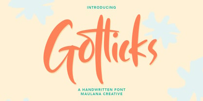 Gotlicks Handwritten Display Font Give your designs an authentic handcrafted feel. Gotlicks Handwritten Display Font is perfectly suited to logo, stationery, branding, typography quotes, magazine or book cover, website header, clothing, branding, packaging design, restaurant and more.
 - Gothan by IM Studio,
$19.00 Gothan Scripts Fresh & modern new scripts with handcrafted calligraphy style, decorative characters and dancing baselines! Very pretty on invitations such as greeting cards, branding materials, business cards, quotes, posters and more!! Gothan Script comes with 401 glyphs. Alternate characters are divided into several Open Type features such as Swash, Stylistic Sets, Stylistic Alternates, Contextual Alternates. The Open Type feature can be accessed using Open Type savvy programs such as Adobe Illustrator, Adobe InDesign, Adobe Photoshop version of Corel Draw X, and Microsoft Word. And this Font has provided PUA unicode (custom coded font). so that all alternative characters can be easily accessed in full by a craftsman or designer.
 - Mithic by IbraCreative,
$17.00 Mithic, a captivating handwritten script font, effortlessly combines fluidity and grace, breathing life into every stroke. Its meticulous cursive detailing reflects a perfect balance between elegance and informality, making it an ideal choice for projects seeking a touch of personalized charm. The individuality of each character in Mithic resonates with authenticity, conveying a sense of warmth and human touch. Whether used in invitations, branding, or creative displays, Mithic captures the essence of handwritten beauty, bringing a timeless and personal element to the world of typography. With its versatile nature and organic flow, Mithic stands as a testament to the artistry of hand-scripted fonts, offering a unique and enchanting presence to any design endeavor.
 - Gothico Antiqua by MADType,
$21.00 Gothico Antiqua is the result of grunging up one of my early sans-serif type designs. It strangely works very well and looks authentic at small to medium settings.
 - 210 MGothic by Design210, Korean Fonts,
$300.00
- Gothiks Round by Blackletra,
$50.00 Gothiks Round is the rounded version of Gothiks. It is a narrow 6-weight display sans-serif influenced by Texturas. The rhythm and verticality of Texturas can be easily identified on the letters with diagonal strokes like A N M K k V v W w X x Y y Z z: here they are all vertical. This kind of morphology was chosen because it accepts condensation in a very natural way, giving to this sans-serif a very unique personality. The intermediate weights can be used for short texts while extreme weights are excellent for big sizes. It has an extensive character set—with extensive language support—and many OpenType features like fractions, small capitals and different figure sets. Default figures align with lowercase. The typeface’s name refers to the plural of the word Gothic, which in turn can refer to both sans-serifs or Blackletter, depending on geographic location.
 - Gothiks Condensed by Blackletra,
$50.00 This is the condensed version of Gothiks , a 6-weight display sanserif influenced by Texturas. It is ideal for everything big, compact and powerful. This family has an extensive character set — with extensive language support — and many OpenType features like fractions, small capitals and different figure sets. Default figures align with lowercase.
 - Gothiks Compressed by Blackletra,
$50.00 This is the compressed version of Gothiks , a 6-weight display sanserif influenced by Texturas. It is ideal for everything big, compact and powerful. This family has an extensive character set — with extensive language support — and many OpenType features like fractions, small capitals and different figure sets. Default figures align with lowercase.
 - Midmoon Gothik by Andy Peat,
$10.00 About this font family Midmoon Gothik was designed for typesetting magazines and information-heavy publications; using simple, clean letterforms for clear communication but with enough character to make it enjoyful. The new lighter weights are a nice addition to the set allowing for finer control over the texture of the page. Features 4 weights; Hairline, Thin, Light and Regular. Multi language Ligatures: fi fl ij ffi ffl fb fj ff fk fh Numerals: tabbed lining, proportional lining, proportional oldstyle Fractions: ½, ¼, ¾, ⅛, ⅜, ⅝, ⅞ Symbols: ¶ § © ® ℗ ™ ° † ‡ ℮ ¢ ¤ $ € ₣ ₤ ₧ £ ₽ ¥ Maths: ⁼+−×÷=≠> Arrows: ↑↗→↘↓↙←↖↔↕ Capital spacing To be able to access alternative fonts, make sure the software you use can support opentype features such as Microsoft Word, Paint, Adobe, Corel draw, Cricut and other applications. Designed and published by Andy Peat. www.andypeat.com Released October 2022
 - FF Robot - Personal use only

- The Black Box - Personal use only

- Black Metal G - Unknown license

- LT Glockenspiel Black - 100% free

- Black Metal Logos - Unknown license

- 11S01 Black Tuesday - Personal use only

- Archery Black Rounded - Unknown license

- RNS BARUTA BLACK - 100% free

- Archery Black Outline - Unknown license

- Walkway Oblique Black - Unknown license

- KR Black Kat - Unknown license

- Black Eye Nue - Unknown license

- Loud noise Black - Unknown license

- Wide awake Black - Unknown license

- SF Archery Black - Unknown license

- Quasidipitous Black Spot - Unknown license

- Zipper blues Black - Unknown license

- Archery Black Rounded - Unknown license

- SF Archery Black - Unknown license


