10,000 search results
(0.038 seconds)
- Leathercrafter JNL by Jeff Levine,
$29.00A popular hobby in the 1950s and 1960s was creating your own wallets, belts and other items from leather do-it-yourself kits. Stamped or carved initials, names or phrases were often added to the leather with special tools and templates - many featuring a Western-styled alphabet with a hand-lettered look. Leathercrafter JNL recreates that same look in a digital font format, complete with the unusual and contrasting letter shapes. - Diaconia Old Style by Hackberry Font Foundry,
$24.95Diaconia Old Style is a new rendition of my workhorse body copy font that I originally designed to use for the body copy of "Printing in a Digital World." I became increasingly upset with the lack of lowercase numbers and true small caps. Diaconia started life as a modification of one of the Dutch Bible fonts I traced. It has changed a lot since then (although I have a hard time telling how much because I have lost the original). The plain and italic work especially well when used in very large sizes as display faces. The other four variants (small caps, heavy, heavy italic, and black) are designed for use in book production. Because I format all my own books, I was able to design fonts that met my needs exactly: lowercase numbers, SMALL CAPS font, Mac Command, Option, and Control symbols, ballot box in the section slot, and several other special characters. DiaconiaPro is the OpenType family of my body copy workhorse. This is the first font family I ever created: classic, elegant, easy to read. 583 characters: small caps, oldstyle figures, numerators, denominators, lining figures, accents and a lot more. - UGLY LOVER - Unknown license

- Academia MF by Masterfont,
$59.00 So clear ay any size, yet conveys distinguished look as well as comics look
 - Alons Antique by BA Graphics,
$45.00Created as a Headline Face Alons Antique works amazingly well as a text face. - Curiousness by Bogstav,
$17.00 Comic font with crunchy lines - with multi language support as well as contextual alternates!
 - Quadrate by The Type Fetish,
$10.00Quadrate is a simplified grid typeface that retains legability fairly well at smaller sizes. - AleKoteret MF by Masterfont,
$59.00 This high readable font family is highly suitable for headlines as well as text.
 - Orcin Sans by Fontmill Foundry,
$20.00Orcin Sans is a functional well crafted sans serif typeface available in 6 styles. - Haarlemmer by Monotype,
$29.00 Haarlemmer is a recreation of a never-produced Jan Van Krimpen typeface that goes one step beyond authentic: it shows how he wanted it to be designed in the first place. The original, drawn in the late 1930s, was created for the Dutch Society for the Art of Printing and Books and was to be used to set a new edition of the Bible, using Monotype typesetting. Hence the problem: fonts for metal typesetting machines like the Linotype and Monotype had to be created within a crude system of predetermined character width values. Every letter had to fit within and have its spacing determined by a grid of only 18 units. Often, the italic characters had to share the same widths as those in the roman design. Van Krimpen believed this severely impaired the design process. The invasion of Holland in World War II halted all work on the Bible project, and the original Haarlemmer never went into production. Flash forward about sixty years. Frank E. Blokland, of The Dutch Type Library, wanted to revive the original Haarlemmer, but this time as Van Krimpen would have intended. Blokland reinterpreted the original drawings and created a typeface that matched, as much as possible, Van Krimpen's initial concept. While Van Krimpen's hand could no longer be on the tiller, a thorough study of his work made up for his absence. The result is an exceptional text family of three weights, with complementary italic designs and a full suite of small caps and old style figures. Van Krimpen would be proud.
 - Densit by Adtypo,
$32.00 Densit is a display mega black typeface, containing 6 styles. It aims for a ultimate density with a maximum weight on a minimum place. Glyphs therefore balances on a slim border of touch. The typeface is designed for expressive and short texts at big sizes and is suitable for photography or other visual materials underlaying. The 3 basic styles parodies ordinary type styles. They only differents from each other lays in the lenght of straight thin lines. The stencil style without these lines is intended especially for spray stencils, the sans style is imitating linear sans types and the serif style having stronger contrast and indicated serifs. The typeface contains a large set of special ligatures for playing with aesthetic qualities of text and obtain maximum space saving. Densit contains 34 special forms for members and frequently used short words in various languages. Very short terminals offer compact setting of multi-lines captions. Densit can be used for music posters, eye-catching headlines of art articles and everything in which is possible graphic impression from legibility prefered. • 6 styles (2 alternatives, 3 kinds) • 12 OT features • 1313 glyphs • sophisticated system of ligatures • support of latin languages
 - Bullets by Wiescher Design,
$6.00 BulletNumbers come in very handy for all kinds of lists that don't exceed 100 categories. I have long since been using my own Bullets in positive and negative and four styles, serif, sans, engravers and script, a fitting one for every occasion. Now I added six more designs and perfected the Bullets for all of you. The following is a »must read«! Here is how to use them: (Important! Set letterspacing to '0', otherwise the two digit numbers will have gaps!!!) The numbers 1-0 reside on the standard keys. Two digit numbers 01-99 can be composed out of left and right half circles by using (lowercase) 'abcdefghij' for the first digit (left half circle) and 'lmnopqrstu' for the second digit (right half circle). The critical pairs (all combinations with 1) can be found in various places. Type '!' for 10, '#' for 11, '$' 12, '%' for 13, '&' for 14, '(' for 15, ')' for 16, '*' for 17, '+' for 18, ',' for 19, '-' for 21, '.' for 31, '/' for 41, ':' for 51, ';' for 61, '?' for 81, '_' for 91. The two arrows are on the < and > keys. '100' can be found with shift+option+1. Last but not least, the capital letter bullets A-Z can be found on the shift+letter A-Z. Your very practical Gert Wiescher
 - Malabar by Linotype,
$29.99 Malabar is a type family for extensive text. Its design was developed with a nod toward newspapers. Malabar's characters are seriffed and of the Old Style genre. A strong diagonal axis is apparent within the curves. Sturdy serifs help strengthen the line of text in small point sizes, as well as define the overall feeling of the face. Malabar's x-height is very high, a deliberate choice that makes the most important parts of lowercase letters visibly larger in tiny settings. The height of the capital letters is also rather diminutive, allowing for better character fit, as well as eliminating a bit of clumsiness in German, which often includes quite a few uppercase letters. Diacritical marks and additional alphabetic forms required by many Western, Central, and Eastern European languages are naturally a part of the character set, including those needed in the Baltic states, for Romanian, and for Turkish. Malabar's accents are bold and direct, sitting well with their base glyphs. The family includes three weights, each with a companion Italic. Malabar Regular is equipped with small caps, and both it and Malabar Italic include oldstyle figures. All members of the family have both proportional and tabular-width lining figures, as well as special variants of certain punctuation marks vertically adjusted for all-caps text setting. Malabar is informed both by contemporary ideas of typeface design (sheared terminals, the wider-drawn s) as well as by 16th-century masters. Malabar Heavy and Heavy Italic are very loud; their blackness almost shouts out from the page. The Regular's wedge serifs become more slab-ish in nature as the letters' weight increases. Malabar Heavy and Heavy Italic are best relegated to headline use only. Malabar Bold and Bold Italic may be used for text emphasis, a job for which the Heavy is to dark. Malabar received a Certificate of Excellence in Type Design at the Type Directors Club of New York TDC2 competition in 2009.
 - Avento by Larin Type Co,
$16.00 Avento this is a wonderful vintage font designed in the Art Deco style. With it, you will be transported to the era of the 20s-60s. it will add charm, estetica and create a unique atmosphere of this time in your design project. this font includes four styles : regular, InLine, thin outline and bold outline, as well as it has many alternates that you can use to play with the dynamics of the font. This font is easy to use and has OpenType features. Following international .
 - Flexi Gloo by Dryy Type,
$14.00 Flexi Gloo Font A display typeface that has a bubble character and graffiti theme font to work with. The Flexi Gloo font is, as the name suggests, a hypebeast and unique display font. This font I've created has been in heavy use this year & is very versatile, goes well with a variety of designs, elevating it to the highest level. Add this font to your favorite creative ideas and see the results! Features: Single Case, alternate, ligature & multilingual There it is! I really hope you enjoy it
 - Hadriel by Letterara,
$12.00 Hadriel is a beautiful light handwritten font with a unique feel and looks stunning. This fantastic handwritten font is best suited for headlines of all sizes, as well as for blocks of text. Whether it’s for web, print, moving images, or anything else. It will add a luxury spark to any design project! This font is PUA encoded which means you can access all of the amazing glyphs and swashes with ease! It also features a wealth of special features including alternate glyphs and ligatures.
 - Teenage Workhood by Teenage Foundry,
$19.00 Teenage Workhood typeface, a classic and vintage-inspired font that brings a charming and nostalgic touch to your designs. Designed to evoke the essence of youthful creativity and the timelessness of workmanship, this typeface is perfect for projects that require a touch of vintage appeal. This versatile typeface lends itself well to a range of design projects. Whether you're creating old-school logos, vintage posters, retro packaging, or even designing an authentic vintage-inspired website, Teenage Workhood is the go-to choice to add that classic touch.
 - Axalp Grotesk by ROHH,
$39.00 Axalp Grotesk™ is a post-Swiss-Style modernist sans serif type family characterized by the play between elegant rounded shapes and sharp angular details. It is minimal, legible, well balanced and charismatic. Its heavy weights deliver powerful yet friendly impact. Thin ones emanate elegance, fine lines and precision. The family has very versatile proportions and generous x-height allowing a successful use for user interfaces, all sorts of display and branding scenarios, as well as a paragraph text typeface. Contemporary minimalistic approach makes Axalp Grotesk an outstanding design tool for creating modern visual identities and user interfaces. A truly universal sans serif family where beautiful forms and proportion work together with careful spacing, kerning and hand-hinting. Axalp Grotesk is an attractive contemporary alternative to the classics of Swiss Design School such as Akzidenz-Grotesk, Univers and Helvetica. It is bright, crisp, modern and friendly in character, and features an alternative stylistic set for more minimalistic and neutral look, simplifying such characters as “Q”, “J”, “a” and “y”. The family has extended latin language support, as well as broad number of OpenType features, such as stylistic alternates, case sensitive forms, ligatures, contextual alternates, lining, oldstyle, tabular and circled figures, slashed zero, fractions, superscript and subscript, ordinals, currencies and symbols.
 - XXII Geom by Doubletwo Studios,
$- XXII Geom and its slab-serific XXII Geom Slab are modern geometric type systems designed with focus on functionality & legibility and with an eye on the old masters. Their well balanced low contrast letter shapes come with a tall x-height. The italics are designed with a little more curvy approach what brings up a different individual character fitting perfect to the straighter forms of the uprights. With its large range of Opentype features it is designed to fulfill the needs your content deserves (Smallcaps, Case Sensitives, Ligatures…) as well as serving your individual taste (Stylistic alternates & Sets). More information on Behance.
 - Guapa by Type-Ø-Tones,
$50.00 Guapa was first born from a personal experiment: transforming a geometric sans serif 'à la Futura' into a charming postmodern deco design. It was applied in a poster specially designed for a typography exhibition called 'Pimp the type'. Later it became a well-suited typeface for the word: from titles for magazines to book & record covers and packaging. The family consists in one single weight, which is provided with Discretionary ligatures, Alternative characters, Swashes forms, Initials and some Stylistic Sets. The Ornaments Series will be designed in the future, as well as a Cyrillic update. Guapa is fancy, delicious & fresh!
 - Pila by Alex Jacque,
$20.00 Pila, designed by Alex Jacque in 2014, is a modular, sans-serif stencil typeface that comes in regular and condensed formats. Crafted to be a bold, punchy, no-nonsense stencil typeface, Pila owes its unique look — as well as its name — to its adherence to the rigid modular system it is built upon. Pila is meant to be used at larger point sizes where visual impact is desired. Pila has a broad glyph set with the necessary characters to support a wide number of languages. Through the use of OpenType Pila can automatically create fractions as well as create superscript and subscript numerals.
 - Pretty September by Good Java Studio,
$20.00 Pretty September is the perfect font for all your fun designs. The main font file is equipped with ordinary characters (A-Z, a-z, 0-9, ligature), as well as more than 300+ glyphs to support most Latin-based languages. Everything is made with the same brush, and everything is the same size as Pretty September, so you can be sure they will work well together! It is suitable for you to use in making t-shirt design, quote, label, packaging, logo type, or long writing. Because we have compiled kerning and matrices that are tailored to your needs.
 - Excentra Pro by Mint Type,
$35.00 Excentra Pro, being a sans serif inspired by the typefaces of 1920s, features the humanistic stroke variation with inclined axis. The peculiar elegant drawing makes Excentra Pro suitable for use in magazines as well as in all kinds of branding applications including body-copy typesetting. The typeface comes in 8 weights + real italics, each supporting numerous Latin-based and major Cyrillic languages. Its OpenType features include ligatures, small caps, 6 sets of digits, superiors and inferiors, fractions, ordinals, respective punctuation varieties including all-cap punctuation, as well as language-specific alternates. It also features the newly adopted German capital Eszett.
 - Eventyr by PizzaDude.dk,
$17.00 Eventyr is danish and means fairytale. You may know the name of the famous danish author, HC Andersen, who was well known for his fairytales. Actually I finished this font while listening to one of his fairytales, and that inspired me to call this font Eventyr. Most fairytales include the number 3 (3 choices, 3 wishes ... etc) but this font has the number 4 - because you have 4 slightly different versions of each letter to choose from. Enough to make your project look magical! Of course, the font has multilingual support, because fairytales are well known all around the world! :) Caps only Fonts.
 - Sassoon Sans US by Sassoon-Williams,
$48.00 North American version for teaching children’s first letterforms With dots and arrows these print script fonts have no ‘exit stroke’ found in the European version. An upright typeface family developed to meet the demand for letters to produce pupil material for handwriting as well as for reading. Upright letters with extended ascenders and descenders are ideal on screen. They facilitate word recognition. Teachers can print desk strips, charts of letter families and alphabet friezes, as well as consistent material across the curriculum. Together these typefaces provide a valuable resource for special needs teachers. Free to download resources How to access Stylistic Sets of alternative letters in these fonts
 - Kidsglow by Good Java Studio,
$22.00 Kidsglow is the perfect font for all your fun designs. The font file is equipped with ordinary characters (A-Z, a-z, 0-9, ligature and lots of punctuation), as well as more than 350 glyphs to support most Latin-based languages. Plus, it comes with super fun ligature! Everything is made with the same brush, and everything is the same size as Kids, so you can be sure they will work well together! It is suitable for you to use in making t-shirt design, quote, label, packaging, logo type, or long writing. Because we have compiled kerning and matrices that are tailored to your needs.
 - Nantua Flava by Characters Font Foundry,
$25.00 Nantua Flava XL is a display font by heart. It's preferably seen on posters or flyers. It's inspired by the Op Art style of lettering in the USA from the 1960s and 70s. But it holds also very futuristic elements so it work very well on futuristic techno party flyers and posters. Nantua Flava XLi speeds up your design. It's powerful as a Ferrari engine, strong as a steam locomotive. The very close innerforms and low contract make it perfectly suited for background patterns as well as big headline texts. The stiff little brother of this is simply called Nantua. They are a happy family.
 - Johnstemp by Linotype,
$29.99As a spinoff to his Tagesstempel™ design, Georg John created Johnstemp™ in 2008. The Johnstemp family has four weights, as well as a special Mix" variant. Each of the basic fonts (Light, Medium, Bold, and Heavy) contain many alternate glyphs, allowing users to set text that realistically simulates stamped impressions. For even faster design, Johnstemp Mix is the perfect choice; it contains letters with far more stylistic and weight variation out-of-the-box, and was developed to create even livelier impressions. Here as well, many alternates are included in the character set to prevent too much repetition of the same glyphs. " - Bayamo by Monotype,
$29.99 Emil Bertell's Bayamo is a contemporary, digital take on the brush script tradition. It echoes the loose forms and energetic personality of sign painted letters, tapping into the current nostalgia for hand-drawn type. “I think most script fonts nowadays are either some kind of modern calligraphy, or synthetic/mechanical scripts,” says Bertell. “This one leans more towards a classic American sign painting tradition.” Contextual alternates ensure that lowercase characters change depending what's next to them, mimicking the more varied word shapes created by sign writers. Well suited for branding projects, packaging and headlines, Bayamo also pairs well with strong sans serif, and other typefaces with angular forms.
 - Lumios Typewriter by My Creative Land,
$19.99 Lumios Typewriter is a slab serif font that was inspired by, as you may guess, an old typewriter letters. The family has 4 unique styles: New, Used, Old and texturized Tape. All fonts benefit from OpenType features such as stylistic alternates that enhance a natural look of this font family. As well as Latin-based language support, it also offers a basic Cyrillic one. It is ideally suited for websites, packaging, editorial and branding design needs as well as for posters, greeting cards, billboards etc. Lumios Typewriter is a perfect companion to Lumios Marker, sharing the same soft curves and clean letter edges (excluding theTape style).
 - Dupincel by Plau,
$30.00 A typeface for telling stories. After seven years through which Rodrigo Saiani worked on Dupincel, Plau’s team still had months of dedication until found a good way of summing up this typeface. All this effort was rewarded, though, when we came up with a motif that gave Dupincel the grandiosity it deserves. Telling stories is this typeface’s gift because it has the emotion for it, resources for it and the breadth for it. Like all that wasn’t enough, it has the scale for it: optical sizes Small, Medium and Large make Dupincel optimized for stories of every length. From short stories displayed big or long stories on small letters. We don’t want to dictate the types of stories either, anything goes. But if ornaments make a good fit with that story, we will be even more thrilled. In the end, Dupincel makes us want to find new stories to tell.
 - LunchBox by Kimmy Design,
$25.00 LunchBox is a uniquely hand-drawn typeface that gives infinite customizable options and a fully authentic look. Using Lunchbox’s OpenType features gives access to over 1,500 different characters. Contextual alternatives give each letter 4 different character styles, all cycling through each other to ensure that no two letters ever show up together. There is also a custom set of small caps, each with 4 style variations as well. Stylistic alternatives give an extra hand-drawn flourish, loop and slight variation, also with 4 different styles per letter. Discretionary ligatures pertain to both regular all caps Lunchbox as well as stylistic alternatives. It takes special letters and gives a unique interaction with the characters around them, giving your design a unique and personalized look. Swashes also have four style variations to both the regular and stylistic alternatives, as well as lowercase letters with ascenders and descenders. All of these options are available in Light, Regular and Bold and can be purchased with Lunchbox Ornaments for an extra element. If you do not use Opentype but are using a program that includes a full glyph panel, you will be able to access each of the style variations you want. Enjoy!
 - Astori by Gian Studio,
$16.00 Astori font is an elegant Display typeface with subtle details. This neat font can add modern and fashionable brand appeal. This versatile display typeface has enough character for logos and branding, as well as headlines, apparel, bridal and more. Keep it classic, or decorate it with ornate alternatives to uppercase and lowercase glyphs! To access the alternatives, you must have access to an older version of Photoshop to copy/paste the glyphs from the included PSD, OR the Glyphs Panel, which can be found in Photoshop CC or any Version of Adobe Illustrator.
 - Montalica by Gatype,
$12.00 Montalica Typeface font is an elegant serif typeface with subtle details. This neat font can add modern and fashionable brand appeal. This versatile display typeface has enough character for logos and branding, as well as headlines, apparel, bridal and more. Keep it classic, or decorate it with ornate alternatives to uppercase and lowercase glyphs! To access the alternatives, you must have access to an older version of Photoshop to copy/paste the glyphs from the included PSD, OR the Glyphs Panel, which can be found in Photoshop CC or any Version of Adobe Illustrator.
 - Lovely Christmas by Reyrey Blue Std,
$16.00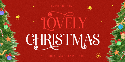 Introducing, Lovely Christmas Typeface. This font has many extra swirly characters to give more playful and swirliness into the design. Lovely Christmas Typeface is well-suited for advertising, layout design for quotes or body copy, best used as a display for headings, logos, branding, magazines, product packaging, invitations. logotypes, and much more. It matches each of your holiday creations so add this font to your designs and make them come alive! Features : · All Uppercase and Lowercase · Number & Symbol · Supported Languages · Alternates · PUA Encoded Hope you enjoy with our font!
 - Wiloka by Ergibi Studio,
$20.00 Introducing Wiloka is a quirky and fun sans, perfect for branding, headlines, posters, books, magazines and packaging projects! Mainly characterized by a modern look with a straight shape, it goes well with vintage style This font has ligatures which add a unique style to the characters. Additionally, it is a unicase typeface, so you can also play with uppercase and lowercase initials. Features Regular Version Uppercase & Lowercase Number & Symbol Ligatures Multilingual and PUA Encoded If there is a problem, question, or anything about my fonts, don't hesitate to ask! Big Thanks ~ Ergibi Studio
 - Rossellina by GRIN3 (Nowak),
$28.00 Rosselina is a handwritten, fully connected script with ligatures and contextual alternates to help with flow and readability. It can be used for invitations, greeting cards, posters, advertising, weddings, books, menus etc. Every lowercase letter has at least two variations. To get the alternate glyph just add "+" before the letter in any OpenType savvy application or manually choose the character from Glyph Palette. When you type uppercase letters they will change to Small Caps. Language support includes Western, Central and Eastern European character sets, as well as Baltic and Turkish languages.
 - FF Daxline by FontFont,
$83.99 German type designer Hans Reichel created this sans FontFont in 2005. The family has 14 weights, ranging from Thin to Black (including italics) and is ideally suited for advertising and packaging, book text, editorial and publishing, logo, branding and creative industries, poster and billboards, small text as well as web and screen design. FF Daxline provides advanced typographical support with features such as ligatures, small capitals, case-sensitive forms, fractions, super- and subscript characters, and stylistic alternates. It comes with a complete range of figure set options – oldstyle and lining figures, each in tabular and proportional widths. As well as Latin-based languages, the typeface family also supports the Cyrillic and Greek writing systems. This FontFont is a member of the FF Dax super family, which also includes FF Dax and FF Dax Compact.
 - Palatino Sans Arabic by Linotype,
$155.99Palatino Sans Arabic is a collaboration between Lebanese designer Nadine Chahine and Prof. Hermann Zapf. The design is a low-contrast companion to the award winning Palatino Arabic and comes in both regular and bold weights. It is designed for use in print in both large and small sizes, and brings into Arabic the informal and friendly appearance of Palatino Sans. The counters are wide open to allow for better readability in small sizes as well as to maintain an open and friendly appearance. The font has 1091 glyphs and includes a large number of extra ligatures and stylistic alternates as well as the basic Latin part of Palatino Sans and support for Arabic, Persian, and Urdu. It also includes proportional and tabular numerals for the supported languages. - Feverish by Veil of Perception,
$66.00 “Feverish” was a font borne out of perceived need in the marketplace. Hallmark retired font designer and master letter designer Myron McVay first approached Bill LaFever to collaborate on a project to design a semiformal calligraphic script that could be set as text copy with a large variety of swash and alternative characters and small caps. Bill penned the initial forms and Myron did the digital conversions and initial technical work. After Myron passed away, Terry Lee, a protégé of Myron’s at Hallmark, also retired, took over and the project was completed. “Feverish” is a semi-formal italic which can be used in a wide variety of commercial and advertising applications. The font family is large which can accommodate a variety of unique applications.
