10,000 search results
(0.037 seconds)
- Supra by Wiescher Design,
$29.00 »Supra« – designed by Gert Wiescher in 2012/13 – is a new sans typeface family of eight weights with matching italics. Supra is influenced by current and past sans typefaces, but has a completely new look. The pleasant flow and warm touch combined with great legibility makes Supra unique. The light and normal weights and the dominant x-height with its high ascenders make for easy reading of long copy. The heavy and x-light weights are great for elegant headlines. Supra is an OpenType family for professional typography with an extended character set of over 700 glyphs. It supports more than 40 Central- and Eastern-European as well as many Western languages. Ligatures, different figures, fractions, currency symbols and smallcaps can be found in all cuts.
 - Breve Slab Title by DSType,
$50.00 Breve was designed for use in editorial projects. Simple but with enough personality to stand by is own, in a quest for a more forceful and contemporary appearance. All the fonts in Breve superfamily, share the same exact structure, both in terms of anatomy and functionality. The Text versions provide a softer and warm feel to the typographic palette and is intended for use in much longer passages of text, while the Title versions are distinguished by non-descending letterforms, making the titles and headlines much more uniform and interesting. The News version is more classic, with ball terminals and classic proportions, while the Display is, somehow, the set of fonts we had to design: extra-black, ultra-contrasted, proud-display fonts.
 - Reina by Lián Types,
$37.00ATTENTION! See the newest version of Reina here. Reina Neue is now a family of 45 styles and it's also a Variable Font! Have a look. For the traditional version of Reina, you may stay here ;) --- Reina is Sproviero’s didone of the year. We recommend seeing its user’s guide . Inspired in the sweet letters of calligraphy and typography masters of our past; such as Didot, Bodoni and the incredible Herb Lubalin, its aim was to incorporate the decorative accolades from blackletter and copperplate styles of calligraphy into a Modern Roman typeface. Reina reflects sovereignty due to the enveloping atmosphere and the sensation of greatness that can be felt when using it. It has an unique way of standing over paper and screen, being its swashes responsible of an extreme elegance. Similar to what Lian did in his last font Breathe , Reina was designed to be playful yet formal: While none of its alternates are activated it can be useful for short to medium length texts; and when the user chooses to make use of its open-type decorative glyphs, it can be useful for headlines with dazzling results. TECHNICAL Reina is a family with many members. In order to achieve better results when printing, Lian took his time to design the necessary styles: Reina 72 Pro, prepared for display sizes; Reina 36 Pro, for medium sizes; and Reina 12 Pro, the best for text or decorative words in small size. Each of these members have variants inside, which are open-type programmed: The user decides which glyph to alternate, equalizing the amount of decoration wanted. Reina Engraved Pro has the same features than the variants mentioned above. The family also contains variants which were made exclusively for decoration. These are: Reina Words, a set of the most common words used in english, german, italian, french and spanish; Reina Capitals, which consists in a big set of ornamented capitals; and Reina Fleurons, those little friends which always help to embellish our work. - Bulblamp by Popskraft,
$9.00 Layered font set 3D Bulb lamp Bulblamp is a 12 component font system that can be layered in different ways to create endless classic titling effects used commonly in signage by skilled sign painters and sign makers and any who interested in simple and flexible ways to make graphic design. Examples of how to use this you can see on the images. Moreover, You can start fast in Figma, Illustrator and Photoshop with predefined downloadable package. ! Download free predesigned Figma, Illustrator and Photoshop sets for this fonts here: https://drive.google.com/open?id=17ogdSIjPuLA5-CUaAO1TlqJGbRPWy5iA&authuser=popov_av%40koriphey.ru&usp=drive_fs Each file is named according to its purpose. The number indicates the recommended order of the layers. 1 below, 5 on top. 1 means you should place it first. Of course, you do not have to use all the fonts, and vice versa - you can repeatedly use the same font style with different styles. What is Layered font? In fact, these are common fonts located in a stack strictly one above the other. This allows quickly create unique text effects using ordinary fonts. Where can you use this? These fonts can be used in any program that allows you to stack fonts as objects strictly one above the other, however it is recommended to work in professional programs such as Illustrator, Photoshop, Figma and so on ... How to use this font set quickly? For quick use, I recommend using ready designs for Figma, Photoshop or Illustrator. Download fonts and Install all fonts. Go to the link https://drive.google.com/open?id=17ogdSIjPuLA5-CUaAO1TlqJGbRPWy5iA&authuser=popov_av%40koriphey.ru&usp=drive_fs which has contained pre-made solutions for this font applicable in Figma, Photoshop or Illustrator and download presets. Follow the recommendations on the pages. Basically, you will need to replace the words in the template with your own, then edit colors and transfer the result to your design. In that’s all, it's easy.
 - Drummer by Harvester Type,
$20.00 Drummer is a large futuristic font family inspired by the Expansion TV series, old science fiction book covers and Honda Prelude and Porsche logos. The family contains a large number of styles and a lot of language support. 54 styles, 6 in width (Ultra Condensed, Condensed, Normal, Expanded, Extra Expanded, Ultra Expanded) and 9 in weight (Thin, Extra Light, Light, Regular, Medium, Semi Bold, Bold, ExtraBold, Black). The font also has a variable version. 573 glyphs, including 40 alternate characters. A lot of work has been done on the font. The fillets on the symbols have been well worked out and tested for a better visual and practical experience. The font combines the monospacing of many characters combined with kerning, which makes it very convenient for many purposes, such as vertical typography. The font is good in all sizes, both small and large, which makes it possible to use it anywhere. Branding, logos, titles, posters, texts, covers, merch, prints, web, titles, banners, games and design in games and much more. In the near future, it is planned to add another axis of variability - the slant. Consequently, the family itself will increase. It is also planned to add a small case (capital). If you want to say something about the font or get a font in other formats, then write to the mail: bunineugene@gmail.com .
 - Notice3Std - 100% free

- Challah Display by Typophobia,
$25.00 Challah is a display font containing 295 glyphs. Letters are very diverse, but because they contain several shapes characteristic for each other - they retain a certain coherence. When creating the font, the main inspiration was to take from the Brazilian graffiti trend - Pichação and Korean typography. Most of the letters are the same size and width, however, when designing, we also tried to include at certain moments small "surprises" that will surely interest and surprise the user of the above-mentioned typeface. The font fits very well into the urban structure, therefore it perfectly matches the art on the walls with the art on the billboards, creating a kind of dialogue.
 - Afronaut PRO by Borutta Group,
$39.00 Afronaut PRO (New version of typeface published in 2019) was inspired by vernacular Latin & Arabic typography in St. Louis (on Senegal-Mauretania Border, Africa). Geometric forms working well and contrasting with smooth, round elements. After reading "Afronautics – from Zambia to the Moon" by Bartek Sabela (about Zambian conquest of space) a breif was set to create typeface that looks like mix between: vernacular Arabic script, futuristic typography and some special lettering that I found in Africa during my travels to Guinée, Bissau, Gambia, Senegal, Mauritania and West Sahara. Afronaut has seven weights, also many letters have 3 different forms. Afronaut PRO can work as regular version of my Yalla Typeface.
 - Isard Hebrew by Letterjuice,
$40.00 Isard is a very agile typeface, honoring its name, which is the name of a type of mountain goat from the Catalan Pyrenees. It is a multipurpose sans serif typeface with a down-to-earht elegance, thought for information design as well as branding. Isard is warm and friendly which also makes it suitable for advertising, packaging, and magazine. It has a contemporary feel to it with its squarish curves, it has being built with legibility in mind, bearing a considerably large x-height. The family covers two scripts, Hebrew and Latin. It has seven weights, from the very sturdy Black to the delicacy of the Thin, with its italics.
 - Logotype Style by Sensatype Studio,
$15.00 Logotype is Modern Logo Font is a well-balanced modern font with a minimalist, unique, and iconic sans serif, font that you can combine to get any variations and unique shapes easily just in seconds with choose ligatures of them. It is a sans serif font with minimalist style that perfect for branding projects, logo, poster designs, social media posts, advertisements, product packaging, product designs, label, photography, watermark, invitation, stationery, and any projects, it makes with a high level of legibility. What's Included: Character set A-Z Numerals & Punctuation Accented Characters (West Europe) Works on PC & Mac Recommended using Adobe Illustrator or Adobe Photoshop. Wish you enjoy our font. :)
 - New Millennium Sans by Three Islands Press,
$24.00New Millennium Sans is one of three font families that share a common name, a common design philosophy, a common x-height, and basic character shapes. (The others are New Millennium and New Millennium Linear; all three work well together.) New Millennium Sans is a "humanist sans" in the Optima vein -- but without certain quirks (e.g., the "waisted" strokes) of the latter. It has proportional lining numerals whose height comes midway between the lower- and uppercases. (The bold styles are identical to those of New Millennium.) New Millennium Sans might be used in books, periodicals, or any large text blocks where a legible sans is desired. - Elegancy Style by Sensatype Studio,
$15.00 Elegancy is Modern Luxury Elegant Font is a well-balanced contemporary font with a fancy, unique, and versatile Luxury serif, font that you can combine to get any variations and unique shapes easily just in seconds with choose alternates of them. It is a serif display font with moderate contrast that perfect for branding projects, logo, wedding designs, social media posts, advertisements, product packaging, product designs, label, photography, watermark, invitation, stationery, and any projects, it makes with a high level of legibility. What's Included: Character set A-Z Numerals & Punctuation Accented Characters (West Europe) Works on PC & Mac Recommended using Adobe Illustrator or Adobe Photoshop. Wish you enjoy our font. :)
 - Royal by Sensatype Studio,
$15.00 Royal is Modern Luxury Unique Serif Font is a well-balanced contemporary font with a fancy, unique, and versatile Luxury serif, font that you can combine to get any variations and unique shapes easily just in seconds with choose alternates of them. It is a serif display font with moderate contrast that perfect for branding projects, logo, wedding designs, social media posts, advertisements, product packaging, product designs, label, photography, watermark, invitation, stationery, and any projects, it makes with a high level of legibility. What's Included: Character set A-Z Numerals & Punctuation Accented Characters (West Europe) Works on PC & Mac Recommended using Adobe Illustrator or Adobe Photoshop. Wish you enjoy our font. :)
 - Totally Awesome by Comicraft,
$29.00 Our newest release is so Totally Awesome, we haven't even found a good NAME for it yet! It’s the kind of font you'll splash all over your covers and title pages to call out FINAL BATTLES WHEN ALL-NEW ALL-DIFFERENT TITANS CLASH! It’s gonna grab your readers and pull them into your own special house of ideas! The story this font wants to tell you is NOT a what if?, NOT a hoax, not an imaginary story. It didn't come BEFORE ELEPHANTMEN, AFTER ELEPHANTMEN or anywhere inbetween! It’s Uncanny, it’s Amazing, it’s Incredible, Invincible, it’s Mighty, Superlative and Wondrous. It’s ready to Assemble, it’s TOTALLY AWESOME!
 - Mercado by MADType,
$24.00 Mercado is a versatile stencil font family with 3 styles and 3 weights of each style. I was inspired by local boutique supermarkets to create a stencil font family with both upper and lowercase as well as a large international characterset. Mercado Regular can be used at small point sizes without the stencil gaps filling in. It also makes a bold statement when used large. Mercado Display with it's precision slices is best used large, or in any design solution where the tight gaps will not become filled in. Mercado Sans is a quirky and strong sans serif based on the bones of the stencil version.
 - Inversion by Wordshape,
$20.00 Inversion is a display typeface that is based on a rare bit of lettering from a 1910 German lettering book. What was the inspiration for designing the font? I found the base lettering years ago in a specimen and scanned it. I've used it perennially for assorted metal bands' logos, and finally decided to digitize it. What are its main characteristics and features? It is a spidery bit of lettering that would work well in Harry Potter movies or on album covers. Usage recommendations: Display type for use in materials that are meant to have a hand-wrought look circa the turn of the century.
 - Qatana by Ixipcalli,
$20.00 La tipografía Qátana es una tipografía inspirada en el estilo románico serif y sans serif. Su estilo elegante y de fácil lectura ha logrado ser una tipografía esencial para redacciones de documentos, textos o libros. Cuenta con tres pesos bien marcados que dan un juego visual de resaltados y tenues. Además de las formas itálicas. The Qátana typeface is a typeface inspired by the Romanesque serif and sans serif style. Its elegant and easy-to-read style has become an essential typeface for writing documents, texts, or books. It features three well-marked weights that give a visual play of highlights and lows. In addition to the italic forms.
 - MTT Roma by MTT Type Firm,
$39.99 MTT Roma is designed to re-create the atmosphere of the city of Rome of the 21st century. The studio for the letterform evolved from the Trajan Column alphabet. Suitable for both display and body-text usage, stylistically MTT Roma aims to distance itself from the proliferation of geometric sans-serif families of its time. The result is a sharp, subtly humanist typeface inspired by modern day Rome, the city of contrasts and eternal beauty. Featuring an extended character set to support Central and Eastern European as well as Western European languages, the typeface comes with six weights – from thin to black — with matching italics.
 - Basic Sans Cnd by Latinotype,
$29.00 Basic Sans Cnd: A new sans. Designed by Daniel Hernández Basic Sans Cnd is a narrower version of Basic Sans. It is a family of Grotesque features with a functional, neutral and seeming clean style that looks to keep a neutral (or basic) appearance on paper, but including lots of details that give it a unique personality. Basic Sans Cnd is a sans-serif typeface well-suited for publishing projects, medium-sized text, branding, posters, headlines and more! This font family comes in 7 weights—ranging from Thin to Black—plus matching italics and it has a set of 416 characters that support 206 different languages.
 - Benchmark2 by Alphabet Agency,
$30.00 Benchmark2 is a super cool serif font developed from the popular original Benchmark font. This version has been remastered in the latest font developing software and now the new version includes a lot of additional characters that are not available in the original. The original font has been used worldwide, used in Hollywood films and in products in popular clothing lines. The font works well in a variety of themes including tattoo, rebellious, street, western and vintage, to name some. The font was initially designed for use on Baseball jerseys in an effort to developed ways of creating new looks in the field of sports related graphic design.
 - Adoret Loves by Say Studio,
$12.00 About the Product Adoret Loves is a beautiful a Fabulous hybrid font from modern serif with elegant script . come with 2 versions regular & italic. Adoret Loves is made mainly for headlines, titles, and other short texts and is well-suited for advertising, vintage mood board, branding, logotypes, packaging, titles, editorial design, modern logos, websites, social media quotes, wedding branding, modern and vintage design. What you get: - Adoret Loves Regular - Adoret Loves Italic - Accessible in the Adobe Illustrator, Adobe Photoshop, Coreldraw, even work on Microsoft Word. PUA Encoded Characters – Fully accessible without additional design software. - Fonts include multilingual support. Thanks, Have a wonderful Day Say Studio
 - Octopuss by ITC,
$29.99Octopuss is an energetic titling typeface designed in 1970 by Colin Brignall for Letraset dry transfer sheets. Brignall expanded the basic alphabet with an outline variation with a shadow, which makes the typeface look three dimensional, almost like it is floating. Octopuss font displays the unmistakable signs of the typefaces of the 1970s, as do Countdown and Harlow, also designed by Brignall. The circular strokes of the capitals that drop well under the base line are striking and unique. Because of the small white spaces of its lower case letters, the rounded, robust Octopuss is meant exclusively as a headline font and should be set in large point sizes. - Ribbon Cursive by Okaycat,
$29.50 Ribbon Cursive was developed largely from Mercator's Italic Hand, which originated from Italy, during the Renaissance. Ribbon Cursive is fancy, legible, and luxurious text. Works great if you are designing a logo, or use it to create some beautiful titling. Use it for advertisement copy, or even for short to medium-length bodies of text. It should be noted that, due to the heavy embellishment of all the capital letters, this font will not work well if your text is set in all capitals! Ribbon Cursive is contains the full West European diacritics and a full set of ligatures, making it suitable for multilingual environments and publications.
 - Aurelia by Linotype,
$29.99The design for Aurelia is based on the forms of Jenson, an Old Style typeface developed by Nicolas Jenson in 1470 which still influences type design today. Zapf gave Aurelia a bit of his own personal style and adapted it to the demands of modern technology. The family of typefaces was originally designed for use with the typesetting machines produced by the German company Dr.-Ing Rudolf Hell GmbH which was later merged with Linotype. The name Aurelia is a nod to the Roman emperor Aurelianus (214–275), who built the Via Aurelia in Italy. Aurelia is a robust and classic font, suitable for both text and headlines. - Saturday Morning Toast by Nick's Fonts,
$10.00Based on the logotype font of the Saturday Evening Post from the 20s, Saturday Morning Toast is warm, cuddly and endearing in its quirky charm. All versions of this font contain the complete Unicode Latin A character complement, with support for the Afrikaans, Albanian, Basque, Bosnian, Breton, Catalan, Croatian, Czech, Danish, Dutch, English, Esperanto, Estonian, Faroese, Fijian, Finnish, Flemish, French, Frisian, German, Greenlandic, Hawaiian, Hungarian, Icelandic, Indonesian, Irish, Italian, Latin, Latvian, Lithuanian, Malay, Maltese, Maori, Moldavan, Norwegian, Polish, Portuguese, Provençal, Rhaeto-Romanic, Romanian, Romany, Sámi, Samoan, Scottish Gaelic, Serbian, Slovak, Slovenian, Spanish, Swahili, Swedish, Tagalog, Turkish and Welsh languages, as well as discretionary ligatures and extended fractions. - Samarquand by BluHead Studio,
$29.00 Samarquand is a handwritten script design from Roy Preston. Based on the handwriting of a friend, Roy has expanded this friendly, semi-connecting script to include three weights, Light, Regular and Bold, opening up even more design possibilities. The Samarquand fonts support an extended character set, as well as some ligatures, inferior and superior numbers, and unlimited fractions. There are some really nice letterforms in these fonts, particularly that uppercase W! Peruse the posters to see. I'm kind of partial to the Light weight, which is really quite elegant in use, but that Bold can really make a strong statement! Samarquand. Check it out for yourself.
 - Makro by Tokotype,
$50.00 Makro is a family of extended display sans fonts with an imposing profile with six weights, ranging from Light to Black. This series is distinguished by the excessively contrasting shapes and tones of the shapes on each opening joint and adjusted open counter. This font was designed primarily for large display text that demands more space, such as on out-of-home graphics, headings, titles, or another similar application. The most recent version of Makro supports variable weight and italic axes, as well as OpenType features such as alternatives, circled numbers, etc. In addition, the family has enlarged its linguistic repertoire to incorporate Cyrillic in addition to Latin.
 - Stefani by Okaycat,
$19.50 Stefani EHYO was designed ultimately with pure simplicity in mind, to carry an inviting, friendly style. The result is an ultra clean look with versatility: useful for either full bodies of text or for a nice headliner. The simplified smooth forms are highly legible and carefully well-matched, so can even be used over a busy background or at very small point settings. Stefani is extended, containing the full West European diacritics & a full set of ligatures, making it suitable for multilingual environments and publications. Choose Stefani for any application where you want solid readable text, any time you want a pleasant and clean feel to your presentation.
 - Isard Hebrew Latin by Letterjuice,
$85.00 Isard is a very agile typeface, honoring its name, which is the name of a type of mountain goat from the Catalan Pyrenees. It is a multipurpose sans serif typeface with a down-to-earht elegance, thought for information design as well as branding. Isard is warm and friendly which also makes it suitable for advertising, packaging, and magazine. It has a contemporary feel to it with its squarish curves, it has being built with legibility in mind, bearing a considerably large x-height. The family covers two scripts, Hebrew and Latin. It has seven weights, from the very sturdy Black to the delicacy of the Thin, with its italics.
 - Blue Village by Issam Type,
$18.00 Blue Village – A Two-faced Modern or Vintage Serif Font with a fancy, playful, unique, and versatile vintage style. It looks amazing at display sizes and is easily readable in text size. This font also have a lot of unique alternate and ligature that will create amazing design projects. Blue Village with it’s vintage / retro style work well for branding projects, logo, wedding designs, social media posts, advertisements, product packaging, product designs, label, photography, watermark, invitation, or whatever project you’re working on. What’s Included? Uppercase & lowercase letters, numbers, punctuation Ligature & Huge Stylistic alternate Multilingual support If you have any questions, please feel free to get in touch. Thank you
 - Southwark by Hanoded,
$15.00 London is one of my favourite cities, so it was about time I named a font after it. Well, technically, I named a font after one of London’s districts. Southwark comes from the Anglo-Saxon word Suthriganaweorc, which means ‘Fort of the men of Surrey’. The font Southwork is a handmade Clarendon. I used a Japanese brush pen to create the outlines. I gave the glyphs texture by filling them in with a brush and Chinese ink. Southwark, therefore, has an uneven look and a brushy texture. It looks good on just about anything, but posters, greeting cards and product packaging come to mind.
 - Jimmy Oh Timmy by Maculinc,
$18.00 This multipurpose script typeface includes many different alternatives for each lower case. Make this typeface cool in your Font Library. It is a lot of fun to use as each word can be changed to your liking. This typeface works really well for Logo and Apparel Designs. It's also great for making Prints or Merchandise, as you can use the illustration quality of shapes to create artwork. Mix and match with a bunch of alternative characters to fit your project. The alternative characters in this font were divided into several OpenType features such as Stylistic Alternates, Ligature and Ligature Alternates. Mail support : maculinc@gmail.com Thank you! Maculinc
 - Parandea by IbraCreative,
$17.00 Parandea, a vintage serif typeface, seamlessly blends the essence of bygone eras with a touch of modern sophistication. Each letter in Parandea exudes timeless charm, featuring elegant serifs and fine details that harken back to the craftsmanship of vintage typography. The typeface’s well-balanced proportions and graceful curves evoke a sense of nostalgia, making it a perfect choice for projects that demand a classic and refined aesthetic. Parandea’s versatility shines through, whether it’s used for branding, editorial design, or any application where a touch of vintage character is desired. With its distinctive yet understated elegance, Parandea captures the spirit of the past while maintaining a contemporary allure.
 - News Copy JNL by Jeff Levine,
$29.00 Found within the pages of the 1934 edition of the American Type Foundry’s “Book of American Type” is a sans serif design with rounded terminals that emulates a typewriter face. “Jumbo Typewriter” is reminiscent of the type of lettering formerly found on teletype news copy. “Teletype” was a division of Western Electric (part of AT&T), and the machines utilized telephone lines to electronically type and send (as well as receive) messages worldwide. Many folks will remember the sound of teletype machines in the background when radio stations had their news breaks. Now available digitally as News Copy JNL, it is available in both regular and oblique versions.
 - Margaret by Sensatype Studio,
$15.00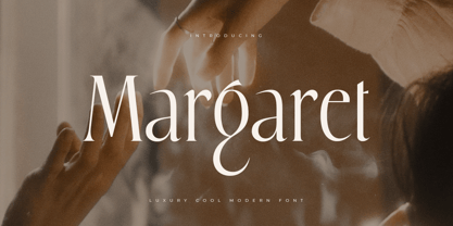 Margaret is Modern Luxury Unique Serif Font is a well-balanced contemporary font with a fancy, unique, and versatile Luxury serif, font that you can combine to get any variations and unique shapes easily just in seconds with choose alternates of them. It is a serif display font with moderate contrast that perfect for branding projects, logo, wedding designs, social media posts, advertisements, product packaging, product designs, label, photography, watermark, invitation, stationery, and any projects, it makes with a high level of legibility. What's Included: Character set A-Z Numerals & Punctuation Accented Characters (West Europe) Works on PC & Mac Recommended using Adobe Illustrator or Adobe Photoshop. Wish you enjoy our font. :)
 - Yanking by Sensatype Studio,
$15.00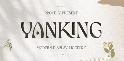 YANKING is Modern Display Ligature Font is a well-balanced contemporary font with a fancy, unique, and versatile Luxury serif, font that you can combine to get any variations and unique shapes easily just in seconds with choose alternates of them. It is a serif display font with moderate contrast that perfect for branding projects, logo, wedding designs, social media posts, advertisements, product packaging, product designs, label, photography, watermark, invitation, stationery, and any projects, it makes with a high level of legibility. What's Included: Character set A-Z Numerals & Punctuation Accented Characters (West Europe) Works on PC & Mac Recommended using Adobe Illustrator or Adobe Photoshop. Wish you enjoy our font. :)
 - Isard by Letterjuice,
$52.00 Isard is a very agile typeface, honoring its name, which is the name of a type of mountain goat from the Catalan Pyrenees. It is a multipurpose sans serif typeface with a down-to-earht elegance, thought for information design as well as branding. Isard is warm and friendly which also makes it suitable for advertising, packaging, and magazine. It has a contemporary feel to it with its squarish curves, it has being built with legibility in mind, bearing a considerably large x-height. The family covers two scripts, Hebrew and Latin. It has seven weights, from the very sturdy Black to the delicacy of the Thin, with its italics.
 - Klapt by SevenType,
$24.99 Klapt is a geometric sans serif family that is soft on the outside and sharp on the inside. This family of four weights, includes an extended character set supporting most Latin languages even Vietnamese! Klapt, which can be bold or very elegant, is well suited for designs ranging from branding and corporate identity to editorial design and also web design. It is great for display purposes especially for headlines, posters, magazines, book covers, logos... you name it! Feel free to share your designs using Klapt or just get in touch via email to hi@seventype.com. Need extended Cyrillic support? We've got you covered https://www.myfonts.com/fonts/seventype/klapt-cyrillic/
 - Hupp Antiqua NF by Nick's Fonts,
$10.00An enchanting design by Otto Hupp for Gebr. Klingspor in 1909 provided the pattern for this timeless classic, which gracefully and seamlessly combines medieval inspiration with Art Nouveau flair. All versions of this font contain the complete Unicode Latin A character complement, with support for the Afrikaans, Albanian, Basque, Bosnian, Breton, Catalan, Croatian, Czech, Danish, Dutch, English, Esperanto, Estonian, Faroese, Fijian, Finnish, Flemish, French, Frisian, German, Greenlandic, Hawaiian, Hungarian, Icelandic, Indonesian, Irish, Italian, Latin, Latvian, Lithuanian, Malay, Maltese, Maori, Moldavan, Norwegian, Polish, Portuguese, Provençal, Rhaeto-Romanic, Romanian, Romany, Sámi, Samoan, Scottish Gaelic, Serbian, Slovak, Slovenian, Spanish, Swahili, Swedish, Tagalog, Turkish and Welsh languages, as well as discretionary ligatures and extended fractions. - Cruller by Wordshape,
$20.00 Cruller is a display typeface that is based on a rare bit of lettering from a 1910 German lettering book. What was the inspiration for designing the font? I found the base lettering years ago in a specimen and scanned it. I've used it perennially for assorted metal bands' logos, and finally decided to digitize it. What are its main characteristics and features? It is a spidery bit of lettering that would work well in Harry Potter movies or on album covers. Usage recommendations: Display type for use in materials that are meant to have a hand-wrought look circa the turn of the century.
