10,000 search results
(0.03 seconds)
- Radio Days NF by Nick's Fonts,
$10.00This Deco delight is based on logotype lettering for Crosley Radios from the 1930s. By aLtErNaTiNg upper and lowercase letters (brackets and braces, too), you can maintain the flow of the lightning bolts through the letters. Additionally, inline hyphens can be found at the ASCII circumflex and ASCII tilde positions. This font contains the complete Latin language character set (Unicode 1252) plus support for Central European (Unicode 1250) languages as well. - Rock Concert JNL by Jeff Levine,
$29.00 Rock Concert JNL is a playful free form type design inspired by the opening title and credits for the 1964 motion picture comedy “Send Me No Flowers” starring Rock Hudson, Doris Day, and Tony Randall. Strongly resembling hippie movement poster lettering of the mid-1960s, this fonts fits well with any retro project emulating the “Peace and Love” movement or (as its name implies) re-creating period piece rock concert posters.
 - Realvish by Picatype,
$12.00 Realvish is a handwritten brush font, a contemporary approach to design, handmade natural, suitable for use in title design such as clothing, invitations, book titles, stationery designs, quotes, branding, logos, greeting cards, T-shirts, packaging designs, posters, and more. Realvish has one normal, complete with uppercase and lowercase letters, as well as multi-language support, numbers, punctuation. Thanks very much for finding and let me know if you have any questions.
 - Vamp by Burghal Design,
$29.00A quintet of remorseless homewreckers, each member of the Vamp family contains hypnotic dingbats to lure you into their web. The Vamp family consists of the bewitching Vamp, the bigger, brasher Vamp Bold, the dangerous, psychedelic Psycho Vamp, as well as the lean (but still mean!) Vamp Slim and Vamp Slim Oblique. The Vamp family's seductive art deco form and fiendishly geometric wiles will break your heart and steal your soul. - Old Claude LP by LetterPerfect,
$39.00 Old Claude was drawn by Paul Shaw to simulate an old cut of the classic (Claude) Garamond type designs of the 16th & 17th centuries. The pronounced rough edges and coarse letter shapes create the effect of letterpress printing with old foundry type onto handmade paper. The companion Old Claude Expert includes small caps and old-style figures. This "antiqued" design works equally well for both text and display.
 - Bubblegum Sans Pro by Sudtipos,
$19.00 Bubblegum Sans Pro is upbeat, flavor-loaded, brushalicious letters for the sunny side of the street. It bounces with joy and tells a great story. Designed by Angel Koziupa and produced by Ale Paul, this typeface is a loud 21st century shoutout to the kind of the 1930s lettering that sold everything to everyone through every medium. Bubblegum Sans Pro version covers all Latin-based languages and includes some alternates.
 - Guile by Bunny Dojo,
$10.00 A timeless and mighty sans-serif, Guile's chiseled forms make the font ideal for reaching into history, while its minimalism and balance are fit for propelling into the future. Guile voraciously absorbs and enhances the style of its surroundings. In sports, it's a true team player, from the jerseys to the on-air presentation. In film, it's a blockbuster star, from the title treatment to the billing block.
 - Signpost by Studio K,
$45.00 The name says it all. Signpost is a display font purpose-designed for directional, informational and publicity signage, as well as posters, public notices and advertisments. It comes complete with a choice of 'pointing hands' symbols and quartrefoil borders of the kind used on traditional British street signs. It is essentially a drop shadow version of my Red Top font family, which has a similar range of applications.
 - Angars Runes by Mans Greback,
$59.00 Angars Runes is a Middle Age style rune typeface. With engraved letterforms and gothic curves, this font is the perfect addition to a medieval project. The font was drawn and created by Måns Grebäck in 2019. Use the symbols plus + period . multiply × colon : for decorative separators. Angars Runes contains all characters you will ever need, as well as numerals and alternate letters. This is a font with multilingual support.
 - HK Kelie by HK Studio,
$25.00 HK Kelie is a light to medium-contrast typeface with swashy, medium bracketed serifs, and terminals in the appropriate places, as well as bracketed junctions in various letterforms. The main feature of the typeface is the disconnection between the bowls and the stems. However, the bowl is very close to the stem, creating the illusion of connection. HK Kelie is calm, attractive, and legible — but above all, it is sophisticated.
 - Cyntho Slab Pro by Mint Type,
$- Cyntho Slab Pro is the slab serif companion to Cyntho Pro. It’s a modern geometric slab serif with extensive language support including Cyrillic and Greek scripts, rich with OpenType features, perfect for magazines, posters, advertising, corporate identity, and much more. It offers optional upright and real italic forms, wrapped in OpenType ‘stylistic alternates’ features, or stylistic set #02, where sets can be applied separately. Small caps are included as well.
 - Blunch by Estudio Calderon,
$35.00 Blunch is a new glyphic typeface that has flared slightly strokes. The design is based on many typographic references as Basilea, Stettler and Pascal. It includes three styles: Upright, slanted and backslanted. Blunch is equipped with an extended character set to support Central and Eastern European as well as Western European languages. I recommended use Blunch in the following design concepts: Brewing company Can beer desing Sports Branding Packaging design
 - Zeebonk by Hanoded,
$15.00 Zeebonk (literally 'Sea Chunk') is Dutch for a sailor - in particular, a large, pickled and brined, seven-seas-been-there-done-that specimen. The font itself brings back memories of the outrageous tattoos those same 'zeebonken' used to have. Zeebonk comes with extensive language support, alternates for the upper case (and some lower case letters as well) and a healthy dose of good old fashioned sea dog humor!
 - Kidnapped At Old Times by Intellecta Design,
$11.90 Kidnapped at Old Times, by Intellecta Design, is a collection of 35 fonts (and growing) of some of the most decorative caps we have ever carried. Decorative caps can capture the attention of anyone when used well. These caps are remarkably interesting and very detailed. So many to choose from - the entire family has over 2000 exotic, intrincate and historical letters. Easier to just order the whole family!
 - Designer RD by Kostic,
$40.00 Designer RD was created in 1999, at the same time as Just Square and Why Square typefaces, and envisioned to be their rounded alternative. Zoran based the font on the logotype his son Nikola made and its primary purpose is to be used in logotypes, headlines, fliers, websites, etc. that are going for a hard geometric look. Designer RD’s character set supports Western European languages, as well as the Cyrillic script.
 - Madame by Linotype,
$40.99 The font, Madame, first appeared in a sample with similar fonts, presented by the Fonderie Typographique Française in the 19th century. The font consists of three cuts, letters, accents and numericals. The flamboyant Madame is meant for titles and headlines, emphasis in text or as initials. It combines well with both serif and sans serif fonts, but should be used sparsely to maximize the advantages of its ornate forms.
 - Angel Face by RCKY Studio,
$16.00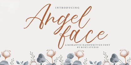 Angel Face is a romantic handwritten font with contemporary, sophisticated accents. Suitable for use in watercolor designs. Such as Novel tittle, Apparel, Invitations, Quotes, Books tittle, Stationery Design, Branding, Logos, Greeting Card, T-shirt, Packaging design, Poster and more. Angel Face Font includes a complete set of uppercase and lowercase letters, as well as multi-language support, numbers, punctuation, ligatures and alternative character,also with additional Angel Face extra swashes.
 - Gamesome by Mevstory Studio,
$20.00 Gamesome is SPORTY, FUTURISTIC, and SHARP font. It will make your design looks sporty and also futuristic design. Gamesome Really fit for retro, futuristic, automotive, and gaming themed designs. Just look how it performs on the preview that I have provided, you will see its capabilities. But it will also work well with other themes. I can’t wait to see what you guys will come up with with using this font!
 - Petite Fleur by Wiescher Design,
$39.50 Petite Fleur is a combination of engraved, flowery embellishments and the Capitals of my redesigned Royal Romain (Romain du Roi), the exclusive font of King Louis XIV. It is best used as initials only, but can be mixed with Royal Romain. On the keys for ≥ and ≤ I designed two filler embellishments and the ciphers 0-9 are embellished as well. Enjoy! Your designer of beautiful fonts, Gert Wiescher
 - Nanami by Thinkdust,
$10.00 A font inspired by the oriental flavours of Japan, Nanami a confident font with clear, clean lines which are well defined without being obtrusive. The distinctly sharp edges slice through empty space like Samurai swords, proudly wearing curves and corners like a Samurai wears their traditional ceremonial armour, and just as fierce. If Nanami isn't quite floating your boat why not check out its counterparts Nanami Rounded and Nanami Handmade.
 - Prelom by Tour De Force,
$25.00 Prelom is modern serif family inspired by retro designed typefaces. Comes in 5 Normal weights, 5 true Italics and 5 Condensed weights. With tall x-height, sharp serifs like fishing hooks, original Italics and distinctive character overall design, Prelom is ideal family for editorial use or branding. Beside extended Latin character set, Prelom contains Cyrillic characters as well. It is equipped with Initials, Ligatures, Fractions and Tabular Numbers as OpenType features.
 - HT Tabaccaio by Dharma Type,
$19.99 HT Tabaccaio?is a casual and versatile script. Its very unique kern, loop, and dot makes it unforgettable look. HT Tabaccaio is well-suited for product design, books covers, film posters, branding, magazines, signage and other creative projects. Holiday Type Project offers retro hand drawing scripts. Inspired by retro script on shopfront lettering, wall paint advertisements in Italy around 1950s. Check out the script fonts from Holiday Type!
 - SF Abyan by Sultan Fonts,
$19.00 Abyan is An Arabic typeface for desktop applications & display. Abyan is suitable for large display sizes, especially in the area of advertising, while still functioning well as a text face. The font includes a matching Latin design and support for Arabic, Persian, and Urdu. It also includes proportional and tabular numerals for the supported languages. Abyan typeface comes with many opentype features. Designer: Sultan Maqtari Design date: 2019 Publisher: Sultan Fonts
 - Rugfish by Darumo,
$15.00 Introducing Rugfish, a playful chunky font with a cheerful and slightly infantile mood. This eclectic font is specially designed for vivid and eye-catching headers and allows you to do some crazy tricks with it like multi-colored letters or filling with patterns. Perfect for logo/emblem design, package design, etc. Also, it works really well if you are designing any kind of product for kids. Have fun using it!
 - Mama Script by Sudtipos,
$45.00 Initially an experiment in vertical calligraphy, Mama Script was developed by drawing on multiple sources of inspiration. These range from simple swashy handwriting, lettering and signage, to the works of renowned calligraphers. This script likes to stand out everywhere it appears. Mama Script comes with a full set of alternates, as well as many ligatures for precise display use and a simulated balance between the hand and the machine.
 - Varstate Denim Slab by Alphabet Agency,
$15.00 Varstate Denim Slab font is inspired by the varsity team name lettering often seen on apparel such as Letterman jackets, t-shirts and hoodies. The font has a denim texture pattern incorporated into the characters. The fonts can be used across a variety of themes and works particularly well in menswear/fashion genres. The font includes Latin basic characters which includes uppercase, lowercase, numbers, punctuation and much more.
 - Brollo by Greater Albion Typefounders,
$15.00 Brollo is a chunky display face full of the spirit of the 60s and 70s. Its bold character makes it ideal for poster work, and for anywhere that the point really needs to be driven home. The letter forms have been designed to work well either used conventionally or exclusively in capitals. We recommend use in combination with strong patterns, psychedelic colours and anything else outrageous you can think of.
 - Bogeyman by Hanoded,
$15.00 I haven’t been sleeping well lately: I wake up every night around 5 and I don’t know why. Maybe it’s the Bogeyman! Wait… Bogeyman? Excellent name for a new font! Bogeyman is a handmade display font. It comes in two varieties: regular and eroded, both with their Italics. Use it for your posters, book covers and packaging, but you’ll have to promise not to scare your kids with it!
 - Vanguard CF by Connary Fagen,
$35.00 Constructed for maximum impact in tight horizontal spaces, Vanguard's eight weights span a featherlight Thin to a striking Heavy, with accompanying obliques. Vanguard CF impresses in print, headlines, video, and social media. Vanguard CF pairs excellently with its sibling typeface, Integral CF. It also contrasts well with warmer styles, like Artifex CF and Greycliff CF. All typefaces from Connary Fagen include free updates, including new features, and free technical support.
 - Suffolk by Hemphill Type,
$30.00 Suffolk is a traditional yet modern font family that takes inspiration from the county of Suffolk and its rich coastal history. This handwritten style font is a modern rustic take on a traditional script font and comes with a joined up 'script' style and an individual 'print' style. Along with a 'serif' style that evokes a similar feeling of old meets new that works well alongside the two handwritten styles.
 - Roveron by Asenbayu,
$15.00 Roveron is a futuristic wide display font that has a unique geometric shape. Roveron is inspired by space explorers with a strong contemporary feel. The Roveron features a highly expanded alternative style as well as a discretionary ligature. You can use this font in a modern and sophisticated design. This font is perfect for various projects such as: logos and brand identity, headlines, posters, signs and many more.
 - Garloise by Ergibi Studio,
$14.00 Garloise of script and sans will match perfectly. This font is perfect for logotype, apparel, branding, packaging, advertising and more. It comes with uppercase, lowercase, punctuation, symbols, numerals, stylistic alternates, ligatures, and several different swashes are included as well. Includes multi-lingual support for; Afrikaans, Albanian, Catalan, Danish, Dutch, English, Icelandic, Italian, Spanish, Portuguese, German, Swedish, Norwegian, Polish, Indonesian, Zulu. Hope you enjoy with our font! Big Thaks, Ergibi Studio
 - Betm Rounded by Typesketchbook,
$39.00 The typeface of Betm Rounded is based on the successful Betm font family by font foundry Typesketchbook. Font designer Chatnarong Jingsuphatada created Betm as a Rounded version to Betm. Both type families consist of ten weights plus with italic versions. Betm’s typeface has a friendly and modern sans serif appearance. This modern geometric font is very legible and can be used for headlines as well as small and long text.
 - Chipper by ITC,
$29.99Chipper is the work of British designer Andrew Smith, an adorably awkward typeface resembling the first printing of a child. Shaky lines and irregular forms combine for this naive look, which is completed by tiny specks surrounding each form as well as a number of illustrations. Chipper reflects an innocent fun and is perfect for children's greeting cards, certificates, or magazines and advertising for or about the little ones. - Astromonkey by Hanoded,
$15.00 Astromonkey - here he is, all new, all excited to be alive! Astromonkey comes from outer space, where he has rubbed shoulders with the Star Trekkers, the aliens and Major Tom, who is still floating in his tin can. The font is a squarish all caps, with a different set of glyphs for upper and lower case (so they mingle quite well) and Astromonkey himself - disguised as the paragraph glyph. Enjoy.
 - Cuanky by Kereatype,
$14.00 Cuanky is a super fun, retro-style sans serif font with subtle serifs. It possesses a recognizable flair and evokes a sense of warm nostalgia. Available in both regular and italic styles, Cuanky also features a playful hint of the future. Cuanky is perfect for headlines or food-related designs, such as pizza, burgers, and restaurant themes. Additionally, it's well-suited for creating eye-catching posters with a cool aesthetic.
 - His Nibs NF by Nick's Fonts,
$10.00 This swoopy, loopy script was inspired by an “American roundhand” presented by John M. Bergling in his Art Alphabets and Lettering, first published in 1914. Bergling’s unique talent crafted uppercase letters which manage, at the same time, to be both elegant and ostentatious. The PC Postscript, Truetype and Opentype versions contain the complete Latin language character set (Unicode 1252) plus support for Central European (Unicode 1250) languages as well.
 - Piano Keys by Funk King,
$10.00 Piano Keys is a musically-inspired font. It can be used for commercial as well as educational projects. In other versions, I tried to accurately replicate the pattern of black and white keys across the character set. Of course when used, the randomness of text and characters often produced less than realistic results when needed. This version allows black and white keys to be accurately arranged, if desired.
 - ITC Tyfa by ITC,
$29.99 Some words from the designer, Frantisek Storm... Designed by Josef Tyfa in 1959, digitalized by F. Storm in 1996. This Roman and Italic are well-known perhaps to all Czech graphic artists and typographers ever since their release. Although this type face in some details is under the sway of the period of its rise, its importance is timeless, in contradistinction to other famous types dating from the turn of the sixties which were found, after some time, to be trite. The italics live their own life, only their upper-case letters have the same expression as the basic design. Thin and fragile, they work excellently, emphasizing certain parts in the text by their perfect contrast of expression. When seen from a distance they are a little bit darker than the Roman face. Tyfa Roman was released in 1960 by Grafotechna in Prague for hot setting. Later on, Berthold produced letter matrices - "rulers" for Staromat devices, used for manual photosetting of display alphabets. In the eighties it was available on dry transfers of Transotype and today it is offered also by ITC. The meticulously executed designs of the individual letters in the 288 point size are arranged into a set of signs on a cardboard of about B2 in size. The yellowed paper reveals retouches by white paint on the ink. Blue lines mark the baseline, the capital line, the ascender and descender lines and the central verticals of the letters. With regard to the format of the flat scanner, the designs had to be reduced, with the use of a camera, to the format A4, i.e. to the upper-case letter height of about 30 mm. These were then scanned in 600 dpi resolution and read as a bitmap template to the FontStudio programme. The newly created bold type faces derive from Tyfa's designs of the letters "a", "n", "p", the darkness of which was increased further, approximately by 3%, to enhance their emphasizing function. The text designs have hairstrokes thickened by one third; the contrast between thin and thick strokes has been modified, in order to improve legibility, in sizes under 12 points. We have used electronic interpolation to produce the semi-bold designs. Josef Tyfa himself recommends to choose a somewhat darker design than the basic one for printing of books.
 - Ainslie by insigne,
$- Get your Aussie on! The new typeface, Ainslie, with its mix of influences from Oz, makes its mark as the first semi-serif from insigne Design. Ainslie, named for Mt. Ainslie and Canberra’s inner suburb of the same name, was originally developed for the Canberra Australia Centennial Typeface Competition. Canberra is Australia’s capital, and it’s a planned city designed by American Walter Burley Griffin, a contemporary and one-time associate of Frank Lloyd Wright. Griffin’s plan involved a distinctly geometric design with several focal points--one of which was Mt. Ainslie. This same purely geometric scheme is now the basis for insigne’s new release. Similar to the Chatype project in its scope, its challenge, and the way its concept was developed, Ainslie incorporates influences from Canberra and surrounding areas to form a font that is uniquely Australian. In comparison, Chatype was developed for the city of Chattanooga, Tennessee by insigne in conjunction with designer Robbie de Villiers. Chatype took elements from Chattanooga’s industrial character and Cherokee past and merged them with the area’s technological influences. Likewise, Ainslie takes Canberra’s distinct, geometric design and blends it with the organic, flowing effect of aboriginal art. Add in touches from the smooth, aerodynamic design of the boomerang and Ainslie gives you a look uniquely Australian yet usable in a wide range of applications. The fashionable typeface includes a multitude of alternates that can be accessed in any OpenType-enabled application. These stylish alternates along with a number of swashes as well as meticulously refined details with ball terminals and alternate titling caps keep the font well accessorized. Also included are capital swash alternates, old style figures, and small caps. Peruse the PDF brochure to see these features in action. OpenType enabled applications such as the Adobe suite or Quark can take full advantage of the automatic replacing ligatures and alternates. This family also offers the glyphs to support a wide range of languages. While Ainslie wasn't selected as the final font in the Canberra competition, the outcome allowed for additional adjustments to the typeface. Several approaches were attempted for the final product including a technological hexagonal concept, which may still be developed to another form later. Some of the organic forms were removed and substituted with more abrupt endings, leaving the face looking pretty spiffy and a fair bit more legible. In the end, Ainslie was pulled back to the basic forms from which it was started. Give it a go for your next project. It’s guaranteed to be anything but a barbeque stopper.