10,000 search results
(0.071 seconds)
- Kaelawan by Sopheynoft,
$40.00 Kaelawan Regular is a beautiful and versatile script font that is perfect for a variety of design uses. It features elegant, flowing lines that are both feminine and elegant. Kaelawan Regular is also highly legible, making it a great choice for both print and digital designs. Possible design uses for Kaelawan Regular: Invitations and wedding stationery Logos and branding Social media graphics Product packaging Website design Book covers and magazines Greeting cards and posters And much more! What makes Kaelawan Regular unique: Kaelawan Regular has been carefully crafted to be both elegant and legible. The flowing lines and graceful curves give the font a touch of femininity, while the clear and concise letterforms make it easy to read. Kaelawan Regular is also highly versatile. It can be used for a variety of design purposes, from formal invitations to fun and whimsical social media graphics. Functional aspects of Kaelawan Regular: Kaelawan Regular is available in OpenType format. Kaelawan Regular includes a variety of special features, such as ligatures and alternates.
 - Novel Sans Condensed Pro by Atlas Font Foundry,
$50.00 Novel Sans Condensed Pro is the humanist grotesque typeface family within the largely extended award winning Novel Collection, containing Novel Pro, Novel Sans Pro, Novel Sans Hair Pro, Novel Sans Condensed Pro, Novel Mono Pro, Novel Sans Rounded Pro and Novel Sans Office Pro. Novel Sans Condensed Pro has a carefully attuned character design and a well balanced weight contrast. Classic proportions and the almost upright italic makes Novel Sans Condensed Pro being a space saving, modern humanist with the calligraphic warmth of a real italic. Many similarities with the other typeface families within the Novel Collection enable designers to combine the families and reach highest quality in typography. Novel Sans Condensed Pro [1020 glyphs] comes in 6 weights and contains small caps, an extra set of alternate glyphs, many ligatures, lining figures [proportionally spaced and monospaced], hanging figures [proportionally spaced and monospaced], small caps figures [proportionally spaced and monospaced], positive and negative circled figures for upper and lower case, superior and inferior figures, fractions, extensive language support, arrows for uppercase and lowercase and many more OpenType™ features.
 - Flinders by Eko Bimantara,
$24.00 Flinders is a modern humanist sans serif font family designed by Eko Bimantara in 2023. This typeface is intended to be used for various reading purposes and has letterforms optimized for legibility and ease of reading. The styles of Flinders are a sans serif interpretation of classical roman proportions, characterized by a low x-height, subtle calligraphic strokes, angled stroke ends, and open counters and apertures. Flinders is a versatile typeface that is readable in both large and small sizes. Its legibility makes it an excellent choice for body text in books, magazines, and newspapers, while its modern design and open counters make it well-suited for digital screens and web design. Flinders can also be used for branding and identity design, as well as packaging and signage. Overall, Flinders is a contemporary and readable typeface that is suitable for a wide range of design projects. Its humanist characteristics and modern design make it a unique and versatile option for designers looking for a typeface that combines classical proportions with contemporary style.
 - Kasia by ROHH,
$40.00 Kasia™ is a unique contemporary sans serif family, full of character and originality. It's soft and rounded shapes give it warm, friendly, playful and dynamic feel. Special ink traps serve as ornamental details in bigger sizes, making Kasia™ a wonderful display font family. In small sizes, Kasia™ is very clean and legible. Its proportions and optimized kerning make it a versatile, friendly and organic text family, that features broad variety of OpenType features. Thanks to its various advantages Kasia™ is a great choice for all kinds of design work, both print and on-screen. It is a great choice for branding, logo design and advertising, as well as all sorts of paragraph text. Kasia™ consists of 20 fonts - 10 weights and their corresponding italics. It has extended language support including cyrillic and true italics, as well as OpenType features, such as small caps, case sensitive forms, ligatures, stylistic alternates, contextual alternates, lining, oldstyle, tabular, small cap and circled figures, slashed zero, fractions, superscript and subscript, ordinals, currencies and symbols.
 - Serenata Vantages by Fikryal,
$23.00 Serenata Vantages is a sophisticated and elegant sans-serif font that exudes modernity and refinement. With its clean lines and well-proportioned letters, this font is perfect for a wide range of design projects, from branding and advertising to editorial and web design. The font features a range of weights, from thin to bold, giving you the flexibility to create both delicate and bold designs. The characters are beautifully crafted with subtle curves and angles, creating a sense of fluidity and balance. Serenata Vantages is perfect for designs that require a touch of class and sophistication, such as luxury branding, high-end fashion, and editorial publications. It is also ideal for websites and digital interfaces that need a modern and clean look. Overall, Serenata Vantages is an elegant and versatile font that can elevate your designs to new heights, making it a must-have for any designer’s toolkit. Features : Serenata Vantages Light Serenata Vantages Regular Serenata Vantages Bold Multilingual Support If you have any questions please don’t hesitate to contact me follow my Instagram: @fkryall Thank you
 - Ronnia by TypeTogether,
$45.00 One of the most remarkable characteristic of this humanistic sans serif is its versatility. Ronnia’s personality performs admirably in headlines, but is diffident enough for continuous text and small text alike. The heavier weights deliver very cohesive shapes, and they have been successfully used for branding and newspaper headlines. Its ten styles grant the designer a broad range of coherent color and texture variations in text blocks, necessary tools to solve complex information and editorial design problems. Ronnia has been mainly engineered for newspaper and magazine applications manifested in its properties: economic in use, highly legible, and approaching the reader with some friendliness and charm. Ronnia features about 800 characters per weight, including small caps, fractions, old style and lining numbers, scientific superior/inferior figures, and a set of symbols and arrows. It supports over 40 languages that use the Latin extended alphabet. Ronnia Basic is a reduced version of Ronnia. It is still an OT-font but without any particular features except of a set of ligatures, class-kerning and language support including CE and Baltic.
 - Novel Sans Office Pro by Atlas Font Foundry,
$50.00 Novel Sans Office Pro is the humanist grotesque typeface family optimized for office environments within the largely extended award winning Novel Collection, also containing Novel Pro, Novel Sans Pro, Novel Sans Condensed Pro, Novel Mono Pro and Novel Sans Rounded Pro. Novel Sans Office Pro has a carefully attuned character design and a well balanced weight contrast. Classic proportions and the almost upright italic makes Novel Sans Office Pro being a modern humanist with the calligraphic warmth of a real italic. Many similarities with the other typeface families within the Novel Collection enable designers to combine the families and reach highest quality in typography. Novel Sans Office Pro [1020 glyphs] comes in 6 weights and contains small caps, an extra set of alternate glyphs, many ligatures, lining figures [proportionally spaced and monospaced], hanging figures [proportionally spaced and monospaced], small caps figures [proportionally spaced and monospaced], positive and negative circled figures for upper and lower case, superior and inferior figures, fractions, extensive language support, arrows for uppercase and lowercase and many more OpenType™ features.
 - Magneton by Melvastype,
$32.00 Magneton is a brush script typeface that contains three weights and two slant angles. Three weights simulates the pressure of the brush pen; light is written with a gentle pressure and the bold one with more pressure. Two slant angles gives Magneton two natures; the more casual one and the more dynamic one. So with this script you have lots of options to choose from. You can adjust the look and feel just like when writing with a real brush pen! Magneton has lots of alternates and swash characters. It has two sets (and more) of upper case letters. The more basic one and the more flamboyant one. It also has lots and lots of lower case alternates: two styles of end swashes, underlines, a few different ascender and descer swashes and much more. Please explore the images and glyhp set to get the idea. I hope you like what you see and use Magneton in logos, lettering compositions, t-shirts etc. there are lots of opportunities with this one. Thank you and please enjoy!
 - Intro Script by Fontfabric,
$19.00 Intro Script carries with it ideas of resurgence, renewal and unconditional freedom. An updated and expanded version of the Intro Rust sub-family, itself developed from the popular Intro type system, Script comes with 8 different weights and a whole slew of goodies and additional features for you to tinker with. These consist of 3 supplementary fonts with ready-made words, patterns and even banners, so you can put the spark back into your project. The set includes a large number of ligatures and contextual alternates, including both lower and upper case versions, as well as positional variations. The latter allow for symbols to connect at different joints, and help you dodge unnecessary voids, resulting in an efficient work process and a more natural flow. With its broad language support and wide range of OpenType features, Intro Script’s friendly, hand-crafted appearance makes it a suitable and flexible choice for any design. Features: • An updated and polished version of the famous multifaceted bundle • 8 refined monoline styles; • Extended language support; • Supplementary goodies - words, patterns, banners; • Additional ligatures and contextual alternates; • Stylistic positional variations;
 - Jamie Handwriting by Mans Greback,
$49.00 Jamie Handwriting is a charming hand-script font. Its contextual and stylistic alternates makes for a typography indistinguishable from a true handwritten text. Jamie Handwriting's cute and quirky lettering fits any project or contexts that requite that extra bit of genuineness and life. It is wild and funny to look at, and its quick movements emits a happy optimism. The family consists of ten high-quality styles: The weights Thin, Light, Medium, Bold, Black as well as each style as Regular and Alternate. The different thicknesses ensures it will work in any size, and the Alt style prevents any repeating characters. Jamie Handwriting is built with advanced OpenType functionality and has a guaranteed top-notch quality, containing stylistic and contextual alternates, ligatures and more features; all to give you full control and customizability. It has extensive lingual support, covering all Latin-based languages, from North Europe to South Africa, from America to South-East Asia. It contains all characters and symbols you'll ever need, including all punctuation and numbers.
 - Grinda by Putracetol,
$22.00 Introducing the stunning and sophisticated Grinda font, an elegant serif typeface inspired by luxury classic covers and combined with modern typeface style. With 534 glyphs and 359 alternate characters, Grinda provides an extensive range of display combinations for lettering, giving you endless design possibilities. Grinda comes with a variety of OpenType features including alternates and end swashes, making it easier to create beautiful and unique lettering. This font also supports multiple languages, making it versatile and accessible for designers around the world. Perfect for logotypes, headings, covers, posters, logos, quotes, product packaging, headers, merchandise, social media, greeting cards, and much more, Grinda will elevate your designs to the next level of elegance and sophistication. To access the alternate glyphs, you'll need a program that supports OpenType features such as Adobe Illustrator CS, Adobe Photoshop CC, Adobe InDesign, and Corel Draw. In the zip package, you'll find the Grinda font files in OTF, TTF, and WOFF formats, and it comes with uppercase and lowercase letters, as well as numbers, punctuation, and symbols.
 - Robur by Canada Type,
$24.95 It shouldn't be a surprise to anyone that these letter shapes are familiar. They have the unmistakable color and weight of Cooper Black, Oswald Cooper's most famous typeface from 1921. What should be a surprise is that these letters are actually from George Auriol's Robur Noir (or Robur Black), published in France circa 1909 by the Peignot foundry as a bolder, solid counterpart to its popular Auriol typeface (1901). This face precedes Cooper Black by a dozen of years and a whole Great War. Cooper Black has always been a bit of a strange typographical apparition to anyone who tried to explain its original purpose, instant popularity in the 1920s, and major revival in the late 1960s. BB&S and Oswald Cooper PR aside, it is quite evident that the majority of Cooper Black's forms did not evolve from Cooper Old Style, as its originators claimed. And the claim that it collected various Art Nouveau elements is of course too ambiguous to be questioned. But when compared with Robur Noir, the "elements" in question can hardly be debated. The chronology of this "machine age" ad face in metal is amusing and stands as somewhat of a general index of post-Great War global industrial competition: - 1901: Peignot releases Auriol, based on the handwriting of George Auriol (the "quintessential Art Nouveau designer," according to Steven Heller and Louise Fili), and it becomes very popular. - 1909-1912: Peignot releases the Robur family of faces. The eight styles released are Robur Noir and its italic, a condensed version called Robur Noir Allongée (Elongated) and its italic, an outline version called Clair De Lune and its condensed/elongated, a lined/striped version called Robur Tigre, and its condensed/elongated counterpart. - 1914 to 1918: World War One uses up economies on both sides of the Atlantic, claims Georges Peignot with a bullet to the forehead, and non-war industry stalls for 4 years. - 1921: BB&S releases Cooper Black with a lot of hype to hungry publishing, manufacturing and advertising industries. - 1924: Robert Middleton releases Ludlow Black. - 1924: The Stevens Shanks foundry, the British successor to the Figgins legacy, releases its own exact copies of Robur Noir and Robur Noir Allongée, alongside a lined version called Royal Lining. - 1925: Oswald Cooper releases his Cooper Black Condensed, with similar math to Robur Noir Allongée (20% reduction in width and vectical stroke). - 1925: Monotype releases Frederick Goudy's Goudy Heavy, an "answer to Cooper Black". Type historians gravely note it as the "teacher steals from his student" scandal. Goudy Heavy Condensed follows a few years later. - 1928: Linotype releases Chauncey Griffith's Pabst Extra Bold. The condensed counterpart is released in 1931. When type production technologies changed and it was time to retool the old faces for the Typositor age, Cooper Black was a frontrunning candidate, while Robur Noir was all but erased from history. This was mostly due to its commercial revival by flourishing and media-driven music and advertising industries. By the late 1960s variations and spinoffs of Cooper Black were in every typesetting catalog. In the early- to mid-1970s, VGC, wanting to capitalize on the Art Nouveau onslaught, published an uncredited exact copy of Robur Black under the name Skylark. But that also went with the dust of history and PR when digital tech came around, and Cooper Black was once again a prime retooling candidate. The "old fellows stole all of our best ideas" indeed. So almost a hundred years after its initial fizz, Robur is here in digital form, to reclaim its rightful position as the inspiration for, and the best alternative to, Cooper Black. Given that its forms date back to the turn of the century, a time when foundry output had a closer relationship to calligraphic and humanist craft, its shapes are truer to brush strokes and much more idiosyncratic than Cooper Black in their totality's construct. Robur and Robur Italic come in all popular font formats. Language support includes Western, Central and Eastern European character sets, as well as Baltic, Esperanto, Maltese, Turkish, and Celtic/Welsh languages. A range of complementary f-ligatures and a few alternates letters are included within the fonts.
 - Mayfair by Canada Type,
$24.95The long awaited and much requested revival of Robert Hunter Middleton's very popular classic is finally here. Mayfair Cursive was an instant hit for Middleton in 1932, and it went on being used widely until late into the 1970s, in spite of it never having crossed over to film type technology. Like a few of its contemporary designs, most notably the work of Lucien Bernhard, Mayfair is a formal script that is somewhat based on traditional italic forms with swash uppercase, but also employs subsidiary hairline strokes in some of its lowercase as an emphasis to the script's cursive traits. Why these gorgeous letters never made the leap into photo typesetting is a mystery to us. But here they are now in digital form, almost three quarters of a century since they first saw the light in metal. Mayfair was redrawn from original 48 pt specimen. It also underwent a major expansion of character set. Plenty of swash characters and ligatures were added. An alternate set of lowercase was also made, in order to give the user a choice between connected and disconnected variations of the same elegant script. Mayfair ships in all popular font formats. While the Postscript Type 1 and True Type versions come in two fonts (Mayfair and Mayfair Alt), the OpenType version is a single font containing all the extra characters in conveniently programmed features that are easily accessible by OpenType-supporting software applications. We are quite sure today's graphic designers will be appreciative of having access to the face that all but defined menus, romance covers, wine and liquor labels and chocolate boxes for almost two 20th century generations. - PMN Caecilia Sans by Monotype,
$50.99 Few projects are outside the range of PMN Caecilia® Sans. Drawn specifically for on-screen imaging, the family benefits from a large suite of weights, each with several stylistic variations. This is a design ideally suited to building digital interfaces, complex websites, apps, games, kiosks, HTML ads and large-scale brand identities. “My goal was to create a, friendly, versatile, ageless, yet discerning typeface family that will serve the needs of many users,” says Peter Matthias Noordzij. the typeface’s designer. “It is not intended to be eye-catching, but generous: enabling numerous visual and typographical expressions.” The use of Noordzij’s earlier design, PMN Caecilia, in Amazon’s Kindle® wireless reading devices, gave him the opportunity to study the behavior of the slab serif typeface in an on-screen environment. Although based on his earlier design, Noordzij incorporated fundamental changes to optimize PMN Caecilia® Sans’ digital performance. While PMN Caecilia has proven to be a steadfast serif typeface in print and on screen, the addition of a sans serif counterpart gives designers more flexibility when creating complex hierarchies. The combination of serif and sans serif makes the PMN Caecilia family a good choice for everything from print editorial projects to complicated web sites. A broad range of typefaces pair well with PMN Caecilia Sans. Humanist serif typefaces, such as Agmena™, Dante®, and Frutiger® Serif, set up dynamic typographic harmony, while designs like ITC New Veljovic™ Masqualero™ and Perpetua®, will create a striking counterpoint. And, of course, PMN Caecilia is a natural design partner – as are other slab serif typefaces, like the Aptifer™ Slab, Joanna® Nova and Soho® families.
 - Sapore by Fonderia Serena,
$23.90 Sapore is a script font family, mostly monoline, inspired by the elegant handmade signs in the beautiful city of Venice, Italy, where I work and live. Many of these signs were made at the beginning of the 20th century by skillful craftsmen and artists, carrying that distinct vintage Italian flavour, and this is why I named the font Sapore, which means precisely flavour (also, one of the signs is from a pastry shop that makes the most delicious things). The design takes this retro vibe into the 21st century, making it up-to-date and fresh, while keeping it authentic. It is a script font, but I added some stand alone capitals that you can use in all caps words and texts effortlessly, as the open type code is taking care of using the right set of letters at the right time, I could have made two separate fonts, but I wanted to give you the best value I could and ease of use. Make sure contextual alternates are always on! There are also swashes, alternate styles, stylistic sets, small caps, 2 figure sets and decorative elements, all accessible through open type. I think the font is particularly suited for display use, as in logos, packaging design, branding, but it is readable enough for small text blocks. You can access the non-linking caps by clicking on the discretionary ligatures button. You can access the loopy caps by clicking on the titling alternates button. The main version has straight terminals but I included a round version and a calligraphic one, called “classico”. Hope you like it!
 - Elektrakution by Comicraft,
$19.00 SHE'S DEAD, FRANK It's the year 1991, BC (Before Comicraft) when REM were still making records and Frank Miller’s memorable run on Marvel Comics’ DAREDEVIL was just over ten years old. Comicraft’s Richard Starkings found himself working in Anaheim, California for Graphitti Designs. Graphitti had produced the first hardcover edition of Miller’s Batman tale, DARK KNIGHT RETURNS and was now putting together the sequel to Miller’s DAREDEVIL — ELEKTRA LIVES AGAIN! Richard was not engaged to letter this book, the pages of Frank’s incredible original art that came through Graphitti’s studio were already lettered by Marvel Stalwart, Jim Novak. However, there were some cover elements that needed to be added, based on the logo originally rendered by Frank’s brother, Steve. Starkings set about the task of creating an alphabet that could be used to develop Steve’s idea for the trade dress -- the cover elements, the back cover copy and credits on the interior pages. This was long before Macintosh computers and font programs made this work considerably easier, so Rich sat down with a pencil and a sheet of vellum and rendered an alphabet that could be used as the basis for the text that was needed... Those sketches have languished in a drawer for nearly thirty years, but now, finally, Comicraft’s John Roshell has dusted off those old letterforms and Elektrakuted a font based on those designs, a font we HAD to call ELEKTRAKUTION! As for Elektra; she’s dead, Frank. Features: Ten weights (Light, Regular, Bold; Rough Light, Regular & Bold; Inline, Inline Rough, Outline & Outline Rough) with upper & lowercase characters, Western & Central European accents and Greek characters.
 - VLNL Melk by VetteLetters,
$29.99 At VetteLetters we like food but we also appreciate our drinks. Yes, of the non-alcoholic kind as well. Like milk. Contrary to what Arnold Schwartzenegger once said, Milk is not just for babies. It contains a whole lot of stuff that is genuinely good for you. Like proteins, carbohydrates, minerals (calcium a.o.) and many vitamins. One time visiting The Hague, Donald DBXL spotted a tile tableau on a brick wall, advertising a dairy factory called ‘De Sierkan’. Yellow sans serif letters on a bright blue background, dating back to the late 19th century, immediately grabbed DBXL’s attention. Especially because the tableau showed both regular and bold letters with some lovely peculiarities here and there. De Sierkan appeared to have been a milk factory solely operating in The Hague from 1879 until 1961. A number of these wall adverts are still to be seen in The Hague streets today. Photos were taken for later reference. Later is now, the lettering has been digitized, missing characters added, and VLNL Melk sees the light of day. VLNL Melk is an all-caps geometric display sans serif family of three weights, Regular, Bold and Black. The basic shape of the letters is a rectangle with rounded corners, leaving a sturdy no-nonsense look and feel. It has a distinct historic aura, but with both feet in this digital day and age. It can equally well be used for the logo of a hipster coffee place, as the cover of a historic novel. Actually, VLNL Melk kan be applied in a wide range of designs like logos, posters, flyers, book covers and magazine headlines.
 - Pina Colada by Larin Type Co,
$12.00 Pina Colada this beautiful handwritten font duo is a smooth script and playing sans, they perfectly combine and complement each other, they will bring their unique style to any design project and make it unique. It is as sweet as Pina Colada, fall in Love with its incredibly versatile and simple style and use it to create gorgeous wedding invitations, beautiful stationery, greeting cards, attractive social media messages and more! This font is easy to use, has OpenType features, and supports PUA encoding.
 - Sweet Monica by Gatype,
$9.00 Sweet Monica is an elegant script with a creative mood and perfect form, inspired by today's beautiful calligraphy. thick, balanced and varied, born for luxury and beauty. In my example I show how this script can be used. It's great for logotypes, branding, wedding invitations, romantic cards, alcohol labels, packaging, name spelling and more. Sweet Monica comes with beautiful uppercase and lowercase letters, numbers, and punctuation. In addition to the main character set, there are many alternative characters, early and late sweeps.
 - Timeless Classic by Epiclinez,
$18.00 Introducing our fun and playful Timeless Classic typeface! Suitable for creating professional-looking headlines, titles, posters - or any other creative project. With its bold look and hand-drawn vibe, this font is sure to make a statement. Say goodbye to confusing and boring messages and say hello to clarity and simplicity with this timeless classic. Features : Basic Latin Uppercase and Lowercase Numbers, symbols, and punctuations Multilingual Support. Fully accessible without additional design software Simple Installations works on PC & Mac Thank You
 - SF Saggar by Sultan Fonts,
$19.99 SF Saggar is an Arabic typeface for Print and screen. Inspired by an alphabet written by the calligrapher and artist Mohamed Said Al-Saggar 40 years ago to simplify Arabic printing. Saggar is from Naskh style and contains 3 weights: Regular, bold and black. SF Saggar is a simple and little detailed font and its three weights are fully harmonized, one letter with one length on the line, and words with a uniform length on the line, gives a comfortable reading look.
 - Magdelin by Adam Ladd,
$24.00 Magdelin is a minimal yet warm gothic sans with normal and alternate families. At its core, the design has simple forms and low contrast, yet it takes some qualities from the humanist class with its calligraphy or cursive-inspired details found in the italics and the bowl shapes of characters like b and d. The small x-height, longer ascenders and descenders, and semi-condensed proportions give it a bit of a vintage or classic feel while still appearing contemporary and modern.
 - East Botany by Reyrey Blue Std,
$16.00 Say Hi to East Botany. A new bold and stylish font with modern, groovy and retro look. It comes with large selection of alternate glyphs to give your any project to a unique design. East Botany is perfect for luxury logo and branding, classy editorial design, woman magazine, cosmetic brand, fashion promotional, blog design, modern advertising design, card invitation, art quote, book/cover title, and modern and more. Features : · All Uppercase and Lowercase · Number & Symbol · Supported Languages · Alternates and Ligatures · PUA Encoded
 - Enjoika by Fontiko,
$10.99 Enjoika serif font family Enjoika is an elegant and neat font inspired by the Petrykivka painting (traditional Ukrainian decorative painting style) distinctive features of this folk art style are its flower patterns and Art Nuevo style by Alphonse Mucha with the floral and nature thematic and the swirls. This font looks luxury, stylish, elegant and clean and . This font is great for logo branding & invitations, photography, quotes, wedding design, business cards, posters, watermark, holiday cards, special events and much more.
 - FF Archian by FontFont,
$41.99 Hungarian type designer György Szönyei created this display FontFont in 1999 and extended it in 2010. The family has 11 weights, and is ideally suited for advertising and packaging, logo, branding and creative industries, music and nightlife as well as sports. FF Archian provides advanced typographical support with features such as ligatures, alternate characters, and stylistic alternates. It comes with proportional lining and tabular lining figures. As well as Latin-based languages, Archian Stencil also supports the Cyrillic writing system.
 - Christmas Magic by Letterara,
$14.00 Christmas Magic is an elegant and flowing handwritten font. It is PUA encoded which means you can access all of the glyphs and swashes with ease! These alternate and swash features are also designed to be easy to use in Silhouette software. It features a varying baseline, smooth lines, gorgeous glyphs, and stunning alternates. It maintains its classy calligraphic influences while feeling contemporary and fresh. Fall in love with its incredibly distinct and timeless style and use it to create spectacular designs!
 - Alfaline by Arkalandara,
$130.00 "Alfaline" is Italic style handwriting is a beautiful and sophisticated script characterized by its slanted and slightly cursive letterforms. Italic handwriting dates back to the Renaissance and has evolved into a popular choice for individuals seeking a refined and artistic script, elegant Italic style handwriting combines grace and legibility, making it a popular choice for formal invitations, personal correspondence, and artistic endeavors. Learning and mastering this script can be a rewarding pursuit for those who appreciate the artistry of handwriting.
 - Mild Mannered by Comicraft,
$59.00 When this font slips on a pair of ordinary, over-the-counter spectacles, applies a little hair gel and straightens its red, white and blue tie, it disappears amongst common mortals like you and I... But when danger raises its ugly head, when Truthiness, Justice and the American Way are threatened, MildMannered abandons its secret identity, rips open its shirt and takes to the skies to fight evil... ... and, of course, to help sell colorful paper plates, halloween costumes and happy meals.
 - PiS Wanderlust by PiS,
$36.00 PiS Wanderlust is inspired by specimens from the book „Die Schriften des Malers“ from 1950 and by vintage hand painted signposts and guides found on hikes in the outskirts of Vienna and rural Austria, hence the name Wanderlust! Although classic, constructed modernist it features some charmingly unfashionable quirks and is available in rounded for a smooth and warm feel. Lace up those hiking boots, don't forget to pack some Landjäger and cool drinks and enjoy the view from above the treeline!
 - ASF Diana by Edik Ghabuzyan,
$30.00 ASF Diana is a Serif family font. It has 5 upright weights and their Italics and supports Latin, Armenian and Cyrillic alphabet systems. The weights from Regular to Bold and their Italics can be used as text fonts. ASF Diana can be used as Display fonts too. It is an easily readable two side serif font and the eyes don't get tired while reading. ASF Diana has a contrast style and at the same time is quite bright and clear.
 - ITC Cancione by ITC,
$40.99ITC Cancione is the inspired work of California calligrapher and illustrator Brenda Walton. She gave a rough texture to her tall, thin all caps alphabet and its ornaments, making them look as though they were drawn with a brush on stone and then left to withstand years of weather and wear. The graceful letters are complemented by a variety of ornaments and flourishes as well as alternates and even stylized words making ITC Cancione perfect for greeting cards and stationery. - Badire by Issam Type,
$18.00 Badire is a beautiful and unique sans-serif font that is perfect for wedding invitations, branding, logos, product packaging and so much more. With its clean lines and distinctive design, Badire offers endless creative possibilities. It comes in regular, italic, round, and round italic font styles, and includes uppercase and lowercase letters, numbers, punctuation, ligatures, alternates, and multilingual support." OpenType Features Kerning Alternates Ligatures Stylistic Sets If you have any questions, please feel free to get in touch. Thank you
 - NorB Note by NorFonts,
$28.00 NorB Note is a handwritten text font with an angled fat marker lettering style. You can use this font with any word processing program for text and display use, print and web projects, apps and ePub, comic books, graphic identities, branding, editorial, advertising, scrapbooking, cards and invitations and any casual lettering purpose… or even just for fun! NorB Note comes with 3 weights, each with their matching Italics, Oblique and in a Light, Normal and Condensed version. (a Chalk version is also featured!)
 - Heart Garden by Letterhend,
$19.00 Thin and casual font with modern touch give aesthetic & simple font choice for your projects. This typeface has beautiful and modern look which is perfectly made to be applied especially in headline, logotype, apparel, invitation, branding, packaging, wedding card, advertising etc. Features : uppercase & lowercase numbers and punctuation multilingual alternates and ligatures PUA encoded We highly recommend using a program that supports OpenType features and Glyphs panels like many of Adobe apps and Corel Draw, so you can see and access all Glyph variations.
 - Ferments by Haksen,
$14.00 Ferments is a stylish modern and natural handwritten script font with casual chic flair. It is perfect for branding, wedding invites and cards, and maybe for red wine label. Ferments includes full set of Natural uppercase and lowercase letters, numerals, a large range of punctuation and ligatures. In order to use the beautiful swashes, you need a program that supports OpenType features such as Adobe Illustrator CS, Adobe Photoshop CC, Adobe Indesign and Corel Draw. Thanks and have a great day, Haksen Studio
 - Stallone by Suza Studio,
$19.00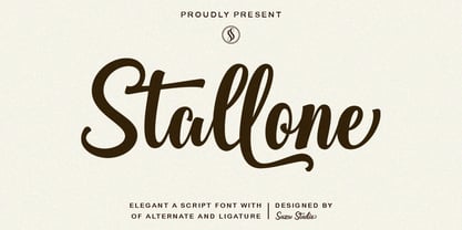 Stallone is a stunning Elegant Script font with a classic retro style, regular artistic swirls, coming together to create a distinctive, high-quality and exclusive typeface that will bring vintage charm to your designs. This font is created with advanced OpenType functionality and has the best quality guarantee, contains stylistic and contextual alternatives, ligatures and other features; all to give you complete control and customization capabilities. It contains all the characters and symbols you need, including all punctuation and numbers.
 - Bloom Lover by Reyrey Blue Std,
$14.00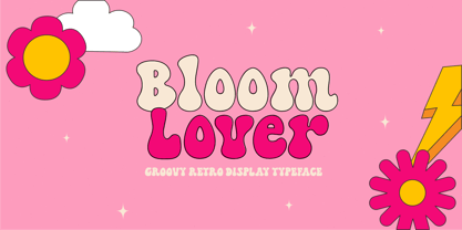 Introducing Bloom Lover Typeface. Bloom Lover is a modern, bold and playful display font with retro and groovy style concept. This font comes in 2 styles, Regular and Outline version. This font is perfect for all of your retro designs, procreate designs, social media, shirts, stickers, branding, logos, prints, Cricut projects, svg designs and and other design what you want. Features : · All Uppercase and Lowercase · Number & Symbol · Supported Languages · Alternates and Ligatures · PUA Encoded Hope you enjoy with our font!
 - Lethbridge by Factory738,
$15.00 Introducing Lethbridge a luxury handwritten font with a personal touch. Lethbridge script is ideal for a variety of projects that require a handwritten touch, such as branding and logo designs, wedding invitations and stationery, social media posts and advertisements. Lethbridge Script (Regular, Caps, and Tails) Basic Latin A-Z and a-z Numerals & Punctuation Stylistic Ligatures Multilingual Support for ä ö ü Ä Ö Ü … OTF file format Free updates and feature additions Thanks for looking, and I hope you enjoy it.
 - FF Folk by FontFont,
$41.99 Italian type designer Maurizio Osti and American type designer Jane Patterson created this display FontFont in 2003. The family contains 4 weights and is ideally suited for advertising and packaging, music and nightlife as well as poster and billboards. FF Folk provides advanced typographical support with features such as ligatures, alternate characters, case-sensitive forms, and stylistic alternates.The font was based on the original alphabet created by Ben Shahn in 1940. It comes with proportional lining and tabular lining figures.
 - GHEA Samo by Edik Ghabuzyan,
$30.00 GHEA News is a super family font. It has 8 upright weights and their Italics and supports Latin, Armenian and Cyrillic alphabet systems. The weights from Regular to Bold and their Italics can be used as text fonts. The weights thicker than Bold can be used as Display fonts. It is an easily readable two side serif font and the eyes don't get tired while reading. GHEA News has a contrast style and at the same time is quite bright and clear.