10,000 search results
(0.098 seconds)
- Mr Palker by Letterhead Studio-YG,
$35.00 A slab serif Mr Palker and grotesque Mr Palkerson build one superfamily together. These are blank types. In a way even the display ones. Typefaces for newspapers, announcements, cheap advertising and police posters. Mr Palker and Mr Palkerson will turn every language into a fence. And due to six types of faces one can choose what material should the fence be made from — from Thin steel rods to the Black stone blocks. In their simplest appearance Mrs P&P are intended for the solid blank composition in victorian or industrial style. They are quite decent, a bit old-fashioned slab serif and grotesque with closed aperture. All my types have layers. Walker and Palkerson also do. Besides the standard set of symbols, they have 4 add-ons. 1. Alternate glyphs, including unicase ones. 2. Ligatures with A letter. 3. Extra tall small caps. 4. Two-storey ligatures. All this options are intended for the complex composition. The additional letters are rather eccentric as their main function here is to imitate the victorian oddities. Imitate, parody, just not repeat. There are lower-case As and Es in the set in height of small caps and uppercases. They can turn every writing into the unicase. The lower-case A (as well as uppercase and small caps version of it) has deliberately by my taste grown a ludicrous tail. To compensate it I’ve built all the possible ligatures - ад, ал, ая. There are 35 of this ligatures all together. Take a closer look at the Russian letters D, L, K, Ya from the main set as well as their alternates. The additional glyphs are one more comic than the other — on purpose to imitate (not to repeat!) the victorian set. This sets have lowercase numbers. And small caps numbers as well. What a modern typeface without them. They also have an У-letter with a generously curvy tail. As if before the WWI. The Latin of course has alternates as well. It has letters to make the perfect French sound more like the russian provincial version of it. The tails of Js and Ts can be made a little bit more open — or a little bit closed. My favorite feature here, an invention of a kind - extra tall small caps. It allows to compose logos with the small caped uppercases directly from the keyboard. The small caps of this typefaces are usually much taller than the customary ones. This is the kind of small caps that Palker and Palkerson have. More to that, the strokes’ weight and the letters width are corresponded to the uppercases. Just a ready set for making a logo a la 1913 style. With a unicase, one has to mind! One more trick with the tall small caps is a possibility to make them work like lower uppercases. Their height is just in between of lower- and uppercases. Isn’t it great to have an additional set of uppercase working ponies in stock for the case of emergency. And finally — the trademark of Palkers family, two-storey ligatures. They are made in the height of uppercases and turn every writing into an ornament or a puzzle of a kind, while at the same time making them much shorter. Each face has 90 of them. Mainly those are twins: CC, BB, DD and so on. ll this things are for the unhasty compositing, even for lettering. Which means that for the things which are not there you always should have Command+Option+O and some patience. Also — among the two storey ligatures one also can find some belvedere villas. All my types are glasses from the one kaleidoscope. The P&Ps family was preliminary part of the victorian set, which already has 1 Cents and Clarendorf - optionally one can add Costro, Gordoni, Handy, Guardy, Surplus, Red Ring, Red Square, Babaev to the list. And also Sklad, Odessa, Dreamland, Romb, Platinum - here, at Letterhead’s, every second one is victorian. All together our typefaces can allow one to set advertisement of any kind, even the trickiest one, and compose everything, from the coffee place’s menu to the antiquarian magazine.
 - Mr Palkerson by Letterhead Studio-YG,
$35.00 A grotesque Mr Palkerson and slab serif Mr Palker build one superfamily together. These are blank types. In a way even the display ones. Typefaces for newspapers, announcements, cheap advertising and police posters. Mr Palker and Mr Palkerson will turn every language into a fence. And due to six types of faces one can choose what material should the fence be made from — from Thin steel rods to the Black stone blocks. In their simplest appearance Mrs P&P are intended for the solid blank composition in victorian or industrial style. They are quite decent, a bit old-fashioned slab serif and grotesque with closed aperture. All my types have layers. Walker and Palkerson also do. Besides the standard set of symbols, they have 4 add-ons. 1. Alternate glyphs, including unicase ones. 2. Ligatures with A letter. 3. Extra tall small caps. 4. Two-storey ligatures. All this options are intended for the complex composition. The additional letters are rather eccentric as their main function here is to imitate the victorian oddities. Imitate, parody, just not repeat. There are lower-case As and Es in the set in height of small caps and uppercases. They can turn every writing into the unicase. The lower-case A (as well as uppercase and small caps version of it) has deliberately by my taste grown a ludicrous tail. To compensate it I’ve built all the possible ligatures - ад, ал, ая. There are 35 of this ligatures all together. Take a closer look at the Russian letters D, L, K, Ya from the main set as well as their alternates. The additional glyphs are one more comic than the other — on purpose to imitate (not to repeat!) the victorian set. This sets have lowercase numbers. And small caps numbers as well. What a modern typeface without them. They also have an У-letter with a generously curvy tail. As if before the WWI. The Latin of course has alternates as well. It has letters to make the perfect French sound more like the russian provincial version of it. The tails of Js and Ts can be made a little bit more open — or a little bit closed. My favorite feature here, an invention of a kind - extra tall small caps. It allows to compose logos with the small caped uppercases directly from the keyboard. The small caps of this typefaces are usually much taller than the customary ones. This is the kind of small caps that Palker and Palkerson have. More to that, the strokes’ weight and the letters width are corresponded to the uppercases. Just a ready set for making a logo a la 1913 style. With a unicase, one has to mind! One more trick with the tall small caps is a possibility to make them work like lower uppercases. Their height is just in between of lower- and uppercases. Isn’t it great to have an additional set of uppercase working ponies in stock for the case of emergency. And finally — the trademark of Palkerson family, two-storey ligatures. They are made in the height of uppercases and turn every writing into an ornament or a puzzle of a kind, while at the same time making them much shorter. Each face has 90 of them. Mainly those are twins: CC, BB, DD and so on. ll this things are for the unhasty compositing, even for lettering. Which means that for the things which are not there you always should have Command+Option+O and some patience. Also — among the two storey ligatures one also can find some belvedere villas. All my types are glasses from the one kaleidoscope. The P&Ps family was preliminary part of the victorian set, which already has 21 Cents and Clarendorf - optionally one can add Costro, Gordoni, Handy, Guardy, Surplus, Red Ring, Red Square, Babaev to the list. And also Sklad, Odessa, Dreamland, Romb, Platinum - here, at Letterhead’s, every second one is victorian. All together our typefaces can allow one to set advertisement of any kind, even the trickiest one, and compose everything, from the coffee place’s menu to the antiquarian magazine.
 - Shenandoah Clarendon by Megami Studios,
$7.50 With a hint of flair and some nice update touches, Shenandoah Clarendon is a beautiful and modernized revival of the traditional Clarendon font. Adding new glyphs and measurements into the mix, it's sure to add a distinctive touch to your works!
 - Green Fairy by Maria Montes,
$39.00 Green Fairy is a chromatic font family highly ornamented for display purposes. Green Fairy’s characters have been specifically designed to accommodate its loops and ornaments following a modern typeface structure. Green Fairy has four chromatic weights: 1. Green Fairy Outline 2. Green Fairy Dots 3. Green Fairy Stencil 4. Green Fairy Full The outline weight has been created as the base or structure for the other weights. You can combine these weights as well as add colours to obtain multiple effects and type styles. Green Fairy has also three combined weights (combos) to simplify your work flow, for these occasions when you only want to use one single colour in your font: 5. Green Fairy Dots Combo 6. Green Fairy Stencil Combo 7. Green Fairy Full Combo GREEN FAIRY ORIGINS The origin of this typeface is the lettering I designed in October 2015 as part of my illustrated cocktail artwork called “Absinthe. La Fée Verte (The Green Fairy)”. Originally, this lettering only featured eight letters “AB·SINTHE” vector drawn in Illustrator. Right after creating the full-colour artwork, I designed a fountain-letterpress print version of it, in collaboration with Ladies of Letters, A.K.A. Carla Hackett and Amy Constable from Saint Gertrude Fine Printing. At the beginning of 2016 –and thanks to the project @36daysoftype– I found the motivation, and most importantly the deadline, to draw the rest of the twenty-six letters of the uppercase alphabet using Illustrator. I started 2017 having my first two calligraphy courses sold out, so I took this amazing opportunity to devote myself to Green Fairy for a few months. In February 2017, I purchased the font software Glyphs and I started to re-draw all twenty-six letters of the uppercase alphabet again. PRODUCTION PROCESS Green Fairy started being one weight, but quickly turned into a layered/chromatic font. Things were going more or less fine till I arrived to the Dots weight: 1) I started drawing squares following a grid; 2) Then, the squares turned into diamonds following the same grid; 3) Then, the grid wasn’t working so well on the round letters so I tried randomising the position of the diamonds but it didn’t work; 4) So I went back to the grid, and this time scaled down the size of the diamonds creating a visual half-tone effect. I spent over four weeks working on the Dots weight and I felt like I was in the middle of a very long tunnel and I couldn’t see the light at the end. I encountered many other problems along the way but by June 2017, I felt I was back on track again. I kept working, tweaking, re-drawing and re-adjusting, and then the diacritics came on board… And then more re-drawing, re-tweaking, re-adjusting and then numbers… And then spacing, symbols, and currencies… And then more spacing, kerning, contextual kerning for triplets… In September 2017 I told myself “that’s it, I’m going to finish it now!” But guess what? More re-tweaking, testing, hinting, testing, rendering, testing… For those of you not familiarized with typeface design, it is extremely time consuming and it requires a lot of hard work, focus and determination. This project could not have been possible without the help of these generous professionals: Jose Manuel Urós, typeface designer based in Barcelona and my teacher twice in the past; Jamie Clarke, freelance letterer and typeface designer who has released a couple of chromatic fonts recently; Troy Leinster, Australian full-time typeface designer living and working in New York City; Noe Blanco, full-time typeface designer and hinting specialist based in Catalonia; And Nicole Phillips, typographer currently relocating from Australia to New Zealand. To all of you: THANK YOU VERY MUCH!
 - MTF Gosh Darn Trouble Maker by Miss Tiina Fonts,
$12.00 Gosh Darn Trouble Maker is a fresh and fun sans-serif font capable of adding a whimsical touch to your designs. Add it to covers, branding materials, packaging, or anything. You’ll love its fantastic legibility and alternates!
 - Chive Turkey JNL by Jeff Levine,
$29.00Chive Turkey JNL is a solid version of Jeff Levine's inline font, Toucan Tango JNL. This bold and sassy sans serif has the great retro look of hand lettering and can really add some punch to ad copy. - Sejen by Differentialtype,
$10.00 Sejen is a beautiful and elegant font, perfect for branding, logos, invitation cards, and more. Adding it to any of your projects will add a touch of luxury. This font is PUA encoded, which means you can access all of the glyphs and swashes with ease!
 - Langit Salju by Aisyah,
$12.00 This casual handwriting font adds a touch of personality and charm to any project. With its organic, flowing lines and unique character, it captures the essence of natural handwriting while remaining legible and easy to read. The font is perfect for adding a natural touch to invitations, posters, social media graphics, and more. Its versatility makes it a great choice for a wide range of creative projects. Whether you're looking to add a fun and casual vibe or simply want to create something that stands out, this handwriting font is the perfect choice.
 - Feodalist by Warung Grafis 62,
$15.00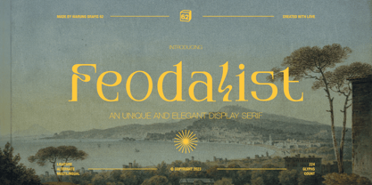 Feodalist is a timeless serif font that effortlessly embodies elegance and luxury. Its classic design, with a touch of uniqueness, adds sophistication to various projects. With meticulously crafted letterforms, Feodalist seamlessly fuses tradition and modernity. The font encompasses: - Uppercase and lowercase letters - Symbols, numbers, and punctuation - Ligatures and alternates for added versatility - Multilingual support for broader usability.
 - Cool Cat by Fox7,
$10.00 Cool Cat is a fun and comfortable handwritten font that is easy to read. You can use it for various projects, such as blog posts, logos, branding, ads, invitations, greeting cards, planners, photo albums, decorations, and much more. Add it to any of your designs, and enjoy the results!
 - Stardelle by Letterhanna Studio,
$19.00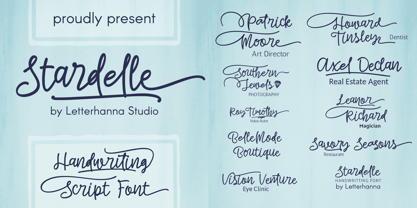 "Introducing 'Stardelle,' a bold and beautifully handcrafted font that adds a touch of elegance to your designs. With its flowing lines and abundant swashes, 'Stardelle' exudes charm and sophistication. This handwritten font is perfect for adding a personal and artistic flair to invitations, posters, branding, and more. Let 'Stardelle' illuminate your creativity and bring a touch of magic to your projects."
 - Emily Cute by Fox7,
$12.00 Emily Cute is a cute lettered handwritten font that is easy to read and joyful. You can use it for various projects, such as blog posts, logos, branding, ads, invitations, greeting cards, planners, photo albums, decorations, and much more. Add it to any of your designs, and enjoy the results!
 - Mane by BaronWNM,
$14.00 Mane is a display font with a slant block shape. thick on the vertical line and thin on the horizontal line. have a firm and solid impression. Suitable for writing titles, posters, games, ad taglines, sports, space, etc. has an alternate start and end on each capital letter and several ligatures in order to add variations to each usage.
 - Madison 01 by Fateh.Lab,
$10.00 Madison 01 is a bold, powerful and sporty font, perfect for sports logos, branding, posters, clothing designs with a bold and confident look. and also suitable for editorial / web titles. by adding some very detailed illustrations, of course this is very helpful to add elements to the design that you will make.
 - Purely Woman by Sronstudio,
$23.00 Purely Woman - Monoline Font This elegant script font features fluid strokes and delicate serifs that exude sophistication and luxury. Its detailed and precise letters are perfect for adding a touch of refinement to wedding invitations, branding, packaging, and more. With its timeless style and versatility, this font adds a touch of class to any project. Features: Uppercase and lowercase letters Alternates Ligatures Multilingual, numerals, and punctuation Thank You!
 - Meow ROB by TypeSETit,
$20.00 Meow ROB is a mono weight family with a variety of styles. Each font in the family could be considered a stand alone font, but combined, the whole family works eclectically and harmoniously to add a fun, whimsy look to your posters, ads, invitations and similar designs.
 - MPI Arcadian by mpressInteractive,
$5.00 Arcadian was first produced in wood type around 1870 by William H. Page & Company. It is a semi-ornamented face based on a French Clarendon, with dots added to the median and the tops and bottoms of the letters. It has a distinctly “Old West” feel, and was likely used to add a little pizzazz to advertising and broadsides of the time.
 - Milking by WAP Type,
$20.00 Milk is a bouncy and quirky display font. It will add a fresh and contemporary touch to your designs. Add this unique display font to each of your creative ideas and notice how it makes them stand out!
 - Fleurons Initials by Wiescher Design,
$39.50Fleurons Initials is a set of elegantly decorated blocked initials, reminiscent of old Jazz and Circus Posters. I have added one set of flat underlays and one of blocked underlays, so you can easily add a little colorful touch here and there. Easy because those underlays have the the same spacing! Have fun. Your elegant designer, Gert Wiescher - Buddy Kids by Fox7,
$10.00 Buddy Kids is a fun-lettered handwritten font that is easy to read. You can use it for various projects, such as blog posts, logos, branding, ads, invitations, greeting cards, planners, photo albums, decorations, and much more. Add it to any of your designs, and enjoy the results!
 - Affair by Sudtipos,
$99.00 Type designers are crazy people. Not crazy in the sense that they think we are Napoleon, but in the sense that the sky can be falling, wars tearing the world apart, disasters splitting the very ground we walk on, plagues circling continents to pick victims randomly, yet we will still perform our ever optimistic task of making some little spot of the world more appealing to the human eye. We ought to be proud of ourselves, I believe. Optimism is hard to come by these days. Regardless of our own personal reasons for doing what we do, the very thing we do is in itself an act of optimism and belief in the inherent beauty that exists within humanity. As recently as ten years ago, I wouldn't have been able to choose the amazing obscure profession I now have, wouldn't have been able to be humbled by the history that falls into my hands and slides in front of my eyes every day, wouldn't have been able to live and work across previously impenetrable cultural lines as I do now, and wouldn't have been able to raise my glass of Malbeck wine to toast every type designer who was before me, is with me, and will be after me. As recently as ten years ago, I wouldn't have been able to mean these words as I wrote them: It’s a small world. Yes, it is a small world, and a wonderfully complex one too. With so much information drowning our senses by the minute, it has become difficult to find clear meaning in almost anything. Something throughout the day is bound to make us feel even smaller in this small world. Most of us find comfort in a routine. Some of us find extended families. But in the end we are all Eleanor Rigbys, lonely on the inside and waiting for a miracle to come. If a miracle can make the world small, another one can perhaps give us meaning. And sometimes a miracle happens for a split second, then gets buried until a crazy type designer finds it. I was on my honeymoon in New York City when I first stumbled upon the letters that eventually started this Affair. A simple, content tourist walking down the streets formerly unknown to me except through pop music and film references. Browsing the shops of the city that made Bob Dylan, Lou Reed, and a thousand other artists. Trying to chase away the tourist mentality, wondering what it would be like to actually live in the city of a billion tiny lights. Tourists don't go to libraries in foreign cities. So I walked into one. Two hours later I wasn't in New York anymore. I wasn't anywhere substantial. I was the crazy type designer at the apex of insanity. La La Land, alphabet heaven, curves and twirls and loops and swashes, ribbons and bows and naked letters. I'm probably not the very first person on this planet to be seduced into starting an Affair while on his honeymoon, but it is something to tease my better half about once in a while. To this day I can't decide if I actually found the worn book, or if the book itself called for me. Its spine was nothing special, sitting on a shelf, tightly flanked by similar spines on either side. Yet it was the only one I picked off that shelf. And I looked at only one page in it before walking to the photocopier and cheating it with an Argentine coin, since I didn't have the American quarter it wanted. That was the beginning. I am now writing this after the Affair is over. And it was an Affair to remember, to pull a phrase. Right now, long after I have drawn and digitized and tested this alphabet, and long after I saw what some of this generation’s type designers saw in it, I have the luxury to speculate on what Affair really is, what made me begin and finish it, what cultural expressions it has, and so on. But in all honesty it wasn't like that. Much like in my Ministry Script experience, I was a driven man, a lover walking the ledge, an infatuated student following the instructions of his teacher while seeing her as a perfect angel. I am not exaggerating when I say that the letters themselves told me how to extend them. I was exploited by an alphabet, and it felt great. Unlike my experience with Ministry Script, where the objective was to push the technology to its limits, this Affair felt like the most natural and casual sequence of processions in the world – my hand following the grid, the grid following what my hand had already done – a circle of creation contained in one square computer cell, then doing it all over again. By contrast, it was the lousiest feeling in the world when I finally reached the conclusion that the Affair was done. What would I do now? Would any commitment I make from now on constitute a betrayal of these past precious months? I'm largely over all that now, of course. I like to think I'm a better man now because of the experience. Affair is an enormous, intricately calligraphic OpenType font based on a 9x9 photocopy of a page from a 1950s lettering book. In any calligraphic font, the global parameters for developing the characters are usually quite volatile and hard to pin down, but in this case it was particularly difficult because the photocopy was too gray and the letters were of different sizes, very intertwined and scan-impossible. So finishing the first few characters in order to establish the global rhythm was quite a long process, after which the work became a unique soothing, numbing routine by which I will always remember this Affair. The result of all the work, at least to the eyes of this crazy designer, is 1950s American lettering with a very Argentine wrapper. My Affair is infused with the spirit of filete, dulce de leche, yerba mate, and Carlos Gardel. Upon finishing the font I was fortunate enough that a few of my colleagues, great type designers and probably much saner than I am, agreed to show me how they envision my Affair in action. The beauty they showed me makes me feel small and yearn for the world to be even smaller now – at least small enough so that my international colleagues and I can meet and exchange stories over a good parrilla. These people, whose kindness is very deserving of my gratitude, and whose beautiful art is very deserving of your appreciation, are in no particular order: Corey Holms, Mariano Lopez Hiriart, Xavier Dupré, Alejandro Ros, Rebecca Alaccari, Laura Meseguer, Neil Summerour, Eduardo Manso, and the Doma group. You can see how they envisioned using Affair in the section of this booklet entitled A Foreign Affair. The rest of this booklet contains all the obligatory technical details that should come with a font this massive. I hope this Affair can bring you as much peace and satisfaction as it brought me, and I hope it can help your imagination soar like mine did when I was doing my duty for beauty.
 - Andeeta by Tlatous Type,
$19.00 Andeeta! A sweet handwritten font that will add fun to your creativity. the font consist of a charming all-caps font and a sweet handwritten script font for the perfect and fun blend of your content. Andeeta has also added 26 doodles to add interest to your content in separate files. Each font file includes uppercase, lowercase, numbers, punctuation, and multilingual support. That's it! I hope you enjoy it. Feel free to comment if there are issues or queries. You can also say hi to me on Instagram: https://www.instagram.com/tlatoustype/ Thank You!
 - Marsha & Joshua by Tlatous Type,
$19.00 Marsha & Joshua! A sweet handwritten font that will add fun to your creativity. the font consist of a charming all-caps font and a sweet handwritten script font for the perfect and fun blend of your content. Marsha & Joshua has also added 26 doodles to add interest to your content in separate files. Each font file includes uppercase, lowercase, numbers, punctuation, and multilingual support. That's it! I hope you enjoy it. Feel free to comment if there are issues or queries. You can also say hi to me on Instagram: https://www.instagram.com/tlatoustype/ Thank You!
 - Obdulia by Andinistas,
$39.9520g Rosadelia + 200g Alcira + 2 tablespoons Heleodora + 1 cup ninja stock + 100g Lucrecia + 2 tablespoons lirrot. REDUCE to a medium heat and melt the grunge. Add the photo and color and sauté for 5 minutes or until softened. Add the design, stock and andinistas and simmer until slightly thickened. Serve immediately with Dingbats and handwriting South America. - Abdo Joody by Abdo Fonts,
$29.50 Abdo Joody is a straight style. This is an OpenType Font supporting Arabic, Persian and Urdu and compatible with the various operation systems and modern software. The combination of square Kufi and modern styles made it a beautiful typeface, appropriate to titles and text, and able to meet the desire of the user in the design of ads and modern designs of various types of audio and visual. I will add more weights of this font with Allah willing.
 - Squalo by Letritas,
$30.00 Squalo, the genesis The idea of this project called Squalo popped into my mind while I was working with excitement on some sketches. I was chasing after a strong typographical character, something that for me has to be crystallized in form which is always legible and functional. The concept The concept of Squalo arises from the observation of an athlete’s body: you notice that even if most are lean, they are also strong, cut and chiselled. The sport they play molds and modify their bodies. Just think, for instance, on a professional swimmer: during the competition every single muscle, tendon, tissue, cell is working to swim faster. Every single part is there to give strength and speed like in a “squalo” (shark in italian). Not as an eel, nor as a mermaid, nor as a hake. Just like a shark. If you take a quick look, you will notice that the width of the typeface is slightly more condensed than that of a standard sans serif. We designed Squalo this way specifically to assist and strengthen your concepts through stylized typography. We designed the joins and terminals (tip ends) of the characters A, V, W, Z, v, w, z, to create a feeling of “tension”, reinforcing the concept of shark, danger, caution, as well explicit, intentional movement. Pure strength. We wanted to recall the exact moment of the start of the 100 meters race: when the sprinter initially spreads all of his powerful energy. The italic version, starting with the former two typographical concepts of width and tension, emphasizes them. First of all, we compressed the characters 10 percent more, and slanted it 10 degrees to the right. With this movement I intended to convey the gorgeous feeling of tension in power and rapidity. The typeface has 9 weights, from “hair” to “black”, and two versions, “regular” and “italic”. All 18 fonts include small caps, unicase, tabular and oldstyle numbers, numerators and denominators, and much more. Squalo is an ideal typeface that I recommend for use in marketing campaigns, design of packaging, magazines, branding for tv programs, films, book texts, editorial, publications, logos, corporate projects, web texts, and graphic design in motion. Squalo supports the following languages: Abenaki, Afaan Oromo, Afar, Afrikaans, Albanian, Alsatian, Amis, Anuta, Aragonese, Aranese, Aromanian, Arrernte, Arvanitic (Latin), Asturian, Atayal, Aymara, Bashkir (Latin), Basque, Bemba, Bikol, Bislama, Bosnian, Breton, Cape Verdean Creole, Catalan, Cebuano, Chamorro, Chavacano, Chichewa, Chickasaw, Cimbrian, Cofán, Corsican Creek,Crimean Tatar (Latin),Croatian, Czech, Dawan, Delaware, Dholuo, Drehu, Dutch, English, Estonian, Faroese, Fijian Filipino, Finnish, Folkspraak, French, Frisian, Friulian, Gagauz (Latin), Galician, Ganda, Genoese, German, Gikuyu, Gooniyandi, Greenlandic (Kalaallisut)Guadeloupean, Creole, Gwich’in, Haitian, Creole, Hän, Hawaiian, Hiligaynon, Hopi, Hotcąk (Latin), Hungarian, Icelandic, Ido, IgboI, locano, Indonesian, Interglossa, Interlingua, Irish, Istro-Romanian, Italian, Jamaican, Javanese (Latin), Jèrriais, Kala Lagaw Ya, Kapampangan (Latin), Kaqchikel, Karakalpak (Latin), Karelian (Latin), Kashubian, Kikongo, Kinyarwanda, Kiribati, Kirundi, Klingon, Ladin, Latin, Latino sine Flexione, Latvian, Lithuanian, Lojban, Lombard, Low Saxon, Luxembourgish, Maasai, Makhuwa, Malay, Maltese, Manx, Māori, Marquesan, Megleno-Romanian, Meriam Mir, Mirandese, Mohawk, Moldovan, Montagnais, Montenegrin, Murrinh-Patha, Nagamese Creole, Ndebele, Neapolitan, Ngiyambaa, Niuean, Noongar, Norwegian, Novial, Occidental, Occitan, Old Icelandic, Old Norse, Oshiwambo, Ossetian (Latin), Palauan, Papiamento, Piedmontese, Polish, Portuguese, Potawatomi, Q’eqchi’, Quechua, Rarotongan, Romanian, Romansh, Rotokas, Sami (Inari Sami), Sami (Lule Sami), Sami (Northern Sami), Sami (Southern Sami), Samoan, Sango, Saramaccan, Sardinian, Scottish Gaelic, Serbian (Latin), Seri, Seychellois Creole, Shawnee, Shona, Sicilian, Silesian, Slovak, Slovenian, Slovio (Latin), Somali, Sorbian (Lower Sorbian), Sorbian (Upper Sorbian), Sotho (Northern), Sotho (Southern), Spanish, Sranan, Sundanese (Latin), Swahili, Swazi, Swedish, Tagalog, Tahitian, Tetum, Tok Pisin, Tokelauan, Tongan, Tshiluba, Tsonga, Tswana, Tumbuka, Turkish, Turkmen (Latin), Tuvaluan, Tzotzil, Uzbek (Latin), Venetian, Vepsian, Volapük, Võro, Wallisian, Walloon, Waray-Waray, Warlpiri, Wayuu, Welsh, Wik-Mungkan, Wiradjuri, Wolof, Xavante, Xhosa, Yapese, Yindjibarndi, Zapotec, Zulu, Zuni
 - Curro by Bon Bon Lab,
$12.00 Curro is a handwritten font that radiates joy and happiness. With playful and charming curves, this typeface adds a lighthearted touch to any design. Whether it's crafting greeting cards, designing invitations, or adding a touch of whimsy to your branding. Curro will uplift and captivate your audience. Unlock a world of positivity and vibrant creativity with this font, and let your designs come alive with the infectious spirit of happiness.
 - DB Doodledeedoo by Illustration Ink,
$3.00DB Doodledeedoo is great for adorning a scrapbook page or adding a nice to touch to a card or invitation. Adds child like art to to give all your creations that fun home and family touch. - Almond Buttery by Nurrontype,
$17.00 Introducing "Almond Buttery" - A Playful and Retro Bold Font with Curvy Elegance and Stylistic Flair Get ready to infuse your designs with a touch of whimsy and nostalgia with "Almond Buttery," a dynamic and bold font that pays homage to the retro aesthetic while adding a modern twist. With its curvaceous letterforms and an array of stylistic alternates, "Almond Buttery" is a versatile typeface that's ready to add character and charm to your projects.
 - Steffi by Epiclinez,
$18.00 This font is perfect for adding a little love and warmth to your designs--in a way that feels authentic and personal. Whether you're designing a t-shirt or logo, this cute hand-drawn font will add a friendly touch to any project. So what’s included : Basic Latin Uppercase and Lowercase Numbers, symbols, and punctuations Multilingual Support. Simple Installations works on PC & Mac Thank You.
 - Signature Present by Fikryal,
$23.00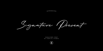 Signature Present – Signature Font is a meticulously crafted typeface that exudes elegance and sophistication. This font is designed to add a touch of personal flair and exclusivity to your projects, making it an ideal choice for various creative endeavors. With its exquisite strokes and graceful curves, Signature Present embodies the art of calligraphy, making it perfect for adding a luxurious and handwritten feel to your designs.
 - Teenage Dreams by Indieground Design,
$10.00 This handwritten font is ideal for bringing back 90s nostalgic atmospheres. With its indie nature, this grungy font will add a touch of spontaneity and style to any creative project. This font recreates the atmospheres of our teenage years in the 90s, when we listened to Smashing Pumpkins, wore Chucks, and went to indie gigs. We love thinking about that time of wonder, discovery and imagination, and Teenage Dreams is perfect for bringing them back into our creative projects. Achieve a realistic handwritten effect by mixing the 4 different versions in titles and covers, instantly creating typographic artwork with an alternative, intimate attitude. On top of that, we also added a 5th bonus version of this dreamy font, with scribbles and drawings you can add to your compositions. This way, you will get a grungy scrapbook effect while adding intensity and style to any project. It is awesome when used on dark, noisy backgrounds, or used on top of images and photographs!
 - Fashion Signature by Letterara,
$14.00 Fashion Signature is an enchanting handwritten font. This versatile Monoline font has a wide spectrum of applications ranging from greeting cards, fashion, weddings, posters, beauty cosmetics, and logos to headlines and is guaranteed to add a romantic or casual feel to your next project. Add it confidently to your projects, and you will love the results. This font is PUA encoded which means you can access all the beautiful glyphs and swashes with ease! Add to your collection for future Design and projects!
 - Print Shop Cuts JNL by Jeff Levine,
$29.00 Once again, another eclectic mix of vintage cartoons, ad cuts, sales builders, dingbats, borders and embellishments come together in Print Shop Cuts JNL. These charming images add that touch of "retro" to any digital or print project.
 - Tecna Dark Up Triangle BNF by Descarflex,
$30.00 The Tecn@ Dark&Light Triangle Background Nomenclature Font family is differentiated by the direction of the triangle tip in the 4 cardinal points. The family were designed to head, enumerate, indicate or highlight writings or design plans, for this reason, the characters are available only in capital letters and some signs or symbols that can serve such purposes. A triangle or empty character is included so that the user can use it overlaying any character of his choice or to be used alone. What is Lorem Ipsum? Lorem Ipsum is simply dummy text of the printing and typesetting industry. Lorem Ipsum has been the industry's standard dummy text ever since the 1500s, when an unknown printer took a galley of type and scrambled it to make a type specimen book. It has survived not only five centuries, but also the leap into electronic typesetting, remaining essentially unchanged. It was popularised in the 1960s with the release of Letraset sheets containing Lorem Ipsum passages, and more recently with desktop publishing software like Aldus PageMaker including versions of Lorem Ipsum. Why do we use it? It is a long established fact that a reader will be distracted by the readable content of a page when looking at its layout. The point of using Lorem Ipsum is that it has a more-or-less normal distribution of letters, as opposed to using 'Content here, content here', making it look like readable English. Many desktop publishing packages and web page editors now use Lorem Ipsum as their default model text, and a search for 'lorem ipsum' will uncover many web sites still in their infancy. Various versions have evolved over the years, sometimes by accident, sometimes on purpose (injected humour and the like). Where does it come from? Contrary to popular belief, Lorem Ipsum is not simply random text. It has roots in a piece of classical Latin literature from 45 BC, making it over 2000 years old. Richard McClintock, a Latin professor at Hampden-Sydney College in Virginia, looked up one of the more obscure Latin words, consectetur, from a Lorem Ipsum passage, and going through the cites of the word in classical literature, discovered the undoubtable source. Lorem Ipsum comes from sections 1.10.32 and 1.10.33 of "de Finibus Bonorum et Malorum" (The Extremes of Good and Evil) by Cicero, written in 45 BC. This book is a treatise on the theory of ethics, very popular during the Renaissance. The first line of Lorem Ipsum, "Lorem ipsum dolor sit amet..", comes from a line in section 1.10.32. The standard chunk of Lorem Ipsum used since the 1500s is reproduced below for those interested. Sections 1.10.32 and 1.10.33 from "de Finibus Bonorum et Malorum" by Cicero are also reproduced in their exact original form, accompanied by English versions from the 1914 translation by H. Rackham. Where can I get some? There are many variations of passages of Lorem Ipsum available, but the majority have suffered alteration in some form, by injected humour, or randomised words which don't look even slightly believable. If you are going to use a passage of Lorem Ipsum, you need to be sure there isn't anything embarrassing hidden in the middle of text. All the Lorem Ipsum generators on the Internet tend to repeat predefined chunks as necessary, making this the first true generator on the Internet. It uses a dictionary of over 200 Latin words, combined with a handful of model sentence structures, to generate Lorem Ipsum which looks reasonable. The generated Lorem Ipsum is therefore always free from repetition, injected humour, or non-characteristic words etc.
 - Rettisha by Stripes Studio,
$15.00 Rettisha Display is a stylish serif with beautiful ligatures. Available in two styles: Normal and Expanded fonts. Designed with clean and high contrast. Add interest with adding beautiful ligatures to make your typography truly unique. Perfect for anything your creativity. To access the Opentype Ligatures you will need software that supports Opentype features in fonts and also PUA unicodes support for other software.
 - Rosamila by Stripes Studio,
$15.00 Rosamila Display is a stylish serif with beautiful ligatures. Available in two styles: Normal and Expanded fonts. Designed with clean and high contrast. Add interest with adding beautiful ligatures to make your typography truly unique. Perfect for anything your creativity. To access the Opentype Ligatures you will need software that supports Opentype features in fonts and also PUA unicodes support for other software.
 - Smiling Holiday by Create Big Supply,
$17.00 Introducing Smiling Holiday, a delightful and playful sans serif font that brings a sense of fun and joy to your designs. With its cute and unique style, Smiling Holiday is the perfect choice for projects that require a touch of whimsy and lightheartedness. Whether you're creating greeting cards, children's books, or party invitations, this font will add a cheerful and playful vibe. Smiling Holiday features both uppercase and lowercase letters, allowing you to mix and match for added creativity. The inclusion of numbers and punctuations ensures versatility and seamless integration into your designs. Express yourself in various languages with the font's multilingual support, making it accessible to a global audience. With PUA encoding, accessing all the glyphs and decorative swashes of Smiling Holiday is a breeze. Add extra flair to your designs with the included ligatures, enhancing the overall visual appeal.
 - Sterling Park by Olivetype,
$18.00 Meet Sterling Park, this font is perfect for adding a little love and warmth to your writing--in a way that feels authentic and personal. Whether you're writing love notes or cards or designing a tshirt, this hand-drawn font will add a friendly and authentic touch to your creations. So what’s included : Basic Latin Uppercase and Lowercase Numbers, symbols, and punctuations Multilingual Support. Simple Installations works on PC & Mac Thank You.
 - Broodim by Twinletter,
$18.00 The Broodim Groovy font is unique, stylish, and fun. Having an anatomical shape between thin and thick lines makes it beautiful and visually unique from most other fonts. Your project can be made more stunning by adding this font. Not only that, but this font also features cool alternative letters and ligatures to add a unique flair to your projects. Make the most of your designs by using this font today.