10,000 search results
(0.048 seconds)
- FF Mode01 by FontFont,
$30.99 Italian type designer Fabrizio Schiavi created this pi and symbols FontFont in 1995. The font is ideally suited for music and nightlife and software and gaming. It comes with proportional lining figures.
 - Hilgreds Script by FallenGraphic,
$20.00 Hilgreds Script is an amazing handwritten font and includes several alternates. This font will make your design more beautiful and powerful, and is suitable for any design including branding, quotes and more.
 - Gradl Initialen ML by HiH,
$12.00 Max Joseph Gradl designed Art Nouveau jewelry in Germany. At least some of his designs were produced by Theodor Fahrner of Pforzheim, Germany -- one of the leading manufacturers of fine art jewelry on the Continent from 1855 to 1979. I don't know if he designed for Fahrner exclusively, but every example I found was produced by that firm. I assume it was also the same M.J, who edited a book, Authentic Art Nouveau Stained Glass which was reissued by Dover and is still available. For an artist as accomplished as Gradl was, he is very tough to research. There just does not seem to have been much written about him. The jeweler is visible in most of his typeface designs. They exhibit a sculptural quality as if they were modeled in clay (or gold) rather than drawn on paper. His monograms, especially, reflect that quality. Those shown in plates 112 through 116 in Petzendorfer actually appear to have been designed specifically for fabricating in the form of gold or silver pendents. Of the initial letters that came out of Germany during this period, these by Gradl seem unusually open and lyrical. They seem to be dancing on the page, rather than sitting. Please note that Gradl designed only the decorated initials. All other characters supplied were extrapolated by HiH, including the accented initials. Orn.1 (unicode E004) is based on a jeweled gold clasp designed by Gradl (please check out Gallery Image on Myfonts.com). Also included are an art nouveau girl’s face, a swan and the face from Munch’s “Scream”, from scans of old printer’s ornaments. Gradl Initialen M represents a major extension of the original release, with the following changes: 1. Added glyphs for the 1250 Central Europe, the 1252 Turkish and the 1257 Baltic Code Pages. Added glyphs to complete standard 1252 Western Europe Code Page. Special glyphs relocated and assigned Unicode codepoints, some in Private Use area. Total of 341 glyphs. Both upper & lower case provided with appropriate accents. 2. 558 Kerning Pairs. 3. Added OpenType GSUB layout features: salt, dlig, ornm and kern. 4. Revised vertical metrics for improved cross-platform line spacing. 5. Refined various glyph outlines. 6. Alternative characters: 16 upper case letters (with gaps in surrounding decorations for accents above letter). 8. Four Ornaments: face1, face2, swan and orn1 (silhouette of Gradl clasp) The zip package includes two versions of the font at no extra charge. There is an OTF version which is in Open PS (Post Script Type 1) format and a TTF version which is in Open TT (True Type)format. Use whichever works best for your applications.
 - Figgins Tuscan by HiH,
$12.00 Early in the 19th century, foundries began releasing a variety of decorated ornamental letters based on the Tuscan letterform. Fancy Tuscan letters quickly became so popular, they eventually came to represent the cluttered extremes of Victorian design. Foundries competed with each other to produce most extravagantly decorated letterforms. As often happens, success turned to excess. What is often overlooked is the long history of the Tuscan style. Early examples have been traced back to ancient Rome. Indeed, the characteristic bifurcation may have represented a fishtail to the early Christians, thus sharing in the roll of symbolic identification played by the simple drawing of a fish as a whole. Later. trifurcation was developed as an alternate termination, followed by loops, full fishtails, curls, hooks and other fancy variations. Nicolete Gray provides an extensive history in her Appendix One of NINETEENTH CENTURY ORNAMENTED TYPEFACES. According to Gray, the first metal typeface based on the Tuscan form was the Ornamented of 1817 by Vincent Figgins of London. Thorowgood followed suit in 1821, Fry in 1824 and Caslon in 1830. Each was to re-visit the form many times during the Victorian era. Here we present our interpretation of what Figgins might have produced in a basic, plain Tuscan form - free of the decorative additions. We are pretty safe here because Figgins was very creative. He explored many of the terminal variations listed above and combined them with different decorative devices to produce a constant stream of new faces to meet the demands of the marketplace. Figgins Tuscan ML represents a major extension of the original release, with the following changes: 1. Added glyphs for the 1250 Central Europe, the 1252 Turkish and the 1257 Baltic Code Pages. There are also a few glyphs for Anglo-Saxon, Gaelic and Old Gaelic. Total of 355 glyphs. 2. Added OpenType GSUB layout features: aalt, ornm and liga ˜ with total 34 lookups. 3. Added 351 kerning pairs. 4. Redesigned several glyphs: the comma, quotes, brackets, braces, acute accent, and grave accent. 5. Revised vertical metrics for improved cross-platform line spacing. Please note that some older applications may only be able to access the Western Europe character set (approximately 221 glyphs). The zip package includes two versions of the font at no extra charge. There is an OTF version which is in Open PS (Post Script Type 1) format and a TTF version which is in Open TT (True Type)format. Use whichever works best for your applications.
 - Ghibli by Eyad Al-Samman,
$- The word ‘Ghibli’ per se refers to a Saharan hot and dry wind commonly known as the Sirocco. In Arabic language, ‘Ghibli’ is known as ‘Qibli or Kibli’, meaning ‘Southern’ for those Arabic nations who live in the North of Africa. The ‘Ghibli’ wind is most common during spring and autumn, and can blow at almost 60mph; it is this wind which is responsible for the dry, dusty conditions on the Mediterranean coast of North Africa. ‘Ghibli’ can last for days making life miserable and is therefore feared by the desert dwellers in that region. It can also have profound effect on the landscape by moving vast quantities of sand and dunes. Inspired by the Studio Ghibli’s unique and magical characters, the ‘Ghibli’ typeface is designed as a Latin free and literary serif typeface. It strongly expresses transition, imagination, sharpness, characterization, and modernization. It is a literary type that can capture the eyesight of readers and other observers with its acute and stylistic letterforms, dots, and numerals. It has transitional serifs and it is generally based upon the Latin printing style of the 18th and 19th centuries, with a pronounced vertical contrast in stroke emphasis (i.e., vertical strokes being heavier than the horizontal strokes). It has more regular forms in which serifs are bracketed and more symmetrical. The main characteristic of ‘Ghibli’ typeface is in its new designed serif letters. Special letters that can be described as having modern designs include small ‘g’, ‘p’ (with their open ends), ‘x’, and capital ‘B’, ‘P’, ‘Q’, and ‘R’ (with their open ends). ‘Ghibli’ typeface has also both of lining and old-style numerals which makes it more suitable for any literary and printing purposes. This gratuitous font comes in only two weights (i.e., Ghibli Regular and Ghibli Bold). It is absolutely preferable to be used in the wide fields related to literature and publication industry. This includes typing titles of diverse literary and academic books, readable texts of novels, novellas, short stories, prose, poetry, textbooks, newspapers, and magazines. It is also notable if chosen for designs that include movies’ titles, logos of academic institutions such as colleges and universities, organizations and associations’ names, medical packages such as those dedicated for tablets and syrups, and also other different educational and social materials. ‘Ghibli’ is simply a free literary typeface dedicated for all who want to write and read using a modern and stylish serif font. Enjoy it.
 - Attractype Reborn by Garisman Studio,
$24.00 Attractype Reborn combines attractive curves with a fresh urban edge; delivering a stylish script which is guaranteed to add an eye-catching appeal to your logo designs, brand imagery, quotes, product packaging, merchandise & social media posts
 - Brainchild by Seemly Fonts,
$14.00 An exceptional handwritten typeface with simple lettering is called Brainchild. Add it to your original ideas to see how it helps them stand out since it can be readily suited to a huge range of projects.
 - Starx by Koray Özbey,
$11.00 Starx is a variable display typeface with angular lines, offering a futuristic and dynamic aesthetic. It consists of three axes: angular, rounded, and slanted. The bold version embodies a strong and high-tech expression, while the italic and rounded versions convey a dynamic, sporty, and futuristic impact.
 - FF Rian's Dingbats by FontFont,
$41.99 British type designer Rian Hughes created this pi and symbols FontFont in 1993. The family has 5 weights, and is ideally suited for poster and billboards.It provides an extensive collection of wonderful dingbats and expressive graphic cartoons. It comes with tabular lining and proportional lining figures.
 - Feminine Grace by Objectype,
$20.00 "Feminine Grace Font" by Candi Erwanto from Objectype Studio is a perfect blend of elegance and simplicity. With its neat and legible serif style, it's ideal for creating elegant and feminine wedding invitations and print materials. Bring beauty and sophistication to your designs with "Feminine Grace."
 - Milky Line by Sakha Design,
$12.00 Milky Line is a modern and elegant display font! Each letter is thoughtfully crafted with clean lines and stylish details, resulting in a sophisticated and refined look. Perfect for creating eye-catching headlines, titles, and branding materials that exude an air of professionalism and high-end quality.
 - Bulgari by Slex Studio,
$15.00 Bulgari is an organic handwritten font suitable for branding, wedding invitations, promotions, product packaging and other necessities. This font is modern, simple, but still authentic. You'll get a full set of lowercase and uppercase letters, numbers and punctuation, multilingual symbols, lowercase start and end swashes, and ligatures.
 - Raspberry Script by Mans Greback,
$59.00 Raspberry Script is a tall and characteristic script typeface. It supports hundred of Latin languages, and has several ligatures to maximize the letters' flow. The font is designed and created by Noah Kinard and Måns Grebäck. Also check out its sister fonts: Blueberry Script and Strawberry Script.
 - ITC Usherwood by ITC,
$29.99 ITC Usherwood font was designed by Leslie Usherwood, an informal and personable font which bridges the gap between modernity and tradition. There are hints of Bauer, Goudy and Augustea in this font, but ITC Usherwood remains both classic and contemporary, beautiful in form and functional in design.
 - Hedonist by Struvictory.art,
$14.00 Hedonist is a modern sans serif. The font is represented by condensed lowercase and extended uppercase. To get an elegant and contemporary design, combine them together. Hedonist is suitable for retro and modern posters, typographic prints, event design and city identity, design of books and magazines.
 - SF Topic by Sultan Fonts,
$19.99 Topic - Dedicated to writing a Big text in newspapers, magazines, road boards, book , TV and other printing products, and web pages. The Topic font contains 4 styles (Light, regular, Medium and bold) The font includes a matching Latin design and support for Arabic, Persian, Kurdish, and Urdu.
 - Fedot by Oleg Stepanov,
$20.00 Fedot is a hand-drawn font, based on shapes of early cyrillic scripts (so-called "ustav" and "poluustav"). Lowercase typesetting with its variable letter heights is more brisk and authentic, and uppercase is more equable and neutral. Some of letters are the same in lowercase and uppercase.
 - Larou by Emily Lime,
$29.00 Larou was created to be original and fun, imperfect and quirky. Letters are not uniformly sized... they are created such that the final product is unexpected and interesting. Larou includes alternates and ligatures - to assist with readability and letter flow. Try it, you will fall in love!
 - Blueberry Script by Mans Greback,
$59.00 Blueberry Script is a bold and characteristic script typeface. It supports hundred of Latin languages, and has several ligatures to maximize the letters' flow. The font is designed and created by Noah Kinard and Måns Grebäck. Also check out its sister fonts: Raspberry Script and Strawberry Script.
 - Rajin black by Sulthan Studio,
$10.00 A cool black font combined with bold letters that have lines inside is very suitable for any logo and also for all titles, both books and crafts and also used on T-shirts. comes with complete upper and lower case letters, numbers, punctuation, and language support
 - Flapstick by PizzaDude.dk,
$19.00 Flapstick is a straight forward and fun sans-serif font. It's 100% handmade and is ready for your "get well soon" cards, children's books, posters of all kinds and anything that needs an authentic handmade look! Multilingual support and alternate versions of a, g and y!
 - Fleurons Six by Wiescher Design,
$39.50 Fleurons are embellishments and this is my sixth and so far most beautiful round. I again found some nice old ones and made them completely new. These go well with many Copperplate scripts and especially with my scripts Nadine and Ellida. Your very elaborate, Gert Wiescher
 - Ovalime by Sayurihuynh,
$7.00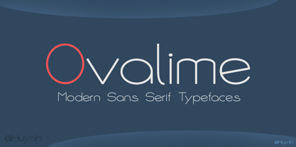 Ovalime, a modern and minimalistic sans serif typeface was designed by Ngoc Huynh. It looks stunning in every context and perfect for branding, stationery, social media posts, advertisements, product packaging, label, photography, watermark, special events, and more. Includes: - Uppercase and lowercase letters; - Multilingual symbols, numerals, and punctuation.
 - Maybelle by Monotype,
$15.99 Designed by calligrapher Rachel Yallop, Maybelle is pretty and proudly romantic, with delicate flourishes and a superbly handwritten, calligraphic sensibility. Drawn with a pointed pen and ink, this script boasts dainty loops and high contrast letterforms. Maybelle is available with some ligatures and alternate glyph shapes.
 - II Increments Sans by Increments,
$19.00 Informed by classic grotesk proportions and principles within musical theory, II Increments Sans results in a rhythmic and composed sans-serif. Set within a structured grid, the intonation and harmony between its functional principles and emotive characteristics allow for use at both text and display sizes.
 - Strawberry Script by Mans Greback,
$59.00 Strawberry Script is a stylish and characteristic script typeface. It supports hundred of Latin languages, and has several ligatures to maximize the letters' flow. The font is designed and created by Noah Kinard and Måns Grebäck. Also check out its sister fonts: Raspberry Script and Blueberry Script.
 - Alsace by 38-lineart,
$17.00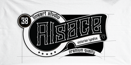 Alsace is a powerful blackletter font. It features a great look and feel and it is perfect for logos, tattoo designs, branding, stationery and much more! vintage styled and assertive display font. Thick lettered and distinct, this font will make each of your designs stand out
 - Kamaru Sans by ActiveSphere,
$30.00 Kamaru Sans is a sans-serif display font and works best in text and display applications, such as headline, posters, signage, magazine, product branding, corporate branding, logos and titles. Each style has a full upper and lower-case, accents, punctuation and a selection of monetary symbols.
 - Fonce Sans Pro by Ryan Ford,
$10.95 Fonce Sans Pro is a mono-weight, Swiss-style typeface with influences from great typefaces like Din, Helvetica, Interstate, and Trade Gothic. Its form is unique and sophisticated with an unmistakable Dutch style. It’s subtle and enjoyable, and works beautifully in both display and body copy.
 - NS Mudolf by Novi Souldado,
$35.00 NS Mudolf is inspired by the lettering of vintage prints, signs and labels. It comes with five font styles and extra swashes, ligatures and stylistic alternates. It's ideal and perfect for creating a design piece such as letterheads, posters, signage, charters, labels, packaging, logotypes, and more.
 - Galileo by Arendxstudio,
$12.00 Galileo, a vintage font family made by brush. Each letter that has been hand drawn and then scanned, which makes the font unique and special. Galileo contains 4 styles and can be used for headlines, t-shirts, logos and posters. Appreciate this project and follow us :)
 - Best Life by Sulthan Studio,
$12.00 Best life - This cool one line handwritten font is very stylish and elegant that has a great style for your work with hearts in the middle and also lowercase swashes in front and back and lowercase swashes on back and hearts in front of letters to connect.
 - Altarossa by Popskraft,
$15.00 Hey there, check out Altarossa! It's a font that blends classic elegance with the bright plasticity of nature. This natural fusion gives Altarossa a captivating charm that's both tough and tender, young and chic. The rounded corners and curvy lines of Altarossa will remind you of the fresh and light vibes of nature, perfect for designs that need a touch of natural beauty. This font is well-balanced both for headings and typography and for typing large text blocks. In addition to its captivating charm, Altarossa is the perfect font for a variety of businesses and activities. If you're in the fashion game, Altarossa's stylish yet natural vibe will elevate your brand to the next level. For sports and fitness brands, Altarossa's strong and flexible nature will perfectly represent your message. And for weddings, luxury brands, commerce, hobbies, and more, Altarossa brings a touch of elegance and sophistication that'll make your designs pop. This font is well-balanced both for headings and typography and for typing large text blocks. With its versatile and adaptable nature, Altarossa works with pretty much any project you throw its way. Don't sleep on Altarossa, it's a font that's too awesome to pass up!
 - Biwa by Wordshape,
$20.00 Biwa is a new straight-sided family of formally nuanced grotesk typefaces. Biwa’s lighter weights feel subdued, cool in tone, and neutral, while the heavier weights are more robust and full of personality. Developed over the past few years by Ian Lynam and James Todd, the 14-member Biwa family and the accompanying 14-member Biwa Display family are paeans to the immediate moment when phototype arrived on the global scene — partially smooth and partially machined. Biwa and Biwa Display are neutral in tone, have enlarged x-heights, and look amazing on-screen and in print. Each weight is designed to be highly readable in print and on-screen. The italic variations are true italics, having a single-storied italic a and have been designed for smooth, fluid reading and text-setting. Lovingly spaced and kerned, the Biwa family works equally well for text typesetting and for display design work. Languages supported include Western European, Central, and South European as well as Vietnamese. The entire family is comprised of a range of weights and a matching display family that features rounded terminals for large-scale display work. An agate version of Biwa Black is provided for free.
 - Mullen Hand by Canada Type,
$24.95 Mullen Hand is the fresh digitization and expansion of a Jerry Mullen metal typeface called Repro, originally published by ATF in 1953. The connectivity of certain letters in the original type was limited by metal technology, but this new digital version is updated to resolve those issues with. Two- and three-letter ligatures take care of the r, s, x and z connections. These ligatures are programmed in the 'liga' feature of the OpenType version, so they automatically activate in programs that support advanced typography. Casual, tall, and elegantly friendly, Mullen Hand's even strokes and confident connections embody the spirit of contentedness and reassurance sought by today's appeal designer. It accommodates a variety of applications, from posters and signs, to book and music covers and product packaging. Mullen Hand comes in all popular formats. The TrueType and PostScript versions come with 2 fonts, one of them containing the ligatures and some alternates. The OpenType version combines both fonts into one, and includes programmed features for localization, alternation and intelligent substitution. Language support includes Western, Central and Eastern European character sets, as well as Baltic, Esperanto, Maltese, Turkish, and Celtic/Welsh languages.
 - Apolline Std by Typofonderie,
$59.00 A Venetian serif in 6 styles The Apolline typeface family was created by Jean François Porchez as a means to study the transition from Renaissance writing into the first printing types. Rather than sticking to the method commonly used these days for the creation of revivals of Jenson or Bembo types, it seemed more interesting to try and get in the same mindset as those exceptional designers during this pivotal period in the history of typography. Thus Apolline is an exploration of the design methods used by people like Nicolas Jenson and his contemporaries for adapting handwriting with its multiple occurrences (a, a, a, b, b, b…) into single, unique signs (a, b…). Initially Jean François made drawings modelled after his own calligraphy. They were done at a very small size on tracing paper (2 cm high for the capitals) to preserve the irregularity of human handwriting. Besides emphasising the horizontal parts of the letter forms, the serifs were designed asymmetrically to reinforce the rhythm of the writing. The final drawings were produced at a large size (10 cm high for the capitals) to allow for subtle optimisation of specific details. The very narrow and fluid Apolline italic Influenced by various concepts for an ideal italic by Van Krimpen, Gill, etc. Apolline italic was designed at 8° degrees. Although the structure of the letterforms were informed by chancery scripts, the italic has full serifs like the roman. Very narrow and fluid, its unique design creates a good contrast when used in combination with its upright counterparts. Thanks to the presence of the serifs similar to roman typefaces it sets very neatly in large sizes. The next step was digitising the drawings with Ikarus (the pre-Bézier-curves era) to create the final roman and italic fonts. Two years later, when the family was expanded to six series the same method was used, this time with Fontographer. This was necessary for correcting a few problems caused by the conversion to Bézier outlines, and to add intermediate weights. Before the advent of feature-rich OpenType, quality type families consisted of several separate fonts for each weight to provide users with various sets of numerals, an extended ligature set and alternates, ornaments, and so on. Introducing Apolline Morisawa Awards 1993
 - Kinesthesia by Typodermic,
$11.95 Introducing Kinesthesia, the hypermodern typeface that channels the sleek, futuristic aesthetic of liquid crystal displays. With its sharp diamond points and hi-tech letterforms, Kinesthesia is the perfect choice for anyone looking to communicate their message with a cool, technical tone. Whether you’re designing a cutting-edge website, a high-tech advertisement, or a bold logo, Kinesthesia will give your work an unmistakable edge. But what sets Kinesthesia apart from other typefaces on the market? For starters, it offers a wide range of monetary symbols, as well as numeric ordinals, primes, and OpenType fractions. So whether you’re writing a report for work or creating a digital design for a client, you can be confident that Kinesthesia has all the symbols and characters you need to convey your message with precision. And of course, let’s not forget Kinesthesia’s angular design. With its sharp, diamond-shaped points, this typeface is the perfect choice for anyone looking to add a contemporary edge to their work. Available in Ultra-Light, Extra-Light, Light, Regular, Semi-Bold, Bold, and Heavy with obliques, Kinesthesia offers a wide range of weights and styles to suit any design need. So if you’re ready to take your design game to the next level, look no further than Kinesthesia. With its technical aesthetic and wide range of features, this typeface is the perfect choice for anyone looking to make a bold, unforgettable statement. Most Latin-based European writing systems are supported, including the following languages. Afaan Oromo, Afar, Afrikaans, Albanian, Alsatian, Aromanian, Aymara, Bashkir (Latin), Basque, Belarusian (Latin), Bemba, Bikol, Bosnian, Breton, Cape Verdean, Creole, Catalan, Cebuano, Chamorro, Chavacano, Chichewa, Crimean Tatar (Latin), Croatian, Czech, Danish, Dawan, Dholuo, Dutch, English, Estonian, Faroese, Fijian, Filipino, Finnish, French, Frisian, Friulian, Gagauz (Latin), Galician, Ganda, Genoese, German, Greenlandic, Guadeloupean Creole, Haitian Creole, Hawaiian, Hiligaynon, Hungarian, Icelandic, Ilocano, Indonesian, Irish, Italian, Jamaican, Kaqchikel, Karakalpak (Latin), Kashubian, Kikongo, Kinyarwanda, Kirundi, Kurdish (Latin), Latvian, Lithuanian, Lombard, Low Saxon, Luxembourgish, Maasai, Makhuwa, Malay, Maltese, Māori, Moldovan, Montenegrin, Ndebele, Neapolitan, Norwegian, Novial, Occitan, Ossetian (Latin), Papiamento, Piedmontese, Polish, Portuguese, Quechua, Rarotongan, Romanian, Romansh, Sami, Sango, Saramaccan, Sardinian, Scottish Gaelic, Serbian (Latin), Shona, Sicilian, Silesian, Slovak, Slovenian, Somali, Sorbian, Sotho, Spanish, Swahili, Swazi, Swedish, Tagalog, Tahitian, Tetum, Tongan, Tshiluba, Tsonga, Tswana, Tumbuka, Turkish, Turkmen (Latin), Tuvaluan, Uzbek (Latin), Venetian, Vepsian, Võro, Walloon, Waray-Waray, Wayuu, Welsh, Wolof, Xhosa, Yapese, Zapotec Zulu and Zuni.
 - SF Shabwa by Sultan Fonts,
$19.99 Shabwa is An Arabic typeface for Print And screen. this font family is from Kufi style and contains 3 weights: Regular, Medium and bold. Shabwa is simple and a little detailed font and its three weights are fully harmonized, one letter with one length on the line, and words with a uniform length on the line, gives a comfortable reading look.
 - Blackfire by Fype Co,
$13.00 Blackfire is a classic sans serif font that features beautiful alternates and ligatures, with regular and rounded edges in favor of a smooth and clean look. Blackfire features beautiful alternates and ligatures, allowing you to experiment with and create a multitude of stunning results. You can also use Blackfire for design projects like logotype, poster, promotional design, header, and many more.
 - FF Tsunami by FontFont,
$41.99 Dutch type designer Donald Beekman created this display FontFont in 1999. The family has 8 weights, ranging from Regular to Bold in Normal and Expanded (including italics) and is ideally suited for music and nightlife and poster and billboards. FF Tsunami provides advanced typographical support with features such as ligatures and case-sensitive forms. It comes with proportional lining figures.