5,002 search results
(0.008 seconds)
- Metropolitaines by Linotype,
$29.99This art nouveau style typeface is the one that had been used for the signage of the historic Paris metro stations. - Only One Dollar by JBFoundry,
$1.00 It isn’t very beautiful, very badly written, but it’s cheap. C'est pas bien beau, très mal écrit, mais c'est pas cher.
 - Getty Dubay by Handwriting Success,
$9.00 The Getty-Dubay® family of fonts has been 500 years in the making — so that you can make your handwriting worksheets in seconds. These fonts are modern descendants of the chancery handwriting style (now called “Italic”) from the Italian Renaissance, when master scribes designed a fluid and graceful hand, inspired by the proportions of the golden rectangle and Roman capitals. The Italic style has been in constant use since then. In modern times, it has been celebrated by Alfred Fairbank, Lloyd Reynolds and many others including authors Barbara Getty and Inga Dubay in their Getty-Dubay® Italic method. The Getty-Dubay® monoline handwriting fonts provide a replete resource to effectively model the highly-legible and beautiful Italic handwriting style. These are the official fonts of Getty-Dubay® Italic. Download the Getty-Dubay® Font Guide for everything you need to know about the Getty-Dubay® fonts. The Getty-Dubay® Joined fonts produce a clean cursive handwriting with join-as-you-type ease. Four join options are included: Standard, Pointed (altered joins into m, n and r), e k (utilizing the two-stroke e and one-stroke k), and Beginning (easiest joins only). The Getty-Dubay® Basic fonts provide sans-sarif clarity suitable for young writers. The Getty-Dubay® Precursive fonts add serifs to the lowercase letters, while retaining the pure Roman capitals of Basic Italic. The Getty-Dubay® Smallcaps fonts make mixed capitals easy to use. All Getty-Dubay® fonts come with scaffolds such as dashed contours, ruled lines, directional arrow and starting dots (for Basic and Smallcaps). They support multiple Latin-based languages from around the world. Getty-Dubay® is a registered trademark in the United States.
 - Bowler Hand by wearecolt,
$19.00 Bowler Hand has been created from hand drawn letter forms using a Rotring ink pen which gives the font a great look.
 - Francesco Decorative by Intellecta Design,
$14.95In accordance with Roman use, please note that the cap 'U' in this font has been made to look like a 'V'. - Hebrew Modern by Samtype,
$49.00 This is a classic design from the beginning of the 20th century. This font can be used in many kinds of books
 - Apple Juice by Elemeno,
$25.00Apple Juice has a straightforward, childlike simplicity, but has been divided in the middle to create a bottom-heavy contrast. Kids welcome! - Payload by Device,
$29.00 Payload began as an early concept for Loaded magazine, and here is developed into a clean outline and rough splattery spraycan version. In this font, the upper and lower case characters are subtly different enabling a more realistic appearance to be achieved by ßipping between cases whenever characters occur together in pairs. Wide and Narrow styles of this popular font have been subsequently been added. This font is reminicent of military stencilling, urban graffiti and freight packaging. The "Outline" version, as before, is a carefully weighted addition where the thickness of the stroke is identical to the stencil gap. It has also been respaced and rekerned to allow for the additional character spread.
 - Crisis by SIAS,
$29.90 Crisis is a child of the dictatorship of economics. Since time is money the time budget of its production has been rigidly limited. Crisis was designed and generated completely on one single day. The target was to make a useful font while investing nothing more than absolutely indispensable. The component-based glyph construction scheme of another font has been utilized, further detailing work has been strictly limited. Due to those restrictions some letters have rather unusual shapes. This straightforward and contemporary sans (320 glyphs) is of compact proportions and very legible even when set in small sizes. In printing you get more text on one page and thus save up to 30% of paper.
 - Vialog 1450 by Linotype,
$40.99Designed by Werner Schneider and Helmut Ness, the Vialog® 1450 typeface family has been drawn within the standards of the German DIN 1450 regulations. The typefaces conform to the DIN specifications for proportion and line thickness and also contain characters designed in accordance with its requirements. These include characters that can be easily confused, such as uppercase I and lowercase l, and the uppercase O and figure 0, with the corresponding accentuating graphemes and ligatures. In addition, letter pairs that can readily seem to merge together under less than ideal reading environments have also been redesigned. Characters like the g, J and R have also been redrawn to be more legible. Normal glyphs are available as alternatives. - Cyclic by ArtyType,
$29.00 Cyclic is a stylish and modern slab serif in three practical, highly legible weights. The name ‘cyclic’ suits this typeface in several ways. Firstly because I wanted to create an ‘all-round’ typeface (pun intended) that could adapt to most applications, but also, as the dictionary definition explains - “occurring in circles, regularly repeated”. The basis for a lot of the characters did begin with a circle or sections of one; the equally distributed, rounded forms of this font are complemented however by the vertical strokes, and further counter-balanced by angular slab serifs on the remaining glyphs. Curved alternates with a celtic vibe are also included in the fonts and feature on the default slots in the separate Cyclic Uncial set. In summary, the whole Cyclic type family comprises a combined palette of circles and straight lines; something the cubist movement would have been proud of!
 - Cyclic Uncial by ArtyType,
$29.00 Cyclic is a stylish and modern slab serif in three practical, highly legible weights. The name ‘cyclic’ suits this typeface in several ways. Firstly because I wanted to create an ‘all-round’ typeface (pun intended) that could adapt to most applications, but also, as the dictionary definition explains - “occurring in circles, regularly repeated”. The basis for a lot of the characters did begin with a circle or sections of one; the equally distributed, rounded forms of this font are complemented however by the vertical strokes, and further counter-balanced by angular slab serifs on the remaining glyphs. Curved alternates with a celtic vibe are also included in the fonts and feature on the default slots in the separate Cyclic Uncial set. In summary, the whole Cyclic type family comprises a combined palette of circles and straight lines; something the cubist movement would have been proud of!
 - Blooming Meadow by ParaType,
$25.00A set of original ornamental symbols was designed by Viktor Kharyk and licensed to ParaType in 2007. The name was inspired by the famous book “Champ Fleury” by Geoffroy Tory (1529) but the theme of blooming meadow was embodied much more literally. Each ornamental motive has a real prototype in flora. Mainly there are plants raising on Ukrainian wooded steppe. Plants were chosen for their Ukrainian and Latin names begin of proper letters from Ukrainian and Latin alphabets. The font is consisted of two styles: Day for normal and Night for reversed that reminds night lighting by its unexpected distribution of black and white areas. Fleurons may be used for creation of ornamental surfaces, composed borders and corners, decoration of any materials, and even as botanical illustrations. Blooming Meadow Day have been adjudged Award of Excellence in Type Design at TypeArt’05 international type design contest - Mixcoatl Mono by URW Type Foundry,
$19.99 The Typeface «Mixcoatl» by Elia Salvisberg was developed as a part of a course at the Lucerne School of Design and Art in 2016. Based on the book «The Empire of the Inca», a display-font has been created, which is inspired by the graphic language of the South American Empire of the Incas. At the beginning, only capital letters were designed but there was the desire for a complete typeface – which is why the missing signs were added. The font is based on a grid, so the characters are constructed equivalently and a uniform geometric font arose. The name was adopted from the god of hunting who plays an important role in the mythology of the Aztecs and appears in various forms. The uppercase letters can also be represented and combined in two alternative character-sets, so there are a lot of opportunities to combine uppercase words in different forms.
 - Poynter Serif RE by Font Bureau,
$40.00 Inspired by the work of Hendrik van den Keere, Tobias Frere-Jones and David Berlow designed a family of typefaces focused on the challenges of newsprint publishing. This version of the family is part of the Reading Edge series of fonts specifically designed for small text onscreen, having been adjusted to provide more generous proportions and roomier spacing, and having been hinted in TrueType for optimal rendering in low resolution environments.
 - Fugel by Attype Studio,
$15.00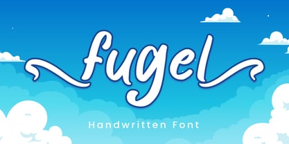 Fugel is a delicate and incredibly distinct handwritten font with beginning & ending swashes. Fall in love with its incredibly versatile style and use it to create spectacular designs! Fugel is perfect for branding, logo, invitation, stationery, social media post, product packaging, merchandise, blog design, game titles, cute style design, Book/Cover Title and more. What's Included : - Fugel.otf - Beginning & Ending Swash - Multilingual Support --- Hope you enjoy with our font! Attype Studio
 - VG Sans by Vitaliy Gotsanyuk,
$25.00 VG Sans is a distinctive grotesque font that preserves the features of old grotesques while incorporating new conceptual solutions. Working on the font, its shape has been completely transformed, corrected, and the glyph set has been expanded. The font has a light contrast that increases with weight. VG Sans includes 5 weights, 670 glyphs, an extended Cyrillic/Latin character set, multiple stylistic sets, ligatures, numeral sets, and more.
 - Chi Town NF by Nick's Fonts,
$10.00A 1931 poster for the film The Man from Chicago provided the pattern for this quirky Deco delight. Although the fonts is all uppercase, tasty variants have been added in the lowercase positions, and all possible letter combinations have been kerned, so you can mix the forms freely. This font contains the complete Latin language character set (Unicode 1252) plus support for Central European (Unicode 1250) languages as well. - Landsdowne Commercial by Greater Albion Typefounders,
$18.00 ‘Landsdowne Commercial’ is a development of one of our designer’s earlier public domain releases, ‘Landsdowne’. All glyphs have been completely redrawn and refined. An extensive range of stylistic alternates and ligatures have been added, as well as a completely new bold face and several forms of numerals. Landsdowne commercial is ideal for period-inspired design work, such as posters and book covers as well for clear elegant communications.
 - Helena Handbasket NF by Nick's Fonts,
$10.00The 1888 edtion of James Conner's Sons United States Type Foundry specimen book listed this little gem simply as "Antique Light". Its original, rather anemic outlines have been beefed up and its serifs have been rounded, with the result that this face will get noticed wherever it goes. Both versions of this font include the complete Latin 1252 and CE 1250 character sets, with localization for Romanian and Moldovan. - Sesame Street - Unknown license

- BuggyFont by Ingrimayne Type,
$14.95 AntsyPantsy, BuggyFont, and MousyFont are based on the same design; only the building blocks—ants, bugs, and a stylized mouse—have been changed.
 - AntsyPantsy by Ingrimayne Type,
$14.95 AntsyPantsy, BuggyFont, and MousyFont are based on the same design; only the building blocks—ants, bugs, and a stylized mouse—have been changed.
 - MousyFont by Ingrimayne Type,
$14.00 AntsyPantsy, BuggyFont, and MousyFont are based on the same design; only the building blocks—ants, bugs, and a stylized mouse—have been changed.
 - PeaceNow Basic - Unknown license

- Pukupuku by yamayama,
$20.00 Pukupuku is a cute round font. This font is designed based on the shape of clouds and beans, which looks somewhat like handwritten letters.
 - Swing Bill by Monotype,
$29.99The Swing Bill font was designed as a display face for sport material or pop music posters, but has also been seen on TV. - Ritmo by Monotype,
$29.99Designed by Aldo Novarese and released in 1955, the Ritmo Bold font has broad, tapered strokes that have been drawn with a square nib. - 1886 Romantic Initials by GLC,
$20.00 This family of decorated initial letters was inspired from a French catalogue dedicated to engravers, embroiders and jewelers. unfortunately, we don't know the name of the illustrator, no more than the publisher, because a large part of the pages seems to have been lost or have been damaging, so, we have had to redrawn a few of figures. The font is containing standard Latin capitals without diacritics, identically repeated in lower case keys, and numerals.
 - Sports Wave by Funk King,
$10.00Sports Wave is a specialty font that can be used for sports-themed projects. Previously available as a free version with only the pictograms, Sports Wave has been a popular download. Now we offer you the added usability of a full and extended character set. Some glyphs have been provided to extend the height of the shorter “banner” glyphs. These glyphs are negatively kerned and appear near the end of the set. - Eleonora by Three Islands Press,
$24.00Eleonora tends to defy standard categories. Had the typeface been designed in about 1790, it might've been called a "late transitional face" and lumped together with Bell and Bulmer. But it's a modern typeface, showing more restraint in its finer details than even Baskerville. Also noteworthy: it has no traditional, script-like italic but a more severe oblique with baseline serifs and other roman features. Has regular, italic, bold, and bold italic styles. - Cadogan by Device,
$39.00 A freeform linking script that uses OpenType programming to replace beginning and ending characters with uniquely designed variants. Also includes ligatures and an extended t-bar carefully designed to not collide with ascenders. (Note: Please view the image above for correct versions of the end and beginning letters, as they will appear in Indesign, Illustrator, etc. The Myfonts previews below are not Opentype savvy, and so these specially designed versions do not substitute themselves.)
 - Estricta by Graviton,
$24.00 Estricta font family has been designed for Graviton Font Foundry by Pablo Balcells in 2017. It is a sans serif typeface with a geometrical and mechanic appearence, its sharp, angular edges provide a strong and solid design. It has been conceived to be most suitable for short and middle length text blocks, as well as on all sized headlines. Estricta consists of 12 styles. Each containing small caps and glyph coverage for several languages.
 - Mensura by Graviton,
$20.00 Mensura font family has been designed for Graviton Font Foundry by Pablo Balcells in 2012. It is a modular, geometric typeface with subtle rounded angles that provides a soft, pleasent appearence. It has been conceived to be primarily a display typeface, but given its clarity it can also be used for composing short and intermediate length texts. Mensura consists of 8 styles and 4 weights plus italics. Each containing small caps and several alternate characters.
 - OYReem arabic by Omartype,
$14.00 Introducing a brand new typeface, meticulously crafted by your hands. Inspired by the rich culture and heritage of the Arabic language, this typeface embodies your unique vision and artistic expression. It combines modern techniques with a deep understanding of the language's aesthetics. This typeface has been developed using advanced techniques to ensure excellent clarity and readability. Every shape, line, and detail has been carefully studied to strike a perfect balance between elegance and legibility
 - Tuerca by Graviton,
$24.00 Tuerca font family has been designed for Graviton Font Foundry by Pablo Balcells in 2021. It is a slightly extended sans serif typeface with a strong technical appearence. Its squared, angular shapes provide a futuristic and robust aesthetics. It has been conceived to be most suitable for logos, headlines and display design pieces as well as short length text blocks. Tuerca consists of 8 styles, each containing small caps and glyph coverage for several languages.
 - Binaria by Graviton,
$24.00 Binaria font family has been designed for Graviton Font Foundry by Pablo Balcells in 2018. It is a sans serif typeface with a mechanic appearence. Its squared, angular shapes provide a futuristic and robust design. It has been conceived to be most suitable for logos, headlines and display design pieces as well as short length text blocks. Binaria consists of 12 styles, each containing small caps and glyph coverage for several languages.
 - Benton Sans RE by Font Bureau,
$40.00 A redesign of drawings of News Gothic from the Smithsonian, Cyrus Highsmith and the Font Bureau studio created Benton Sans, one the most popular and versatile families in this genre. This version of the family is part of the Reading Edge series of fonts specifically designed for small text onscreen, having been adjusted to provide more generous proportions and roomier spacing, and having been hinted in TrueType for optimal rendering in low resolution environments.
 - Qaylla by MIX.Jpg,
$17.00 Qaylla is a handwritten font inspired by 80s-90s music, retro, disco, grunge, and pop culture. Best used for posters, logos, clothing, books, invitations and more. Qaylla includes a complete set of upper and lower case letters, numbers, various punctuation marks and ligatures. All lowercase letters include the beginning and end of swash, giving your projects a realistic handwriting style. All uppercase letters include the beginning of swash, which makes the font look great!
 - Armstrong by Device,
$39.00 An elegant geometric linking script that uses OpenType programming to intelligently substitute "beginning" and "ending" characters with uniquely designed variants. The family also includes swash alternates that can be toggled on or off in the Opentype panel. (Note: Please view the image above for correct end and beginning letters as they will appear in Indesign, Illustrator, etc. The Myfonts previews below are not Opentype savvy, and so these specially designed versions do not substitute themselves.)

