10,000 search results
(0.029 seconds)
- LTC Garamont by Lanston Type Co.,
$24.95Frederic Goudy joined Lanston as art advisor in 1920. One of his first initiatives was to design a new version of Garamond based on original Garamond designs of 1540. Goudy intended his free-hand drawings to be cut exactly as he had drawn them and fought with the workmen at Lanston to keep them from “correcting” his work. This new type was called Garamont (an acceptable alternate spelling) to distinguish it from other Garamonds on the market. (The other Garamonds on the market at that time were later confirmed to be the work of Jean Jannon.) In 2001, Jim Rimmer digitized Garamont in two weights. The display weight is based on the actual metal outlines to compensate slightly for the ink gain that occurs with letterpress printing. The text weight is a touch heavier and more appropriate for general offset and digital text work. Digital Garamont is available to the public for the first time in 2005. - Ace Attitude by Limelight Artistry,
$24.00 Ace Attitude is a friendly, readable font with character and flair. When I started designing this font I wanted something that was readable as well as interesting and appealing. Something that showed character. When I look at this font now I think of an old fashioned aviator. One of those poeple that likes to show off and have fun but can still follow rules. This font is perfect for logo's and branding. But its also very versatile would be great in things like magazines, posters, packaging, billboards, etc. Ace Attitude has an impressive 179 Contextual alternates. These are like ligatures, but oh so much better. These contextual alternates will give any project that personal touch - all without any extra effort. All you have to do is make sure that they are turned on in your program. Unfortunately, these do not yet show up in the sample text. To help with this I have created a demo version of the font so that you can still try it out before you spend the money. Ace Attitude also has Over 800 glyphs and includes features such as small caps, ordinals, ligatures, fractions, tabular numbers, proportional numbers, subscript, superscript, numerators and denominators.
 - Colourbars - Unknown license

- ITC Newtext by ITC,
$40.99ITC Newtext was designed by Ray Baker, who created a well designed and legible typeface and built into it every design refinement which could optimize its usefulness. The expanded shapes are generous and legible and the economical vertical set results in more lines to the page. - Amina by Wayne Fearnley,
$40.00 Amina was created using the DNA of Metrik. A neutral grotesque sans serif, chopped and remixed to create Amino. The ink traps have been raised to create a dynamic typographic language that makes Amina contemporary and dynamic. Amina works great for bold, typographic treatments and still maintains readability in body copy. Includes language support, stylistic alternates.
 - Film Reel JNL by Jeff Levine,
$29.00 In a World War II training film from the U.S. Signal Corps, the opening title card saying “First Aid” was hand lettered in an extra bold, Art Deco inline style. Those two words (with seven available letters) used as a work model has inspired Film Reel JNL, which is available in both regular and oblique versions.
 - Game Paused by Ahmad Jamaludin,
$17.00 Dive into the world of retro nostalgia with the GAME PAUSED font. With its 6 unique styles in each type - Regular, Slant, Outline, Extrude, Outline Slant, and Extrude Slant Features: Game Paused Main File Has 6 Variable: Regular, Slant, Outline, Extrude, Outline Slant, and Extrude Slant Instructions (Access special characters, even in Cricut Design) Enjoy Designing! Dharmas Studio
 - Hortensia by Canada Type,
$24.95 Hortensia, designed around 1900 by Emil Gursch for his own Berlin foundry, is a typeface most expressive of the post-Victorian aesthetic that was all the rage in both Europe and America during the second half of the 19th century and up until the Great War. It is a reduced aesthetic of sharp points and natural curves that almost want to apologize for their own elegance, but clearly embody the simple excitement about the blossoming of industry and crafts during the period. This deco script trend would get a re-run for about a decade on either side of the second World War — especially in the entertainment and financial industries — before giving way to art nouveau and big brush faces. Hortensia was Gursch's most popular typeface, used extensively and prominently in many beautiful type catalogs, and a commonly seen design element in Germany for quite a while after its release. This digital version brings plenty of fixes and additions to the original metal Hortensia design, including many alternates sprinkled throughout the character set, and support for a wide range of Latin-based languages (including Central European, Baltic, Turkish and Welsh).
 - French Typewriter by Typorium,
$15.00 French Typewriter is a slab serif typeface created in 2019 by Jean-Renaud Cuaz. It takes roots in the typewriting font styles with a French flair. In the history of this font style, early typewriters were initially thought to be replacements for printing and so featured proportional fonts, before being replaced by monospaced typefaces. French Typewriter was created with proportional design, departing from the constraint of identical width and space. Designed for vintage and modern use with a script influenced italic, French Typewriter provides a large range of weights from Extra Light to Black with matching italics offering a large palette of styles for both vintage and modern design. A series of swash capitales has been created for all 6 italic weights along with ligatures and alternative a, g, y signs to provide opportunities for attractive text design. Fine tuned kerning has been implemented to make this slab serif font family greatly legible in small size. Condensed styles will be available in 2019.
 - KillJoy by Comicraft,
$19.00 S P O I L E R A L E R T ! We don't want to be a drag, a wet blanket or a spoilsport, but we're here to tell you that everything before “but” is bulls*it! Yep, if you're a merrymaker, a carouser, a jester, a reveler or a live wire, we're here to poop your party with our latest knicker-twister, KILLJOY! Call us cynics, call us crabs, grouches, grumpy old men, sourpusses or bores, but we're the kind of Killjoys who just have to make some noise... sound effects (sic) everybody, so listen up even if you can't handle the truth... and here’s OUR truth; Keep Calm and be a Fabulous Killjoy! Yes, it’s easy to be mean -- but why should anybody else have all the fun? Or all the fonts?
 - Film Title JNL by Jeff Levine,
$29.00 A World War II training film had its opening title card “First Aid” hand lettered in a casual, Art Deco sans serif design. This is now available digitally as Film Title JNL, in both regular and oblique versions.
 - Amputation - 100% free

- Deltoid - Unknown license

- BubbleMan - Unknown license

- BECROSS - Unknown license

- Adelica Brush by Java Pep,
$11.00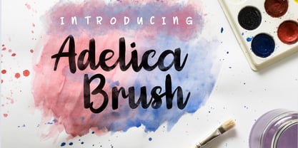 Adelica Brush is made with a handwritten brush. This font is perfect to give your project a fun, feminine, childish, and watercolor effect. Adelica Brush is a solid font. To raise the watercolor effect you must mask it with a watercolor brush or other. Adelica Brush contains: -Uppercase & lowercase -Numeral & punctuation -PUA encoded -Multi-lingual support Thank for using this font, if you have any question don't hesitate to message me at java.indonesian@yahoo.com.
 - Constroke by Ingo,
$24.00 Strictly geometrically constructed character forms with an even stroke width The idea behind it: to construct letters according to geometric principles — without correcting the inevitable optical imbalances and unsightly thickening. The round shapes are really circular too. The main feature of the Constroke is the constant stroke width. Another typical feature of almost all geometric fonts is the round small a. Many characters are also available as stylistic alternates. This gives the font a completely different look. A total of 7 style sets and unusual ligatures invite you to play with alternate forms. Constroke also includes tabular figures, circled numerals and directional arrows.
 - Quartz by ITC,
$29.99The figures of Quartz font are based on those on digital clocks and LCD displays. All strokes are set at right angles to one another to create abstract characters. Fonts created for electronic displays gained in popularity at the same time as the computer became an everyday object. The standard is still around today and is the model for numerous interpretations. Fonts like Quartz have already won a firm position in trend typography. They embody the spirit of the late 20th century. Quartz font is a good choice whenever a marked contrast to everyday alphabets is the goal. - Buffalo Bill by FontMesa,
$35.00 Buffalo Bill is a revival of an old favorite font that’s been around since 1888, the James Conner’s Sons foundry book of that same year is the oldest source I've seen for this old classic. If you're looking for the font used as the logo for Buffalo Bill’s Irma Hotel in Cody Wyoming please refer to the FontMesa Rough Riders font. New to the Buffalo Bill font is the lowercase and many other characters that go into making a complete type font by today’s standards. The Type 1 version is limited to the basic Latin and western European character sets while the Truetype and OpenType versions also include central and eastern European charcters. William F. (Buffalo Bill) Cody called America’s Greatest Showman was one of the United State’s first big celebrity entertainers known around the world, millions of people learned about the Old West through Buffalo Bill’s Wild West shows which traveled throughout the United States and Europe. William Cody, at age eleven, started work on a cattle drive and wagon train crossing the Great Plains many times, he further went on to fur trapping and gold mining then joined the Pony Express in 1860. After the Civil War Cody went on to work for the Army as a scout and hunter where he gained his nickname Buffalo Bill. In 1872 William Cody started his entertainment career on stage in Chicago along with Texas Jack who also worked as a scout, the Scouts of the Prarie was a great success and the following year it expanded to include Wild Bill Hickok and was eventually named The Buffalo Bill Combination. By 1882 Texas Jack and Wild Bill Hickok had left the show and Buffalo Bill conceived the idea for the traveling Wild West Show using real cowboys, cowgirls, sharpshooters and Indians plus live buffalo and elk. The Wild West shows began in 1883 and visited many cities throughout the United States. In 1887 writer Mark Twain convinced Cody to take the show overseas to Europe showing England, Germany and France a wonderful and adventuruos chapter of American history. The shows continued in the United States and in 1908 William Cody combined his show with Pawnees Bill’s, in 1913 the show ran into financial trouble and was seized by the Denver sheriff until a $20,000 debt (borrowed from investor Harry Tammen) could be paid, Bill couldn't pay the debt and the loan could not be extended so the assets were auctioned off. William Cody continued to work off his debt with Harry Tammen by giving performances at the Sell’s-Floto Circus through 1915 then performed for another two years with other Wild West shows. William F. Cody passed away in 1917 while visiting his sister in Denver and is buried on Lookout Mountain joined by his wife four years later. Close friend Johnny Baker, the unofficial foster son of William Cody, began the Buffalo Bill Memorial Museum in 1921, over the years millions of people have visited William Cody’s grave and museum making it one of the top visitor attractions in the Denver area. William F. Cody romantisized the West creating the Wild West love affair that many still have for it today through books and cinema.
 - 1557 Italique by GLC,
$38.00 Italic type was invented by Aldus Manutius in 1499 or 1501, first, before to be a style name, it was a plain font familly name. This Italique style font was inspired from these who was used by Jean de Tournes in Lyon (France) to print La mÈtamorphose d'Ovide figurÈe, a splendid book with numerous gothic style wood carved pictures. The original font contains almost all modern usual characters except accented ones, no longer in use on that time. They have been added, with some others, with respect for the original design. . A render sheet, enclosed in file, help to identify various others unusual letters on keyboard. It is used as successfuly as web-site titles, posters and fliers design, editing ancien texts or greeting cards, invitations, gastronomic menus... and much more, as a very decorative and elegant font... It supports easily as enlargement as small size, remaining clear and easy to read from 8 or 9 points to 72 and more, particularly on prints.
 - Egg Farm JNL by Jeff Levine,
$29.00 The opening titles and credits of the 1947 film comedy “The Egg and I” were done in a hand lettered casual sans serif typeface which inspired the digital font Egg Farm JNL; available in both regular and oblique versions. “The Egg and I” introduced audiences to Ma and Pa Kettle as portrayed by Marjorie Main and Percy Kilbride, who went on to do a number of additional films as those characters.
 - Domosed Slab Serif by Etewut,
$29.00 Domosed Slab Serif typeface was build during lockdown. As a result of home sitting it appears in two weights. It refers to Italian futurism when all generation understand global changes of industrial revolution. The forth industrial revolution appears with new rules but the main idea is the same – simplifying the processes. Causing the vibe of a bright phenomenon I want you to use my font to match to zeitgeist.
 - Evil Ways JNL by Jeff Levine,
$29.00 The April 8, 1932 issue of The Film Daily ran an ad for a film entitled "The Sin of Lena Rivers". Hand lettered in a block style of chamfered characters, it is reminiscent of the 1920s, but still carries a touch of Art Deco influences with the thinner and extended horizontal strokes of the E, F and H. This retro sans serif design is now available digitally as Evil Ways JNL in both regular and oblique versions.
 - Consonant SRF by Stella Roberts Fonts,
$25.00 This imaginative and unusual serif text face was developed by Jeff Levine from an old Ray Larabie design. Improved and updated, it is exclusive to Stella Roberts Fonts. The net profits from my font sales help defer medical expenses for my siblings, who both suffer with Cystic Fibrosis and diabetes. Thank you.
 - Artigua by Picador,
$29.00 High contrast, sharp endings and geometrical shapes – these are the main features of Artigua. The relation of vertical and horizontal lines reduces with weight – this makes regular weight appropriate for longer texts and black ideal weight for headings. Whole family contains small caps, subscript, superscript, italics, fractions old style and tabular figures. Over 1100 glyphs and 18 fonts makes a perfect match for clean and minimal projects. With Artigua it’s super easy to prepare adverts, books or web headings.
 - Scradl by Luxfont,
$35.00 Welcome to the world of Scradl - where fonts become the tool of the cutter and the artist at the same time. These letters, as if cut out of paper without preliminary drawings, are rough, angular and full of character. The main font is the canvas for your creativity. Additional variations add a stroke, shadow, or even a sticker effect, creating a harmonious visual interaction. Features: - Multilingual - Kerning - Ability to adapt letters to other languages
 - Escritura Hebrew by Vanarchiv,
$21.00 It was my first attempt to drawing a Hebrew alphabet to mach directly with other typeface (Latin) which I already designed. The Latin version is an handwriting display typeface influenced by chancery handwriting from the Italian Renaissance (broad-nib pen). One of the most typographic characteristic is there wavy forms, especially the serifs, where contains some of the main calligraphic references from this font family. The Hebrew script contain reverse contrast, the vertical proportions are more tall and the stroke weight is slightly more strong than latin lowercase to produce a correct visual balance between them, especially on small sizes (text proportions). This Hebrew square book-hand was influenced by Sephardic script style. The Latin characters contains interrupted strokes, the same was made for Hebrew letterforms to transpose correctly the same calligraphic approach between these two different alphabets.
 - Imperio by Juan I. Siwak,
$40.00 Imperio is a font inspired by old posters, especially those related to constructivism and futurism. It reflects both the rationalism of Bauhaus as a propagandist and revolutionary spirit of an era. On the other hand it is not nostalgic, but instead looks for its own way to get diagonals where there was rigidity. The poster itself is the language of graphic design, and geometry is its ally. This font aims for that goal. It has two variants that derive from its source. Imperio Giga Black attempts to be a negative typography, starting with the black and then searching for small windows in which they begin to uncover the morph. This is an extreme and modern font. Imperio West is a metamorphosis of the original one, with decorative details which transform it into a typeface of wood and saloon font. In all cases we recommend its use in large sizes (up to 20pt) and main titles. Imperio UltraBlack can work in smaller sizes than Imperio Regular.
 - Salloon by Ingrimayne Type,
$8.95 The original version of Salloon was what has become Salloon-Wide. It was designed a year or two before 1990. The narrower version, which is now the regular version of the face, was constructed a few years later. There never has been a true lower-case set of letters for these fonts, but the narrower version introduced a second set of caps by removing the side bumps from the letters. Although Salloon may look like an old font, no historic font closely resembles it. Fonts with bold, thick stems such as Salloon invite interior decoration. The five striped versions and the shattered version of the font were produced a year or two after the construction of the narrower Salloon when the arrival of a font distortion program made it easy to cracked and stripe fonts. In 2019 an outline style and two highlighter styles were added to be used in layers with the Salloon-Regular and one highlighter style was added to be used with Salloon-Wide.
 - Lombardia Illuminata by Celebrity Fontz,
$24.99Lombardia Illuminata is a collection of Lombardic-style letters surrounded by natural forms of vines, leaves, trellises, scrolls, sun rays, and flowers. This beautifully ornate font includes one set of A-Z ornamental initials conveniently assigned to both the upper and lower case alphabet characters which are perfect for starting off the beginning of paragraphs in artistic publications, storybooks, fairy tales, and texts conveying the feel of medieval manuscripts of the 12th-16th centuries. - Buffet Script by Sudtipos,
$99.00 Buffet Script is based on fantastic calligraphy by Alf Becker, arguably the greatest American sign lettering artist of all time. The Alf Becker series of nameless alphabets published by Sign of the Times magazine in 1941 has attracted letter digitizers for a few years now, so it’s really a wonder that a few of those alphabets are still in the non-digital realm. It is understandable, though, that the basis for Buffet Script was not digitally attempted until now. The page presenting this alphabet shows a jungle of letters running into each others and swashes intertwining. The massive amount of work involved in digitizing such lettering, where scanning is nowhere near being an option, is quite obvious at a mere glance. If anyone was going to commit this particular alphabet to a digital form, it would have to be redrawn stroke by stroke and curve by curve on the computer. And don't we love a challenge! But seriously, the challenge was not the main attraction. In a way, the Becker approach to lettering is so far from digital that the imagination is almost forced to work out possibilities and letter combinations to solve problems presented by the scant showings in that magazine. After a few imaginative visualizations, the digital potential becomes clear in the mind, and the eye and hand follow. The result with Whomp (another Alf Becker-inspired work) was an enormous font with a lot of alternates and ligatures. With Buffet Script the imaginative process was no different, but the result particularly shines here, because this is some of the most fascinating flowing calligraphy ever seen. Calligraphy is where the accountability of all the little extra touches, such as alternates and swashes and ligatures, is raised to a higher level than in most other type categories. Buffet Script’s OpenType programming contains discretionary ligatures, stylistic and contextual alternates, interacting with each other to allow the composition of just the right word or sentence. This font is best used where lush elegance is one of the design’s requirements.
 - Silk Sans Display by SilkType,
$47.50 Silk Sans Display is the sans version of the high-contrast typeface Silk Serif. The main feature of the font family is the disconnection between the bowls and the stems. However, the bowl is very close to the stem, creating the illusion of connection. Silk is delicate and legible — but above all, it is sophisticated. Silk Sans Display is available in 7 weights, from Extra Light to Black, and supports Western, Central and South-Eastern European languages.
 - Apura by Adelina Apostolova,
$12.00 Apura stands for a clear geometric language based on two main shapes: a circle and a square, complemented by organic elements. It‘s perfect for headlines, posters, experimental designs as well as branding. The font includes uppercase and lowercase characters, both latin and cyrillic, alternates, numbers, punctuation marks and symbols.
 - Blackhaus by Canada Type,
$25.00Almost a half of a millennium after being mistaken for the original 4th century Gothic alphabet and falsely labeled "barbaric" by the European Renaissance, the blackletter alphabet was still flourishing exclusively in early 20th century Germany, not only as an ode to Gutenberg and the country's rich printing history, but also as a continuous evolution, taking on new shapes and textures influenced by almost every other form of alphabet available. Blackletter would continue to go strong in Germany until just before the second World War, when it died a political death at the height of its hybridization. For almost 50 years after the war, blackletter was very rarely used in a prominent manner, but it continued to be seen sparely in a variety of settings, almost as a subliminal reminder of western civilization's first printed letters; on certificates and official documents of all kinds, religious publications, holiday cards and posters, to name a few. In the early 21st century, blackletter type has been appearing sporadically on visible media, but as of late 2005, it is not known how long the renewed interest will last, or even whether or not it will catch on at all. The last few years before World War II were arguably the most fascinating and creative in modern blackletter design. During those years, and as demonstrated with the grid-based Leather font, the geometric sans serif was influencing the blackletter forms, taking them away from their previous Jugendstil (Art Nouveau) hybridizations. Blackhaus is a digitization and elaborate expansion of a typeface called Kursachsen Auszeichnung, designed in 1937 by Peterpaul Weiss for the Schriftguss foundry in Dresden. This is one of very few designs from that time attempting to infuse more Bauhaus than Jugendstil into the Blackletter forms. This is why we used a concatenation of the words blackletter and Bauhaus to name this face. The result of injecting Bauhaus elements into blackletter turned out to be a typeface that is very legible and usable in modern settings, while at the same time harking back to the historical forms of early printing. The original 1937 design was just one typeface of basic letters and numbers. After digitizing and expanding it, we developed a lighter version, then added a few alternates to both weights. The Rough style came as a mechanically-grunged afterthought, due to current user demand for such treatment. Having the flexibility of 2 weights and many alternates of a blackletter typeface is not a very common find in digital fonts. More specifically, having the flexibility of 2 weights and alternates of a 20th century blackletter typeface is almost unheard of in digital fonts. So the Blackhaus family can be quite useful and versatile in an imaginative designer's hands. - Childfolk by Good Java Studio,
$23.00 Childfolk is the perfect font for all your fun designs. The main font file is equipped with ordinary characters, as well as more than 350 glyphs to support most Latin-based languages. Everything is made with the same brush, and everything is the same size as Letter Kids, so you can be sure they will work well together! It is suitable for you to use in making t-shirt design, quote, label, packaging, logo type, or long writing. Because we have compiled kerning and matrices that are tailored to your needs.
 - BB Hilda by Bartosz Bugaryn,
$10.00 Hilda is an ode to countryside. This typeface is inspired by the peace that comes with escaping the city and drinking a cup of coffee while listening to the chirping of birds. The name comes from a cartoon series “Hilda” based on comic series by Luke Pearson. I describe it with 2 words - elegant and playful. It is an all caps, display font that can be used for titles and short texts. Hilda is multilingual and if it gains enough recognition I am willing to add more weights and styles!
 - Autumn Melody by PeachCreme,
$22.00 Autumn Melody is a modern calligraphy font that adds a classy and deluxe touch to your designs. The main pursuit of this font is to give you that authentic hand-calligraphy feel. Autumn Melodycomes with a full set of uppercase and lowercase letters as well as ligatures and beautiful letter alternates. The font provides several (up to15) alternates of some frequently used letters such as a, t, h, n, s, etc. The number and look (length, width) of the swashes vary depending on the frequency of this or that letter's usage. Autumn Melody is suitable for many projects related to the wedding industry (stationery, logo, etc.)
 - Librum by Hackberry Font Foundry,
$24.95 This is the serif text family for the book design group of font families which David designed in the process of writing "Practical Font Design With FontLab 5". The letterspacing is set wide for body copy use. The main purpose is readability and reading comfort. There are several whimsical graphics, plenty of OpenType features: oldstyle figures [tabular and not], small cap figures, lining figures [tabular and not], discretionary ligatures, small caps, and so on. The feature set is limited for the italic and bold versions. It produces an exceptional book. See Librum Book Design Group for a package containing all fifteen fonts,
 - Edgethorn by Up Up Creative,
$16.00 Edgethorn is a beautiful, italic-only transitional serif typeface that was born after I became obsessed with a few small paragraphs of italic text on a type specimen broadside from 1785. Working on this type revival allowed me to delve much more deeply than I ever have before into type history and typeface classification, and I’ve included some type history for you with your download so that you can play around with the smattering of historical characters I included (like the medial s). Although it is based on centuries-old typefaces, Edgethorn is elegant, timeless, and perfect for 21st century projects. Edgethorn includes approximately 525 glyphs — including 64 standard and discretionary ligatures and a handful of contextual alternates and character variants — and supports over 200 languages. The OpenType features can be very easily accessed by using OpenType-savvy programs such as Adobe Illustrator and Adobe InDesign.
 - Bertoboy by Gloow Studio,
$18.00 Introducing Bertoboy - A Display Retro Script Font. In creating this font, I just wanted to combine classic style with modern retro style, so be this font. Hope you like it. Inspired by some retro fonts that I made before. Bertoboy is perfect for vintage and retro design, badge, logos,t-shirt, poster, branding, packaging, signage, book coverand so much more! Come with Opentype feature with a lot of alternates, its help you to make great lettering. This font is also support multi language. To access the alternate glyphs, you need a program that supports OpenType features such as Adobe Illustrator CS, Adobe Photoshop CC, Adobe Indesign and Corel Draw. Comes with feature : - Uppercase - Lowercase - Alternate - Number, Punctuation And Symbols - Multilanguage Support. If you have any questions, feedback or comments, please feel free to send me a message. Happy Creating! Thanks!


