10,000 search results
(0.037 seconds)
- Quenda by Marc Lohner,
$25.00 Quenda is a small sans-serif family comprising six weights: thin to heavy. Due to its rounded terminals and a slight handwritten look, Quenda has a friendly and warm appearance. Its main purposes are for advertising and branding projects. You will find lots of ligatures and a total of 593 glyphs in each style. With extensive language support, lining-, old-style- and tabular-figures, a slashed zero, self-building fractions, superscript and subscript digits, a set of arrows as well as thousands of kerning pairs, Quenda is ready to contribute to your next design project. Designed by Marc Lohner in 2015.
 - Mynaruse by insigne,
$22.00 Mynaruse is an elegant and regal roman inscriptional titling family. It has sharp and elongated serifs that give the face extra punch. The face shines in settings that call for elegance and splendor. Mynaruse’s six weights range from a fine, delicate thin to a powerful and solid heavy weight. Mynaruse includes many useful OpenType features, including a set of swash alternates, alternate titling forms, ligatures and miscellaneous alternates. OpenType-capable applications such as Quark or the Adobe suite can take full advantage of the automatically replacing ligatures and alternates. This family also includes the glyphs to support a wide range of languages.
 - Noir by Mindburger Studio,
$39.00 Noir is a sans serif font family of 12 fonts with contemporary aesthetics heavily influenced by early 20th century geometric typefaces. While having its geometric structure it carries organic personality with touch of warmth injected to each form. Noir font family ranges from light and elegant weights perfect for small text, to extremely heavy and masculine weights suited for large display sizes. Noir has a rich arsenal of Open Type features for highly professional use and extended Latin, Cyrillic and Greek language support. Noir is delivered as Std and Pro version. Cyrillic and Greek are available in Pro package only.
 - Monckeberg by Latinotype,
$29.00 Monckeberg is an expressive font with a strong personality which is based on 15th century classic Venetian typefaces. High contrast between thin and thick strokes, calligraphic features and diagonal stress are its most striking characteristics. Monckeberg is ideal for short text and paragraphs, and specially designed for logos, branding, editorial design and web use. Monckeberg consists of 2 subfamilies of 9 weights, from Thin to Heavy, with matching italics, resulting in a total of 36 fonts. The basic family is classic and elegant while the alternative version allows for greater design freedom. Monckeberg contains 511 characters that support over 200 Latin-based languages.
 - Posh by Lián Types,
$49.00 I've always been in love with fat didones. That’s the reason of Posh. In search of something unique, I started this family back in 2013 with the aim of creating the fattest yet readable bodonian typeface in the market: It was a challenge, because roman fonts need generous counters (or what some call white spaces) and taking them to the extreme of inexistence attempted against the construction of many glyphs. Ears, dots, terminals and serifs always need some extra space so I had to find the exact point of boldness to make characters which have those attributes work well in the middle of those which haven't. (1) After a while, I felt I was again ‘in my element’: Big contrasted letters, sexy and elegant curves, and that Lubalinesque feeling that characterise my fonts. (2) Words written with Posh are a explosion of elegance and sensuality due to the fact that its didone attributes were exaggerated. Since it’s full of alternate glyphs, one can change and choose them until a nice block of ‘‘black’’ is achieved. (3) To accompany the regular style, I designed Posh Inline, a font with the same quantity of glyphs than the regular one; an all caps style called Posh Capitals, and also a really playful Italic version. I hope you find this one delicious like I do! This font is dedicated to all who understand letters are not just meant to be read, but also to be appreciated in group and individually. Enjoy it. NOTES (1) In example, it can be easy to design a fat letter ‘n’ with almost no counter, but really tough to make a satisfactory letter ‘s’ with serifs to match that ‘n’. (2) Also, it wasn't my first attempt in fat didones. Take a look at my font Reina, made in 2012. (3) Posters above show many words with ball terminals that seem to dance above and below the words in order to fill those “undesired” blank spaces.
 - Schneidler Latein by Spirit & Bones,
$33.00 The Schneidler Latein is a sharp and elegant Antiqua based on the ductus of the broad edged pen with a strong character. Running perfectly in paragraph text giving it something quite special and being effortlessly legible at the same time, Schneidler Latein works great in headings as well. Each glyph is a piece of art ready to be used in branding and blowup combining beauty and personality in a kick-ass blend. It is absolutely new to the digital world as it never has been digitized before. This new version digitized, further developed and extended by artist and graphic designer Lena Schmidt comes in nine styles from which there are four application-related ones like Subtext and Display and five weight-related ones like Bold and Heavy. Each style contains 948 glyphs, variations of numbers, three stylistic sets one preserving the historic forms of changed characters, small caps, open type features and superior and inferior characters. Designed by F. H. Ernst Schneidler the Schneidler Latein was released in 1916, the bold version in 1920 and the italics in 1921. Schneidler was born in 1882 in Berlin. He studied at the school for applied arts in Düsseldorf with professor F. H. Ehmcke and P. Behrens. He was as a painter, graphic designer and illustrator. In 1920 he was appointed as teacher in the school for applied arts Stuttgart. His students were Albert Kapr, Imre Reiner and Lilo Rasch-Naegele among others. Further well-known fonts from his hands are for example Legende, Amalthea, Schneidler Mediävel and Schneidler Antiqua. Lena Schmidt was born 1981 in Bremen. She is a german painter, graphic designer and illustrator mostly known for her huge wood carving paintings. From 2003 to 2011 she studied Fine Arts in Hamburg with professor Matt Mullican. From 2015 to 2019 she studied graphic design with a focus on type design at HAW Hamburg Department Design with professor Jovica Veljović. She lives and works in Hamburg, Germany.
 - Hype Runner by Invasi Studio,
$17.00 Hype Runner is a bold and stylish brush font that is perfect for sports and anything that requires strength and power. With its unique style and edgy look, Hype Runner is ideal for a wide range of design projects, including headings, flyers, greeting cards, product packaging, book covers, printed quotes, logotypes, and album covers. This font features alternate glyphs, ligatures, and support for Latin Multilingual, giving you plenty of design options to create unique and eye-catching designs. Whether you're creating designs for sports or simply want a strong and impactful font, Hype Runner is a great choice.
 - Royal Style by Rizkimau,
$30.00 Royal Typeface is stylish copperplate fonts, combines from copperplate to contemporary font with a dancing baseline, classic and elegant touch. Can be used for various purposes. Such as headings, luxury, logos, wedding invitation, t-shirt, letterhead, lable, news, posters, badges etc. Royal Typeface features 1.500 glyphs. Support with Opentype: Unique glyphs, With cool Stylistic Alternates, Swash, Italics, Stylistic Sets 1-20, Ligatures, Multilingual characters, UPPERCASE, LowerCase, Numeric, Oldstyle Figures & Tabular Figures.
 - Helvair Graffiti by Sipanji21,
$16.00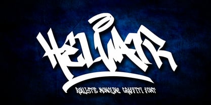 Helvair is a Handwritten font with a Realistic monoline graffiti style, with awesome swash perfect for your awesome urban designs. It will elevate a wide range of design projects to the highest levels, be it branding, headings, designs, invitations, signatures, logos, labels, and much more! Features: Uppercase Punctuation Swash PUA Encoded open Support for MAC or PC Simple installation for Adobe Illustrator, Corel Draw, Photoshop, or Procreate (New Updated)
 - GEOspeed - Personal use only

- Sargento Gorila - Personal use only

- Glotona Black - Personal use only

- Amenable by Twinletter,
$12.00 Our latest fonts that save beauty in every word order you write with this font. made by paying attention to detailed geometric and paying attention to the perspective of the eye when reading the text using this font, so we made this font design to appear harmonious and comfortable to read. use this font to create a perfect design. This font is very suitable as text with displays for various kinds of branding, advertisements, posters, banners, packaging, news headlines, magazines, websites, logo design, banners, social media design and of course you can use a lot more.
 - Mrs Eaves XL Serif by Emigre,
$59.00 Originally designed in 1996, Mrs Eaves was Zuzana Licko’s first attempt at the design of a traditional typeface. It was styled after Baskerville, the famous transitional serif typeface designed in 1757 by John Baskerville in Birmingham, England. Mrs Eaves was named after Baskerville’s live in housekeeper, Sarah Eaves, whom he later married. One of Baskerville’s intents was to develop typefaces that pushed the contrast between thick and thin strokes, partially to show off the new printing and paper making techniques of his time. As a result his types were often criticized for being too perfect, stark, and difficult to read. Licko noticed that subsequent interpretations and revivals of Baskerville had continued along the same path of perfection, using as a model the qualities of the lead type itself, not the printed specimens. Upon studying books printed by Baskerville at the Bancroft Library in Berkeley, Licko decided to base her design on the printed samples which were heavier and had more character due to the imprint of lead type into paper and the resulting ink spread. She reduced the contrast while retaining the overall openness and lightness of Baskerville by giving the lower case characters a wider proportion. She then reduced the x-height relative to the cap height to avoid increasing the set width. There is something unique about Mrs Eaves and it’s difficult to define. Its individual characters are at times awkward looking—the W being narrow, the L uncommonly wide, the flare of the strokes leading into the serifs unusually pronounced. Taken individually, at first sight some of the characters don’t seem to fit together. The spacing is generally too loose for large bodies of text, it sort of rambles along. Yet when used in the right circumstance it imparts a very particular feel that sets it clearly apart from many likeminded types. It has an undefined quality that resonates with people. This paradox (imperfect yet pleasing) is perhaps best illustrated by design critic and historian Robin Kinross who has pointed out the limitation of the “loose” spacing that Licko employed, among other things, yet simultaneously designated the Mrs Eaves type specimen with an honorable mention in the 1999 American Center for Design competition. Proof, perhaps, that type is best judged in the context of its usage. Even with all its shortcomings, Mrs Eaves has outsold all Emigre fonts by twofold. On MyFonts, one of the largest on-line type sellers, Mrs Eaves has been among the 20 best selling types for years, listed among such classics as Helvetica, Univers, Bodoni and Franklin Gothic. Due to its commercial and popular success it has come to define the Emigre type foundry. While Licko initially set out to design a traditional text face, we never specified how Mrs Eaves could be best used. Typefaces will find their own way. But if there’s one particular common usage that stands out, it must be literary—Mrs Eaves loves to adorn book covers and relishes short blurbs on the flaps and backs of dust covers. Trips to bookstores are always a treat for us as we find our Mrs Eaves staring out at us from dozens of book covers in the most elegant compositions, each time surprising us with her many talents. And Mrs Eaves feels just as comfortable in a wide variety of other locales such as CD covers (Radiohead’s Hail to the Thief being our favorite), restaurant menus, logos, and poetry books, where it gives elegant presence to short texts. One area where Mrs Eaves seems less comfortable is in the setting of long texts, particularly in environments such as the interiors of books, magazines, and newspapers. It seems to handle long texts well only if there is ample space. A good example is the book /CD/DVD release The Band: A Musical History published by Capitol Records. Here, Mrs Eaves was given appropriate set width and generous line spacing. In such cases its wide proportions provide a luxurious feel which invites reading. Economy of space was not one of the goals behind the original Mrs Eaves design. With the introduction of Mrs Eaves XL, Licko addresses this issue. Since Mrs Eaves is one of our most popular typefaces, it’s not surprising that over the years we've received many suggestions for additions to the family. The predominant top three wishes are: greater space economy; the addition of a bold italic style; and the desire to pair it with a sans design. The XL series answers these requests with a comprehensive set of new fonts including a narrow, and a companion series of Mrs Eaves Sans styles to be released soon. The main distinguishing features of Mrs Eaves XL are its larger x-height with shorter ascenders and descenders and overall tighter spacing. These additional fonts expand the Mrs Eaves family for a larger variety of uses, specifically those requiring space economy. The larger x-height also allows a smaller point size to be used while maintaining readability. Mrs Eaves XL also has a narrow counterpart to the regular, with a set width of about 92 percent which fulfills even more compact uses. At first, this may not seem particularly narrow, but the goal was to provide an alternative to the regular that would work well as a compact text face while maintaining the full characteristics of the regular, rather than an extreme narrow which would be more suitable for headline use. Four years in the making, we're excited to finally let Mrs Eaves XL find its way into the world and see where and how it will pop up next.
 - Insider by Characters Font Foundry,
$25.00 Insider is a warm & legible grotesque. It’s custom made for Insider Consulting in Düsseldorf, Germany. It’s highly legible in small sizes because of the basic proportions and the balanced inner forms. It’s optimized for setting longer texts, but also works very well in headlines and leads. The fonts contain loads of OpenType features to spice up your design. The matching Stencil font is very suited for creative designs. The Stencil Regular has the same dimensions as the Insider Regular, so you can mix them without hassle. The font family has real italics and not just mathematically slanted romans. The dynamic cursive shapes root in handwriting. With 9 styles (5 weights + 4 italics), the family is very versatile and can be used for designs with a complex typographical hierarchy.
 - HGB Info SC by HGB fonts,
$10.00 It's nice when a font provides old style figures, small caps and alternate letters. But what if my typesetting program doesn't support Open Type features? The solution may be old-fashioned, but it's effective: the variants are placed in separate font families: Standard, Old Style Figures (OSF), and Small Caps (SC). Any word processor can handle it. HGB Info SC adds real Small Caps to HGB Info.
 - Fractus by Eurotypo,
$36.00 The requirements of Middle Ages scribes who copied and produced books in monasteries were fundamentally to preserve space, due to the high cost of the writing surface. During this long period of the development of Gothic forms, many other variations of the style of black letters appear: Textur or “Gothic-antique”, another group called Rotunda preferred by Italian and Spanish scribes. In 1490, the style "Bâtarde" (according to the the French classification) began to be widely used in Germany with more rounded shapes and named Scwabacher (probably derived from the city of Schwabach, but not certified) Fractur is a more condensed and narrower form than Schwabacher. This style is attributed to Johann Neudörfer of Nuremberg, cut in 1513; it was quickly imitated, therefore a few years later became to be a German national identity that extended over the next four centuries. The shape of its characters can be considered as a fusion of Texture and Schwabacher: the lowercase actually has medium strictly vertical and half curved strokes. The first expressions of the baroque influence this writing whose appearance of movement is due to the ornaments applied to the uppercase letters and the ascending and descending features of the lowercase. Despite having spent so many years and being a typeface not suitable for extensive reading texts, the Gothic Fractur has endured over time for possessing a strong and solid characteristic, as well as being closely linked to the spirit of gothic cathedrals of countries in northen Europe. In fact, it is probably that this expressive feature leads them to be chosen in the most varied graphic communication needs, which run from from banks and financial companies, insurers, law offices, publishers, newspapers and TV networks, till alcoholic drinks, funeral tombstones, packaging and even tattoos.
 - Kiperman by Harbor Type,
$29.00 🏆 Selected for Tipos Latinos 9. 🏆 Selected for the 13th Biennial of Brazilian Graphic Design. 🏆 Hiii Typography 2018 Merit Award. Kiperman is a text typeface designed in honor of Henrique Leão Kiperman, founder of the publishing house Artmed, now Grupo A. Its forms are simple and straightforward, with no unnecessary embellishments that could disturb the reading. The fonts are slightly narrower than normal, which yields higher efficiency without compromising reading comfort. Besides that, its italics are not just a slanted version of the romans, but rather a separate drawing. With a slope of 8°, its calligraphic structure provides the right amount of emphasis when necessary. The Kiperman typeface works best when setting books, magazines, ebooks and websites. It will also work very well in branding and packaging projects where a sober typeface is needed. The inspiration for the design came from the personality of the honoree. Just as Henrique always wanted to stay away from spotlights, the Kiperman typeface was designed so that it would not call attention to itself or impose any obstacles in the understanding of the text. In this way, the fonts revere Henrique’s legacy by respecting and honoring the published content. Henrique Leão Kiperman began his career in 1958, selling medical books in travels through the interior of the Brazilian states of Paraná and Santa Catarina. In 1973, he opened a bookstore in downtown Porto Alegre, the Artes Médicas Sul, and a few years later edited his first book. Since then, his company has grown to become one of the most important publishers in Brazil in the area of scientific, technical and professional books, with more than 2400 active titles distributed among the McGraw Hill, Bookman, Artmed, Penso and Artes Médicas imprints. Henrique passed away in 2017 at the age of 79. The Kiperman type family has been commissioned by Grupo A and is available for licensing. This was the way found for the fonts to be read by more people, spreading some of his spirit around the world.
 - SF Kitab by Sultan Fonts,
$19.99 SF Kitab is An Arabic typeface for desktop applications. The font is dedicated for printing diverse books and publications. SF Kitab is clear and the reader feels comfortable reading long texts. It is contains two weights: normal and bold. This font supports Arabic, Persian and Urdu.
 - SP Isis by Remote Inc,
$39.00They say the Nile has many secrets and she was the most sacred of them all. Isis. I met her in a small tavern outside of Edfu, hidden like a jewel between Luxor and Aswan. I had journeyed to Egypt to study the mating habits of homosexual hippos. I had no idea it was the journey that would teach me the true nature of love. - Secret Operation JNL by Jeff Levine,
$29.00 The movie poster for the 1952 bank heist drama “Kansas City Confidential” had its title hand lettered in a condensed serif stencil design. This inspired Secret Operation JNL, which is available in both regular and oblique versions.
 - Knucklehead by Big Typephoon,
$20.00Once I ate a knuckle sandwich after saying some things about some guy's pregnant girlfriend. It turns out she wasn't pregnant at all. I felt like a real knucklehead. So I made this font. Use the font where ever you like. Just be sure you know what you are talking about, or you too could end up with knuckles flying at your head. - KG Chasing Cars by Kimberly Geswein,
$5.00 This cute bunting style font includes extras like a cupcake, anchor, and a fleur de lis. Use the ( ) { } [ ] to make end pieces and join them with the underscore __.
 - Barkanon by wearecolt,
$29.00 Barkanon is not your ordinary humanist sans serif typeface. Blending modern styling with classic humanist flow creates a bold and captivating look. Designed to be expressive in the right places and legible where needed. Barkanon is great for headings, body copy, logos, etc. Barkanon was picked to be a part of the 2024 Typodarium and an early version of the font was featured on James Edmonson's (Oh No Type Co) YouTube channel Barkanon covers 96 languages, 9 styles plus italics, with stylistic alternates, ligatures, and other opentype features.
 - Paragraph Stretch by Paragraph,
$15.00 When merely “extended” just would not do, here is Paragraph Stretch™: a super extended or elongated geometric display typeface. It is a typeface with an unicase effect: the capitals and lower case fit the same height and a similar width, so they are interchangeable: fancy a round “W” in all caps? Use the lower case. Want a straight “x” in lower case? Use the cap. And so on. Designed for use at larger sizes for logotypes, short titles or headings. It supports Western plus Nordic, Eastern European and Turkish languages.
 - Puzzle Face by Jonahfonts,
$15.00 Puzzle Face is a novelty six-tiered overlay font with a range of possibilities. With the use of your graphic application* your artwork can have special color effects. Ideal for concepts involving problems such as solutions, mysteries and of course puzzles. Ideal for a range of logos, posters, headings and bookjackets using ALL or SOME of the six layers. For Layer-info there is a pdf file in the graphics section for you to download and print. Have fun! *Each layer contains Opentype ‘Contextual Alternates’ and may only be accessible via Opentype-aware applications.
 - Mafuta by Scholtz Fonts,
$19.00Mafuta is a round, happy font, named for the Zulu word for "fat". In tribal societies in Africa, where food was often scarce and almost never easily come by, it was considered desirable to appear "well fed". Roundness was a symbol of high status in the tribe, and a sign of wealth. The up-beat, bold outline of the font celebrates the confidence of people who feel comfortable being who they are. The font manages to be both contemporary and African. It is best used for posters and for headings. - Terminax by Monotype,
$29.99Terminax™ is a highly legible monospaced sans serif font with an extensive character set. Unlike other monospaced fonts, Terminax has a personality all its own. Terminax is a futuristic and assertive font which is popular with titles, and headings. Why a Small Caps font you may ask? While most word processing and page layout software offer a small cap feature - this merely distorts the letterforms and creates squashed, uneven results. Terminax features small caps that were designed so their weight matches the upper case letters, providing a clean, attractive appearance. - Grenda by Yukita Creative,
$14.00 Grenda is a modern and elegant serif font. This serif font is inspired by Arabic and European art. Serif fonts are perfect for you, a creative worker who wants to make something modern and elegant. Perfect for branding, logos, headings, advertising, product packaging, web design, print design, film covers, youtube, & more! Serif typeface Ranges in style from sleek & subtle to luxurious Character set A-Z Numbers & Punctuation. Why not try Grenda Serif Font today? It comes in uppercase, lowercase, punctuation, and numbers; no more worrying about anything else.
 - Royal Victor by Putracetol,
$28.00 Royal Victor is a bold display font with beautiful ligatures, tons of alternative glyphs and multilingual support. It’s bold, groovy, clean and unique with vintage fell. Royal Victor is very versatile font that works great in large and small sizes. Helps to create layout design in 60s or 70s design projects. Come with open type feature with a lot of alternates, its help you to make great lettering. Royal Victor best uses for heading headlines, cover, poster, logos, quotes, product packaging, merchandise, social media & greeting cards and many more.
 - Palmerson by Uncurve,
$30.00 Palmerson is an aesthetic vintage font, inspired from the past typography, elegant signage, gold leaf , sign painting and old label product. Palmerson comes with tons of alternates characters to make more eye cacthy . Two different size uppercase and one lowercase it's make more choice to combine and find some more great typography. Palmerson Font is suitable for authentic logos, headings, sign painting, posters,letterhead, branding, magazines, album covers, book covers, movies, apparel design, flyers, greeting cards, product packaging, and more. Finally BOOM..!! you get a great design for your project.
 - Morrello by Putracetol,
$28.00 Morrello is a bold retro decorative serif font with beautiful ligatures, tons of alternative glyphs and multilingual support. It's bold, groovy, clean and unique with vintage fell. Morrello is very versatile font that works great in large and small sizes. Helps to create layout design in 60s or 70s design projects. Come with open type feature with a lot of alternates, its help you to make great lettering. Morrello best uses for heading headlines, cover, poster, logos, quotes, product packaging, merchandise, social media & greeting cards and many more.
 - Elastic Heart by Putracetol,
$22.00 ELASTIC HEART is a display vintage font with beautiful ligatures, tons of alternative glyphs and multilingual support. It’s bold, groovy, clean and unique with vintage fell. ELASTIC HEART is very versatile font that works great in large and small sizes. Helps to create layout design in 60s or 70s design projects. Come with open type feature with a lot of alternates, its help you to make great lettering. ELASTIC HEART best uses for heading headlines, cover, poster, logos, quotes, product packaging, merchandise, social media & greeting cards and many more.
 - Antia Notario by Putracetol,
$16.00 Antia Notario is a modern vintage serif font with beautiful ligatures, tons of alternative glyphs and multilingual support. It’s bold, groovy, clean and unique with vintage fell. Antia Notario is very versatile font that works great in large and small sizes. Helps to create layout design in 60s or 70s design projects. Come with open type feature with a lot of alternates, its help you to make great lettering. Antia Notario best uses for heading headlines, cover, poster, logos, quotes, product packaging, merchandise, social media & greeting cards and many more.
 - Westiga by Pixesia Studio,
$23.00 Introducing Westiga - a Modern & Luxury Serif Font Westiga is a modern and luxury serif typeface designed with beautiful crafted characters that follow the trend. It can be used for adding a unique touch to logos, heading, branding business, magazines, product packaging, invitation, monograms, merchandise, poster book title, movie title or pull quotes and so much more. FEATURES - Stylistic Alternates - Ligatures - PUA Encoded - Uppercase and Lowercase letters - Numbering and Punctuations - Multilingual Support - Works on PC or Mac - Simple Installation - Support Adobe Illustrator, Adobe Photoshop, Adobe InDesign, also works on Microsoft Word Hope you Like it. Thanks.
 - Du by sugargliderz,
$20.00 Du is a self hommage to Uncertain Felttip. Uncertain, made in 2008, is a typeface which reproduced faithfully the style in which I am writing on copy paper, usually using the felt-tip pen. This time, I wrote the new family by the same method but using the tablet PC and the touch pen. Although, as for some characters, Uncertain differs in a form, it is the result of reflecting my hand writing. I wrote all the characters. If it is original, all the characters diverted and composed, for example, characters, such as Aacute and Agrave, are written. Different specification from Uncertain is family composition. Although Uncertain had only 3 weight, 7 weight were designed for Du. This way a user can choose his favorite weight because the variation of weights increased.
 - Amsi Grotesk by Stawix,
$40.00 In 2015, Amsi Pro was released with the intention of easy usage and headings. After more than 5 years, Amsi has developed itself into the direction of Grotesk, which can be use comfortably as Graphic, both text and headlines, keeping its friendliness trait with Semi-Rounded and Humanist approach looking pleasing to the eye, succeeding the DNA of Amsi. The font has been set to equipped with 3 widths (Normal / Narrow / Condensed) for flexibilities in various demands. We are truly proud to present Amsi Grotesk.
 - Funky Gloom by Invasi Studio,
$16.00 Introduction Funky Gloom is a Fancy and modern font with a Blackletter style, special for your Display or Body text Design, which puts a bold on your projects and will inspire you to create something unique or modern look design. Funky Gloom will help you to create special and touching typographical designs for your Display or Body text project, it is perfect for headings, flyers, greeting cards, product packaging, book cover, printed quotes, logotype, apparel design, album covers. Funky Gloom Features: Ligatures Alternate Multi-language Punctuation
 - Boulevard by Doeltype,
$22.00 Boulevard is a new romantic modern calligraphiy font with exquisite accents, and distinctive style that is perfect for your branding design. Modern calligraphy with many alternatives. Now this is an opentype! It's smart and in line with your wishes! You are welcome to use it, suitable for various purposes: logo, signatures, corporate symbol, wedding invitation, title, creative, t-shirt, business card, letterhead, nameplate, headings, label, poster, news, badge, letterhead, cutting, hot stamping, quotation, etc. Includes the initial letter to terminal, alternative, ligature and multiple language support.
 - Monadic by TEKNIKE,
$45.00 Monadic is a modern singular monospace display font. The typeface is made from groups of single basic triangular geometric units. Monadic is inspired by structured and organic geometry. The name is derived from the Ancient Greek μοναδικός (monadikós, “single”), from μονάς (monás, “a unit”); it is the adjective of monad, an elementary individual substance which reflects the order of the world and from which material properties are derived. Monadic is great for display work, logos, structures, architecture, technology, biology, sports, monograms, quotes, headings and posters.


