10,000 search results
(0.145 seconds)
- Brown Cow by Throndsen,
$5.00 But how? Brown Cow :-)
 - Presley Slab by Sudtipos,
$49.00 The lightest weight of Presley Slab takes inspiration from a late nineteenth-century type specimen, but what began as a decorative and delicate contrasted serif stirred Alejandro Paul’s imagination to conjure voluptuous reverse contrasted letterforms. These became the heaviest weight of Presley Slab, which nods to the lacquered hairstyles from the birth of rock ’n roll with its idiosyncratic ball terminals. Its playful allure and swagger remains visible in the weights that stand between these two extremes but as the curls loosened, many things happened in the design process including the appearance of swashes and alternates. Presley Slab’s personality has breadth; it is a fun, confident and contemporary palette of letters that will perfectly perform for any job, from editorial design to branding. The Extra Bold and Black weights are a powerful option at large sizes for use on posters and billboards; the graceful Thin and Extra Light weights are delicate options for packaging design or fashion branding. Despite it conjuring images of mid-century music halls, Presley Slab is also staunchly European in it’s aesthetic, offering everything from good-humour to elegance with its unique touches.
 - EraMax 123 by Our House Graphics,
$15.00 EraMax 123 is a multi-layered display geometric sans serif, meant to be set BIG, for large, colourful statements. It's the perfect face for packaging, posters & branding, where a strong, colourful voice is needed... Did I mention posters? The "Max" in EraMax comes from the ultra bold weight, but also, and mainly as a tip of the hat to Peter Max, the designer and artist, known for creating so many images which have come to be emblematic of the sixties and seventies. The bold gradient effects in some of his posters were the inspiration behind the dotted and striped layers. This font's vintage flavour truly stand out in a retro setting, but also has a modern flavour that lends it the flexibility to work well in a more contemporary context. This is the second of what is to be an extended family of typefaces based on the original hand painted signage found in the T. H. & B Railway station in Hamilton Ontario, a classic Art Moderne building, designed by the New York architectural firm of Fellheimer and Wagner for the Toronto Hamilton and Buffalo Railway line and completed in 1933.
 - Calingham by Dierstudio,
$16.00 Introducing Calingham is a brush font with a which gives a vintage and retro style but still with elegant and classy touch to your projects. Features: - ligature - 7 Stylistic set - Works on PC & Mac - Simple installations - Accessible in the Adobe Illustrator, Adobe Photoshop, Adobe InDesign, even works on Microsoft Word. - Multilingual Support
 - Bishops Stinger by Folding Type,
$9.00 Ouch! Bishops Stinger is a unique isometric display typeface, perfect for bold headlines and logotypes. The blunt serifs and terminals that appear on select letters help ground the faced-paced look. When used for a block of text at smaller sizes the style resembles old script writing but with a retro futuristic twist.
 - Encorpada Classic Condensed by dooType,
$20.00 Encorpada Classic, designed by Eduilson Coan, brings the best features of the Didone genre, but with a 21st century look and feel. With smooth details Encorpada Classic is an elegant choice for your type library. The family has three widths – compressed, condensed & normal, support for more than 40 languages and opentype features.
 - Churchward Lorina by BluHead Studio,
$25.00 Churchward Lorina is a four weight typeface family originally designed in 1996 by New Zealand type designer Joseph Churchward. A personable geometric sans serif, it possesses some of Churchward's trademark quirkiness but reamins highly legible and readable on screen as well as in print. The family includes Light, Regular, Bold and Black.
 - Witchcraft by Alan Meeks,
$45.00 Witchcraft is a classic Roman font in three weights and corresponding italics. The ‘v’,’w’,and ‘y’, use the old style join at the top reminiscent of Georg Belwe’s Roman design “Belwe”. The large x-height makes for a powerful headline font but excellent for text setting especially in the lighter weights.
 - Ashtanga by Hanoded,
$15.00 Ashtanga was named after a type of yoga. In Sanskrit it means "eight-limbed", which I find quite appropriate, give the amount of swirls and curls. The font is 'all-caps', but the upper and lower case glyphs differ completely. They are, of course, fully interchangeable. Ashtanga comes with multi language support.
 - Middle Earth Variable by Mans Greback,
$69.00 Middle Earth is a Medieval calligraphy serif font. With the historic charm of ancient manuscripts and the ethereal beauty of elven realms, Middle Earth typeface weaves tales of valor and legends. Variable font! Only one font file, but the file contains multiple styles. More info about Variable Fonts: https://mansgreback.com/variable-fonts
 - Ferrocarbon by Megami Studios,
$7.50 For the angular, blocky look, the future is Ferrocarbon! Designed primarily as a title font, I created it way back in 2013 and promptly forgot about, so I'm releasing it to the world now. it's meant to be used for your tech and sci-fi uses, but don't let us stop you there!
 - Vivala Re by Johannes Hoffmann,
$15.00 The design of Vivala Re highlights a powerful contrast between thin curved lines and straight stems. The inline style is not limited to the inside of the strokes but is actively incorporated into the design. This font is well suited for all headlines in posters, book design, magazines, brochures and web design.
 - Kryptonite by Elemeno,
$10.00Designed to be the ultimate grunge font, Kryptonite and Kryptonite Bizarro are nearly illegible at small sizes, but can't be touched at large sizes. The Kryptonite family has a limited character set and is named for the element capable of killing Superman (with all due respect). Not for the faint of heart. - Encorpada Classic Compressed by dooType,
$20.00 Encorpada Classic, designed by Eduilson Coan, brings the best features of the Didone genre, but with a 21st century look and feel. With smooth details Encorpada Classic is an elegant choice for your type library. The family has three widths – compressed, condensed & normal, support for more than 40 languages and opentype features.
 - Edda Morgana NF by Nick's Fonts,
$10.00In the 1921 work Letters and Lettering by Frank Chouteau Brown, these letterforms were offered as examples of typical medieval English fare. The font is all caps, but there are variant letterforms in all the lowercase positions. Both versions of the font include 1252 Latin, 1250 CE (with localization for Romanian and Moldovan). - Jilkyway by PizzaDude.dk,
$20.00Jilkyway is a truly weird font. Here and there you might spot some sanity in the weird font curves. But as you type, your text becomes more and more weird! The font is also suitable for text written in ALL CAPS! You will need to use OpenType supporting applications to use the autoligatures. - Weedy Beasties NF by Nick's Fonts,
$10.00In Issue Number 84 of Push Pin Graphic, Seymour Chwast offered up this rather odd variant of his own extrablack, superbold in-your-(type)face, Blimp. Not recommended for body copy, but makes interesting and unusual headlines. Both versions of the font include 1252 Latin, 1250 CE (with localization for Romanian and Moldovan). - Nugetto by ZetDesign,
$15.00 Nugetto is a font with a groovy theme. This font has bold, pointed, and circular strokes so it looks very bold but still has a lot of flexibility. This font is very suitable for non-formal writing such as party celebrations, Halloween, food, holidays, and is also suitable for writing on logos...
 - Harbour by Alias Collection,
$60.00 Harbour is a clash of Latin and Germanic typestyles - two conflicting letterforms, culturally, politically and aesthetically. Latin letterforms have a geometric base, blackletter types are calligraphic. Harbour takes calligraphic forms that derive from writing with quills, but is a typeface that is clearly drawn‚ rather than written‚ to produce graphic, dynamic letterforms.
 - Abelarde by Scriptorium,
$18.00Abelarde is a classic medieval gothic style font which combines traditional blackletter style lower case characters with more ornate and decorative capital letters with some nice swash features. We've done some simpler fonts in the same general vein like Cymbeline, Aneirin and Perigord, but Abelarde takes the style to a higher level. - Ballowien by Javatypestd,
$10.00 Introducing Ballowien is Display Halloween Font. This font is beautifully crafted to meet your Halloween needs. has a scary character but also looks elegant and funny. Ballowien font perfect to a t-shirt, halloween day, card invitation, halloween party, quotes, etc. This font comes in uppercase, lowercase, punctuation, symbols, numerals, and unique ligatures.
 - Harvest Moon NF by Nick's Fonts,
$10.00The letterforms for this unusual display face were inspired by a 1930s ad for Tanguy Crepes, by an uncredited artist. Due to the ornate nature for this font, it has a limited character set, but does include all letters, numbers and punctuation for the Unicode 1252 Latin and 1250 Central European character sets. - Attaboy by Hanoded,
$15.00 Attaboy is a posh word for ‘well done’. It was made with a broken marker pen to give it that ‘eroded’ look. It is an all caps typeface, but upper and lower case can be mixed. Attaboy comes with stylistic alternates for the lower case glyphs and all the diacritics you need.
 - Party Palm by Graphicfresh,
$25.00 Hi everyone, this time we created a new font in retro style. An adaptation of the life of the design industry in the 80s and 90s. We made this so you can reminisce in a classic style. This font looks classic, but a modern and elegant impression is still embedded in it.
 - Burpology by Typodermic,
$11.95 Hey, cats and kittens! Dig this groovy font we got for ya—Burpology! It’s the perfect typeface for all your cartoon headline needs. With its heavy weight, small counters, and tight spacing, you’ll be making a visual footprint that’ll knock ’em out! And that’s not all, daddy-o! Burpology comes equipped with automatic shuffling of three letter and numeric variations in OpenType-savvy apps, giving your words that cool, hand-drawn vibe. It’s like having your very own in-house cartoonist! So, if you want to add some serious pow and pizzazz to your headlines, just hit up your application’s contextual alternates or standard ligatures option and watch the magic happen. Don’t be a square, man—get Burpology and let your words do the talkin’! Most Latin-based European writing systems are supported, including the following languages. Afaan Oromo, Afar, Afrikaans, Albanian, Alsatian, Aromanian, Aymara, Bashkir (Latin), Basque, Belarusian (Latin), Bemba, Bikol, Bosnian, Breton, Cape Verdean, Creole, Catalan, Cebuano, Chamorro, Chavacano, Chichewa, Crimean Tatar (Latin), Croatian, Czech, Danish, Dawan, Dholuo, Dutch, English, Estonian, Faroese, Fijian, Filipino, Finnish, French, Frisian, Friulian, Gagauz (Latin), Galician, Ganda, Genoese, German, Greenlandic, Guadeloupean Creole, Haitian Creole, Hawaiian, Hiligaynon, Hungarian, Icelandic, Ilocano, Indonesian, Irish, Italian, Jamaican, Kaqchikel, Karakalpak (Latin), Kashubian, Kikongo, Kinyarwanda, Kirundi, Kurdish (Latin), Latvian, Lithuanian, Lombard, Low Saxon, Luxembourgish, Maasai, Makhuwa, Malay, Maltese, Maori, Moldovan, Montenegrin, Ndebele, Neapolitan, Norwegian, Novial, Occitan, Ossetian (Latin), Papiamento, Piedmontese, Polish, Portuguese, Quechua, Rarotongan, Romanian, Romansh, Sami, Sango, Saramaccan, Sardinian, Scottish Gaelic, Serbian (Latin), Shona, Sicilian, Silesian, Slovak, Slovenian, Somali, Sorbian, Sotho, Spanish, Swahili, Swazi, Swedish, Tagalog, Tahitian, Tetum, Tongan, Tshiluba, Tsonga, Tswana, Tumbuka, Turkish, Turkmen (Latin), Tuvaluan, Uzbek (Latin), Venetian, Vepsian, Võro, Walloon, Waray-Waray, Wayuu, Welsh, Wolof, Xhosa, Yapese, Zapotec Zulu and Zuni.
 - Nouveau Poster JNL by Jeff Levine,
$29.00 When master letterer Hugh Gordon and his student, Ross F. George developed a set of lettering pens between June 16, 1913 and Sept. 1, 1914, they had no idea that their invention (which they named Speed-Ball®) would still be in use nearly a hundred years later. The C. Howard Hunt pen company [originally of Camden, New Jersey] became the original (and sole) distributor of these pens. By 1915 an instructional booklet entitled "Modern Pen Lettering" was produced, and it was copiously illustrated with examples of layouts, lettering techniques and an assortment of alphabets for the user to learn. Nouveau Poster JNL is Jeff Levine's interpretation of a sanserif design found within the pages of this vintage publication.
 - Rich Dingbats & Bursts by Enrich Design,
$24.95 Rich Dingbats & Bursts was created with graphic designers in mind. I worked for a weekly newspaper, and finding different bursts was a challenge. You either had to draw your own (and who has time for that under tight deadlines) or use the same dull bursts over and over. I wanted to give the people I worked with at the newspaper choices, and Rich Dingbats & Bursts was born. There are several uses for this font. It's great for adding graphic elements to your Photoshop artwork. In FreeHand, users can convert the burst and paste a photo inside the burst for an interesting effect. QuarkXPress users don't have to import or draw bursts, just type the appropriate character!
 - McKnight Kauffer by K-Type,
$20.00 McKnight Kauffer is a casual sans derived from poster and book cover lettering by the American designer, Edward McKnight Kauffer, who mainly worked in England through the 1920s and 1930s. The style owes much to Louis Oppenheim's Fanfare of 1927, but without the Germanic blackletter inflection. The two display fonts, regular and outline, have a playful art deco feel, and share spacing and kerning so can be overlapped for bicolor effects.
 - Corton by Greater Albion Typefounders,
$14.00 Corton was inspired by the traditional lettering on a gravestone in an English village. While that might sound a rather solemn beginning, Corton has wonderfully lively air, with distinctive lively serifs and beautifully swashed downstrokes. Eight faces are offered: regular and titular each in three weights plus regular condensed. Between them they are ideal signage and display faces, merging 'olde-worlde' charm and fun character, but remaining clear and legible.
 - Odyssey Pro by Tim Rolands,
$29.00Odyssey Pro is an elegant and majestic face well suited for display work in books, magazines, posters, invitations, and more. Featuring an abundance of ligatures and alternates, as well as swash capitals. Its design was inspired by the letterforms of classical Roman inscriptions in stone but also strongly influenced by later calligraphic forms. The result is a chiseled authority and dignity tempered by a refined warmth and flow. - Caramel Chestnut by Letterhend,
$19.00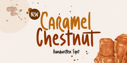 Introducing, Charamel chestnut! this font is a carefully crafted display font but still have an organic touch. this font is perfect for branding, packaging, headline, title, etc. Features : uppercase & lowercase numbers and punctuation multilingual alternates and ligatures PUA encoded We highly recommend using a program that supports OpenType features and Glyphs panels like many of Adobe apps and Corel Draw, so you can see and access all Glyph variations.
 - 1871 Dreamer 2 Pro by GLC,
$42.00 Like our first "1871 Dreamer Script" this script font was inspired from a lot of manuscripts, notes and drafts, written by the famous american poet Walt Whitman. However, it is a very different font, with a higher x-line, numerous different ligatures, alternates and twin letters, including fractions, and, as a real "Pro" font, usable not only for Western European, but also for Eastern and Central European, Baltic and Turkish.
 - Greenalyzed by PizzaDude.dk,
$17.00 Greenalyzed is a made up word is a font that could set your mind to something handmade and eco friendly. The letters are clumsy and childish naive, but really fun and legible. Comes in 3 different versions: Regular, Rough and Stitch. The Stitch version is good as a top or shadow layer. I also added multilingual support and "jumpy" ligature substitutions for the most common double letters. Enjoy!
 - Luengo by Hashtag Type,
$25.00 Luengo is a modern geometric sans serif font family. Rounded corners give a natural and overall home-felt feel with an accessible air and an elegant touch. Luengo is for display purpose, but it also looks great in longer copy, making this family of 5 weights perfect for a range of uses such as brand identities, packaging and editorial. Luengo offers ligatures and alternatives with manual kerning and spacing.
 - Air Factory by Khaito Gengo,
$22.00 Air Factory was originally designed for a merchandise company, and ordered to design iconic but plain forms. Air Factory is a very simple and modern sans-serif font inspired by early 1900’s typefaces, like Futura, and consisting of 5 weights and stencil type(free). This contemporary typeface would be good used for restaurant, retail, book, poster etc. Air Factory also features various ligatures, stylistic alternates, fractions, and languages as well.
 - Drunken Tower by PizzaDude.dk,
$20.00 Drunken Tower may look like a bit like my a Drunken Hour and Drunken Shower fonts. But there are a lot differences! This font is way more distorted and rugged than its brothers! The font has got Ligatures for double upper- and lowercase and numbers as well. Plus, an alternate version for each letter - again, both upper- and lowercase! You will need to use OpenType supporting applications to use the autoligatures.
 - Petals BF by Bomparte's Fonts,
$39.00 Ooh so soft, so curvaceous, so voluptuous and so swash-buckling. Hey, I'm talking ’bout Petals BF! Here’s a design inspired by the work of Dave West and infused with a plethora of pleasingly plump letterforms, with swashes reminiscent of 60s and 70s types. But here’s the twist: where you might typically expect to find ball terminals, you'll experience some sensuous curls; and some playful letterforms such as lowercase h, k, m, and n, may even call to mind that groovy look of ’60s bell-bottoms. Spread across its capitals and lowercase are swash variants for beginning, middle and ending letterforms —candy for your eyes. Petals BF is where Didone style happily marries the organic and curvaceous forms of Art Nouveau. Strange I know, but so is a duckbill platypus —and somehow they all seem to work surprisingly well. Among the many typographic niceties you'll discover, are such Opentype features as Contextual and Stylistic alternates, Ligatures, Case-sensitive forms and Fractions. Please note: these magical features demand the use of opentype-savvy applications such as Adobe Creative Suite, QuarkXPress and etc. Petals BF is multilingual, and speaks the languages of Western, Eastern and Central Europe, in addition to Turkish and Baltic. It gets around. So let your creativity blossom with Petals in projects that involve headlines, magazine layouts, product packaging, logos, signage, branding and etc.
 - Tandelle by Typodermic,
$11.95 Welcome to the world of Tandelle—a sans-serif typeface with a unique flavor that will make your designs stand out. Tandelle was designed with a specific purpose in mind: to operate efficiently when there is a limited amount of horizontal space available. Its narrow letterforms are perfect for headlines, captions, and other types of text where space is at a premium. What sets Tandelle apart from other sans-serif typefaces is its flat points on verticals such as “A” and sharp points on horizontals such as “Z”. These distinctive features add a touch of sophistication and elegance to your designs, making them visually appealing and easy to read. Tandelle’s spacious shapes and minimal detail make it simple to read despite its narrowness. The typeface’s clean lines and modern design lend themselves to a wide range of applications, from branding and advertising to packaging and web design. Tandelle comes in four styles: Regular, Italic, Bold, and Bold-Italic. Whether you’re looking for a subtle accent or a bold statement, Tandelle has you covered. With its narrow letterforms and unique flavor, Tandelle is the perfect choice for any project that requires a touch of sophistication and style. So why settle for ordinary when you can have extraordinary? Try Tandelle today and see the difference for yourself. Most Latin-based European writing systems are supported, including the following languages. Afaan Oromo, Afar, Afrikaans, Albanian, Alsatian, Aromanian, Aymara, Bashkir (Latin), Basque, Belarusian (Latin), Bemba, Bikol, Bosnian, Breton, Cape Verdean, Creole, Catalan, Cebuano, Chamorro, Chavacano, Chichewa, Crimean Tatar (Latin), Croatian, Czech, Danish, Dawan, Dholuo, Dutch, English, Estonian, Faroese, Fijian, Filipino, Finnish, French, Frisian, Friulian, Gagauz (Latin), Galician, Ganda, Genoese, German, Greenlandic, Guadeloupean Creole, Haitian Creole, Hawaiian, Hiligaynon, Hungarian, Icelandic, Ilocano, Indonesian, Irish, Italian, Jamaican, Kaqchikel, Karakalpak (Latin), Kashubian, Kikongo, Kinyarwanda, Kirundi, Kurdish (Latin), Latvian, Lithuanian, Lombard, Low Saxon, Luxembourgish, Maasai, Makhuwa, Malay, Maltese, Māori, Moldovan, Montenegrin, Ndebele, Neapolitan, Norwegian, Novial, Occitan, Ossetian (Latin), Papiamento, Piedmontese, Polish, Portuguese, Quechua, Rarotongan, Romanian, Romansh, Sami, Sango, Saramaccan, Sardinian, Scottish Gaelic, Serbian (Latin), Shona, Sicilian, Silesian, Slovak, Slovenian, Somali, Sorbian, Sotho, Spanish, Swahili, Swazi, Swedish, Tagalog, Tahitian, Tetum, Tongan, Tshiluba, Tsonga, Tswana, Tumbuka, Turkish, Turkmen (Latin), Tuvaluan, Uzbek (Latin), Venetian, Vepsian, Võro, Walloon, Waray-Waray, Wayuu, Welsh, Wolof, Xhosa, Yapese, Zapotec Zulu and Zuni.
 - Jelly Ball by Yumna Type,
$15.00 Finding a perfect font for your project which always looks good in different display types can be a complicated task. Furthermore, the right font choice determines the success and the failure of your project. Unfortunately, if you fail to find the perfect one, you will waste your time, money and energy. Therefore, we would like to introduce you to Jelly Ball, a perfect font for any different display types without decreasing the legibility. Jelly Ball is a display font in round shapes on the letters’ edges to produce different effects on different applications. Generally, such a display font shows amazing, fresh, modern expressions to highlight important messages, to attract readers’ attention, and to beautify the display as well. The letters’ forms and proportions are relatively consistent enough to be legible. An extra bonus given is the clipart. You can also enjoy the available features here. Features: Multilingual Supports PUA Encoded Numerals and Punctuations Jelly Ball fits best for various design projects, such as brandings, posters, banners, headings, magazine covers, quotes, invitations, name cards, printed products, merchandise, social media, etc. Find out more ways to use this font by taking a look at the font preview. Thanks for purchasing our fonts. Hopefully, you have a great time using our font. Feel free to contact us anytime for further information or when you have trouble with the font. Thanks a lot and happy designing.
 - Komu by DizajnDesign,
$39.00 Komu is the revival of a style of letters frequently used on billboards during the socialist period in the former Czechoslovakia. These were usually uppercase letters made of paper and covered with a layer of aluminum foil. People just had to pick the letters (that included a variety of widths and sizes) out from a box and pin them up on a styrofoam billboard, thus making it easy to announce any event. Komu consists of two styles. Version A is rather squarish and includes some weird characters (K, 5, narrow E, strange diacritics) while version B is more rounded with most letters equally wide (with the exception of E, F and L, which look really wide next to the rest). The optical disparity of the original letters was kept, so that some of them look slightly darker than the others. Komu is intended to be used on posters, books and other products about Socialism in our region and includes full support for languages based on latin script.