10,000 search results
(0.116 seconds)
- FS Aldrin by Fontsmith,
$80.00 Elegant and round Having harboured a desire for a rounded font within the Fontsmith library for some time, Phil Garnham recognised that FS Emeric offered the perfect skeleton around which to design it. Most new rounded fonts rely on scripts or other in-app automation to form their characters. For all their warmth and approachability, they too often conjure images of jelly sweets and sausages. Not so FS Aldrin, where every curve and transition has been crafted by hand, giving a distinctive look and elegant feel. Design highlights FS Aldrin enjoys wide-open ‘lunar’ counters and soft, tube-like terminals. These improve legibility, especially on backlit signage and screens. The open proportions and circular strokes are juxtaposed against a more serious technical aspect that exists within each counter shape. The lighter weights feel precise and efficient, perfect for notes on blueprints or technical drawings. The heavy weights are equally crafted but more playful by their rotund nature, and are perfect for strong headlines or packaging projects. UI icons A suite of 268 icons complement the typeface beautifully and extend the design language in all directions. They cover a range of commonly used applications and themes ranging from ecommerce to weather, and also serve as a solid starting point for a bespoke brand icon set or UI. In addition, born of FS Aldrin’s astronomical theme and playful nature is a special collection of space-themed icons, including rockets, shuttles and lunar modules (hint: if you type the word BUZZ with ligatures enabled, an astronaut appears). Earth to Buzz Buzz Aldrin was the pilot of Apollo 11’s lunar module, the one that put man on The Moon for the very first time. Early on in the project’s life, FS Aldrin emerged as the ideal hook on which to hang the font’s space helmet (hardly surprising given Phil’s fascination with space travel and astronomy). An approach was made to Buzz’s management to see if he would sanction the association. Not only was the great man himself happy to see his name on a typeface, he also asked to use it in his upcoming keynote talks, book launches and online projects.
 - Italia by ITC,
$29.00Italia is the work of Colin Brignall, a refreshingly different serif typeface. At first glance, Italia might seem comparable to any other square serif typeface, but it has a distinctive pattern all its own. Italia can be used as either a display or text typeface and will give any text a unique look. - Yolk by Monotype,
$31.99 Yolk is an Eggcentric Sans Serif Typeface consisting of nine weights in both roman and italic. Essentially, this is a geometric sans typeface that has been inspired by the shape and proportions of an egg. With its bottom-heavy glyphs, Yolk has an unusual personality – it’s not too awkward to be off-putting, and it’s not too uniform to be associated with the myriad of generic geometric sans fonts that are available. Yolk has a distinctive presence in its upright form, while the italics exude a more flamboyant nature. When combined, your typographic results will be pleasing and perhaps a little quirky too. This 18-font type family achieves a good balance of personality, versatility, and usability. Small Caps are available at the click of a button, then add Stylistic Set 1 to achieve Petite Caps. The petite caps harmonise with the regular lowercase forms, so that you can create unicase-style typography too. All Latin-based languages are covered within the 1000+ glyphs of each Yolk font. Key Features: • 18 font family – 9 weights in Roman and Italic • Small Caps, Petite Caps, with Proportional, Old Style, and Small Cap figures, plus Fractions, Numerators, Denominators, Superiors, and Inferiors • Full European character set (Latin Extended) • 1,000+ glyphs per font.
 - Art Gothic HiH by HiH,
$10.00 Art Gothic was attributed to the Central Type Foundry of St. Louis, Missouri, USA by Henry Lewis Bullen, writing in INLAND PRINTER in 1907, with a reproduction shown in Kelly’s American Wood Type. The typeface appears on the cover of an issue of “The Superior Printer” pictured in Typology by Heller and Fili dated in the 1870s. Art Gothic was designed in 1884 by Gustav Schroeder and proved to be one of the more popular and enduring of the American-designed Victorian display faces of the period, appearing frequently in ads in various publications. The Hamilton Mfg. Co showed a very similar wood type, No. 232, with a modified and rather heavy-handed upper case in 1892. As late as 1897, it may be found in the advertising section of The Ivy of Trinity College of Hartford, Connecticut and was included in the Norwood Press 1902 Specimen Book. Our font includes a complement of five upper case and four lower case alternatives as follows: 123=C, 125=E, 135=H, 137=S, 172=c, 175=e, 215=m and 247=s. Great for period pieces. ART GOTHIC HIH is clean, readable, and surprisingly modern-looking; unlike so many overly complex Victorian display fonts, it can be used in text sizes.
 - Hijrnotes by Mans Greback,
$59.00 Hijrnotes is a quick, handwritten and monolined script font. Big uppercase with a very small lowercase, but it is still elegantly readable. Very good for autography design, name cards, neon signs and quote typography posters and flyers.
 - ÉconoSans Pro by Ingo,
$41.00 The most space-saving sans serif This font saves more space than any of its kind! Slim proportions, but not “condensed” Characters which nearly touch Sparse ascenders and descenders Distinct forms How close to each other can the characters of a font get? Theoretically, as close as you want. But obviously, the words should still be legible. And as any designer knows, body clearance of characters also depends on other parameters such as point size and line spacing. In practice, there are always situations in which as much information as possible has to be positioned in as little space as possible. The ingoFont ÉconoSans is made for exactly this purpose. Even the name of the font implies its function: French for the infinitive “to save” is “économiser.” Now if that doesn’t sound good… The shapes of the upper and lower case letters are completely matter-of-fact, the way a modern font has got to be. The letters c e, and s are wide open to their neighbors. An especially distinguished trait of this font is the design of the “triangular” characters v w y x k z and A V W Y Z K X M N. And the open form of B R and P is also not typical in a sans serif. The distance between letters is kept tight and often the characters nearly touch, but only nearly. With ÉconoSans you gain approximately 20% more text in a line than with »Tahoma«, and even still more than 10% compared to »Helvetica«. ÉconoSans also includes tabular figures as well as ligatures. Among the ligatures, the double mm is especially unusual and is hardly familiar, but can contribute greatly to saving space without catching the reader’s eye.
 - URLOP by Mikołaj Grabowski,
$9.00 Colour is more fun than black, but multicolour is even better. Let me introduce URLOP, a wide type family suitable for your fancy posters, headlines, covers, illustrations, websites, initials, blackmails, chronicles, signboards, poems and many others. Twelve basic styles, which make the overall construction, give a wide range of opportunities. All of them, being able to mix with each other, vary from a thin INSIDE, through a medium FILL, to a double-stem PLUS styles. And then comes a range of colour fonts, so you don’t have to waste any of your precious time for experiments, because I’ve already done it for you! URLOP is an all-caps display collection consisting of three sub-families of fonts, divided by the usage they are designed for. First of all, there is a wide range of alphabets made in the new OpenType-SVG colour fonts format. This is quite a novelty and a very promising technology at the same time. It allows designers to store colour information inside the font. Due to my experience with layered colour thinking that I explored in my first family - Epilepsja , I decided to make several preset layer combinations in this auspicious format. This sub-group is tagged RGB. Make sure that your field of usage and software support OT-SVG format. However, if you feel a need to experiment in the old-fashioned way, you may buy separate layers under the DIY tag. The last group is very similar to the DIY, but it was optimized to look better when standing without other layers. It’s called PRO*. All styles cover Latin alphabets of Europe, basic Cyrillic and Greek sets. Have fun! Before using the font, read the instructions and specimen attached to font files in the purchased package or download them from the Gallery tab on this site. This will help you avoid making unexpected mistakes when combining layers. *PRO subfamily release planned in 2019.
 - Kidyzen by Niznaztype,
$10.00 Kidyzen is a sans handwritten typeface. Inspired from the character of kids writing in their book. Kidyzen have unique style because it like same with typing of children. Kidyzen is perfect for comic, illustration, cartoon, kids design and very suitable for speech bubble text. It have very fun, cute, easy communication, easy reading and unique styles. You can use it for kids t-shirt, cover book, tagline, poster, branding, advertising, wall painting letter and graphic designs that use kids character . Kidyzen have 6 styles, there are regular, italic, bold, bold italic, thin and thin italic. Be enjoy it with my fonts.
 - Valentia Nit by Eurotypo,
$59.00 “Valentia Nit” is a copperplate typeface enriched with swashes and extensions in alternate characters. Its main feature is the intense contrast between thick and thin strokes that gives you clarity of reading while providing a delicate and subtle texture in the text. Another feature is the spontaneity of its stems, the agile and casual ties, which in fact, these combinations can offer the designer a variety of possibilities to structure a logo or headline in sophisticated lettering style. “Valentia Nit” was designed to combine with our previous font “Valentia” in order to obtain the necessary hierarchy of texts using changing thicknesses.
 - Cardea by Emigre,
$39.00 The Cardea family of typefaces is the outcome of David Cabianca’s 2003–04 MA Typeface Design experience at the University of Reading. With Cardea, Cabianca intended to mix classical and modern characteristics, and in the process he created a typeface that “sparkles” on the page, with high contrast, luster and crisp edges. The result is a type with a muscular or sculptural feel much like the work of artists like Arne Quinze or Mark di Suvero. Cardea was designed to function as a text face. It features three weights each with accompanying italics, small caps and a variety of ligatures.
 - Sassoon Felt by Sassoon-Williams,
$48.00 Sassoon Felt’s more casual letterforms can be used either as informal text or for the teaching of reading and handwriting; having the letterforms most taught in UK schools. These fonts are an educators alternative to Comic Sans (from Microsoft) and Chalkboard (from Apple), which are more appropriate for ‘Print’ style writing in United States Elementary schools and may also be appropriate for parts of Australia, which can be identified usually by crucifix t, diagonal y downstroke, short f, two-stroke and there may be more. Free to download resources: How to access Stylistic Sets of alternative letters in these fonts
 - Breuer Text by TypeTrust,
$30.00 Breuer Text is a simple geometric sans with relaxed curves and slightly condensed proportions suitable for moderate lengths of body copy. The italics are optically adjusted obliques with a selection of augmented lowercase glyphs for a warmer read. Breuer Text offers the distinct aura of technical precision in a personable tone, ideal for instructional copy or safety warnings. Its basic structure and conservative letterforms maintain a level voice without turning robotic or sterile. Pair with the two-font Breuer Headline family for a simple and complete editorial type system. Breuer Text includes Small Caps, Old Style Figures and Tabular Figures.
 - Japan Gate by Senekaligrafika,
$12.00 "Japan Gate" is a Japanese-style display font inspired by traditional Japanese gate (Torii Gate) .This font is a sans serif font with a authentic japanese look and feel designed as unique as possible to create a beautiful and easy-to-read combination of sentences. This font is also very flexible for you to use in your various projects, ensuring that your project has a fantastic and appealing appearance that will be remembered by all audiences. Logotypes, food banners, branding, brochure, posters, movie titles, book titles, quotes, and more – may all benefit from this font. The owner of endless possibilities!
 - Steradian by Emtype Foundry,
$69.00 Steradian is an exploration of the geometric genre and although it has a geometric base, the widths between letters are not much different across the weights. That is due to the process, in which the proportions of the heavier weights paved the way for the lighter ones. It also has a series of details that make Steradian stand out and gives it a special touch. Some of its main features are the double-story ‘a’, its closed apertures and some of the capitals have a distinct personality (such as the G and Q). Read more about the design process at the Emtype’s Blog.
 - Bandera by AndrijType,
$21.00 This square serif typeface is a real workhorse. It is a modern tool for text design: extremely legible and well shaped. Bandera has six weights with original italics. It catches attention in headlines of posters and magazines or makes reading comfortable in plain texts. Bandera shares main proportions with sans serif Osnova Pro typefamily so ideally can pair it. It has Bandera Text and Bandera Display sister families as well. Please check also Pro version for pan-european support (full Latin-Greek-Cyrillic). Bandera is Spanish for ‘flag’. And Bandera is a symbol of Ukrainian fighting for freedom for many years.
 - Letter Gothic 12 Pitch by ParaType,
$30.00 The Bitstream version of Letter Gothic designed by Roger Robertson in 1956-62 for IBM electric typewriter. It is a condensed, monospaced font resembling a typewriter face, suitable for tabular material. Primarily used for slide presentations and for word processing applications, Letter Gothic is very helpful for printing out software source listing, for informal office communications and for tabular charts where alignment of columns is important. Besides, being a clear and easy-to-read font, Letter Gothic is popular now for display and advertising matters. Cyrillic version was developed for ParaType in 2000 by Gayaneh Bagdasaryan.
 - Monoicono by astroluxtype,
$40.00 Monoicono is a graphics font which contains various iconography related to environmental, health, weather, emergency, quality control, and synergy. There are a total of sixty-six items which includes a light version in the lowercase letters and a bold version in the uppercase letters as well as various numbers that have additional icons. See the poster examples provided for all the dingbats/icons in the font. Recommended size usage would be approximately 62 points or above in size, although some icons will read fine much smaller. Note parenright and left, braceright and left have additional icons.
 - ITC Juanita by ITC,
$29.99 ITC Juanita is the work of Argentinian-born designer Luis Siquot and was inspired by a text set only with woodcuts which he was reading during a long international flight. ITC Juanita is a series of six distinct typefaces which Siquot sees as a personal reinterpretation of designs that originated in the 1930s and 40s and were still popular during his childhood in the 1950s. For me, Juanita is like a toy, charming, expressive, and also dramatic," says Siquot. The ITC Juanita series offers designers a range of variations based on similar structures, each variation with its own look."
 - Corradine Handwriting Italic by Corradine Fonts,
$19.95 Few fonts reach the goal of simulate properly the hand writing aspect. Based on the hand writing of Manuel Corradine, Corradine Handwriting fonts have a lot of automatized alternates and ligatures that give them a natural hand writing feeling. Initially we were offering just the upright version of Corradine Handwriting but now here is the nice italic version.
 - Ginger Snack by Forberas Club,
$16.00 Ginger Snack is a Handwritten Script font that will make your designs look classic, Farmhouse, Boho, and Feminine. It is a great font for events, Wedding Project, signature, album covers, logos, branding, magazines, social media posts, advertisements, but it also works great for other projects. Add it to your fonts’ library, and it will enhance your creativity!
 - Lucky Yellow by Forberas Club,
$17.00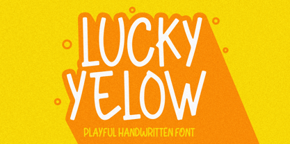 Lucky Yellow is a Handwritten Script font that will make your designs look classic, Farmhouse, Boho, and Feminine. It is a great font for events, Wedding Project, signature, album covers, logos, branding, magazines, social media posts, advertisements, but it also works great for other projects. Add it to your fonts’ library, and it will enhance your creativity!
 - Good Zodiac by Forberas Club,
$16.00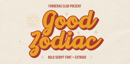 Good Zodiac is a Vintage Retro font that will make your designs look classic, Farmhouse, Boho, and Feminine. It is a great font for events, Wedding Project, signature, album covers, logos, branding, magazines, social media posts, advertisements, but it also works great for other projects. Add it to your fonts’ library, and it will enhance your creativity!
 - Scrivere by Forberas Club,
$18.00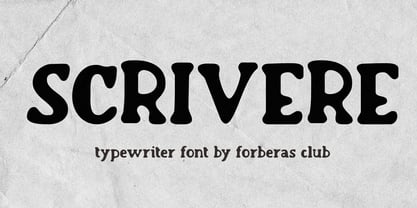 Scrivere is a Handwritten Script font that will make your designs look classic, Farmhouse, Boho, and Feminine. It is a great font for events, Wedding Project, signature, album covers, logos, branding, magazines, social media posts, advertisements, but it also works great for other projects. Add it to your fonts’ library, and it will enhance your creativity!
 - Sunkist Island by Forberas Club,
$16.00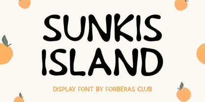 Sunkist Island is a Handwritten Script font that will make your designs look classic, Farmhouse, Boho, and Feminine. It is a great font for events, Wedding Project, signature, album covers, logos, branding, magazines, social media posts, advertisements, but it also works great for other projects. Add it to your fonts’ library, and it will enhance your creativity!
 - Ring Legs by Ochakov,
$9.00 An integral part of Ring Family beauty are the Legs... Ring Legs! In addition, elegant and stylish. Ring font family even more so now. More opportunities, more ambitions, more likely! Ring Legs and all other is always prepared for any surprise. Comes in 8 weights, but so many combinations. The Ring Font Family continues to grow steadily!
 - Music Lesson JNL by Jeff Levine,
$29.00 During the 1940s and 1950s, the Miller Music Corporation issued a number of its songs with a stock cover design for their “Miller Series of Piano Solos” but the song titles were hand lettered in an Art Deco dual line design. Recreated digitally as Music Lesson JNL, this type design is available in both regular and oblique versions.
 - FTF Brotein by Forberas Club,
$19.00 FTF Brotein is a Handwritten font that will make your designs look Powerful, Playful, Bold, and good. It is a great font for events, Wedding Project, signature, album covers, logos, branding, magazines, social media posts, advertisements, but it also works great for other projects. Add it to your fonts’ library, and it will enhance your creativity!
 - Kaleidoxope by PizzaDude.dk,
$20.00 Kaleidoxope is my hand-drawn headline font. However, I traced the font digitally to make it look more smooth - but still kept the handmade look. As usual it has that well known pizzadude mixture of funk, grafitti and a teaspoon of madness! Comes with alternate characters for double lettering and a swashy version of most letters! Enjoy! :)
 - Mealcoke by Forberas Club,
$18.00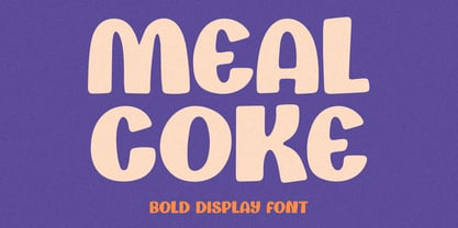 Mealcoke is a Handwritten Script font that will make your designs look classic, Farmhouse, Boho, and Feminine. It is a great font for events, Wedding Project, signature, album covers, logos, branding, magazines, social media posts, advertisements, but it also works great for other projects. Add it to your fonts’ library, and it will enhance your creativity!
 - House of Gold by Forberas Club,
$17.00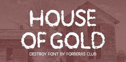 House of Gold is a Handwritten Script font that will make your designs look classic, Farmhouse, Boho, and Feminine. It is a great font for events, Wedding Project, signature, album covers, logos, branding, magazines, social media posts, advertisements, but it also works great for other projects. Add it to your fonts’ library, and it will enhance your creativity!
 - Mells Butter by Forberas Club,
$17.00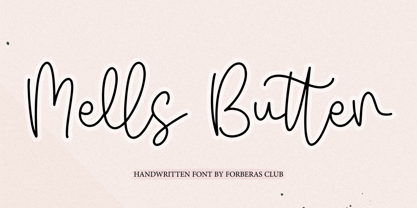 Mells Butter is a Handwritten Script font that will make your designs look classic, Farmhouse, Boho, and Feminine. It is a great font for events, Wedding Project, signature, album covers, logos, branding, magazines, social media posts, advertisements, but it also works great for other projects. Add it to your fonts’ library, and it will enhance your creativity!
 - Sandwich Market by Forberas Club,
$16.00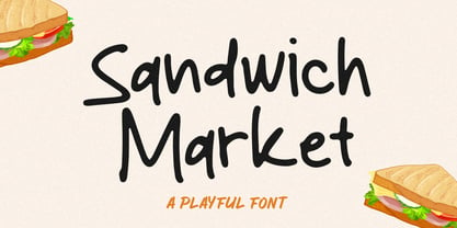 Sandwich Market is a Handwritten Script font that will make your designs look classic, Farmhouse, Boho, and Feminine. It is a great font for events, Wedding Project, signature, album covers, logos, branding, magazines, social media posts, advertisements, but it also works great for other projects. Add it to your fonts’ library, and it will enhance your creativity!
 - Metrisch by Gumpita Rahayu,
$18.00 Metrisch is new sans serif typefamily of seven weights plus seven italics uprights in each weights. The typefaces designed based on traditional geometric construction that have been built with letter size wider, the x-heights taller and short descender that almost proportioned with the basic letter shape. With little details added like clean vertical cuts on the terminals and optimized sharp corners that makes this fonts smooth and refined looks. It was represents the flavor of the most common humanist typefaces style and grotesk feels. The weights comes from extra light to extra bold suitable to make display appearance, and the book and medium weights also works well as small/medium text sizes to accompany your design, such as editorial fashion magazine, solid headline, websites heading, poster, advertising, logo, signage, etc Also, Metrisch type-family fully loaded with OpenType features such as some stylistic alternates, case-sensitive forms, fractions, small capitals,and another most common numerals features such as super & subscript, tabular & oldstyle figures, numerator-denominator, and has more extended latin diacritics characters.
 - Grogie by Luhop Creative,
$16.00 Grogie font family consists of 06 families,is a high-contrast typography inspired by transitional and contemporary typography. Fonts extend their use by giving weights ranging from thin to black. The natural curve, a swollen and sloping stem, grows in character as the font gains weight. While the thinner weight has lowered contrast and optical correction to create a warm and soft look. Featuring beautiful, excellent weight and extensive language support. The elegant modern font creates a unique design and is sure to steal the eye of the design target audience. Besides being unique, the Grogie font also has a luxury simple character that makes the design charming and luxurious. Grogie excels in display settings such as headlines, titles, branding projects, Logo design, packaging, magazine headings, advertising, short or long text. Grogie Features: Multilanguange PUA Encoded Alternates Ligatures. Open Type LatPro To be able to access alternative fonts, make sure the software you use can support opentype features such as Microsoft Word, Paint, Adobe, Corel draw, Cricut and other applications. If you need help, please contact me :)
 - Ultimate College Team by Fontscafe,
$39.00 College styles fonts are a "must have" for any designer just because of their really vast possibilities of uses. With our "Ultimate College Team" pack we're giving a whole range of "College style" fonts where you'll be able to select in any moment the perfect characteristic necessary for your next project. The pack includes 9 hand crafted fonts that capture these very emotions of team work and campus life. Our college fonts speak largely of sports activities, but also of those strong emotions that combines force, discipline, determination, confidence and that feeling to be “in the Team”. The "Hot Sports Elements" font, which consists of handy sports related graphic elements, is the last touch to reinforce and add meaning of a piece of text and create the best balance to your layout and it comes free when you buy the packs available!
 - Core Sans M by S-Core,
$25.00 The Core Sans M Family is a part of the Core Sans Series, such as Core Sans N, Core Sans N Rounded, Core Sans N SC, and Core Sans G. This font family has open and square letter shapes, and overall rounded finishes provide a soft and friendly appearance. Simple and modern shapes with a tall x-height make the text legible and the spaces between individual letter forms are precisely adjusted to create the perfect typesetting. The Core Sans M Family consists of 2 widths (Condensed, Normal), 7 weights (ExtraLight, Light, Regular, Medium, Bold, ExtraBold, Heavy), and Italics for each format. Small Caps versions are also available. It supports WGL4, which provides a wide range of character sets (CE, Greek, Cyrillic and Eastern European characters). Each font includes support for Tabular numbers, Arrows, Box drawings, Geometric shapes, Block elements, Mathematical operators, Miscellaneous symbols and Opentype Features such as Proportional Figures, Numerators, Denominators, Superscript, Scientific Inferiors, Subscript, Fractions and Standard Ligatures. The Core Sans M Family provides both OpenType (.OTF) and TrueType (.TTF) versions in the same package. We highly recommend it for use in books, web pages, screen displays, and so on.
 - Mountella by Kereatype,
$14.00 Mountella is a modern editorial serif font family that includes 18 fonts, uprights, italic, and 2 variable font from Extra Light to Black which has more than 500 characters, and still has all the nostalgic vibes!. Mountella is a beautiful serif family that includes many visual details, adding uniqueness that looks incredible in both large and small settings as a display and body text. Mountella can be used in high-end branding, logo designs, magazines, product packaging & invitations. One thing to note about Mountella is the letter spacing. It was intentionally for clean reading if you wanted to use it for the body type, so I recommended setting the spacing a little tighter for display use (around -10 to -50 should do!). Design Tips: combine the regular and italic, whether all in one word or body text for logo or quote. Adjust your letterspacing to add more groove! Tighter letterspacing for large headers.
 - Girly Style by Akrtype Studio,
$19.00 Girly Style is a beautiful and simple handwriting script font, contemporary and fashionable, Girly Style looks elegant for a wide variety of designs. This elegant font can be read and looks good as a title or body text. This font will be perfect for many different designs for magazine headlines, social media, branding, wedding invitations, cards, etc. Girly Style fonts include ligatures, capital letters and alternate letters. You need a program that supports OpenType features like Adobe Illustrator CS, Adobe Photoshop CC, Adobe Indesign and Corel Draw X6 / X7. and you can also access alternative flying machines via Font Book (Mac users) or Windows Character Map (Windows users).
 - Lucida Grande by Monotype,
$50.99 Lucida Grande is a humanist sans serif font with a large x-height, clear letterforms, and space-saving economy. Its easy reading qualities make it legible for printing and screen displays even down to small sizes. Lucida Grande is part of the Lucida superfamily of fonts from Bigelow & Holmes. Lucida is highly regarded for legibility and its extensive range of type styles. The Lucida Grande family has eight fonts with weights from Thin to Black with matching italics. Each font has 674 glyphs and supports the W1G character set. This includes Latin, Greek and Cyrillic alphabets to support many languages in Europe, the Americas, and worldwide.
 - Janda Swirlygirl by Kimberly Geswein,
$5.00 The swooshy swirls of the uppercase paired with the simple lowercase creates a very useful title font. Romantic and girly but still perfectly legible.