10,000 search results
(0.041 seconds)
- Nawin Latin by Letterjuice,
$66.00 Nawin is an informal Arabic typeface inspired by handwriting. The idea behind this design is to create a type family attractive and ownable for children but at the same time a design that keeps excellent letter recognition for reading. Handwriting has been a great source of inspiration in this particular typeface. By emulating the movements of the pen, we have obtained letter shapes that express spontaneity. A bright group of letters create a lively and beautiful paragraph of text. To get closer to handwriting and the variety of letter shapes that we draw while writing, this typeface offers a large number of alternative characters, which differ slightly from the default ones. Because we have programed the «Contextual Alternate» feature in the fonts, these alternate characters appear automatically as you set a text on your computer. For instance, in the Arabic variability on vertical proportions between letters Alef and initial Lam, create movement in text and avoid the cold mechanical feel of repetition. In the case of the Latin a part from having an entire alternate basic alphabet, there are also different letterforms for characters with diacritics, this way variability becomes even greater. Nawin is quirky and elegant at the same time. Letter recognition is relevant when reading continuous text. For this reason, in the Arabic, we have added another contextual alternate feature with alternate characters that help to avoid confusion when letters with similar or the same shape repeat inside one word. This is the case of medial «beh and Yeh» repeated three times continuously in the same word. The alternate characters change in shape and length, facilitating distinction to the reader. Since this typeface is inspired by handwriting and the free movement of the hand while writing, we considered ligatures a good asset for this design. The Arabic has a wide range of ligatures that enhance movement and fluidity in text making look text alive, while the Latin achieves this same effect via contextual alternates.
 - Nawin Arabic Ltn by Letterjuice,
$107.00 Nawin is an informal Arabic typeface inspired by handwriting. The idea behind this design is to create a type family attractive and ownable for children but at the same time a design that keeps excellent letter recognition for reading. Handwriting has been a great source of inspiration in this particular typeface. By emulating the movements of the pen, we have obtained letter shapes that express spontaneity. A bright group of letters create a lively and beautiful paragraph of text. To get closer to handwriting and the variety of letter shapes that we draw while writing, this typeface offers a large number of alternative characters, which differ slightly from the default ones. Because we have programed the «Contextual Alternate» feature in the fonts, these alternate characters appear automatically as you set a text on your computer. For instance, in the Arabic variability on vertical proportions between letters Alef and initial Lam, create movement in text and avoid the cold mechanical feel of repetition. In the case of the Latin a part from having an entire alternate basic alphabet, there are also different letterforms for characters with diacritics, this way variability becomes even greater. Nawin is quirky and elegant at the same time. Letter recognition is relevant when reading continuous text. For this reason, in the Arabic, we have added another contextual alternate feature with alternate characters that help to avoid confusion when letters with similar or the same shape repeat inside one word. This is the case of medial «beh and Yeh» repeated three times continuously in the same word. The alternate characters change in shape and length, facilitating distinction to the reader. Since this typeface is inspired by handwriting and the free movement of the hand while writing, we considered ligatures a good asset for this design. The Arabic has a wide range of ligatures that enhance movement and fluidity in text making look text alive, while the Latin achieves this same effect via contextual alternates.
 - Orca Pro by (v) design,
$49.00 Orca Pro is a modern sans-serif font family. Its lowercase letters are inspired by the well known OCR-A font, however every single glyph has been more or less revised. Capitals, numerals and all other characters and punctuation marks are entirely new. Feel free to download the PDF Specimen for detailed info and examples. The Orca Pro family consists of 10 fonts – light, regular, medium, bold and heavy weights including real italics. It supports many OpenType features like automatic fractions, ordinals, proportional/tabular figures, numerators, denominators, superiors, inferiors or case sensitive forms and offers great multilingual support for most of Latin-based languages (including CE). Orca Pro contains a number of standard and discretionary ligatures, numerals as well as 62 bullets, symbols and arrows. Orca reveals its soft, rounded character in bigger sizes while it remains distinct and legible in small sizes.
 - Secca Soft by astype,
$42.00 Secca Soft is the rounded sister of Secca font family. With its workhorse qualities, Secca Soft is perfectly suited for a wide range of applications - especially where legibility and economy are important factors. It comes with a wide language support and many typographic features and extras. The family comes in nine weights from Thin to Ultra Black - each with italics, small caps and italic small caps. While the weights from Light to Bold perform well in text sizes, the more extreme styles give extra freedom for Headlines & Signage. For setting tables and charts, Secca Soft offers tabular figures, fractions, currency signs and mathematic operators which share the same fixed width throughout the entire range of weights. This special feature is called "weight duplexing" and is a time saver for designers of annual reports and other figure-heavy texts.
 - Fansan by W Type Foundry,
$25.00 Organic and sublime, Fansan is an Art Nouveau type family that includes roman, italic, and optical sizes. Its roots can be found in famous works such as Benguiat, Windsor, and Melbourne — worldwide typographic references which all have a sense of being imperfectly appealing. The aesthetic influence of Art Nouveau on Fansan can be seen in the top-heavy stress found in most characters. Applying this stress consistently throughout the character set was a significant challenge in the design of the family. The sharp terminals of numerous lowercase characters — including the a, f and g — provide a visual link between the upper and lowercase forms. As a result, Fansan is able to be elegant and pointed in its lighter weights, and playful and full of character in its heavier styles. Fansan is ideally suited for use at display sizes where personality is needed.
 - Bandet by eyetype,
$12.00 Bandet includes both a script and display weight, which are beautiful and unique, a model of modern calligraphy typefaces, working well in combination. Languages supported: Breton, Catalan, Czech, Danish, Estonian,French, German, Hungarian, Icelandic, Italian, Romanian, Scottish Gaelic, Slovak, Latvian, Lithuanian, Norwegian, English, Finnish, Polish, Portuguese, Slovenian, Spanish, Swedish, Turkish, Welsh. Basically, all European languages that are based on latin alphabet Can be used for various purposes.such as headings, logos, wedding invitation, t-shirt, letterhead, labels, news, posters, badges etc. To enable the OpenType Stylistic alternates, you need a program that supports OpenType features such as Adobe Illustrator CS, Adobe Indesign & CorelDraw X6-X7.
 - Hello Crystal Script by Romie Creative,
$14.00 Hello Font Lovers... Introducing my latest font "Hello Crystal Script"! Hello Crystal Script is a modern calligraphy font that features a varying baseline, smooth line, classic and elegant touch. Can be used for various purposes.such as headings, signature, logos, wedding invitation, t-shirt, letterhead, signage, labels, news, posters, badges etc. To enable the OpenType Stylistic alternates, you need a program that supports OpenType features such as Adobe Illustrator CS, Adobe Indesign & CorelDraw X6-X7, Microsoft Word 2010 or later versions.There are additional ways to access alternates/swashes, using Character Map (Windows), Nexus Font (Windows), Font Book (Mac) or a software program such as PopChar (for Windows and Mac).
 - TA Typefire by Tural Alisoy,
$- Typefire font will be known as TA Typefire from now on. Additionally, Cyrillic, Caucasian Albanian scripts and some glyphs were added. I made some slight modifications to letters. I hope you like it. Much love! TA Typefire is perfectly suited for editorial design, branding, magazines, logos, headings and more. TA Typefire OT Features: aalt, calt, case, dlig, dnom, frac, kern, liga, locl, numr, ordn, salt, sinf, ss01, ss02, ss03, subs, sups Supported Languages: Western Europe, Central/Eastern Europe, Baltic, Turkish, Romanian, Cyrillic, Caucasian Albanian Amount of glyphs included 456 Latin Plus languages supported 94% Latin Plus diacritics included 88% source: underware TA Typefire graphic presentation at Behance
 - Pisonest by Meutuwah,
$20.00 INTRO Pisonest is perfect for modern projects, headings, blogs, logos, brandings, invitations and more! Programs that support in this font is a Microsoft Office Adobe Photo Shop, Adobe Illustrator, Adobe Indesign, and Corel Draw, badges etc. Languages supported. Breton, Catalan, Czech, Danish, Estonian,French, German, Hungarian, Icelandic, Italian, Romanian, Scottish Gaelic, Slovak, Latvian, Lithuanian, Norwegian, English, Finnish, Polish, Portuguese, Slovenian, Spanish, Swedish, Turkish, Welsh. Basically, all European languages that are based on latin alphabet. To enable the OpenType Stylistic alternates, you need a program that supports OpenType features such as Adobe Illustrator CS/CC, Adobe Indesign CS/CC, Adobe Photoshop CS/CC, CorelDraw X6-X7 & Microsoft Office. THANK YOU SO MUCH.
 - Jean Paul Fraktur by RMU,
$25.00A typographic treasure, originated at the end of the 18th and the beginning of the 19th century, had been brought back to life. With its charming touch it makes a wonderful font for poems, bookcovers, reprints and other historically relevant projects. To get access to all ligatures, it is recommended to activate both Standard and Discretionary Ligatures; the round s you find on the # key, and typing the combination N-o-period and activating the OT feature Ordinals gets you the numero sign. - Dress Rehearsal JNL by Jeff Levine,
$29.00 In a career spanning the early 1900s through 1940, George M. Cohan wrote and produced over 50 plays, 300 songs and was also an actor, singer and dancer. Many of his works honored his Irish roots, and the cover of one piece of sheet music called “The Irish American” (1905) had its title hand lettered in a condensed Art Nouveau type design with tiny spurred serifs. This is now available digitally as Dress Rehearsal JNL, in both regular and oblique versions.
 - Mirantz by insigne,
$32.00 Y’all ready for this? Now starting for Insigne: the new serif Mirantz. This rookie all-star plays a precise game every game, cutting at all the right angles to leave your reader impressed and ready to see more. You can always count on Mirantz to lead with solid mechanics and a clean style, but don’t be surprised when the face keeps it real with a little individual flare and creativity. This personal touch is nothing short of elegance in every appearance. So what makes us love this rookie above the other great players in the field? Contrast, for one. Mirantz brings more contrast to the game than most serifs out there. The serifs on this face have a crisp, sharp wedge that naturally draws the reader’s eye. You can’t help but fall in love with its clean, natural style. Mirantz also features a tall x-height and regular proportions that can play a number of positions on the page and still stay strong through the last half of the copy or even the final period. Mirantz is a solid powerhouse player, containing a complete set of small capitals and nine weights from thin to bold. It can play well both down low and up top with its subscripts and superscripts and can move your reader’s eye easily across the copy with its titling capitals, condensed and extended variants, and open style figures. With its options covering more than 72 Latin-based languages, look for this newcomer to have international success in the near future. It you haven’t set your draft picks for this next round of projects, think hard before passing up Mirantz. A capable serif like this one is a guaranteed asset to any team of fonts. Production assistance from Lucas Azevedo.
 - CA Edwald by Cape Arcona Type Foundry,
$40.00 CA Edwald, the superbly crafted alphabet design now available in 5 weights, combining the familiar, the unusual, the practical and the aesthetic. Plan ahead and make use of the assorted logo letters that add distinction to your headline. CA Edwald is a welcome addition to our ever-growing collection of alphabet designs. It is prepared to meet your graphic requirements. Now there is one trusty Musketeer for today’s advertising. The illegitimate child of Oswald Bruce Cooper and Ed Benguiat, a mixture or even the “best of”: CA EDWALD.
 - Magethai by Gatype,
$10.00 Magethai is a beautiful mono-line font, perfect for logo design, branding, apparel design, signage, posters, wedding invitations and more. My goal with this font was to create an easy-to-read script font that would work for a variety of purposes. Magethai are encoded with PUA Unicode, which allows full access to all additional characters without having to design special software. Mac users can use Font Book and Windows users can use Character Map to view and copy any additional characters to paste into your favorite text editor/application. Hope you enjoy this font!
 - Alice by Mirror Types,
$25.00 Alice is a formal fantasy font. It’s inspired in the fairy tales and magical lands that my mother used to tell me as a child when I went to sleep. The capitals are really nice and complex, while the minuscules are cleaner for easier reading. The style Curly uses some features of the normal uppercase letters in the lowercase ones. There are some minor, yet noticable, flaws in a number of characters that will need correction for signage/vinyl letter cuts (characters appx. 2-1/2" and larger).
 - Bilal by Arendxstudio,
$16.00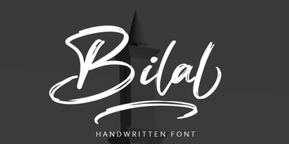 Bilal is a script font with distinctive handwritten characters, perfect for branding projects, logos, wedding designs, media posts, advertisements, product packaging, product designs, labels, photography, watermarks, invitations, stationery, and any project which needs a handwritten feel. Features : • Character Set A-Z • Numerals & Punctuations (OpenType Standard) • Accents (Multilingual characters) • Ligature • Swash There it is! I really hope you enjoy it - comments & likes are always welcome and accepted. More importantly, don't hesitate to send a message if you have a problem or question.Now just read this, go there and make it happen :)
 - Squidrock by Arendxstudio,
$18.00 Squidrock is a brush script with a distinctive handwritten character, perfect for branding projects, logos, wedding designs, media posts, advertisements, product packaging, product designs, labels, photography, watermarks, invitations, stationery, and any project which need a handwritten style. Features : • Character Set A-Z • Numerals & Punctuations (OpenType Standard) • Accents (Multilingual characters) • Ligatures • Swashes There it is! I really hope you enjoy it - comments & likes are always welcome and accepted. More importantly, don't hesitate to send a message if you have a problem or question. Now just read this, go there and make it happen :)
 - Ikhsani Grotesk by Makarsih Studio,
$9.00 Ikhsani Grotesk is a modern, contemporary font that offers an elegant and stylish look. It's perfect for any project that requires a bold yet sophisticated style. The font features strong lines and curves with sharp edges to create a unique visual effect. Its clean design makes it easy to read on both digital platforms as well as in print materials, making it ideal for logos, branding projects, websites or other graphic designs. With its versatile nature and timeless appeal, Ikhsani Grotesk is the perfect choice when you need something special yet classic!
 - Righteous by Arendxstudio,
$19.00 Righteous is a font with distinctive handwritten characters, perfect for branding projects, logos, wedding designs, media posts, advertisements, product packaging, product designs, labels, photography, watermarks, invitations, stationery, and any project that needs a handwritten touch. Features : • Character Set A-Z • Numerals & Punctuations (OpenType Standard) • Accents (Multi-lingual characters) • Ligatures • Alternates • Swashes There it is! I really hope you enjoy it - comments & likes are always welcome and accepted. More importantly, don't hesitate to send a message if you have a problem or question.Now just read this, go there and make it happen.
 - Matthias by Arendxstudio,
$16.00 Matthias is a brush script font with distinctive handwritten characters perfect for branding projects, logos, wedding designs, media posts, advertisements, product packaging, product designs, labels, photography, watermarks, invitations, stationery, and any project who need handwritten dishes. Features : • Character Set A-Z • Numerals & Punctuations (OpenType Standard) • Accents (Multilingual characters) • Ligature • Swash There it is! I really hope you enjoy it - comments & likes are always welcome and accepted. More importantly, don't hesitate to send a message if you have a problem or question. Now just read this, go there and make it happen :)
 - Sketchley BT by Bitstream,
$50.99Ronna Penner's Sketchley is a 2001 winner of ATypI's bukva:raz! design competition, held recently in Moscow. Inspired by handwriting samples and unable to find a typeface to satisfy her needs, Ms. Penner decided to create her own. The result is this warm, casual script. The compliment of characters demanded the creation of two fonts. Sketchley is considered the base font and should be used for basic layouts. Sketchley Swash has numerous initial, medial and final swash characters that, when used thoughtfully with Sketchley, can recreate the look of hand drawn calligraphy. - Qibtiyah by Arendxstudio,
$16.00 Qibtiyah is a brush script font with distinctive handwritten characters perfect for branding projects, logos, wedding designs, media posts, advertisements, product packaging, product designs, labels, photography, watermarks, invitations, stationery, and any project who need handwritten designs. Features : • Character Set A-Z • Numerals & Punctuations (OpenType Standard) • Accents (Multilingual characters) • Ligature • Swash There it is! I really hope you enjoy it - comments & likes are always welcome and accepted. More importantly, don't hesitate to send a message if you have a problem or question. Now just read this, go there and make it happen :)
 - Strenght To Strenght by Ronny Studio,
$19.00 Strenght To Strenght is distinctive handwriting and encapsulates the essence of street style. It gives every design project an urban vibe with its rugged and raw characteristics. This font is the perfect choice for people looking for a strong and influential typeface inspired by the rebellious spirit of street culture and graffiti. This font is designed to be versatile, making it suitable for a wide range of creative projects. Whether you're working on a skateboard deck design, a streetwear stuff, or a poster for an underground event, this font will infuse your work with urban attitude and a raw, handcrafted feel. The uppercase characters in Thrasher Head are bold and impactful, while the lowercase letters exhibit a slightly more refined style, providing a balanced mix of legibility and street-inspired aesthetics. This typeface is perfect for an poster event, movie title, streetwear stuff, magazine layout, fashion brand, quotes, or simply as a stylish text overlay to any background image.
 - Vogan by Heinzel Std,
$9.00 Vogan Typeface is a versatile font that comes in both regular and outline versions, both of which are in all capital letters. The regular version of the Vogan typeface features solid, bold characters that are perfect for making a statement. The letters are clean and well-defined, making them highly readable and suitable for a variety of design projects. Whether used for headings, logos, headlines, magazines, posters, or other creative applications, the regular version of Vogan Typeface commands attention with its bold and impactful appearance. In contrast, the outline version of Vogan Typeface provides a different aesthetic. The characters in this version are defined by their outer contours, creating a stylish and modern look. The outline font maintains the overall shape of the letters while allowing the background to show through the center, adding a touch of sophistication and creativity to any design. This version is particularly popular for design projects where a contemporary and edgy vibe is desired.
 - Sweet Moments by Din Studio,
$25.00 Is your branding missing something that makes people going WOW? Have you thought about how you can add that touch of magic to your branding and projects? What if we told you that we have solution to maximize your designs? Introducing Sweet Moments-A Handwritten Brush Font This font is more than just another brush font. It encapsulates the essence of luxury and elegance. With elegance and passion edged into every curve and twist of this brush font - you’ll be sure to boost your sales and make best impressions. This font become more special with many swash version option. Use it for headings, logos, business cards, printed quotes, invitations of all sorts, cards, packaging, and your website or social media branding. Sweet Moments includes Multilingual Options to make your branding globally acceptable. Features: Beautiful Ligatures Stylistic Sets Alternates Swashes Multilingual Support (84 languages) PUA Encoded Numerals and Punctuation Thank you for downloading premium fonts from Din Studio
 - Monly by WildOnes,
$10.00 The main idea behind creating Monly typeface was to combine playfulness with a strong letter construction backbone, so all the letters would stand tall and firm, but not to lose the playfulness. Like people, who grow up but try to save their inner child. By doing so and combining all this, the typeface achieves a great readability and appealing look. Monly font suits best for logos, headlines and small text blocks, but can also be used for big text blocks if the style suits the purpose.
 - Maybrook JNL by Jeff Levine,
$29.00 One of the type examples found within the pages of “Lettering” by Harry B. Wright (1950) is a bold hand lettered serif typeface with a unique twist – the slab serifs had rounded corners, looking very much like show card lettering of the early 1900s. This design is now available digitally as Maybrook JNL, in both regular and oblique versions.
 - Conscription JNL by Jeff Levine,
$29.00 The sheet music for the 1914 Word War I comic novelty song "When the War Breaks Out in Mexico I'm Going to Go to Montreal" had one of those overly-worded song titles popular during this period (13!), along with interesting sans serif hand lettering. It now debuts digitally as Conscription JNL in both regular and oblique versions.
 - KG Dark Side by Kimberly Geswein,
$5.00 This thick and thin mixed handwriting is perfectly legible and neat but still full of fun!
 - FS Sinclair by Fontsmith,
$80.00 ZX Spectrum In 1982, a home computer came on the market that would launch the UK IT industry. The ZX Spectrum sold five million units and spawned thousands of software titles. It was the must-have gadget for every teen. FS Sinclair is inspired by the memory of Sir Clive Sinclair’s greatest creation: the experience of entering its clunky command codes and reading its simple, grid-placed type. Smart, switched-on, great in text and display, FS Sinclair is a modern grid-based font, drawn with the Spectrum in mind and brought to life by well thought-out design. Formula Having completed the font for Channel 4’s brand update, the Fontsmith team defined the formula for its next font: the creative essence of the C4 work but with more structural discipline, more rigid form and a little more seriousness. The new font wouldn’t look self-consciously retro but it would reference the past and, it was hoped, influence the future. Readability Like the ZX Spectrum, it took a while for the new font to do exactly what it was meant to do. Many of the early concepts by Phil Garnham and Jason Smith were too jagged – the result of an awareness of getting too close to existing fonts of the same ilk, such as Wim Crouwel’s Gridnik. Eventually, FS Sinclair evolved into a more readable, functional grid-based type design that answered Phil and Jason’s original, self-set brief. Idiosyncratic There’s a technological, systems feel to FS Sinclair but ultimately, humans are in charge. The lowercase “a”, “n”, “m” and “r” have clean-cut “ears”, and the square-ish design is softened by round joins on the inside of the letterforms. The idiosyncratic design of letters such as “g”, “j”, “k”, “v”, “w” and “y” bring the design up to date. This is a modular font with character, and a range of weights that allow varied application.
 - Address Sans Pro by Sudtipos,
$39.00 History is always in sight; it is constantly being reconsidered and reformulated in the context of now. We see approaches to art, fashion, textiles, homewares, furnishings … not to mention music, graphics and everything else that culturally enriches our daily lives, revisited and made anew for today. Address Sans indulges in the spirit and aesthetics of mid-century Modern – Italian industrial design, sleek coffee makers, stylish cars, seductive jazz pressed on vinyl – with a charm and charisma that defies time. It evokes history but is decisively created for today. Its design, in reality, is rooted in the condensed structure and block modulation of early 1950s German lettering intended for use in street signage, but when we started to work on the various weights and widths, the result was a set of fonts in a style similar to the typographic work developed by Butti and Novarese in the 60s. The multitude of potential applications for Address Sans then became clear. In a range of 3 widths and 8 weights each, Address Sans includes little verses, true italics, small caps and numerous alternative signs for a total of 48 fonts. The result is a functional typeface that is effortlessly seductive, with geometric features and design details that ooze cool, and take it away from mere reinterpretation towards typographic forms that adapt perfectly for contemporary use.
 - Quintavy by Groen Studio,
$20.00 Quintavy This is my font based on a handwritten project in a modern calligraphy style in the modern era. very much with today's retro typography designs. Quintavy also comes with extra Extruded and Outline Font versions. as a function to create an extrusion effect for this font. Can be used for various purposes.such as headings, logos, wedding invitation, t-shirt, letterhead, lable, news, posters, badges etc. Multilingual support for various languages including: French, German, Spanish, Portuguese, Italian, Dutch, Finnish, Swedish, and more. Quintavy works great in any branding, logos, magazines, films. The different weights give you a full range of whole hosts of applications, while the outlined fonts give a real modern feel to any project. OpenType features can be accessed by using OpenType smart programs such as Adobe Photo Shop, Adobe Illustrator, Adobe Indesign, Corel Draw and Microsoft Office. can also be accessed through the character map.
 - Karayel Handwritten by Tatbikililer,
$19.00 Erdogan Karayel, a master in graphic arts and a cartoon artist, has long dreamed of transforming characters made up of his own handwriting into fonts. This dream has come true with the technical support of Karayel's school friend Sabahattin Kayış, a graduate of the Istanbul School of Applied Fine Arts (Marmara University Faculty of Fine Arts). The biggest problem of handwritten fonts in the font world is the difficulty of reading in long texts due to their curved and flexible letters that create spacing problems when used side by side. The "Karayel Calligraphy", on the contrary, is created as a solution to this problem. It's a font that is sufficiently fluid, visually satisfying and easy to read. In particular, a lot of effort is made to ensure the utmost harmony between the character's spaces. The “Karayel Calligraphy” font is now available for download.
 - Tuna by Ligature Inc,
$49.00 Tuna is simply a contemporary body text font. It is contemporary, meaning the merge of charming broad-nibbed calligraphic style with optimized readability on screen – showing that the roots of writing and typesetting are still in charge when reading “Anna Karenina” on your Kindle till 4 o’clock in the morning. Tuna has a natural fit for cross-media use because the design is based on forms characterized by different conditions of constancy, stability and good readability. Well-defined shapes and distinctive details only become apparent when used in larger sizes, making Tuna a true all-rounder. With more than 700 glyphs in 10 styles created with a maximum of consideration, it has all the qualities of a modern OpenType font serving the needs of today's communication. If you would like to read more about the Typeface please visit our promo site.
 - Italiano Fushion Color by RM&WD,
$35.00 Italiano Fushion is part of an expanding project on which we have been working for several years and is the colors ersion of ITALIANO FUSHION. Starts from the study of the great Futurist adventure of the early 1900s by great artists such as DEPERO and MARINETTI, who twisted the world of typography with shapes and colors. Italian Fushion is made up of almost 2,000 glyphs for each weight and in addition to hundreds of alternatives mainly, such as initials and endings of each word but also different alternatives for the letters I, J, Y. Thanks to the characteristics of Open Type, you can change them in automatic many of the alternatives, use it as a simple text font by changing only the I's and J's that have the typical capital dot, and giving the text a more fun breath to the composition. Italiano Fushion is suitable for large texts and to get the most out of it it is compulsory to transform the text into UPPERCASE text using the tabs of graphic applications such as Illustrator, or activate the Alternavive tabs and the various options of SS. You just need do a sandwitch between the 1 ( on the top ) and the 2 ( on the bottom ), choose the 2 different color and you hae finished. by transforming them into traces you can enrich the interaction between the two levels with nuances of pleasure. If you would like to be above layer 2, you can make the text parts transparent without swashes. Ideal for creating Logos, Head Lines, Web Titles, Posters, Epub Covers, Tatoo Projects, T-Shirts, Drink Labels ...
 - Dolsáb by Kent Barns,
$20.00 Dolsáb was designed from scratch with uniqueness in mind. The subtle movement from thick to thin and the variants of sharp to rounded make this cutting edge san serif a must have. The inspiration for Dolsab was a simple pairing of a rhombus and calligraphy. While neither of those two elements can be seen in their entirety in any instance, the influence of both is strong. The rhombus can be notice on most ascenders like on the lowercase t & l, for example. And the calligraphy inspiration is most easily captured on the descenders such as the lowercase y & g. The most beautiful characteristics of Dolsab is definitely the calligraphy-influenced movement. These features really stand out on the lowercase a & e. It's almost amusing to let your eye follow the contours of those two letter forms as they travel from thick to thin, sharp to rounded and back again. Users are welcomed to try all font styles of Dolsab in any applique of their choosing. However, it will be quickly noticeable that only Dolsab Air & Demi (the thiner of the styles) will be best suited for body copy. Personally I like to see these letterforms as large as they can be to really showcase the subtle movement, especially in Dolsab Heavy where these movements become much more dramatic. You'll never know what really works best unless you experiment. Dolsab surely isn't the answer to all projects, but it's certainly worth trying. No other typeface moves quite like Dolsáb.
 - CF Arche Grotesk by Contrafonts,
$22.00 Without serifs and without exaggeration. A project that seeks simplicity, with focus on reading and coverage in many languages. Arche has 5 weights and its italics. 10 fonts ranging from Light to Black. It also has a set of styles, old and modern numbers, arrows and ornaments. Excellent alternative to standards such as Akzidenz Grotesk or Helvetica, with a contemporary look, focus on legibility and with Latin American freshness. For more information visit our website Contrafonts.cl
 - Corda by Hoftype,
$39.00 Corda – an elegant serif family with an easygoing, flowing ductus. It is semi-contrasted and even in the heavier styles appears light and breezy. Pleasant for reading and in display sizes very attractive. Corda comes in ten styles, in OpenType format and with extended language support for more than 40 languages. All weights contain standard and discretionary ligatures, proportional lining figures, tabular lining figures, proportional old style figures, lining old style figures, matching currency symbols, fraction- and scientific numerals.
 - Baekrajan by Arendxstudio,
$18.00 Baekrajan is a luxurious, casual and distinctive script that is perfect for your branding design, wedding invitations, business cards, and more. Baekrajan features Uppercase and Lowercase characters, figures and ligature standards that are very realistic. There it is! I really hope you enjoy it - comments & likes are always welcome and accepted. More importantly, don't hesitate to send a message if you have a problem or question. Now just read this, go there and make it happen :)
 - Angustina by Diego Massaro,
$30.00 Angustina is an elegant display typeface, it takes inspiration from classic letter styles. I chose the font name after reading the classic Italian novel “The Tartar Steppe”. I was inspired by the sickly, stoic and mysterious man who differs for his willingness to stay at Fort Bastiani. Angustina conveys distress and stinging sensation with extreme contrasts between thick and thin strokes and exasperated serifs. The alternate of hairline and bracketed serifs gives Angustina a modern and military appearance.