10,000 search results
(0.051 seconds)
- Silex by Our House Graphics,
$14.00 A different kind of beauty. Silex began life in the labs of R.U.S.S.T Institute a number of years ago, starting with a skeleton of C.A.D./C.A.M system fonts, a disused tungsten carbide blade off an old milling machine for a soul and a little box of OpenType features for brains. This family of 3 solid, Silex is a hard-edged, hard-working display fonts. Suitable for headlines, logos, heavy equipment and... If you are a wrestler or mixed martial arts fighter, your resume. OpenType features include stylistic alternates, discretionarily ligatures, case sensitive glyphs, small caps, dozens of standard and discretionary ligatures.
 - High Fidelity by District 62 Studio,
$59.00 High Fidelity is our funky new variable font that was inspired by an incredible vintage poster we saw at the NYPL (sadly, the designer wasn't credited.) First we developed the ultra wide top-heavy style. Then, unable to resist the dynamics of variable type, we added the narrow width and violà our first variable font was born. We then added "drip" and "stretch" axes so you can play around and customize it to your heart's content. We think it works for anything from album covers, posters, social media, apparel - really anywhere you need a fun, expressive look.
 - Lombriz by Sudtipos,
$79.00 Lombriz attempts to bridge the gap between different kinds of typography - including packaging, signage, and sporting. The result is a heavy, yet casual, 1950s-inspired semi-connected script. The freestyle Lombriz feels friendlier, more readable, and a touch more ‘real’ than most scripts of its kind. In certain settings, the thickness of the stroke in the capital letters accentuates, while the lowercase flows like casual, brush-drawn letters should. Lombriz comes equipped with more than 50 alternates and custom ligatures. These extras are conveniently tucked into the OpenType version for those programs that support such functionality.
 - Gezart by Ani Dimitrova,
$30.00 Gezart is a modern sans serif with geometric touch in 32 weights - 16 uprights and its matching italics. The weights are ranging from Hair to Heavy, with one of them (Extra Thin) is for free of charge. Each weight of Gezart contains more than 700 glyphs. The family is equipped for complex, professional typography with Open Type Features including — small caps, localized forms, old-style figures, standard ligatures, subscripts, superscripts, numerators, denominators, numbers in circles arrows, currency symbols and fractions. The Gezart font family is ideally suited for branding & layout design, posters, body text, web, editorial design, and more.
 - White Wolf by Match & Kerosene,
$25.00 Set it large... I dare you! 100pt+ is definitely encouraged with this face. White Wolf was created to fill the void for condensed sharp wedge serif fonts. Taking inspiration from other hybrid fonts such as FF Dog, FF Vortex and HI Halfway House, I wanted to create a font that would offer something different for artists looking for a condensed font that has a lot of character. Use it for titles, subtitles, logos, posters, signs and pair it with some heavy wood types or slab serifs and you will be pleased with the attitude White Wolf will bring to your project!
 - SK Phlegmatica by Shriftovik,
$10.00 SK Phlegmatica™ is a heavy geometrical grotesque with an industrial spirit. The typeface is built on a contrast between thin and wide lines. Such contrast creates certain frames, which in turn give room for experiments with the rhythm of symbols. The monumental shape of the typeface with the rhythmic contrast of the characters creates a unique pattern in the text line. In addition to the visual advantages, the typeface has technological advantages. SK Phlegmatica is a monospaced multilingual typeface that supports more than 100 Latin and Cyrillic languages. The typeface is great for highlighting titles, working with posters, and web design.
 - Geofota by Keristyper Studio,
$14.00 Geofota is a bold and heavy modern style font inspired by urban street culture. This font is good for logo design, Social media, Movie Titles, Books Titles, short text even long text letters, and good for your secondary text font with sans or serif. Featured: Standard Uppercase & Lowercase Numeral & Punctuation Multilingual : ä ö ü Ä Ö Ü ß ¿ ¡ Alternate & Ligature PUA encoded We recommend programs that support the OpenType feature and the Glyphs panel such as Adobe applications or Corel Draw. so you can use all the variations of the glyphs. Hope you enjoy our fonts!
 - FS Joey Paneuropean by Fontsmith,
$90.00Kangaroo FS Joey was the offspring of a project with Rudd Studio to develop a logotype for an online streaming TV service, in 2008. While under wraps, the secret project was code-named Kangaroo. The logotype led to a second project, to design a corporate typeface for the service. It was the first big project Fernando Mello had worked on with Jason Smith. “Like any designer who just joined a team, I was very excited about it, drawing and sketching lots of ideas. I remember Jason and I experimenting with lots of possibilities, for both the logo and the typeface.” Online As the font for a Spotify-style, internet-based service, FS Joey needed to be highly legible on-screen, including at very small sizes. There had to be a range of weights, and they’d have to work well in print, too. It was also important that it felt corporate, not too quirky, while still having a strong character of its own. Quirkiest “We designed three weights specifically for use on the Web,” says Jason Smith. “There was the usual fight between me and my team. I wanted at least one identifiable letter that was a quirk. As always I went straight for the lowercase ‘g’, and it was drawn numerous times with lots of variation. I got the quirkiest one accepted by the client.” But, later in 2009, the Competition Commission blocked Project Kangaroo, and Fontsmith were left with a couple of weights of an as yet unused font. From Kangaroo, Joey was born. A favourite “Straight away, people started to notice the typeface,” says Jason. “I can take the credit for pushing the art direction and standing up for the quirks. But it was Fernando who was the key to pulling it all together and adding his own distinct flavour. Now it’s one of my favourite designs in our library.” Fresh and friendly, geometric and energetic, Joey is available in five weights, all with italics, all finely-tuned for both screen and print. - FS Joey by Fontsmith,
$80.00 Kangaroo FS Joey was the offspring of a project with Rudd Studio to develop a logotype for an online streaming TV service, in 2008. While under wraps, the secret project was code-named Kangaroo. The logotype led to a second project, to design a corporate typeface for the service. It was the first big project Fernando Mello had worked on with Jason Smith. “Like any designer who just joined a team, I was very excited about it, drawing and sketching lots of ideas. I remember Jason and I experimenting with lots of possibilities, for both the logo and the typeface.” Online As the font for a Spotify-style, internet-based service, FS Joey needed to be highly legible on-screen, including at very small sizes. There had to be a range of weights, and they’d have to work well in print, too. It was also important that it felt corporate, not too quirky, while still having a strong character of its own. Quirkiest “We designed three weights specifically for use on the Web,” says Jason Smith. “There was the usual fight between me and my team. I wanted at least one identifiable letter that was a quirk. As always I went straight for the lowercase ‘g’, and it was drawn numerous times with lots of variation. I got the quirkiest one accepted by the client.” But, later in 2009, the Competition Commission blocked Project Kangaroo, and Fontsmith were left with a couple of weights of an as yet unused font. From Kangaroo, Joey was born. A favourite “Straight away, people started to notice the typeface,” says Jason. “I can take the credit for pushing the art direction and standing up for the quirks. But it was Fernando who was the key to pulling it all together and adding his own distinct flavour. Now it’s one of my favourite designs in our library.” Fresh and friendly, geometric and energetic, Joey is available in five weights, all with italics, all finely-tuned for both screen and print.
 - Verbatim by Monotype,
$25.99 This extensive 60-font type family was inspired by the best (and worst) of 1970s science fiction TV shows and movies. Verbatim aims to extract the essence of futuristic type from that era, add a dash of modern style and conjure a cinematic typeface for the 21st century. From the extremes of the thin condensed, all the way through to the black extended, Verbatim has the scope to add drama to your titles and headings, and finesse to your logo and branding projects. Distinguishing features include a large x-height and open counters that aid legibility. This typeface crosses a few boundaries of type specification in that it is both rounded and square, it is part geometric in construction with a touch of humanistic flair and stroke contrast – giving Verbatim a distinctive and confident air. Key features: • 6 weights in Roman and Oblique • 5 Styles – Condensed, Narrow, Regular, Wide, Extended • Small Caps and 7 Alternates • European Language Support (Latin) • 600 glyphs per font. See more detailed examples at the Verbatim microsite.
 - H.H. Samuel - Personal use only

- Safira March by Din Studio,
$25.00 Hoping to make bold and statement projects? Trying to impress your audiences or costumers? How about a mix of tropical, style, and elegance? Then check this one out. Introducing Safira March- A Serif Font Family This gorgeous font will engage your audience and make your promotions and projects stand out. It comes with 9 different weights fonts. Bring your branding to life and add a touch of modernity and style with Safira March. Use it for headings, logos, business cards, printed quotes, invitations of all sorts, cards, packaging, and your website or social media branding. Our font always includes Multilingual option to make your branding globally recognized. Features: Standard Ligatures Stylistic Sets Multilingual Support (91 languages) PUA Encoded Numerals and Punctuation Thank you for downloading premium fonts from Din Studio
 - CA Smut by Cape Arcona Type Foundry,
$19.00 Sometimes the ugliest pets can be the cutest ones. And the dirtiest fonts can be the most charming ones. Like CA Smut which comes in two styles that can be stacked on top of each other. “Regular” is the shadow, while “Fill” is the filling. Create little masterpieces by playing with different colors, offset or deviating tracking. You can even try to use the “Fill” style on its own, but do so at you own risk. The spacing and kerning is optimized for the use with “Regular”, so be open minded for surprising results. If you ever had the intention to design a horror movie poster, there’s no way around CA Smut.
 - Bonyad by Naghi Naghachian,
$98.00 The Bonyad font family, designed by Naghi Naghashian, was developed considering specific research and analysis on Arabic characters and definition of their structure. Bonyad is a modern Sans Serif font family.The Bonyad innovation is a contribution to modernisation of Arabic typography; gives the Arabic font letters real typographic arrangement and provides for more typographic flexibility. Bonyad supports Arabic, Persian, and Urdu and includes proportional and tabular numerals for the supported languages. The Bonyad Font family is available in six weights; Thin, Light, Regular, Demi Bold, Bold and Heavy. Its intuitive design arrangement fulfills the following needs: It is precisely crafted for use in electronic and print media. Bonyad is not based on any pre-digital typefaces and it is not a revival. Rather, its forms were created with today’s ever-changing technology in mind. Bonyad is suitable for multiple applications, and gives the widest potential for acceptability. It is extremely legible not only in its small sizes, but also when the type is filtered or skewed, e.g., in Photoshop or Illustrator. Bonyad's simplified forms may be artificially oblique with InDesign or Illustrator, without any degradation of its quality for the effected text. Bonyad is an eye-catching and classy typographic image that developed for multiple languages and writing conventions. Bonyad uses the very highest degree of geometric clarity along with the necessary amount of calligraphic references. The Bonyad typeface is of a high vibration that is finely balance between calligraphic tradition and the contemporary sans serif aesthetic commonly seen in Latin typography.
 - California Signature by Bosstypestudio,
$16.00 California Signature is the perfect blend of Luxury and Unique. California Signature is a set of Seven modern fonts: upper and lowercase serifs and stylized script. The subtle curves of the serifs create a feminine feel. California Signature is perfect for logos, social media posts, invitations, and many other projects. It comes with multilingual support as well. These notes include: • California Signature Script Regular / Bold • Thin and realistic signature font containing 24+ ligatures and substitutes, lowercase, uppercase, all punctuation & numbers. • California Signature Serif Regular / Italic / Outline / Bold / Heavy • California Signature supports the following languages; English, French, Italian, Spanish, Portuguese, German, Swedish, Norwegian, Danish, Dutch, Finnish, Indonesian, Malay, Hungarian, Polish, Croatian, Turkish, Romanian, Czech, Latvian, Lithuanian, Slovak, Slovenian. I hope you enjoy this font. If you have any questions, feel free to message me :)
 - Mongek by Alit Design,
$12.00 Introducing Mongek Typeface Mongek Typeface is designed with a modern concept that is simple and dynamic. The serif style adopted by the Mongek font is a 2022 style font, has a unique swash alternative, has a large selection of ligatures. In addition. Serif typefaces such as “Mongek typeface” are very easy to apply to any design, especially those with an elegant and smooth concept, besides that this font is very easy to use both in design and non-design programs because everything changes and glyphs are supported by Unicode (PUA). The Mongek typeface contains 603 glyphs with many unique and interesting alternative options. Plus, there's a cool serif font family for header and description text from Thin to heavy. In the poster preview all the letters are in the Mongek typeface.
 - Mollyn by Alit Design,
$11.00 Introducing Mollyn Typeface Mollyn font is designed with a modern concept that is simple and dynamic. The sans serif style adopted by the Mollyn font is a 2022 style font, has a unique swash alternative, has a large selection of ligatures. In addition. Sans Serif typefaces such as “Mollyn typeface” are very easy to apply to any design, especially those with an elegant and smooth concept, besides that this font is very easy to use both in design and non-design programs because everything changes and glyphs are supported by Unicode (PUA). The Mollyn typeface contains 556 glyphs with many unique and interesting alternative options. Plus, there's a cool sans serif font family for header and description text from thin to heavy. In the poster preview all the letters are in the Mollyn typeface.
 - Mathery by Alit Design,
$14.00 Introducing Mathery Typeface Mathery font is designed with a modern concept that is simple and dynamic. The serif style adopted by the Mathery font is a 2022 style font, has a unique swash alternative, has a large selection of ligatures. In addition. Serif typefaces such as “Mathery typeface” are very easy to apply to any design, especially those with an elegant and playful concept, besides that this font is very easy to use both in design and non-design programs because everything changes and glyphs are supported by Unicode (PUA). The Mathery typeface contains 806 glyphs with many unique and interesting alternative options. Plus, there's a cool serif font family for header and description text from thin to heavy. In the poster preview all the letters are in the Mathery typeface.
 - Neospace Exp - Personal use only

- MFC Distinto Borders by Monogram Fonts Co.,
$19.95 The inspiration source for Distinto Borders are the Black & White and Running Borders from the 1906 Abridged Keystone Type Foundry Specimen Book. Nine Black & White Borders and Thirteen Running Borders are compiled within this font, all of which can be formatted in various manners to allow maximum versatility. While we've adjusted the metrics in this font, your program of choice may override and use their own settings. Make certain that the point size and the leading size are the same so that the borders connect properly. For instance, the font set at 12 points, should also be set to have 12 points of leading. It's that easy! Download and view the Distinto Borders Guidebook if you would like to learn a little more.
 - Friendly Monster by Putracetol,
$24.00 Friendly Monster - Character Monster Font. Friendly Monster funny font is a kid's friendly spooky monster for your projects. When we talk about monster, it's not always the one that really scary. We can all have a cute, adorable, and friendly monster as well. Friendly Monster comes just like that. Friendly Monster has a strict style, but still gives a cheerful impression, making it very easy to read and apply in all design projects such as poster designs, clothing, logos, quotes, album covers, books, business cards, product designs, and many more design projects The alternative characters were divided into several Open Type features such as Swash, Stylistic Sets, Stylistic Alternates, Contextual Alternates, and Ligature. The Open Type features can be accessed by using Open Type savvy programs such as Adobe Illustrator, Adobe InDesign, Adobe Photoshop Corel Draw X version, And Microsoft Word. This font is also support multi language.
 - The Mix Office by LucasFonts,
$59.00"TheMix" is a semi-serif typeface with low-contrast – i.e., the differences between thin and thick strokes are not very pronounced. Yet the reference to writing with the broad-nibbed pen is still present, giving the letters a diagonal stress and a forward flow that facilitates reading. - TheMix by LucasFonts,
$59.00 "TheMix" is a semi-serif typeface with low-contrast – i.e., the differences between thin and thick strokes are not very pronounced. Yet the reference to writing with the broad-nibbed pen is still present, giving the letters a diagonal stress and a forward flow that facilitates reading.
 - Pills by UNDT,
$45.00PILLS is a modular font based on overlayed circular and square forms, the characters have been spaced mathematically. 'PILLS' can have interesting side effects, when the leading is set very close. Feelings of anxiety, loneliness and depression can be avoided by 'PILLS'. Do not exceed daily dose. - Furniture Type by Forme Type,
$19.99 Forme Furniture Type Em and Furniture Type En Designed by using the pieces of letterpress furniture usually hidden, to create letter shapes. The square nature of the type means it could be used as a low resolution type. Forme Furniture Type Em – Low resolution type. Designed using *Furniture and **Em quads from letterpress printing. *Furniture: Pieces of wood or metal placed around or between metal type to make blank spaces and fasten the printed matter in the chase. ** Quads: (originally quadrat) is a metal spacer used in letterpress typesetting. An em quad is a space that is one em wide and one em high. Also available as Em Shadow to be used as a headline or display font. Forme Furniture Type En – Low resolution type. Designed by using *Leads and ** En quads from letterpress printing. *Lead or Reglet is a piece of Lead or wooden spacing material used in letterpress typesetting, to provide spacing between paragraphs. **An En quad is a space that is one En wide half the width of an Em quad, and the same height as the typeface. Also available as En Shadow to be used as a headline or display font.
 - FS Brabo Paneuropean by Fontsmith,
$90.00Worldly Even though it’s a new arrival, FS Brabo has seen the world. Designed by a Brazilian working in London and studying in Belgium under a Dutchman, it’s certainly well-travelled. And it was inspired by the extraordinary archive of early book typefaces at the world-renowned Plantin-Moretus Museum in Antwerp, while Fernando Mello was attending Frank Blokland’s Expert class Type Design course at the Plantin Institute of Typography. It was there that Fernando became engrossed in the collection of early metal type, matrices, punches and type samples by figures such as Garamond and Granjon. So much so that he took on the mighty task of developing ‘a beautiful, functional, serifed text font’ of his own. Heroic FS Brabo’s journey from sketch to font family took an epic three years, starting in Antwerp, continuing at Fontsmith in London, and reaching its conclusion back in Fernando’s home city of São Paulo. No wonder Fernando was reminded of another titanic face-off: that of Antwerp’s Roman hero of legend, Silvius Brabo, and the evil ogre, Antigoon. Brabo came to the town’s rescue after the tyrannical giant had been charging ships’ captains extortionate taxes and chopping off the hands of those who refused to pay up. Having finally downed Antigoon after a long and terrible duel, Brabo cut off the giant’s own hand and threw it into the river Scheldt, unwittingly giving the town its name: the Dutch for ‘hand-throw’ is hand werpen. What better way for Fernando to name his literary typeface than after the hero of Antwerp’s oldest tale? The garalde factor FS Brabo is not a revival, but a very much a contemporary, personal interpretation of a garalde – a class of typeface originating in the 16th century that includes Bembo, Garamond and Plantin, with characteristically rounded serifs and moderate contrast between strokes. Brabo’s ‘ct’ and ‘st’ ligatures, upper-case italic swashes and contextual ending ligatures – ‘as’, ‘is’, ‘us’ – all preserve the beauty and character of traditional typefaces, but its serifs are chunkier than a garalde. Their sharp cuts and squared edges give them a crispness at text sizes, helping to bring a beautifully bookish personality to hardworking modern applications. A workhorse with pedigree It may give the appearance of a simple, four-weight typeface, but FS Brabo has hidden depths beneath its simplicity and beauty. OpenType features such as cap italic swashes, contextual ending swashes – programmed only to appear at the end of words – and stylistic alternatives make this a complete and well-equipped typeface. Comprehensive testing was carried out at text and display sizes, too, to prevent counters from filling in. All of which makes FS Brabo a very modern take on a traditional workhorse serif typeface: colourful and versatile enough to adorn not just editorial projects but also signage, advertising and logotypes. - FS Brabo by Fontsmith,
$80.00 Worldly Even though it’s a new arrival, FS Brabo has seen the world. Designed by a Brazilian working in London and studying in Belgium under a Dutchman, it’s certainly well-travelled. And it was inspired by the extraordinary archive of early book typefaces at the world-renowned Plantin-Moretus Museum in Antwerp, while Fernando Mello was attending Frank Blokland’s Expert class Type Design course at the Plantin Institute of Typography. It was there that Fernando became engrossed in the collection of early metal type, matrices, punches and type samples by figures such as Garamond and Granjon. So much so that he took on the mighty task of developing ‘a beautiful, functional, serifed text font’ of his own. Heroic FS Brabo’s journey from sketch to font family took an epic three years, starting in Antwerp, continuing at Fontsmith in London, and reaching its conclusion back in Fernando’s home city of São Paulo. No wonder Fernando was reminded of another titanic face-off: that of Antwerp’s Roman hero of legend, Silvius Brabo, and the evil ogre, Antigoon. Brabo came to the town’s rescue after the tyrannical giant had been charging ships’ captains extortionate taxes and chopping off the hands of those who refused to pay up. Having finally downed Antigoon after a long and terrible duel, Brabo cut off the giant’s own hand and threw it into the river Scheldt, unwittingly giving the town its name: the Dutch for ‘hand-throw’ is hand werpen. What better way for Fernando to name his literary typeface than after the hero of Antwerp’s oldest tale? The garalde factor FS Brabo is not a revival, but a very much a contemporary, personal interpretation of a garalde – a class of typeface originating in the 16th century that includes Bembo, Garamond and Plantin, with characteristically rounded serifs and moderate contrast between strokes. Brabo’s ‘ct’ and ‘st’ ligatures, upper-case italic swashes and contextual ending ligatures – ‘as’, ‘is’, ‘us’ – all preserve the beauty and character of traditional typefaces, but its serifs are chunkier than a garalde. Their sharp cuts and squared edges give them a crispness at text sizes, helping to bring a beautifully bookish personality to hardworking modern applications. A workhorse with pedigree It may give the appearance of a simple, four-weight typeface, but FS Brabo has hidden depths beneath its simplicity and beauty. OpenType features such as cap italic swashes, contextual ending swashes – programmed only to appear at the end of words – and stylistic alternatives make this a complete and well-equipped typeface. Comprehensive testing was carried out at text and display sizes, too, to prevent counters from filling in. All of which makes FS Brabo a very modern take on a traditional workhorse serif typeface: colourful and versatile enough to adorn not just editorial projects but also signage, advertising and logotypes.
 - Pecot Couteir - Unknown license

- Pecot Oblique - Unknown license

- Pecot Spacewarp - Unknown license

- Iconified - Unknown license

- Pilatus by Milan Rohrer Studio,
$20.00 The Pilatus font is a sans-serif standard technical font based on the ISO 3098 standard. The standard was developed for a good reading when reducing technical plans on films. The font follows clear rules and geometric proportions.
 - Cheesegum by PizzaDude.dk,
$20.00 Cheesegum is super legible even at very small sizes. If you use Cheesegum at larger sizes, you can see the delightful crucnhy edges! Kinda like roasted cheese! The crunchier, the lovelier! :) Just go ahead and eat some Cheesegum!!!
 - Shogi by Attractype,
$14.00 Attractype presents Shogi, a beautiful modern serif font, which has sharp shapes and high contrast. Suitable for easy-to-read text or attractive displays. Shogi comes with some beautiful ligatures that make your letter projects even more special.
 - Defect Scam by PizzaDude.dk,
$12.00 Defect Scam could easily have been a name for a punk band. But it's not - it's the name of my stencil wannabe font. But, it was inspired by a combination of some punkband's LP cover and the vibes of that genre of music - but not overdoing it by making an obvious punk font! Well, you get 4 different versions of each letter in the Regular, Black and Fill versions, as well as multilingual support!
 - Gaheris by Scriptorium,
$12.00Gaheris is a decorative font in the same tradition as our Goddard and Ganelon fonts, but with a somewhat more calligraphic look. It is suitable for use as a text or title font, but has some characteristics of a script font, which gives it an unusual and appealing appearance. It's based on early 20th century advertising type of a style which you don't see much any more, but which deserves to be preserved. - Murva by madeDeduk,
$16.00 Murva is a expanded font with single weight. You can explore and combine creating rhythm for comfortable reading. It allows multiple options when designing, adapting to different composition solutions. use this font for any branding, product packaging, invitation, quotes, headline, label, poster, logo etc. Feature Uppercase & Lowercase Number & Symbol International Glyphs Multilingual support Alternative Ligature Feel free to drop us a message any time and follow my shop for upcoming updates Hope you enjoy it.
 - LD Cherries by Dikas Studio,
$15.00 Hello... this is Cherries, a cute and bounch hand drawn font family. Cherries have 5 weight: light, regular, medium, semibold and bold with 2 styles: regular and slanted also included with pairing font Cherries Display. Cherries included with some alternate character and ligature to make your design awesome. Cherries is fun and very suitable for cute or girly design needs such as cover design, typography, sticker, greetings card, logo, merchandise and many more. Cherries also easy for read and you can use it for quote or caption. Add this beautiful handwritten font to each of your creative ideas and notice how it makes them stand out!
 - Eulogy Family by pentagonistudio,
$9.00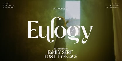 Eulogy Is A Serif Family Font and Variable Display Inspired By Retro and Vintage Style. . SOFTWARE REQUIREMENTS : Fonts and alternate : No special software required they may be used in any basic program /website apps that allows standard fonts That's it folks! You can go ahead and get cracking :) Follow My Shop For Upcoming Updates Including Additional Glyphs And Language Support. And Please Message Me If You Want Your Language Included or If There Are Any Features or Glyph Requests, Feel Free to Send me A Message. Have a Good Day !
 - La Babaca - Personal use only


