10,000 search results
(0.048 seconds)
- Los Niches by Latinotype,
$39.00 Los Niches is a stylized sans serif typeface that combines modern, monoline characters with strokes and loops reminiscent of manuscript lettering. With a consistant, harmonious style Los Niches takes on a youthful flair when presented in bright colors, but is elegant and contemporary when dressed all in black. The flexible personality of Los Niches makes it ideal for catalogs, magazines or product packaging.
 - Los Banditos by Dicky Syafaat,
$15.00 The classical vintage font Los Banditos comes in a serif and sans serif form with a lot of of stylistic alternates and ligatures that will give a unique, classic, amd retro look on your design projects. Use it as a Display font on a poster, logo, menu, clothing brand, magazine, movie, website and much more.
 - Los Lana by T-26,
$19.00 - Los Muertos by Just My Type,
$25.00 Happy Halloween (and All Souls Day and Day of the Dead)! I’ve seen other fonts made up of bones of various kinds, but none with this variety. Henry Gray’s Anatomy of the Human Body (the book, not Grey’s Anatomy, the TV series) was heavily scoured to find more unusual bones shaped like letters. You’ll find Los Muertos both fun and appropriate for the up-coming holidays. (Uppercase is Solid, lowercase is Outline).
 - Los Vampiros by Comicraft,
$39.00 Wooden Stake? Check. Holy Water? Check. Gideon's Bible? Check. Crucifix? Check. One PC or Mac copy of the Los Vampiros font from the pages of Cliffhanger's CRIMSON? Check. Slayers shouldn't leave home without one.
 - Heavy Bevel BRK - Unknown license

- Never Let Go - Personal use only

- Never Writes Back - Unknown license

- Heavy Bevel (BRK) - Unknown license

- Nouveau Never Dies by Intellecta Design,
$13.90 Nouveau Never Dies is a compreensive family of ornaments from Art Nouveau era.
 - Bauer Bodoni EF by Elsner+Flake,
$35.00 - Architype Bayer Type by The Foundry,
$99.00 Architype Universal is a collection of avant-garde typefaces deriving mainly from the work of artists/designers of the inter-war years, whose ideals underpin the design philosophies of the modernist movement in Europe. Their ‘universal’, ‘single alphabet’ theory limits the character sets. Architype Bayer-type is based upon Herbert Bayer’s 1931 universal, modern serifed alphabet. Although the ‘modern’ style appears to be a radical departure from his first sans single alphabet of 1925, the structure of this later serifed style is still grid based and geometrically constructed.
 - Jungle Fever NF by Nick's Fonts,
$10.00An adaptation of the font Neuland, designed by Rudolph Koch in 1923. The freeware (TrueType) version has a limited character set. The Pro Set (Postscript) version has a complete character set (Adobe Standard for PC; Macintosh Standard for Mac), and extensive kerning. - MTF Bakers Dozen by Miss Tiina Fonts,
$12.00 Baker’s Dozen is a lovely display font that’s sure to put a smile on your face. It is a delightful handwritten font that complements anything nicely. Slightly minimalistic and very tidy, this typeface is sure to please! Its charming, playful design features soft curves and whimsical details that evoke a sense of innocence and sweetness.
 - FF Bauer Grotesk by FontFont,
$50.99 FF Bauer Grotesk is a revival of the metal type Friedrich Bauer Grotesk, released between 1933 and 1934 by the foundry Trennert & Sohn in Hamburg Altona, Germany. The geometric construction of the typeface, infused with the art déco zeitgeist of that era, is closely related to such famous German designs as Futura, Erbar, Kabel and Super Grotesk that debuted a few years earlier. However, Bauer Grotesk stands out for not being so dogmatic with the geometry, lending the design a warmer, more homogenous feeling. The oval “O” is a good example of that, as well as characteristic shapes like the capital M or the unconventionally differing endings of “c” and “s” which make for a less constructed look. Watch the FF Bauer Grotesk introduction video on Vimeo
 - Brave Eighty One by Alit Design,
$12.00 Brave Eighty One is inspired by futuristic design concepts and space-like design concepts. This font is good for future, modern, space, sports, bold and speed themed designs. This font is perfect for collecting on your computer for up-and-coming design projects or work in progress, because the Brave Eighty One has no trending period, and will always look cool whatever year it is.
 - Never Give Up by Seemly Fonts,
$14.00 Never Give Up is a simple and friendly handwritten font, featuring the perfect amount of trendiness. This original look will appeal to a wide range of crafty ideas, from letterheads and titles to stationery.
 - The Quality Brave by Alit Design,
$19.00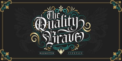 ✒️The Quality Brave✒️is a font inspired by the Blackletter typeface, made with a modern impression but still looks strong and unique. Supported by alternative options such as swash, ligature and alternative characters, making The Quality Brave font very easy to create designs with strong or dark themes. In addition, The Quality Brave font is also supported with multilingual characters that can be used in several international languages. The Quality Brave font is very suitable for use in making music album cover designs, tattoo logos, wishkey labels, packaging pomades and so on which are made with dark and strong concepts.
 - Western Bevel JNL by Jeff Levine,
$29.00Western Bevel JNL smooths out the ornate design of Stablehand JNL to offer a cleaner slab serif font that retains its Western wood type feel. Aside from Western themes, it can be applied to sports team promotions and other nostalgic projects. - Never Let Go by Kimberly Geswein,
$5.00 Natural, authentic cursive handwriting. Legible, yet imperfect.
 - 3D Fantablock Beveled by Okaycat,
$24.50Fantablock is a bold, high impact text. The edges are beveled to create the illusion of 3D raised text. The bevel effect makes it easy to create an embossed or engraved look. Punchy outlines make Fantablock perfect for headlines, or any project you want to be really eye catching. It is intended for larger sizes, but with care can be set small too. To make it extra fun, a handful of the largely useless alternates, (like that dumb “currency” symbol) were replaced with big blocky hearts, stars, arrows, and even a crown. Check it out! Fantablock is extended, containing the full West European diacritics & a full set of ligatures, making it suitable for multilingual environments & publications. - Dirty Bakers Dozen by Typodermic,
$- Dirty Baker’s Dozen, was released in 1998 and has since become the gold standard in raunchy stencil fonts. This version of Dirty Baker’s Dozen is pants-full of handy symbols, fractions, accents and what not. Need numeric ordinals? Probably not, but if you do, Dirty Baker’s Dozen will be there with boots on and numeric ordinals a-blazing. Two new styles were introduced in 2009: Scorch & Spraypaint. When you're using Scorch or Spraypaint styles in an OpenType savvy application, common letter pairs will be automatically replaced by custom pairs for a more realistic, filthy effect.
 - Old Dog, New Tricks - Unknown license

- KR Lots Of Hearts - Unknown license

- D3 Roadsterism Long Italic - Unknown license

- KR Lots Of Holly - Unknown license

- Parking Lot Stencil JNL by Jeff Levine,
$29.00 At first glance Parking Lot Stencil JNL look quite similar to many sans stencil fonts, but rest assured there are numerous subtle nuances that give the typeface its own unique flavor. Modeled after the plastic stencils used for marking numbers and directional information on paved surfaces, the lettering is clean yet industrial.
 - Parking Lot Sale JNL by Jeff Levine,
$29.00 Here’s a novelty font emulating the plastic pennant streamers that were popular in the 1950s and 1960s used to decorate a store parking lot or used car lot for a sales event. The typeface inside the individual pennants is Manufacturer JNL, which can be used for body copy associated with titles made by this font. Parking Lot Sale JNL is available in regular (black letters on white pennants) and black (with white letters). A blank pennant for word spacing or end caps is available on the backslash key.
 - Back Lot Stencil JNL by Jeff Levine,
$29.00 Back Lot Stencil JNL is a hand lettered slab serif stencil design based on the titles and credits from the 1954 film “Human Desire” and is available in both regular and oblique versions. Caps only Font.
 - Loo Snoo Roman NF by Nick's Fonts,
$10.00Here's a fresh version of an old favorite, Loose New Roman, from the Schaedler Studio of New York. Easy, breezy and carefree, it's a natural for happy headlines. Both versions of the font contain the complete Unicode Latin 1252 and Central European 1250 character sets. - Fear Logo Fires Trial - Personal use only

- Hamburger Heaven NF Pro by CheapProFonts,
$10.00 A stylish retro script where I have completely redone the spacing to make the text look more even. All of the diacritics have been redone, too - and the character set expanded in our usual fashion. So now this little gem from Nick Curtis is ready for the big time! Nick Curtis says: “This font is basically a design exercise, influenced by a number of contemporary fonts, but unique in its own way. The gentle, fluid motion reminded me of diner lettering from the 30s and 40s, hence the name.” ALL fonts from CheapProFonts have very extensive language support: They contain some unusual diacritic letters (some of which are contained in the Latin Extended-B Unicode block) supporting: Cornish, Filipino (Tagalog), Guarani, Luxembourgian, Malagasy, Romanian, Ulithian and Welsh. They also contain all glyphs in the Latin Extended-A Unicode block (which among others cover the Central European and Baltic areas) supporting: Afrikaans, Belarusian (Lacinka), Bosnian, Catalan, Chichewa, Croatian, Czech, Dutch, Esperanto, Greenlandic, Hungarian, Kashubian, Kurdish (Kurmanji), Latvian, Lithuanian, Maltese, Maori, Polish, Saami (Inari), Saami (North), Serbian (latin), Slovak(ian), Slovene, Sorbian (Lower), Sorbian (Upper), Turkish and Turkmen. And they of course contain all the usual “western” glyphs supporting: Albanian, Basque, Breton, Chamorro, Danish, Estonian, Faroese, Finnish, French, Frisian, Galican, German, Icelandic, Indonesian, Irish (Gaelic), Italian, Northern Sotho, Norwegian, Occitan, Portuguese, Rhaeto-Romance, Sami (Lule), Sami (South), Scots (Gaelic), Spanish, Swedish, Tswana, Walloon and Yapese.
 - Becker Monoline Modern NF by Nick's Fonts,
$10.00The first in a series of typefaces based on the work of legendary lettering artist Alf Becker, whose works appeared in Signs of the Times magazine for almost thirty years. Originally titled "Extreme Thin Gothic", this was Becker’s 185th design for the magazine. Both versions of the font include the 1252 Latin and 1250 CE character sets (with localization for Romanian and Moldovan). - Better Part Of Me by Epiclinez,
$18.00 Introducing Better Part of Me, a fun and quirky font for adding a touch of whimsy and personality to your designs. This eye-catching font is perfect for creating attention-grabbing headlines, posters, and logos. With its playful style and cheerful spirit, it's sure to brighten up your day. Better Part of Me font includes : Standard Latin Uppercase and Lowercase Numbers, symbols, and punctuations Multilingual Support. PUA Encoded and fully accessible without additional design software Simple Installations Works on PC & Mac Thank You.
 - VTC Lo-Down - Unknown license

- Natural Curves OG by Kingpin Designs,
$9.00 'Natural Curves OG' is a friendly typeface that works seamlessly without any trimmings. It's perfect for giving any work a hand-drawn look and feel. The typeface is balanced so the eye doesn't move straight to any singular letter, which means that creating a hierarchy with other elements in your design is simple. Colour blocking to support brand identity is easy with this typeface, and it adds character simply and authentically. This typeface was created for my own brand's identity, and it's been great to add splashes of art in the form of type all over my website and collateral.
 - Volvoreta RG LG by LGF Fonts,
$17.00 Bolboreta Hollow is a revival of "Decorativa" font of Richard Gans Foundry .We've expanded the family with padded versions, striped versions (gray on other Gans fonts, in keeping with the days of lead fonts), and those same fills in separate font files, for graphic designer layered play. In addition to Bold versions.
 - Los Lana Niu by Latinotype,
$45.00 Los Lana Niu was designed by Bruno Jara and Luciano Vergara. The typeface is based on Los Lana (2007). Along with the redesign, the font has increased from 1 to 24 different styles. This new version preserves the rustic aesthetics of the original typeface, but it lacks of curves and it visually looks as if it was a nirregular font. Los Lana Niu comes with a wide range of ligatures included in every weight: from Thin to Black. In order to offer a wide array of uses, the typeface has been structured by adding acomplete family of small caps, which makes this font well-suited for headlines, posters, branding and publishing design. Los Lana Niu comprises 3 subfamilies: Los Lana Niu Essential (392 glyphs) – including both regular and alt versions, Los Lana Niu Small Caps (392 glyphs) and Los Lana Niu (820 glyphs), which includes a variety of OpenType features such as stylistic ligatures, contextual alternates and small caps.
 - Lo Fi Copy by 2D Typo,
$24.00 Lo-Fi Copy is a good way to add an analog look to your design. Brutal pixels have chaotic errors, like a damaged signal.
 - Los Lana Pro by Latinotype,
$39.00 Los Lana Pro is a handmade display typeface. Unlike other font families, this type has not a modular structure, that is, each character has been individually designed. The coherence of structure elements across different characters is given by irregular strokes. This curveless typeface is perceived as being curved because of its straight lines, which form different-size angles. Los Lana Pro is a rustic typeface that captures the stereotypical “Andean hippie” handmade aesthetics. Irregular shapes and broken lines give it a distinct personality. Los Lana Pro looks better in larger sizes. Includes many ligatures, two groups of alternate characters, and titling caps characters. Languages include: Basic Latin, Western European, Euro, Catalan, Baltic, Turkish, Central European, Romanian and Pan Africa Latin. Photos by Sergio Recabarren.


