9,697 search results
(0.021 seconds)
- Costa Dorada by Letterhead Studio-YG,
$15.00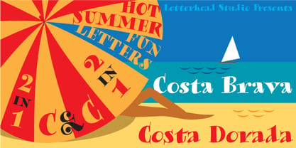 Costa Brava and Costa Dorada are devoted unforgettable days on beaches of tender Mediterranean sea in Catalonia. Enjoy! Both fonts were originally created in the summer 2003. The OpenType version, with extended Latin characters, was released in 2009.
 - Minimalisto by Blackdreamist,
$15.00Minimalisto is a typeface made by designer Keith Hayden. The distinguishing feature of this font is the simplistic style of each letter. This simplicity gives each letter a modern and sophisticated look. - Spotted Fever - Unknown license

- Slightly Hollow - Unknown license

- Garlic Salt by Adam Ladd,
$19.00 Garlic Salt is a flavorful, hand drawn, serif font family. Drawn with a single marker pen, it has a monoline appearance giving it a distinct mix of whimsical and modern qualities. The semi-condensed propositions are sturdy and space-saving for your layouts. Choose from either the regular weight or a slightly thicker line in the bold weight to suit your needs. It works great set large as a display font to show off the hand drawn texture, but it also is pleasantly readable set in smaller point sizes because of the carefully drawn letterforms. BONUS: Garlic Salt also comes with a free Extras font of matching ornaments and dingbats to complement your designs! Special features include stylistic alternates and swashes to enhance the type to your liking. Those glyphs are also PUA-encoded to make them accessible in software that is not OpenType-savvy. This font has extensive Latin language support.
 - Tropical Punch by Missy Meyer,
$12.00 I am shocked to my very core that the name "Tropical Punch" hasn't been used for a font yet. What a delight, that my very first name choice is available, and I can grow my collection of fonts named after delicious food and drink! Tropical Punch is a retro-tropical font with a ton of variety: I've included nearly 200 multi-letter ligatures with nesting letters, to add quirky and fun variety to all of your projects. There are also a few alternate vowels, plus a few dingbats to add jazzy pizzazz; and 10 smaller catchwords like THE, AND, WITH, and more! I've also made an outline version--Tropical Punch Outline--which surrounds the solid letters beautifully, so you have even more options! Of course, both versions have my usual 300+ extended Latin characters for language support. And I've included a set of uppercase Greek letters as well! And everything, as always, is fully PUA-encoded so all characters are easy to access.
 - Wolfsblood by Monotype,
$29.99 Wolfsblood is a new display face by Jim Ford, adapted from hand-lettered logos spawned by punk rock bands like The Misfits and Bad Brains. The style can be traced back further to Hollywood and the explosion of low-budget exploitation, horror and sci-fi films, which also had an influence in punk rock. Wolfsblood captures this bizarre dark-spirited lettering which has become a staple in the designer‘s work for bands and posters. The Wolfsblood font has an expanded character set with borders, dingbats (yes, Bats!), and contextual ligatures programmed to give the typeface a random appearance by default. As with some of Jim‘s other typographic experiments, Wolfsblood encourages the designer to play with upper and lowercase, and mixed-case settings, to replicate the decisions that a lettering artist might make. Wolfsblood is great for logos, posters, headlines and short bits of text, and will add a fun, aggressive energy to your dark and other-worldly creations.
 - Drop_it by Just in Type,
$18.00Drop_it is a redesign of fonts originally created to be recognized by computers using OCR (optical character recognition) softwares. Strangely, human beings fell in love for the stylistic inconsistencies of these fonts made for machines. In small sizes, Drop_it emulates the appearance of fonts in antique operational systems monitors. In large sizes, its structure is composed of capsules and pills allude the universe of medicines, drugs and rave culture. Drop_it Dingbats follow the the same grid of its alphabetic version, and can be used side by side in sign projects. Besides the traditional symbols, it present specific images from the rave culture like DJ (Disc-Jockey) and VJ (Visual-Jockey). Drop_it italic set adds velocity to text compositions using six angle variations. All the fun starts with a very unusual Break version. Fall version is a kind of "anti-italic". Slow version put your text in another rhythm. Swing have a little italic emphasis. Italic is, you know, italic. And Speed version run away. - Solar by Andinistas,
$34.00 Solar is a font family designed by Carlos Fabian Carmargo G. Its members, together or separate, can be used in packaging, posters, cards, invitations and logos that need expressive letters with craft features. First, a set of arbitrary ideas were designed on rough paper, and through changes five styles resulted to mix and compose bright words and phrases. Solar Script comes from crossbreeding and the collusion of primitive visceral strokes and calligraphy on textured paper. This way its letters were planned for empty and full areas deteriorated sometimes simulating irregular ink clots. Therefore, the simulate trajectories with bold brushstrokes made that it works especially well in sizes larger than 12 points. Its rhythmic vitality and energy give personality, reflected in uninterrupted rapid and logical talics with strokes. Solar Words has more than 115 words unstable and inclined. Solar Dingbats has more than 100 brightness generating drawings, Solar Sans and Serif are capitals combined with other members of the family.
 - Illustrissims by Typephases,
$-76 illustrations of vintage-inspired characters, most of them drawn from imagination, in the tradition of metal stock cuts or woodtype vignettes. Illustrissims is offered as a free sampler of our illustration style. Its themes are futher developed in the Absurdies, Bizarries, Genteta, Ombres and Whimsies series, also available from MyFonts! These illustrations are ready to use at any size and in any application (their vectorial format ensures they can be scaled to any size with no loss of sharpness). They can be used out of the box, or easily customized in any graphics program, adding colour or texture, resizing, combining... The variety of suggested uses is huge, from small spot illustrations to full-page layouts. Use them to great effect in magazine spreads, advertisements, stationery, packaging, bulletins or poster creative designs. Illustrissims combines three formerly separate dingbats (the Illustries 1-2-3 series), which have been unavailable for quite a few years. - PLAKAT Wood by TypoGraphicDesign,
$19.00 The typeface PLAKAT Wood is designed from 2021 for the font foundry Typo Graphic Design by Manuel Viergutz. The display font based on the original wood letter from Paul Renners typeface Plak Schmalfette and is inspired in the past and present. The font started from 80 wood letters (analog) and was finally digitalize and extended to 640 glyphs (digital). 3 font-styles (Rough, Rough Mix, Rough Invert) + 1 icon-style with 640 glyphs (Adobe Latin 2) incl. 100+ decorative extras like icons, arrows, catch words, dingbats, emojis, symbols, geometric shapes (type the word #LOVE for ❤ or #SMILE for ☺ as OpenType-Feature dlig) and stylistic alternates (7 stylistic sets). For use in logos, magazines, posters, advertisement plus as webfont for decorative headlines. The font works best for display size. Have fun with this font & use the DEMO-FONT (with reduced glyph-set) FOR FREE! ■ Font Category: Display for headline size ■ Glyph Set: 640 glyphs (Adobe Latin 2) incl. 100+ decorative extras like icons
 - NEON CLUB MUSIC by TypoGraphicDesign,
$19.00 The typeface Neon Club Music is designed in 2011 for an Logo-Design of a electronic music label from South Germany. 324 glyphs incl. decorative extras like arrows, dingbats, emojis, symbols, geometric shapes, decorative ligatures (type the word #SMILE for ☺ or #LOVE for ♥ as OpenType-Feature dlig) and stylistic alternates (as OpenType-Feature salt. For use in logos, magazines, posters, advertisement plus as webfont for decorative headlines. The font works best for display size. Have fun with this font & use the DEMO-FONT (with reduced glyph-set) FOR FREE! CONCEPT/CHARACTERISTICS The geometric and rounded character of the typeface is a very unique futuristic sci-fi atmosphere. The sans-serif monoline letter-forms looks very modern, clean, fresh and fancy. APPLICATION AREA The fancy, geometric & round party, music & movie font “NEON CLUB MUSIC” would look good at display size for party flyer & movie poster, music covers or headlines in magazines or websites…
 - Geller by Ludka Biniek,
$29.00 A truly faithful ally for every designer looking for fresh yet familiar and reliable font choice. Geller was created as a part of graduation project in Typowa Pracownia at Academy of Fine Arts in Warsaw. It is a typeface family especially intended for newspapers, magazines, and advertising. Geller family comes in two optical sizes - headline and text, so it is a complete solution for editorial purposes. During the design process, the technical needs of certain typographic fractions were examined. The capital letters were specially and purposely designed: its modern proportions (derived from Didone fonts) with optimized inner lights as well as short ascenders and descenders work very well within titles and leads. In addition to a wide range of OpenType features, Geller contains bullets & dingbats providing many possibilities of entry points in editorial design. Compact diacritics, proportionally tall x-height, narrow letter construction, all these features allow easy typesetting of narrow text columns and spreads.
 - Bizarries by Typephases,
$25.00 This series, with 104 illustrations in three files, collects original ink drawings with absurdities, bizarre people, whimsical personalities and risky behaviors! There is a very peculiar sense of narrative in the sucession of characters, even if they came out rather spontaneously and their order is random.With a vintage look and feel, these people seem to come out of a time capsule from Victorian times. Almost everything in the Bizarries (and also in their close relatives, our Illustries, Whimsies, Ombres, Absurdies and Genteta dingbats) is invented and drawn with no references —just a handful of images were sketched from historical photography. These illustrations can be very useful for a variety of projects, either in black and white, or colored in a paint or drawing application. You can use them at any size, from a small spot illustration to a huge poster, depending on your needs. The outlines remain crisp and clear no matter how much you enlarge, reduce, distort or tweak their shapes.
 - Nemocón by Andinistas,
$59.67 Nemocon is a display font family designed by Carlos Fabian Camargo G. Nemocon It is ideal for making attractive messages. Nemocon has over 2200 glyphs distributed in 6 files OT designed from handmade lettering and usability testing. • Nemocon Script (1382 glyphs): based on the rotation of a flat tip brush. Its letters correspond to the uninterrupted calligraphic logic, as well as similar ingredients as the ones used in font Brush Script by Robert E. Smith, created for the American Type Founders in 1942. • Nemocon Tuscan (375 glyphs): Inspired by representative types of wood from the 19th century, specifically speedball brawny Tuscan capitals with serifs fishtail shaped. • Nemocon Catchwords (115 glyphs) + Nemocon Catchwords Shadow (115 glyphs): categorically inflated words with and without shadows, to accompany, highlight and prioritize. • Nemocon Dingbats (114 glyphs) + Nemocon Containers(150 glyphs): unconventional pictograms consisting warm and comforting thoughts designed to highlight words or phrases which needed multicolored illustrations or drawings in black and white.
 - Infusion by Andinistas,
$39.00 Infusion is a type family designed by CFCG & Fabio Godoy for andinistas.net. The creative process of Infusion evolved throughout a myriad of experiments supported by my font gluten This is why its expressivity comes from the addition and subtraction of its parts by mixing and combining, resulting in a great variety and new versatility of uppercase, lowercase, multiple and different numbers to be applied at the beginning, middle or end of the word. Infusion is used to write sentences in craft contexts that require organic graphic design, with meticulous imperfect look. Infusion offers typographic solutions out of the limits, or out of borders that divide the mechanics of the drawn by hand. Infusion has 6 decorative and legible fonts to write casual messages with organic, friendly and natural personality. Infusion “Script, Mix, Roman, Shadow, Extras, Dingbats” contain unconventional visually appealing ideas to work independently or in group in the design of logos, packaging, presentations, headlines or editorials.
 - Chella Lyfe by Chella Lyfe,
$25.00 Features: Chella Lyfe Print: Uppercase letters, numbers, & extended punctuation We Offer Non-English support for the international designer as well Same stroke thickness with each font, so you don't need to make any time-consuming adjustments to get it looking right! This is such a fun new display font, perfect for creating quotes, logos, or just adding a hand-written touch to any project! While other fonts usually take some size adjusting to look just right, The ChellaLyfe variations in stroke thickness for upper and lower case fonts, so you can so it can display creativity and life in every stroke! Each font also has alternates for each letter, so when you type uppercase or lowercase for each font, the letters will change slightly. For example, tying in all caps with the Script font will connect each letter, whereas typing all lowercase will disconnect each letter.
 - Catalina by Kimmy Design,
$10.00 Earlier this year I visited a bakery in Newport Beach, CA and fell in love with the organic design and typography of the place. Hand-drawn menus, table cards, chalkboards, and wall quotes surrounded the charming spot. It inspired me to create a new font family based on the combination of hand drawn fonts. Included in this package are 5 font families, with 2 graphic ornament fonts. Each font family contains at least a light, medium and bold. Here is a breakdown of what's cookin' at Catalina's Bakery: Catalina Anacapa: Tall and skinny, this font comes in 3 weights for both sans and slab serif styles. It includes contextual alternatives (giving 3 versions of each letter), stylistic alternatives for select letters (A, K, P, Q, R, Y) and also includes Small Caps. Catalina Avalon: Based off Anacapa, this sub family has a high contrasting line weight. It comes in light, regular and bold as well as an inline alternative for both sans and slab serif styles. Avalon also includes opentype features such as contextual alternatives (giving 3 versions of each letter), stylistic alternatives for select letters (A, K, P, Q, R, Y) and small caps for each letter. Catalina Clemente: In a more standard width, Clemente is one of the two sub families that can be used for paragraph text as well as headlines. It's organically geometric in style and comes in ALL CAPS and lowercase, includes upright and custom italics, and has the opentype feature giving 3 versions of each letter. Catalina Script: A great compliment with the display sub-families, Catalina Script rounds out the package with a hand-drawn cursive flair. It includes contextual alternatives (giving 2 variations to each letter) as well as stylistic alternatives for many of the capital and lowercase letters. It has special ligatures for some letter combinations, and titling alternatives for all the capital letters. Catalina Typewriter: The second of the paragraph text sub-families, this typewriter inspired hand-drawn font family works great as either a display or paragraph text. It has contextual alternatives with 3 versions of each letter, and comes in both upright and custom italics versions. Catalina Extras! These two fonts go perfectly with the Catalina Family. They includes borders, frames, arrows, banners, flourishes and more. Catalina Flourish has all of it's options in a light and bold style, to use the light version type all lowercase letters, then to make something bold, used it's uppercase (or shift+) characters. For a breakdown of graphic/letter correlation, see the breakdown PDF. All of Catalina was drawn by the same hand, using the same ink and technique. While they contrast in their type styles, they work together perfectly to create one cohesive font family.
 - Super Ride by Realtype,
$16.00 Super Ride is a manual written font to get the best texture for each letter. Super Ride is perfectly designed, each letter character will make your design strong and dazzling. Each letter and symbol is painted using the best brushes and ink. Super Ride contains uppercase and lowercase characters, numbers and various punctuation marks ready for you to use with unique and charming characters.
 - Better Friend by Trustha,
$17.00 Better Friend is an authentic handwritten signature font with personal touch. Created with a marker by hand makes each stroke more natural. This font fits all creative projects and will make each of your projects amazing!
 - Kalash by Tomass Gavars,
$7.00 Kalash is minimalistic monospaced font family. Each glyph has eased 45° angled cut and has the right properties to fit with various styles. Combine multiple weights for best results. Each font includes 230 Glyphs & Latin support.
 - Filthy Creation by Wing's Art Studio,
$9.00 Filthy Creation; An Outrageously Cartoonish Slime Font - Barf Bag Optional! Creeping off my ink-drenched drawing board, these illustrated slime fonts offer designers a unique set of diabolical tools for use in their gruesome creations. The five hand-drawn font styles are reminiscent of the best in vintage horror comics, 80s trading cards, gross-out movies, paperbacks and Saturday morning cartoons. Each style comes with uppercase and lowercase characters, plus numerals, punctuation, language support and symbols. Added to this is a complete set of alternatives (no need to repeat those oo’s, tt’s and ee’s) and an extra collection of grotesque illustrations that’ll leave you reaching for the barf bag! When you need the most gory, disgusting and slimy looking titles, look no further than this Filthy Creation.
 - Bakery Script by Sudtipos,
$49.00 Bakery Script is the Argentine duo's nod to the high spirits of the 1970s. Angel Koziupa used his ever popular wild brush to draw the outline version, and Alejandro Paul refined it, expanded it, then extrapolated the solid version. While the outline version makes the letters seem like they're growing out of each other's shadows, the solid version presents a wilder version of the casual dancing letters Koziupa's brush has entertained us with during recent years. Sharp in places, perfectly curved in others, and with many letter alternates and ligatures included within the fonts, Bakery Script would be at home in packaging design, outdoors and adventure literature, and everywhere a display design needs that sharp but friendly touch to reach its goal.
 - Rukishy by Twinletter,
$17.00 Rukishy font is the most appropriate choice to enhance the visual appeal of your branding projects. With an attractive Script font style, this font presents an impressive design touch, creating an unforgettable charm. What makes Rukishy so unique is its wide range of features. With a complete family that includes regular, shadow, slant, and shadow slant, you have everything you need to express your creativity optimally. Not only that but some ligatures and alternates add a unique touch to each character, helping you create truly original designs. The ability to support multiple languages makes Rukishy a universal choice that allows you to reach a global audience. With its ease of use and flexibility, this font becomes a valuable asset in your design world.
 - ROSETTA STONE - Personal use only

- BENS ALIENS - Personal use only

- Pea Stacy's Doodles - Unknown license

- Millwal by RagamKata,
$16.00 Millwal is a vintage serif font. With many alternate features for each letter, Millwal provides flexibility and variety in the appearance of the text. Each letter has a unique alternative, adding a creative and eye-catching touch to your designs. From curvy shapes to artistic details, each character in this font displays a different kind of beauty and authenticity. Features : - Ligatures & Alternates - Letters, numbers, symbols, and punctuation - Multilingual Support
 - Junegull by Typodermic,
$11.95 Introducing Junegull, the typeface that seamlessly blends retro-tech design with a contemporary twist. With its friendly all-caps rounded sans, Junegull is like a breath of fresh air—a perfect combination of technological prowess and gentle charm. But don’t let its cuddly appearance fool you; Junegull is like a murderous mechanical teddy bear, with a sharp edge that’s ready to take on any design challenge. For those who crave something wilder, Junegull Beach is the font for you. This wild sibling is perfect for those who want to take their designs to the next level. With Junegull Beach, every letter pair is carefully crafted to give you a more realistic, sandy feel. It’s like taking a walk on the beach, with every letter a grain of sand that transports you to a world of creativity. What sets Junegull Beach apart is its tailor-made pairs, giving you a font that’s uniquely yours. Whether you’re designing a logo, a website, or a poster, Junegull Beach will help you stand out from the crowd with its dynamic and playful style. So why settle for an ordinary font when you can have Junegull and Junegull Beach? With their retro-tech design and contemporary charm, these fonts are a must-have for any designer looking to create something truly extraordinary. Most Latin-based European writing systems are supported, including the following languages. Afaan Oromo, Afar, Afrikaans, Albanian, Alsatian, Aromanian, Aymara, Bashkir (Latin), Basque, Belarusian (Latin), Bemba, Bikol, Bosnian, Breton, Cape Verdean, Creole, Catalan, Cebuano, Chamorro, Chavacano, Chichewa, Crimean Tatar (Latin), Croatian, Czech, Danish, Dawan, Dholuo, Dutch, English, Estonian, Faroese, Fijian, Filipino, Finnish, French, Frisian, Friulian, Gagauz (Latin), Galician, Ganda, Genoese, German, Greenlandic, Guadeloupean Creole, Haitian Creole, Hawaiian, Hiligaynon, Hungarian, Icelandic, Ilocano, Indonesian, Irish, Italian, Jamaican, Kaqchikel, Karakalpak (Latin), Kashubian, Kikongo, Kinyarwanda, Kirundi, Kurdish (Latin), Latvian, Lithuanian, Lombard, Low Saxon, Luxembourgish, Maasai, Makhuwa, Malay, Maltese, Māori, Moldovan, Montenegrin, Ndebele, Neapolitan, Norwegian, Novial, Occitan, Ossetian (Latin), Papiamento, Piedmontese, Polish, Portuguese, Quechua, Rarotongan, Romanian, Romansh, Sami, Sango, Saramaccan, Sardinian, Scottish Gaelic, Serbian (Latin), Shona, Sicilian, Silesian, Slovak, Slovenian, Somali, Sorbian, Sotho, Spanish, Swahili, Swazi, Swedish, Tagalog, Tahitian, Tetum, Tongan, Tshiluba, Tsonga, Tswana, Tumbuka, Turkish, Turkmen (Latin), Tuvaluan, Uzbek (Latin), Venetian, Vepsian, Võro, Walloon, Waray-Waray, Wayuu, Welsh, Wolof, Xhosa, Yapese, Zapotec Zulu and Zuni.
 - MoreLeaves by Ingrimayne Type,
$14.95 In 1990 I designed the font XLeafMeAlone. In 2006 I decided that it was time to improve it. Instead of adding to it, I created two new fonts containing almost 200 leaves: MapleOaks and More Leaves. Among the leaves you will find in MoreLeaves are elm, cottonwood, tulip tree, ash, hickory, locust, ginko, aspen, sassafras, hawthorn, beech, and birch. There are also a few that come from shrubs and I am not sure what they are, but they looked interesting so I put them in. You will not find oaks, maples, or sycamores--they are in MapleOaks. Why leaves? Because people like them. As a large part of the biological world that is all around us, leaves are fascinating in their shapes and endless variations. In XLeafMeAlone I took about 50 shapes and rotated them 180 degrees to give a typeface with approximately 100 glyphs. In each of these two typefaces, MoreLeaves and MapleOaks, there are almost 100 glyphs. Each of those glyphs is rotated in 90-degree increments to yield two families of four typefaces that should be very useful if one wants to create borders of leaves.
 - Ball And Chain by Funk King,
$5.00 Each glyph is fashioned using "balls" and "chains".
 - Blessing and Struggle by Colllab Studio,
$7.00 Presenting Blessing and Struggle! A Spontaneous Handwritten Font with all-caps glyphs. This font made with the perfect combination of each character. You can combine with Extra to get a unique combination. It looks original and can be used for all your project needs. Each glyph has its own uniqueness and when meeting with others will provide dynamic and pleasing proximity. This font can be used at any time and in any project. You can see in the presentation picture above, Blessing and Struggle looks unique and authentic style on design projects. So, Blessing and Struggle can't wait to give its touch to all your design projects such as quotes, poster design, personal branding, promotional materials, website, logotype, product packaging, etc. WHAT'S INCLUDED? 1. Blessing and Struggle Regular • The first version comes with uppercase, lowercase, ligatures, numeral, punctuation, symbols, and Standard Latin Multilingual Support (Afrikaans, Albanian, Catalan, Danish, Dutch, English, French, German, Icelandic, Indonesian, Italian, Malay, Norwegian, Portuguese, Spanisch, Swedish, Zulu, and More). 2. Blessing and Struggle Slant • The first version comes with uppercase, lowercase, ligatures, numeral, punctuation, symbols, and Standard Latin Multilingual Support (Afrikaans, Albanian, Catalan, Danish, Dutch, English, French, German, Icelandic, Indonesian, Italian, Malay, Norwegian, Portuguese, Spanisch, Swedish, Zulu, and More). 3. Blessing and Struggle Slant Bold • The first version comes with uppercase, lowercase, ligatures, numeral, punctuation, symbols, and Standard Latin Multilingual Support (Afrikaans, Albanian, Catalan, Danish, Dutch, English, French, German, Icelandic, Indonesian, Italian, Malay, Norwegian, Portuguese, Spanisch, Swedish, Zulu, and More). 4. Blessing and Struggle Semi Bold • The first version comes with uppercase, lowercase, ligatures, numeral, punctuation, symbols, and Standard Latin Multilingual Support (Afrikaans, Albanian, Catalan, Danish, Dutch, English, French, German, Icelandic, Indonesian, Italian, Malay, Norwegian, Portuguese, Spanisch, Swedish, Zulu, and More). 5. Blessing and Struggle Minus Slant • The first version comes with uppercase, lowercase, ligatures, numeral, punctuation, symbols, and Standard Latin Multilingual Support (Afrikaans, Albanian, Catalan, Danish, Dutch, English, French, German, Icelandic, Indonesian, Italian, Malay, Norwegian, Portuguese, Spanisch, Swedish, Zulu, and More). 6. Extra Swashes • Included 7 Dingbats. You can feature all with typing c_1 until c_7 (in all versions) A Million Thanks Colllab Studio
 - Airliner JNL by Jeff Levine,
$29.00Airliner JNL is based on hand-lettering found on a promotional postcard for Kitty Davis' Airliner - a popular Miami Beach night spot of the 1940s. All of the usual things that make hand-lettering endearing can be found in the letter shapes of this font. - Trocadero JNL by Jeff Levine,
$29.00Trocadero JNL was inspired by an early 1950s photo showing the signage for the Trocadero Restaurant located on Liberty Avenue and 23rd Street in Miami Beach. Highly stylized and classically Art Deco in design, it is best used in short one- or two-word titles. - Czykago Rough by TypoGraphicDesign,
$19.00 From 2019 back to the 90s … The typeface “Czykago Rough” by Alexander Branczyk and Manuel Viergutz is a re-issue of the font “Czykago” published in 1995 by the font label “Face2Face”. Designed as a re-release for the Font Foundry “Typo Graphic Design” in 2019. The rough sans serif display font is inspired by the 80s and 90s. Glyhph-Set: Latin Extended (Adobe Latin 3). 907 glyphs with 3× A–Z & a–z and 350+ decorative extras like icons, arrows, dingbats, emojis, symbols, sign of the zodiac, geometric shapes, catchwords, decorative ligatures (type the word #LOVE for ❤ or #SMILE for ☺ as OpenType-Feature dlig) and stylistic alternates (4× stylistic sets). For use in logos, magazines, posters, advertisement plus as webfont for decorative headlines. The font works best for display size. Have fun with this font & use the DEMO-FONT (with reduced glyph-set) FOR FREE! ■ Font Name: Czykago Rough ■ Font Weights: Cond + Stretch + Mix + CondBG + Icons + DEMO (with reduced glyph-set) ■ Font Category: Display for headline size ■ Font Format: .otf (OpenType Font for Mac + Win) + .ttf (TrueType Font) ■ Glyph Set: 907 glyphs with 350+ decorative extras like icons ■ Language Support: 80+ for Latin Extended (Adobe Latin 3). Afrikaans, Albanisch, Baskisch, Bemba, Bena, Bosnisch, Dänisch, Deutsch, Englisch, Estnisch, Färöisch, Filipino, Finnisch, Französisch, Friulisch, Galizisch, Gusii, Indonesisch, Irisch, Isländisch, Italienisch, Kabuverdianu, Kalenjin, Katalanisch, Kinyarwanda, Kölsch, Kornisch, Kroatisch, Lettisch, Litauisch, Luhya, Luo-Sprache, Luxemburgisch, Machame, Madagassisch, Makhuwa-Meetto, Makonde, Malaiisch, Manx, Morisyen, Niederländisch, Niedersorbisch, Nord-Ndebele, Norwegisch Bokmål, Norwegisch Nynorsk, Nyankole, Obersorbisch, Oromo, Pare, Polnisch, Portugiesisch, Rätoromanisch, Rombo, Rukiga, Rumänisch, Rundi, Rwa, Samburu, Sango, Sangu, Schottisches Gälisch, Schwedisch, Schweizerdeutsch, Sena, Shambala, Shona, Slowakisch, Slowenisch, Soga, Somali, Spanisch, Suaheli, Taita, Teso, Tschechisch, Türkisch, Turkmenisch, Ungarisch, Vunjo, Zulu ■ Specials: Alternative letters, stylistic sets, automatic contextual alternates via OpenType Feature (3× different versions of A–Z & 0–9 + a–z), Euro, kerning pairs, standard & decorative ligatures, Versal Eszett (German Capital Sharp S), 350+ extras like Dingbats & Symbols, arrows, hearts, emojis/smileys, stars, further numbers, lines & geometric shapes ■ Design Date: 1995–2019 ■ Type Designer: Alexander Branczyk and Manuel Viergutz
 - Comic Sans by Microsoft Corporation,
$49.00The Comic Sans® typeface, one of Microsoft's most popular designs, has received a makeover courtesy of Monotype Imaging. The company has introduced the four-font Comic Sans Pro family of typefaces. Featuring elements such as speech bubbles and cartoon dingbats, Comic Sans Pro extends the versatility of the original Comic Sans, designed by Vincent Connare for Microsoft in 1994. Hats off to Monotype Imaging for enlivening Comic Sans and getting it back to its roots as a comic book lettering face. Now everyone can write with more panache - and look even more like a pro using swashes, small caps and other typographic embellishments," said Connare. "Every day, millions of people rely on Comic Sans for countless applications ranging from scrapbooking to school projects," said Allan Haley, director of words and letters at Monotype Imaging. "Comic Sans is also a favorite in professional environments, used in medical information, instructions, ambulance signage, college exams, corporate mission statements and executive reprimands - even public letters from sports team owners to their fans. Breaking up with your spouse? Why not write a letter in Comic Sans Pro, embellished with a typographic whack!, pow! or bam! Comic Sans is everywhere, and now it's even better." The Comic Sans Pro family includes regular and bold fonts, in addition to two new italic and bold italic fonts drawn by Monotype Imaging's Terrance Weinzierl. "Our aim is to put the 'fun' back in 'functional.' We can't wait to see Comic Sans Pro used in everything from second wedding announcements to warning labels," said Weinzierl. "Long live Comic Sans!" Comic Sans Pro contains a versatile range of typographic features including swashes, small caps, ornaments, old style figures and stylistic alternates - all supported by the OpenType® font format. OpenType-savvy applications, such as Adobe® Creative Suite®, QuarkXPress® or Mellel™ software are required to access these features. Comic Sans Pro can also be used in new versions of Microsoft® Office including Microsoft Word 2010 and Microsoft Publisher 2010. In addition, Comic Sans Pro includes a set of ornaments and symbols, including speech bubbles, onomatopoeia and dingbats, pre-sized to work well as bullets." - Nosara by Never Better,
$9.00 Inspired by a trip to Costa Rica and named after its famous beach town, Nosara is a layered vector font that's perfect for projects that require a realistic, hand-painted desert-island look. It comes in three styles: Regular, Outline, and Fill. The styles can be layered to create authentic-looking hand-painted letters and icons—in vector! You can create outlines from this font in order to customize to your heart's desire. Millions of bespoke combinations are possible. This typeface was made by hand, meaning each letter was painted with real paint and digitized, not created on an iPad, which is why this font looks great and has a warm natural quality even at large sizes. Nosara is perfect for packaging, parties, signage, and even looks great in long-form text! Nosara Xtra is a set of pictograms, also in 3 styles that can be layered for the same effect, evoking the imagery and happy vibes of a sunny tropical vacation.
 - Bikini Season by Los Andes,
$37.00 Summer has come! Boho girl is going on her beach vacation. Relaxed, spontaneous, feminine, irreverent, though. Like a girl with a Gipsy soul, she just grabs her Bikini and turns away! This is the new font duo by the couple Coto and Luciano. Bikini includes a sans version, based on the proportion and structure of Roman capitals, but with a contemporary flavor and a clean style that give the typeface a chic touch. The other version of this font duo is a modern calligraphy script of handmade style. The mix is just perfect: opposites attract creating a very interesting counterpoint. Can you guess who is the designer behind each style? This font duo is intended to be used for posters, labelling or branding. The sans and script styles add visual hierarchy when composing text. Feel the fresh free spirit of its OpenType features and ornaments! Please see User Guide Every season is Bikini season!
 - Sharpe by Mans Greback,
$29.00 Sharpe is a stylish serif typeface family. The type has been drawn by Måns Grebäck during 2018 and 2019. It is clear, sharp and has brave, lively letter forms but with a conservative backbone. The five font weights balance beautifully in contrast to each other, and each weight has an italic equivalent, totaling in ten styles from Thin to Black. Each style contains ligatures and support for a wide range of languages.
 - Tuna Salad by Blythe Green,
$14.00 Tuna Salad is a handcrafted, multi-weight, ALL CAPS font with a playful, authentic feel. Type in lowercase to explore alternate characters for each letter! It's perfect for: logos, branding, greeting cards, posters, quotes, magazines, social media, planners, shirts, prints, and more. FEATURES: Alternate characters for each letter to give an authentic, handwritten feel for each word Light and bold to create emphasis and hierarchy in your work Multilingual accents + characters for the global designer


