10,000 search results
(0.016 seconds)
- Wiramatra by Beewest Studio,
$25.00 Wiramatra is a modern Wire-Metric style font. This neat display font with unique wire cable on each character. Dainty and joyful, this font will be ideal for Sci fi Novel Tittle book, or writing techno modern wedding style invitations, cards or any other design that may need a techno futuristic romantic, personalized touch!
 - Human by Susana Simplício,
$25.00 Human Dingbats are inspired by everyday life, and its main feature is the design-based lines and a wide range of topics of human life. Each Dingbat can be used individually or in the construction of illustrations through the combination of drawings, the limit is the imagination to create a variety of creative possibilities.
 - Bambino New by Mindburger Studio,
$19.00 ‘Bambino New’ font is a geometric sans serif with humanist readability. It comes in 7 different weights, 14 styles and plenty of OpenType features. It can be said it’s an arrogant cousin of Bambino font, mostly because of its legibility, personality and attitude. Each character has been carefully crafted and implemented with properly modified italics.
 - Klarise by Olivetype,
$17.00 Klarise is a cool handwritten brush font. Its informal style and casual vibe will make this font a go-to choice for each of the designs that require a relaxed touch yet strong character. So what’s included: Basic Latin A-Z & a-z. Numbers, symbols, and punctuations Multilingual Support. Accented Characters : ÀÁÂÃÄÅÆÇÈÉÊËÌÍÎÏÑÒÓÔÕÖØŒŠÙÚÛÜŸÝŽàáâãäåæçèéêëìíîïñòóôõöøœšùúûüýÿžß Thank you
 - Kohirug by Twinletter,
$15.00 Looking for a font that exudes style and elegance? Look beyond the KOHIRUG Blackletter font. This font evokes a strong, confident personality with striking details on each side of the lettering. Whether you’re creating a vintage-inspired project or want to add a bold classic look to your visuals, this font is a perfect choice.
 - Simple Nib by Attractype,
$10.00 Simple Nib is a simple, modern and elegant serif font. The corners of each letter are rounded, making them dynamic and eye-catching for any design project. The embedded standard features are enough to meet your standard typography needs. However, if you like this font and need additional features, please feel free to contact me.
 - Space Quest by Lone Army,
$10.00 This font is inspired by aerospace. I use the negative spaces of each font to form planets or rockets. every glyph has its power. can be used as initials or as a word nicely. and also supports multilingual. the space design side is also found in punctuation to! thanks and enjoy the design! cherrs
 - Jasmine Bloom by Orenari,
$16.00 Jasmine Bloom is a semi-allcaps font with lovely and cute shape. This font has two styles, regular style and decorated style with jasmine flower decoration which spread from the bottom of each letter. Jasmine Bloom font is perfect for any design purposes. Mix and match some uppercase and lowercase to get lovely combining.
 - Courtland by Garisman Studio,
$22.00 One name originating from Canada greatly inspired the birth of this vintage font. With the opentype feature: standar ligature, stylistic alternate (specifically for lowercase), Stylistic Sets 01 through 06 with different styles in each letter. Courtland is perfect for use in logo types, vintage logos, posters, labels, packaging, headlines, t-shirts and other designs.
 - Pen And Ink by Rachel Kick,
$10.00 Pen & Ink is a quirky hand-drawn font. Inspired by notetaking and classroom doodles, this font has a friendly and approachable feel that perfectly compliments artwork and social media. Mix and match uppercase and lowercase letters throughout each word to get a truly hand-drawn feel. There are also 33 swash and icon extras.
 - Rosereta by Almarkha Type,
$33.00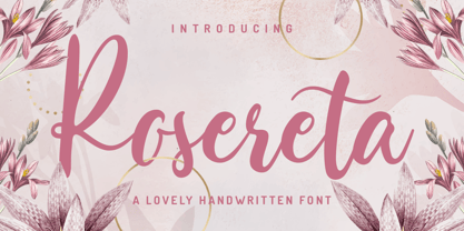 Rosereta - Lovely Script font with a natural handwritten feel. This handmade font will make your design has a beautiful natural touch for each details. It is perfect for any design project as Invitation,logo, book cover, craft or any design purposes. This font is PUA encoded which means you can access all of ligatures.
 - Lucky Night by Epiclinez,
$18.00 Lucky Night is a cute, quirky, and childish handwritten font. Whimsical and relaxed, this font will brighten up each of your designs. So what’s included: Basic Latin A-Z, a-z, numbers, symbols, and punctuations Multi-Languages support: from Afrikaans Albanian Catalan Danish to Dutch English Spanish Swedish Zulu. Accented Characters : ÀÁÂÃÄÅÆÇÈÉÊËÌÍÎÏÑÒÓÔÕÖØŒŠÙÚÛÜŸÝŽàáâãäåæçèéêëìíîïñòóôõöøœšùúûüýÿžß Thank you
 - Larsson by GRIN3 (Nowak),
$19.00 Larsson is a hand-drawn, all-caps, ultra-narrow font created by Bartek Nowak. It contains two variations for each letter and a lot of ligatures. Use for invitations, greeting cards, posters, advertising, weddings, books, menus etc. Language support includes Western, Central and Eastern European character sets, as well as Baltic and Turkish languages.
 - Inbrush by Alex Camacho Studio,
$15.00 Inbrush is a monospaced font whose letters and characters each occupy the same amount of horizontal and vertical space. All the characters, including diacritics, fits in the same space.This makes this font ideal for texts in both directions, horizontal and vertical. A fun and playful display font made by brush to make interesting compositions.
 - ALS Dulsinea by Art. Lebedev Studio,
$63.00 Decorative font based on XIX century Cyrillic handwriting. Dulsinea is a handwriting-based font, that is why most of the letters are tied to each other. Such handwriting is often seen in documents dated 2nd half of the XIX century. Its special features are rounded lengthy movements and unusual for present days sequence of strokes.
 - Lost In South by Gassstype,
$27.00 Introducing Lost in South – Natural Brush Font is a Signature Style and classy style, this font is great for your creative projects such as watermark on photography, and perfect for logos & branding. Lost in South a natural handwritten feel. This handmade font will make your design has a beautiful natural touch for each details.
 - Gangrena by Stolat Studio,
$19.00 Gangrena is a display font family, based on a old lettersets and style of UK punk posters from 80’s. It is characterized by a huge amount of automatic alternates, cycling in a random way trough the text. Each letter has three versions. To complement the font Gangrena has a set of six different brushes.
 - Unytour by NicolassFonts,
$25.00 Unytour is a modern sans serif font family of 54 fonts. It includes nine weights with italics from Extra Light to Heavy. Each weight includes alternatives (A,G,I,R,a,l) and OpenType features. Unytour is easy to read and perfect for logotypes, advertising, packaging, book covers and magazines, headings, corporate identities, and more.
 - Bristles by Typodermic,
$11.95 Step right up folks and feast your eyes on the most authentic and pure font to ever grace the pages of your ad campaign. Bristles is the name, and it’s a font that speaks volumes of homegrown authenticity with every brushstroke. As you gaze upon this sun-bleached and weathered sans-serif, you’ll notice how the paint barely holds onto the substrate. It’s as if the letters themselves are just barely hanging on, like they were painted decades ago and left to weather the storm. But that’s what makes Bristles so special. Its wispy, textured lettering gives your message a voice of purity that simply can’t be replicated by other fonts. Each letter has its own unique character, telling a story that only a sign painter’s hand could convey. And with its letter pair ligatures, Bristles breaks up the monotony of blatantly repeating characters in OpenType-savvy apps. It’s a font that’s as versatile as it is beautiful, perfect for any project that needs a touch of old-school authenticity. So what are you waiting for? Give your message the voice it deserves with Bristles, the font that speaks volumes of homegrown authenticity. Most Latin-based European writing systems are supported, including the following languages. Afaan Oromo, Afar, Afrikaans, Albanian, Alsatian, Aromanian, Aymara, Bashkir (Latin), Basque, Belarusian (Latin), Bemba, Bikol, Bosnian, Breton, Cape Verdean, Creole, Catalan, Cebuano, Chamorro, Chavacano, Chichewa, Crimean Tatar (Latin), Croatian, Czech, Danish, Dawan, Dholuo, Dutch, English, Estonian, Faroese, Fijian, Filipino, Finnish, French, Frisian, Friulian, Gagauz (Latin), Galician, Ganda, Genoese, German, Greenlandic, Guadeloupean Creole, Haitian Creole, Hawaiian, Hiligaynon, Hungarian, Icelandic, Ilocano, Indonesian, Irish, Italian, Jamaican, Kaqchikel, Karakalpak (Latin), Kashubian, Kikongo, Kinyarwanda, Kirundi, Kurdish (Latin), Latvian, Lithuanian, Lombard, Low Saxon, Luxembourgish, Maasai, Makhuwa, Malay, Maltese, Māori, Moldovan, Montenegrin, Ndebele, Neapolitan, Norwegian, Novial, Occitan, Ossetian (Latin), Papiamento, Piedmontese, Polish, Portuguese, Quechua, Rarotongan, Romanian, Romansh, Sami, Sango, Saramaccan, Sardinian, Scottish Gaelic, Serbian (Latin), Shona, Sicilian, Silesian, Slovak, Slovenian, Somali, Sorbian, Sotho, Spanish, Swahili, Swazi, Swedish, Tagalog, Tahitian, Tetum, Tongan, Tshiluba, Tsonga, Tswana, Tumbuka, Turkish, Turkmen (Latin), Tuvaluan, Uzbek (Latin), Venetian, Vepsian, Võro, Walloon, Waray-Waray, Wayuu, Welsh, Wolof, Xhosa, Yapese, Zapotec Zulu and Zuni.
 - Lyra by Canada Type,
$39.95 Lyra is an Italian Renaissance script that might have developed if metal type had not broken the evolution of broad pen calligraphy. It lies in the area between the humanist bookhand and the chancery cursive, combining the fullness and articulation of the Roman letters with a moderate italic slant and condensation. A steep pen-angle allows use of a broader pen relative to the x-height, giving the letters more contrast with light verticals and heavy curves. Lyra embodies the Renaissance spirit of refining technical advances of the late middle ages with reintroduction of ancient classical principles. Based on the moving penstroke with constantly changing pen-angle, it brings the vitality of handwriting to the ordered legibility of type. Lyra is a formal italic, too slow for copying books. By eliminating the element of speed, digital technology opens up a new level of calligraphy, bringing it into the sphere of typography as would naturally have happened if metalworkers had not controlled the process. If classical Western traditions are respected, digital calligraphy has the potential to recapture the work of the past and restart its stalled evolution. There is of course no substitute for the charm of actual writing, with each letter made for its space; but the tradeoff is for the formal harmony of classical calligraphy as every curve resonates in tune with every other. This three-weight font family marks Philip Bouwsma's much-requested return from a three year hiatus. It also reminds us of his solid vision in regards to how calligraphy, typography and technology can interact to produce digital beauty and vesatility. Each of the three Lyra fonts contains almost three character sets in a single file. Aside from the usual wealth of alternates normally built into Bouwsma's work, Lyra offers two unique features for the user who appreciates the availability of handy solutions to subtle design space issues: At least three (and as many as six) length variations on ascending and descending forms, and 65 snap-on swashes which can be attached to either end of the majuscules or minuscules. The series also offers 24 dividers and ornaments built into each weight, and a stand-alone font containing 90 stars/snowflakes/flowers, symmetric contstructs for building frames or separators, masking, watermarking, or just good old psychedelia.
 - New Horizons - Unknown license

- BN-Gangsters - Unknown license

- Speed Bowling - Unknown license

- Rosie by AVP,
$29.00 Rosie is a chunky but elegant pen script with useful OpenType features. In non OpenType-savvy applications it still works beautifully as a fully joined script.
 - Tourist by Solotype,
$19.95MacKeller, Smiths and Jordan had a font called Giraffe Wide which we liked, but like many Victorian display fonts it had no lowercase. We fixed that! - BrunoBook by JOEBOB graphics,
$9.00 Stop using Times new Roman in children's books! BrunoBook is here to stay. A complete character set with numbers and most (but not all) special signs.
 - Alquitran Family by RodrigoTypo,
$40.00 This is an extension of Alquitran, but now converted into a family from the Thin to the Black Line, it contains dingbat, inspired by the Pichação!
 - This Little Piggy by Hanoded,
$10.00 This Little Piggy is a cute, kiddy-style font. A little haphazard, a little messy, but funny and happy. Great for wishing-well cards or books.
 - AZ Claire by Artist of Design,
$20.00 AZ Claire was inspired by hand scripts, but with the necessity for a bolder look. This font was designed for use as a fun bold headline.
 - Van Alt JNL by Jeff Levine,
$29.00Looking similar to a Deco-era classic typeface, Van Alt JNL has slightly different character shapes, but pays due respect to its inspiration by the original... - Kardust TS Condensed by ARToni,
$7.00 Kardust TS is a part of Kardust family, which is born from it skeleton to suit Transportation and Sport, but it will suitable for any purpose.
 - Shareholder JNL by Jeff Levine,
$29.00 Shareholder JNL could possibly be found on a stock certificate, but in truth, it's based on hand-lettering found on some old sheet music entitled "Sharing".
 - Thwaites by Eyad Al-Samman,
$20.00 ‘Thwaites’ typeface is fully dedicated to one of my best Canadian friends who I do cherish and value highly. This great and industrious Canadian friend is ‘James Douglas Thwaites’ who lives along with his good-natured family in British Columbia, Canada. For me, James is like a source of inspiration and I do consider him as an ideal in my life. Our strong friendship has started since 1999 and I hope that it will endure just to the last moment of my life. Sometimes I see him as the writer and poet that I learn a lot from, sometimes I see him as a devoted religious minister that I try to understand more about his teachings, and other times I see him as the educator that I strive to imitate verbatim in my life. When I want to talk more about this Canadian friend, I will not be able to give him his due in full. Thus, I will instead mention some excerpts of his biography that he wrote himself saying that: “James D. Thwaites is a self-accomplished man. Having worked in various fields including restaurant management and cleaning, he has achieved his goals of being a full-time teacher, past-time writer, and volunteer religious minister for the Christian Congregation of Jehovah's Witnesses. His personal and academic pursuits have led him to be published in various magazines, newspapers, self-published books, and websites, including his now defunct ‘poetryofthemonth.com’ website. He continues to learn and augment the craft of writing while working primarily in early literacy and delayed literacy learners, teaching reading and literature to a wide age range of students. He views his religious endeavors as an extension of his academic ones. He teaches others both as a public speaker and in one-on-one situations, teaching about the benefits of submission to God and to His teachings. His future goals include expanding his ministry and continuing his writing.” The name ‘Thwaites’ itself comes from Great Britain and originated from the last Viking raids upon England, being an Anglicized version of a Scandinavian term meaning—depending on the source material—either "a place that is difficult to approach" or "a small thicket of trees." Another recitation mentions that ‘Thwaites’ can be described also as an English surname but one of pre 7th century Norse-Viking origins. It may be either topographical or locational, and is derived from the word "thveit", meaning a clearing or farm. As a locational surname it originates from any one of the various places called "Thwaite", found in several parts of Northern England and East Anglia to the south. The various modern spelling forms include Thwaite, Thwaites, Thwaytes, Thoytes, Twaite, Twatt, Twaites, Tweats and Twite. The name, although often appearing unique to outsiders, can often be found within other famous names like Braithwaite, Goldthwaites, or Misslethwaites. With various spellings, some families not including the ‘e’ or the ‘s’ at the end, Thwaites and its derivations—although not exceedingly common—is a name found worldwide. ‘Thwaites’ typeface is simply a sans-serif streamlined, stylish, and versatile font. It is designed using a combination of thick and thin strokes for its +585 characters. Its character set supports nearly most of the Central, Eastern, and Western European languages using Latin scripts including the Irish language. The typeface is appropriate for any type of typographic and graphic designs in web, print, and other media. It is also absolutely preferable to be used in the wide fields related to publication, press, services, and production industries. It can create a very impressive impact when used in headlines, posters, titles, products’ surfaces, logos, medical packages, product and corporate branding, and also signage. It has also both of lining and old-style numerals which makes it more suitable for any printing or designing purposes. ‘Thwaites’ typeface is really the cannot-miss choice for anyone who wants to possess unique artistic and modern designs produced using this streamlined typeface.
 - Salloon by Ingrimayne Type,
$8.95 The original version of Salloon was what has become Salloon-Wide. It was designed a year or two before 1990. The narrower version, which is now the regular version of the face, was constructed a few years later. There never has been a true lower-case set of letters for these fonts, but the narrower version introduced a second set of caps by removing the side bumps from the letters. Although Salloon may look like an old font, no historic font closely resembles it. Fonts with bold, thick stems such as Salloon invite interior decoration. The five striped versions and the shattered version of the font were produced a year or two after the construction of the narrower Salloon when the arrival of a font distortion program made it easy to cracked and stripe fonts. In 2019 an outline style and two highlighter styles were added to be used in layers with the Salloon-Regular and one highlighter style was added to be used with Salloon-Wide.
 - Zoya by MireyDesign,
$10.00 Zoya is a humanist sans serif typeface, a versatile font family that stands out with it's warm and natural feel. Humanist sans serifs have roots in calligraphy, their round, dynamic, open forms have higher stroke contrast than the other sans serif classifications. Can be used by any organization that wants to appear simultaneously modern, approachable, active and professional. FEATURES Four weights + Bold Outline / Italics / Numbers & Punctuation / Extensive Language Support / Long term support, free features and bug fixes The font family includes 10 fonts Zoya Light - delicate and edgy Zoya Bold - strong but approachable Zoya Regular and Semi Bold are the balance between the two Zoya Bold Outline - engaging + Italics USE Strong capitals and a smooth, open lowercase are effective in a variety of applications. This font is perfectly suited for headlines, posters, branding, packaging, presentations, logo, quotes, titles, magazines headings, web layouts, advertising, invitations, packaging design, books, and nearly any creative design.
 - SL Borges by Sudtipos,
$29.00A man purposes himself the task of drawing the world. Among the years, he populates a space with images of provinces, reigns, mountains, bays, ships, islands, fishes, rooms, instruments, heavenly bodies, horses and people. A while before he died, he discovers that patient labyrinth of lines traces the image of his own face. J. L. Borges. SL Borges is a homage to the genial Jorge Luis Borges, illustrious Argentinean writer who lived between 1899 and 1986. Sharply depicted by Augusto Costhanzo, SL Borges synthesizes to icons the big themes that obsessed him: the infinite, labyrinths, libraries, identity. But it although traces lines over the more human side of the writer, who loved cats, fervent politics and the taste of Tango. SL Borges abridges a sum of original iconographic illustrations in True Type format, which masterly synthesizes the most important themes of the grand genius of the literature. SL Borges takes part of the "Icons of Icons" Gallery, developed by SinergiaLab for Sudtipos - Sticky Fingers by Comicraft,
$19.00 LOOK OUT! It's kinda creepy, we know, but we're convinced that this font does whatever a spider can -- in fact, we believe it can actually spin a web of pretty much any size, and even catch thieves as if they were bugs of some sort -- let's say flies. In fact we'd almost go so far as to say that, in the chill of night (perhaps at the scene of a crime) this font may just arrive like a streak of light in the nick of time. We're releasing this font now not for wealth or fame, we ignore those things, action is our reward. Here at Comicraft we think of life as a great big bang up, and whenever there's a hang up, you won't find us climbing -- or crawling -- the walls... well, not without STICKY FINGERS anyway. Find yourself a pair of webshooters and this font is the perfect complement to any Halloween costume.
 - Kaput Black - Personal use only

- Kaput Black Black - Personal use only

- Sterling Script by Canada Type,
$54.95 Sterling Script was initially meant to a be digitization/reinterpretation of a copperplate script widely used during what effectively became the last decade of metal type: Stephenson Blake's Youthline, from 1952. The years from 1945 to 1960 saw a heightened demand for copperplate faces, due to post-war market optimism, as well as the banking and insurance industries booming like never before, which triggered the need for design elements that express formal elegance and luxury. The name Sterling Script is a tip of our hat to England, the Stephenson Blake foundry's country of origin. It is also a historical hint about copperplate scripts having been used mainly for banking and bonds in the 19th century. Originally we just wanted to resurrect a gorgeous metal type from the ashes of forgotten history. But after the main font was done we saw that the original s really needed an alternate. We made one. But we felt sorry for the original s and didn't want to see it dropped from use altogether, so we saved it by building a set of ligatures that solve the minor connection problem with the s at large sizes. Before the completion of the ligatures, a few different alternates were also drawn, and we were faced by the fact that the single font we set out to do was now a much larger set than we anticipated. While thinking about how to split up our unexpected bundle of large characters, we drew a few more alternates and some swashes. This abundance "problem" reached a certain point where there was no looking back, so we just decided to go all the way with this font. We added many more alternates, swashes, ligatures, and two full sets of each beginning and ending lowercase letter. The result is over 750 characters of sheer elegance. Sterling Script has many features that set it above and beyond other copperplate scripts: - It has 2 beginning and 2 ending alternates for every single lowercase character. The beginning and ending variants on the vowels are also available in accented form in the appropriate cells of the character map. - Sterling Script is the ultimate elegant font choice for luxury design. Very elegant, but not too soft. Its strong and confident shapes convey a message that is real, comforting and assuring. - One of the eventual purposes of expanding Sterling Script this extensively was to create a script that finds the middle ground between formal and informal without compromising either trait, a script where the degree of formality can be gauged, tweaked, cranked up or toned down depending on the layout's needs. Aside from beginnings and endings, there are multiple variations for the majority of the basic characters. This is a formal script on steroids, where twirls and swashes can be set to come out unexpectedly from any place in the word, which is great for reducing the inherent rigidity of words set in copperplate scripts and "humanizing" them whenever needed. This is especially useful for wedding, postcard and invitation design, where not every viewer of the collateral material has something to do with banking or insurance. - With such an extensive character set, a designer can easily set a word or a sentence in 10 or more different ways, and choose the perfect one for the task at hand. This is particularly useful for work where details are of utmost importance, like logos, slogans, or elegant engravings that consist of one to three words. Let those swashes and twirls intertwine for maximum elegance. The Sterling Script complete package consists of 7 fonts: Sterling Script, Alternates, Beginnings, Endings, Swashes, Swash Alternates, and Ligatures. Sterling Script is available in five different purchase options and price ranges. But with such a massive offering of variation, the Sterling Script complete package is definitely the most value-laden set in its class. Once you use Sterling Script, you will never want to go back to other copperplates.


