10,000 search results
(0.013 seconds)
- Spock by Los Andes,
$19.00 Spock has a neutral and clean structure but as we explore its OpenType features we will begin to discover a rich variety of alternates—even glyphs with pointed ears. All these combined elements provide a wide range of choices to meet different design needs. Each of the 4 sub-families consists of 6 weights and matching italics, making Spock a super family of 48 styles. The Pro family set contains 609 characters and it includes a generous number of alternates. The three other Essential sets are composed of alternative glyphs. Spock is specially suited for advertising as well as editorial and corporate design.
 - Dark Light by Twinletter,
$15.00 DARK LIGHT is a graffiti-style display font with individuality in each letter. Use this font to create a unique style that will pique the interest of many people. Not only that, but your project will look more attractive and natural if you use it. This graffiti font is great for product logos, poster titles, headlines, packaging, film titles, logotypes, gorgeous writing, and trendy graffiti designs, among other things. Of course, if you utilize this font in your numerous creative projects, they will be perfect and outstanding. Use this typeface right away for your one-of-a-kind and remarkable projects.
 - 1682 Writhed Hand by GLC,
$42.00 This funny font was created inspired from a contract of sale for a field prepared by a French notary in the end of the year 1682 (December seventh). We have worked to transform the almost illegible original form into a contemporary usable typeface, but keeping the special "writhed" appearance. It is a "pro" font containing Western (including Celtic) Eastern and Central European, Icelandic, Baltic, and Turquish diacritics. The numerous OTF alternates and ligatures(about 5 different glyphs or ligatures for almost each basic lower case letter) made the font looking like a real various hand as closely as we can do it.
 - Mr Jones by Miller Type Foundry,
$25.99 Mr Jones was originally conceived as a family for print design consisting of a sans and a headline. The lowercase are wide for legibility at small sizes while the caps are narrower to save space and keep an even balance of negative space when used in body copy. The overall widths of certain characters have been adjusted to almost extremes to keep an even balance of white space around each letter. He works well in body copy, but will need decreased tracking for larger settings. He comes with small caps; proportional, oldstyle, and tabular figures and discretionary ligatures.
 - Typrighter V1 by Jadugar Design Studio,
$75.00 Here is a revolution in typewriter fonts.......typrighter.......yes! typrighter V1 and typrighter V2.....We applied Contextual Substitutions feature in Fontlab with 6 different alternative of each letter (standard English alphabets). No more repeating same contours of letters which a typical typewriter fonts does......a next same letter replaces itself automatically to 6 variations to give you real typewriter text flowing out of your computer keyboard...... Please watch a short demo and enjoy the open type features in word, illustrator and Photoshop.... https://www.youtube.com/watch?v=HMM98Wmb_sg The basic version is bold version but does not have Contextual Substitutions option.
 - Caleb Mono by Brenners Template,
$19.00Caleb Mono Font Family It is originally inherited from Caleb Grotesk. And, It is a reinterpretation of the proportional and grotesque sensibility of Glphs with a more modern and rarity feeling. Monospace fonts are a great choice for any designer who wants to create a retro, and minimalist feel. The disadvantages of ambiguous readability due to its wide width and mechanical placement are clearly present, but still attractive and elegant. To overcome these shortcomings, this font family gave variable side bearing values to each glyph and adjusted the width of the glyphs themselves. It is designed with a more human sensibility. - Morn by Wahyu and Sani Co.,
$20.00 Morn is a sharp geometric sans font with roman proportion. Every characters are essence from a rectangle (square), a circle and a triangle with require little adjustment to make them appear optically equivalent. This font is equipped with some OpenType Layout Features such as fraction and ligature and the default layout for numbers is proportional lining, but can be changed as tabular lining. So the space between numbers looks more even. Morn has total 20 fonts which are upright and oblique. Each font has 460+ characters, and it supports many Latin languages such as Western Europe, Central/ Eastern Europe, Baltic, Turkish, Romanian.
 - Hurme Geometric Sans No. 4 by Hurme,
$49.00 Hurme Geometric Sans No.4 includes seven weights with true Small Caps, obliques and swash alternates. Uppercase swash alternates can be automatically applied to all characters or just to first and last characters of each word. Please see the specimen PDF for complete overview of the typeface and its features. Alternate characters and other Opentype features make for a versatile family that can be adjusted for specific needs. Hurme Geometric Sans is a series of font families all with distinctive qualities and features but share the same basic construction and proportions. See also the other Hurme Geometric Sans families.
 - Vignettic by Allmo Studio,
$19.00 Vignettic font comes with a retro, modern, and vintage touch. Inspired by the dynamic culture, sign, and badges design. Vignettic Script comes with uppercase, lowercase, numerals, punctuations and so many variations on each character include OpenType alternates. This font is great for your creative project such as logos, posters. invitations cards, packaging, badges, logotype, apparel design, and labels. But don't let us restrain your imagination of course. Work well on both vintage and modern designs. You can see our design implementation on preview images to check the resulting sample. Vignettic Font looks Perfect for use in anything from Branding, Web, Packaging, Etc.
 - Goolavin by Attype Studio,
$25.00 Goolavin is a Modern Minimal Serif typeface This font exudes a sense of power. It is elegant but strong and confident in appearance. Each letter has been carefully designed to create the best possible impression. It looks stunning on packaging, clothing, and any industry where elegance is needed without sacrificing boldness. that suitable for strong and modern looks on your works. Goolavin is perfect for sport product, branding, logo, invitation, stationery, product packaging, merchandise, monogram, blog design, game titles, cute style design, Book/Cover Title and more. Features : - Goolavin Font - Ligatures - Multilingual, US Roman, Latin 1 Support
 - Chewy Camel by Bogstav,
$16.00 Originally I wanted to call this font Chewy Caramel, because I love caramel. But that name was already taken, so I deleted two letters in the name and ended up with Chewy Camel instead. I know that the designer of Chewy Caramel don’t mind - because that is my good friend, David, who made that one! :) Chewy Camel was made with a slightly blurry and inky pen, and is suitable for most things that need a true organic hand lettered font. I have added 6 slightly different versions of each letter, and there is multilingual support as well
 - Hearth Stone by Mightype,
$15.00 Hearth Stone Script is a modern calligraphy font with the current handwriting style, this font is perfect for branding, wedding invites, magazines, mugs, business cards, quotes, posters, and more, you can try first if you want to buy this font. Hearth Stone Script is equipped with 309 glyphs. With so many glyphs, you can choose the letters according to your liking. There are many variations and options for each letter, so you can customize based on your design needs. This font contains: Hearth Stone Script OTF If you have any question, do not hesitate to contact me by email: mightype89@gmail.com
 - Umberland Slab by Sharkshock,
$115.00 Umberland Slab is an attractive family available in 3 different weights with italics. There’s a particular emphasis on simple geometric shapes and the way they interact with tall vertical strokes. Smooth curves and sharp angles blend together in a pleasing symmetry. Stroke widths are given variable degrees of contrast but serifs are consistent and heavy handed. Spacing is on the tight side with some lowercase pairs quite snug against each other. Umberland Slab would work well in small blocks of text, corporate logos, menus, or signage. This family is equipped with European accents/diacritics for international support, fractions, alternates, and ligatures.
 - Tartufo by Hanoded,
$15.00 A Tartufo is a truffle in Italian. I have to admit, I have never eaten one, so I couldn’t really tell you if they’re any good. I suppose they are, but you’ll have to find that out for yourselves! Tartufo font is a bit of a weird font. It was hand made with a rollerball pen on some very expensive French paper. As I was drawing each glyph, I figured I might as well include Cyrillic and Greek. Tartufo is not a text font - I’d use it for packaging, posters, book covers and T-shirts. Comes with a whole bunch of diacritics!
 - Kelpt by Typesketchbook,
$55.00 Kelpt font is an extra large super family of 54 fonts! Kelpt has such a big abundance of contrast, styles, weights, X-Hight. Typesketchbook consists of a very usable, clean and modern sans typeface with rounded corner. The font looks clean and geometric but it’s designed with unusual stylistic features to give the Kelpt font a special and unique touch. The complete Kelpt type family includes 9 weights with italic and X-Hight (A1-A3) versions for each of them all in all 54 fonts for a multifunctional usage, especially for cooperative work, such as website, magazine, editorial, publishing , as well as packaging.
 - Alasassy Caps by Leksen Design,
$19.00 Bring some sass to your signage! Alasassy is a font inspired from Sharpie pen drawings, featuring ink ball terminals. The lowercase letters are a mix of uppercase and lowercase letters that share the same cap height and baseline. There are several alternate characters with a mix of high and low crossbars as well as crossbar overhang options and language support for each. This display font will bring some zest to your logo, signage, packaging design or large titles on book covers or advertising. It is a great combination of an organic, hand drawn feel but still clean and crisp enough to look professional.
 - Organic Thinker by Bogstav,
$19.00 Monospaced fonts can be so dull...they are often only suitable for something like programming and other places where you need the text lined up perfectly. Well, that is not the case with Organic Thinker! Yes, it is monospaced, but it is also handmade and full of vibrant and organic life! Each letter has 5 slightly different versions, and they automatically changes as you type - makes you forget everything about programming, kerning and other dull things! :) Well...you are more than welcome to use Organic Thinker for your next Turbo Pascal text, actually I'd fancy that! :)
 - Eventyr by PizzaDude.dk,
$17.00 Eventyr is danish and means fairytale. You may know the name of the famous danish author, HC Andersen, who was well known for his fairytales. Actually I finished this font while listening to one of his fairytales, and that inspired me to call this font Eventyr. Most fairytales include the number 3 (3 choices, 3 wishes ... etc) but this font has the number 4 - because you have 4 slightly different versions of each letter to choose from. Enough to make your project look magical! Of course, the font has multilingual support, because fairytales are well known all around the world! :) Caps only Fonts.
 - Burford Rustic by Kimmy Design,
$10.00 Burford Rustic is the weathered and textured alternative to the Burford Family. It works the same way as Burford as a layer-based font family, but with some style variations and new layering options. It includes 20 font files, starting with four texture variations from Black, Bold, Light to Ultralight. It also includes and Outline and two Inline Weights. Additionally it offers three line weights (light, medium and bold) for top layering options. There are two extruded fonts and two drop shadow fonts, all either in a solo version and set with Burford Rustic Black for users not using Opentype programs. For users that have Opentype programs, such as Adobe Illustrator, Photoshop, InDesign, Microsoft Publisher and Quark, each font also comes with a set of Stylistic Alternatives for letters A C E F G H P Q R. There are two versions of each letter, and by using contextual alternatives, no two letters next to each other will be the same. Burford Rustic Basic package is created for users who don’t have access to programs with Opentype capabilities and are unable to use the layering effect. Burford Rustic can still be a powerful tool as each font can also be used on it’s own. It includes every font file not needed for the layering effect. The Burford Rustic Ornaments uses all basic keyboard characters - around 100 total elements per set. They are designed to go specifically with Burford Rustic and use the same textured edge. The set includes: banners, borders, corners, arrows, line breaks, catchwords, anchors and many more!
 - ITC Tactile by ITC,
$29.99ITC Tactile is a puzzle of subtle typographic contradictions. Capitals have traditional epigraphic proportions, but the lowercase has a uniform optical width. Light weights are stately and elegant, but bold designs are almost jolly. This paradoxical alphabet even combines two distinctively different serif designs. Designer Joe Stitzlein says, “I wanted to create a modern and dynamic serif face that draws its forms from antiquity. I also wanted to have as much fun as possible with the drawing and architecture of each letter. Hopefully I've created a very legible typeface that grabs the reader's eye in a nice, 'tactile' way.” The apparent inconsistencies of the design are the result of careful consideration. Of the seemingly odd serif design, Stitzlein explains, “The transitional serif is an entry point for the eye into the letterform, and the long slab is an exit, leading to the next letter.” The result is a typeface that's easy to read at text sizes but offers surprising details when enlarged to display sizes, setting ITC Tactile apart from more traditional designs. While this is his first commercial typeface design, Stitzlein has ample experience creating custom typefaces for corporate branding, including companies such as Silicon Graphics and Sempra Energy. His graphic design business has served a wide range of clients, including Apple Computer and the 2002 Salt Lake City Olympics. The ITC Tactile family is available in three weights, with complementary italic designs and a suite of small caps for each of the roman designs. Stitzlein drew the small caps to match the height of the lowercase x-height, which enables “bi-form” or “unicase” setting in display copy. - Treppenwitz by Hanoded,
$15.00 Treppenwitz (literally: ‘Staircase Wit’) is a German word describing a conversational remark that only occurs to someone after the opportunity to make it has passed. I love words like this: they can sum up a whole sentence or a complex train of thought. Treppenwitz font is hand brushed. It’s a little uneven, a little shaky, but will look good on product packaging and book covers. Comes with loads of diacritics and double letter ligatures as well.
 - Bergamot by Emily Lime,
$20.00 Bergamot was inspired by vintage apothecary labels, but this font is actually quite modern in both style and effects. It features all caps plus 2 sets of alternates (so, 4 total variations for each letter). The coolest part… they intermingle randomly as you type! Ok, so it’s not exactly random, but that’s the easiest way to explain what you'll see. The letters are actually coded to rotate with their respective alternates. This effect is both useful or can be purely for fun! Let’s talk about the useful part for a sec… Repeating characters are often a dead giveaway that a font is being used. And sometimes we don't want that, right? We want to give the illusion that our design has been custom hand-lettered for a particular project… and can't be recreated by another. That’s exactly what this font aims to do. The randomizing effect is built into the Contextual Alternates feature and will likely be “on” automatically in your chosen program. Alas, even random doesn't guarantee that like characters won't appear in close proximity. So for those of you with access to the “Stylistic Alternates” feature, easily change repeated letters that are near each other simply by turning this feature “on”. Voila! Custom…hand…lettering. Bergamot also features separate files for Frames & Ornaments. Check them out below.
 - Sisters by Type-Ø-Tones,
$40.00 Sisters is a lively set of stencil display typefaces designed by Type-Ø-Tones’ co-founder Laura Meseguer. The family features four fresh fonts that share foundational principles of construction yet complement each other—as sisters do—by celebrating their differences. Variations in contrast, weight, and design characteristics result in four distinct styles dubbed One through Four. This cool quartet contains no lowercase, asserting the family’s rightful place in the titling typography space. Like many Type-Ø-Tones typefaces, Sisters was conceived as a custom lettering project—in this case, the design was crafted for the identity of an art exhibition. Laura initially drew only the limited character set the show required, but from the outset, she saw great potential for a fully developed type family based on her lettering concept. The first member of Laura’s new family was, naturally, Sisters One. She later added contrast to produce Sisters Two, then equalized the weight of Sisters Two to create Sisters Three. To round out the group, Laura added a deco touch to Sisters Two, resulting in the festive but retro-elegant Sisters Four. Each Sister shares DNA with the other members of the family, just as human siblings do :). Credit for the Sisters name goes to Eider Corral and we couldn’t imagine a more fitting moniker for this little family.
 - Varygraphie by Mans Greback,
$39.00 Varygraphie is a modern Art Deco sans-serif family. This expressive typeface is provided as a variable font, and was designed by Mans Greback between 2019 and 2023. It gives any project a modernist appearance, as a reinvention of the hundred-year-old style of design, adapted and adjusted to fit in present-time purposes and technology. The Varygraphie family contains 12 high-quality styles: Thin, Light, Regular, Medium, Bold and Black, and each weight as Italic. Mix the weights to see how they balance perfectly against each other. Or use the variable font and set any weight between Thin and Black: Only one font file, but the file contains multiple styles. Use the sliders in Illustrator, Photoshop or InDesign to manually set any weight and width. This gives you not only the predefined styles, but instead more than a thousand ways to customize the type to the exact look your project requires. More info about variable fonts: https://mansgreback.com/variable-fonts The font is built with advanced OpenType functionality and has a guaranteed top-notch quality, containing stylistic and contextual alternates, ligatures and more features; all to give you full control and customizability. It has extensive language support, covering all Latin-based languages, from Northern Europe to South Africa, from America to South-East Asia. It contains all characters and symbols you’ll ever need, including all punctuation and numbers.
 - Credit Crunch by Comicraft,
$29.00 Here in the heart of Santa Monica, in the disused 1940s aircraft hangar we like to call the Comicraft Studios, we know that times are tough. As we were driving to “work” in the back of our chauffeur driven Humvee limo, sipping martinis out of the navels of Playboy bunnies and wondering what font we should release next, we decided it was time to reach out to the poor people. Yes, we felt it was time to create a font for the huddled masses yearning to breathe free, for the wretched refuse of our teeming shores. A font, if you will, for the tempest-tossed. It’s a little skinny and might be described as pinched and starved, but it’s guaranteed to see you through this current economic crisis as only the 26 letters of the alphabet can. It was a tall order, but Jazzy JG Roshell created this one while he was in line at the bank, waiting for his personal bailout. Meticulously crafted using one of those ballpoint pens attached to the cashier’s station by elastic, Credit Crunch is the Hamburger Helper of comic book fonts. It’s kind of a hybrid -- just like the Priuses our trophy wives drive to their personal plastic surgeons -- and it’s solar powered and also comes with a tank full of good old fashioned Biro ink. The Recession, Climate Change AND Global Hunger will probably end mere minutes after you crack open your life’s savings to buy this font. How can you afford NOT to...? See the families related to Credit Crunch: Credit Extension.
 - Tuna Salad by Blythe Green,
$14.00 Tuna Salad is a handcrafted, multi-weight, ALL CAPS font with a playful, authentic feel. Type in lowercase to explore alternate characters for each letter! It's perfect for: logos, branding, greeting cards, posters, quotes, magazines, social media, planners, shirts, prints, and more. FEATURES: Alternate characters for each letter to give an authentic, handwritten feel for each word Light and bold to create emphasis and hierarchy in your work Multilingual accents + characters for the global designer
 - Zachary - Unknown license

- Palmer Lake by Jen Wagner Co.,
$13.00 Features: Palmer Lake Print: Uppercase letters, numbers, & extended punctuation Palmer Lake Script: Lowercase letters, numbers, & extended punctuation Non-English support for the international designer Same stroke thickness with each font, so you don't need to make any time-consuming adjustments to get it looking right! Palmer Lake Print (uppercase font) letters are the same height as the Script lowercase letters, so making quotes is super easy! This is such a fun new duo, perfect for creating quotes, logos, or just adding a hand-written touch to any project! While other fonts usually take some size adjusting to look just right, Palmer Lake duo has the same stroke thickness for both fonts, so you can set each font to the same size and you're done! Plus, the uppercase letters of the Print font are the same height as the lowercase letters of the Script font (see the samples), so lining them up with one another is a breeze! Each font also has alternates for each letter, so when you type uppercase or lowercase for each font, the letters will change slightly. For example, tying in all caps with the Script font will connect each letter, whereas typing all lowercase will disconnect each letter. Test it out for yourself in the box above!
 - Altemus Pinwheels by Altemus Creative,
$11.00 Each style is a collection of 174 pinwheel designs.
 - Cross Worded by Funk King,
$5.00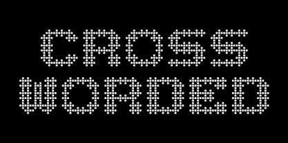 Each glyph is fashioned as a cross word puzzle.
 - Fortune Teller by Kitchen Table Type Foundry,
$15.00 Back in the nineties I had a deck of Tarot cards. It was part interest and part curiosity, but I also liked the look of them. My readings were just for fun; I thought it was all a joke, but when people started to return for more readings (because what I had predicted actually happened), I quit. That was way out of my comfort zone! Fortune Teller is a nice brush font. I made it with one of my late father in law’s Chinese brushes and ink. It comes with all diacritics and a set of alternate glyphs. If you buy this font, you will meet with a tall and handsome stranger and you will win the lottery. Guaranteed! Haha!
 - Bulkr by Hackberry Font Foundry,
$24.95 Over the years, I've used Impact a lot. But, not because I liked it—rather because it was the only font I could find with the bulk I needed for a given title or whatever. I finally decided to make my own. It was originally built off Librum Sans Bold, but I quickly made a mask of Impact for the widths, bumped the x-height way up, made the horizontals much heavier, and on and on. You know how it is when you start designing. The result is a black sans with the bulk of Impact and much more interesting character shapes. I suspect I'll use it a lot. My hope is that you like it as much as I do. Have fun!
 - Bender Script by Dear Alison,
$29.00 Would you hire one of the top hand lettering artists that worked for companies like Max Factor for your designs? Of course you would! Chas Bluemlein passed away many years back, and you couldn't have afforded his services anyway, but his lettering prowess which graced many advertisements, primarily cosmetic ads, has been pulled together from numerous samples to make this font. Bender Script comes with BONUS Swash alternates to mix up the flavor a bit, and exudes passion and confidence! Now you can own not only a piece of his lettering legacy, but you can also put it to work for you! This beauty is a sure fit into any font collection, so what are you waiting for, buy it today!
 - Matita Written by Trine Rask,
$12.00 Matita Written is the first release from a larger type family developed from 2005 through 2019 with handwriting in mind. It is a solid sans serif in two weights and dotted instructional versions, with alternative glyphs based on different writing habits. For teaching, teaching material or just typography. An unchildish handwritten type family for many purposes.
 - Handion by AF Type,
$10.00 Handion is a modern calligraphy font with today's handwriting style, this font is perfect for branding, wedding invitations, magazines, mugs, business cards, quotes, posters, and more, you can try it first if you want to buy this font. Handion is equipped with 400 glyphs. and by having many of these glyphs, you will be able to choose letters according to your liking, lots of variations and options for each letter, so you can adjust to your design choices. To use various kinds of glyphs, you need a program that supports OpenType features such as Adobe Photoshop Cs/Adobe Photoshop CC, Adobe Illustrator CS/Adobe Illustrator CC, Adobe Indesign and Corel Draw and many more programs that support OpenType. If you don't have a program that supports OpenType, you can access all the alternative glyphs using Font Book (Mac) or Character Map (Windows). Thanks and happy designing :-) Thank you for buying!
 - All Round Gothic by Dharma Type,
$24.99 Originally designed in 2012 by Ryoichi Tsunekawa, All Round Gothic is a font family inspired by classic sans serif fonts such as Avant Garde Gothic and Futura. All Round Gothic is a structured geometric sans, but also creates a sweet and cute atmosphere by removing unnecessary stems. With their bowls shaped by not-perfectly-geometric circles, All Round Gothic makes an organic impression in some degree. As a result, All Round Gothic became a new font family that covers between 1920s Bauhaus and contemporary design trends comprehensively and one of the most suitable family for any purpose such as text, headline, logo, poster, and animations thanks to clean and legible but soft and friendly letterforms. All Round Gothic includes 5 weights and obliques corresponding to each weight. Why don't you try this family if you got a little bored with classic sans serifs. This font is used in Minions movie.
 - Arpona by Floodfonts,
$49.00 For anyone who prefers to stand out from the crowd, than to go with the flow! Arpona is a typeface with small wedge serifs and a strong character, ideal for corporate design and all projects characterized by a sense of individualism – for example art, fashion, food, beverage and lifestyle topics. Arpona is inspired by roman letters carved in stone but otherwise difficult to categorize. It is neither a pure serif nor a sans but rather a symbiosis of different design concepts. Because of its display qualities, Arpona is a good choice for packaging, advertising and editorial design and is well readable even in running text on screen. The family has nine weights, ranging from Thin to Black plus corresponding italics. Each style includes 590 glyphs supporting all western-, eastern- and central-european languages including four sets of figures and various currency symbols. For more information visit the microsite: http://floodfonts.com/arpona
 - Pumpkin Island by Ardyanatypes,
$12.00 Be prepared, this Halloween party would be extraordinary . PUMPKIN ISLAND! A cute decorative Halloween theme Typeface, but still keeping the versatileness. Summoned for a Halloween theme look but doesn't lock the possibility to use in other attractive stuff. It fully pumps including ligatures & stylistic alternates in both capital or basic character, and the good news is . . PUMPKIN ISLAND also support multi-language within numbers and punctuations Glide through with every curve of each letter and be ready to rock pump your awesome needs! As how it looks, PUMPKIN ISLAND really fit for any needs such as horror books cover, posters, branding or any attractive design taste Here it goes! Have an awesome party ~ ----------- A guide to accessing all alternatives can be read at: http://adobe.ly/1m1fn4Y ---------- **Features:** - A-Z Character Set - a-z Characters set - Numerals & Punctuations (OpenType Standard) - Multilingual Thank you and have a nice day
 - DIN Next Decorative by Monotype,
$40.99 This four-piece family is the DIN design, but not as you know it. The famously, crisp, clean and precise typeface has been given a textured update that's reminiscent of rusted metal, or rubber stamps. Underneath this lies the same sturdy, geometric shapes that have allowed DIN to stand the test of time, but with a new sense of tangibility. “This kind of treatment is more about creating a feeling or a mood that goes beyond the communication of the words themselves,” explains Monotype Studio director Tom Rickner. “I think it expands the repertoire of what DIN Next can express.” Designed for display, these four typefaces – DIN Next Rust, DIN Next Shadow, DIN Next Slab Rust and DIN Next Stencil Rust – show a new side of DIN Next's personality, as if the surface of each letterform has been gradually worn away over the years.
 - DeSoto by Stephen Rapp,
$49.00 Warm and inviting— DeSoto is a titling face sure to add a touch of grace to many projects. Its name and inspiration come from a few letters in a 1958 DeSoto magazine advertisement. Many automobile ads back then used wide faces to create a feeling of luxury and elegance. DeSoto gives you that same feeling, but in a more contemporary fashion. DeSoto’s extended width characters show a hint of old school aesthetics. It comes in four styles all featuring a balance of caps and smallcaps. As a titling face, DeSoto will work in all kinds of setting; well… maybe not death metal flyers, but who knows? Taking advantage of OpenType programming, DeSoto features include alternate characters, fractions, oldstyle figures, ligatures, case-sensitive punctuation, ornaments and swashes, and Central European language support. All features, including ornaments, are included with each weight, taking full advantage of the OpenType format.
