10,000 search results
(0.019 seconds)
- Blue Thunderbird by Cyberian Khatru,
$15.00 This font is meant evoke Native American art of the South-West US. The examples of this art that I've seen are very geometric, using rectangles and triangles to create all the images. This font isn't meant to be an authentic example of native American art, but is inspired by such. http://homepage.mac.com/baronvoncruzer/cyberiankhatru/bluethunderbird.htm
 - Sunny Weather by Hanoded,
$15.00 Spring is in the air! My chickens are broody and are sitting on an ever increasing pile of eggs; my fruit trees are budding and the sun is shining! Sunny Weather is a happy kind of font: it was handwritten, using a Sharpie pen. It comes with double letter ligatures and a good dose of vitamin D!
 - Sandwich Market by Forberas Club,
$16.00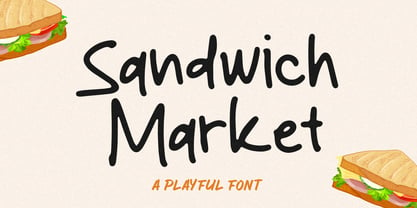 Sandwich Market is a Handwritten Script font that will make your designs look classic, Farmhouse, Boho, and Feminine. It is a great font for events, Wedding Project, signature, album covers, logos, branding, magazines, social media posts, advertisements, but it also works great for other projects. Add it to your fonts’ library, and it will enhance your creativity!
 - Fatigue by Typesthetic Studio,
$13.00 Heroic is a bold and playfull handwritten brush font. This font is very unique because sometimes it can look fierce like in modern street art graffiti if with capital letters, but sometimes it can look cute if it is included with the lowercase letters. As a result, this font can matches a wide pool of designs.
 - Uncial Romana ND by Neufville Digital,
$29.60 There are many Uncial types in the type catalogues around the world, but most of them have a rough and stiff appearance. The Roman Uncial ND by Ricardo Rousselot stands out for the realism of its strokes, which look as if they are handwritten, bringing freshness and authenticity to its applications. Uncial Romana is a Trademark of BauerTypes SL
 - Trivette by Greater Albion Typefounders,
$12.00 Trivette is an ‘All Capitals’ calligraphic display face, where all upright strokes are rendered as curves and where everything approaching the vertical are rendered in threes. That’s probably as clear as mud, but the results combine charm and legibility with a decorative period air. Recommended for poster work where a sense of dignified fun is important.
 - Cielo by Wilton Foundry,
$29.00 Cielo font family consists of Cielo Light, Cielo Light Italic, Cielo Regular, Cielo Italic, Cielo Bold, Cielo Bold Italic, and Cielo Stencil (Regular weight) Cielo is a versatile contemporary typeface family that will serve you well in many design situations like advertising, corporate communications, etc. Buying all seven weights make it an excellent value for money!
 - Yulia Khaira by Jehansyah,
$20.00 Yulia khaira This beautiful script font is perfect for all design needs, will keep it simple but look special, plus several alternatives that support your design, make sure you don't miss it, and it's your favorite font supported by PUA encoded, which is easy to access include : Yulia khaira latin numeric punctuation Alternate 400+ Thank you very much
 - Ebdus by AdultHumanMale,
$12.00 Ebdus is a thin, modern, lightweight font, occasionally a little gawky and tall, sometimes a little plump and rounded. The font is available in 5 weights from Thin to Heavy but they all lean towards all things anorexia. It looks as good in copy as it does in headlines, it’s perfect for an angry letter to an uppity android.
 - Laurel by Fenotype,
$25.00 Often in typography, a standout appeal is required – but preferably without compromising on clarity and legibility. Laurel font family by Fenotype is where the best of both worlds meet – an edgy display letter yet easily legible and appropriate for a wide range of use cases. Brand identities, packaging, posters or editorial – choose Laurel for a touch of unique flair.
 - FS Siena for Walbusch by Fontsmith,
$80.00Siena is a luxurious type. A modern contrasted sans serif. Over 25 years in the making, FS Siena is tailor made for high-end brands. Sumptuous, elegant and eclectic, a nonconformist typeface with classical roots. It’s been a long time coming, but with its heady mix of elegance and quirky charm, FS Siena is worth the wait. - On The Ground by Fascination Workshop,
$10.00 On the Ground is a picture font made from drawings of found objects. These object were found on the ground while walking around different cities in the United States. The font uses varying drawing styles (from detailed to pictographic) but they all have a similar irregularity, unifying the characters. Perfect for animations, signs, greeting cards, posters, etc.
 - Gamos by Letterara,
$12.00 Gamos comes from Greek which means marriage. Add some love in an instant. The font comes decorated with small embellishments, such as hearts. Making it the perfect font for Valentines Day designs, but also Christmas, Weddings, Anniversaries, Birthday cards, table numbers, header menus, display’s, logos, slider blogs, custom addresses, stamps, packaging, greeting cards, and much more!
 - Ramston by Katatrad,
$29.00 Ramston is a humanist sans serif typeface of 20 fonts in total — a normal and a condensed width in 5 weights with matching italics. The condensed version is designed for space-saving typography but with high legibility in mind. Ramston is an ideal font family for display, print, corporate identity, mobile devices, magazine cover, signage, and web design creation.
 - Polanix by Outerend,
$25.00 This unique geometric design will make your projects stand out from the crowd! If you're looking for a futuristic but with an edgy twist, "Polanix" could be the one. The interesting deformation of its variable version also works great with animation, game design and film/TV credits & titles as well as interface, app and web designs.
 - MTF Dear Santa Pro by Miss Tiina Fonts,
$9.00 If you’re writing Santa a letter, use this adorable, handwritten childlike font! Dear Santa PRO not only gives you inspiration on how to start the letter, but it also has neat and original characters. This typeface duo also comes with some cute Christmas doodles to complement your writing. Have fun, and create something spectacular this Christmas!
 - Picadyll by T4 Foundry,
$21.00 Picadyll is a sanserif that flirts with the 1920s Art Deco tradition but adds a modern touch. The sober letter design brings old movie posters and packaging to mind. Picadyll is a sophisticated and fun font from Swedish type designer Bo Berndal and the T4 font foundry. It is an OpenType creation, for both PC and Mac.
 - FF Milo Slab by FontFont,
$68.99 FF Milo Slab is not just the sans with slabs attached. It has undergone a wide range of careful adjustments from increased contrast, longer ascenders and descenders and modified glyphs in the heavier weights. All these changes amount a typeface that feels enough like Milo but also can stand on its own as a new and fresh typeface.
 - Hoogy by Wildan Type,
$12.00 Introducing new typeface! Hoogy- A modern sans serif with beautiful swash. It has unic construction for the future style. Hoogy Font look clean, luxury, unic, elegant but still has funny taste. Perfectly used for product presentation, elegant logo design, packaging or invitation cards or heading text. Features Two style/ Numbers & Punctuation / Extensive Language Support/ligature and alternate
 - Spaghetti And Cheese by Hanoded,
$15.00 Who doesn’t like Spaghetti & Cheese? Well, my son doesn’t like it, because he hates cheese, but he seems to be one of the few. Spaghetti & Cheese is also a handmade font: slightly slanted, slightly eroded, yet very legible and clear. It was made with a Japanese ‘Shake & Write’ marker pen. Comes with a generous topping of diacritics.
 - Quiroga Serif Pro by TipoType,
$29.00 Quiroga Serif began in 2007 with the name Quadratta Serif. This typography was designed for continuous text, legible at medium and small sizes, with great saving of space, optimized for 6, 8, 10 and 12 points. The morphology is a mix between tradition and innovation; it has a vertical axis, thick serifs, tall x-height, light modulation and a lot of internal space between letters: key to improve legibility at small sizes. Formally, my idea was to make a serif type that had a unique color, this is visible due to the light modulation. This is also complemented with the incorporation of not common, alternative signs. Some parts of the letters that are usually curb or diagonal where made horizontal (for example: a, q, p, etc.), this makes the eye of each character to be wide and unique. The serifs (wedge type) suffered diverse variations during the process. At the begining they where thicker and ended vertically, but this caused a great deal of printing errors. And so we decided to modify them by giving them an angle to avoid visible errors in medium and small sizes. The ch, and ll ligatures where rescued because they are a part of our current spanish alphabet. The historic ligatures and stylistic alternates give different options to users who want different alternatives within a text. The accentuation signs were composed in a middle line above all signs to avoid visual shock. We also gave plenty of importance to small caps numbers, mathematical signs and currency signs so that the could interact well.
 - Francisco by Homelessfonts,
$49.00 Homelessfonts is an initiative by the Arrels foundation to support, raise awareness and bring some dignity to the life of homeless people in Barcelona Spain. Each of the fonts was carefully digitized from the handwriting of different homeless people who agreed to participate in this initiative. Please Note: these fonts include only the latin alphabet; no accented characters, no numbers or punctuation. MyFonts is pleased to donate all revenue from the sales of Homelessfonts to the Arrels foundation in support of their mission to provide the homeless people in Barcelona with a path to independence with accommodations, food, social and health care. The world is a very big place, the world is for travelling. And that’s what Francisco did, travel. Though born in Spain, he was raised in Brazil, where he worked as a graphic designer. He spent years hitchhiking round South America, his eagerness to see and learn new things preventing him from settling in one place. He returned to Spain an old man, to find his roots. Francisco never dreamed he’d end up in the street: “The experience of the street has taken away my vanity,” or that he would grow as a person there. “The only thing I’ve learnt in life is that in life you have to learn, because if you spend your life without learning you haven’t lived.” In Barcelona, the street changed his life and taught him just how tough it can be. Tough, but full of good people. He says that’s the best thing about the street.
 - Acorde by Willerstorfer,
$95.00 Please note: Acorde webfonts are exclusively available at willerstorfer.com Acorde is a reliable workhorse for large, demanding design projects. It was designed to be perfectly suited to all different sizes, from small continuous text to large headlines and big signage. The typeface’s name is derived from ‘a’ ‘cor’porate ‘de’sign typeface, however Acorde is not only suitable for corporate design programmes but for information design and editorial design purposes as well. Acorde’s inception was in early 2005 as Stefan Willerstorfer’s final project in the Type and Media course at the Royal Academy of Art in The Hague (NL). It is a humanist sans serif with noticeable diagonal contrast and shows clear influences of the broad nib pen, especially in the Italics. Acorde’s characterful details give it a distinctive appearance in large sizes and contribute to its high legibility in small sizes. It comes in 14 styles – seven weights in Roman and Italic each. While the proportions of the Regular style were chosen to guarantee optimal legibility without being too space consuming, the heavier the weight gets the more suitable it is for headline purposes. The heavy weights are relatively narrower than the lighter ones, which gives them a strong appearance. The huge character set contains 925 glyphs per font and covers a vast range of latin-based languages. Various accented letters, small caps, eleven figure-sets, superscript and subscript are all included. OpenType features allow for a comfortable use of the large set. Acorde was honored with the 2010 Joseph Binder Bronze award for type design by DesignAustria.
 - Blured Stroke by Ditatype,
$29.00 Blured Stroke is a beautiful script font. Every letter in this font looks like it was created with a skillfully swung brush. The subtle and soft brush strokes are clearly visible at every angle and bend, giving the entire font an artistic and expressive feel. The ends of each letter tend to be rounded, giving it a soft and elegant touch. This font is designed with detail and a perfect balance between thick and thin strokes. The thicker lines bring out strength and firmness, while thinner lines add softness and elegance to this font. The perfect combination of these differences creates an eye-catching visual harmony and expresses a unique writing style. The colors used in this font can vary, but to maintain a soft impression, bright colors would be the right choice. The letters remain legible and understandable because they have clear outlines. Enjoy the various features available in this font. Features: Ligatures Multilingual Supports PUA Encoded Numerals and Punctuations Blured Stroke fits best for any design projects that want to convey tenderness, friendliness and creativity. This font can be used in the invitations, greeting cards, brand logos, promotional materials, and many other design projects that require a warm artistic touch and are full of personality. Find out more ways to use this font by taking a look at the font preview. Thanks for purchasing our fonts. Hopefully, you have a great time using our font. Feel free to contact us anytime for further information or when you have trouble with the font. Thanks a lot and happy designing.
 - Xmas by Linotype,
$29.99Christmas cookies have already slowly crept onto your local supermarket's shelves -- the Linotype Xmas Fonts just can't wait any longer! Ravishingly friendly and universally applicable: Fuenfwerken -- a design studio from Wiesbaden, Germany -- is proud to present its latest Fun Font Family. Bringing variety to the dry Christmas card genre, these fonts can also be used on posters to spread holiday cheer at home. No limits are placed on your creativity here! The family has three different fonts, each with more than 60 symbols inside: Xmas Story includes the whole figure palette necessary for a classical Christmas story. From a cute little Baby Jesus to the Three Wise Men and woolly Aramaic sheep and everything that one needs to add special flair to a letter to grandma, or to set up a Nativity Scene at home for the kids is included. Customers who aren't searching for a biblical font should check out Xmas Essentials. This font contains typical non-denominational end-of-the-year holiday ornaments, such as snowflakes, decorated Christmas trees, nutcrackers, and stars. Last but not least is the Xmas Modern font. Just as global warming poses severe risks to snowmen, this font will make recipients of your holiday and New Year's cards melt. Glyphs such as Santa Claus riding on a Vespa -- complete with iPod -- speed away from normal, stuffy holiday seriousness, and signal that the Fun Generation has arrived! The best choice, of course, is to treat yourself to all three fonts this Christmas. Then you'll be prepared for every situation. Happy Holidays! - Megre by JAB,
$16.00The courageous Russian author of the best seller Anastasia, Vladimir Megre, once said that this remarkable woman would inspire creative people around the world to produce their best work. Since I consider myself a creative person who has been deeply touched by her story, I sincerely hope that this will be true for me also. Anastasia talks a lot about God, the wonders of the natural world and how all things have been created so perfectly. This belief in universal perfection, however, is not confined to mystics alone. Many great mathematicians and scientists, including Albert Einstein, were of the same opinion. Having read Dan Brown’s The Da Vinci Code, I became quite fascinated with the so-called Fibonacci series; "a sequence of integers in which each integer (Fibonacci number) after the second is the sum of the two preceding integers; specif., the series 1, 1, 2, 3, 5, 8, 13, . . ." (Webster’s Dictionary). These mysterious numbers, which are said to give divine proportions, are found throughout nature in everything from a rose to a spiral galaxy. Many believe that this reinforces the argument that there is a divine intelligence back of creation. With that in mind, I thought it would be interesting to see if I could somehow create a font using these numbers in the design process. If I have succeeded - even partially - in attaining these mystical proportions, it will definitely have been worth all the hard work. And, I sincerely hope that many will enjoy using this font in producing their own best work. - Robard by Dear Alison,
$24.00 My brother is an architect, and I have always loved his lettering, you know, the style of writing that can be found on architectural drawings. There is a common thread to it, yet each architect or engineer brings their own personality to it. I have seen a similar style being used by some hand-letterers for invitations, place cards and signage. Inspired, I set out to create my own, and the result is my new typeface, Robard! I wanted something compact, somewhat modular, done quickly but with control, and sourced from hand-lettering. Starting out with a handful of pigment ink pens, I settled on a 0.1mm Copic Multi-Liner, and using a light table with a grid underneath the paper, I cranked out grouping after grouping, letter after letter, numbers, punctuation, accents, just trying to zero in on the feeling and the look I was after. There were some ideas that didn't work, like unicase (there would be no regular lowercase), or swash alternates. Ultimately, I ended up with a decent array of glyphs to choose from, and alternates like oldstyle numbers, and an alternate set of caps for the lowercase slots, and even alternative figures so doubles like 88 would be different. In the font, the OpenType ligature code automatically alternates the cap and lowercase (alternate cap) letters, and numbers as you type, lending Robard that hand-lettered look in a digital typeface that I was hoping for. There are also oldstyle figures, and unlimited fractions, ordinals, and a few alternate letters. I hope you like Robard!
 - Grafical by Halbfett,
$30.00 Grafical is a contemporary take on 19th-century sans serifs. In this family, the amount of geometry inherent within the letterforms has been amped up. Many shapes have received further streamlining, too. All the geometric forms you see have been optically corrected, ensuring their delivery of better legibility. Grafical ships in two different formats: depending on your preference, you can install the typeface as two Variable Fonts or use the family’s 16 static OpenType font files instead. The static fonts offer eight weights, running from Extralight through Black. Each weight has an upright and an italic font available. While the static-format fonts offer a good intermediary-step selection, users who install the Variable Fonts have vastly greater control over their text’s stroke width. The Grafical Variable and Grafical Variable Italic font’s weight axes allow users to differentiate between almost 1,000 possible font weights. That enables you to fine-tune your text’s exact appearance on-screen or in print. Grafical is the perfect tool for a range of design uses, including text on the web, text in print, and text in motion graphics. Its fonts are typographic workhorses – not just from their legibility perspective but also because of the amount of OpenType features they include. There are ligatures, for instance, as well as proportional and tabular lining and oldstyle figures, fractions, numbers placed inside circles, and even Roman numerals. Users can also substitute alternate versions of the “a”, “g”, “i”, “j”, “y”, “G”, and “Q” into their work.
 - Masheu by Twinletter,
$17.00 Masheu is a classic serif font that depicts elegance and perfection in every line and curve of the letters. With a distinct touch of classic modernism, this font is the perfect solution for creating designs that exude a timeless beauty. Each Masheu character is designed with captivating detail and subtlety. With well-proportioned proportions and elegant serif forms, this font strikes a harmonious balance between simplicity and elegance. The typography styles brought to you by Masheu will add a touch of luxury and professionalism to any of your design projects. Not only has an attractive appearance but Masheu is also equipped with creative features. With the available ligatures and alternates, you can create unique and interesting style variations to suit your project needs. Also, multilingual support ensures that this font can be used in multiple languages easily. Are you looking for a font that combines classic beauty and modern sophistication in one perfect unit? Masheu is the answer. With benefits that include a stunning classic serif style, creative features such as ligatures and alternates, and extensive multilingual support, this font will quickly grab the attention of your potential customers and deliver eye-catching designs in no time. What’s Included : File font All glyphs Iso Latin 1 Alternate, Ligature Simple installations We highly recommend using a program that supports OpenType features and Glyphs panels like many Adobe apps and Corel Draw so that you can see and access all Glyph variations. PUA Encoded Characters – Fully accessible without additional design software. Fonts include Multilingual support
 - Blacker Sans Pro by Zetafonts,
$39.00 Blacker Sans Pro is a complete redesign and development of the original family designed by Francesco Canovaro in 2019 as a sans-serif variant of the successful Blacker created by Cosimo Lorenzo Pancini and Andrea Tartarelli. The original idea of Blacker Sans was to create a versatile pairing for Blacker, parting with its spiky wedge serifs but keeping its dark, elegant character and extending its weight range to 20 weights including italics. This Blacker Sans Pro family did also differ in contrast from the original Blacker family, choosing a more even and monolinear, almost grotesque approach. This choice that favored versatility over elegance left some of the original uses of Blacker not covered by its sans counterpart, and so two subfamilies were added, applying to the same skeleton varying degrees of contrast, from the readability-optimized medium contrast of Blacker Sans Text to the extreme variations of Blacker Sans Display, with its elegant juxtapositions of thin curves and thick black slabs. The original signature details of Blacker, like the hook shape of lowercase "f", have been complemented by new alternate forms, ligatures and swashes, with stylistic sets providing options to easily make logos and headings stand out. The wide range of OpenType features (that includes also small caps, positional numbers, and alternate punctuation) is applied to all the 60 weights of the family, each with over 1600 characters offering language support for 220+ languages using Latin, Cyrillic and Greek alphabets. Ready to make your text look gorgeous? Ditch your usual sans-serifs and try Blacker Sans Pro!
 - Rainbow Night by Nathatype,
$29.00You may want your designs to look sharp, professional, and interesting without exaggerations, but how would you do it amid the abundance of font options available to choose? Rainbow Night is a perfect answer to your design needs. Rainbow Night is an elegant, prominent display serif font to attract everyone who sees it. A serif font is a font with hooks and tiny scratches attached to the letters’ edges. The huge serif size adjacent to each other in such a font makes the letters look heavier. Moreover, this font is deliberately created in thick lines and strong contrasts as the characters of a display font to produce strong visual displays. Generally, such a display serif font can show elegant, classy nuances to assign a strong identity to the brand, to stand the desired messages out, and to get the messages easily recognized by readers. You can apply this font for various text sizes due to its great legibility. In addition, you can make use of the available features here as well. Features: Stylistic Sets Ligatures Multilingual Supports PUA Encoded Numerals and Punctuations Rainbow Night fits best for various design projects, such as brandings, posters, banners, headings, magazine covers, quotes, printed products, merchandise, social media, etc. Find out more ways to use this font by taking a look at the font preview. Thanks for purchasing our fonts. Hopefully, you have a great time using our font. Feel free to contact us anytime for further information or when you have trouble with the font. Thanks a lot and happy designing. - Macklin by Monotype,
$50.99 Designed by Malou Verlomme of the Monotype Studio, Macklin is a superfamily, which brings together several attention-grabbing styles. Macklin is an elegant, high contrast typeface that demands its own attention and has been designed purposely to enable brands to appeal more emotionally to modern consumers. Macklin comprises four sub-families —Sans, Slab, Text and Display— as well as a variable. The full superfamily includes 54 fonts with 9 weights ranging from hairline to black. The concept for Macklin began with research on historical material from Britain and Europe in the beginning of the 19th century, specifically the work of Vincent Figgins. This was a period of intense social change--the beginning of the industrial revolution. A time when manufacturers and advertisers were suddenly replacing traditional handwriting or calligraphy models and demanding bold, attention-grabbing typography. Typographers experimented with innovative new styles, like fat faces and Italians, and developed many styles that brands and designers continue to use today, such as slabs, serifs, and sans serifs. Verlomme pays respect to Figgins’s work with Macklin, but pushes the family to a more contemporary place. Each sub family has been designed from the same skeleton, giving designers a broad palette for visual representation and the ability to create with contrast without worrying about awkward pairings. With Macklin, Verlomme shows us it’s possible to create a superfamily that allows for complete visual expression without compromising fluidity. Macklin™ font field guide including best practices, font pairings and alternatives. Featured in: Best Fonts for Websites
 - Prossima Moda by Mans Greback,
$59.00 Prossima Moda is a font that radiates modernity and fashion-forward style. Its sleek and contemporary design evokes a sense of sophistication and elegance, while its contrasting lines add a touch of visual interest and intrigue. The font exudes a cool and sweet vibe, creating a captivating and alluring atmosphere. With Prossima Moda, each letter is meticulously crafted to showcase its unique beauty, creating a harmonious blend of form and function. The font's smooth curves and clean lines give it a polished and refined look, reflecting the precision and attention to detail that are synonymous with the fashion industry. This font not only captures the spirit of the latest fashion trends, but it also embodies a sense of individuality and self-expression. It is a font that speaks to the modern individual who seeks to make a statement and stand out from the crowd. The font is built with advanced OpenType functionality and has a guaranteed top-notch quality, containing stylistic and contextual alternates, ligatures, and more features; all to give you full control and customizability. It has extensive lingual support, covering all Latin-based languages, from Northern Europe to South Africa, from America to South-East Asia. It contains all characters and symbols you'll ever need, including all punctuation and numbers. Mans Greback is the innovative designer behind the captivating Prossima Moda font. Hailing from Sweden, Mans has established himself as a prominent figure in the world of typeface design, renowned for his diverse and versatile portfolio.
 - Nova Horst by PintassilgoPrints,
$35.00 Nova Horst is an amplified version of Horst, a highly original font (MyFonts Rising Star) based on etchings by the extraordinary artist and printmaker Horst Janssen. Nova Horst keeps all the amazing wilderness of the original font, while enriched with sharp OpenType programming, plus a whole new set of alternates, a handy set of ornaments and loads of cool unpredictable overlapping glyphs. Language support was also expanded. Now there are 5 sets of letters, 2 sets of numerals and a robust set of discretionary ligatures. OpenType functionalities now include an extremely playful Contextual Alternates feature and also Discretionary Ligatures and Stylistic Alternates. Nova Horst is an energizing blend of eccentric characters, cool OpenType features, loads of alternates and a meticulous kerning table. But be warned: as the original font, this one is quite addictive! A quick roadmap: • All features turned off: you can choose the different letterforms stored on upper- and lowercase sets. There are no overlapping letters. • Contextual Alternates turned on: you get alternating characters from 4 sets of glyphs, with loads of overlapping letters, all managed by a carefully handcrafted kerning table. The result is a very cool random effect on glyphs distribution. • Discretionary Ligatures turned on: now some additional glyphs enter the scene. There are more than 60 ligatures glyphs which substitute pairs of letters for some extra-coolness • Stylistic Alternates turned on: access the counterless glyphs from the Stylistic Alternates set. Use each feature alone or mix them up for added boldness. Gorgeous extravaganza guaranteed!
 - Corpid by LucasFonts,
$49.00 The name Corpid derives from “Corporate Identity” — which is what this family of low-contrast sans-serifs was made for. Corpid was originally commissioned by Studio Dumbar in the Netherlands as a corporate typeface for the Dutch Ministry of Agriculture, Nature Management and Fishing. The font was designed to replace the existing standard typeface (a well-known business-like sans-serif) to provide the organization with a unique and strong identity. Although it was designed to fit strict technical requirements, Corpid has a personality all of its own. This was in part a result of what Luc(as) calls “creating tension” between the inner and outer curves of each character. “I tend to put a little more diagonal contrast into fonts than is the case in most neutral sans serif fonts. This brings a certain humanistic touch to the typeface. Much more subtle here than in Thesis – but although it is almost invisible, it is still palpable.” Corpid was gradually expanded into a five-weight, three-width family. The new Corpid SemiCondensed has double functionality. It is a no-frills, compact headline font that offers optimum legibility in sizes from small to huge. It is also a great space-saving text typeface for magazines, newsletters or annual reports: economic, versatile, and provided with several different numeral sets. In this OpenType type version, all weights come with Small Caps. With its wealth of numeral styles and complete character sets (including Central European) the Corpid family is now well equipped to tackle the most complex of typographic tasks.
 - Bi Bi by Naghi Naghachian,
$78.00 BiBi font family is designed by Naghi Naghashian. This font family is developed on the basis of specific research and analysis on Arabic characters and definition of their structure. This innovation is a contribution to modernisation of Arabic typography, gives the font design of Arabic letters real typographic arrangement and provides more typographic flexibility. This step was necessary after more than two hundred years of relative stagnation in Arabic font design. BiBi supports Arabic, Persian, and Urdu. It also includes proportional and tabular numerals for the supported languages. BiBi Font family is available in five weights: Light, Regular, Demi, Bold and Heavy; each of them in two diferent styles including normal and extended. BiBi designs fulfill the following needs: A Explicitly crafted for use in electronic media fulfils the demands of electronic communication. BiBi is not based on any pre-digital typefaces. It is not a revival. Rather, its forms were created with today’s technology in mind. B Suitability for multiple applications. Gives the widest potential acceptability. C Extreme legibility not only in small sizes, but also when the type is filtered or skewed, e.g., in Photoshop or Illustrator. BiBi's simplified forms may be artificial obliqued in InDesign or Illustrator, without any loss in quality for the effected text. D An attractive typographic image. BiBi was developed for multiple languages and writing conventions. E The highest degree of geometric clarity and the necessary amount of calligraphic references. This typeface offers a fine balance between calligraphic tradition and the contemporary sans serif aesthetic now common in Latin typography.
 - ITC Handel Gothic by ITC,
$40.99 The Handel Gothic? typeface has been a mainstay of graphic communication for over 40 years - all the while looking as current as tomorrow. Designed by Don Handel in the mid-1960s, and used in the 1973 United Airlines logo developed by Saul Bass, Handel Gothic was an instant success when released to the graphic design community. Its generous lowercase x-height, full-bodied counters and square proportions make the design highly readable at a wide range of sizes. Handel Gothic's slightly idiosyncratic character shapes gave the face a futuristic look 40 years ago that retains its power today. In addition, its Uncial-like lowercase is instantly identifiable - and unique among sans serif typestyles. Award-winning type designer Rod McDonald was attracted to the simple, decisive forms of the original, but he felt the design needed to be refined and updated. ?One of my goals was to bring a modern typographic discipline to what was really an old phototypesetting font.? To achieve his goal, McDonald re-proportioned every character and balanced the delicate relationship between the curves and the straight strokes. He also added a number of alternate characters to extend the range of the design. ?I wanted to give designers a large enough character set so they wouldn't feel constrained in what they could do. I want them to be able to play with the fonts, not just set words.? McDonald enlarged the family from the single-weight original to five weights, each with a full suite of alternate characters.In 2015 Nadine Chahine designed matching arabic weights to this family.
 - Klainy by Identity Letters,
$29.00 An unadorned Grotesque with a refreshingly personal touch. If “Grotesque” mainly means “industrial, mechanical, anonymous typeface” to you, Klainy might redefine your image of the genre. Yes, it’s a Grotesque—but with a contemporary look and a lot of personality. Klainy’s apertures are more closed at the top and more open at the bottom, creating an informal rhythm that sets Klainy apart: a confident, optimistic voice with a clean appearance. Terminals are subtly back-bent: these quaint “hooks” make Klainy a bit more personal, a bit friendlier. (You can find them in the a, c, f, and r.) Just like its old-style Grotesque ancestors, Klainy is optimized for display sizes and short texts. There, its unobtrusive quirks can be wholly appreciated. However, the familiar Grotesque appearance makes sure that the typeface is comfortable to read in smaller sizes, as well. Use Klainy whenever a basically classic sans-serif typeface with a modern and individual twist is called for. This font family comes in eight weights ranging from Thin to Black, each with a matching italic style. More than 500 glyphs and a bunch of Open Type Features make it a reliable companion for all of your projects. You can fine-tune the flavor of Klainy with Stylistic Alternates such as a one-story a and a two-story g. Their simple construction blends perfectly with the design concept of this typeface. Klainy is a seasoned blue-collar worker that surprises you with wit and team spirit. It’ll be a great addition to your font library.
 - Okojo Pro by Wordshape,
$20.00 The Okojo Pro Complete family is a reworking of Wordshape’s immensely popular Okojo family of typefaces. It includes Okojo Pro, a semi-geometric sans serif, Okojo Slab Pro, a semi-geometric slab serif, Okojo Pro Display, a round-cornered sans serif variation, and Okojo Slab Pro Display, a round-cornered slab serif. The entire Okojo Pro family looks great at small or large sizes. The Okojo Pro family is designed for readability in long texts while simultaneously functioning as effective display type. Features of Okojo Pro Display: - all lowercase characters have an enlarged x-height, creating less optical dazzle than typefaces like Futura, Neutra or Avant Garde - more humanist numerals and punctuation for enhanced readability - complete Western, Central and Eastern European characters sets - radically improved spacing guaranteeing beautiful results in print and on screen for the Czech, English, Hungarian, Croatian, Esperanto, Maltese, Romanian, Turkish, Albanian, French, Portuguese, Spanish, Basque, Bulgarian, Finnish, Swedish, Norwegian languages The Okojo Pro Display family is influenced by the type designs of Paul Renner and Herb Lubalin, but smoothed over with more than a bit of Americana. Both work well on-screen as webfonts and in print as book type. Each is hinted with accuracy and kerned with precision.The lighter weights are slightly slimmer than the regular and bold weights to give the typeface more of a vertical feel, inviting readers' to rapidly read typeset text with a maximum of contrast and a minimum of optical distortion. Okojo: it’s a little bit country and a little bit rock’n’roll.
 - Hernández Niu by Latinotype,
$29.00 In the typedesign industry the terms ‘nova’, ‘neue’, ‘next’, ‘new’ are often used to refer to a typeface that has been modified in different ways: redesign, technical readjustments, greater number of characters, etc. At Latinotype we are now starting to use the word ‘niu’ to refer to these kinds of typefaces. Niu is an adaptation of the original word ‘new’, i.e., we have adapted this English word to the phonology and spelling of our own language but keeping the original meaning. Race mixing, diversity, change and adaptation are part of the essence of Latin American culture and, at Latinotype, we are all constantly expressing these elements in everything we do. Latin Power! Hernández Niu was designed by César Araya and Daniel Hernández. The font is based on the design of Hernández Bold: the thickest weight has been adapted to fit small text better. Five new styles have been added, ranging from neutral to more expressive fonts. Hernández Niu is a display slab serif font of thickened serifs, functional expressive ink-traps and true italics. Detailed forms and counterforms allow this typeface to be used in very large sizes. Hernández Niu is well-suited for publishing, small text and headlines. A wide variety of weights make the font a perfect choice for hierarchical type-setting, branding, logotypes, magazines, etc. This font consists of 6 weights, ranging from Extra Light to Heavy, each with matching true italics. Hernández Niu comes with a set of 397 characters, making it possible to use the font in 212 different languages.