10,000 search results
(0.064 seconds)
- Mixtra Sansserif by T4 Foundry,
$21.00Mixtra is a versatile and complete type family designed by Bo Berndal. The three Mixtra family branches are Roman, Sansserif and Slabserif, each with a full set of weights. The Roman also has a Small Caps font. Combining the three family members is a good starting point for creating a coherent typographical design. Mixtra works well in magazines and all sorts of print in need of a strong visual identity. "Mixtra is a multiface", says Bo Berndal. "With or without serifs, or with powerful slabserifs, you can pick the version that best suits the design and printing technique you have chosen." - Origen by Alex Camacho Studio,
$35.00 Origen is a typeface inspired by the illuminated manuscripts whereby the text is accompanied by a decorative capital letter at the start of the text. The family is formed by three different weights (light, regular, bold) and an additional decorative set of capital letters. Each of the four styles has characters to write in all Latin-based languages. It is an Open Type font. The Origen family is a hybrid between Textura and Rotunda fonts, characterized by a dynamic calligraphic flow. Origen is also playful as it can be use in editorial, advertising and packaging designs to capture viewers' attention through refined details.
 - Arboretum by Joe Hewitt Design,
$12.00 Inspired by a number of Green and forward thinking ventures, Arboretum is designed to be an Eco-friendly typeface. Perfect for use with recycled products, environmental advertising and anything nature themed. However, its clean and modern appearance works beautifully for a large range of projects. The typeface contains lower and uppercases, the latter having two complete sets of alternatives, each with differing levels of flourish! You will also find a selection of leafy glyphs to help personalise and decorate your Arboretum lettering. The glyph set includes all languages covered in Basic Latin, Latin-1 Supplement and Latin Extended-A scripts.
 - Opinion Pro by Mint Type,
$35.00 Opinion Pro is a geometric grotesque sans-serif typeface with extra-large x-height that comes in 64 styles. It is composed of 4 width variations, each in 8 weights with respective italics. Its rigid curves with pronounced vertical stems makes it useful as both display and paragraph typefaces. Also it works particularly well as a typeface for technical applications such as wayfinding or labeling of any kind. Opinion Pro features a wide range of supported languages, including all Latin-based European languages, main Cyrillic languages, plus Kazakh. The OpenType features include, among others, 4 sets of digits, small-caps, ordinals.
 - Bhortead by Vultype Co,
$29.00 Bhortead that has a vintage theme that you can use for your project. This font has 2 styles, Clean and Rough, and so you can use that style according to the type of project. This font has many OpenType features so you can combine each font to be more dynamic. Special features include: stylistic alternates, ligatures and swashes. Bhortead includes western European characters (multilingual support). All characters have an imperfect shape that gives a natural look in design. It cooperates well for creating the traditional style logos, labels, package design, lettering for t-shirts and much others.
 - Pikelet by Aah Yes,
$14.00Pikelet is a misprinted grunge font ideally suited to headlines, poster and display. As well as irregularities of printing in the actual letters, the ordinary versions contain "print errors" around some of the letters, whereas the Clean versions are identical but without those extra bits of overprint. The All Caps version has 2 sets of capitals which are different to the capitals in the Regular version (and to each other). And the jumbled versions have varying amounts of mis-alignment, but not variations in size. There's also an extensive selection of accented characters for both Western & Eastern European languages, and punctuation and fractions. - Democrasweet by Allouse Studio,
$16.00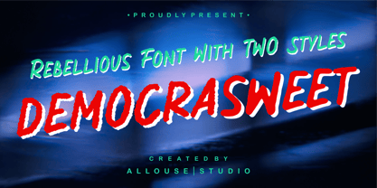 Proudly Present, Democrasweet a Rebellious Handwritten font With Two Styles, Rough and Smooth. Democraswwet come with 6 ampersand styles each, underline styles and Multilingual-Support to fulfill your need. We highly recommend using a program that supports OpenType features and Glyphs panels like many of Adobe apps and Corel Draw, so you can see and access all Glyph variations. Democrasweet is perfect for any tittle, logo, product packaging, branding project, megazine, social media, wedding, or just used to express words above the background. Enjoy the font, feel free to comment or feedback, send me PM or email. Thank You!
 - Bassanova by Julia Bausenhardt,
$35.00 Bassanova is a dynamic display font inspired by lettering on the "Love in the Afternoon" movie poster by Saul Bass. The font captures the minimalistic, yet very distinct look that is so typical for his designs. Bassanova offers four versions for each letter that change automatically and give the font a handlettered feel. It also contains over 100 discretionary ligatures to add even more dynamic letter combinations to the mix. This cool all-caps typeface fits a wide range of design applications, and it features a full international character set. Please activate Open Type Features to get the most out of this font.
 - Rastely by Craft Supply Co,
$20.00 Unleash Your Joy with Rastely Dive into the fun with Rastely – Funky Typeface. It’s a joyful escape, perfect for creative minds. Inspired by psychedelic vibes, this font keeps it chill. Its playful curves promise a good time. Every letter brings a smile, designed for fun at first sight. Playful to the Core Rastely isn’t just a font; it’s a party invitation. Crafted with a relaxed approach, it’s easy-going yet bold. Let each character tell a story of cheer. Imagine your projects with a touch of whimsy. Moreover, its easy legibility makes it perfect for all ages.
 - Spitting Image by preussTYPE,
$25.00 SpittingImage is a font which speaks of mechanical exactness, cool and reserved. The SpittingImage font family is formed by two different weights (regular and bold), each one with uppercase and lowercase letters, numbers, punctuation marks and diacritic characters in regular and italic. The outline version included as a part of OpenType-Feature. There are in all styles numerous ligatures, alternate characters, small caps, and different sets of numbers that you can put both headlines and short texts without any problems. OpenType features: contains over 1.000 Glyhps Central European Glyhps Standard Ligatures Small Capitals Stylistic Alternates Discretionary Ligatures OldStyle Figures Ordinals Slashed Zero Feature
 - Delmon Delicate by Atharuah Studios,
$19.00 Delmon Delicate is a classy font duo, with elegant sans and script fonts. The two fonts are made with a balance that produces a beautiful blend to support all your design needs. For example, social media content, branding, merchandising, advertising, packaging, etc. Delmon Delicate includes 2 fonts: Delmon Delicate (Sans Serif) and Delmon Delicate Script, each of which has uppercase, lowercase letters, numbers, punctuation, and multilingual support. That's it! I hope you enjoy it. Feel free to comment if there are issues or queries. You can also say hello to me on Instagram: https://www.instagram.com/atharuah_ Thank You!
 - Mramor Pro by Storm Type Foundry,
$52.00 The Mramor family first appeared in the Stormtype catalogue in 1994. The first sketch arose in 1988 through the narrowing of Roman capitals. It has uniform width proportions and, above all, original lower-case letters, unprecedented with Roman Capitals. The text designs are discontinued since they were replaced by the related Amor Serif family (along with its -sans version). Now, Mramor has “only” 10 designs that each include true small caps, Cyrillics and a rich variety of figures, ligatures and alternates. Mramor excels in corporate identity or bottle-label design, also whenever there is a need for a “classic” looking face.
 - Atomette by Device,
$39.00 Atomette is a bouncy sans that is friendly without being flippant, warm yet still stylish. The upper case and lower case options provide letters with less or more animation. Five weights plus an inline provide a neat mini-family to cover all your requirements. Suitable for snack packaging, comic books, toys, celebratory banners, book covers and games. Contains two or three options for each letter, including automatically-substituting letter-pairs to prevent repetition, plus an alternate set of numbers in circles. These can be chosen from the Glyphs palette or toggled on and off in the Opentype panel.
 - Brockies by Ronny Studio,
$19.00 Brockies is a sporty, strong, and elegant typeface, with a college style. Inspired by design styles that are currently popular, this is the answer to every need for ideas that you will pour in this modern era, with a thick and sturdy style in each letter as if this font has a soul in it. It excels on posters, social media, headlines, headlines, large format print - and anywhere else you want attention. Features : - Lowercase & Uppercase ( All Caps ) - numbers and punctuation - multilingual - Ligature - alternates - PUA encoded Please contact us if you have any questions. Enjoy Crafting and thanks for supporting us! :) Thank you
 - Staple by Ajeet Mestry,
$50.00 Staple is a Display Font. Each letter and number is made up of a clever arrangement of staples. Together, they retain the simplicity and beauty of a perfectly folded stapler pin. This creates a font that provides very good readability, solid shape and simple elegance that makes it perfect for use as a display font. To add elegance to the font, the letters and numerals are designed to retain the pin identity across all characters. Care has been taken so that the pins do not overlap. Nor are the pins bent or twisted into unnatural shapes to create the characters.
 - Mixtra Roman by T4 Foundry,
$21.00Mixtra is a versatile and complete type family designed by Bo Berndal. The three Mixtra family branches are Roman, Sansserif and Slabserif, each with a full set of weights. The Roman also has a Small Caps font. Combining the three family members is a good starting point for creating a coherent typographical design. Mixtra works well in magazines and all sorts of print in need of a strong visual identity. "Mixtra is a multiface", says Bo Berndal. "With or without serifs, or with powerful slabserifs, you can pick the version that best suits the design and printing technique you have chosen." - Another Story by Gassstype,
$23.00 Introducing Another Story is All Caps Display Font Authentic that is written casually and quickly. Then scanned and carefully drawn into vector format. This handmade font will make your design has a beautiful natural touch for each details. It is perfect for any design project as Invitation,logo, book cover, craft or any design purposes. That is why Another Story has charming, authentic and relaxed characteristic more natural look to your text with a more natural look to your text. You can activate Ligature OpenType panel design more interesting. Another Story is perfect for homeware designs,branding projects, Logo design, Quotes product packaging.
 - Montu by Supfonts,
$12.00 Montu is an elegant, modern sans serif font family. It includes upright and Italic style, each of them has five weights from thin to bold. This is a multi-functional font that is perfect for any project Montu Font Features: - Full Set of standard alphabet and punctuation - PUA Encoded - no special software needed to access extra characters - Language support: All European languages - Multilingual Characters AÁĂÂÄÀĀĄÅÃÆBCĆČÇĊDÐĎĐEÉĚÊËĖÈĒĘẼFGĞĢĠḠHĦIIJÍÎÏİÌĪĮĨJKĶLĹĽĻŁMNŃŇŅÑ OÓÔÖÒŐŌØÕŒPÞQRŔŘŖSŚŠŞȘẞTŤŢȚUÚÛÜÙŰŪŲŮŨVWẂŴẄẀXYÝŶŸỲỸZŹŽŻ aáăâäàāąåãæbcćčçċdðďđeéěêëėèēęẽfgğģġḡhħiıíîïìijīįĩjȷkķlĺľļłmnńňņñoóôöòőōøõœpþ qrŕřŗsśšşșßtťţțuúûüùűūųůũvwẃŵẅẁxyýŷÿỳỹzźžż Thanks so much for checking out my shop, and please get in touch if you have any questions! Don't forget to subscribe so you don't miss out on the new awesome fonts Dima
 - Hop Serif Hand Lettering by Joanne Marie,
$10.00 Here’s another font family for your hand lettering projects. Hop Serif Hand Lettering is a font family consisting of 3 styles: 1.) Hop Serif Hand Lettering Regular 2.) Hop Serif Hand Lettering Lines 3.) Hop Serif Hand Lettering Shadow This font family is all authentically hand drawn from pencil and paper to the digital screen and is perfect to include on designs for apparel such as mugs, t-shirts, bags, notebooks, inspirational quotes for the home and office, and more. Each font is multi-lingual too! I love using this font in my hand lettering designs and I hope you will too!
 - Concrete Asphalt by Gassstype,
$23.00 Hello Everyone, introduce our new product Concrete Asphalt is Destroy Display Typeface with a natural feel. This handmade font will make your design has a beautiful natural touch for each details. It is perfect for any design project as Invitation,logo, book cover, craft or any design purposes. Concrete Asphalt is Inspired by Food Logo style and combination with Unique Craft style. that will fulfill your design needs for quotes,sporty theme, logotype, wordmark, etc. This has many opentype features and support multi language. This font is PUA encoded which means you can access all of the magical glyphs with ease!
 - Along Sans Rounded by Brenners Template,
$19.00 Hi Designers. Everyone will try these soft and sweet typography at least once. All the angles and sharpness are transformed with soft and smooth. Each of these 18 styles has a unique personality and can be combined to showcase the designer's emotion more smoothly. Here is the advantage of being able to stay new without being bored. Of course, it can also be used in typography design for kids. And these soft styles include the following Ligatures. - La, Le, Lo, da, de, do, fi, fl, me, mo, mu, ne, no, nu, ta, te, th, to, tt
 - Ramai by Gassstype,
$23.00 Hello Everyone, introduce our new product Ramai is Display Typeface with a natural feel. This handmade font will make your design has a beautiful natural touch for each details. It is perfect for any design project as Invitation,logo, book cover, craft or any design purposes. Ramai is Inspired by Food Logo style and combination with Unique Craft style. that will fulfill your design needs for quotes,sporty theme, logotype, wordmark, etc. This has many opentype features and support multi language. This font is PUA encoded which means you can access all of the magical glyphs with ease!
 - Good Butter by Twinletter,
$12.00 This font is created with original hand-drawn strokes for a relaxed, beautiful, and elegant feel, which is dazzling for a variety of food-themed design projects as well as other designs. also, beautiful abstract typography harmony in this font impression for a wide variety of design projects, including natural handwriting in digital form for designs, quote designs, for social media business designs, advertisements, trademarks, promotional banners, posts, posters, signatures, and all designs need handwriting or whatever design you want. This font is equipped with uppercase, lowercase, numbers, punctuation marks, swhases, and several variations on each character including multi-language.
 - Androgino by Cititype,
$17.00 Androgino is a unique handwritten font with deconstruction concept, where each letters connected to others with different spaces and sizes and sometimes overlaps. This font has an abstract 'dual interpretation'. On the one hand, the unique design of the letters does not have a stylistic tendency. On the other hand, the letters are combined in a unique form when they become sentences. Coupled with several ligatures that add diversity and give a certain surprise and impression when typed. Unique and stand out is the right definition for Androgino. It’s another word of Androgynous, Feminism which is masculine, suitable for all types of branding.
 - Sceptical by Gassstype,
$23.00 Hello Everyone, introduce our new product SCEPTICAL is Strong Display Font with a natural feel. This handmade font will make your design has a beautiful natural touch for each details. It is perfect for any design project as Invitation,logo, book cover, craft or any design purposes. SCEPTICAL is Inspired by Logo style and combination with Unique Craft style. that will fulfill your design needs for quotes,sporty theme, logotype, wordmark, etc. This has many opentype features and support multi language. This font is PUA encoded which means you can access all of the magical glyphs with ease!
 - Zirkel by Ondrej Kahanek,
$35.00 Zirkel is a geometric sans serif typeface which includes 16 fonts – eight weights and eight matching italics. Each character is geometrical, but optically corrected for better readability. Featuring austere lines, the font gains its strength in the final layout, which is created by the user. Zirkel Sans is suitable for headlines of all sizes, but it can be used in variety of long text as well. This font supports Western, Central and Eastern European languages, ligatures, alternate characters such as A, V, w, etc., and will find its place in the beginning, centre or end of any word. Geometry rulezz...
 - Red Ribbon by Gassstype,
$22.00 Hello Everyone, introduce our new product Red Ribbon is Modern Display Typeface with a natural feel. This handmade font will make your design has a beautiful natural touch for each details. It is perfect for any design project as Invitation,logo, book cover, craft or any design purposes. Red Ribbon is Inspired by Food Logo style and combination with Unique Craft style. that will fulfill your design needs for quotes,sporty theme, logotype, wordmark, etc. This has many opentype features and support multi language. This font is PUA encoded which means you can access all of the magical glyphs with ease!
 - Petulante by PintassilgoPrints,
$20.00 Petulante is a striking and creative hand-drawn face with a scribbled feel. It's an all-caps font and brings two options for each letter and numeral for a more organic and natural look. There are yet a few ornaments to add an extra something here and there. Petulante is ideal for book covers, packaging, apparel, album art, posters, or any situation where you want a stylish and uncommon hand-crafted look. And let's not forget to mention the broad language coverage: Petulante speaks more than 208 languages, including Russian and Greek. Yes, just take it everywhere!
 - Rotis II Sans by Monotype,
$50.99 Developed over several years by the late Otl Aicher and first released in the late 1980s, the Rotis® typeface has become a timeless classic. ROTIS II SANS HISTORY Aicher was a renowned German designer and corporate image consultant. He created the four basic designs of Rotis – sans serif, semi sans, semi seif and serif – within an extended typeface family concept, wherein all designs share a common cap height, lowercase x-height, basic stem weight and general proportions. While each version is part of the large, integrated family, each was also designed to function on its own as a distinctive typestyle. The result is that all members of the Rotis family combine smoothly with each other. Aicher, however, did not design the Rotis family with the weights and proportions normal for more contemporary releases. Rotis Sans Serif, for example, was drawn with just six weights and only two italics. Starting in 2010, Robin Nicholas, senior designer for Monotype Imaging in the UK, and freelance designer Alice Savoie collaborated to bring Rotis Sans Serif up to current standards. The result is Rotis II Sans, a completely new addition to the Rotis family. “We devised our approach together,” recalls Savoie, “deciding which weights to start with, what kind of alterations to make to the original Rotis, etc. I went to work on the typefaces, regularly submitting proofs to Robin. We would then decide in tandem on the next steps to take.” Nicholas elaborates, “We revisited the range of weights and added matching italics so that the new additions to the family offer increased versatility. We optimized the outlines, corrected the weight of several letters and re-examined overall spacing and kerning. In addition to a new set of numerals, with a height similar to the capitals, we also drew case-sensitive punctuation.” ROTIS II SANS USAGE The new Rotis II Sans suite comprises 14 typefaces: seven weights, ranging from extra light to black, each with a companion italic. The designs are available as OpenType® Pro fonts, allowing for automatic insertion of ligatures and fractions. Pro fonts also offer an extended character set supporting most Central European and many Eastern European languages. Aicher’s original Rotis designs were widely used for branding and advertising. With the addition of Rotis II Sans, the family is again poised to become a powerful communicator.
 - Fichte Fraktur by RMU,
$25.00 Walter Tiemann’s Fichte-Fraktur, released by Klingspor in 1934, has come to life again. This font contains the traditional long s which can be accessed by either the OT feature historical alternatives or by typing [alt] + b. Two framing elements can be reached by typing [alt] + shift + p and [alt] + p respectively.
 - RMU Trifels by RMU,
$35.00 RMU Trifels is a revival of Heinrich Wieynck’s great design which was released by Bauer in 1905. This beautiful Art Nouveau font comes with a long s and a historical form of the letter H. Border and adorning elements were added which you can reach by typing [alt] + P and [alt] + p.
 - Aldo Manuzio by RMU,
$30.00 This 1897 Schelter & Giesecke in-house design was carefully redrawn, extended and redesigned for modern usage. It is a remarkable font for book covers, film and video titles, ads and much more. This font contains a 'long s' and its ligatures which can be reached by the OTF historical feature and ligatures.
 - Michiana Pro by BluHead Studio,
$39.00 Michiana Pro is my new, hand-crafted connecting script! I've been hand lettering cards and envelopes to my wife and family in this type style for years and decided it was time to make a font based on it. I typically start with a single thin stroke for each letter, then build up the weight of the heavy stroke, so there ends up being a lot of charming variations in terms of style and color. The overall finish is rough, yet friendly. Perfect for invitations, place cards, love notes, and with its large x-height, it sets nicely for text. I grew up running around the dunes and beaches along Lake Michigan in northwest Indiana, and I think the shoreline and dune grass has inspired my aesthetic. Michiana Pro takes the name from a small area along the lake between the Indiana and Michigan state lines. There are a lot of nice, modest homes nestled in the duneland forests. Thinking about what it's like back there, it's like having a bowl of steaming hot comfort food. So I hope Michiana Pro feels that way to you too. Michiana Pro features include: + extended character set for Western European language support + 1,205 glyphs + lowercase beginning and ending swashes + contextual initial and final letterforms + alternates for L, R, Z, f, g, p, t and y + 140+ ligatures + superior and inferior figures for unlimited fractions + ordinals (st, nd, rd, th) + 4 ornamental swashes + available in both OTF and TTF formats
 - Sada by Arabetics,
$45.00 Sada is a text font designed with hand held devices and ebooks in mind. Glyphs are designed to be larger than usual and very clear with soft visual characteristics and many traditional Arabic calligraphic transitional features incorporated to improve legibility. The word “sada” means “echo” in Arabic. Even though Sada is a cursive style font it offers clearly distinguished and visually unified letter shapes in every position of a word. Sada supports all Arabetic scripts covered by Unicode 6.1, and the latest Arabic Supplement and Extended-A Unicode blocks, including support for Quranic texts. It comes with three weights, regular, bold, and ultra-light. Each weight has normal and left-slanted “italic” styles. The script design of this font family follows the Arabetics Mutamathil Taqlidi style and utilizes varying x-heights. The Mutamathil Taqlidi type style uses one glyph per every basic Arabic Unicode character or letter, as defined by the Unicode Standards, and one additional final form glyph, for each freely-connecting letter in an Arabic text. Sada includes the required Lam-Alif ligatures in addition to all vowel diacritic ligatures. Sada’s soft-vowel diacritic marks (harakat) are only selectively positioned with most of them appearing on similar lower or upper positions to emphasize they are not part of letters. Kashida is zero width glyph.
 - Pulse JP Arabic by jpFonts,
$29.95 النبض - the Pulse Pulse JP ME is a constructivist text and display font that differs from comparable fonts due to its special sharpness and harmonious balance. Its technical and constructed form creates a somewhat artificial impression of particular appeal. It is ideal for display on the screen and can be used in many projects. Pulse JP ME is a super family consisting of 48 fonts from compressed to expanded in six weights each. This opens up a wide designspace with the possibility of combining typefaces of the same character in a wide variety of variants and being able to adapt them to very different conditions. The details of the individual fonts are coordinated with each other with great precision and perfectly implemented in terms of craftsmanship. In all variants, this leads to a very balanced design with particular sharpness. The very extensive character set supports 120 Latin + 7 Arabic languages + Hebrew. The Arabic characters were designed in close collaboration with the Iranian designer Prof. Raafat Negarandeh. Here the constructivist approach is repeated within Arabic proportions. This leads to a very reduced and clear design with high legibility. Additional typographical adjustments can be made in the variable font, which is also available. There all variants are stored in a single font and can be continuously fine-tuned between them.
 - Fodecumbers Display by Zamjump,
$9.00 Fodecumbers is a strong FontFamily and Sans sophisticated look. Inspired by dynamic squares can be felt through controlled letterforms and a modern twist. Balance of hard lines and smooth curves. Each font in the family can be standalone, dynamic, and authoritative on its own, or mix it with italics for the tagline in a logo. it's really worth it. Fodecumbers includes all thirteen uppercase fonts: Four weights, two outlines, seven italics. FEATURES Four weights / Italics / Lines / Numbers & Punctuation / Extensive Language Support USE Fodecumbers works well in every branding, logo, magazine, film. The different weights give you the full Fodecumbers is a strong FontFamily and Sans sophisticated look. Inspired by dynamic squares can be felt through controlled letterforms and a modern twist. Balance of hard lines and smooth curves. Each font in the family can be standalone, dynamic, and authoritative on its own, or mix it with italics for the tagline in a logo. it's really worth it Fodecumbers includes all thirteen uppercase fonts: Four weights, two outlines, seven italics. FEATURES Four weights / Italics / Lines / Numbers & Punctuation / Extensive Language Support USE Fodecumbers works well in every branding, logo, magazine, film. The different weights give you the full range to explore a whole host of applications, while the fonts outlined give a real modern feel to any project. Any specific license questions or questions, feel free to contact zamjump@gmail.com zamjump
 - Alimentary by Missy Meyer,
$12.00 Alimentary (adjective): relating to nourishment or sustenance. If you've seen my other fonts, you know I tend to lean into food-based names. This name has to do with food and science combined, so it's double nerdy in the ways I like to be nerdy! I started with Alimentary Medium, which was inspired by my shorter, wider font MacGuffin - I wanted something taller, narrower, with a hip and retro feel. When I finished the Medium weight, I felt like I wanted a Light weight. Then a Heavy weight. Then I figured, "what the heck," and made an outline version of the Medium weight too. In the end, I wound up with four members of the Alimentary family, each with over 700 glyphs! Not only do they all have the basics (A-Z, a-z, 0-9, and tons of punctuation), but they also each have 330 characters for European language support, and a limited selection of Greek, Coptic, and Cyrillic characters. Plus a double handful of alternates and ligatures to add a little variety to your designs! And of course, all of the Alimentary fonts are super-smoothed, with reduced nodes and clean curves, so whether you're cutting them out, printing them, engraving them, or using them in a way I haven't even thought of, these fonts will be sharp and crisp!
 - Fino by TypeTogether,
$35.00 Tall, stately, and refined, with a showy contrast between thick and thin, a certain kind of titling Didone has become synonymous with fashion. Ermin Međedović’s latest type system amplifies the most theatrical aspects of this genre while bringing an uncommon flexibility of style and variation to any type palette — particularly those required for editorial design. Fino is a Rational (or Modern) display serif with sharp details. Its fairly Title proportions produce a regular beat of bold stems at frequent intervals. One can add an unexpected twist to this plot line by introducing the alternate ‘C, D, G, O, and Q’ (found in the uppercase); these replace the standard, Title oval shapes with big, full, show-stopping round ones. Other alternate forms, along with a grand ensemble cast of ligatures, lets the director continually flip the script. This stage is set in three acts: Fino, Fino, and Fino Stencil. Each of these offer six weights and italics, and each actor is comfortable speaking any Latin-based language, from standard Hollywood English to the many accents of Eastern Europe. Finally, every style comes in two optical sizes, with Title having the finest hairlines for the biggest parts. This lets you put Fino to work in a variety of productions, from short texts (24pt–48pt settings) to epic titles. The complete Fino family, along with our entire catalogue, has been optimised for today’s varied screen uses. All these talents let Fino perform a range of roles far broader than your typical Bodoni or Didot.
 - Fino Sans by TypeTogether,
$35.00 Tall, stately, and refined, with a showy contrast between thick and thin, a certain kind of titling Didone has become synonymous with fashion. Ermin Međedović’s latest type system amplifies the most theatrical aspects of this genre while bringing an uncommon flexibility of style and variation to any type palette — particularly those required for editorial design. Fino Sans is a Rational (or Modern) display serif with sharp details. Its fairly Title proportions produce a regular beat of bold stems at frequent intervals. One can add an unexpected twist to this plot line by introducing the alternate ‘C, D, G, O, and Q’ (found in the uppercase); these replace the standard, Title oval shapes with big, full, show-stopping round ones. Other alternate forms, along with a grand ensemble cast of ligatures, lets the director continually flip the script. This stage is set in three acts: Fino Sans, Fino Sans, and Fino Sans Stencil. Each of these offer six weights and italics, and each actor is comfortable speaking any Latin-based language, from standard Hollywood English to the many accents of Eastern Europe. Finally, every style comes in two optical sizes, with Title having the finest hairlines for the biggest parts. This lets you put Fino Sans to work in a variety of productions, from short texts (24pt–48pt settings) to epic titles. The complete Fino Sans family, along with our entire catalogue, has been optimised for today’s varied screen uses. All these talents let Fino Sans perform a range of roles far broader than your typical Bodoni or Didot.
 - Fino Stencil by TypeTogether,
$35.00 Tall, stately, and refined, with a showy contrast between thick and thin, a certain kind of titling Didone has become synonymous with fashion. Ermin Međedović’s latest type system amplifies the most theatrical aspects of this genre while bringing an uncommon flexibility of style and variation to any type palette — particularly those required for editorial design. Fino Stencil is a Rational (or Modern) display serif with sharp details. Its fairly Title proportions produce a regular beat of bold stems at frequent intervals. One can add an unexpected twist to this plot line by introducing the alternate ‘C, D, G, O, and Q’ (found in the uppercase); these replace the standard, Title oval shapes with big, full, show-stopping round ones. Other alternate forms, along with a grand ensemble cast of ligatures, lets the director continually flip the script. This stage is set in three acts: Fino Stencil, Fino Stencil, and Fino Stencil Stencil. Each of these offer six weights and italics, and each actor is comfortable speaking any Latin-based language, from standard Hollywood English to the many accents of Eastern Europe. Finally, every style comes in two optical sizes, with Title having the finest hairlines for the biggest parts. This lets you put Fino Stencil to work in a variety of productions, from short texts (24pt–48pt settings) to epic titles. The complete Fino Stencil family, along with our entire catalogue, has been optimized for today’s varied screen uses. All these talents let Fino Stencil perform a range of roles far broader than your typical Bodoni or Didot.