10,000 search results
(0.009 seconds)
- Laurels Qeylla by Asd Studio,
$15.00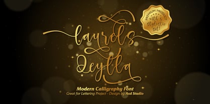 Laurels Qeylla is a script font created with love, sincerity, and patience. can be used to make invitation writing, lettering, and all graphic design needs. This font is equipped with 5 stylistic sets and several alternative letters that will make your design look more attractive and beautiful. Thank you if you are interested in purchase and using my font.
 - Gancio by Funk King,
$39.00 Gancio is my first fully realized hand-drawn font and has a robust character set. Its simple lines and sophisticated curves are contemporary, but recall vintage and retro cool. The font is very adaptable and flexible and can be used effectively in a number of themes. Also included are the dingbats used in the poster art.
 - Sturdy by Hackberry Font Foundry,
$24.95 Sturdy is designed to be as black as possible yet still legible. As an OpenType Pro font it has my normal complement of around 500 characters. New to this font I have added what I call ordinals: first through tenth in addition to Caps, lowercase, small caps, lining, oldstyle, and small caps figures, ligatures, and so on.
 - Kopi Senja by Orenari,
$10.00 Kopi means coffee, and Senja means sunset. The inspiration of Kopi Senja Font Duo is indie music fans. Every curves of the character is originaly drawn by my hand with heart. Kopi Senja has sans and script version, mix and match it with your own imagination. Be creative and make your project stand out with Kopi Senja.
 - Soft Lime by PizzaDude.dk,
$10.00 Soft Lime is my simple, yet powerful typeface. It definitely fits in the comic department, but is very useful for posters, postcards (do anybody use these anymore?!) greeting cards and anything that needs a legible handmade typeface. It comes in several versions, that can be mixed for great results - and of course they all have multilingual support!
 - Prospect Heights JNL by Jeff Levine,
$29.00 While the inspiration for Prospect Heights JNL may have been a piece of vintage sheet music entitled "My Ohio Lullaby", the name is classically New York. To be precise, it's a neighborhood in the Borough of Brooklyn. Prospect Heights JNL is available in both the regular version (with an engraving line) and a solid (plain) version.
 - Heavy by madeDeduk,
$14.00 Introducing Heavy is a fun bold font and will be perfect for book, title branding, product packaging, invitation, quotes, t-shirt, label, poster, logo etc. Feature Uppercase & Lowercase Number & Symbol Alternates Ligatures International Glyphs Multilingual support Feel free to drop us a message any time and follow my shop for upcoming updates Hope you enjoy it.
 - Splinterhand by Hanoded,
$12.00 No, I did not have a splinter in my hand when I came up with the name for this font. It sounded right, so I used it! Splinterhand is a script font made with an almost dried out marker pen. It comes with a whole bunch of diacritics and it can be used for just about anything.
 - Just Boys by j.dsky,
$19.00 Silhouette font designed to be used as a decorative element within layouts and illustrations. Featuring boys and toys in everyday life situations. Inspired by my kids and their friends playing, running, fighting and expressing different emotions. To create this set of 81 glyphs I used photographs that I hand-traced. Picture font recommended for a variety of illustrative purposes.
 - Spaghetti And Cheese by Hanoded,
$15.00 Who doesn’t like Spaghetti & Cheese? Well, my son doesn’t like it, because he hates cheese, but he seems to be one of the few. Spaghetti & Cheese is also a handmade font: slightly slanted, slightly eroded, yet very legible and clear. It was made with a Japanese ‘Shake & Write’ marker pen. Comes with a generous topping of diacritics.
 - Yuge by Hanoded,
$15.00 Yuge, apparently, is how New Yorkers pronounce huge. I have never been to New York, so I can’t tell if this is a fact. But I often hear a certain New Yorker pronounce it that way, so I guess it’s sort of true. Yuge is a handwritten font - made with a Sharpie pen. Believe me, it is a good font. It is fantastic. It is the best font ever. It is YUGE! ;-)
 - Crowbar by Hanoded,
$15.00 Technically a crowbar is a straight metal rod used for digging. The tool I had in mind when I named this font is called a jemmy or pry bar, but I guess I liked the name crowbar better. Crowbar font, like its namesake, is a very useful tool: its brush-like appearance fits any design, especially if you are aiming for the ‘scary’ look. Comes with a toolbox full of diacritics too!
 - Rollicking Polly by Happy Heart Fonts,
$19.99 This is my frilly, girly font I created in 2011. It's my version of my teenage handwriting. I hope you enjoy it and use it often. It's perfect for fun scrap-booking projects or making cute tags etc.
 - New Beginnings by Hanoded,
$15.00 A new year has begun, new resolutions have been made. Fresh ideas are popping up and a new life is about to begin. All in all, I figured New Beginnings was the perfect name for my first font in 2016. It is a very happy, very original typeface. All caps, but upper and lower glyphs differ and can be interchanged. New Beginnings font can be used virtually anywhere, but children’s books and product packaging spring to mind. Comes with an abundance of diacritics.
 - AT Move Wolfszn by André Toet Design,
$39.95 WOLFSZN Anniversary! WOLFSZN is the tenth Font of André Toet. The inspiration for this capital alphabet came from the trails of an agricultural machine (think tractor) leaves in the soil after working the land. But it’s not meant to be ‘like a heavy workload’, in fact to us it seems like a very useful Font for headings, logotypes, advertising or films. We hope WOLFSZN will be happily and wisely used by my dear colleagues. Concept/Art Direction/Design: André Toet © 2017
 - Interstellar by Loshaj Foundry,
$10.00 Interstellar is inspired by science fiction movies and writings. My initial idea for the font was to be used for signage and user interfaces that would appear on spaceships and bases. However, Interstellar is very flexible and can be used in many creative ways. For example, it is perfectly suited for graphic design applications ranging from editorial, corporate, web, interaction, and product design. The font contains 400+ glyphs which includes uppercase letters, numbers, symbols, accented characters, and multiple language support. Check it out.
 - SF Saladin by Sultan Fonts,
$19.99 Saladin font family is designed to be used in broad writing and short sentences. It is an ornate heading font with minimal details. Its domain is stationery, logos, branding, ad design, and posters, and it can be paired with a range of other font styles to create different moods. The font family is available in 4 styles: Saladin, Saladin-bold, Saladin-curl, and Saladin-rolled The Saladin font family supports Arabic, Latin, Persian, and Urdu. Greetings to my brother Saladin
 - The·demon·font by KalaamFonts,
$- “THE DEMON FONT” has been specifically created for a very contemporary graphical usage. It represents Gore, Violence, and Lust with Sinful appearance; with diabolical appearance and reflects the dark side in its every character, which may not be Ideal for daily use. But some expressions never look good in the boldest, brightest of Type, for it is their Vocabularic nature and deep interpretations. In such cases The Demon Font shall fill the role gracefully. INSPIRATION When I recently started my web graphic novel focusing around Demonic Possessions, Crime and Paranormal occurrences, I felt the need to have a type that spoke very unconventionally and supported the language of my story. I wanted to break apart from the usual Comic Sans like typefaces used for decades in Pop cultural mainstream Comics, and wanted something very sublime and independent in style concurrent to the the parallel digital media of Web Comic genre. Thus I created my own type to help translate the communication of my plot thicker to the plain old “Lettering” Font.
 - Monkton News by Club Type,
$36.99 This classified version of Monkton, with its expanded proportions and extended serifs can be used at small sizes for classified advertising, newspaper text or larger displays. Its semi-medium weight (heavier than Book weight) makes it robust to be legible when smaller and cope with various printing methods. The inspiration for this typeface family came from my childhood experiences at Monkton, amidst an historic part of the South West of England. Studies of the original incised capitals of the Trajan column in Rome were analysed and polished for this modern version. The lower case letterforms and numerals were then created in sympathy, taking their proportions from the incised letters of local gravestones. Its name honours not only the area where the original alphabet was conceived and drawn, but also the people responsible for fostering my initial interest in letters.
 - Daily Challenge by Hanoded,
$15.00 My daily challenge is how to get my kids out of bed, feed them breakfast, get them to dress, wash and pack their school bags and drop them off at school before the bell rings. The rest of the day, the challenge is to renovate our house, get my work done, pick up the kids from school (plus all of their friends, who want to come and play) and cook dinner. Of course, the word ‘challenge’ was misused by the internet. Not too long ago, there seemed to be and endless stream of crazy challenges that ended up hurting or even killing a few people. Daily Challenge font is none of the above: it is a clean cut, 100% handmade, all caps font. The only challenge here is how to adapt your design so it fits this font perfectly… ;-)
 - DM Unarmed by DM Founts,
$12.50 Unarmed began life as a series of rectangles in Fireworks. The task was designing my own business card for the first time in years, and the perfect lettering couldn't be found in either free or commercial fonts. While there were some good choices, none of them really communicated who I was. Initially only the lowercase letters in my name were created, with each being designed around a 7 x 4 grid of squares. I liked the result so much that I wanted to use the same typeface in different projects - and to save time in future, I decided to create this font. In creating DM Unarmed, the intention was to avoid diagonal lines, and to keep all the lines horizontal, vertical and grid-like. This made creating some of the characters - particularly the rounded ones and the letters X and Z - challenging. Coming from both worlds, I wanted to achieve a blend of technicality and creativeness, without trying to pretend one was the other. For best results this font should be used for large and prominent text, although it works at smaller sizes up to 12pt. I've spent a lot of time trying to hint a few characters that wouldn't play ball, such as 2, 7 and 8. In case you're wondering: DM Unarmed got its name from my philosophy of facing challenges without reliance on tools and weapons.
 - Just Realize by Kimberly Geswein,
$5.00 This messy, natural handwriting font is a mix of cursive and print. It seems that the busier my life is, the messier my handwriting gets- and this is based on my real-life scribbled notes to myself and shopping lists.
 - VTC-TribalThreeFree - Personal use only

- Ringo by typoland,
$9.00 Whassup y’all! Me and my bros got this li’l gang together: we is Ringo, and we got da bling, yo! We is da typeface family for ya all! We got some real sweet stuff for ya, some nice characters. We got all ’em OpenType features like fractions and proportional figgers, we even got da cubic root, man! And check out da question mark, man, is real sweet. And the ampersand, yeah! I luv ’em ampersands. Now my brothers over here got some light action for ya, and they got some real bold action for ya. We got some nice foxy curves goin’ on, some nice tension, and some nice relaxation. My bro Light over here is kind of like the subtle guy, ya know. He’s in for the female fans, ya know. Heh! Hell, yeah! And man, we speak like 84 languages: we speak the German, and the French, and the Spanish, and we speak the Polish, and the Czech, and the Hungarian, and we even speak Shambala and Swahili and Rundi, and we got some Esperanto thing as well for ya. And check out my bro Black right over here, he’s like the action superhero, man! He’s got impact, man! Yeah yeah, but you know, my bros Regular and Bold are the real deal. Them is like da word of da street, man! Like da word of you, and you. And we got a message for y’all: life is hard, life is real, but you should work your mojo, be smooth, be nice, chill. We got all them kerning pairs, and all them weights, and we got ’em alternate letters. So check us out, yo!
 - Robard by Dear Alison,
$24.00 My brother is an architect, and I have always loved his lettering, you know, the style of writing that can be found on architectural drawings. There is a common thread to it, yet each architect or engineer brings their own personality to it. I have seen a similar style being used by some hand-letterers for invitations, place cards and signage. Inspired, I set out to create my own, and the result is my new typeface, Robard! I wanted something compact, somewhat modular, done quickly but with control, and sourced from hand-lettering. Starting out with a handful of pigment ink pens, I settled on a 0.1mm Copic Multi-Liner, and using a light table with a grid underneath the paper, I cranked out grouping after grouping, letter after letter, numbers, punctuation, accents, just trying to zero in on the feeling and the look I was after. There were some ideas that didn't work, like unicase (there would be no regular lowercase), or swash alternates. Ultimately, I ended up with a decent array of glyphs to choose from, and alternates like oldstyle numbers, and an alternate set of caps for the lowercase slots, and even alternative figures so doubles like 88 would be different. In the font, the OpenType ligature code automatically alternates the cap and lowercase (alternate cap) letters, and numbers as you type, lending Robard that hand-lettered look in a digital typeface that I was hoping for. There are also oldstyle figures, and unlimited fractions, ordinals, and a few alternate letters. I hope you like Robard!
 - Rather Risque by SilverStag,
$14.00 RATHER RISQUÉ is a brand new & creative contrast serif font, my take on a classical serif typeface, with over 165 unique ligatures and alternates for all uppercase and lowercase letters. This serif font was inspired by fashion editorial fonts, I wanted it to be bold but with a contrast thin touches, modern ligatures and unique features. RATHER RISQUÉ serif font comes with over 165 ligatures and alternates, full language support and it will be perfect for any kind of design work. Whether you're making a poster, logo design, full branding or a website, you can use it and get an amazingly creative result. I invite you to check out the preview images, and I hope you will be immersed in my vision for this creative typeface that, I am sure, will work for all kinds of interesting projects you might be working on this year. It also includes full language support, punctuation, numerals and detailed instructions how to use alternate letters most of the apps on your computer, as well as in Canva. If you end up publishing your designs on Instagram, tag me - @silverstagco and I will make sure to showcase your design and work to my audience as well! RATHER RISQUE | A Ligature Serif Font Includes: RATHER RISQUE.otf - Classical Serif Typeface With Modern Alternates & Ligatures 165+ Creative Alternates & Ligatures Numerals & Punctuation Language Support Web Font Kit is included as well Detailed instructions on how to use alternates in most of the apps on your computer and in Canva Happy creating everyone!
 - Phone Pro by Tamar Fonts,
$50.00 "Relation Between Typology and Type Design" 'PRISTINE'; this font is—neither beautiful nor ugly, neither vigorous nor weak, neither traditional nor modern, neither serif nor sans serif, neither script nor printable, neither a text font nor a display font—it is rather all of the above, which makes it a more versatile typographic tool—[handwritten] characters that are well-suited for a wide variety of applications—from editorial design, [friendly] greeting cards... to branding, advertising, publicity and digital. Each glyph design combines its unique shapes and stylish ink-traps with parabolic curves. Each glyph design has been treated as an 'individual character'—the way I would treat a breathing, living, vulnerable and courteous human being; looking after each and every character as if it was my only child — bringing to light the authenticity and uniqueness of each individual, as well as my objective to bring about peace and harmony between them all as a whole. Designed with the intention of harmonizing between four scripts — Latin, Cyrillic, Greek and Hebrew; the whole family has a comprehensive set of characters—in addition to the Latin letters, the Phone typeface also has a full set of characters for Vietnamese, partially extended Cyrillic, Greek and Hebrew (sold separately). The t_t ligature is something unique to Phone, as well as the t_z ligature, among others and extras. A distinctive trait of the Phone typeface, is a high x-height combined with relatively short ascenders. The Phone typeface is in a way evoking the feeling of some Gaelic font and of the [Egyptian] Papyrus font (by Chris Costello, though, not being based on neither of those), having an exotic and an exquisite look, under the category of "Soft Fonts & Friendly Faces". Copyright Tamar Fonts/Hillel Glueck 2021 ALL RIGHTS RESERVED Any unauthorized distribution of my work is strictly prohibited, and will be prosecuted; do the right thing, and do not participate in the piracy of my typefaces; if you appreciate my work, then please pay for it and help me prosper — thank you!
 - Semilla by Sudtipos,
$79.00 I spend a lot of time following two obsessions: packaging and hand lettering. Alongside a few other minor obsessions, those two have been my major ones for so many years now, I've finally reached the point where I can actually claim them as “obsessions” without getting a dramatic reaction from the little voice in the back of my head. When you spend so much time researching and studying a subject, you become very focused, directionally and objectively. But of course some of the research material you run into turns out to be tangential to whatever your focus happens to be at the time, so you absorb what you can from it, then shelf it — like the celebrity bobblehead that amused you for a while, but is now an almost invisible ornament eating dust and feathers somewhere in your environment. And just like the bobblehead may fall off the shelf one day to remind you of its existence, some of my lettering research material unveiled itself in my head one day for no particular reason. Hand lettering is now mostly perceived as an American art. Someone with my historical knowledge about lettering may be snooty enough to go as far as pointing out the British origins of almost everything American, including lettering — but for the most part, the contemporary perspective associates great lettering with America. The same perspective also associates blackletter, gothics and sans serifs with Germany. So you can imagine my simultaneous surprise and impatience when, in my research for one of my American lettering-based fonts, I ran into a German lettering book from 1953, by an artist called Bentele. It was no use for me because it didn't propel my focus at that particular time, but a few months ago I was marveling at what we take for granted — the sky is blue, blackletter is German, lettering is American — and found myself flipping through the pages of that book again. The lettering in that book is upbeat and casual sign making stuff, but it has a slightly strange and youthful experimentation at its heart. I suppose I find it strange because it deviates a lot from the American stuff I'm used to working with for so long now. To make a long story short, what’s inside that German book served as the semilla, which is Spanish for seed, for the typeface you see all over these pages. With Semilla, my normal routine went out the window. My life for a while was all Bezier all the time. No special analog or digital brushes or pens were used in drawing these forms. They're the product of a true Bezier process, all starting with a point creating a curve to another point, which draws a curve to another point, and so on. It’s a very time-consuming process, but at the end I am satisfied that it can get to pretty much the same results easier and more traditional methods accomplish. And as usual with my fonts, the OpenType is plenty and a lot of fun. Experimenting with substitution and automation is still a great pleasure for me. It is the OpenType that always saves me from the seemingly endless work hours every type designer must inevitably have to face at one point in his career. The artful photos used in this booklet are by French photographer and designer Stéphane Giner. He is very deserving of your patronage, so please keep an eye out for his marvelous work. I hope you like Semilla and enjoy using it. I have a feeling that it marks a transition to a more curious and flexible period in my career, but only time will tell.
 - Pulp Fiction by Comicraft,
$19.00 The name's Heironymous Flask. Some of my acquaintances call me 'Hip.' Those that know me really well don't call me at all. In my game, you don't make friends. You make excuses. Like it says on the door, I'm a private hippopotamus. This is my story. This is my font. Features: Six weights (Regular, Italic, Bold, Bold Italic, Heavy & Heavy Italic) with upper and lowercase alphabets.
 - Quarantinus by JOEBOB graphics,
$33.00 The Quarantinus font was created during the 2020 covid 19 lock-down. Tranquility being all around, the JOEBOB graphics studio almost felt like a monastery, and as a result my style of writing and my choice of pen had to fit. All this writing was turned into an authentic handwritten script font with over 150 ligatures, which make it look very credible and spontaneous. The font is especially suitable for personalized 'handwritten' notes, cards and messages. It can be used on T-shirts and on shop-windows. It has an 'instant logo' quality, it can be used for tattoo-designs and it screams home-made everything. And in case you are a writer you now have an option to print your work in a way that seems as if you wrote it yourself. Please note that even though the font comes with a complete set of Western characters, accents and special signs, the Cyrillic and Greek characters that are in the font do not make a complete set.
 - Stars Stripes RH by Enrich Design,
$-The recent tragedies in America have resulted in a tremendous need for donations. This new font was created to benefit the victims in New York. This font is a great opportunity for artists, designers and computer users to show their support. The font needs to be big, 36 points or higher is recommended. It can be used at smaller point sizes, but there is little detail at smaller sizes. I felt a need to do something, ever since I saw those two beautiful buildings collapse in New York. You see, I went to school in New York, and I learned so much there. I truly love New York, and this is a way for me to show my support to the Big Apple. A $20.00 donation to the Twin Towers Fund is requested for those who download this font. Please send the donation to: Twin Towers Fund General Post Office P.O. Box 26999 New York, NY 10087-6999 Special thanks to those who reviewed my font and offered advice on what needed to be done to complete the font. - KG Primary Whimsy by Kimberly Geswein,
$5.00 This quirky font is a playful take on my This quirky font is a playful take on my KG Primary Penmanship.
 - Motora Sans by Hubert Jocham Type,
$39.00 Many of my typefaces like Narziss and Mommie and also NewLibris or Verse are rather feminine. With Motora Sans I wanted to be the opposite. Masculine with a smell of gasoline and sweat. Technical and angular. Strong and self-confident. The weights are laid out in the usual way I create my families. 9 weights up to a strong UltraBold, all with italics. What was the inspiration for designing the font? A typeface you would long for in a men's magazine. What are its main characteristics and features? Legible constructed sans serif with German industrial and heritage. Usage recommendations: Corporate branding and magazines and other publications.
 - Scribble Note by Hanoded,
$15.00 My family and I recently bought a fixer-upper farm from the 1930 and I have been renovating and building for the last three+ months. I have a lot on my mind (as you can imagine), so I write little notes to keep track of what I need to do. Of course, since I’m often in the middle of something that needs to be done NOW, these notes are kind of messy. I just finished the bathroom and toilet upstairs, so I could actually finish a new font! Scribble Note is an ode to all those messy notes I wrote. Comes with a cool Doodle pack as well!
 - Printout by Hanoded,
$15.00 Font naming is not all that difficult. Take Printout for example. I was busy working on this font, when my niece came over with a poem she needed to have printed. One of her classmates had the same request (they’re writing poems for our national Remembrance Day). As I was printing out these poems, I thought the name Printout would be perfect for the font I was working on. See? It’s not rocket science! Printout is a totally awesome, completely handmade font. I used an almost dried out Japanese brush pen to get the eroded effect. Maybe I should name my next font ‘Dried Out Brush Pen’? I’ll let you know.
 - Acre by Jonathan Ball,
$24.00 Acre is a geometric sans-serif type family of eight weights that's both inspired by and named after my great grandfather, Tex Acre. Tex was an artist and sign maker whose handcrafted signs illuminated the roadsides of the American Midwest and typified mid-century Americana. Acre is a tribute to him, his work, and many of my favorite early 20th century geometric typefaces. With eight weights ranging from Thin to Black, Acre is an extremely versatile family that can be used for display, text, or anything in between. Acre offers full European language support plus many OpenType features such as tabular and oldstyle figures.
 - PRONK Clean by wearecolt,
$9.00 Introducing PRONK. By Wearecolt. This is a tall, bold and round display font designed for retro-modern designs. This font is perfect for your next logo design or magazine titles. Taking inspiration from many tall fonts and American number plates i created a display font that would be my 'go to' for a neat tall, bold font. I also wanted something which would be able to take a good amount of treatment like stamp effects and grunge. The PRONK pack includes: .otf and standard webfont file types
 - Another Monday by Hanoded,
$15.00 I started this font on a Monday and I finished it the Monday after, so I guess the name is right! Another Monday started off as a bit of doodling (with a Sharpie pen) on a piece of paper. Before I knew it, I had a complete glyph set and it looked nice. Another Monday is a bit messy, uneven and maybe even a little weird, but it will look good on postcards, packaging and labels.
 - Cookie Crumble by Hanoded,
$10.00 I like cookies. Especially butter cookies and ginger nuts. The word cookie comes from the Dutch word ‘koekje’ - which means exactly the same. Cookie Crumble is a cute little font that I made on a rainy day. I just needed something that looked and sounded happy and I guess it applies to this font. Cookie Crumble comes with a bunch of alternates, a full set of diacritics and a bit of sunshine to chase away your rainy day.
 - Litter Funk by PizzaDude.dk,
$15.00 You may already have guessed it...Litter Funk is experimental typography. Some letters are fat blocks, others have stars, stripes or dots, some are funny and funky while others are plain weird - but all in all, they leave a really nice confusing effect when used. Due to the contextual alternates, each letter comes in 5 different versions, and automatically cycle as you type. Well, the font was fun to make - I hope you have fun using it! :)
