10,000 search results
(0.806 seconds)
- Bamdad by Naghi Naghachian,
$95.00 Bamdad Extra Bold Condensed is designed by Naghi Naghashian. This Headline Font is developed on the basis of specific research and analysis on Arabic characters and definition of their structure. This innovation is a contribution to modernisation of Arabic typography, gives the font design of Arabic letters real typographic arrangement and provides more typographic flexibility. This step was necessary after more than two hundred years of relative stagnation in Arabic font design. Bamdad supports Arabic, Persian, and Urdu. It also includes proportional and tabular numerals for the supported languages. Bamdad Font is available in Extra Bold Condensed. This font is designed to be used as advertising and newspaper headlines. Bamdad design fulfills the following needs: A Explicitly crafted for use in electronic media fulfills the demands of electronic communication. Bamdad is not based on any pre-digital typefaces. It is not a revival. Rather, its forms were created with today’s technology in mind. B Suitability for multiple applications. Gives the widest potential acceptability. C Extreme legibility not only in small sizes, but also when the type is filtered or skewed, e.g., in Photoshop or Illustrator. Bamdad's simplified forms may be artificial 'obliqued' in InDesign or Illustrator, without any loss in quality for the effected text. D An attractive typographic image. Bamdad was developed for multiple languages and writing conventions. E The highest degree of geometric clarity and the necessary amount of calligraphic references. This typeface offers a fine balance between calligraphic tradition and the contemporary sans serif aesthetic now common in Latin typography.
 - Acorde by Willerstorfer,
$95.00 Please note: Acorde webfonts are exclusively available at willerstorfer.com Acorde is a reliable workhorse for large, demanding design projects. It was designed to be perfectly suited to all different sizes, from small continuous text to large headlines and big signage. The typeface’s name is derived from ‘a’ ‘cor’porate ‘de’sign typeface, however Acorde is not only suitable for corporate design programmes but for information design and editorial design purposes as well. Acorde’s inception was in early 2005 as Stefan Willerstorfer’s final project in the Type and Media course at the Royal Academy of Art in The Hague (NL). It is a humanist sans serif with noticeable diagonal contrast and shows clear influences of the broad nib pen, especially in the Italics. Acorde’s characterful details give it a distinctive appearance in large sizes and contribute to its high legibility in small sizes. It comes in 14 styles – seven weights in Roman and Italic each. While the proportions of the Regular style were chosen to guarantee optimal legibility without being too space consuming, the heavier the weight gets the more suitable it is for headline purposes. The heavy weights are relatively narrower than the lighter ones, which gives them a strong appearance. The huge character set contains 925 glyphs per font and covers a vast range of latin-based languages. Various accented letters, small caps, eleven figure-sets, superscript and subscript are all included. OpenType features allow for a comfortable use of the large set. Acorde was honored with the 2010 Joseph Binder Bronze award for type design by DesignAustria.
 - Avesta Extra Bold by Naghi Naghachian,
$95.00 Avesta ExtraBoldCondensed is designed by Naghi Naghashian. This Headline Font is developed on the basis of specific research and analysis on Arabic characters and definition of their structure. This innovation is a contribution to modernisation of Arabic typography, gives the font design of Arabic letters real typographic arrangement and provides more typographic flexibility. This step was necessary after more than two hundred years of relative stagnation in Arabic font design. Avesta supports Arabic, Persian, and Urdu. It also includes proportional and tabular numerals for the supported languages. Avesta Font is available in ExtraBoldCondensed. This font is designed to be used as advertising and newspaper headlines. Avesta design fulfills the following needs: A Explicitly crafted for use in electronic media fulfills the demands of electronic communication. Avesta is not based on any pre-digital typefaces. It is not a revival. Rather, its forms were created with today’s technology in mind. B Suitability for multiple applications. Gives the widest potential acceptability. C Extreme legibility not only in small sizes, but also when the type is filtered or skewed, e.g., in Photoshop or Illustrator. Avesta's simplified forms may be artificial obliqued in InDesign or Illustrator, without any loss in quality for the effected text. D An attractive typographic image. Avesta was developed for multiple languages and writing conventions. E The highest degree of geometric clarity and the necessary amount of calligraphic references. This typeface offers a fine balance between calligraphic tradition and the contemporary sans serif aesthetic now common in Latin typography.
 - FF Signa Round by FontFont,
$72.99 FF Signa Rounded is a natural complement to the rest of the FF Signa super family – and can stand on its own in a variety of print and on-screen applications. The design is Ole Søndergaard’s rounded branch in his FF Signa family three. In it, he took the distinctive shapes and proportions of FF Signa Sans and created a warm, inviting design for text and display copy. Like its parent design, FF Signa Round is not a humanistic sans, nor is it based on 19th-century grotesques. Its characters are minimalist interpretations of letterforms – distinctive, yet easy to read. Thanks to FF Signa Round’s large x-height, open counters and simple character shapes, the design does not overpower the message – and draws the reader in. At substantial sizes, especially in the bolder weights, the design communicates with amiable conviction. At text sizes, FF Signa Round remains inviting and legible. It can be used as a companion to the rest of the FF Signa family, providing depth of style and breadth of reach. The collection of designs can also be used on their own for brand, brochure, publication, and way-finding design in digital and hard copy environments. Like the rest of the FF Signa family, OpenType® Pro fonts of FF Signa Round provide for the automatic insertion of ligatures and alternate characters, and also offer an extended character set supporting over 100 languages, including most Central European and many Eastern European – in addition to Cyrillic and Greek.
 - Hempa Sans by Yukita Creative,
$9.00 Hempa Sans is a modern sans serif font family with a geometric touch. Consists of 16 Styles 8 upright and 8 inclined to match. Thin Weight - Black Designed with strong open-type features in mind. This font has alternate characters in Letters (G, M, R, g, k, r, t, u, y). Each weight includes extended language support for numbers, arrows, binders, and more. Great for graphic design and any display use. It can easily work for Web, Print, and more. This typeface comes with a standard 445 character set that supports more than 80 Latin-based languages.
 - Kristas by Dora Typefoundry,
$19.00 Krista's is an elegant classy serif display font with a uniquely styled ligature character set that connects letters smoothly. It also has 100+ binders, 115+ alternatives for uppercase and lowercase letters and multilingual support. This font is perfect for your creative projects like Logotypes, printed quotes, invitations, cards, product packaging, headers, Letterheads, Clothing, Web design, Magazines, Books, etc. FEATURE: Number of Glyphs : 457 Uppercase Lowercase Punctuation and Marks Symbol Alternate Ligatures & Characters This type of family has become the work of true love, making it as easy and fun as possible.I really hope you enjoy it! Thank you and good job.
 - Angkora Volk by Skinny Type,
$18.00 Angkora Volk - a stylish OpenType rich serif with letters that seem to dance and swirl in harmony - to form a unique & elegant typographic design. A large selection of interwoven Opentype binders and replacements, meaning lots of choice and variety in your final look. To access these OpenType features, you need Opentype-enabled software such as: Word, Textedit, Photoshop, Sketch, Pages, Keynote, Numbers, iBooks Author, QuarkXPress, Indesign and Illustrator. A wide variety of useful glyphs are included - see preview images of all glyphs. Angkora Volk also includes the full set: -uppercase and lowercase letters -multilingual symbols -number -punctuation -alternative style -fastener
 - Narration by Pesic,
$39.00 Narration is a bright serif font with classic proportions, that is inspired by the Renaissance as well as neoclassical tradition, contemporary design with a delicate sense of rhythm, clarity and legibility. Serif fonts, although reduced and simplified geometric lines, have a role model in the Roman lapidary inscriptions. Narration is suitable for the style that requires elegance and grace of the text, publications of historical, archaeological, artistic and other cultural events, as well as fashion, labels for cosmetics, wine... Character folders correspond to all functional letterpress requirements and contain all the glyphs of Latin European languages and Cyrillic.
 - PL Radiant by Monotype,
$29.99Radiant font was designed by Robert Hunter Middleton in 1938 and first appeared with the Ludlow Typograph Company. It displays the strong stroke contrast typical of transitional antiquas but has no serifs. It mixes characteristics of the antique style with that of the sans serif and is therefore referred to as a sans serif antiqua. The font Brittanic displays similar characteristics. The slender characters with their high x-heights give Radiant font an elegant, sophisticated look. The finer weights are a good choice for short and middle length texts and the bolder weights are good for headlines. - Arian by Linotype,
$187.99 For decades, the Persian-born Naghi Naghashian has been working as a graphic designer and illustrator in Germany. Arian™ is his first commercial Arabic typeface. Named after his mother, Naghi created the Arian typeface family after years of systematically analyzing the Arabic script. The Arian design is sought to fulfill the many needs and was developed for multiple languages and writing conventions. It's extremely legibilitable not only in small sizes, but also when the type is filtered or skewed. This typeface offers a fine balance between calligraphic tradition and the contemporary sans serif aesthetic now common in Latin typography.
 - KG Build A Game by Kimberly Geswein,
$5.00 Build your own board game! This unique font contains lots of bits and pieces to put together your very own custom board game. Print the backgrounds large on cardstock and use the blank die outline to createa custom die! This is a great creativity builder for kids – let them create their own game with their own rules! Alisha Peare of The Bubbly Blonde has come up with a great free synonym/antonym game to showcase some of the ways you can use this font. Download her excellent game for free here: http://www.teacherspayteachers.com/Product/Lost-Leprechaun-AntonymSynonym-Game-Board-FREEBIE
 - Radiant by NicePrice Font Collection,
$4.99Radiant font was designed by Robert Hunter Middleton in 1938 and first appeared with the Ludlow Typograph Company. It displays the strong stroke contrast typical of transitional antiquas but has no serifs. It mixes characteristics of the antique style with that of the sans serif and is therefore referred to as a sans serif antiqua. The font Brittanic displays similar characteristics. The slender characters with their high x-heights give Radiant font an elegant, sophisticated look. The finer weights are a good choice for short and middle length texts and the bolder weights are good for headlines. - Blingston Brush Font by madjack.font,
$18.00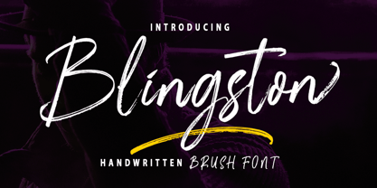 Blingston Brush. is a textured brush font, a contemporary approach to design, with handcrafted and natural underlines and also has alternatives & binders that make your designs more attractive. Suitable for use in title design. Such as clothes, invitations, book titles, stationery designs, quotes, branding, logos, greeting cards, t-shirts, packaging designs, posters, and others. Blingston Brush. equipped with Standard Characters upper and lower case, Punctuation, Numbers. And some glyph variations of OpenType features like Standard Ligatures and Stylistic Sets. Includes multiple multilingual support If you have any questions, feel free to message me :) Thank you so much for watching and enjoying it!
 - Ardiland by Dora Typefoundry,
$17.00 Introducing, Ardiland - a stylish serif with beautiful binders and substitutes! Ardiland is a modern serif font to apply to many graphic or editorial design projects. A classy, unique high contrast, and light binding style for your upcoming projects. for feminine logo signs, fashion & editorial design heads, branding projects, Apparel Branding, packaging, magazine titles, advertisements, T-shirts, postcards and other special occasions. Here's what's included: Alternatives & Ligatures Numbers & punctuation Character with accent Support Multiple Languages PUA encoded This type of family has become the work of true love, making it as easy and fun as possible. I really hope you enjoy it! Thank you
 - Browellay Synthya by Arterfak Project,
$19.00 Introducing Browellay Synthya, an expressive, classy, and elegant signature font that will bring joy to your designs! Designed with bolder strokes to make it stand out as a display font. This font is perfect for showcasing your personal touch as it captures the natural beauty of handwriting. Let your creativity shine with Browellay Synthya in projects like posters, flyers, quotes, apparel, logotypes, fashion, branding, motion graphics, invitations, weddings, and much more! Browellay Synthya features: Uppercase letters Lowercase letters Numbers and punctuation marks Symbols Stylistic alternates Ligatures Multilingual support Elevate your designs to new levels of sophistication with Browellay Synthya!
 - Blueberry Jam by Hanoded,
$15.00 I love blueberries. When my brother and I were young, we used to pick them in the forest by the bucket. Afterwards, we’d always look like victims of a serial killer, but it was all worth it, as nothing quite tastes likes homemade blueberry jam. I don’t know why I named this cute little font Blueberry Jam. Maybe I was craving some… Blueberry Jam is a highly legible, extremely cute and very handmade font. It would look good on just anything, but book covers, product packaging and homemade jam labels come to mind. Blueberry Jam comes with a bucketload of diacritics.
 - Chimphand by One Fonty Day,
$6.00 Chimphand is an organic, natural and contemporary handwritten typeface with their tall x-height. Weights of light, regular and bold for both normal width and condensed allow you to play with the typeface more. In addition, you will have an access to their style sets ( Gap ) to add stencil-ish character to every weights. This gap style is much more subtle than normal stencils, but unique and nicely fit to the typeface. Gaps are more visible on larger fonts and bolder weights. Chimphand is good for any purpose, but works more on shorter text. Thanks and enjoy!
 - Biscuits And Spam by Kitchen Table Type Foundry,
$10.00 I remember that my auntie once made a dish called ‘Macaroni and Smac’. It consisted of little ‘elbow’ macaroni, Spam (which in Holland was called Smac), cheese and ketchup. I am sure it didn’t contain on of your five a day, but it was delicious. As far as I know, I have eaten it only once, but it did make a lasting impression! Biscuits & Spam is a handmade ‘Western’ style font, which I found in my ‘unfinished fonts’ folder. It comes with multilingual support, a full set of alternates for the lower case letters and a really happy vibe.
 - Keyboard by Red Rooster Collection,
$45.00 Keyboard is a condensed and elongated Egyptian font family with thin serifs and a large x-height. Its original design was created in 1951 by Stephenson Blake. International TypeFounders, Inc. gained exclusive licensing rights to the Stephenson Blake Collection, and then Paul Hickson (P&P Hickson) and Steve Jackaman (ITF) created its digital form in 1994. Keyboard excels in display and subhead sizes, and brings a formal feel to any project. Its condensed nature gives it great visual density in the bolder weights, and the lighter weights allow it to retain legibility at both small and massive sizes.
 - Garinstae Script by Pista Mova,
$19.00 Garinstae Script Pro, is modern and classic handwritten calligraphy, so soft, perfect for your next designs, such as logos, printed quotes, invitations, cards, product packaging, headers and anything else from your imagination. Garinstae Script Pro allows you to create custom dynamic text. You can access by turning on; Alternative Styles, Swashes and binders in Photoshop, Adobe Illustrator, Adobe InDesign or via the glyph panel like Adobe Illustrator, Photoshop CC, Let's go from regular characters to alternate characters to get the text with the layout of your dreams. Garinstae Script Pro also includes glyphs, punctuation, numbers and multilingual. Thank you for your visit
 - Deco Nights JNL by Jeff Levine,
$29.00 Sheet music for the tune "Put Your Arms Around Me Honey" (from the 1937 film "Coney Island" starring Betty Grable, George Montgomery and Cesar Romero) has the song title hand lettered in a condensed Art Deco sans serif design. This became the basis for Deco Nights JNL, which is available in both regular and oblique versions. For trivia buffs, the song was written by Junie McCree and Albert Von Tilzer and was first featured in the Broadway show "Madame Sherry" in 1910 and was revived for a second time in the 1949 Judy Garland -Van Johnson film "In the Good Old Summertime".
 - Nouveau Calendar JNL by Jeff Levine,
$29.00 Inspired by the lettering on Koloman Moser’s poster design for Fromme’s Calendar (circa 1912), Nouveau Calendar JNL is available in both regular and oblique versions. According to Wikipedia: “Koloman Moser (30 March 1868 – 18 October 1918) was an Austrian artist who exerted considerable influence on twentieth-century graphic art and one of the foremost artists of the Vienna Secession movement and a co-founder of Wiener Werkstätte. Moser designed a wide array of art works, including books and graphic works from postage stamps to magazine vignettes; fashion; stained glass windows, porcelains and ceramics, blown glass, tableware, silver, jewelry, and furniture.”
 - Baritta Script by madjack.font,
$18.00 Baritta is a modern script font made with brushes and ink, thick and irregular lines. It contains the complete set of lowercase, uppercase, alternative, binder, punctuation, numbers, and multilingual support. Get inspiration from the preview above. Baritta is perfect for use in watercolor designs or bold handwriting styles, such as blog headings, branding, t-shirts, weddings, social media, product design, stationery, advertisements, clothing, cover books, business cards, greeting cards, branding, merchandise, invitations and handmade quotes and more. Baritta features alternative OpenType styles, binders and international support for most Western Languages included. To enable the OpenType Stylistic alternative, you need a program that supports OpenType features such as Adobe Illustrator CS, Adobe Indesign & CorelDraw X6-X7, Microsoft Word 2010 or newer versions. How to access all alternative characters using Adobe Illustrator: https://www.youtube.com/watch?v=XzwjMkbB-wQ Baritta is coded with Unicode PUA, which allows full access to all additional characters without having special design software. Mac users can use the Font Book, and Windows users can use the Character Map to view and copy one of the additional characters to paste into your favorite text editor / application. How to access all alternative characters, using Windows Character Map with Photoshop: https://www.youtube.com/watch?v=Go9vacoYmBw If you need help or have questions, please let me know. I am happy to help :) Thank you & Happy Designing!
 - Pais by Latinotype,
$39.00 "País" is a contemporary and modern grotesque sans serif, inspired by the grotesques of the early 20th century, but more geometric and with a wider x-height than its referents; making it ideal for the current times. "País" comes in 2 versions, each with 9 weights, from thin to black, and matching italics, for a total of 36 fonts. The standard sans serif version is fresh, clean, and more ideally neutral. It's a perfect choice for editorial design, branding, headlines, or any other piece of graphic design. The "País Alt" version has more expressive and modern characters, with some giving it a much more playful image. It is ideal for logos, packaging, web and television use. País contains a total of 682 characters that make it possible to write in more than 200 Latin languages and basic Cyrillic.
 - Wide House by Letterhend,
$16.00 Introducing Wide House, a playful and charming hand-written font that will add a touch of whimsy to your designs. This font has a casual and relaxed vibe that makes it perfect for projects that require a friendly and approachable feel. The letters are slightly wider than usual, giving it a modern yet comfortable appearance. Wide House works well for various design projects especially in logo, and the other various formal forms such as invitations, labels, logos, magazines, books, greeting / wedding cards, packaging, fashion, make up, stationery, novels, labels or any type of advertising purpose. Features : Uppercase & lowercase Numbers and punctuation Alternates & Ligatures Multilingual PUA encoded We highly recommend using a program that supports OpenType features and Glyphs panels like many of Adobe apps and Corel Draw, so you can see and access all Glyph variations.
 - Amper MF by Masterfont,
$59.00 Will this be your next tattoo? Or will this be your new Yacht logo?
 - Morgan Sans by Feliciano,
$50.00The Morgan Project can be considered a big type family with ‘many styles’ or a set of different types that match with each other. For me it’s one typeface with different versions with deliberate and visible differences according to the propose to which each version was created. The design started in 2000 as a display type with the design of the Morgan Tower, to which more two display versions were added; Morgan Poster and Morgan Big — all together the make our: FTF Morgan Display Kit 1. All three versions consist only in uppercase with alternate letters in the lowercase and a set of special ligatures. Morgan Tower has four variants that differ in width/weight, Morgan Poster has six variants (often called styles), three weights in upright and oblique and Morgan Big has twelve, six weights in upright and oblique. Lately, the FTF Morgan Tex Kit 1 was added. Apropriate versions to use in text setting. Both versions, FTF Morgan Sans and FTF Morgan Sans Condensed share the same structure and character mapping. Four variants each; regular, bold, oblique and bold oblique with a large character set including: small caps, lining and old style figures (here called Office figures) — both tabular —, small caps lining figures, mathematical symbols and fraction figures, and, a set of foreign characters expanding the possibilities of use for a wider range of languages. Characters are distributed in six different font layouts: Lining, Office, Expert, Caps, Figures & Pi. - Tiresias by Bitstream,
$29.99Tiresias was designed for subtitling by Dr. John Gill from the Royal National Institute for the Blind (RNIB), in the United Kingdom. The Tiresias font is designed to have characters that are easy to distinguish from each other, especially important for the visually impaired. The following key factors were considered during the design process: character shapes, relative weight of character stokes, intercharacter spacing, and aspect ratios that affect the maximum size at which the type could be used. The benefits of the Tiresias font are greatest on lower resolution displays, such as televisions, train and airline information terminals, and low resolution displays on wireless communication and handheld devices. InfoFont is for printed instructions on public terminals where legibility is the primary consideration; these instructions are often read at a distance of 30 to 70 cm. Infofont is not designed for large quantities of text. The Tiresias LPfont is a large print typeface specifically designed for people with low vision. Large print publications should be designed to specifically help with reading problems, and should not just be an enlarged version of the ordinary print. The Tiresias LPfont family, made up of roman, italic, and bold weights, was designed to address and solve these issues. The RNIB developed PCfont for people with low vision to use on computer screens. It is designed for use at larger sizes only. PCfont includes delta hinting technology in the font to ensure pixel-perfect display at key sizes. Signfont is for fixed (not internally illuminated) signage. The recommended usage is white or yellow characters on a matt dark background. Note that the “Z” versions have slashed zeroes, and are identical in all other respects. These faces were developed together with Dr. John Gill of the National Institute of the Blind, Dr. Janet Silver; optometrist of Moorfields Eye Hospital, Chris Sharville of Laker Sharville Design Associates, and Peter O'Donnell; type consultant. Tiresias himself is a figure from Greek mythology, a blind prophet from Thebes. - Beady Ready by Putracetol,
$28.00 Beady Ready - Bold Display Font Beady Ready is a bold display font featuring a modern style, perfect for creating sporty modern-inspired designs. This font is the perfect choice for designers looking to add a bold and unique touch to their projects. Created with attention to detail, Beady Ready is a versatile font that can be used for a variety of purposes, such as branding, packaging, advertising, and more. When using Beady Ready, the possibilities are endless. This font works well for designs that need bold and eye-catching titles or headings. It can be used in posters, flyers, product packaging and other printed materials that require a strong visual impact. Additionally, Beady Ready can be used in digital designs such as social media graphics, web banners and more. Beady Ready comes packed with features that make it an excellent choice for designers. This includes uppercase and lowercase letters, as well as alternatives and ligatures via the OpenType feature. This feature makes it easy to add a unique touch to your designs by swapping out the letters for different variations. Fonts also include numbers, punctuation, and symbols, making them easy to use in a variety of projects. Finally, Beady Ready has multilingual support, allowing you to use it for projects in multiple languages. If you're looking for a font that is unique, bold, and full of character, Beady Ready is the right choice. This font is perfect for designers looking to add a touch of modern sport to their projects. In short, Beady Ready is a bold display font with a modern style that's perfect for creating sporty-inspired designs. It comes with a variety of features, including alternatives and binders via the OpenType feature, making it easy to add a unique touch to your designs. This font also includes multilingual support, making it an excellent choice for projects in multiple languages. With the Beady Ready font, you can create eye-catching designs that stand out from the crowd.
 - Giotto Handwriting - Personal use only

- Fontenay Fancy - Personal use only

- Bieta by Naghi Naghachian,
$98.00 Bieta is a sans-serif font family designed by Naghi Naghashian in four weights. Bieta Light, Bieta Regular, Bieta Bold and Bieta Heavy. Width of this font family is almost condensed therefore specially space saving. Bold and heavy versions are suitable particularly for big titles. This font family is a contribution to modernisation of Arabic typography, gives the font design of Arabic letters real typographic arrangement und provides more typographic flexibility. Bieta supports Arabic, Persian and Urdu. It also includes proportional and tabular numerals for the supported languages. Bieta design fulfills the following needs: A Explicitly crafted for use in electronic media fulfills the demands of electronic communication. B Suitability for multiple applications. Gives the widest potential acceptability. C Extreme legibility not only in small sizes, but also when the type is filtered or skewed, e.g., in Photoshop or Illustrator. Bieta’s simplified forms may be artificial obliqued in InDesign or Illustrator, without any loss in quality for the effected text. D An attractive typographic image. Bieta was developed for multiple languages and writing conventions. Bieta supports Arabic, Persian and Urdu. It also includes proportional and tabular numerals for the supported languages. E The highest degree of calligraphic grace and the clarity of geometric typography.
 - Jaleh by Naghi Naghachian,
$102.00 Jaleh is a sans-serif font family designed by Naghi Naghashian in tree weights, Jaleh Light, Jaleh Regular and Jaleh Bold. Width of this font family is Extra-expanded; a unique typeface. It is extremely legible even in very small size. This font family is a contribution to modernisation of Arabic typography, gives the font design of Arabic letters real typographic arrangement und provides more typographic flexibility. Jaleh supports Arabic, Persian ( Farsi ) and Urdu. It also includes proportional and tabular numerals for the supported languages. Jaleh design fulfills the following needs: A Explicitly crafted for use in electronic media fulfills the demands of electronic communication. B Suitability for multiple applications. Gives the widest potential acceptability. C Extreme legibility not only in small sizes, but also when the type is filtered or skewed, e.g., in Photoshop or Illustrator. Jaleh’s simplified forms may be artificial obliqued in InDesign or Illustrator, without any loss in quality for the effected text. D An attractive typographic image. Jaleh was developed for multiple languages and writing conventions. Jaleh supports Arabic, Persian and Urdu. It also includes proportional and tabular numerals for the supported languages. E The highest degree of calligraphic grace and the clarity of geometric typography.
 - Cyan Sans by Wilton Foundry,
$29.00The design of Cyan was inspired by features found in classic Roman and styles like Trajan and Bodebeck. The characters stay true to the same features as the capitals, resulting in an unusually distinctive style. The Capitals version contains Roman numerals. Cyan's weight is similar to Trajan's but the horizontal strokes are slightly bolder resulting in better legibility for small sizes, especially for lowercase characters. Cyan Sans evolved out of the hugely successful Cyan Serif family. Cyan Sans retains the same geometric Roman proportions with open centers in B,P,R b, d, p . This helps create a thick and thin stroke illusion since the actual strokes don't vary much. There are many subtle details in Cyan Sans that become more interesting in larger sizes. The beauty of Cyan Sans is that it has no features that "jar" the eye. The result is a very pleasing and distinctive sans that scales well. Cyan Sans is a robust font that will exceed expectations in areas never explored before. The name is inspired by the Greek word cyan, meaning "blue". Blue as a primary color that has many hues and uses. Cyan the font, we hope will be seen in a similar light. Obviously Cyan Sans is a perfect companion to the Cyan Serif family. - Shahira Script by madjack.font,
$12.00 Shahira Script is a modern calligraphy design. Shahira is a girl's name meaning "Famous", "Known" and is of Arabic origin. This typeface is casual and beautiful with swash. Can be used for various purposes such as logos, product packaging, wedding invitations, branding, headlines, signage, labels, signatures, book covers, posters, quotes, and more. Shahira Script includes changes in OpenType language style, binders and international support for most Western languages. To activate the OpenType Stylistic alternative, you need a program that supports OpenType features such as Adobe Illustrator CS, Adobe Indesign & CorelDraw X6-X7, Microsoft Word 2010 or newer versions. How to access all alternative characters using Adobe Illustrator: https://www.youtube.com/watch?v=XzwjMkbB-wQ Shahira Script is coded with Unicode PUA, which allows full access to all additional characters without having special design software. Mac users can use Letter Books, and Windows users can use Character Maps to view and copy one of the additional characters to attach to your favorite text editor / application. How to access all alternative characters, using Windows Character Map with Photoshop: https://www.youtube.com/watch?v=Go9vacoYmBw If you need help or have questions, let me know. I am happy to help! Thank you and Happy Designing!
 - PF Encore Sans Pro by Parachute,
$79.00 Encore Sans Pro is a sans serif which projects an image of reliability, authority and competence making it ideal for corporate applications. A functional typeface which combines utility with style. It’s subtle round characteristics such as the slightly curved-in edges, create a distinctly contemporary look, blending effectively traditional with modern details. Encore Sans Pro has received 3 international awards and distinctions including a Silver at the european ED Awards 2010. This is a contemporary typeface which may function as the perfect alternative to several overused classic sans. Encore Sans Pro does not pretend being different but it does claim its own personality. It is simple and stylish. Furthermore, it is extremely versatile. It comes with 22 weights and supports simultaneously Latin, Greek and Cyrillic. Each font contains 1535 glyphs and is loaded with 22 advanced OpenType features. Extreme weights, such as the elegant hairline, are carefully designed to establish an even color throughout, while ultra black despite its heavy characteristics is quite legible and powerful. Other intermediate weights such as light and book are ideal as body text for magazines and catalogs. Every font in this series has been completed with 270 copyright-free symbols, for packaging, public areas, environment, transportation, computers, fabric care and urban life.
 - Syakila Script by madjack.font,
$14.00 -INTRODUCE- Syakila Script is a modern calligraphy font. Here you will find beautiful script fonts. This font is available with several modern swirls that can make your work look elegant, sweet and flawless. It can be used for various purposes such as headings, signatures, logos, wedding invitations, t-shirts, letterheads, signage, labels, news, posters, badges etc. Syakila Script features alternatives to OpenType styles, binders, and International support for most of the included Western Languages. To activate the OpenType Stylistic alternative, you need a program that supports OpenType features such as Adobe Illustrator CS, Adobe Indesign & CorelDraw X6-X7, Microsoft Word 2010 or a later version. How to access all alternative characters using Adobe Illustrator: https://www.youtube.com/watch?v=XzwjMkbB-wQ Syakila Script is coded with PUA Unicode, which allows full access to all additional characters without having to design special software. Mac users can use Font Book, and Windows users can use Character Map to view and copy additional characters for pasting into your favorite text editor / application. How to access all alternative characters, using the Windows Character Map with Photoshop: https://www.youtube.com/watch?v=Go9vacoYmBw If you have any questions, feel free to contact me. Thank you very much for viewing and Enjoying it!
 - The Red Devil Script by Bal Studio,
$12.00 The Red Devil is a handmade script font with clear style and creative projects such as logos, printed quotes, invitations, cards, product packaging, headers, logos, letterhead, posters, clothing designs, labels, as you can use the illustrative qualities of the shapes to create an art piece. The Red Devil Script come with uppercase letters, lowercase letters, numbers, punctuation, and so many variations on each character including alternative opentype, general binder. It's fun to use because each word can be transformed to you like. To enable the OpenType Stylistic alternates, you need a program that supports OpenType features such as Adobe Illustrator CS, Adobe Indesign & CorelDraw X6-X7, Microsoft Word 2010 or later versions. How to access all alternative characters, using Windows Character Map with Photoshop: https://www.youtube.com/watch?v=Go9vacoYmBw How to access all alternative characters using Adobe Illustrator: https://www.youtube.com/watch?v=XzwjMkbB-wQ The Red Devil Script is coded with PUA Unicode, which allows full access to all the extra characters without having special designing software. Mac users can use Font Book , and Windows users can use Character Map to view and copy any of the extra characters to paste into your favourite text editor/app. Thanks so much for looking and please let me know if you have any questions.
 - Mildred by Burghal Design,
$29.00Remember when a coyote was a light-boned rangy member of the canine family and not the name (spelled C-A-O-T-I) of your neighbor's four year old daughter? When a cricket was a leaping, chirping insect and not the name (spelled K-R-I-Q-U-I-T-T-E) of your purple-haired, pierced-tongued waitress? When Madison and Austin were cities, when brie was a variety of cheese, when radon and alar were hazardous substances and NOT FIRST NAMES? Burghal Design remembers the good old days, when people were not named Whisper, Zandren, Skylar or Dakota but were called Eleanor, Arthur, Edward and Irene. In the spirit of these classic monikers, we give you Mildred, a script font family for proud and simple folk: the down to earth Mildred Plain, hearty Mildred Stout, the barely-there Mildred Scrawn,and the barfly Mildred Cocktail. There's also the slightly more formal (but still all-purpose) Mildred Fancy, bolder Mildred Strong, and the wisp of Mildred Mild. Rounding out the family is Mildred Ornaments, a collection of symbols that can be used for snowflakes, for bullets, or just for fun. Mildred: just an old-fashioned, hard working font. - Vertical by Alias,
$60.00 Alias Vertical is a sans serif typeface with a vertical cut-off point for letter endings. The vertical cut-offs bend round characters (b, c, o, etc) into a squarish, high-shouldered shape, suggesting Roger Excoffon’s Antique Olive. In mid-weights, the typeface mixes Antique Olive with typefaces such as Gill or Johnston, for example the shape of the t, the l borrowing Johnston’s flick. Vertical has the same minimal difference in weight between verticals and horizontals as Gill and Johnston, and the same sharp connection point where curves meet straight lines. Like Antique Olive, Vertical has a narrow connection point here, adding contrast and definition. The overall effect feels austere at lighter weights and strident and graphic at bolder weights, and sharp and incised throughout. In the Bold and Black weights, the squarish and top heavy shape of Antique Olive is most noticeable. For example the wide uppercase, with the B having almost-even width between top and bottom curves, and the almost-overhang of the top curve of the G. But Vertical does not have as extreme an aesthetic or square shape as Antique Olive. As well as its wide design, the upper case is given extra authority by being a slightly heavier weight than the lower case. This is a device borrowed from Gill, and other ‘old’ typefaces, where the upper case is presented as a titling design. Modern sensibilities are more focussed on an even colour between upper and lower case. Vertical was originally intended as a sister typeface to Ano, like AnoAngular or AnoStencil. Vertical developed into a similar but separate design. Ano was designed for use in Another Man — in its modular, circle-base design, and the way there aren’t the amendments usually made in bolder weights to ensure letter clarity. This is for layouts where different weights are used together in different sizes so that the overall letter weight is the same, a feature of the magazine. Where Ano is simple and graphic, Vertical has nuance and texture. It is a pragmatic, utility design. In the balance between graphic and typographic, its focus is the latter.

