10,000 search results
(0.032 seconds)
- Medieval Scribish - Unknown license

- Lovely Autumn by AEN Creative Studio,
$14.00 Lovely Autumn is a sweet and friendly handwritten font. Its natural and unique style makes it incredibly fitting to a large pool of designs. The only limit is your imagination! This font is PUA encoded which means you can access all of the glyphs and swashes with ease! It features a varying baseline, smooth lines, gorgeous glyphs and stunning alternates.
 - Hagia Pro by Studio Fat Cat,
$9.00 Hagia Pro's unique sans serif font family is the perfect tool for creators to create impactful things with a different touch. Hagia Pro contains several weights to give the user an interesting experience when using it. This unique sans serif font family is very good for branding, logo projects, headings, advertising, packaging, web design, print goods and other creative projects.
 - Tomato by Canada Type,
$22.95Tomato is the digitization and quite elaborate expansion of an early 1970s Franklin Photolettering film type called Viola Flare. This typeface is an obvious child of funk, the audio-visual revolution that swept America and put an end to the art nouveau period we now associate with the hippy era. Funk is of course little more than jazz with a chorus and an emphatic beat. Nevertheless, it became the definition of cool in the 1970s, thanks to blaxploitation movies with excellent soundtracks like Shaft and Superfly. Funk began as a commercial audio experience, then later expanded its signature to cover everything, from design to fashion to the later birth of disco, which is really a further simplification of funk. Funk had very strong and unique typographical elements, particularly a kind of titling with an essentially western, wooden core that suddenly changed and flared in unexpected areas until a very individual brand was achieved. Everything that can be tacked on to the alphabet was used towards that individuality. Things like curls, swirls, swashes, ligatures were always plentiful in funk, sometimes giving the titling a specific gender, sometimes bulging, sometimes speeding, sometimes fading in the distance, sometimes doing nothing but crazily aligning with other design elements, but the result was always a fascinating creature that seemed to invariably want to dance and have fun. Tomato was built in exactly that spirit. The original film type certainly had enough swashes and curls to be an unmistakable funk font in itself, but our further expansion of it cements it and makes it the definite font for the genre. With as many as 12 different possibilities for some letters, the designer's choices for a titling set in Tomato are virtually limitless. The Postscript and True Type versions of Tomato come in five fonts, including two fonts for alternates, one font for ligatures, and one font for swashes. These are split into two affordable packages. The entire family package is also available at an even more affordable price, and includes complimentary Cyrillic, Greek, Turkish, and Central European versions of Tomato. A Tomato Pro OpenType version is also available. It is a single font that includes over 650 characters, glued together with extensive programming for convenience of use in OpenType-friendly applications, where you can watch the letters morph and dance as you push the buttons and change the options of your OT palette. Now you know which font will come to mind when someone says the word "funky". - Garnison by OzType.,
$15.00 Garnison, is a contemporary take on the humanist sans serif from Eric Gill with readability and craftsmanship at its core. Specially designed for editorial and publishing purposes. Garnison blends Eric Gill’s humanist sensibilities with a younger, more versatile attitude with 74 variations ranging from lightest hairline to heaviest black, the family features an extensive set of weights and optical sizes, matching true italics and lots of cool OpenType features. The variation in stroke width and letterforms help it achieve great scalability while still retaining its character. For inquiries please contact ozfoundry@gmail.com.
 - Smashing by PintassilgoPrints,
$26.00 Smashing is a stout typeface, with a twist. It’s a massive all-caps font with bouncing glyphs, positively bold yet quite good-humored. Its upper and lower case slots stores different lettershapes, providing handy options to choose from. When working with OpenType savvy applications you can turn on the contextual alternates feature to instantly get alternating glyphs, which add spontaneity to your artwork and prevent neighbor double letters from using the same glyph. Also try the discretionary ligatures feature to get some cool interlocking pairs. A smashing font for truly smashing designs!
 - FWD Egyptian Tower by Fontwright Design,
$39.99 FWD Egyptian Tower is a designers stack-able Display family best purchased as one package. The four versions can be manipulated in your favorite graphics or sign making application to achieve the different effects as shown in the font family ad designs. All fonts are tightly spaced and are very often intentionally overlapped creating a balance for each very unique wider bottomed character. Being stack-able, the designer can duplicate the original text layer and by changing the font on the lower of the two layers to another of the family can then add another available effect. This can be repeated to add other of the available effects. Then by converting the text of the lower text layers to curves or outlines and welding the characters of the words together, the overlaps can be eliminated. This process is fairly common practice for a graphic designer and quite easy once done a few times.
 - Swingly Lours by Jolicia Type,
$21.00 Meet Swingly Lours, the epitome of serif elegance enriched with magnificent ligatures and a plethora of alternates. This font transforms your typography into a visual symphony, striking the perfect balance between classic sophistication and contemporary creativity. Swingly Lours is not just a typeface, it's a versatile tool for crafting unique and captivating designs. Elevate your projects with the charm of this serif font, where every detail tells a story of timeless sophistication and customizable creativity.
 - Rockgen by Typebae,
$10.00 Rockgen is a sans serif font that has 4 cool styles. It has a strong and unique look and it is perfectly suited for branding, logos, magazines, films, websites, headlines, titles and more. What's Included? 4 Font Style Regular, Expanded & Rounded Uppercase & Lowercase Numbers & Punctuation Multilingual support PUA Encoded
 - Legendary Legerdemain by Comicraft,
$29.00 Are you watching closely? We know what you're looking for -- the secret. Comicraft’s magic formula, our Legendary Legerdemain. But you won't find it because of course, you're not really looking. You don't really want to work it out. You want to believe in the magic. Every great Comicraft font consists of three parts. The first part is called “The Pledge”. Comicraft shows you an ordinary looking font: A through Z, nothing more than the letters of the alphabet, unaltered, normal. But of course... they aren't. The second part is called “The Turn”. Comicraft takes the ordinary letters of the alphabet and makes them look extraordinary. Now you are peering closely -- you convince yourself you're looking for the secret... even though you really don't want to know. You want to be fooled. And you are! But don't applaud yet. Because making something extraordinary isn't enough... That’s why every Comicraft font has a third part, the hardest part, what we call “The Prestige”. That''s when we have to SELL the font. And that’s the real trick. See the families related to Legendary Legerdemain: Legendary Legerdemain Leggy.
 - Fabiola by Lián Types,
$49.00 -Fabulous, beautiful, friendly, talkative, sweet, caring, a little on the odd side, very desirable by many, good at almost everything- That's the definition of Fabiola according to the slang dictionary of americans. If you were you looking for something delicious, a font that covers a really wide range of uses and always looks amazing, Fabiola should be your choice. Although it may look as another of my scripts with juicy swashes, this time I explored in depth the pairing and interaction with capital letters for more unique results. Why? We are going through some crazy days where the number of people interested in letters is only growing. We see lettering everywhere: I can say that finally our field is shouting out loud; letters are THE protagonist more than ever. Hence the need of combining and pairing different styles is booming. Fabiola Script and Fabiola Caps were done in a way that they seem to need each other. There's nothing better than the above images to prove this. But, how does it work? The big swashes of the Script style were designed so they can surround, wrap and mingle with the Caps styles. The smaller swashes are meant to be used when the Script is alone. Simple, right? I hope you find Fabiola useful on your projects and enjoy using it like I did when making the posters! Have a super fabulous day!
 - Sharon by Haksen,
$20.00 Sharon is a Classic Display serif style with Uppercase and Lowercase feel nice balanced. Provide alternates font in uppercase and lowercase variant style make the design letter looks incredible. Honestly it works perfectly for headlines, logos, posters, packaging, T-shirts and much more. Recommended to use in Adobe Illustrator or Adobe Photoshop with opentype feature. How to access Alternate Characters? Open glyphs panel : In Adobe Photoshop choose tool Window glyphs In Adobe Illustrator choose tool Type glyphs Have a great day, Haksen
 - Slm by Antiochus,
$30.00 We produce original printing press letter fonts, for example from the journal Southern Literary Messenger (circa 1830 - 1870). The only one in the world. What makes our fonts so attractive to the eye, are the myriad imperfections. It's not an approximation to the printing-press letters--- these are the actual letters, complete with all their manifold differences. If you look closely you will notice that the letter 'e' say, each time it is printed, is slightly different. These differences arise from the mechanical action of the inked-wooden press on the paper, and cannot be faked by artificial means. The eye subconsciously picks up this text as the actual printing press letters. Edgar Allan Poe published many of his great works in the Southern Literary Messenger, as did many other great nineteenth century writers, ie. Henry Wadsworth Longfellow, Nathaniel Hawthorne &c.
 - Haudrey by Arterfak Project,
$24.00 Proudly presents Haudrey, a handpainted typeface with a strong, condensed and bold style. Carefully crafted with dashed lines on the letterform and giving authentic handpainted and cool texture. Haudrey is surprisingly versatile, and you can apply it to many design projects. This font is perfect for display, headline, logo, poster, sports, food menu, flyer, apparel, stickers, and more! You can make a lot of fun with this font. This textured font is equipped already with special characters, stylistic alternates, multilingual support, and PUA Encoded which means you don't need any special software to access all the characters. That's all, friends. Don't hesitate to message me if you have any inquiries. Thank you. Ramz.
 - Paranoid Android by Comicraft,
$29.00Fonts are Inhuman and Human Fonts are IN! Now, the Comicraft Cybernetics Corporation is proud to announce the first in a new line of fonts with GFP... Genuine Font Personalities. Paranoid Android is an outer alloy, inner void, solitary solenoid GFP prototype -- you can tell, can't you? Finally a font that knows its place as a digital servant to the human race. What will Comicraft think of next? No, don't bother to answer that, Comicraftsmen are fifty thousand times more intelligent than you and even they don't know the answer. Warning: Nothing left to be enjoyed, every diode rheumatoid*, terminally Paranoid Android is not so much a font, and more a kind of electronic sulking device. Share and Enjoy! *The moving parts on the left side of this font are in a solid state. It may sit in a corner and rust, or just fall apart where it's standing. - Line Art Eclectrice Aligned by DJ THINK,
$95.00 Thanks for checking out LineArt ECLECTRICE (pronounced EHCK-LEHCK-TREES) Light Aligned font by Rene Toussaint (otherwise known as DJ THINK) of LineArt Foundry and Brand. This font is designed in the vein of graffiti art with stylings of hip-hop and hieroglyphic appearance. Try it in a preview window and check out if it will meet your needs for something cool and hip for your next flyer design or other type of graphic art image. Keep in mind that this is a light design and may require extra thickening in your vector program of choice with outline thickness options.
 - Devendra by Wooden Type Fonts,
$20.00 A very distinctive style of font, in a kind of art deco style form the '30s. This font is unique in that there are no open, negative spaces in glyphs such as upper and lower case o, or p, or others which would usually have them. Instead the glyphs are solid. The only letters or glyphs which have triangular sides are A and V, X, and Y. This is unusual.
 - Hypnotica by Deniart Systems,
$15.00 Hypnotize your audience! For a truly unusual eye-catching experience, this modern-day series, containing 52 geometrical and optical mofifs, can bewitch and fool the eyes with unexpected shifts in focus. Whether your documents are for print or screen, these symbols are sure to add a little fun to all your presentations.
 - TWT Prospero by Three Islands Press,
$24.00TWT Prospero is the kind of typeface you seldom find in blocks of continuous text these days. Similar fonts based on late-18th-century work by Bodoni, the Didots, and others tend to be reserved for display type: their exaggerated contrast and vanishing hairlines can make you squint and strain at small sizes. But TWT Prospero, with its moderate contrast and fairly robust hairlines, is impressively legible in book text while remaining ideal for use in display situations. The full family has seven styles: roman, italic, bold, bold italic, condensed roman, condensed italic, and condensed bold. - Gallard by Type-Ø-Tones,
$40.00 Gallard is a two weights family that contains the display type of the great cartoonist and illustrator Miguel Gallardo. In addition, as we usually do for this kind of author fonts, there is a collection of drawings called Victims.
 - LD Elementary by Illustration Ink,
$3.00This font looks like the best effort of small children (when they are trying to be very neat). It is cute. - DIN Next Arabic by Monotype,
$155.99 DIN Next is a typeface family inspired by the classic industrial German engineering designs, DIN 1451 Engschrift and Mittelschrift. Akira Kobayashi began by revising these two faces-who names just mean ""condensed"" and ""regular"" before expanding them into a new family with seven weights (Light to Black). Each weight ships in three varieties: Regular, Italic, and Condensed, bringing the total number of fonts in the DIN Next family to 21. DIN Next is part of Linotype's Platinum Collection. Linotype has been supplying its customers with the two DIN 1451 fonts since 1980. Recently, they have become more popular than ever, with designers regularly asking for additional weights. The abbreviation ""DIN"" stands for ""Deutsches Institut für Normung e.V."", which is the German Institute for Industrial Standardization. In 1936 the German Standard Committee settled upon DIN 1451 as the standard font for the areas of technology, traffic, administration and business. The design was to be used on German street signs and house numbers. The committee wanted a sans serif, thinking it would be more legible, straightforward, and easy to reproduce. They did not intend for the design to be used for advertisements and other artistically oriented purposes. Nevertheless, because DIN 1451 was seen all over Germany on signs for town names and traffic directions, it became familiar enough to make its way onto the palettes of graphic designers and advertising art directors. The digital version of DIN 1451 would go on to be adopted and used by designers in other countries as well, solidifying its worldwide design reputation. There are many subtle differences in DIN Next's letters when compared with DIN 1451 original. These were added by Kobayashi to make the new family even more versatile in 21st-century media. For instance, although DIN 1451's corners are all pointed angles, DIN Next has rounded them all slightly. Even this softening is a nod to part of DIN 1451's past, however. Many of the signs that use DIN 1451 are cut with routers, which cannot make perfect corners; their rounded heads cut rounded corners best. Linotype's DIN 1451 Engschrift and Mittelschrift are certified by the German DIN Institute for use on official signage projects. Since DIN Next is a new design, these applications within Germany are not possible with it. However, DIN Next may be used for any other project, and it may be used for industrial signage in any other country! DIN Next has been tailored especially for graphic designers, but its industrial heritage makes it surprisingly functional in just about any application. The DIN Next family has been extended with seven Arabic weights and five Devanagari weights. The display of the Devanagari fonts on the website does not show all features of the font and therefore not all language features may be displayed correctly.
 - DIN Next Devanagari by Monotype,
$103.99DIN Next is a typeface family inspired by the classic industrial German engineering designs, DIN 1451 Engschrift and Mittelschrift. Akira Kobayashi began by revising these two faces-who names just mean ""condensed"" and ""regular"" before expanding them into a new family with seven weights (Light to Black). Each weight ships in three varieties: Regular, Italic, and Condensed, bringing the total number of fonts in the DIN Next family to 21. DIN Next is part of Linotype's Platinum Collection. Linotype has been supplying its customers with the two DIN 1451 fonts since 1980. Recently, they have become more popular than ever, with designers regularly asking for additional weights. The abbreviation ""DIN"" stands for ""Deutsches Institut für Normung e.V."", which is the German Institute for Industrial Standardization. In 1936 the German Standard Committee settled upon DIN 1451 as the standard font for the areas of technology, traffic, administration and business. The design was to be used on German street signs and house numbers. The committee wanted a sans serif, thinking it would be more legible, straightforward, and easy to reproduce. They did not intend for the design to be used for advertisements and other artistically oriented purposes. Nevertheless, because DIN 1451 was seen all over Germany on signs for town names and traffic directions, it became familiar enough to make its way onto the palettes of graphic designers and advertising art directors. The digital version of DIN 1451 would go on to be adopted and used by designers in other countries as well, solidifying its worldwide design reputation. There are many subtle differences in DIN Next's letters when compared with DIN 1451 original. These were added by Kobayashi to make the new family even more versatile in 21st-century media. For instance, although DIN 1451's corners are all pointed angles, DIN Next has rounded them all slightly. Even this softening is a nod to part of DIN 1451's past, however. Many of the signs that use DIN 1451 are cut with routers, which cannot make perfect corners; their rounded heads cut rounded corners best. Linotype's DIN 1451 Engschrift and Mittelschrift are certified by the German DIN Institute for use on official signage projects. Since DIN Next is a new design, these applications within Germany are not possible with it. However, DIN Next may be used for any other project, and it may be used for industrial signage in any other country! DIN Next has been tailored especially for graphic designers, but its industrial heritage makes it surprisingly functional in just about any application. The DIN Next family has been extended with seven Arabic weights and five Devanagari weights. The display of the Devanagari fonts on the website does not show all features of the font and therefore not all language features may be displayed correctly. - DIN Next Cyrillic by Monotype,
$65.00DIN Next is a typeface family inspired by the classic industrial German engineering designs, DIN 1451 Engschrift and Mittelschrift. Akira Kobayashi began by revising these two faces-who names just mean ""condensed"" and ""regular"" before expanding them into a new family with seven weights (Light to Black). Each weight ships in three varieties: Regular, Italic, and Condensed, bringing the total number of fonts in the DIN Next family to 21. DIN Next is part of Linotype's Platinum Collection. Linotype has been supplying its customers with the two DIN 1451 fonts since 1980. Recently, they have become more popular than ever, with designers regularly asking for additional weights. The abbreviation ""DIN"" stands for ""Deutsches Institut für Normung e.V."", which is the German Institute for Industrial Standardization. In 1936 the German Standard Committee settled upon DIN 1451 as the standard font for the areas of technology, traffic, administration and business. The design was to be used on German street signs and house numbers. The committee wanted a sans serif, thinking it would be more legible, straightforward, and easy to reproduce. They did not intend for the design to be used for advertisements and other artistically oriented purposes. Nevertheless, because DIN 1451 was seen all over Germany on signs for town names and traffic directions, it became familiar enough to make its way onto the palettes of graphic designers and advertising art directors. The digital version of DIN 1451 would go on to be adopted and used by designers in other countries as well, solidifying its worldwide design reputation. There are many subtle differences in DIN Next's letters when compared with DIN 1451 original. These were added by Kobayashi to make the new family even more versatile in 21st-century media. For instance, although DIN 1451's corners are all pointed angles, DIN Next has rounded them all slightly. Even this softening is a nod to part of DIN 1451's past, however. Many of the signs that use DIN 1451 are cut with routers, which cannot make perfect corners; their rounded heads cut rounded corners best. Linotype's DIN 1451 Engschrift and Mittelschrift are certified by the German DIN Institute for use on official signage projects. Since DIN Next is a new design, these applications within Germany are not possible with it. However, DIN Next may be used for any other project, and it may be used for industrial signage in any other country! DIN Next has been tailored especially for graphic designers, but its industrial heritage makes it surprisingly functional in just about any application. The DIN Next family has been extended with seven Arabic weights and five Devanagari weights. The display of the Devanagari fonts on the website does not show all features of the font and therefore not all language features may be displayed correctly. - DIN Next Paneuropean by Monotype,
$92.99DIN Next is a typeface family inspired by the classic industrial German engineering designs, DIN 1451 Engschrift and Mittelschrift. Akira Kobayashi began by revising these two faces-who names just mean ""condensed"" and ""regular"" before expanding them into a new family with seven weights (Light to Black). Each weight ships in three varieties: Regular, Italic, and Condensed, bringing the total number of fonts in the DIN Next family to 21. DIN Next is part of Linotype's Platinum Collection. Linotype has been supplying its customers with the two DIN 1451 fonts since 1980. Recently, they have become more popular than ever, with designers regularly asking for additional weights. The abbreviation ""DIN"" stands for ""Deutsches Institut für Normung e.V."", which is the German Institute for Industrial Standardization. In 1936 the German Standard Committee settled upon DIN 1451 as the standard font for the areas of technology, traffic, administration and business. The design was to be used on German street signs and house numbers. The committee wanted a sans serif, thinking it would be more legible, straightforward, and easy to reproduce. They did not intend for the design to be used for advertisements and other artistically oriented purposes. Nevertheless, because DIN 1451 was seen all over Germany on signs for town names and traffic directions, it became familiar enough to make its way onto the palettes of graphic designers and advertising art directors. The digital version of DIN 1451 would go on to be adopted and used by designers in other countries as well, solidifying its worldwide design reputation. There are many subtle differences in DIN Next's letters when compared with DIN 1451 original. These were added by Kobayashi to make the new family even more versatile in 21st-century media. For instance, although DIN 1451's corners are all pointed angles, DIN Next has rounded them all slightly. Even this softening is a nod to part of DIN 1451's past, however. Many of the signs that use DIN 1451 are cut with routers, which cannot make perfect corners; their rounded heads cut rounded corners best. Linotype's DIN 1451 Engschrift and Mittelschrift are certified by the German DIN Institute for use on official signage projects. Since DIN Next is a new design, these applications within Germany are not possible with it. However, DIN Next may be used for any other project, and it may be used for industrial signage in any other country! DIN Next has been tailored especially for graphic designers, but its industrial heritage makes it surprisingly functional in just about any application. The DIN Next family has been extended with seven Arabic weights and five Devanagari weights. The display of the Devanagari fonts on the website does not show all features of the font and therefore not all language features may be displayed correctly. - Diagon JNL by Jeff Levine,
$29.00This design from Jeff Levine defies description. It's kind of techno, somewhat of a novelty and definitely unusual. Diagon JNL is the perfect font for projects that need a very different look. - Italix by Punch,
$45.00 Italix is an easygoing font family with mainly 4 script styles (Fineliner, Brushpen, Marker & Fatstick) and 7 supportive AllCaps fonts. Each script has its own unique personality, and come with optional ink splatters. These are attached to several ligatures, so don’t forget to activate the “OpenType Features” and the “World Ready Composer” in the application settings. The cool thing about Italix is that you can have a lot of creative fun with it, and its multiple features. Brushpen has a more classic look, Fineliner is a bit quirky, Marker is the chill one, and Fatstick is a total badass!
 - Spaghetti Cyrillic by Ira Dvilyuk,
$17.00 The Spaghetti playful cute font includes the main & alternative uppercase, and main & alternative lowercase, and the full set of double letters in an upper and lowercase, and a large range of numerals and punctuation. The Spaghetti font will be perfect for use in all your fun design projects be it logos, labels, packaging design, blog headlines. Also, it will look great on mugs, cards, kids books headlines, or other typographic projects. Spaghetti cute playful font contains the Cyrillic glyphs too. The Cyrillic part of the font contains a full set of uppercase lowercase, and the Spaghetti Symbols is an additional font with 52 hand-drawn doodles, catchwords, arrows, and swashes and can help to make your design more original. Combine and arrange swashes and illustrations to create your own designs and make borders, frames, dividers, logos, and more (just use A-Z and a-z keys in the included Spaghetti Symbols font). A different symbol is assigned to every uppercase or lowercase standard character so you do not need graphics software just simply type the letter you need. Multilingual Support for 31 languages: Latin glyphs for Afrikaans, Albanian, Basque, Bosnian, Catalan, Danish, Dutch, English, Estonian, Faroese, Filipino, Finnish, French, Galician, Indonesian, Irish, Italian, Malay, Norwegian Bokmål, Portuguese, Slovenian, Spanish, Swahili, Swedish, Turkish, Welsh, Zulu. And Cyrillic glyphs support for Russian, Belorussian, Bulgarian and Ukrainian languages. Thanks!
 - Karatone by Letterhend,
$19.00 Introducing, Karatone, An Elegant Serif. This typeface has many alternates with swashes that can make your lettering / logotype become more interesting. The clean and neat of a serif combined with the swirl swashes makes this font one of a kind! This font perfectly made to be applied especially in logo, and the other various formal forms such as invitations, labels, logos, magazines, books, greeting / wedding cards, packaging, fashion, make up, stationery, novels, labels or any type of advertising purpose. Features : uppercase & lowercase numbers and punctuation multilingual ligatures alternates swashes PUA encoded We highly recommend using a program that supports OpenType features and Glyphs panels like many of Adobe apps and Corel Draw, so you can see and access all Glyph variations. Email us to letterhend@gmail.com if you need something! Happy Designing!
 - Liebelei Pro by Wannatype,
$29.90 “Liebelei” – dalliance, flirtation, hanky-panky; kind of diminutive of “Liebe” (German for love) The typeface Liebelei has its roots back in 1932, when Vienna-based painter Rudolf Vogl created the poster for a movie called Liebelei after the popular play by Arthur Schnitzler. Only the title letters existed of that typeface. I loved the letters from first sight and proceeded by adventurously interpreting the missing characters. The goal was to create letterforms that fit to the original from the 1930s and represent a modern multi-purpose font. It should be an easy-to-use italic font with warm and friendly details and a huge variety of alternates and languages. The characteristic curled ends of most letters provide a script touch to the Liebelei. The first font entirely designed was the bold one which corresponds to the original poster lettering, although I tweaked the proportions a tiny bit to a more contemporary shape. Liebelei covers Western, Central European, and Central Eastern European Languages and contains also complete Greek and Cyrillic character sets. Liebelei is best for poster design as well as detailed usage, for example handsome tables, since it supports small caps, different kinds of numerals and fractions.
 - CA Negroni by Cape Arcona Type Foundry,
$29.00 A dinner is not complete without a fine appetizer. Whatever you dinner will be, CA Negroni is the perfect introduction. Delivered in three flavors, Normal (Light + Black + Fill), Inline and Round. Versatility is proved by the extensive language support, covering whole Central Europe. CA Negroni is the well aged and improved version of a typographic classic: in the beginning of the 20th century, type in advertising was mostly drawn by hand. A master of this art and pioneer in logo-design was Wilhelm Deffke (1187–1950). CA Negroni is inspired by his kind of bold and solid letterings, picking up some of the charming details while leaving away other that might have a disturbing effect on the general look. Two stylistic sets let you choose between a more serious or a more playful look.
 - Florati by Proportional Lime,
$19.99 Can you imagine the delight that the printers of the Incunabula era would have had if they had such a tool as this font with a hundred and fifty glyphs of decorative capitals. The printers of that era were lucky to have more than a handful such delights. These Decorated initials and drop caps are all based on early period exemplars, dating to prior to 1525, from a wide range of printers such as Thomas de Blavis to Günther Zainer. Every Proportional Lime Font comes equipped with a complete character map.
 - Bubble Boom by Blankids,
$18.00 Bubble Boom is inspired by graffiti, and fits well for themes such as graffiti posters, Hip Hop music, kids posters, flyers, children books, cartoons, comics, and more. Features included: Uppercase Lowercase Number Punctuation Multilingual PUA Encode OpenType
 - Neogloss by Fauzistudio,
$12.00 Neogloss is a rounded sans serif with lots of personality. A great choice for friendly web designs, kids products, and natural beauty brands, Neogloss provides a good organic feel to any project. Hope you enjoy. Intuisi Creative
 - Swadi Marker by Sipanji21,
$15.00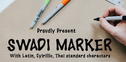 Swadi Marker is a sweet and friendly serif font and features Cyrillic and Thai character. Its natural and unique style makes it incredibly fitting to a large pool of designs. The only limit is your imagination!
 - Maladroit by Comicraft,
$29.00 Okay, we admit it! Comicraft's latest offering -- wrenched heavy-handedly from the pages of CHARLEY LOVES ROBOTS – is definitely a little awkward, maybe even loose-limbed and goofy. Those (usually) awfully nice chaps in the Comicraft studio are perhaps best known for their dexterity, their lightness of touch and nimbleness of finger rather than the kind of bungling, graceless, clumsy work evident in their latest digital alphabet. So, yes, MALADROIT is probably the most inept, cack-handed, undiplomatic addition to our catalogue ever submitted by freewheelin' John Roshell (formerly GAUCHE-ell) but might just possibly be the perfectly wrong font choice for your more bungling, inept, incompetent and hamfisted characters.
 - Red Tape by Wiescher Design,
$39.50 Red Tape is three fonts that were designed by sticking letters together with red tape. It makes for a wonderful makeshift set of fonts. And I really enjoyed sticking those letters together. Of course I did it on screen using bits and pieces of scanned red tape. Just use it as you like, I won't give you any red tape in how to use the fonts. »Red Tape« is since February 2012 on permanent display in the »German National Library« – next to the likes of »Bodoni«, »Garamond« and »Helvetica« – being part of the exhibition about type through the ages. Your (now a little famous) unproblematic type designer, Gert.
 - Admiral by Greater Albion Typefounders,
$12.00 Admiral was inspired by and extrapolated from the Art Nouveau lettering incised into the facade of a local hostelry. This gave us some inspiration for the capitals 'A', 'B', 'C', 'E', 'H', 'I', 'L', 'O', 'S', 'T' and 'U'; we then had great fun extrapolating the rest! The source of the name Admiral can be spotted if you look at characters such as 'A', 'H' and 'N'. Admiral's distinctive charm and humour lends it to projects with a 1900s Art Nouveau theme, be they book covers, posters, signage, invitations, cards, or anything else you enjoy!
 - Giulia by HVD Fonts,
$30.00 Giulia is a sweet type family consisting of 12 Fonts. It was created by Hannes von Döhren and published by HvD Fonts. Besides a fancy curly version there is a second version with a more straight architecture, still owning the same soft and friendly character. Informal and easy going at first sight and perfect for display settings, however the straight architecture of Giulia Plain also makes it nice for shorter to medium texts. This contemporary type family is ideal for use in retail, packaging, games, food, kids applications and advertising.
 - Pretty Songs by PizzaDude.dk,
$16.00 What exactly is a pretty song? To tell you the truth, I have no idea! My taste of music ranges from classical music to heavy metal, from hip hop to jazz - and even soundtracks like Flash Gordon, Merry X-mas Mr Lawrence and Tommy. But font-wise, I know what a Pretty Song is! It's this organic looking, handmade text font - suitable for many things, such as books for kids, organic products, posters ... whatever design that needs a fresh and jumpy boost! BTW, the names was inspired by another favourite artist, Nirvana!
