10,000 search results
(0.044 seconds)
- Pero by Dharma Type,
$24.99 Pero is a condensed rounded sans-serif family designed by Ryoichi Tsunekawa and the whole family consists of 7 weights from ExtraLight to ExtraBold.The range of styles provides flexibility for title, headline and body text. And the large x-heights add to legibility. The basic skeleton of the letterform was designed modularly and minimalized by removing unnecessary stems and ends were rounded out. The minimalized modular design gives this family contemporary urbane taste and rounded corners make this family warm and friendly. This rounded feature will also accentuate your design work moderately. Pero supports almost all European languages: Western, Central, South Eastern Europeans and afrikaans. And superior figures, inferior figures, denominators, numerators and fraction can be accessed by using OpenType features.
 - Eurotypo BKL by Eurotypo,
$28.00 Eurotypo BKL is a family of fonts inspired in on one of the most beautiful British Typography ever done. This version of Baskerville tries to reflect the taste of his fine style, compatible with the bluntness of the digital present. As many other designers and foundries, our intention has been to represent the atmosphere of Baskerville's style, than simply relive the shapes of its letters. Actually, capitals fits almost to a square proportions, lowercases are more open, ascenders and descenders are shorter, offering more space for enlarge the "x" high. The beauty of his letterforms can enrich headlines; this font can also be used as body text for its good legibility and accurate kerning. John Baskerville (1706-1775) was born 1706 in Wolverley, England. He was a great typographer and printer who published a remarkable edition of Virgil in 1757. His typefaces were greatly admired by Benjamin Franklin; He also has improved and developed many innovations in printing, paper and ink production. Baskerville’s typefaces are regarded as transitional types that represents the link between Old Roman Style and Modern Roman typography.
 - Monarda by Monotype,
$29.99 Monarda™ is Terrance Weinzierl’s take on the loud and splashy brush scripts of the 1950s. It’s energetic, playful, and equally at home in hardcopy headlines as it is in interactive banners. In addition to the basic alphabet, OpenType® fonts of Monarda are also awash in super-sized swash caps, contextual alternate characters and ligatures. Pair Monarda with a mid-century structural sans like Trade Gothic® or a sturdy slab serif like Egyptian Slate™ to create typographic counterpoint that’s confident, compelling and memorable! Named for a riotous bright red flower that attracts butterflies and humming birds, Monarda is a rare combination of flamboyance and effortless beauty. Weinzierl describes it as “casual yet precise: a stiff denim jacket or perfectly white sneakers at a formal event.” Monarda clearly stands out – and always fits in. Well, almost always. Drawn for print, the design’s robust x-height, open counters and wide apertures also make Monarda screen-friendly. Monarda can be perfect for a wide variety of food and lifestyle applications as well as travel, stationery and packaging projects. Advertising campaigns and product branding are also well within its reach. Monarda works best when used large – but economically. Two or three words are its sweet spot. Think: product name, print headline or the lettering on the side of a truck. It could easily become your go-to design for projects that call for a script with a bright personality and fearless demeanor. The excellence of Weinzierl’s work has been recognized by the Type Directors Club and Print Magazine. When not working on creating new typefaces, he augments his professional practice through calligraphy, lettering, and letterpress printing. Monarda is another winner from Weinzierl’s creative mind and talented hand.
 - ChillyMoe - Unknown license

- Ecuador by WAP Type,
$15.00 This font has a unique character and can be used for your logos, business cards and other projects for a unique vintage look.
 - DF Etalage Script by Dutchfonts,
$33.00 Etalage Script was drawn for the first time in the year 2000, based on a early 20th century lettering stencil with what farmer Boelema at Lalleweer stenciled his grainsacks. Eventually the script letter was developed as a typeface with a wink to the ‘lost’ display types for the ‘display window’ of graphic designer Ariënne Boelens, who in exchange made the website www.lalleweer.nl. What originated the Ariënne should be evident now.
 - HU Suryeo by Heummdesign,
$15.00 HU Suryeo is a new typeface of Heumm's calligraphy that takes the motif from carefully written calligraphy. It follows the calligraphic shape of Korean classics and can be used for titles and body text without distinction. The stroke thickness, strength, and degree of bending were set differently for each style. The thinner it is, the sharper it is, and the thicker it is, the blunt and round it is.
 - New Berolina MT by Monotype,
$29.99 Martin Wilke designed the dynamic calligraphic typeface New Berolina in 1965. The light line of the strokes and the strong stroke contrast lets New Berolina dance across the page. Broad, generous capitals complement beautifully the narrower lower case characters with their low x-height. The capitals can also be used as initials. Used carefully and with generous line spacing, New Berolina will lend any text a fresh, lively look.
 - Incarceration JNL by Jeff Levine,
$29.00 The hand lettered Art Deco title on the cover of the sheet music for “There Must be A Bright Tomorrow (for Each Yesterday of Tears)” inspired the font Incarceration JNL, which is available in both regular and oblique versions. Incarceration JNL earns its dubious name from the fact the song was written by Prisoner No. 3223 (Wallace Wysocki) who was held in the Marquette State Prison, Marquette, Michigan (1931)
 - Angro by Linotype,
$29.99 The sans serif Angro was designed in the weights light and bold by Erwin Koch. The figures are based on the form of a rectangle which along with the high xheight and short ascenders and descenders gives the forms a static character. Lines of text in Angro are very compact and close set. Due to the reserved ascenders and descenders Angro can be set with very close line spacing.
 - Figgins Sans by Shinntype,
$79.00 The first sans serif types were made in London in the early 19th century. They were severely modern, all caps and bold. The Figgins foundry, inventor of the term sans serif, showed a ?ne example in its specimen of 1836. The extra bold weight of Figgins Sans is a close revival of the original, with the addition of a lower case which retains its partly geometric, partly grotesque quality. The family is rounded out with other weights and an italic, and extended into Cyrillic and Greek, all executed in what is assumed to be as authentic a manner as possible, given the hypothetical nature of the exercise. Together with Scotch Modern, comprises The Modern Suite of matched fonts.
 - Craftsman by Woodside Graphics,
$19.95The Craftsman font is a faithful reproduction of the logo, or Title typeface used for Gustav Stickley's "Craftsman" Magazine, the foremost journal of the American Arts & Crafts Movement during its publication years of 1901-1916. It is an All-Caps font, with condensed and closely-spaced characters, specifically designed for titles and headlines. The "Craftsman" font is available in two versions: "Craftsman Regular" and "Craftsman Outline." Each is two fonts in one, in the sense that the capital letters are contained in a hand-drawn box (as on the cover of "The Craftsman" Magazine). Lower-case characters are identical, but without the box. Thus, the two may be used separately, or in combination, to achieve a desired effect. - Rosewood by Adobe,
$29.00Rosewood font, like its relatives Zebrawood, Pepperwood and Ponderosa, was created by the designer trio K.B. Chansler, C. Crossgrove and C. Twombly, and has its roots in the slab serif style. The first weight displays the simplicity typical of display typefaces at the end of the 18th century. The other weights are playful variations on this theme. The tendency toward display and ornametal typefaces began with the English Industrial Revolution. The introduction of new machines made mass production possible in the print industry, a technique meant to constantly produce new and unusual products to sell to more and more consumers. Many of the typefaces created in this time were meant simply to catch attention and to advertise products. The two ornamental weights of Rosewood reflect this tendency and never fail to catch the reader's eye. Rosewood, like Zebrawood and Schwennel, is a bicolor font, meaning that the weight Rosewood fill can be used as a decoration for the inner spaces of Rosewood regular. - Anisette Std Petite by Typofonderie,
$59.00 Geometric font inspired by shop signs in 4 styles Anisette has sprouted as a way to test some ideas of designs. It has started with a simple line construction (not outlines as usual) that can be easily expanded and condensed in its width in Illustrator. Subsequently, this principle of multiple widths and extreme weights permitted to Jean François Porchez to have a better understanding with the limitations associated with the use of MultipleMaster to create intermediate font weights. Anisette built around the idea of two widths capitals can be described as a geometric sanserif typeface influenced by the 30s and the Art Deco movement. Its design relies on multiple sources, from Banjo through Cassandre posters, but especially lettering of Paul Iribe. In France, at that time, the Art Deco spirit is mainly capitals. Gérard Blanchard has pointed to Jean Francois that Art Nouveau typefaces designed by Bellery-Desfontaines was featured before the Banjo with this principle of two widths capitals. The complementarity between the two typefaces are these wide capitals mixed with narrow capitals for the Anisette while the Anisette Petite – in its latest version proposes capitals on a square proportions, intermediate between the two others sets. Of course, the Anisette Petite fonts also includes lowercases too. Anisette Petite, a geometric font inspired by shop signs in 4 styles So, when Jean François Porchez has decided to create lowercases the story became more complicated. His stylistic references couldn’t be restricted anymore to the French Art-déco period but to the shop signs present in our cities throughout the twentieth century. These signs, lettering pieces aren’t the typical foundry typefaces. Simply because the influences of these painted letters are different, not directly connected to foundry roots which generally follow typography history. The outcome is a palette of slightly strange shapes, without strictly not following geometrical, mechanical and historical principles such as those that typically appear in typefaces marketed by foundries. As an example, the Anisette Petite r starts with a small and visible sort of apex that no other similar glyphs such as n or m feature, but present at the end of the l and y. The famous g loop is actually inspired by Chancery scripts, which has nothing to do with the lettering. The goal is of course to mix forms without direct reports, in order to properly celebrate this lettering spirit. This is why the e almost finishes horizontally as the Rotis – and the top a which must logically follow this principle and is drawn more round-curly. This weird choice seemed so odd to its designer that he shared his doubts and asked for advise to Jeremy Tankard who immediately was reassuring: “Oddly, your new top a is fine, it brings roundness to the typeface, when the previous pushes towards Anisette Petite to unwanted austerity.” The Anisette Petite, since its early days, is a mixture of non-consistent but charming shapes. Anisette, an Art Déco typeface Anisette Petite Club des directeurs artistiques, 46e palmarès Bukva:raz 2001
 - Astrid Grotesk by Eclectotype,
$40.00 Astrid Grotesk is a normalized version of Schizotype Grotesk. Normalized; not neutralized. Where many neo-grotesks appear cold with their harsh neutrality, Astrid has a warmth, eminating from its (for want of a better word) clunkiness. With the latest update, it becomes a true workhorse, with a range of widths and italics for the normal widths. Astrid Grotesk, while being clearly a neo-grotesk in appearance, has a personality all of its own. Standout characters include the f and t, and the default binocular g, unusual in neo-grotesks. And the right angled terminals on c, e and s. Stylistic sets offer up alternate forms of a, g, y, I, @, dutch IJ, german eszett and l. A full complement of numerals is included: proportional and tabular, lining and oldstyle, plus fractions, subscript and superscript. Note also that the tabular figures are duplexed across weights - very useful when highlighting specific entries in tables. The tabular figures feature also substitutes in fixed width (across all weights) comma and period, so your decimals line up perfectly always. Lastly, case sensitive forms of certain glyphs are included for all-cap settings. This typeface will be useful for corporate identities and branding work. It’s spaced more for text settings in the normal width, and gets more display-optimized as the width decreases, but with careful tracking, all styles can sing at display sizes. Bored of those other Swiss style typefaces? Astrid Grotesk could be the face you need to breathe new life into your designs. Coupled with Schizotype Grotesk, its more eccentric cousin, you've got an unorthodox branding system ready to use straight out of the box.
 - Ginchiest by 38-lineart,
$15.00 We introduce our new font named Ginchiest. According to its name, the word ‘Ginchiest’ is slang for something interesting, the coolest, the hippest, the prettiest, the smartest, the most fun to be around. You’re the ginchiest! Maybe this is slang you have heard about; it represents Ginchiest font perfectly. The Ginchiest is a bold script font with retro vintage style. This font is perfect for you lettering lovers because we prepared lots of alternates and ligatures that are very eye-catching. And of course we also designate this font for branding; it's great in logos and logotypes. Bold style make your product look very confident to appear in the public market. For shadow effect, just relax, we have prepared it for free for you, so you don’t need waste time making shadow effects. For the tutorial how to make shadow effect please see this link: https://youtu.be/Bt_DqE0TQjc No doubt - its great choice for lettering and logotype. You’re the Ginchiest!
 - Guerrer by Wahyu and Sani Co.,
$15.00 Guerrer is modern sans serif family of 20 fonts, 10 weights from thin to black, consists of uprights and matching italics (obliques). It has 300+ glyphs which covers major western languages and has some features, such as fractions, ligatures, alternates, mixed case (unicase) stylistic set, tabular & proportional lining, etc. The mixed case (unicase) feature would be very useful for logo branding project which will give a unique touch to the logotype. Ink traps for bolder styles were adjusted to maintain the legibility at smaller size for both print and digital needs. The typeface was inspired by the strength and the boldness of warriors (guerrer in Catalan). Designed with high x-height and short ascender & descender. The ascender has the same level width the caps height. The uppercase G was specially designed to resemble the warrior head with his armor/helmet. Guerrer would be great choice for branding project, display poster, website, packaging, and broad range of graphic design projects.
 - TT Bluescreens by TypeType,
$35.00 TT Bluescreens useful links: Specimen PDF | Customization options Please note! If you need OTF versions of the fonts, just email us at commercial@typetype.org Meet the upgraded TT Bluescreens! TT Bluescreens is a geometric sans serif with narrow proportions. The font has a memorable character, while remaining neutral, so it can be used in various design projects. The range of possibilities of the updated TT Bluescreens has become much wider! Condensed styles with narrowed proportions have been added. The classic styles of TT Bluescreens are universal and suitable for setting both in headings and in text arrays. Condensed styles are intended for non-standard design solutions. In small sizes, they are perceived as if having a texture, thanks to which they can become part of packaging or poster design. In large size they look extraordinary, but they are highly readable and convey information well. Variable font now changes along 3 axes: weight, width and slant. Even more options for those who love variety. The character set of TT Bluescreens was expanded, and additional extended Cyrillic and Latin characters were added. Expanded character set. Each style has 874 characters. This is 253 characters more than it there were in the previous version. New currency signs, arrows, punctuation and fractions were added. Number of OpenType features increased from 18 to 31! The font has become even more functional and convenient thanks to a large number of ligatures, stylistic alternatives and localizations. The quality of the contours has become even higher, diacritics were improved. The updated TT Bluescreens is suitable for the design of covers and posters, it will look aesthetically pleasing in packaging design. It can be used in the design of titles and disclaimers. Condensed styles are preferably used in large size. The TT Bluescreens font has 37 styles: 9 upright and 9 italics of standard width, 9 upright and 9 italics in Condensed, 1 variable style. Each style contains 874 characters. The font has 31 OpenType features, including ligatures, stylistic sets, and localizations.
 - Flexo by Durotype,
$49.00 Flexo is a geometric sans typeface, with humanistic warmth. It is a synthesis of the geometric and the humanistic. It has both mathematical straightforwardness, and humanistic refinement. Flexo has a squarish design, making it stand out in many uses. It will shine in both headlines and text. It is well suited for graphic design and corporate identity design. Flexo has sixteen styles, extensive language support, eight different kinds of figures, sophisticated OpenType features — so it’s ready for advanced typographic projects. Free demo font available. Flexo in use: 1 2 3 4 5 6 7 8 9 10 11 12 13. For more information about Flexo, download the PDF Specimen Manual.
 - Neuer Weltschmerz by Hanoded,
$15.00 About 7 years ago, I released a beautiful (imho) Art Deco inspired font called Weltschmerz. Weltschmerz was an all-caps font and I always wanted to do a lower case version as well. But as things so often go in life, I never found the time and forgot about it. Some time ago, I ‘rediscovered’ my good old Weltschmerz font and remembered that I wanted to create a lower case version. Without further ado: here is Neuer Weltschmerz (‘New Weltschmerz’). I redid the whole font, better kerning, better spacing, better looks… and with a proper lower case! I did keep the original handwritten look intact - because, well, it IS hand made!
 - Fujiwara by W Type Foundry,
$29.00 Fujiwara "A" for sharp contrast neo grotesk & Fujiwara "B" for Display Rounded counterforms is a typeface by WT, these elements plus its aligned counters are Fujiwara's main features. Fujiwara is also the result of studying the proportions of modern Swiss typefaces adding a personal touch to create a versatile and stylized font suitable for all kinds of compositions. Fujiwara includes 20 styles plus 2 VARIABLE FONTS. The slanted versions were very carefully drawn and corrected, it also has a variable option and many open type features like fractions, special numbers, tabular lining numbers, case sensitive forms, standard and discretionary ligatures, emojis, arrows, carefully aligned case-sensitive accents, stylistic alternates, and more.
 - URLOP by Mikołaj Grabowski,
$9.00 Colour is more fun than black, but multicolour is even better. Let me introduce URLOP, a wide type family suitable for your fancy posters, headlines, covers, illustrations, websites, initials, blackmails, chronicles, signboards, poems and many others. Twelve basic styles, which make the overall construction, give a wide range of opportunities. All of them, being able to mix with each other, vary from a thin INSIDE, through a medium FILL, to a double-stem PLUS styles. And then comes a range of colour fonts, so you don’t have to waste any of your precious time for experiments, because I’ve already done it for you! URLOP is an all-caps display collection consisting of three sub-families of fonts, divided by the usage they are designed for. First of all, there is a wide range of alphabets made in the new OpenType-SVG colour fonts format. This is quite a novelty and a very promising technology at the same time. It allows designers to store colour information inside the font. Due to my experience with layered colour thinking that I explored in my first family - Epilepsja , I decided to make several preset layer combinations in this auspicious format. This sub-group is tagged RGB. Make sure that your field of usage and software support OT-SVG format. However, if you feel a need to experiment in the old-fashioned way, you may buy separate layers under the DIY tag. The last group is very similar to the DIY, but it was optimized to look better when standing without other layers. It’s called PRO*. All styles cover Latin alphabets of Europe, basic Cyrillic and Greek sets. Have fun! Before using the font, read the instructions and specimen attached to font files in the purchased package or download them from the Gallery tab on this site. This will help you avoid making unexpected mistakes when combining layers. *PRO subfamily release planned in 2019.
 - Marne by Eurotypo,
$30.00 “Marne” is a new font inspired by letter designs from the 80's but updated. Standing out for its condensation, its angular touch, its slight slant and its thick and thin lines, “Marne” is the perfect mix of elegance and informality. Open Type features include a full complement of international characters, alternatives and ligatures. With all this, the text will look alive and dynamic, without the monotony of repeated letterforms. “Marne” can be the choice to create titles, logos and posters for branding and packaging, invitations, greeting cards, magazine and book covers, children's material, fashion, and wherever you want!
 - Kuunari by Melvastype,
$16.00 Kuunari is structured square sans type family of 42 fonts. It has three widths and 7 weights in both upright and italic versions. The base form is a round cornered rectangle and this form constructs the glyphs throughout the fonts. Kuunari is a straightforward sans serif. It doesn't make any fuss about itself, it just does the job proudly and with confidence. It is very versatile; it can be used for titles and logos to make a statement or more delicately for body text and lead paragraphs. All in all you can achieve diverse and rich typography with the Kuunari type family.
 - Strong Display by XdCreative,
$29.00 The "Strong Display Font" is a derivative of the Clinto slab serif font, originally designed by. Faldy Kudo. This font is specifically crafted to exude strength and impact, making it an ideal choice for display and headline usage. It incorporates the unique typographic feature of ink traps, enhancing its readability even at larger sizes. The font family comprises 6 distinct styles: "Normal, Normal Rounded, Medium, Medium Rounded, Condensed, and Condensed Rounded.” offering versatility in design choices. Additionally, the font provides multi-language support, ensuring that it can be effectively used for a wide range of global content and projects.
 - Roscha by Luhop Creative,
$14.00 Roscha is a fully reconsidered high contrast transitional serif, which is perfectly adapted to modern realities and requirements. When starting this project, we wanted to try to draw a modern serif with the precisely verified shapes, high contrast and detailed elaboration of each character. Roscha is perfect for use in magazines, in the fashion industry, in the branding of premium goods and services. Roscha is quite versatile and suitable for use both in headings and in text arrays. In addition, we have done manual hinting in the typeface, and now it can be used with a clear conscience in the web and applications.
 - Fatum by ParaType,
$25.00 Fatum™ is a new original ultrablack slab serif typeface that was initiated by the impression of the TDC 2011 exhibition. Redundant stem thickness and closed character shapes make a feeling that counterspaces are the narrow slits cut in massive character bodies. Fatum can be used in large sizes in placards, playbills, in the headings of magazines, newspapers and Web-pages, as initials in book setting, for typographic illustrations and compositions. Ultrablack weight also gives a possibility to insert pictures, ornaments or other decorations into the contours of letters. This typeface was designed by Sveta Morozova and released by ParaType in 2013.
 - Hepives by Nocturnal Workspace,
$12.00 Hepives born to be a clothing trademark for the adventurous lover community. Initially we only made a typographic logo with the name "HEPIVES" then we developed it again into a font. inspired by old vintage denim labels, old clothes commercials, labels on 90s tapes.. Ideal for use in logos, flyers, invitations, labels, clothes and more. FEATURES Standard Ligature Stylistic Alternate Fraction, Numerator, Denominator Includes a range of multilingual characters. To improve the quality of use & enrich the font family, we always update the fonts that have been published. Feel free to give us suggestions. Thank you!
 - UT Laurelle by Uniontype,
$20.00 Laurelle is a polished and smooth script family. The family consists of light, regular, bold and press styles. Laurelle provides advanced typographical support with contextual alternates, final forms, ligatures and swashes. This font also includes Cyrillic, with all OpenType features. It is most suitable for the headlines of all sizes, as well as for the text blocks. Laurelle is versatile and can be used on cards, posters, merchandise, book covers, websites, packaging, and basically anywhere you like. The overall feel of the font is warm, elegant and informal and it is perfect if you want to convey a sense of friendliness and style.
 - Bosento by Gatype,
$12.00 Hi everyone, come back from us The Bosento font is perfect for Your projects today are branding, poster design, t-shirts, invitations, designs for children, and editorial design. You will find a lot of glyphs, including ligatures, to look elegant in this bold serif. OpenType features include style sets, character variants, starting and ending forms, and multilingual support. Important information: To access the alternatives, you must have access to an older version of Photoshop to copy/paste the glyphs from the included PSD, OR the Glyphs Panel, which can be found in Photoshop CC or any Version of Adobe Illustrator. Cheer!
 - Rams by TipografiaRamis,
$30.00 RAMS is a Sans Serif type family of four weights with matching italics. The typeface’s design was influenced by the geometric style of Sans Serif faces of the 30s. The letter shapes – based on geometric forms – have been optically corrected for better legibility, thus enabling geometric concepts to be adapted by typographic tradition. While the typeface is intended for use in display sizes, it is also quite legible in text and is well suited for editorials. Rams is released in OpenType format with extended support for most Latin languages and includes some opentype features – proportional/tabular figures, slashed zero, ligatures, fractions...
 - Flanela by Gatype,
$12.00 Flanela is my new elegant serif font that will give your projects a touch of luxury and style. It's perfect for logotypes, branding, monograms and wedding invitations, blog headlines, and more. Browse through all the previews and get as inspired as I was when creating this font. What do you get? - Flanella (OTF,) -Uppercase Letters, Numbers, Punctuation & Symbols. Multilingual Support Important information: To access the alternatives, you must have access to an older version of Photoshop to copy/paste the glyphs from the included PSD, OR the Glyphs Panel, which can be found in Photoshop CC or any Version of Adobe Illustrator.
 - Fd Forever Young by Fortunes Co,
$12.00 Forever Young is A disco 70s retro font is a typeface that captures the bold, flashy, and vibrant style of the disco era, which was popular in the 1970s. These fonts are characterized by their unique design elements that reflect the disco culture. with funky shapes Disco fonts often feature unconventional and geometric shapes, such as curves, swirls, and exaggerated serifs. Retro fonts are widely used in various design projects, branding, posters, and packaging to create a sense of nostalgia or capture the essence of a particular era. They are versatile and can be customized to fit a wide range of creative applications.
 - Virtue Serif by Jehoo Creative,
$19.00 Virtue Serif is a variation of the Virtue Script which is more friendly to use as the body of your design without losing its unique and authentic features while still being a workhorse in display use. The rugged and spacious look is armed with a stylish set that is easy to control due to the simple design of the nodes. with a full range of weights from thin to black, it also includes multilingual support this typeface is truly complete. Used for logo design needs, posters, magazines, mockups, web ui, branding, Cover art and more Virtue Serif font family is ready for that.
 - Bresley by Blankids,
$27.00 Introducing a new clean signatures script called Bresley. Bresley came with open type features such contextual alternates, stylistic alternates, ligature, good for signature logo, wedding invitation, romantic quote, logotype, poster, social media kit, book cover, tshirt design, packaging and any more.
 - Wapstina Love by VType,
$18.00 Wapstina Love is a modern duo font that combines stylish calligraphy with a classic serif font. It comes with one-of-a-kind ligature, making it an ideal font for your blog, logo, social media, branding, poster, quotes, wedding cards etc.
 - Mahaputra by Putracetol,
$14.00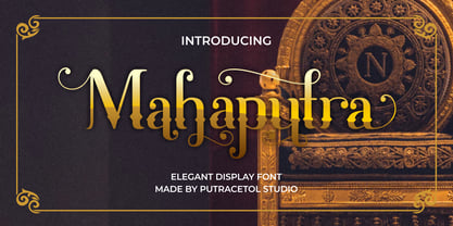 Mahaputra is a vintage display font that is classic, elegant, and unique. Mahaputra is great for any kind of display purpose from logos, t-shirt, apparel, quotes, product packaging, tittle headers, posters, merchandise, social media, labels, branding and greeting cards.
 - CA Prologue by Cape Arcona Type Foundry,
$19.00 Prologue was designed to look like a postmodern typewriter. With plain and simple upper cases and trickier lower cases. Three weights give a good variety for all kinds of designs and seem especially well made for headlines and short teasers.
 - Antartida Rounded Essential by Los Andes,
$18.00 Antartida Rounded Essential is a sans serif with rounded terminals. Its simple, kind of neutral feeling is functional, clean and minimal; its rounded terminals make it friendly and warm. It is a family of 4 fonts: 2 weights and their italics.
 - Kake by Eclectotype,
$30.00 Kake’s upper case letters are inspired by a hand-painted sign outside a temple in Ubud, Bali. The rest of the font is made to fit the style. The hand-made aesthetic is increased by the implementation of contextual alternates, which automatically swap glyphs to alternate forms to avoid the monotony of repeating letters. The amount of variations for each glyph is dependent on letter frequency in English; there are more a’s and e’s than q’s and j’s. Even with only two variations of some glyphs, the programming makes sure that no two matching glyphs are ever next to eachother, and for the most part they will rarely be even two letters apart. This all makes for type that looks like it isn't type. The glyphs bounce and subtly change weight with willful abandon. Some of the letters on that original sign are somewhat quirky. If you're not a fan you can engage stylistic alternates or stylistic sets to change the C, G, S, Y, c, s and y glyphs to a less idiosyncratic form. These variations still have variations themselves, so with contextual alternates on, they will look as random as all the rest. Case sensitive forms and automatic fractions are included, as are 98 ornaments, ranging from the useful to the (let’s just say) esoteric. These can be accessed from the glyph palette. I know you've probably never realized you need an anchor, a fuel pump, skull and crossbones and chess symbols in the same font before, but that doesn't mean you don't! Kake is full on display typography. It’s legible for small blocks of copy but don't go setting essays in it. Unless you really want to... in which case, go for it.
