10,000 search results
(0.052 seconds)
- Neutraface Condensed by House Industries,
$33.00 Richard J. Neutra became an icon of Modern architecture as an artistic visionary, social commentator and outspoken defender of the environment. He refined his unique approach to design, for which he coined the term biorealism, over half a century ago. Regarding humankind and its surroundings as two inseparable halves to a greater whole, Neutra created habitats with the welfare of man and nature as his utmost concern. His ideas of evolutionary growth and adaptability compelled House Industries to develop Neutraface Condensed, built upon the original typeface and driven by the enduring spirit of the revolutionary who inspired it. “I have tried to be a feeling observer of life in all its manifestations, not a cold rationalist.” House Industries adopted this precept of Neutra as the guiding principle when the foundry commissioned Christian Schwartz to draw Neutraface Condensed. Instead of being exactingly compressed, the new companion fonts were composed around a complementary structural framework in order to better reflect the sensibilities of their predecessor. The result is an individualistic design with a restrained exuberance that shuns stylistically ersatz imitation. This compact yet lively presence allows Neutraface Condensed to lend flexibility and economy to headlines without sacrificing the simplicity and charm of the original. Like all good subversives, House Industries hides in plain sight while amplifying the look, feel and style of the world’s most interesting brands, products and people. Based in Delaware, visually influencing the world.
 - Agathsya by Egha's Studio,
$1.00 A font inspired by Javanese script that has ethnic characters. And this font is also named after the name of my new child born 18 September 2020, whose name is Ganya Agathsya. This font is suitable for logos and some ethnic products. And can be tailored to a variety of needs. Thank you Tahta Ega
 - Relista by Jos Gandos,
$15.00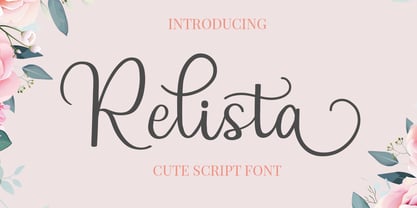 Relista is a beautiful handwritten font carefully created with a touch of elegance. This font is suitable for any projects such wedding cards, watermarks, quotes, social media, posters, invitations, and more. This font is PUA encoded so it will be accessible in the Adobe Illustrator, Adobe Photoshop, Adobe InDesign, even work on Microsoft Word.
 - Feogra by limitype,
$20.00 Feogra is a font inspired by the geometric shape of a robot designed in a modern style that makes this font look futuristic and unique, suitable for your modern design and requires a bold and prominent typeface. This font can also be applied to posters, magazines, etc. Feautures: All Caps Font Numbers Symbols Multilingual
 - Zodor JNL by Jeff Levine,
$29.00Zodor JNL is modeled from the packaging for injection-molded plastic letters used as a teaching toy for youngsters in the early 1960s. The hand-drawn alphabet on the sides of the package was quirky enough to merit being made into a digital font. - Munc by Stone Type Foundry,
$49.00 Munc is the uncial version of Magma. It has been designed with the same stroke weights and cap heights. Characters from the two families can be mixed. Uncial letterforms are ancient, but familiar. Their history remains somewhat mysterious.
 - Milano by ITC,
$29.99Milano is definitely in the upper echelon of display typography with its superb, engraved chromium style, italic lowercase and extravagant initials. The lowercase is designed to be closely set. From the talented hand of British designer David Quay. - Butterworth by AdultHumanMale,
$10.00 Butterworth was designed to reflect the dying, degraded and worn, hand painted signs I had seen around the old Butterworth ferry terminal in Penang Malaysia. I plan for Butterworth to be the first of many Malaysia inspired typefaces.
 - Butter - Unknown license

- Twelkmeyer by Popkern,
$18.00 The multilingual accidental typeface was inspired by the pathos of the late revolutionary asceticism and architectural projects of V.F. Twelkmeyer. All story on twelkmeyer.com This typeface is a spring swallow. This typeface is a dawn and optimism of alumnus of Higher Art and Technical Institute in Leningrad. This typeface is a mirror of the Soviet architecture 30’s. It reflects the impressions from Vesnin brothers and Ginzburg’s works, a curiosity to Bauhaus, and the first test of the waters of socialist reconstructions. This wide, dynamic, angular, drawing typeface will be perfect for serious branding and architectural projects. So, give it a try! From innovative ideas of the 30s to innovative projects of the XXI century.
 - Mantika Sans Paneuropean by Linotype,
$67.99With its well-defined characters that are readily legible even in the small font sizes, Mantika Sans by Jürgen Weltin is ideal for typesetting. The elaborately designed and highly individual set of italics enhances the attractiveness of the font.Jürgen Weltin developed the Mantika™ Sans sans serif font using older designs for an serif font as his inspiration. Nothing more than the merest suggestion of the original serifs has survived. Bevelled line endings and the slight variation in thickness of verticals, in particular, provide Mantika Sans with a very dynamic character that evokes manuscript. Short ascenders and descenders give the font a compact appearance that is also underscored by its condensed proportions. Weltin has achieved his aim of producing a typeface with excellent legibility even in small sizes not just by means of the x-height, which is tall in comparison with the capital letters, but also by using clearly defined and well differentiated designs for critical letters, such as i", "I" and "l". Lower case "i", for example, has a serif while the "l" has a curved base.In addition to uppercase numerals, Mantika Sans also has lowercase or old style numerals that have been designed so that they can be used in both tabular and proportional settings. The uppercase numerals are slightly shorter than the uppercase letters, ensuring that the latter can be sympathetically incorporated within continuous text.The Mantika Sans italics are very unusual. They are inclined at only 4.5° (the usual angle for italics is 10 - 12°) and so appear to be almost upright. In addition, they also have quite distinctive forms. The overall effect calls attention to their curvilinear, manuscript character, enhances contrasts and further emphasizes the terminals. Weltin explains: "Within the variety of forms of the italics there are many contrasting terminal elements that create dynamism. The result is a diversity of interaction between the rounded and angular forms". Mantika Sans Italic thus has all the features of a display typeface, but can also be happily used on its own to set longer text passages. Mantika Sans is available in two weights; Regular and Bold, both of which have corresponding italics sets. Mantika Sans has been designed so that the widths of the four related cuts are identical, meaning that a change of font within a single layout will have no effect on justification. In addition, the members of the Mantika Informal font family, designed by Jürgen Weltin in 2010, also have the same thickness. Other font families having weights with equal thickness can be found in the "Linotype Office Alliance series".The Mantika Sans character sets are paneuropean. There are characters for setting texts in Eastern European languages, Greek and Cyrillic. There is also a range of special symbols, including right-angled brackets, subscript and superscript lower case letters, together with numerals, arrows and many different bullet points.As a vibrant and highly legible text font, Mantika Sans has a broad spectrum of potential applications. Its unusual italics are not just perfect for use in display text. The fact that it has only four cuts means that Mantika Sans is particularly suitable for office use or for the setting of business reports. Its excellent legibility even in the small font sizes also makes it ideal as a text for electronic reading devices; this also applies to Mantika Informal.At the 3rd International Eastern Type Design Competition Granshan 2010, Mantika Sans was awarded in the category Greek text typefaces." - Mantika Sans by Linotype,
$50.99 With its well-defined characters that are readily legible even in the small font sizes, Mantika Sans by Jürgen Weltin is ideal for typesetting. The elaborately designed and highly individual set of italics enhances the attractiveness of the font.Jürgen Weltin developed the Mantika™ Sans sans serif font using older designs for an serif font as his inspiration. Nothing more than the merest suggestion of the original serifs has survived. Bevelled line endings and the slight variation in thickness of verticals, in particular, provide Mantika Sans with a very dynamic character that evokes manuscript. Short ascenders and descenders give the font a compact appearance that is also underscored by its condensed proportions. Weltin has achieved his aim of producing a typeface with excellent legibility even in small sizes not just by means of the x-height, which is tall in comparison with the capital letters, but also by using clearly defined and well differentiated designs for critical letters, such as i", "I" and "l". Lower case "i", for example, has a serif while the "l" has a curved base.In addition to uppercase numerals, Mantika Sans also has lowercase or old style numerals that have been designed so that they can be used in both tabular and proportional settings. The uppercase numerals are slightly shorter than the uppercase letters, ensuring that the latter can be sympathetically incorporated within continuous text.The Mantika Sans italics are very unusual. They are inclined at only 4.5° (the usual angle for italics is 10 - 12°) and so appear to be almost upright. In addition, they also have quite distinctive forms. The overall effect calls attention to their curvilinear, manuscript character, enhances contrasts and further emphasizes the terminals. Weltin explains: "Within the variety of forms of the italics there are many contrasting terminal elements that create dynamism. The result is a diversity of interaction between the rounded and angular forms". Mantika Sans Italic thus has all the features of a display typeface, but can also be happily used on its own to set longer text passages. Mantika Sans is available in two weights; Regular and Bold, both of which have corresponding italics sets. Mantika Sans has been designed so that the widths of the four related cuts are identical, meaning that a change of font within a single layout will have no effect on justification. In addition, the members of the Mantika Informal font family, designed by Jürgen Weltin in 2010, also have the same thickness. Other font families having weights with equal thickness can be found in the "Linotype Office Alliance series".The Mantika Sans character sets are paneuropean. There are characters for setting texts in Eastern European languages, Greek and Cyrillic. There is also a range of special symbols, including right-angled brackets, subscript and superscript lower case letters, together with numerals, arrows and many different bullet points.As a vibrant and highly legible text font, Mantika Sans has a broad spectrum of potential applications. Its unusual italics are not just perfect for use in display text. The fact that it has only four cuts means that Mantika Sans is particularly suitable for office use or for the setting of business reports. Its excellent legibility even in the small font sizes also makes it ideal as a text for electronic reading devices; this also applies to Mantika Informal.At the 3rd International Eastern Type Design Competition Granshan 2010, Mantika Sans was awarded in the category Greek text typefaces."
 - Love Story by Latinotype,
$29.00 Love story is a display hairline typeface for use in big sizes and short texts. It’s inspired by different kinds of love and specially designed for Valentine’s day. Its soft curves and sweet style give it a lovely personality. Designed by Luciano Vergara and his wife Guisela Mendoza who has been studying ornaments since 2007 and has done her best for each project. You can see in her dingbats specially Printa and Abel designed for generate patterns. Now she integrated her passion to the ornament in a clean set which includes dingbats, ornaments and patterns. Luciano Vergara has designed very strong fonts with a particular work in the lines study and close to the geometry since 2005, getting a structure style, you can see in his fonts specially Regia and Kahlo. Now he integrated his study of lines, in a hairline font delicate, continuous and beautiful. In this story both designers have been merged their worlds creating a gorgeous product. This is a romantic type story, a love story.
 - Conium by MKGD,
$13.00 I designed Conium to be a sister font to Nightshade. It was meant to have the appearance of the hemlock plant without being too derivative; it’s thin drooping stems conjure images of Hamlet’s mad Ophilia clutching sickly weeds while thinking them to be flowers. It also projects the appearance of an ice cold, wrought iron, cemetery gate. The sort that one might pass on a damp overcast day. A fitting compliment to an Edward Gorey illustration from top, right down to the frigid ground from which it sprang. Conium has a glyph count of 388 and supports the following languages Afrikaans, Albanian, Asu, Basque, Bemba, Bena, Bosnian, Catalan, Chiga, Colognian, Cornish, Croatian, Czech, Danish, Embu, English, Esperanto, Estonian, Faroese, Filipino, Finnish, French, Friulian, Galician, German, Gusii, Hungarian, Icelandic, Indonesian, Irish, Italian, Kabuverdianu, Kalaallisut, Kalenjin, Kamba, Kikuyu, Kinyarwanda, Latvian, Lithuanian, Low German, Lower Sorbian, Luo, Luxembourgish, Luyia, Machame, Makhuwa-Meetto, Makonde, Malagasy, Malay, Maltese, Manx, Meru, Morisyen, North Ndebele, Norwegian Bokmål, Norwegian Nynorsk, Nyankole, Oromo, Polish, Portuguese, Romanian, Romansh, Rombo, Rundi, Rwa, Samburu, Sango, Sangu, Scottish Gaelic, Sena, Shambala, Shona, Slovak, Slovenian, Soga, Somali, Spanish, Swahili, Swedish, Swiss German, Taita, Teso, Turkmen, Upper Sorbian, Vunjo, Walser, Zulu
 - San Jose by Graffiti Fonts,
$19.99 The San Jose type family provides an array of variants representing a simplified, bay area slant on traditional Chicano American street scripts. The styles in this set can be used in all caps for the most authentic appearance or in a more typographically traditional small caps format. This set also includes latin supplement support and a robust character set in six styles. 3 Stroke variants: Regular, Rough & Bold each have a leaned back, traditional slant variant.
 - Merry Brook by Letterhend,
$19.00 Merry Brook is a beautiful signature script based on manual hand writing. The stylistic alternate, ligatures and the tick and thin stroke kk make this font looks a real hand writing instead of typing a font. This type of font perfectly made to be applied especially in logo, and the other various formal forms such as invitations, labels, logos, magazines, books, greeting / wedding cards, packaging, fashion, make up, stationery, novels, labels or any type of advertising purpose.
 - Apres RE by Font Bureau,
$40.00 Apres is a clear and comfortable typeface from David Berlow, originally designed for the Palm Pre smart phone. This humanist geometric design projects a friendly and forthright familiarity, without being static or mechanical. This version of the family is part of the Reading Edge series of fonts specifically designed for small text onscreen, having been adjusted to provide more generous proportions and roomier spacing, and having been hinted in TrueType for optimal rendering in low resolution environments.
 - Pentagram by Fauzistudio,
$12.00 Pentagram is a typeable three-letter Pentagon monogram font. You can type Monogram a pentagram with a mapped border on the numbers 0-9. With the support of alternative contextual features It works automatically so all you can do is just type. If you liked this feel free to show your appreciation by giving this project a simple like, I will be making a font with a similar feature in the future. Hope you enjoy. Intuisi Creative
 - JP2 by Linotype,
$40.99JP2 has some special roots being inspired by the actual handwriting of Pope John Paul II. Franciszek Otto took this source material and transformed it into a high quality font. The result is a rough, but intelligent, design with letters that slightly bounce along the baseline to mimic typical writing. Their short x-height, long extenders, and unique capital letters make this a very beautiful and distinctive typeface. Try it out for greetings, invitations, or posters! - Ehrhardt MT by Monotype,
$29.99 The Ehrhardt name indicates that this typeface is derived from the roman and italic typefaces of stout Dutch character that the Ehrhardt foundry in Leipzig showed in a late-seventeenth-century specimen book. The designer is unknown, although some historians believe it was the Hungarian Nicholas Kis. Monotype recut the typeface for modern publishers in 1937 to 1938. Ehrhardt has a clean regularity and smooth finish that promote readability, as well as a slight degree of condensation, especially in the italic, that conserves space. Ehrhardt is a fine text face, especially for books.
 - Mansory by Larin Type Co,
$16.00 Mansory is a modern contrasting and elegant sans serif font, which is presented in an upright and oblique style and also has 4 weights, this gives more opportunities for your design project. Contrasting lines and balanced forms of these fonts will provide recognition and will be easy to read. The regular style is perfect for text, while the heavier ones are perfect for logos, headings or will highlight exactly what you need. Mansory has stylistic alternates and ligatures that are harmoniously combined with the font, with them you can make your project more individual. This font is easy to use and has OpenType features.
 - Farm Bluster by Zeenesia Studio,
$14.00 Farm Bluster is a sweet and friendly handwritten font. Its natural and unique style makes it incredibly fitting to a large pool of designs. perfect for large design project like Tshirt, Advertising, bags, quotes, food , poster, fashion, custom sticker, magazine, and many others. It completed with numbers and punctuation. Multilingual support, and came with PUA encoded.
 - Modal by Schriftlabor,
$42.00 Modal is a sans serif type family intended for corporate, editorial and web design. Each weight comes with around 800 glyphs and supports a large variety of features such as ligatures, small caps, figure sets, case sensitive glyphs and so on. With its two italics, Modal offers new possibilities for designers and creates an additional tool for distinct typography.
 - Doodleset by Luxfont,
$20.00 Get ready to meet an unusual family of fonts - Doodleset! Here, each typeface is like a hero with a unique story, creating an amazing assortment. From designing inspirational quotes to designing advertisements and events, every font will become a tool for your ideas. Features: - Free Demo font to check it works. - Sans serif & Serif - Calligraphy and Script - Multilingual - Kerning
 - Pansies by Melonaqua,
$11.00 Pansies is a playful, multilingual handwritten font. It can be used for various projects like handmade craft tags, product labels, brand identity, journaling, cards, and anything that meets the eye of the designer.
 - Borealis by Elemeno,
$25.00Borealis has an over-bitmapped, whimsical quality, but retains the strength and lines of the underlying design. It's ideal for designs in which a grunge font might be desired, but legibility is crucial. - Robson by TypeUnion,
$20.00 Robson is a fluid, condensed, uppercase font made up of eight weights, as well as a variable, that will provide instant visual impact to your projects. The font is made up of 486 glyphs which features extensive language support & stylistic alternates to give your designs the versatility they require. The font has a retro edge to it by using rounded structures on the A, M, N, W and Y glyphs that are reminiscent of posters and promos from the 70s and 80s. The ultra tight thin weight is made to be used at super sizes to bring a focal point to your designs. Robson is meant to be seen big (well, he's a bit of a show-off) Robson is perfect for your digital, print or branding projects. Or, for a poster on your fridge that says "You rock".
 - Compasse by Dharma Type,
$24.99 Compasse is a semi-condensed sans-serif family designed by Ryoichi Tsunekawa and the whole family consists of 12 style: six weights from Thin to ExtraBold and their matching Italics. The range of styles provides flexibility for title, headline and body text. And the large x-heights increases legibility and readability. The basic skeleton of their letterform was not designed over-modularly but moderately semi-modularly (adjusted by designer's experience). Therefore the typical artificiality and unnaturalness which come from module-design does not exist in this family. The sophisticated letterform and its universal, neutral, and standard design make it possible to be used across a wide range of applications in all medias, all purposes. Compasse supports almost all european languages: Western, Central, South Eastern Europeans and afrikaans. And superior figures, inferior figures, denominators, numerators and fraction can be accessed by using OpenType features.
 - HS Almohandis by Hiba Studio,
$59.00 HS Almohandis is an Arabic display typeface. It is useful for book titles and graphic projects where a contemporary, streamlined look is desired. The font is based on the simple lines of modern and simplified Kufi calligraphy, that support Arabic, Persian and Urdu. This font was created in the beginning as regular weight with the font HS Alhandasi in 2007 for use in technical and engineering company. The company tends to follow the geometrical shape with equal dimensions in both vertical and horizontal storks. There is also a tendency to make all characters to be similar to oval shape with the impression that they are all geometrical and clear. I followed that with Bold weight in 2011. The difference between this font and HS Almohandis is that its characters have a sharp baseline.
 - Orion MD by Alphabet Soup,
$45.00 A font where "each word that's set approaches becoming its own logo" is how some have described this unique typeface. Originally inspired by an enamel sign he picked up at a Paris flea market, Michael Doret says that the seven letters contained in the sign were enough to suggest to him that here were letterforms put together in a way that he had never seen in a contemporary digital font. Always eager to create something a little out of the ordinary, he took up the challenge to flesh out the forms into a complete font. Orion can be defined as a geometric, connecting script that is at once contemporary, yet classic and timeless.
 - Chalk Hand Lettering by Fontscafe,
$39.00 If you are into the vintage feel, you will love this one. This is as vintage as it probably gets. There are probably only a handful of places in the world where schools still use blackboards and chalk – they’ve given way to their white board and marker counterparts for decades now. White boards are definitely more practical and less messy when compared to chalk, but then if you are creatively inclined you will agree that a little bit of mess is worth it if you are going to get the effects that you desired! Well, we can give you the effects minus the mess with our chalk hand lettering fonts! As the name suggests, this font gives you that distinctly unique chalk on slate feel, and if you are wondering what’s distinct about it; writing on slate or blackboard was a slow process which required deliberated and concentrated efforts resulting in a handwriting which was usually quite different to a person’s handwriting on paper. Typography of chalk on slate was an everyday event in the classrooms of yesterday, and today we hardly ever get to see one of these if it all. Writing on a black board with chalk was quite an interesting achievement in its own right, if you ended up with anything legible and if your writing remained focused and ‘in-line’! But of course like everything else, his took time to master and when you did get it right, chalk hand lettering was quite an enjoyable experience! For semi-permanent designs, say for example an eventful day at school; students of the day would create beautiful typography on the boards, and add a solidarity to it sometimes by shading one side of the lettering – usual y the right side towards which the lettering leaned. This is the effect our chalk hands lettering shaded variation gives you. You could get this font individually, but we strongly advise you check out the “chalk hand lettering pack” font. It includes the simple “chalk hand lettering” (minus the shading effect) and also a “chalk hand elements” bag of tricks. The elements is a collection of graphic art which resemble shapes and designs that used to be added to chalk art, to beautify the typography. If you enjoyed seeing the effects of our Chalk Hands font, and the shaded variant – you are simply going to go gaga over Chalk Hand Elements! The chalk hand font of course enables you to make typographic art similar to the effect of chalks on slates and black boards. This was quite the art form in the days gone by! The shaded variation added a bit of solidarity and the technique was commonly used to make semi-permanent designs say for example a welcome note when somebody important was to visit. Classic chalk hand designs, especially the semi permanent ones often had little pieces of art to help beautify the creation as a whole. It could simply be symmetrical graphics appearing before and after the title and headings, maybe just an interesting shape to fill in an empty area on the board, and such…our Chalk Hand Elements offers you a ton of such graphics. The two chalk hand variations and the elements are all included in the Chalk Hand Family, and this is strongly recommended if you want to make designs that are truly reminiscent of the days of chalk on slate.
 - Siruca by FSD,
$60.27Siruca is a font created specifically for the Al Hamra Complex, in Kuwait City, which includes the extraordinary Al Hamra Tower, one of the tallest skyscrapers in the world. Siruca is a stencil font designed to be used both by the classical forms, both for possible use with neon tubes. Indeed, the rounded ends and the total absence of sharp corners to prevent abrasion during the use of masks and, simultaneously, provide a realistic neon circuit designer. The typeface is accompanied by a series of pictograms (designed following the same guidelines described above) to be used on signs inside the building. The originality and versatility of the font Siruca™ makes it particularly suitable for the characterization of tainted brands from the strong recognizable. - Elicit Script by Monotype,
$40.99 Elicit Script is a hybrid script family, that can be as casual or formal as the occasion demands. Created by Laura Worthington and Jim Wasco, the design is based on pointed pen Spencerian Script handwriting. “It’s like one of those German italics from the early 20th century, that have beautiful shapes that hold their own,” says Wasco. Elicit Script spans five weights, from Extra Light to Bold, and three styles – Formal, Normal and Casual. This makes it an incredibly versatile script design, easily paired with other typefaces and able to be dressed up or down, depending on what it’s used for. The monoline Casual style offers a more relaxed tone of voice, while Formal sits at the more decorative end of the spectrum. Designers can keep things straightforward, tidy and practical with the typeface’s simple caps, or add in swash caps if they need more exuberance and expression. Generous spacing means Elicit Script works well at smaller sizes as well. Elicit Script Variable Set is a single font file that features two axes: Weight and Contrast. The Weight axis has instances from Extra Light to Bold. The Contrast axis has instances from Casual (low contrast) to Formal (high contrast).
 - PMN Caecilia eText by Monotype,
$29.99PMN Caecilia™ is the premiere work of the Dutch designer Peter Matthias Noordzij. He made the first sketches for this slab serif design in 1983 during his third year of study in The Hague, and the full font family was released by Linotype in 1990. The PMN prefix represents the designer's initials, and Caecilia is his wife's name. This font has subtle variations of stroke thickness, a tall x-height, open counters, and vivacious true italics. Noordzij combined classical ductus with his own contemporary expression to create a friendly and versatile slab serif family. With numerous weights from light to heavy, and styles including small caps, Old style figures, and Central European characters, PMN Caecilia has all the elements necessary for rich typographic expression. eText fonts - the optimum of on-screen text quality With our new eText fonts that have been optimised for on-screen use, you can ensure that your texts remain readily legible when displayed on smartphones, tablets or e-readers. The poor resolution of many digital display systems represents a major challenge when it comes to presenting text. It is necessary to make considerable compromises, particularly in the case of text in smaller point sizes, in order to adapt characters designed in detail using vector graphics to the relatively crude pixel grid. So-called 'font hinting' can help with this process. This, for example, provides the system with information on which lines are to be displayed in a particular thickness, i.e. using a specific number of pixels. As font hinting is a largely manual and thus very complex technique, many typefaces come with only the most necessary information. What is unimportant for a text printed in high resolution can result in a poor quality image when the same text is displayed on a screen, so that reading it rapidly becomes a demanding activity. Specially optimised eText fonts can help overcome this problem. An extremely refined and elaborate font hinting system makes sure that these fonts are optimally displayed on screens. Monotype has not only adopted font hinting for this purpose but has also thoroughly reworked the fonts to hone them for display in low resolution environments. For example, the open counters present in the letters C, c, e, S, s, g etc. have been slightly expanded so that these retain their character even in small point sizes. Also with a view to enhancing appearance in smaller point sizes, line thickness has been discreetly increased and x-height carefully adjusted. Kerning has also been modified. Don't leave the on-screen appearance of your creations to chance. Play it safe and use eText fonts to achieve perfect results on modern display devices. Many typefaces, including many popular classics, are already available as eText fonts and new ones are continually being published. The eText font you can purchase here are available for use as Desktop Fonts or Web Fonts. Should they be used in Mobile Devices such as smartphones, tablets or eReaders, please contact our OEM specialists at sales-eu@monotype.com. - Beliber by Ridtype,
$15.00 Beliber is a Serif Font Family, this font is specially designed to get the best feel and high quality to get the touch of a high end product This font supports Opentype Features, such as Alternate and Ligatures, as well as other forms of support symbols, numeric, mathematical symbols and others characters to be used. Thank you for your support of our product and using it in your project.
 - Speedometer by Dharma Type,
$19.99 Speedometer is derived from Dimensions font family that is most narrow and black font for titling and logo. This Speedometer is more elegant by its contrast between the thickness of stem and thinness of the arms than Dimensions. This contrast makes more vigorous and speedy impressions too. All 6 weights and italics have upper and lower cases, accented characters and small capital glyphs that can be used with OpenType smcp feature.
 - Rosengarten by Typogama,
$19.00 Rosengarten is a condensed, bold typeface inspired by the work of Lucien Bernhard and the Plakatstil mouvement. With bold, rounded serifs, this typeface was created for use in headlines and larger point sizes. A complimentary sans serif style was integrated as a secondary weight with accompanying italics to allow a combination of styles to be set in layouts. This typeface includes an extended Latin and Cyrillic language support.
 - Ramdone by Letterhend,
$17.00 Ramdone is a retro bold script which will bring you back to 60s feel. This typeface has the extrude version so you can create your retro effect font in ease. This font perfectly made to be applied especially in logo, and the other various formal forms such as invitations, labels, logos, magazines, books, greeting / wedding cards, packaging, fashion, make up, stationery, novels, labels or any type of advertising purpose.
 - Querida by Autographis,
$39.50 Querida is an elaborate, elegant, constructed script with intertwining swashes and a timeless appearance. It will serve you well for all kind of high class package design challenges.
 - Window Sign JNL by Jeff Levine,
$29.00 Window Sign JNL is a solidified re-working of Sign Stencil JNL; originally modeled from some vintage lettering stencils that were part of a store sign making kit.
