10,000 search results
(0.025 seconds)
- Hooper dooper - Unknown license

- Cisalpin by Linotype,
$29.99 The ideal typeface for cartography The Swiss designer/typographer Felix Arnold designed Cisalpin during the late 1990s, after he had challenged himself to create a contemporary typeface that could be used for cartographic uses. Arnold came to the subject of cartographic typefaces after analyzing many maps and atlases, and discovering that there was no standard typeface for these types of documents. Like any good cartographic type, Cisalpin is very legible at small sizes. While he was drawing this typeface on his computer, Arnold used a reduction glass to refine his design, making it work in these situations. Cisalpin is a linear sans serif face, with slight resemblance to renaissance serif types. The various weights are all clearly differentiated from one another. And because space is often a premium on maps, Cisalpin runs narrow. Words close in around themselves to help them become more identifiable. The letterforms in Cisalpin are durable, and can maintain their readability when placed over complex backgrounds. They have open interior forms, flattened curves, tall x-heights, and a capital height that almost reaches the tops of the ascenders. Cisalpin also has pronounced Italics, with a very clear angle of inclination. Each letterform in the family has been optimized so that they cannot be easily mistaken for another. This again helps minimize the misunderstandings that often occur because of illegibility. Although Cisalpin was developed for use in cartography, it may be used for countless other purposes; any font that can work well in small sizes on a map could be used almost anywhere else!
 - Bardamu by Groteskly Yours,
$25.00 Bardamu is a variable slab serif font family designed by Eugene Tantsurin and Anna Remm, and released by Groteskly Yours Studio. Bardamu is a type family that is open to interpretation and experimentation, yet this ambiguity does little to hide its inherent friendliness and good vides. Bardamu can easily be used in a variety of projects and feel at home both in graphic design, branding, web design or editorial design. Thanks to its unique letterforms and eye-catching design choices, it can be that final touch that makes your brand pop! One of the standout qualities of Bardamu is its remarkable versatility. Bardamu comes in 25 styles, allowing users to choose a style that best fits their needs. In addition to that, it offers a wide range of styles, from sleek backward-slanted italics at -20° to elegant upright styles, as well as regular 20° italics. For static fonts, there are two extra subfamilies available (10° Half Italic and 10° Half Reverse) that can be used for creating more complex hierarchy in any text. With a total of 25 static fonts and 1 Variable font, Bardamu is the perfect workhorse display slab serif with unlimited typesetting capabilities. Each font in the Bardamu family boasts an extensive 700+ character set, encompassing all major Latin-based languages, punctuation marks, symbols, and even supplementary characters. Bardamu takes flexibility to a whole new level with its incredible OpenType features that further enhance its versatility. With features such as Case-Sensitive Punctuation, Stylistic Alternates, Sub- and Superscript, Tabular Figures, and Localised Forms, you can fine-tune every detail of your design to perfection. Moreover, the multiple stylistic sets available in Bardamu allow you to switch between various versions of the same glyph effortlessly. Bardamu type family includes 25 static styles as well as a variable font. All styles can be purchased separately or as a full family package. Two styles can be downloaded free of charge. If you'd like to explore Bardamu further, we also offer free trials upon request.
 - Romance Fatal Sans - Personal use only

- Spinwash by Hanoded,
$15.00 It is amazing how much laundry I have with 3 small kids! Sometimes it feels like I spend half the week sticking laundry in the machine, or hanging it out to dry. Spinwash is a nice brush font. It smells like ‘summer breeze’, is 100% environment friendly and will take the stains out of your designs.
 - Neo Sans Cyrillic by Monotype,
$103.99The branding agency's client wanted an ultra modern"" typeface that was ""futuristic without being gimmicky or ephemeral,"" according to the design brief. Designer Sebastian Lester took on this intriguing custom font assignment, but soon, a bureaucratic decision cancelled the project. ""I was left with a sketchbook full of ideas and thought it would be a shame not to see what came of them,"" says Lester. He decided to finish the design on his own. Lester's research confirmed that the principal ingredient of an ""ultra modern"" typeface was simplicity of character structure: a carefully drawn, monoline form, open letter shapes and smooth, strong curves. To conceive a typeface that crossed the line from modern to futuristic, Lester decided to amplify these qualities. About a year after Lester's initial conceptual work, two highly functional and versatile typefaces emerged. These are Neo Sans and Neo Tech, designs Lester describes as ""legible without being neutral, nuanced without being fussy, and expressive without being distracting."" Both the Neo Sans and the more-minimalist Neo Tech families are available in six weights, ranging from Light to Ultra. Each has a companion italic, and Neo Tech offers a suite of alternate characters. While engineered to look modern as tomorrow, Neo Sans and Neo Tech display the functional and aesthetic excellence that earns them a place in the list of classic designs from the Monotype typeface library. - Neo Sans Paneuropean by Monotype,
$114.99The branding agency's client wanted an ultra modern"" typeface that was ""futuristic without being gimmicky or ephemeral,"" according to the design brief. Designer Sebastian Lester took on this intriguing custom font assignment, but soon, a bureaucratic decision cancelled the project. ""I was left with a sketchbook full of ideas and thought it would be a shame not to see what came of them,"" says Lester. He decided to finish the design on his own. Lester's research confirmed that the principal ingredient of an ""ultra modern"" typeface was simplicity of character structure: a carefully drawn, monoline form, open letter shapes and smooth, strong curves. To conceive a typeface that crossed the line from modern to futuristic, Lester decided to amplify these qualities. About a year after Lester's initial conceptual work, two highly functional and versatile typefaces emerged. These are Neo Sans and Neo Tech, designs Lester describes as ""legible without being neutral, nuanced without being fussy, and expressive without being distracting."" Both the Neo Sans and the more-minimalist Neo Tech families are available in six weights, ranging from Light to Ultra. Each has a companion italic, and Neo Tech offers a suite of alternate characters. While engineered to look modern as tomorrow, Neo Sans and Neo Tech display the functional and aesthetic excellence that earns them a place in the list of classic designs from the Monotype typeface library. - Mandalay - Unknown license

- Kaktis by Ingrimayne Type,
$5.00 The Kaktis collection features eleven typefaces that have spikes or spines. Some have short spikes, some long, some sparse spines and others abundant spikes. They are novelty fonts with limited uses, but there can be times when a typeface of this sort may be appropriate, perhaps for a sharp rebuke or a pointed reminder. These faces were constructed in the mid 1990s using a font distortion program.
 - Condell Bio by Letritas,
$9.00 Condell Bio is part of the bigger Condell family: a project that involves series of typographies and whose early conception and development began in 2006. Unlike its Poster version , with its excessive and eccentric forms, Condell Bio tries to adapt itself to a monolinear shape, but conserving at the same time the organic character of its forms and endings. In this way Condell Bio is able to expanse its typographical use fields to a vaster scale. Condell’s endings and organic strokes haven’t been conceived in a structural way but stylistically. This means that Condell’s high readability doesn’t change and its original personality and idiosyncrasy as well. Condell can be said the ideal typography for connoting the corporation and brand identity, because of its high readability; especially its “eatable” forms, who collects images of food, are easily adaptable to food industry. Condell is highly recommended for the following products groups: cleansers, dish soaps, toothpastes, all sorts of personal hygiene products (shampoos, soaps,..), industrial cleanser products and also for products which refer to its softness, volatility and smoothness. Condell’s soft forms and nice endings, inspired through spontaneous brush strokes, give to the typography a very peculiar pleasant connotation. Its Italic (10 degrees inclination) has been produced singularly and not automatically calculated by the software. Condell Bio is composed of 16 fonts: from thin to black, whose weights are in regular and italic. Each singular weight has 600 characters and is composed of 206 languages.
 - Magiona Display by Dora Typefoundry,
$20.00 Magiona Display - A modern classic serif font, perfect for creating bold & beautiful designs. Magiona Display is classic and sophisticated typography with 2 weights to captivate your next project. A very versatile font that works in both large and small sizes. This font is suitable for a wide variety of projects such as: headlines, logos, labels, branding projects, magazines, homeware designs, product packaging, mugs, quotes, posters, and more. It can also be more expressive and fun, thanks to the many alternatives and binders that combine harmoniously in this font and make it more interesting and versatile. Try to change alternatives, binders and you will get many options for your project which will make it bold & beautiful. Features: • Full set of uppercase, lowercase letters • 55 Ligatures • 245 Alternates • Big range of numbers, symbols & punctuation • Characters with accents • Supports Multiple Languages • PUA Encoded WHAT’S INCLUDED: • Magiona Display – Regular • Magiona Display – Outline This type of family has become a work of true love, making it as easy and enjoyable as possible. I really hope you enjoy it! I can't wait to see what you do with Magiona Display! Feel free to use the #Dora Typefoundry tag and # Magiona Display font to show what you've done visit my Instagram : https://www.instagram.com/doratypefoundry/ Thank You!
 - IMPuzzled by Ingrimayne Type,
$9.00 IMPuzzled uses the OpenType feature of Contextual Alternatives to alternate two sets of characters. The sets are on two puzzle pieces that tessellate, that is, fit together to fill the plane with no gaps or overlaps. Empty pieces are on the brace keys and can be used to fill spaces. The black or solid style is designed to be used in a layer under the regular style, though it can be used alone if adjacent pieces are given different colors. This unusual font has limited uses but may be appropriate when the topic is related to the broad areas of puzzles, puzzled, and fitting pieces together.
 - Rezak by TypeTogether,
$36.00 Nothing is hidden in the simplistic forms and overt aesthetic of Anya Danilova’s Rezak font family. Rezak is not a type family directly from the digital world, but was inspired by the stout presence of cutting letters out of tangible material: paper, stone, and wood. With only a few cuts, the shapes remain dark and simple. With more cuts, the shapes become lighter and more defined, resulting in a dynamic type family not stuck within one specific category. The Black and medium weights began as one approach before separating into display and text categories. The four text weights were created through pendulum swings in design direction that experimented with contrast, angles, tangent redirections, and the amount of anomalies allowed. The text weights are vocal when set larger than ten points and subtle at smaller sizes. The tech-heavy Incised display style came last, employing a surprising range of trigonometric functions to make it behave exactly as desired. Its look can result in something distinctive and emotional or completely over-the-top. Most normal typefaces change only in thickness; Rezak changes in intention, highlighting the relationship between dark and light, presence and absence, what’s removed and what remains. Rezak’s Black and Incised display styles are like a shaft of light in reverse and are perfect in situations of impact: websites, headlines and large text, gaming, call-outs, posters, and packaging. The tone works for something from youthful or craft-oriented to organic and natural products. Try these two in logotypes, complex print layering, branding, and words-as-pattern for greater experimentation. The text styles are bold, energetic, well informed, and round out the family with four weights (Regular, Semibold, Bold, Extrabold) and matching italics for a family grand total of ten. These jaunty styles work well in children’s books, call-outs, movie titles, and subheads for myriad subjects such as architecture, coffee, nature, cooking, and other rough-and-tumble purposes. Rezak’s crunchy letters are meant to expose rough, daring, or dramatic text. A further benefit is that this family is not sequestered within one specific genre or script, so it can be easily interpreted for other scripts, such as its current Latin and extended Cyrillic which supports such neglected languages as Abkhaz, Itelmen, and Koryak. Rezak’s push toward creativity and innovation, with an eye on typography’s rich history, reinforces our foundry’s mission to publish invigorating forms at the highest function and widest applicability.
 - Flink Neue by Identity Letters,
$45.00 Geometric typefaces are a staple in every typographer’s toolbox since the 1920s. It was a time when iconic faces such as Futura, Erbar, and Kabel appeared on the scene and turned the world of type upside-down. Inspired by those early giants as well as later epigones with a legacy of their own (such as 1970’s Avant Garde Gothic), Flink Neue is the Identity Letters take on this genre, characterized by a clean and focused appearance. With neat shapes and the look of pure geometry, Flink Neue adapts to a vast range of applications and topics, from the fine print in contract to website body copy to logo design to billboard-size slogans. Its x-height is considerably larger than in classic geometric sans-serif fonts; its proportions are harmonized as opposed to strictly constructed. This makes for a more contemporary look, setting it apart from the classics. With three different widths, Flink is a true all-rounder. Geometric fonts are usually quite wide, which often leads to text-settings problems with headlines or small print. The Condensed and Compressed variants of Flink Neue solve this problem easily. This font family comes along in 18 weights from Thin to Black with matching Italics. There are almost 1400 characters per style, including nine stylistic sets that offer variations to the look and feel of Flink Neue, making it even more versatile. Besides the default mood of Flink Neue, there is also a Text and Bauhaus variant, where different letters have been changed to create a new mood. In theory, you just need one single font file to change between all three moods, but to make it easier for you, we also exported each mood within a separate file. Plenty of additional Open Type Features like ligatures, small caps, case sensitive forms, old-style figures, tabular figures and symbols make Flink Neue a valuable tool for the discerning typographer. Flink Neue is the reimagination of a classic genre, designed to suit the needs of our time.
 - TT Alientz by TypeTrends,
$22.00 Useful links: Using the variable font TT Alientz in InDesign About TT Alientz: TT Alientz is a variable* typeface that allows the user to make a visual journey from a laconic extraterrestrial grotesque to a very prickly display serif. As part of this project, we decided to investigate the influence of a foreign substance and the consequent transformation of the original forms, which ultimately leads to extreme visual changes. The TT Alientz family consists of 3 fonts: grotesque, serif and variable* font. Each font contains more than 470 glyphs. In addition to broad language support (including Cyrillic), the typeface has stylish ligatures, contextual alternates, and old-style figures. Variability in the typeface affects the changes in the overall style of the font—moving the slider to adjust the variable axis, you can go from a laconic grotesque to an extreme serif. TT Alientz Grotesque is a fairly neat hipster grotesque, but with its own small features. In the design of some letters of the grotesque you can find small sharp elements that add uniqueness and character to the font when used in large inscriptions and headings. At the same time, when you use the font in a small size of the size and in text blocks, sharp elements do not greatly affect its readability. The design of some letters of the grotesque is quite peculiar and is intended to emphasize the initial concept of slight 'alienness'. TT Alientz Serif is an 'infected' TT Alientz Grotesque and the result of changes to it. Unlike the grotesque, the serif is dynamic, viscous, ductile and very prickly. Serif has a lot of smooth lines and not quite standard strokes contrast. It can be noted that most serifs in the antiqua are pointed inward, not outward. Despite its extremeness, the serif will look good both in large and in small body sizes. *An important clarification regarding variable fonts. At the moment, not all graphic editors, programs and browsers support variable fonts. You can check the status of support for the variability of your software here: v-fonts.com/support/ FOLLOW US: Instagram | Facebook | Website TT Alientz supports more than 160+ languages, such as: Acehnese, Afar, Albanian, Alsatian, Aragonese, Arumanian, Asu, Aymara, Banjar, Basque, Belarusian (cyr), Bemba, Bena, Betawi, Bislama, Boholano, Bosnian (cyr), Bosnian (lat), Breton, Bulgarian (cyr), Cebuano, Chamorro, Chiga, Colognian, Cornish, Corsican, Cree, Croatian, Czech, Danish, Embu, English, Erzya, Estonian, Faroese, Fijian, Filipino, Finnish, French, Friulian, Gaelic, Gagauz (lat), Galician, German, Gusii, Haitian Creole, Hawaiian, Hiri Motu, Hungarian, Icelandic, Ilocano, Indonesian, Innu-aimun, Interlingua, Irish, Italian, Javanese, Judaeo-Spanish, Judaeo-Spanish, Kabuverdianu, Kalenjin, Karachay-Balkar (lat), Karaim (lat), Karakalpak (lat), Kashubian, Khasi, Khvarshi, Kinyarwanda, Kirundi, Kongo, Kumyk, Kurdish (lat), Ladin, Latvian, Laz, Leonese, Lithuanian, Luganda, Luo, Luxembourgish, Luyia, Macedonian, Machame, Makhuwa-Meetto, Makonde, Malagasy, Malay, Manx, Maori, Marshallese, Mauritian Creole, Minangkabau, Moldavian (lat), Montenegrin (cyr), Montenegrin (lat), Mordvin-moksha, Morisyen, Nahuatl, Nauruan, Ndebele, Nias, Nogai, Norwegian, Nyankole, Occitan, Oromo, Palauan, Polish, Portuguese, Quechua, Rheto-Romance, Rohingya, Romanian, Romansh, Rombo, Rundi, Russian, Rusyn, Rwa, Salar, Samburu, Samoan, Sango, Sangu, Scots, Sena, Serbian (cyr), Serbian (lat), Seychellois Creole, Shambala, Shona, Slovak, Slovenian, Soga, Somali, Sorbian, Sotho, Spanish, Sundanese, Swahili, Swazi, Swedish, Swiss German, Swiss German, Tagalog, Tahitian, Taita, Tatar, Tetum, Tok Pisin, Tongan, Tsonga, Tswana, Turkish, Turkmen (lat), Ukrainian, Uyghur, Vepsian, Volapük, Võro, Vunjo, Walloon, Xhosa, Zaza, Zulu.
 - New Moon by Melissa Lapadula,
$14.95This font has been derived from different transformations of the moon transcending into different moods which affect the world. A full moon can cause human beings to be aggressive. While a new moon is a good time for new beginnings. This font can function as headings and subheadings. - MotionBats by Victor Garcia,
$28.00 MotionBats are a sort of movable type otherwise. It is a symbol font type family integrated by 9 styles. The idea behind designs is to give to typographic pictograms –static for definition– the dimension of motion. In pursue of this spirit, each font shows a complete motion sequence. MotionBats are inspired on the photographic work of Eadweard J. Muybridge [1830-1904] –a talented multi-faceted Englishman– who worked in USA by the second half of the 19th century. In those early times of photography, he started –almost by chance– taking a comprehensive and impressive photographic sequential series of human and animal locomotion. This way, he placed himself more than a decade ahead from the beginning of cinematography. This type design family points to pay a humble and certainly incomplete homage to such a pioneering and amazing Muybridge's work.
 - Orto by LetterPalette,
$20.00 Orto is a type family of sans serif fonts in eight weights. It's a humanist typeface with real cursive, containing both Roman and Italic styles. The letters are designed to look good on screen, they have a bit narrower proportions and simple shapes. Their structure is based on flat horizontal and vertical strokes, which are emphasized wherever possible. That’s where the name comes from: Orto is an abbreviation of the word orthogonal. Thanks to its narrow width, the typeface is less space-consuming and adapts well to the screens of smaller devices. It is legible in small sizes, thanks to the larger x-height. The characteristic details, like bent ends of diagonal strokes, stand out when used in larger sizes. Orto can be used equally good in print and its overall neutral look fits different contexts. However, its character is pretty recognizable. Orto contains Latin and Cyrillic script and covers six codepages: Latin 1, Latin 2, Cyrillic, Turkish, Windows Baltic and MacOS Roman. It has basic OpenType features like ligatures, oldstyle numerals, proportional and tabular lining figures, fractions, superiors, etc. Capital German sharp S shows up when the lowercase is typed between two uppercase letters, and the Contextual Alternates feature is turned on. The Stylistic Set 01 changes the shape of the Cyrillic b. The Stylistic Set 02 is a shortcut for using Serban Cyrillic alternatives that differ from Russian in cursive.
 - TessieOddsNends by Ingrimayne Type,
$9.00 A tessellation is a shape that can be used to completely fill the plane—simple examples are isosceles triangles, squares, and hexagons. Tessellation patterns are eye-catching and visually appealing, which is the reason that they have long been popular in a variety of decorative situations. These Tessie fonts have two family members, a solid style that must have different colors when used and an outline style. They can be used separately or they can be used in layers with the outline style on top of the solid style. For rows to align properly, leading must be the same as point size. To see how patterns can be constructed, see the “Samples” file here. TessieOddsNEnds contains shapes that did not fit into the other Tessie fonts: TessieStandingBirds, TessieFlyingBirds, TessieMoreBirds, TessieXtraBirds, TessieSpinners, TessiePuzzlePieces, TessieAnimals, TessieBugs, TessieMiscellaneous, and TessieMoreStuff. (Earlier tessellation fonts from IngrimayneType, the TessieDingies fonts, lack a black or filled version so cannot do colored patterns. The addition of a solid style that must be colored makes these new fonts a bit more difficult to use but offers far greater possibilities in getting visually interesting results.)
 - Risans Basic by Richard Ham Lettertype Ontwikkeling,
$24.99Font with more than 400 glyphs. This font can be used for the most comman languages and can als used for the basic calculus. Some glyphs for the fractions (and special rootfunction) there are used special characters (which be can used with the key code f0000 till f00014 (and Alt + X)) - TessieStandingBirds by Ingrimayne Type,
$13.95 A tessellation is a shape that can be used to completely fill the plane—simple examples are isosceles triangles, squares, and hexagons. Tessellation patterns are eye-catching and visually appealing, which is the reason that they have long been popular in a variety of decorative situations. These Tessie fonts have two family members, a solid style that must have different colors when used and an outline style. They can be used separately or they can be used in layers with the outline style on top of the solid style. For rows to align properly, leading must be the same as point size. Shapes that tessellate and also resemble real-world objects are often called Escher-like tessellations. This typeface contains Escher-like tessellations of birds. A number of years ago I decided to see how many of the 28 Heesch types of tessellations I could use to make birds standing on the backs of other birds. I found standing bird patterns for all 17 of the types that had either translated or glided edges. The TessieStandingBirds typefaces contain the standing-bird shapes that I discovered. At first glance they seem to be quite similar, but small differences matter in how they fit together. Most of the patterns require more than one character. The sample file here shows how pieces fit together to give tessellating patterns. (Earlier tessellation fonts from IngrimayneType, the TessieDingies fonts, lack a black or filled version so cannot do colored patterns.)
 - Singolare by Latinotype,
$29.00 Singolare is a contemporary geometric Sans Serif with angular terminals and a great x height. Its main feature is the style difference between the lighter and heavier weights. The more weight it gains, the higher its singularity. With its weights, styles and layers variety, it's perfect for display use and short texts that require a visual impact. Singolare is composed by five weights, from Ultralight to Black. Every weight has its own stencil variation with expressive cuts and four decorative versions: three outline and one inline version, that can work on it’s own or overlapped to the black normal version (changing the colors of each layer) in order to amplify its usage possibilities.
 - Banthani by Nurf Designs,
$25.00 Banthani is a dynamic bold script font. Inspired by its predecessor Raphtalia, it comes with a bold script style and is equipped with Opentype Features (Stylistic Alternate, Contextual Alternate, Ligature, etc.). You can get a different character in almost every glyph, you can choose it according to your design needs. We designed some characters to change “DYNAMICALLY” when they meet other characters, in order to create readability and harmony in each appearance. Banthani is very suitable for the needs of Logotype, Branding, Header and designs that require distinctive features. Works on PC & Mac Simple installations Accessible in the Adobe Illustrator, Adobe Photoshop, Adobe InDesign, even work on Microsoft Word. PUA Encoded Characters – Fully accessible without additional design software.
 - PiS Hansch by PiS,
$28.00 PiS Hansch has its origin on a small graveyard in Salzburg, Austria. The hand-carved epigraph on a weathered tombstone inspired PiS to create this slightly twisted serif monster. It contains OpenType Features including contextual alternates (you get three different versions of 's', two different versions of 't' and much more), some ligatures and a very special Long S substitution feature that throws you over a hundred years back in time by changing your everyday small "s" into the classic "long s". Use PiS Hansch for your new Metalcore band logo, a zombie flick poster or some hack'n slay computer game titles. works both in display size and for texts in smaller sizes.
 - Grim N Gritty by Comicraft,
$49.00 Thought Balloons. No use for them any more. You can't be taken seriously when your thoughts are floating above your head in cute, puffy clouds. Doesn't look good. When the streets are extended gutters and the gutters are full of blood, a thought bubble just isn't noir enough, is it? It's gotta be GRIM. It's gotta be GRITTY. Let's face it... It's gotta be GRIM'N'GRITTY. In Italic and Bold Italic. Also Regular and Bold. But I've little use for them either. Talk is cheap.
 - Wakame by Stabenfonts,
$30.00 Wakame is a friendly, playful, all uppercase font for book cover, display, packaging, poster, or whatever you can imagine. Each letter has three variations, which are automatically changed, when repeated. Hey, not only when side-by-side, but also if there are up to ten characters in between. Spice up your font menu with Wakame and stabenfonts!
 - Alumina by Rafaeiro Typeiro,
$27.00 Discover Alumina, a typeface that exudes elegance and authority. Its robust weights demand attention, while lighter variants display grace. From bold statements to subtle emotions, Alumina empowers your creativity effortlessly. Suitable for diverse mediums, Alumina remains legible and versatile. Unleash customization with OpenType features like ligatures and fractions. Embrace Alumina as your creative companion, sparking change and expression.
 - Glosta by TRF,
$23.00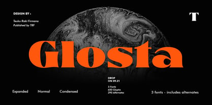 Glosta is a serif font that comes with a very beautiful change character that will bring a touch of luxury and style to your projects. Glosta is perfect for editorial design, branding, headings, logos, magazines and more. Glosta has 650 glyphs and 290 alternate characters, including multiple language support. With OpenType features with an elegant alternative style.
 - Bodoni Classic Ad by Wiescher Design,
$55.00 I became interested in designing Bodoni Classic because of a lazy graphic designer at Jacques Damase publishing house. He had to change a single letter on a bookcover about J. B. BODONI. The French call him Jean Baptiste instead of Giambattista! And that unknown graphic designer just took any old “J” from some newly cut Bodoni. All the new Bodoni cuts have square serifs, whereas the originals had rounded serifs and slightly concave feet. The single letter “J” with the squared off serif was for me like a road sign to start redesigning the entire Bodoni family. That’s exactly what I started in 1993 and a dozen years later I am finished. Okay, I am still adding new Bodoni Classics, but those are my personal additions. Yours very retro, Gert Wiescher
 - Bodoni Classic Initials by Wiescher Design,
$55.00 I became interested in designing Bodoni Classic because of a lazy graphic designer at Jacques Damase publishing house. He had to change a single letter on a bookcover about J. B. BODONI. The French call him Jean Baptiste instead of Giambattista! And that unknown graphic designer just took any old “J” from some newly cut Bodoni. All the new Bodoni cuts have square serifs, whereas the originals had rounded serifs and slightly concave feet. The single letter “J” with the squared off serif was for me like a road sign to start redesigning the entire Bodoni family. That’s exactly what I started in 1993 and a dozen years later I am finished. Okay, I am still adding new Bodoni Classics, but those are my personal additions. Yours very retro, Gert Wiescher
 - Bodoni Classic Chancery by Wiescher Design,
$55.00 I became interested in designing Bodoni Classic because of a lazy graphic designer at Jacques Damase publishing house. He had to change a single letter on a bookcover about J. B. BODONI. The French call him Jean Baptiste instead of Giambattista! And that unknown graphic designer just took any old “J” from some newly cut Bodoni. All the new Bodoni cuts have square serifs, whereas the originals had rounded serifs and slightly concave feet. The single letter “J” with the squared off serif was for me like a road sign to start redesigning the entire Bodoni family. That’s exactly what I started in 1993 and a dozen years later I am finished. Okay, I am still adding new Bodoni Classics, but those are my personal additions. Yours very retro, Gert Wiescher
 - Bodoni Classic Text by Wiescher Design,
$55.00 I became interested in designing Bodoni Classic because of a lazy graphic designer at Jacques Damase publishing house. He had to change a single letter on a bookcover about J. B. BODONI. The French call him Jean Baptiste instead of Giambattista! And that unknown graphic designer just took any old “J” from some newly cut Bodoni. All the new Bodoni cuts have square serifs, whereas the originals had rounded serifs and slightly concave feet. The single letter “J” with the squared off serif was for me like a road sign to start redesigning the entire Bodoni family. That’s exactly what I started in 1993 and a dozen years later I am finished. Okay, I am still adding new Bodoni Classics, but those are my personal additions. Yours very retro, Gert Wiescher
 - Bodoni Classic Hand by Wiescher Design,
$55.00 I became interested in designing Bodoni Classic because of a lazy graphic designer at Jacques Damase publishing house. He had to change a single letter on a bookcover about J. B. BODONI. The French call him Jean Baptiste instead of Giambattista! And that unknown graphic designer just took any old “J” from some newly cut Bodoni. All the new Bodoni cuts have square serifs, whereas the originals had rounded serifs and slightly concave feet. The single letter “J” with the squared off serif was for me like a road sign to start redesigning the entire Bodoni family. That’s exactly what I started in 1993 and a dozen years later I am finished. Okay, I am still adding new Bodoni Classics, but those are my personal additions. Yours very retro, Gert Wiescher
 - Girltalk by Scholtz Fonts,
$10.00 Cute, curly, & very "little missy", Girltalk was specially designed for the pre-teen & young-teen market. Its design was inspired by the kind of curly handwriting that junior school girls use for notes to each other, diary entries, autograph books etc. Pretty & feminine, with a large dose of cheek, Girltalk is a must for all marketing media aimed at the 7-14 age group: -- “girl style” stationery -- diary covers -- clothing hang-tags -- party invitations -- greeting cards -- book covers -- movie posters -- CD covers -- toy and game advertising media Girltalk can also be used for "big girls"! Great for hen parties, baby showers, pamper parties and other occasions that bring out the "girl in" women. Think pink, think hearts & flowers, think ribbons & bows, add Girltalk to the mix, and you have a winner! Girltalk has been carefully letterspaced and kerned. All upper and lower case characters, punctuation, numerals and accented characters are present.
 - Round Saetan by Alit Design,
$18.00 Introducing Round Saetan Typeface The Round Saetan Typeface was created with a modern concept of display font which gives a unique impression because it has a folded shape like a ribbon. The sans serif style adopted by the Round Saetan font is a 2022 style font, has a unique swash alternative, has a large selection of ligatures. In addition. Sans Serif typefaces such as “ Round Saetan typeface” are very easy to apply to any design, especially those with an elegant and smooth concept, besides that this font is very easy to use both in design and non-design programs because everything changes and glyphs are supported by Unicode (PUA). The Round Saetan typeface contains 662 glyphs with many unique and interesting alternative options. In the poster preview all the letters are in the Round Saetan typeface.
 - Bombelli Light Hand by Wiescher Design,
$39.50 Bombelli is a font that looks like it has been handwritten by a meticulous architect in one of those hand-drawn blueprints of the old days. I chose the name to honor one of my ex-bosses -- a graphic designer-architect who taught me a lot of things when I was young and needed the money. One of the things he taught me – and probably the most important one – was to always be on time in the morning. He never said a word about me being late, but it worked. He taught me about being meticulous in detail and many other things I only appreciated much later. This clear and straightforward font deserves bearing his name. Your grateful type designer Gert Wiescher
 - Bruschetta by Canada Type,
$24.95The problem with scripts in general, and brush scripts in particular, is that the majority of them cannot be set in all-caps words or sentences. So as a rule of thumb most designers try to avoid brush scripts when they know they will be entering an all-cap zone. But here comes Bruschetta, so you won’t need to reduce your design options. Bruschetta is a great flowing brush script that can be attractively used in upper-lower, lower-lower, or upper-upper settings. Bruschetta also has so much variety in its design features – original, funny, natural, friendly, legible, and even somewhat psychedelic – it just may be the most versatile brush script ever made. Bruschetta also has an historical value as the revival of the Helmut Matheis’ Contact design from 1963. Why it hasn’t been digitized until this point is beyond us! So we digitized it from original specimen, expanded the character set to completion, and even added a few built-in alternates. Bruschetta’s versatility allows it to be used in a variety of applications. It is great for signage, posters, product labels, menus, book covers, and pretty much anywhere where a friendly bold brush type is needed. Get yourself a copy and show your friends and clients why the overused Choc and Cooper aren’t the last word in cool! - Yacimiento - Personal use only

- Caldwell Script by madjack.font,
$15.00 Caldwell Script is a modern calligraphy design. This typeface is casual and beautiful with swash. It can be used for various purposes such as logos, product packaging, wedding invitations, branding, headlines, signage, labels, signatures, book covers, posters, quotes, and more. Caldwell Script includes changes in the OpenType language style, binders and international support for most Western languages. To enable alternative OpenType alternatives, you need a program that supports OpenType features such as Adobe Illustrator CS, Adobe Indesign & CorelDraw X6-X7, Microsoft Word 2010 or newer versions. How to access all alternative characters using Adobe Illustrator: https://www.youtube.com/watch?v=XzwjMkbB-wQ Caldwell Script is coded with Unicode PUA, which allows full access to all additional characters without having special design software. Mac users can use Letter Book, and Windows users can use Character Maps to view and copy any of the additional characters to attach to your favorite text editor/application. How to access all alternative characters, using Windows Character Map with Photoshop: https://www.youtube.com/watch?v=Go9vacoYmBw If you need help or have questions, let me know. I am happy to help. Thank you & Happy Designing!
 - Donkeyman by Hanoded,
$15.00 A Donkeyman is a person who is in charge of a ship’s engine room. I didn’t know this, but when I was looking for a nice name for this font, I sort of stumbled upon it. Donkeyman font is quite a useful font: it is a handmade, all-caps font that comes with two sets of alternate glyphs. The alternates cycle as you type, creating a ‘random’ effect. Comes with extensive language support, including Sami and Vietnamese.


