10,000 search results
(0.043 seconds)
- PR Valendoodle 01 by PR Fonts,
$14.00 This is a romantic set of ornaments inspired by Valentine’s Day. It includes calligraphic flourishes which include heart shapes, and many that can be combined to form heart shapes, as well as images of hearts, roses, and cupid’s arrows.
 - Meigtan by Dicubit,
$10.00 Meigtan is a curly typeface/font designed with carefully handcrafted. This perfectly made to be applied in logo or branding, stationery, books, packaging, fashion, magazines, t-shirt, greeting or wedding cards, vintage design, novels, labels and many advertising purposes.
 - GHEA Ayb by Edik Ghabuzyan,
$40.00 This light weight Display font includes Basic Latin, Latin 1 Supplement, Latin extended A, Cyrillic + Bulgarian Cyrillic + Ukrainian Cyrillic, Armenian. May be used in titles, posters, labels, etc. Publisher: GHEA Fonts Designer: Edik Ghabuzyan, Yerevan, Armenia. Creation year 2020.
 - Amethyst by Gatype,
$10.00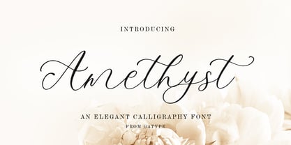 Amethyst is a modern calligraphy font. This font is casual and pretty with a stroke. Can be used for various purposes, such as logos, product packaging, wedding invitations, branding, headlines, signage, labels, signatures, book covers, posters, quotes, and more.
 - Magules by HansCo,
$15.00 Magules is a serif typeface with vintage and retro look!. Equipped with all complete characters ranging from uppercase letters, lowercase letters, numbers, punctuation marks and multi-lingual support, this font is ready to be used in any project. Enjoy!
 - Ausion by Andfonts,
$14.00 Ausion is a minimal and neat sans serif font. It can easily be matched to an incredibly large set of projects, so add it to your creative ideas and notice how it makes them stand out! Caps only fonts.
 - Cleverda by Realtype,
$13.00 Cleverda Script is a beautiful hand painted script, organic, fun with dancing baseline and different ligatures. This fonts can be used for various purposes.such as headings, signature, logos, wedding invitation, t-shirt, letterhead, signage, labels, news, posters, badges etc.
 - Eigerdals by insigne,
$24.99 Eigerdals is a pleasant and visually warm sans-serif type family. Eigerdahl is a soft and amiable face, perfect for when you want to convey a relaxed and pleasant feeling. Eigerdals features a smooth, brushed impression and a tall x-height. The characters are slightly top heavy in the heavier weights to give it a friendly feel. The Eigerdals family contains seven weights and their complementary italics. It contains some unique character traits that give the face a unique look, and the type family is incredibly versatile. The face is highly readable in extended text settings, and the bolder weights are perfect for display work. Eigerdals can be used in a variety of graphic settings. Eigerdals includes many useful OpenType features, including a set of upright italic swash alternates, ligatures and unicase alternates. OpenType-capable applications such as Quark or the Adobe suite can take full advantage of the automatically replacing ligatures and alternates. This family also includes the glyphs to support a wide range of languages.
 - Hypnotique by Comicraft,
$19.00 Do we have a volunteer from the audience! Yes, you young lady, step into the ring, there's no need to be afraid! What's your name? Hypnotique? How appropriate! Now, don't turn away, look into my eyes, look into my eyes, the eyes, the eyes, not around the eyes, don't look around my eyes, look into my eyes, aaaannnndd you're under. And on the menu of mesmerism tonight is a waking dream of letterforms that will keep you on the threshold of consciousness and yet illuminate your every hypnagogic hallucination! Now that we have your focused attention and reduced your peripheral awareness you have an enhanced capacity for response to the suggestion that you should not only purchase this font, but our entire library of fonts. On the count of three you will wake up and you will think of nothing else but acquiring all the tools all good graphic designers should have in their font library. And all we had to do was snap our fingers.
 - DeDisplay by Ingo,
$24.99 A type designed in a grid, like on display panels Type is not only printed. There were always and still are a number of forms of type versions which function completely differently. Even very early in the history of script there were attempts to combine a few single elements into the diverse forms of individual characters and also efforts to construct the forms of letters within a geometric grid system. The “instructions” of Albrecht Dürer are probably most well-known. But although designers of past centuries assumed the ideal to basically be an artist’s handwritten script, the idea which developed in the course of mechanization was to “build” characters in a building block system only by stringing together one basic element — the so-called grid type was discovered, represented most commonly today by »pixel types.« But even before computers, there were display systems which presented types with the help of a mechanical grid display, like the display panels in public transportation (bus, train) or at airports and train stations. In a streetcar, I met up with a modern variation of this display which reveals the name of each tram stop as it is approached. This system was based on a customary coarse square grid, but the individual squares were also divided again diagonally in four triangles. In this way it is possible to display slants and to simulate round forms more accurately as with only squares. The displayed characters still aren’t comparable to a decent typeface — on the contrary, the lower case letters are surprisingly ugly — but they form a much more legible type than that of ordinary [quadrate] grid types. DeDisplay from ingoFonts is this kind of type, constructed from tiny triangles which are in turn grouped in small squares. The stem widths are formed by two squares; the height of upper case characters is 10, the x-height 7 squares. DeDisplay is available in three versions: DeDisplay 1 is the complex original with spaces between the triangles, DeDisplay 2 forgoes dividing the triangles and thus appears somewhat darker or “bold,” and DeDisplay 3 is to some extent the “black” and doesn’t even include spaces between the individual squares.
 - Hanniel by Daily Studio,
$16.00 Hanniel - a modern geometric sans serif font. This font has an elegant and smooth rounded edge style. Specifically developed to be suitable for logos, headlines, titles, branding, visual identity, business cards, and posters. Round out your fonts collection with this gorgeous typeface and make your design look exceptional.
 - Geometry Circle by Vjeko Sumic,
$39.00 Geometry circle is a heading/display type, built with the intent to illustrate and attract the viewer, not to be used for long text. The inspiration comes from the Futurist movement typefaces, especially from Marinetti’s own workshop on new age typography of that time (Italy 1920). The typeface is composed of only capital letters. The letters are of an unique geometric design taking the basic 64 grid system and subtracting the shape of a circle form each glyph in a unique way to form a letter. There is a full complement of typography symbols as well as a support for Central and Eastern European symbols and characters.
 - Gwen by Fontfabric,
$35.00Gwen is a variable type system in 7 weights. The complete font family consists of two subfamilies: the highly characteristic Display Serif family which shows its full potential and beauty in big sizes and a more subtle Text variation appropriate for smaller sizes. The variable font combines the best of both worlds and provides unique flexibility to switch between all of the font weights and the text and display style at the same time. The font supports Extended Latin and Cyrillic scripts and its main purpose is to be used in editorials, although it may find good implications in headlines, impactful landing pages, posters, and packaging. - Bell Gothic by Linotype,
$40.99C.H. Griffith was commissioned by the American telephone company, Bell, to design a typeface which would be particularly suited to small, compressed sentences and inferior paper quality. The font was intended for use in the company’s telephone books. Griffith had already had experience with the conception of newsprint fonts and was interested in legibility issues. In 1922 Griffith created the Legibility Group, which contained particularly legible fonts predestined for newspapers. Bell Gothic has all the typical characteristics which optimize a font’s legibility. The modern heir of Bell Gothic is Bell Centennial, designed by Matthew Carter in 1974 in celebration of the Bell Company’s 100th birthday. - Monod by Resident,
$40.00 Created in 2009 by V.H. Fleisher, Monod is a geometric sans-serif typeface. The font has OpenType features that can be accessed in programs like the Adobe Creative Suite. These features include titling caps which are heavier & more tightly spaced than the regular caps, alternative punctuation marks, and arbitrary nut fractions (for single digit numerators & denominators). By clicking on the "gallery" tab above, you can see an illustration of the OpenType features. The "ff" tab on the "Sample Text" bar below allows you to test the OpenType features with your own text. Supported languages include: Albanian, Czech, Danish, Dutch, English, Faroese, Finnish, French, German, Icelandic, Italian, Norwegian, Portuguese, Spanish & Swedish.
 - Linotype Rough by Linotype,
$29.99French designer Christophe Badani developed the Linotype Rough family in 1999. The family contains nine different typeface styles, each with a slightly different voice. The forms appear to have found a unique middle ground between hand-drawn letters and pure geometry, especially Linotype Rough Outline. Make sure to pay special notice to the true-italic forms in the three italic weights! Badani's attention to typographic detail is not to be missed. Linotype Rough is perfect for headlines and display work. The medium and bold weights can also function splendidly in text. The entire family is included in the TakeType 4 collection, available through Linotype." - Lunga by Lián Types,
$24.50Lunga is a wonderful condensed font. It was designed to be a legible type. It has lots of decorative glyphs and ligatures which were possible thanks to the open-type format! Lunga Real Ligada is the most complete style. The Open Type format contains all the ligatures and alternates. It also contains the SMALLCAPS function. Lunga Exacta has the right quantity of glyphs. The necessary ones if you are not a ligature lover. Lunga Versalita is a SMALLCAPS font. These glyphs are also contained in Lunga Real Ligada. Lunga Extras shows some ligatures and alternates which are actually contained in Lunga Real Ligada thanks to the Open Type format. - Digofa by Twinletter,
$10.00 Introducing the Digofa sanserif font. is an aesthetic font, which in its use has a natural beauty and has a modern style. This clean font when you use it will create an elegant and beautiful impression. We designed this san serif family font by paying attention to the combination of each letter to create a beautiful impression and appearance, making it easier to answer your needs, both formal and non-formal needs. This font is perfect for a wide variety of design projects, sporting events, branding, banners, posters, movie titles, food and beverage, technology, quotes, clothing, logotypes, and more. Of course, by using this font your various design projects will be perfect and amazing, because this font comes with a family of fonts, both for titles and subtitles and sentence text, start using our fonts for your amazing projects.
 - Uppercut Angle by Delve Fonts,
$39.00 Joachim Müller-Lancé's Uppercut is a rather sporting fellow, originally developed for the Krav Maga training center of San Francisco (Krav Maga is a simple and efficient self-defense system that has become equally popular in Hollywood and with law enforcement). Joachim has spent several years training, hitting things and people whenever he needs a break from kerning. Uppercut can be seen on the school's t-shirts and other articles. Despite bearing the same moniker as an upwards punch to the chin, the name actually fell together quite naturally as Uppercut is an all uppercase typeface, and the word "cut" is also historically used to describe a type style in hot metal type. For this slanted look, "Angle" felt just right (with thanks to Mia McHatton). The design idea sprang from pencil sketches for the center's new identity. Uppercut's shapes are not calligraphic or handwritten, more like lettering seen in comics or sports logos. Its brush movements are imaginary, not too literally brushy. During development, details were simplified and reduced until a bit of a cut-paper feel emerged, but more fluid like writing. The shapes are economical and efficient; simplicity makes the font versatile, holding up in small as well as big sizes. Uppercut is decidedly analog, muscular but not bulky, with the fluid but determined movements of a boxer or martial artist - not theatrical but powerful, fast, confident and dynamic. Well... it has punch. In the proportions, there is emphasis on a strong upper edge "keeping its guard up", while several stems protrude downward, giving the impression of leaping or being "light on the feet". Use Uppercut to pick up the pace, add snap, verve and drive - on movie posters for action and adventure, to advertise your dojo, rumble or prizefight, racing team or tuning shop, or invite friends to your barbecue with old time rock'n'roll and homemade hot pepper sauce.
 - Sada by Arabetics,
$45.00 Sada is a text font designed with hand held devices and ebooks in mind. Glyphs are designed to be larger than usual and very clear with soft visual characteristics and many traditional Arabic calligraphic transitional features incorporated to improve legibility. The word “sada” means “echo” in Arabic. Even though Sada is a cursive style font it offers clearly distinguished and visually unified letter shapes in every position of a word. Sada supports all Arabetic scripts covered by Unicode 6.1, and the latest Arabic Supplement and Extended-A Unicode blocks, including support for Quranic texts. It comes with three weights, regular, bold, and ultra-light. Each weight has normal and left-slanted “italic” styles. The script design of this font family follows the Arabetics Mutamathil Taqlidi style and utilizes varying x-heights. The Mutamathil Taqlidi type style uses one glyph per every basic Arabic Unicode character or letter, as defined by the Unicode Standards, and one additional final form glyph, for each freely-connecting letter in an Arabic text. Sada includes the required Lam-Alif ligatures in addition to all vowel diacritic ligatures. Sada’s soft-vowel diacritic marks (harakat) are only selectively positioned with most of them appearing on similar lower or upper positions to emphasize they are not part of letters. Kashida is zero width glyph.
 - Automove by Din Studio,
$25.00 Need some help to finish your designs? There are a lot of considerations when selecting a font type for an important project either for your own company or a daily used font. Therefore, Automove, a display font in the racing theme capital letters, is carefully and accurately created to meet your design needs. This font is available in two versions, regular and italic. Automove, which seems to be a long lasting font amid other typographies owing to its unique styles and shapes, is generally applicable to large-sized texts in titles instead of the contents of the texts due to its readability in such large-sized letters. In addition, this font provides interesting features to help designers improve their design products. Features: Multilingual Supports PUA Encoded Numerals and Punctuations Automove is perfectly suitable for doing design projects such as posters, logos, book covers, headings, printed products, merchandise, social media, etc. Find out more ways to use this font by taking a look at the font preview.
 - Boldest Romance by Nathatype,
$29.00 If you are looking for an aesthetically fun, legible font, Boldest Romance is the perfect choice. It is a thickly designed weight display font to be legible and beautiful at the same time. This is perfect to apply for serious, formal contents as it gives a strong impression. Furthermore, this legible font has regular structures easing readers to recognize every letter correctly. You can also enjoy interesting features available here. Features: Alternates Ligatures Multilingual Supports PUA Encoded Numerals and Punctuations Boldest Romance fits best for various design projects, such as brandings, posters, banners, logos, magazine covers, quotes, headings, printed products, greeting cards, merchandise, social media, etc. Find out more ways to use this font by taking a look at the font preview. Thanks for purchasing our fonts. Hopefully, you have a great time using our font. Feel free to contact us anytime for further information or when you have trouble with the font. Thanks a lot and happy designing.
 - Bosterina by Gatype,
$12.00 Bosterina is a script typeface with a noble, vintage look., this font has a model Trendy, natural and gentle, with this font you can take advantage of the opportunity in every moment of one wonderful way to highlight the celebration of the feast of your best, because this font will be advocates for purposes such as wedding invitations, party, graduation, birthday, gathering, etc. you need a program that supports Adobe Illustrator CS, Adobe Indesign & CorelDraw X6-X7, Microsoft Word 2010 or a later version. How to access all alternative characters using Adobe Illustrator: https://www.youtube.com/watch?v=XzwjMkbB-wQ Bosterina is coded with PUA Unicode, which allows full access to all additional characters without having to design any special software. Mac users can use Font Book, and Windows users can use Character Map to view and copy any additional characters for pasting into your favorite text editor / application. How to access all alternative characters, using the Windows Character Map with Photoshop: https://www.youtube.com/watch?v=Go9vacoYmBw
 - Best Deals by Malindo Creative,
$8.00 Best Deals | Signature Typeface, is a signature script with natural flow & style. This font has a natural looking ligature for the OpenType feature, making the font appear as close as possible to natural handwriting,Best Deals | Signature Typeface is perfect for all projects such as, logos & branding, invitations, stationery, wedding designs, social media posts, advertisements, product packaging, product designs, labels, photography, watermarks, special events or whatever. Best Deals | Signature Typeface Comes With 353 Glyphs and OpenType Features are also added to this font. Best Deals | Signature Typeface has given PUA encoded (fonts with special code). This font comes with language support: €Š‹ŚŤŽŹ‘’“”–—™›śťžźˇ˘¦§¨©Ş«ÍÎĎĐŃŇÓÔŐÖŘŮ ÚŰÜÝ®Ż±˛´·¸Ľ˝ľżŔÁÂĂÄĹĆÇČÉĘËĚĀ ŕáâăäĺćçčéęëěíîďđńňóôőö÷řůúűüý˙¢àèêùˆ˚ąş»š The Features includes: Stylistic Alternates, Swashes, Ligatures, Stylistic Set. You can pick the alternate for all style. If you want other files that are not here, please let me know at malindocreative@gmail.com. I will be happy to help. Thanks For Support, Hopefully Useful.
 - LHF Grants Antique by Letterhead Fonts,
$33.00 Nice for an authentic old fashioned flavor without being over-bearing.
 - Cyne by Typotheticals,
$8.00A plain sans serif that would be good for everyday use. - Ace Attitude by Limelight Artistry,
$24.00 Ace Attitude is a friendly, readable font with character and flair. When I started designing this font I wanted something that was readable as well as interesting and appealing. Something that showed character. When I look at this font now I think of an old fashioned aviator. One of those poeple that likes to show off and have fun but can still follow rules. This font is perfect for logo's and branding. But its also very versatile would be great in things like magazines, posters, packaging, billboards, etc. Ace Attitude has an impressive 179 Contextual alternates. These are like ligatures, but oh so much better. These contextual alternates will give any project that personal touch - all without any extra effort. All you have to do is make sure that they are turned on in your program. Unfortunately, these do not yet show up in the sample text. To help with this I have created a demo version of the font so that you can still try it out before you spend the money. Ace Attitude also has Over 800 glyphs and includes features such as small caps, ordinals, ligatures, fractions, tabular numbers, proportional numbers, subscript, superscript, numerators and denominators.
 - Blend by Typesenses,
$49.00 Blend is a hand drawn collection that takes its cues from the visual universe of bakeries and coffee shops. The name refers to the combining of different kinds of coffee beans to get a balanced taste, and Blend does just that, although here each typographic flavor can also be enjoyed separately. Projects such as branding, children’s books, wedding invitations and labels are sweetened with this cute family. The bouncing informal Script programmed with Open Type offers a wide range of features like ligatures, swashes, endings, initial forms and lots of alternates. Use professional software that widely support Open Type features. Otherwise, you may not have access to some glyphs. Keep the Standard Ligatures feature always active. For further information about features and alternates, see the User Guide Blend has extensive Western, Central and Eastern European language support. Make some coffee and enjoy!
 - Ancyra by Hurufatfont,
$29.00 Ancyra is a transitional serif family designed with current usage areas and requirements in mind. Efforts were made to provide the most effective harmony within each character and with the characters they are associated with. For customizing the usage areas and providing an impressive and fluent reading experience; it is designed in three different optical weights as title, subtitle and body text. Sharp and soft terminals used together (such as v, w, y, s, c, k) have an extraordinary effect, especially in italic styles. Contextual alternatives are designed to be compatible with the letters after the letters "c, e, t" in the text and create a cursive effect. Ancyra is perfect for use in newspapers, magazines, e-books, packaging design and fashion industry, branding of quality products and services. Ancyra has a versatile usage area with its optical weights.
 - Little Micro Sans by Caron twice,
$39.00 It is 1984 and Ridley Scott’s commercial for Apple tells us, “You’ll see why 1984 won’t be like ‘1984’.” The first Mac comes on the market. The Mac interface includes a font for use in small sizes called Chicago. The first version was designed by Susan Kare. The font’s modern grid-like character was also used for the first iPod screens, which is why this font is also associated with music. Today’s font upgrade, Little Micro Sans, is suited for small-point texts, product labels, lists of ingredients, and small captions in books, magazines, websites or applications. For online use, a variable format is particularly handy as it offers all font styles in a single file, has a faster display time and takes up less memory. Little Micro Sans is a revolution for small sizes. Specimen: http://carontwice.com/files/specimen_Little_Micro_Sans.pdf
 - Strawberry Swirl by Krafted,
$10.00 Imagine a world filled with swirls of strawberry, pops of pink, and pure joy to go around for everyone... Are you trying to make an elegant, sweet, and stylish statement with your invitations, social media, website, or printed materials? Then grab some cotton candy, crack a smile, and get ready for a swirly day of wonders! Introducing Strawberry Swirl - A Modern Script Font. This gorgeous & stylish font can be used for a host of different content needs and projects. Use it for your headings, logos, business cards, printed quotes, invitations (wedding, birthday, engagement, etc.), packaging, resumes, and even your website or social media branding. Enchant & delight your audience, clients, or guests with this versatile, stylish, and elegant font. What you’ll get: - Multilingual & Ligature Support - Full sets of Punctuation and Numerals Compatible with: - Adobe Suite - Microsoft Office - KeyNote - Pages Software Requirements: The fonts that you’ll receive in the pack are widely supported by most software. In order to get the full functionality of the selection of standard ligatures (custom created letters) in the script font, any software that can read OpenType fonts will work. We hope you enjoy this font and that it makes your branding sparkle! Feel free to reach out to us if you’d like more information or if you have any concerns.
 - Droid Sans - 100% free

- Settikef by Twinletter,
$14.00 Settikef is a handwritten script font with cute and cute nuances but still beautiful and elegant. This font is great for you to use as a title in your designs as well as great for writing names and words. and to be sure this font is not only limited to that purpose but also very special for every need of your project, be it a formal or non-formal project, this font is still beautiful and elegant. start creating awesome designs with this font! This charming font also offers the beauty of abstract typography harmony for a wide variety of design projects, including digital natural handwriting for designs, quote designs, for social media business designs, advertisements, trademarks, food and beverage promotion banners, text, posters, a signature, and all designs require handwriting or whatever design you want. This font is equipped with uppercase, lowercase, numbers, punctuation marks, swhases and several variations on each character including multi-language. ================================================== This font is best suited for open type friendly applications. How to get alternative glyphs from open type fonts: http://adobe.ly/1m1fn4Y PUA Character Code - Fully accessible without additional design software. do not hesitate anymore start using this font. and Feel free to send any message you want to convey.
 - FS Dillon by Fontsmith,
$80.00 Bauhaus Geometric, economical, functional... The good, wholesome, modernist values that once fired up the tutors and students of the Bauhaus became the inspiration for FS Dillon after an exploration of the work of the pre-war art and design powerhouse in the Fontsmith studio. The font combines simplicity and directness with a characteristic Fontsmith warmth. Letterforms are compact, with a generous x-height, and built for maximum clarity and impact. The Bauhaus sought beauty through function. FS Dillon achieves it. Made for TV The weights of fonts for TV sometimes have to be adjusted so as not to “blow” on-screen. FS Dillon was originally drawn for the on-screen presentation branding of Film Four, whose primary colour was red. Black type on a red background looks heavier than white, so Dillon needed two weights that would allow white and black type to be used together, looking balanced and equal. Type design is an organic process. Years after developing FS Dillon, we revisited it, redrawing elements and adding italics to maintain consistency. Olympic You don’t get a much higher confirmation of the functional fitness of a typeface than to have it selected to guide visitors around an Olympic complex. FS Dillon was selected as the font for signage at some of the key venues at the London 2012 Olympic Park, helping to get spectators, athletes and officials from all over the world to their seats and starting blocks on time.
 - Andron MC by SIAS,
$99.00 The font series Andron MC introduces a new feature to the repertoire of the Andron family: middlecase glyphs (intermediate between upper- and lowercase) – and uncial letters. Middlecase glyphs reach a medium height compared to full caps height and lowercase x-height. However, ‘uncial’ means the historic transitional lettershapes of the medieval ages which have gained no status in the bicameral typographic system of modern times. In all three of the Andron MC fonts middlecase (“MC”) glyphs dwell on the lowercase positions. These are coined in uncial fashion in the MC Uncial and MC Medieval fonts but appear as capital glyphs in MC Capital. The same variation occurs with the uppercase positions: whereas standard Roman/capital glyphs are there in MC Uncial and MC Capital, MC Medieval features uncial majuscules here instead. At the end that makes three different combinations of uncial and capital sorts. These fonts can be used for a great variety of purposes. The uncial sets are particularly well-suited for any typographic matter related to the middle ages. MC Capital is a worthwhile alternative choice when titling is to be possibly set in CAPITALS or Small caps. Andron MC adds a fascinating new aspect to the classical Andron fonts family. It enhances again the unique scope of typographical possibilities Andron is praised for since quite some time now. All three Andron MC fonts support full Latin, Greek (monotonic), Coptic and Gothic character ranges. Each font contains about 1000 glyphs.
 - CAL Bodoni Terracina by California Type Foundry,
$47.00 Bodoni Terracina is a legible, fun-formal script face, with lots of curls. Sometimes script faces are hard to read. Sometimes being formal means that there’s no personality and there’s no fun. Enter Terracina: one of the masterpieces of font design. Some of the most personable italics ever carved. Includes powerful new features for: • Dates • Pricings • Addresses Not is only Terracina formal but fun, it’s also fun to use! In a program like Adobe Indesign or Illustrator, just highlight a word and see lots of fun options. Bodoni himself etched these symbols, and his fun-loving personality shines through. As a semi-script, it can go together with many script fonts, but it is more readable. When you need something equal parts elegant and whimsical, Terracina strikes a perfect balance to let the fun shine through, such as for holiday designs or fairytales. Terracina is a subheads font, but Bodoni also used it for paragraphs. So Terracina works well doing subhead paragraphs, especially when contrasting with the mood of the first font. And because of the swash variety, it works well for setting German and other European languages. CAL Bodoni Terracina is a member of our Origins Series. Origin Fonts are designed to be true to the original designer's intentions and fonts. Our Bodoni origin fonts ARE Bodoni fonts, not imitations or interpretations. They were drawn by Bodoni, our team just expanded it for modern use. For Terracina, Bodoni's original weight is the "Quasi-Lite" option, all other weights have been meticulously matched by the CAL Origins Team.
 - Bumbon by Luxfont,
$18.00 Introducing unusual Sans Serif font family. Font is concise and minimalistic. But behind the apparent simplicity of the font is hidden the original feature in the form of modernized uppercase glyphs, which can be used as an accent in the header or logo. Pure letterings with excellent readability have 2 thicknesses. Font will emphasize the high status of the business and complement modern branding design, and the general versatility of the font provides for its widespread use in various directions and is combined with different styles in design. Balanced glyphs will fit into the typographic design and will not distract attention from the main point. Features: Bold, Bold Italic, Regular, Regular Italic Upgraded uppercase letters Kerning ld.luxfont@gmail.com
 - Sagarana by Eller Type,
$35.00 Sagarana is an elegant display typeface rooted in the style of romantic or didones letterforms; however, it is a sans serif with a cleaner appearance. The contrast and the vertical stress maintain the modern style, while the terminals, the finials, the proportions and the narrow look enhance its stylish personality. It could be suitable for editorial projects such as magazines, books or even for sophisticated environments, let’s say, fashion, department store, perfumes, cosmetics and so on. Sagarana was initially inspired by a Brazilian book cover from 50’s. The name itself combines the words “saga” (as in the English sense of “story”) and “rana,” a Tupi word (Indigenous language) that roughly means “showing similarities”.
 - Panorama KG by Posterizer KG,
$24.00 Panorama KG is a black display font. The starting idea was to design letters that stand on the horizon. For that reason, the descenders are extremely short, and the elements of the letters lying on the base line are cutten, the horizontal strokes are lowered ... These characteristics should reduce the spacing and emphasize the compactness of densely composed titles and shorter text forms. Panorama KG was designed specifically for headlines, logotypes, branding, and similar applications... Due to the characteristics that are in function only in the bold version, it did not make sense to make more styles or family, but Panorama KG can be combined with many other serif and sans serif typefaces.
 - Ctoxina by FSdesign-Salmina,
$39.00 The Ctoxina family is growing. Due to the success the author decided to add an outline version of the font. The typeface is now available in 6 different styles: light, light italic, regular, italic, bold and bold italic. The Atoxina family is designed especially for the burgeoning market of starships and other space cruisers. The fonts are ideal for internal and external use (including zero-g and occasional bursts of cosmic rays), and with their simplified forms are expected to survive well in non-linear galaxies. With their unusual diagonal half-pixels the fonts are striking as abstract designs at astronomical sizes, where small text may be placed within the black holes formed inside the letters.
