10,000 search results
(0.035 seconds)
- Garden Gnome by Hanoded,
$15.00 I am not really fond of Garden Gnomes, but this font is kinda cute and I figured it'd be a nice name. Garden Gnome is a very happy, easy to read Children's Book font. It is bouncy, rounded and comes with all the diacritics you need.
 - Norwill by Din Studio,
$29.00 Norwill is a modern display font. Made for any professional project especially that related to the sports. Beside that, this font can be used for printing, branding and quotes. Features: PUA Encoded Multilingual Support Numerals and Punctuation Thank you for downloading premium fonts from Din Studio
 - Fastrace by Sealoung,
$15.00 Fastrace is a classic sport font. Made for any professional project especially that related to the sports. Beside that, this font can be used for printing, branding and quotes. Features: PUA Encoded Multilingual Support Numerals and Punctuation Thank you for downloading premium fonts from Sealoung Studio
 - Peachy Mochi by Awan Senja,
$14.00 Introducing our newest cute typeface, Peachy Mochi, a Bold Quirky font. This font perfectly made to be in poster funny, and the other various formal forms such as invitations, labels, logos, magazines, books, packaging, fashion, make up, stationery, novels, labels or any type of advertising purpose.
 - Barongko Pastry by Awan Senja,
$14.00 Introducing our newest cute serif typeface, Barongko Pastry, a decorative font. This font perfectly made to be in poster funny, and the other various formal forms such as invitations, labels, logos, magazines, books, packaging, fashion, make up, stationery, novels, labels or any type of advertising purpose.
 - Huggie Bunny by Awan Senja,
$14.00 Introducing our newest funny typeface, Hugie Bunny, a nice fun typeface. This font perfectly made to be in poster funny, and the other various formal forms such as invitations, labels, logos, magazines, books, packaging, fashion, make up, stationery, novels, labels or any type of advertising purpose.
 - Verismo by Martin Verstraaten,
$20.00 Verismo (Italian for ‘realism’, from vero, meaning ‘true’) is a genre of operas with scenarios based on contemporary everyday life. This font is inspired by old school sign painting techniques. In addition, the font has a contemporary look and can therefore be used in many different designs.
 - Megloria by Awan Senja,
$14.00 Introducing our newest cute serif typeface, MEGLORIA, a cute typeface font. This font perfectly made to be in poster funny, and the other various formal forms such as invitations, labels, logos, magazines, books, packaging, fashion, make up, stationery, novels, labels or any type of advertising purpose.
 - Aryaduta by Hrz Studio,
$12.00 Aryaduta is a romantic and gorgeous looking typeface. It can be used for various purposes, such as logos, wedding invitation, t-shirt, letterhead, signage, news, posters, badges and more. This font is PUA encoded which means you can access all of the glyphs and swashes with ease!
 - Bigstorm by Letterhend,
$14.00 Bigstorm is a unique hand made font that will capture the attention at glance. This font is perfect to be used as signature, headline, lettering quotes, wedding invitation, fashion, etc. It also comes in uppercase, lowercase, punctuations, symbols & numerals, stylistic set alternate, ligatures, etc also support multilingual.
 - Wayland by Hanoded,
$15.00 Wayland (Vølund or Völundr) is the mythical blacksmith from Norse mythology. I chose this name, because Wayland is a bulky, sturdy display font. Wayland can be used for many types of design, but headlines, posters and book covers spring to mind. Comes with extensive language support.
 - Hanthem Script by Fargun Studio,
$14.00 Hanthem Script is modern script that perfect for photography, branding, signature. It is so beautiful and classy for your projects. This Font has given PUA code (specially coded fonts). So that all the alternate characters can easily be accessed in full by a craftsman or designer.
 - Verismo Inline by Martin Verstraaten,
$20.00 Verismo (Italian for ‘realism’, from vero, meaning ‘true’) is a genre of operas with scenarios based on contemporary everyday life. This font is inspired by old school sign painting techniques. In addition, the font has a contemporary look and can therefore be used in many different designs.
 - Deltarbo by Aah Yes,
$16.00Deltarbo is a medium-heavy sans-serif typeface that is designed primarily for great legibilty in graphics and display situations, with clean lines and a modern "rounded-rectangle" feel. Please note that this font is not intended to be formal, the characters are ever so slightly casual. - Estro by profonts,
$39.99Estro was originally designed by Aldo Novarese in 1961 for the foundry Nebiolo. Estro can maybe be classified a combination of Egyptienne and script.Ralph M. Unger redrew and digitized this font exclusively for profonts in 2003. His work is based on artwork taken from old font catalogues. - Brand X JNL by Jeff Levine,
$29.00 Brand X JNL is a retro-inspired Art Deco typeface with its name being derived from the generic label given to competitor's brands. Whenever a product wishes to extol its virtues without directly naming its competitors and thereby giving reverse publicity to them, "Brand X" is mentioned.
 - Hell O Ween by Forberas Club,
$16.00 Introducing Hell O Win by forberas, This font born to be a Halloween Project. But still can be made as a display font, and still suit your other fun project. Your review and response are most welcome.
 - Kiro by Dharma Type,
$24.99 Kiro is a minimal, simple condensed sans-serif family designed by Ryoichi Tsunekawa and the whole family consists of 12 style: six weights from Thin to ExtraBold and their matching Italics. The range of styles provides flexibility for title, headline and body text. And the large x-heights gives them legibility and readability. The basic skeleton was designed semi-modularly and the letterform was minimalized by removing their unnecessary stems. Their corners were finished with subtle rounded effect. The minimalized semi-modular design gives this family contemporary urbane taste and rounded corners make this family warm and friendly. Kiro supports almost all European languages: Western, Central, South Eastern Europeans and afrikaans. And superior figures, inferior figures, denominators, numerators and fraction can be accessed by using OpenType features.
 - Fontella by Canada Type,
$24.95 Italian type design master Aldo Novarese was not famous for making calligraphic designs, nor had he any interest in them. He is much better known for his text faces, and quite innovative sans serif and decorative designs which became the definition of what we now know as techno and modern. But in 1968, Novarese surprised everyone with a fantastic flowing deco script entitled Elite. Novarese's formula of simple soft curves and toned-down swashes makes for one of the most unique alphabets ever seen, not to mention one of the best flowing and most legible scripts. This is now its digital incarnation, named Fontella. Fontella's applications are virtually limitless. This is the sort of script that can feel at home pretty much anywhere; a sign, a fridge magnet, a bumper sticker, a greeting card, a movie poster, a book cover, music artwork, magazine ads, newsletter headlines, etc. Digitized from original specimen and expanded with a few built-in alternates and ligatures by Rebecca Alaccari, the font was named after the famed jazz singer Fontella Bass. These letters are just so sweet they had to be called Fontella.
 - Sunchilla by Hydric Design,
$8.00 Hi there! Hydric Design proudly present the Sunchilla Script font, inspired by The Day of the Dead is a Mexican holiday celebrated throughout Mexico, in particular the Central and South regions, and by people of Mexican heritage elsewhere called "Dia De Muertos" design with a touch of Sweet, Unique and Fun style. Sunnchilla Script font is made in a handwriting style so it is suitable for use in product design and display titles. Sunchilla Script font are included in the display font category so can be used for any designs that have a cheerful, elegant and sweet impression. and also will be very suitable when used on titles, logos, product posters, websites, menu books, books, and many designs that can be explored using document fonts. it will looks very beautiful because it will easy to remember and very easy to use.
 - Murisa Barbara by Murisa Studio,
$10.00 This time we present to you our newest font. Barbara is one of our proud fonts. Barbara is designed with the inspiration of a woman's beauty. Barbara was born with stunning elegance. You can use this font for your daily needs, such as writing a message, quote words, or the name of the recipient of your invitation. You can of course also use this font in your products. Barbara will perfect your product. Elegance, cheerfulness, beauty will be the main attraction for your product. Get it right now.
 - Futura BT by Bitstream,
$39.99 Futura is the fully developed prototype of the twentieth century Geometric Sanserif. The form is ancient, Greek capitals being inscribed by the Cretans twenty-five hundred years ago at the time of Pythagoras in the Gortyn Code, by the Imperial Romans, notably in the tomb of the Scipios, by classical revival architects in eighteenth century London, which formed the basis for Caslon’s first sanserif typeface in 1817. Some aspects of the Geometric sanserif survived in the flood of Gothics that followed, particularly in the work of Vincent Figgins. In 1927, stimulated by the Bauhaus experiments in geometric form and the Ludwig & Mayer typeface Erbar, Paul Renner sketched a set of Bauhaus forms; working from these, the professional letter design office at Bauer reinvented the sanserif based on strokes of even weight, perfect circles and isosceles triangles and brought the Universal Alphabet and Erbar to their definitive typographic form. Futura became the most popular sanserif of the middle years of the twentieth century. Ironically, given its generic past, Futura is the only typeface to have been granted registration under copyright as an original work of art, and, further irony, given the key part played by the Bauer letter design office, the full copyright belongs to Renner and his heirs. This decision in a Frankfurt court implies that a further small group of older typefaces may also be covered by copyright in Germany, particularly those designed for Stempel by Hermann Zapf. This situation appears to be limited to this small group of faces in this one country, although protection of designers’ rights in newer typefaces is now possible in France and Germany through legislation deriving from the 1973 Vienna Treaty for the protection of typefaces. Mergenthaler’s Spartan is a close copy of Futura; Ludlow’s Tempo is less close. Functional yet friendly, logical yet not overintellectual, German yet anti-Nazi... with hindsight the choice of Futura as Volkswagen’s ad font since the 1960s looks inevitable.
 - Muisca by JVB Fonts,
$25.00 Muisca, that in its early edition was named as «Muisca Sans», was developed in mid-1997 and based on the graphic concept of pre-Columbian characteristics figures within some of the very few visual elements recovered from the Muisca culture. This ancient pre-Columbian tribe disappeared since the arrival of the Spanish 500 years ago, in what is now the center of Colombia. In fact, the name of the capital Bogotá goes back to Bacatá as primary or village downtown of what was once the imperial capital of the Muisca tribe. This typographic project was submitted as my work for the degree in Graphic Design, obtained in September of that year (at the Universidad Nacional de Colombia), under the creative concept of vindicating the ancient culture and identity through a functional typeface, into a fact without precedent in the country. Muisca was recently edited, arranged and completed, including multilingual diacritic glyphs to be versatile in several languages. Related and inspired by Latin America, Ethnic, Native, Tribal, Mysthical, Handmade, Aboriginal, Pre-Hispanic, Pre-Columbian, Textured, Fantasy. Ideal to be used in logos, display text & titles, games and other design applications that reminds of the Pre-Hispanic art.
 - ASTYPE Ornaments Accolades A by astype,
$28.00 The astype series Accolades A offers the designer a fine balanced set of calligraphic swashes, swirls and floral ornaments. The shapes are in systematic order and harmonize in contrast and detail. The shapes can be combined easily and the advanced designer can build hundreds of sophisticated compositions. No matter, whether packaging lables, invitations or greeting cards - every assignment with the need of a delightful appeal will be served well. Accolades A and A2 share the same base set of ornaments but differ in some of the major shapes. Despite these differences, the total width of the shapes will be always the same. If you are looking for some good companion fonts, give Gracia and Adana a try. Every classic high contrast stroke design like Didot or Bodoni works well. Note: To look perfect, adjust the size of the ornament font to fit in contrast the design of the companion font. So if you use a Bodoni font as companion, try to match the thickness of the thinnest part of a upper case Bodoni letter with the thinnest part of a shape from the ornament. Note 2: Each package comes with a technical documentation and an InDesign2 sample file.
 - As of my last update, there hasn't been specific information available about a font named "Depth Charge" by 2 The Left Typefaces within widely recognized font libraries or font designers' portfolios....
- Quotes by Sudtipos,
$49.00 «Quotes» is the second typeface calligraphed by Yani Arabena, designed along with Guille Vizzari and Ale Paul, for Sudtipos. Being thrilled by the use of the pointed brush, spontaneous messages, gesture and freshness to represent inspirational phrases and quotes written by hand, «Quotes» comes in two handwriting styles: Script and Caps. «Quotes Script» and «Quotes Caps» are thought together and complement each other filling with rhythm and infinite sensations to the spoken words. A more free and spontaneous version –Script–, joined by an uppercase system –Caps–, that offers a huge amount of alternate glyphs, ligatures and connectors, to enrich different messages brought to life with this type family. «Quotes Script» counts on a great variety of alternate signs in its lowercase as well as its uppercase letters. It hands a combination of ligatures and capital alternates that allows to shape the beginnings and endings of words and phrases intended to be inspiring and to inspire others that read them. «Quotes» also stands for the fashion universe, Gourmet, Natural, the D.I.Y. passionates, and for all those who seek for the Handcrafted spirit and agrees that it adds an added value to its products and in their communication possibilities. Nowadays, new trends in the calligraphic and drawn letters fields, have lead to the use of the brush pen as a daily practice, bringing to life phrases that motivates people to share their thoughts. «Quotes» is a typeface that invites to write, share and influence others to make their own. Sometimes a feeling can’t be explained, but «Quotes» is a font that can.
 - Vasarely by B2302,
$33.00 VASARELY has famous roots, its name is related to optical arts own Victor Vasarely. Dropping the field of Op-Art, you already know where we have been aiming at. The REGULAR and LIGHT cuts of VASARELY are quite ordinary, rectangular, but legible typefaces, but with the BOLD and EXTRABOLD versions you will be able to build diverse illusive type illustrations and layouts. Being build on a strict grid with same dimensions, the eye-affecting black-and-white contrast should trigger different optical effects. As an extra we build an EXTRUDED version as well. Have fun!
 - Cinnabar Brush by Hanoded,
$15.00 Cinnabar Brush is a font named after a mineral - mercury sulfide to be precise. I quite like the name and the color, so naming a font after it made sense. Cinnabar Brush is a very bold, very outspoken brush font. It is all caps, but upper and lower case glyphs differ and can be mixed. It is a bit on the heavy side, so I wouldn't set a text in it. Use Cinnabar Brush for posters, book covers, T-shirts and the like. Comes with a mother lode of diacritics.
 - GHEA Granshan by Edik Ghabuzyan,
$40.00 GHEA Granshan is a super font family. It has 9 upright weights and their Italics. It supports Latin Pro, Armenian, Greek, Cyrillic, Bulgarian & Ukrainian alternatives alphabet systems. The weights from Regular to Bold and their Italics can be used as text fonts. The weights thinner than Regular and thicker than Bold can be used as Display fonts. It is an easily readable fond and the eyes don't get tired while reading. GHEA Granshan has a slight contrast style and at the same time is quite bright and clear.
 - Cafelatte by Sudtipos,
$59.00 It's not everyday that you want to have dark chocolate with your favorite latté. But sometimes, as out of the ordinary as it is, it can be just the ticket. Cafelatte's design offers a somewhat unpolished calligraphic concept, reminiscent of wooden type, but done with the unique brush of Angel Koziupa and Bezier wizardry of Alejandro Paul. The discerning packaging designer will certainly find it refreshing to be able to put a darker, unconventional touch on his or her design. And who says primal instincts can't express themselves elegantly?
 - Linotype Maral Armenian by Linotype,
$104.99Linotype Maral is based on an historic Armenian typeface which was originally designed by Henrik Mnatsakanyan. Hrant Papazian has revieved and digitized this four weight type family . Armenian keyboard drivers for Mac OS 9 (and under) as well as for Windows are included when any of the Linotype Maral fonts are purchased. These drivers must be installed before the fonts may be used properly. Linotype Maral will not function properly under Mac OS X, unless you are using the OpenType-format version, which does not work under OS 9! The Linotype Maral family includes four fonts: Linotype Maral Regular, Linotype Maral Oblique, Linotype Maral Bold, Linotype Maral Bold Oblique. The Armenian language is written with its own script. This script and its language are written and spoken in the Republic of Armenia and by the Armenian Diaspora. The Armenian alphabet first appeared around 406 A.D. Its creation is attributed to St. Miesrop Mashtots (died 441), but it is most likely an independent modification and extension of the Greek alphabet created by Gregorian denomination.* * (Source: The book Schrift- und Buchkunst, by Albert Kapr [Leipzig: 1982], references Quadra della storia letteraria della Armenia by Ph. Lukias Somal for this information) - Billowed by Ingrimayne Type,
$9.00 Billowed is a typeface family inspired by a simple shape that tessellates in three different ways: in a single orientation, in two orientations, and in four orientations. The shape resembles a billowing sail, with two concave edges that are adjacent and two convex edges, also adjacent. Forcing letters into this template shape results in some oddly shaped letters, but the result should not be judged by individual letters but by how the words and strings of words appear. Billowed was designed as an alternating-letter font in which two sets of characters alternate. The alternating is done automatically in applications that support the OpenType feature contextual alternatives (calt). To get the ripple pattern not just horizontally but also vertically, lines should alternate between the right and left styles and leading set to the same value as the font size. Billowed is monospaced with tight letter spacing to accentuate the ripple pattern. The family includes outline styles that can be used in a layer above the solid style to add color. Undulate was not designed for any particular use but as a challenge to fit letters into a particular geometric shape. The unusual patterns that result are eye-catching and may be useful for advertising or signage and in other places where one wants attention-grabbing lettering.
 - Today Sans Now by Elsner+Flake,
$59.00 With the publication of the “Today Sans Now” Elsner+Flake extends its offering of the “Today Sans Serif” type family, developed in 1988 by Volker Küster for Scangraphic, by another cut so that the gradation of the stroke width can now be more finely calibrated. The type complement is available for 72 Latin-based languages as well as Cyrillic. Where available, small caps were integrated, and mathematical symbols as well as fractions were included. In order to make the symbols for text applications in regard to headlines more flexible, the insertions which were formerly added, for technical reasons in order to sharpen the corners, were eliminated, and the optical size adjustments of the vertical and diagonal stem endings (I, v, H, V) to the horizontal bars (z, Z) were scaled back. Already since the end of 1984, Volker Küster experimented with broad sticks of chalk and a broad felt pen in order to develop a new sans serif typeface which, in the interest of easy legibility, would be built on the basic structures and proportions of the Renaissance-Antiqua. Using a normal angle of writing, his experiments lead to the form structure of the characters: a small contrast between bold and light weights, serif-like beginning and end strokes in some of the lower-case characters, and the typical, left-leaning slant of all round lower-case letters and the typical left-leaning axis of all round letter forms. In this way, a rhythmization of a line of type was achieved which created a lively image without being “noisy”. With this concept, Volker Küster has enlarged the Sans Serif by a distinctive, trend-setting form variation.
 - Roloi by Mayfield Type Foundry,
$15.00 Originally inspired by the numerals on a vintage clock face, Roloi is a layered numbers font in the deco lettering style, and includes a full set of automatic clock symbols. Its geometric forms are typical of the deco style, but stop well-short of pure geometry. The irregular stroke and character widths work together to give the forms a warm and energetic, yet cohesive, feel. Roloi offers two layering styles—the personable Fill and the more dynamic Inline. Designed to be layered over the background Regular style, they both lend the forms an added level of interest. Roloi also includes a clock symbol for any and every time of day, rounded to the nearest five-minutes. The regular weight provides the circular clock background, while the Fill and Inline styles produce the clock hands. If ligatures are activated in your text-editing program, type out any time—such as 9:32, 12:05, etc.—and the proper clock symbol will be automatically substituted. Go ahead, type any time out below! To stop the automatic clock symbol substitution, simply deactivate ligatures. Because the clock symbols are standard ligatures, every major modern browser will support their use on the web. With some programing they could even be used to make a lightweight, text-only clock. In addition to the clock symbols and basic numerals, Roloi’s glyph range covers numeric superiors and inferiors, standard and arbitrary fractions, currency symbols, all of the punctuation and symbols commonly associated with currency, unicode clock Face symbols, the A M P / a m p letters, and alternates of the 1, 2, and 4, accessible by selecting Stylistic Set 1.
 - ALS Direct by Art. Lebedev Studio,
$63.00 ALS Direct is an open and dynamic typeface with clear-cut letterforms that make it instantly readable. It lends text a neutral, yet agreeable and modern feel. Direct has nine font styles convenient for the purposes of navigation signage. Regular-style letterforms are rather wide, because direction signs are likely to appear before readers at an angle, so the type needs to withstand perspective distortions. And as signs and boards may vary in size, Direct was developed to include several width variations. Condensed fonts can be used where horizontal space is limited, allowing you to keep proper height and readability of the characters. A signage typeface must be easily readable from some distance away and have simple letterfoms with clear-cut features to quickly identify characters. Designing a type for a potentially wide range of purposes calls for a universal approach. If not destined to be used for navigation in a particular building, it shouldn’t incorporate any peculiar elements to agree with certain design or architecture. All of the above determined our choice of a sans serif with large apertures and definite features allowing readers to instantly recognize letters. Descenders are made compact not to interfere with the line below. And the low contrast between thick and thin strokes renders all elements equally perceptible. The x-height is significant, close to the cap height, which inhances readability of the lowercase type. There are two reasons why directions must not be set in all caps. Firstly, lowercase letters are more diverse and include ascenders and descenders identifying some of the letters in the line. And secondly, having learned to read, people recognize word shapes rather than individual letters, which makes lowercase text more readable. With Direct being a signage typeface, first to be developed were its width variations, and different weight styles and italics were added later. Another thing to be kept in mind was that signs often use dark background colors, and black type on a white background appears smaller than white type on a black background. Direct is the first Cyrillic typeface created for navigation purposes. Before that, designers could use the Cyrillic version of Frutiger (Freeset) developed by Adrian Frutiger for the Paris Charles de Gaulle International Airport, and a number of other, mostly body copy, neutral sans serif types. However, signs and boards were dominated by Arial, which Direct would be glad to replace offering elegance and lucidity of form instead of type bluntess. Direct was designed as a signage typeface, but its neutral style and clear-cut letterforms suggest various other ways of application.
 - Kurri Island by Mans Greback,
$29.00 Kurri Island is a positive sans-serif typeface. It was drawn and created by Måns Grebäck between 2017 and 2020. With its slightly irregular strokes and bends the font has a characteristic fun and comical and look. The sans is easy-going and relaxed while being serious enough to be used professionally. Kurri Island is an extensive multi-style font family, composed of 24 high quality fonts. The weights are Thin, Light, Regular, Medium, Bold and Black. Being favorably used as a block letter sans-serif, it has an additional Caps style to maximize the impression, and each font are provided as Italic. Its range of styles gives the typeface great flexibility, while also giving the ability to emphasize phrases or words. Kurri Island contains all characters you'll ever need, including all punctuation and numbers. It has an extensive lingual support, covering all European Latin-based scripts.
 - KillJoy by Comicraft,
$19.00 S P O I L E R A L E R T ! We don't want to be a drag, a wet blanket or a spoilsport, but we're here to tell you that everything before “but” is bulls*it! Yep, if you're a merrymaker, a carouser, a jester, a reveler or a live wire, we're here to poop your party with our latest knicker-twister, KILLJOY! Call us cynics, call us crabs, grouches, grumpy old men, sourpusses or bores, but we're the kind of Killjoys who just have to make some noise... sound effects (sic) everybody, so listen up even if you can't handle the truth... and here’s OUR truth; Keep Calm and be a Fabulous Killjoy! Yes, it’s easy to be mean -- but why should anybody else have all the fun? Or all the fonts?
 - Neutraface Condensed by House Industries,
$33.00 Richard J. Neutra became an icon of Modern architecture as an artistic visionary, social commentator and outspoken defender of the environment. He refined his unique approach to design, for which he coined the term biorealism, over half a century ago. Regarding humankind and its surroundings as two inseparable halves to a greater whole, Neutra created habitats with the welfare of man and nature as his utmost concern. His ideas of evolutionary growth and adaptability compelled House Industries to develop Neutraface Condensed, built upon the original typeface and driven by the enduring spirit of the revolutionary who inspired it. “I have tried to be a feeling observer of life in all its manifestations, not a cold rationalist.” House Industries adopted this precept of Neutra as the guiding principle when the foundry commissioned Christian Schwartz to draw Neutraface Condensed. Instead of being exactingly compressed, the new companion fonts were composed around a complementary structural framework in order to better reflect the sensibilities of their predecessor. The result is an individualistic design with a restrained exuberance that shuns stylistically ersatz imitation. This compact yet lively presence allows Neutraface Condensed to lend flexibility and economy to headlines without sacrificing the simplicity and charm of the original. Like all good subversives, House Industries hides in plain sight while amplifying the look, feel and style of the world’s most interesting brands, products and people. Based in Delaware, visually influencing the world.
 - Agathsya by Egha's Studio,
$1.00 A font inspired by Javanese script that has ethnic characters. And this font is also named after the name of my new child born 18 September 2020, whose name is Ganya Agathsya. This font is suitable for logos and some ethnic products. And can be tailored to a variety of needs. Thank you Tahta Ega
 - Relista by Jos Gandos,
$15.00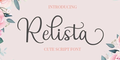 Relista is a beautiful handwritten font carefully created with a touch of elegance. This font is suitable for any projects such wedding cards, watermarks, quotes, social media, posters, invitations, and more. This font is PUA encoded so it will be accessible in the Adobe Illustrator, Adobe Photoshop, Adobe InDesign, even work on Microsoft Word.