10,000 search results
(0.055 seconds)
- Sugar & Spice by Brittney Murphy Design,
$8.00 Sugar and Spice is a sweet & scrumptious font duo! Designed with short descenders, so there’s less of that awkward white space, these work great for multi-line designs! Both include lots of alternates, the script includes plenty of ligatures, and the hand-sans has small-caps, so you can mix and match to create a custom look!
 - Freundschafts-Antiqua AR by ARTypes,
$35.00Freundschafts-Antiqua AR is based on a 20th-century German type design. Freundschafts-Antiqua (which was also called Chinesische Antiqua) was designed by the Chinese calligrapher Yü Bing-nan when he was a student at the Hochschule für Grafik und Buchkunst at Leipzig in 1960. It was cast in 1964 by VEB Typoart, Dresden, in 9-pt and 28-pt (Didot). The design combines the best German traditions with the Chinese bamboo pen. It is a unique, wholly modern, yet quiet and dignified typeface which is well suited for text-setting in many sizes. The original design was carefully crafted with all non-kerning letters (none of the letters overhangs its side-bearings); the lower-case f was designed so that no ligatures were needed. The AR fonts include the type's ch and ck logotypes, monetary signs and all the standard accents. The letterfit of the original design is retained and, as can be seen in the attached printable .pdf, text composed at normal sizes is very agreeable indeed. Freundschafts-Kursiv AR A features old-style (non-lining) figures and 'kerning' letters; Freundschafts-Kursiv AR B contains lining (cap-height) figures and all non-kerning letters following the original design of the face. - Block Capitals by K-Type,
$20.00 BLOCK CAPITALS is a square, geometric, small caps display face that avoids fashionable foibles and exudes the neutral, unpretentious functionality of time-honoured block lettering. The family has three widths (Narrow, Normal and Wide), and the Bold weights are loosely based on well-used squared nets – 3x5, 4x5 and 5x5. However, the typeface escapes its grid origins whenever necessary with slightly modulated stroke weights, sensitive spacing and careful kerning. The aim is to retain the strength and simplicity of strictly geometric characters while introducing barely perceptible refinements that add elegance and usability. That said, letters and numbers line up horizontally without overlapping the capline or baseline, even the tail of the Q does not descend below the Baseline. Diacritics are modesty proportioned, accented characters extending no farther than necessary, allowing the leading on multiple lines of text to be kept to a minimum.
 - PM Doorbuster Plug by Paper Moon Type & Graphic Supply,
$17.00 A new font inspired by vintage hand-painted paper signs. The Doorbuster Collection is based on retro hand-painted paper signs primarily seen in grocery stores from the 1920s through the 1970s. We meticulously hand-drew each font, modeling the spacing and uneven baseline found in vintage sign painting. The purposely organic ascenders and descenders, along with a huge set of ligatures/contextual alternates to avoid the same letters repeating when paired, give it a real hand-lettered look. Doorbuster Plug is perfect for both vintage-inspired and contemporary marketing, branding, and packaging designs. It's a classic workhorse font from the 1950s thru 1970s. Check out a few of the samples included in the thumbnails to see what can be done with it.
 - 1890 Registers Script by GLC,
$38.00 This script font was inspired by the “Ronde” French script. It was in use from 1700s to 1900s (until 1960s in special circumstances) for registers, legal documents and texts, certificates, labels and other documents that must be particularly legible. Today in France, it is still being used for menus, advertising, and labels. The present version is a late 19th Century pattern. This font supports very strong enlargements as well as small sizes. When printed, it remains perfectly legible and elegant from 9/11 pts even if using an ordinary inkjet printer.
 - Shoganai by Hanoded,
$15.00 I really like the Japanese language, as it has words that describe a whole world of meaning. Like Shoganai. It literally means: ‘It cannot be helped’. That’s life, get used to it. Shoganai sums up a lot of the Japanese culture and way of thinking: if things cannot be helped, then accept it and move on. Shoganai is a set of Brush fonts: a thinner, script font and a heavy display font. Use if for book covers, product packaging and more. If you can’t use it, then, well, Shoganai.
 - White Stork by Almazova Dolzhenko,
$12.00 White Stork is a handwritten font family which contains two versions Serif and Sans. So you can combine them to get a more interesting design. The font has simple shapes so it will be versatile to use. It will look great for logotypes, quotes, greeting cards, prints, branding design and much more. Hand-drawn font White Stork contains 2 sets of uppercase (serif and sans), 2 sets of lowercase (serif and sans), alternate set of lowercase letters for serif font, ligatures for double f and t letters. Multilingual support is included. Features: Uppercase & Lowercase Serif Uppercase & Lowercase Sans Alternate set of Lowercase Serif Numerals & Punctuation Ligatures (watch preview) Multilingual support Serif and Sans I hope this font will help you to create you unique design. If you have any question, feel free to contact me! Thanks! Lena (instagram @almaz_dolzhe)
 - Brimley by Chank,
$49.00This slinky number will seduce you with its linking letters and special ligatures. Brimley's strokes are tight and sharp, and its characters are tied together with slender, whispy hooks. Although its elegance is timeless, this is a style that typifies lettering of last century's late '50s and early '60s. Chank Co. intern Tim Drabandt created Brimley with inspiration from antique type books. He named the font after Wilford Brimley. You know... the chubby old guy who tells you to check your blood sugar and eat your Grape Nuts and Quaker Oats. Haven't you ever seen Cocoon? - Queulat by Latinotype,
$- Queulat is a hybrid typeface that combines two different styles, reflecting charm, freshness and, especially, a strong personality. The font is inspired by Modern and Grotesk styles. The former is shown in some characteristic features such as teardrop terminals, which give the typeface an attractive unique look, making it an ideal choice for logotypes and labelling. The latter, with its rationality, makes Queulat a stable and strong face for headings and subheadings. The combination of styles can be clearly seen by comparing the regular with the alt version. The regular version is more simple than the alt one. Differently, the alternative version possesses more features of the Modern style, like teardrop terminals in ‘k’ and ‘v’. Queulat also comes with a Unicase version, in which a higher number of shapes can be found, resulting in a unique colourful display.
 - Telegramo by Volcano Type,
$35.00 Telegramo is modeled on a historic telegraph from Belgrade to Vienna 1914. The original archetypal character set consists of lowercase letters and numerals only. Uppercase letters and special characters were added after careful research. Contact pressure variations of the rudimentary type writing machine are directly imitated in the three weights: the regular weights edges are sharp, medium edges are rounded and the bold letters can nearly be called soft. Since the original typeface did not seem perfectly suitable for modern desktop publishing purposes, two additional stylistic sets were created for each weight, improving certain issues in rhythm, legibility and quirkiness.
 - Citrine by XO Type Co,
$40.00 Citrine is a study in curves, based upon word-processing and in-game text. A tall lowercase makes for easy reading, curved joints give it friendliness, and broad spacing delivers distinctive all-caps treatments. Here’s a downloadable PDF specimen. Citrine’s basic idea began as “a Havelock for reading.” Essential geometry delivers a sense of harmony, and forms sit broadly next to each other to be easily read, even onscreen and very small. Citrine includes case-sensitive alternate shapes for smooth all-caps typesetting, small caps, and a wide range of diacritics to cover a multitude of latin-based languages.
 - Tolkiens Christmas by Kaer,
$19.00 Hey guys! Once I got a book "Letters From Father Christmas" by J.R.R. Tolkien. He wrote them for the children every December from 1920 to 1943. I totally fell in love with the calligraphy in those letters. Now I created a font and you can use it to write your own letter from the North Pole. I've also redrawn stamps and patterns from that book, so you can decorate your blank. It's Icons font style. You'll get: Regular and Icons styles Numbers and symbols Multilingual support and alternative symbols Thanks! Feel free to request to add characters you need: kaer.pro@gmail.com
 - Aglaia by Wildstripe,
$19.00 Aglaia is an elegant geometric sans serif typeface that comes in three weights. Designed in part inspired by Art Deco, but with a modern minimalist approach that makes it a versatile and excellent contemporary display font for titles, editorials and short texts. Font features: Uppercase & Lowercase Numerals, Punctuation & Symbols Alternates & Ligatures Multiple Languages Support (Latin characters + Diacritics) How to access Alternate Characters: The alternate characters can be accessed via the glyphs panel in your favorite software. Or with OpenType features turned on.
 - Hyldae Script by Get Studio,
$17.00 Introducing Hyldae Script, a romantic and modern calligraphy typeface with decorative characters and a dancing baseline! Hyldae Script is particularly well-suited to create the most lovely wedding designs, invitations, mood board, social-media template or for your editorial design needs. Hyldae comes with more than 315 glyphs, includes uppercase and lowercase letters, numerals, a large range of punctuation and ligatures. The OpenType features can be accessed by using OpenType savvy programs such as Adobe Illustrator, Adobe InDesign, and Adobe Photoshop.
 - Andora by Letterara,
$12.00 Introducing Andora, a beautiful, full-featured modern calligraphic font with tons of alternate characters and OpenType features. Andora hand-lettered is particularly well-suited for invitations, branding and editorial design. Perhaps the most fun thing about Andora is that it includes multiple versions of all ascending and descending letters, making it lots of fun to play with layouts and compositions. The OpenType features can be very easily accessed by using OpenType-savvy programs such as Adobe Illustrator and Adobe InDesign.
 - Boarding House by Hanoded,
$15.00 I have never stayed at a boarding house myself, but I’ve heard some horror stories. When I have finished painting the three fonts (using Chinese ink and a small brush), I didn’t have to think long for a name. Boarding House family consists of three distinct hand painted fonts - the complement each other, but can be used separately as well. Use Boarding House for your halloween posters, mystery novels or websites. All fonts come with an attic full of diacritics.
 - HD Anomie by HyperDeluxe,
$40.00 HD Anomie is a modern geometric sans built in 18 styles with variable support and is brought to you by HyperDeluxe®. Its subtle forms and nuanced curves create a simple structure that could be perceived as mundane, but our goal was to create a typeface that is both mechanical and organic in its forms so it seamlessly fits within the environment it is placed. It's clean, minimal approach gives it a wide array of offline uses such as branding, editorial & print, but its modern design and detailed build makes it perfect for UI & digital applications. The clean visual structure of the letter forms give it great readability at smaller sizes, while also being happy to be shown off at larger sizes. Built to be robust and as versatile as possible we have around 1150 Glyphs per weight including extended Latin & Cyrillic support as well as basic Greek. Anomie also features extras such as 2 arrow sets, circled numbers as well as stylistic alternates and case sensitive forms. Find beauty in the Mundane. Meet HD Anomie.
 - Slivky by Slava Antipov,
$25.00 Slivky is a condensed rounded font family. It includes 6 styles: All Caps, All Caps Swash, Regular, Regular Swash, Small Caps, Small Caps Swash. Swash fonts have large capitals in the style of handwritten / script fonts. This cute rounded font is quite versatile due to the different styles. Good for logos, packaging, posters, advertisements and more.
 - Nesti Sweet by Gatype,
$12.00 Nasti Sweet is a round bubble display font, a very unique trendy font with a combination of modern character bindings, and I think this product suits the teaser display theme in every headline design, business cards, leaflets, magazines, children's events, and brand screen printing. Come on, take a look and be happy to hear the review. If you have suggestions about this product, please let your work environment know whether this product is good for them. Thank you so much for everything!!
 - Abela Sweety by Gatype,
$12.00 Abela Sweety is a monoline comic display font, a very unique trendy font with a combination of modern character bindings, and in my opinion this product suits the teaser display theme in every headline design, business cards, leaflets, magazines, children's events and brand screen printing. Come on, take a look and be happy to hear the review. If you have suggestions about this product, please let your work environment know whether this product is good for them. Thank you so much for everything!!
 - Generis Slab by Linotype,
$29.00The idea for the Generis type system came to Erik Faulhaber while he was traveling in the USA. Seeing typefaces mixed together in a business district motivated him to create a new type system with interrelated forms. The first design scheme came about in 1997, following the space saving model of these American Gothics. Faulhaber then examined the demands of legibility and various communications media before finally developing the plan behind this type system. Generis’s design includes two individually designed styles; each of with is available with and without serifs, giving the type system four separate families. Each includes at least four basic weights: Light, Regular, Medium, and Bold. Further weights, small caps, old style figures, and true italics were added to each family where needed. The Generis type system is designed to meet both optical criteria and the highest possible measure of technical precision. Harmony, rhythm, legibility, and formal restraint make up the foreground. Generis combines aesthetic, technical, and economic advantages, which purposefully and efficiently cover the whole range of corporate communication needs. The unified basic form and the individual peculiarity of the styles lead to Generis’ systematic, total-package concept. The clear formal language of the Generis type system resides beneath the information, bringing appropriate typographic expression to high-level corporate identity systems, both in print and on screen. The condensed and aspiring nature of the letterforms allows for the efficient setting of body copy, and the economic use of the page. A range of accented characters allows text to be set in 48 Latin-based languages, offering maximal typographic free range. This previously unknown level of technical and design execution helps create higher quality typography in all areas of corporate communication. Optimal combinations within the type system: Generis Serif or Generis Slab with Generis Sans or Generis Simple. - Generis Serif by Linotype,
$29.00The idea for the Generis type system came to Erik Faulhaber while he was traveling in the USA. Seeing typefaces mixed together in a business district motivated him to create a new type system with interrelated forms. The first design scheme came about in 1997, following the space saving model of these American Gothics. Faulhaber then examined the demands of legibility and various communications media before finally developing the plan behind this type system. Generis’s design includes two individually designed styles; each of with is available with and without serifs, giving the type system four separate families. Each includes at least four basic weights: Light, Regular, Medium, and Bold. Further weights, small caps, old style figures, and true italics were added to each family where needed. The Generis type system is designed to meet both optical criteria and the highest possible measure of technical precision. Harmony, rhythm, legibility, and formal restraint make up the foreground. Generis combines aesthetic, technical, and economic advantages, which purposefully and efficiently cover the whole range of corporate communication needs. The unified basic form and the individual peculiarity of the styles lead to Generis’ systematic, total-package concept. The clear formal language of the Generis type system resides beneath the information, bringing appropriate typographic expression to high-level corporate identity systems, both in print and on screen. The condensed and aspiring nature of the letterforms allows for the efficient setting of body copy, and the economic use of the page. A range of accented characters allows text to be set in 48 Latin-based languages, offering maximal typographic free range. This previously unknown level of technical and design execution helps create higher quality typography in all areas of corporate communication. Optimal combinations within the type system: Generis Serif or Generis Slab with Generis Sans or Generis Simple. - Generis Simple by Linotype,
$39.00The idea for the Generis type system came to Erik Faulhaber while he was traveling in the USA. Seeing typefaces mixed together in a business district motivated him to create a new type system with interrelated forms. The first design scheme came about in 1997, following the space saving model of these American Gothics. Faulhaber then examined the demands of legibility and various communications media before finally developing the plan behind this type system. Generis’s design includes two individually designed styles; each of with is available with and without serifs, giving the type system four separate families. Each includes at least four basic weights: Light, Regular, Medium, and Bold. Further weights, small caps, old style figures, and true italics were added to each family where needed. The Generis type system is designed to meet both optical criteria and the highest possible measure of technical precision. Harmony, rhythm, legibility, and formal restraint make up the foreground. Generis combines aesthetic, technical, and economic advantages, which purposefully and efficiently cover the whole range of corporate communication needs. The unified basic form and the individual peculiarity of the styles lead to Generis’ systematic, total-package concept. The clear formal language of the Generis type system resides beneath the information, bringing appropriate typographic expression to high-level corporate identity systems, both in print and on screen. The condensed and aspiring nature of the letterforms allows for the efficient setting of body copy, and the economic use of the page. A range of accented characters allows text to be set in 48 Latin-based languages, offering maximal typographic free range. This previously unknown level of technical and design execution helps create higher quality typography in all areas of corporate communication. Optimal combinations within the type system: Generis Serif or Generis Slab with Generis Sans or Generis Simple. - Generis Sans by Linotype,
$29.00The idea for the Generis type system came to Erik Faulhaber while he was traveling in the USA. Seeing typefaces mixed together in a business district motivated him to create a new type system with interrelated forms. The first design scheme came about in 1997, following the space saving model of these American Gothics. Faulhaber then examined the demands of legibility and various communications media before finally developing the plan behind this type system. Generis’s design includes two individually designed styles; each of with is available with and without serifs, giving the type system four separate families. Each includes at least four basic weights: Light, Regular, Medium, and Bold. Further weights, small caps, old style figures, and true italics were added to each family where needed. The Generis type system is designed to meet both optical criteria and the highest possible measure of technical precision. Harmony, rhythm, legibility, and formal restraint make up the foreground. Generis combines aesthetic, technical, and economic advantages, which purposefully and efficiently cover the whole range of corporate communication needs. The unified basic form and the individual peculiarity of the styles lead to Generis’ systematic, total-package concept. The clear formal language of the Generis type system resides beneath the information, bringing appropriate typographic expression to high-level corporate identity systems, both in print and on screen. The condensed and aspiring nature of the letterforms allows for the efficient setting of body copy, and the economic use of the page. A range of accented characters allows text to be set in 48 Latin-based languages, offering maximal typographic free range. This previously unknown level of technical and design execution helps create higher quality typography in all areas of corporate communication. Optimal combinations within the type system: Generis Serif or Generis Slab with Generis Sans or Generis Simple. - Kristopher by Vintage Voyage Design Supply,
$22.00 An elegant serif with contrasting lines and balanced curves. A lot of stylish alternates will give you many useful variations for use. Try to play with the compositions of curves / alternate letters. This font may be conservative and classic, but also may be more playful and modern. It is good for theater or art posters and for modern music, web-pictures or vinyl covers. Of course it also will be good for coffee shops, cafe's, restaurants, magazine's headers, signs or gift/post cards and weddings. Try to use it in your beauty or travel blogs, you will see how many options you will have with stylish Kristopher.
 - Andy Bear by Gatype,
$8.00 Andy Bear embodies oddity and authenticity. This dazzling display font will turn any creative idea into a standout. Get inspired by its fun styles, and use them to brighten up kids or school projects! This font has no shadow effect by default. You can create this effect by duplicating the text and placing the duplicates
 - Minimal Nahidha by Attype Studio,
$19.00 Minimal Nahidha is a minimalist sans serif typeface with a casual and trendy outlook. Minimal Nahidha was built to balance the geometric qualities of a san-serif typeface with all the benefits of traditional serif fonts, like readability and personality. Minimal Nahidha comes in Regular and Slant version, each with its own unique set of characters & it has ligatures and stylistic alternates that make it easy to customize your designs. The fonts works best as display typefaces or as beautiful headline fonts, but can also be used in other ways to create stunning designs. Features : - Minimal Nahidha Family Font - Ligatures - Stylistic Alternates - Multilingual, US Roman, Latin 1 Support Hope you enjoy with our font! Attype Studio
 - Penelope by Solotype,
$19.95This was originally brought out as a caps-only font, but later the foundry scrounged up a lowercase that wasn't our idea of a very good match. So we cleaned up the caps and made them a bit bolder, then drew a harmonizing lowercase. - Round Rope by Putracetol,
$28.00 Round Rope - Playful Display Font Round Rope - Playful Display Font is a fun and colorful typeface that is perfect for adding a playful touch to any design. This font was inspired by the idea of creating a font that is both playful and whimsical, perfect for children's books, branding, packaging, posters, and any design that requires a fun and lighthearted touch. The font is designed with a playful, rounded appearance and features a hand-drawn feel that adds to its charm. Round Rope is a versatile typeface that can be used for a variety of design projects. Its playful and whimsical appearance makes it perfect for use in children's books, cartoons, and other designs that require a fun and lighthearted touch. It's also great for branding, packaging, and posters, where its unique style can help your designs stand out. This font comes with a range of features that make it a versatile and functional typeface. It includes uppercase and lowercase letters, as well as Opentype features such as alternates and ligatures, which allow you to create unique designs and add even more character to your text. It also includes support for multilingual characters, making it easy to use in designs that require different languages. In the font package, you will receive three file formats: Round Rope otf, Round Rope ttf, and Round Rope woff. These formats make it easy to use the font across different platforms and devices, ensuring that your designs look great no matter where they are viewed. Round Rope is a fun and playful font that is sure to bring a smile to your face. Its unique style and playful appearance make it a great choice for a wide range of design projects. Whether you're designing for children or adults, this font is sure to add a touch of whimsy and playfulness to your work. In summary, Round Rope - Playful Display Font is a fun and colorful typeface that is perfect for adding a playful touch to any design. Its unique style and playful appearance make it a great choice for a wide range of design projects, including branding, packaging, posters, and children's books. With its range of features and file formats, it's also a versatile and functional typeface that can be used across different platforms and devices.
 - Beautiful Moonlight by Fargun Studio,
$14.00 Beautiful Moonlight is handwritten stylish copperplate calligraphy fonts, combines from copperplate to contemporary typeface with a dancing baseline, classic and elegant touch. Can be used for various purposes. such as headings, signature, logos, wedding invitation, t-shirt, letterhead, signage, lable, news, posters, badges etc.
 - Celover by Balevgraph Studio,
$12.00 Celover is an elegant and modern sans serif font. It can easily be matched with your various projects, so add it to your creative ideas and watch how it makes it stand out. Features: Multilingual Ligatures Alternates PUA encoded Files Included: Celover Regular & Italic TTF
 - Crocante by PintassilgoPrints,
$24.00 Crocante is an energetic and good-humored display font. Although being an all caps alphabet, it counts two versions for each letter, easily accessed through keyboard upper and lower keys. These slightly different letterforms will bring spontaneity and vitality to your designs. Crunching noises guaranteed!
 - Mustafa Script by Fargun Studio,
$12.00 Mustafa Script is handwritten stylish copperplate calligraphy fonts, combines from copperplate to contemporary typeface with a dancing baseline, classic and elegant touch. Can be used for various purposes. such as headings, signature, logos, wedding invitation, t-shirt, letterhead, signage, lable, news, posters, badges etc.
 - Caligendings by Prioritype,
$15.00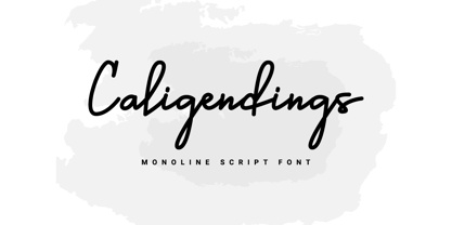 An elegant looking font that's perfect for your project and supports multilingualism. Can be applied to brochures, creative posts, boutiques and salons, women's jewelry, wedding invitations, business cards, photographer watermarks, clothing, and more. For reference, see preview. Features: -Uppercase -Lowercase -Numeral -Punctuation -Ligature -Multilingual
 - Hi TV by Yebhu,
$15.00 Hi TV is an good-humored and energetic display font. Although being an all caps alphabet, it counts two versions for a letter, easily accessed choose uppercase or lowercase. These slightly different letterforms will bring spontaneity and vitality to your designs. Crunching noises guaranteed!
 - Emilyne by Sibelumpagi,
$14.00 Emilyne is a sweet hand-lettered calligraphy font. It includes swashes and alternates which can be used to give your design looks beautiful and elegant. It’s perfect for logos, product packaging, wedding invitations, branding, headlines, signage, labels, signature, book covers, posters, quotes and many more.
 - Extrend by Attractype,
$15.00 Extrend, a clean and modern sans serif typeface, ideal for text that requires more space. suitable for corporate use as well as corporate branding and identity design, magazines, books, comics. With five styles, Extrend can be used to make your creative projects more interesting.
 - Max Stitch by Aboutype,
$24.99Similar to Erasurehead. Redrawn as in line, outline font for embroidery application. Works well with layers, colors, gradients and filters. Max was designed for all media and can be used in a wide range of point sizes. Max requires subjective display kerning and compensation. - CrosswordBelle by JOEBOB graphics,
$19.00 A neat and clean-cut little sister for the grungy crosswordBill font. Try CAPS only too!
 - Nutcake CatchWords by Andinistas,
$49.00 INSPIRED BY THE LOVERS OF LETTERS AND ANCIENT ANIMATED DRAWINGS: We present one of our most desired typographical tools of 2019: NUTCAKE CATCH-WORDS! Designed and produced by #carlosfabiancg and #a_freitez at different times and places in Venezuela and Colombia. Each word design was like “travel to the old school of hand lettering of 1930” due to the number of options and alternatives we discarded to solidify meticulous researches and Bezier drawings, based on analysis and synthesis of empty and full calligraphy, first done with a round brush and then perfected with pencil and paper. For this reason, each NUTCAKE CATCH-WORDS design contains a high dose of cursive expressiveness, apparently handwritten, and that is why our customers can take advantage of more than 160 words compiled in a single OTF file. NOTE: if you need any new word with the NUTCAKE CATCH-WORDS style, please write us and we will gladly design it to include it in your file. Below the list of 160 catch words: and, An, All, As, After, Ante, Avec, Break, Bright, Big, Back, Both, Best, Body, Butter, Breakfast, By, Bajo, Coffe, Café, Closet, Can, Cocktail, Cookies, Custom, Cabe, Con, Contra, Could, Crisp, Candy, City, Chocolate, Chocolat, Come, Del, Don't, Deliver, Desde, Di, Durante, Enjoy, Eat, Example, El, En, Entre, Front, Fire, Free, Fashion, For, Fresh, Friday, Family, Going, Great, Go, Heres, Here, Hand, Hacia, Hasta, Have, I'm, It’s, Imagine, It, Join, Just, Jam, Kitchen, Kiss, Know, Keep, Like, Life, Lady, La, Las, Les, Los, Le, Love, Money, More, Master, My, Mediante, Now, now, New, new, next, nuevo, nueva, Off, out, ofertas, oferta, offer, offers, Please, Para, Per, Page, Quality, Queen, Question, Valley, Queso, Right, Road, Save, See, Show, Something, So, Según, Sin, So, Sobre, Sale, Shop, Style, Styles, Sweet, Special, To, the, The, Theres, There, To, This, Three, They, That, Tras, Think, Time, Take, Transfer, Until, Vacation, Value, Vote, What, Hats, With, Welcome, Which, You, Y, You're, you, Zip, Zoom, Zombie.
PreviousPage 250 of 250