10,000 search results
(0.665 seconds)
- Carilliantine by Device,
$39.00 Carilliantine updates the organic curves of Art Nouveau typefaces typified by John F. Cumming's Desdemona, designed around 1886. A contemporary monoline sans reinterpretation rather than a more traditional serif, its high-waisted emphasis lends it an elegance and class. Carilliantine is replete with hundreds of two- and three-letter ligatures that bring a customised uniqueness to any headline. These are on by default, and can be toggled on or off in the Opentype palette of Adobe apps, or chosen individually according to taste from the Glyphs menu. Suitable for upmarket food packaging, wine labels, restaurants, folk bands, sword and sorcery trilogies, cosmetics and fashion brands that nod to the refinement of yesteryear, but are very much of today.
 - Baskerville Old Face KTKM by KTKM,
$55.00 “So-called Baskerville Old Face of the type foundry Stephenson Blake & Co. of Sheffield. The Script is probably not immediately linked to Baskerville, but it is very much influenced by it. It is one of the most beautiful types of which the mats still exist; it has an incomparably different spirit than the ‘streamlined’ re-cuts of today’s Baskerville. Even keeping the general restraint extremely expressive. According to Berthold Wolpe (‘Signatures’ No. 18), the punches were cut and shown in samples in 1776 by Isaac Moore, who came from Birmingham to Bristol.” – Jan Tschichold, “Meisterbuch der Schrift”, Notes On The Plates, Page 231 Publisher note: I wanted to improve the contrast between thick and thin, reduce some ink-traps and give stems, serifs and links a smoother overall feel. I have also added some alternative letters and old style numerals.
 - Jackipur by HGB fonts,
$20.00 The motivation for Jackipur was: to achieve more openness and thus more clarity. That's why I created more clarity in the structure of the letters in order to avoid formal ambiguities that arise especially with small degrees. I found it important to open up the round letters so that they are straight and horizontal along the center and baselines so that the eye can connect the letters directly and quickly. A simple font, but neither plain nor without elegance.
 - Sabon Next by Linotype,
$57.99 The design of Sabon® Next by Jean François Porchez, a revival of a revival, was a double challenge: to try to discern Jan Tschichold´s own schema for the original Sabon, and to interpret the complexity of a design originally made in two versions for different typecasting systems. The first was designed for use on Linotype and Monotype machines, and the second for Stempel hand composition. Because the Stempel version does not have the constraints necessary for types intended for machine composition, it seems closer to a pure interpretation of its Garamond ancestor. Naturally Porchez based Sabon Next on this second version and also referred to original Garamond models, carefully improving the proportions of the existing digital Sabon while matching its alignments. The new family is large and versatile - with Roman and italic in 6 weights from regular to black. Most weights also have small caps, Old style Figures, alternates (swashes, ligatures, etc); and there is one ornament font with many lovely fleurons. The standard versions include revised lining figures that are intentionally designed to be a little smaller than capitals. Featured in: Best Fonts for Resumes, Best Fonts for Websites, Best Fonts for PowerPoints
 - Honeyguide by Hanoded,
$15.00 Description: Honeyguide is a beautiful, handmade set of fonts. One is a brushed script font; the other a playful all caps font. Both come with italic styles. Use these two babies for your product packaging and book covers, happy holiday greeting cards and products in need of some quality packaging. A honeyguide, by the way, is a bird species (fam. Indicatoridae) from Africa and Asia. They are famous for leading humans to bee colonies, so they can feast on the grubs and beeswax that are left behind.
 - Wezer by Putracetol,
$24.00 The Wezer - Display Bold Font Duo is a unique and bold typeface that breaks away from the conventional font styles. It offers two distinct versions: rounded and display, both designed to bring something entirely fresh to the table. The purpose behind creating this font was to introduce a one-of-a-kind typeface that stands out in the design world. Wezer is the ideal choice for projects that require a touch of quirkiness and originality, making it perfect for logos, branding, headlines, posters, titles, billboards, banners, and any design that dares to be different.
 - Type Uncommon JNL by Jeff Levine,
$29.00 Never let it be said that a good pun and a good font name can't work well together. The vintage sheet music for a 1920s-era song called "King Tut" (not to be confused with the novelty tune by comedian Steve Martin) presented an oddly-interesting block font which is now available in digital form as Type Uncommon JNL. The pun derives from the font's name of "Type Uncommon", which is similar in sound to King Tut's full name (which is Tutankhaten).
 - Dress Quote by PizzaDude.dk,
$17.00 Dress Quote is obviously a wordplay - and I did my best to be funny, coming up with that name. I also did my best to do a funny font. I'll let you be the judge of my success - but personally I am satisfied with my performance in both cases! :) The Regular version is a set of steady, yet kind of rugged letters, while the Outline version is ... well, the same kind og rugged letters in an outlined version! :) Multilingual support is included!
 - Ano Angular by Alias,
$60.00 Ano Angular was originally designed for a fashion company. It was to be used as a headline type, half way between the logo we had designed — made up of straight lines only — and our circle-based Ano typeface, which was to be used for text. Its design is based on the idea of mixing circles with triangles into letter shapes in a modular, constructed way. The effect is digital, mathematical, remeniscent of the typography of 1980s arcade games such as Asteroids.
 - Dilemma by Sudtipos,
$39.00 Dilemma is a sans/sans serif type system with 42 styles; it is inspired by the anonymous Polyphème, Cyclopéen and Extra Condensé designs from the early 1900s at the Peignot Fonderie. From these initial points of reference, Sudtipos went further and reimagined these projects for an actual use by blending them into a unique and complex type system. Dilemma is defined as ‘a situation in which a difficult choice has to be made between two or more alternatives, especially ones that are equally undesirable’ and that is exactly how we designed this font. We created a workhorse system where each style functioned well alone but would be more powerful when working as a team, pairing the sans styles with the serifs. Dilemma comes in 3 different widths and 7 weights in both the sans and the serif, ranging from the more economical yet legible condensed styles, to the opulent bold and expanded weights. Dilemma also contains 2 Variable Fonts. We imagine Dilemma being used in a limitless array of graphic projects including identity systems, digital platforms, public spaces, editorial design and beyond. Now the Dilemma is yours.
 - CopperCanyonWBW - Unknown license

- MadisonSquare - Unknown license

- Frutiger Stones by Linotype,
$29.00In Adrian Frutiger, the discipline of a mathematically exact mind is joined with an unmistakable artistic sense. His independent work possesses the controllable language of letterforms. Personal and intensive, this work is the manifestation of his expressive will. Frutiger's precise sense of outline reveals itself two- or three-dimensionally in wood, stone, or bronze, on printing plates and in the form of reliefs. However, even his independent work can be understood as objectivized signs; in their symbolism, they are embedded in the fundamental questions of human existance. They might have developed in the spirit of playfulness, but their nature is always conceptual, directed towards a complex, yet harmonic, whole. Following function, form also necessarily follows the content of the language. The entire spiritual world becomes readable through letters. Essentially, Adrian Frutiger attempts to fathom the basic, central truth which defines our lives: change, growth, division - beginning and end. In a virtual synthesis, he seems to close the circle in which the world reflects itself in symbolic forms. Frutiger Stones is for Adrian Frutiger the example of his formal artistic sensibility par excellence. Searching for the fundamental elements in nature, he has discovered the pebble, rounded and polished over innumerable years by gently flowing water. And out of this, he has created his complete system, a ruralistic typeface of letters and symbols. It depicts animals and plants, as well as astrological and mythical signs. Because of its unique aura, Frutiger Stones is particularly well-suited to different purposes - in headlines and prominent pictograms, as symbol faces, illustrations, and more. - Ceudah by PojolType,
$12.00 Ceundah font is inspired by thick and thin Hand Sketches. This font can be used for film titles, magazine titles, newspaper front pages, billboards, or company brands.
 - Blacklite by Letterhend,
$14.00 Blacklite is a bold script that will stands out from the crowd! Perfect to be used as logotype, badge and label! This has many OpenType features like ligatures, stylistic alternates, contextual alternates, swash, and more, and support multiple languages.
 - Simple Home by Goodigital13,
$20.00 This font perfectly made to be applied especially in logo, and the other various formal forms such as invitations, labels, logos, magazines, books, greeting / wedding cards, packaging, fashion, make up, stationery, novels, labels or any type of advertising purpose.
 - Benjamin by Solotype,
$19.95Fonts without curved lines were quite popular in Victorian times. We drew this one back in the days of T-squares and triangles, and based it on a type that we felt could stand to be improved. (Arrogant, eh?) - Kiks by David Engelby Foundry,
$25.00 Kiks is the Danish name for biscuit. Just like a biscuit this font throws its crums in every direction with curvy, bold letters. A display font made for headlines and everything else that needs to be visually loud. Enjoy!
 - Rialto Piccolo dF by CAST,
$305.00 Rialto dF is a book face inspired by calligraphic tradition. Named after the famous bridge in Venice, it was conceived as a bridge between calligraphy and typography, roman and italic. It can also be thought of as an imaginary bridge between Italy and Austria, since it is the result of collaboration started in 1995 between the Austrian Lui Karner and Venetian Giovanni de Faccio. The letterforms of Rialto dF were drawn directly in digital format with a starting point deriving from humanistic letterforms memorized in the hearts, minds and the manual ability of its designers… As tradition demands, uppercase, numerals and punctuation are used in combination with italics – the same solution adopted by Francesco Griffo when he cut his first italic for the Virgil, the first of the octavo series printed and published in Venice by Aldus Manutius in 1501. Rialto dF comes in two optical weights: Piccolo, for up to 14 pt, and Grande for 16pt and above. Alternate characters and various dingbats are also provided and these are available through OpenType features developed by type designer and technician Karsten Luecke.
 - Message from Mars by PizzaDude.dk,
$18.00 This is a live recording from Mars: Your planetary system is about to be invaded by the inhabitants of Mars. We come in peace, we come with party! Heh-heh. Say hello to my interplanetary font, Message from Mars. Handmade, yet super digital. Play around with the weird shaped letters, and make your own galactic text - use upper- and lowercase as well as the alternate version
 - Pecattes by Prioritype,
$15.00 A brush font with a script theme that can make your project maximized. Moreover, it is equipped with several attractive alternatives and swashes. Can be used in various print or digital media such as product packaging, content display, social media promotion, broadcasts and many more. Features: -Uppercase -Lowercase -Numeral -Punctuation -Multilingual -Alternate -Swash Don't hesitate to support now!
 - Fleete by Greater Albion Typefounders,
$5.95 Fleete is a modern homage to the many late 19th century typefaces; often used for book titles, posters and newspaper headlines; which have an extreme contrast between hairline horizontal stems and serifs and heavy vertical stems. Greater Albion Typefounders have taken this basic idea, to be found across very many faces of the period and used just that one concept as the basis of a new typeface design, which manages to be elegant yet modern all at once. IF you need something for a section heading which stands out from body text, this is the font family for you. If you need headings on a poster or large scale web-page headings, this is the face you should try. If you need several weights of heading-no problem; Fleete comes in Regular, Bold and Shadowed, as well as a newly designed Sans Serif form.
 - Pocketknife by Blank Is The New Black,
$13.00 Pocketknife is a simple grid-based titling font on it’s surface, but it has a surprisingly prolific set of features under the surface. The most notable of these features is an abundant set of ligatures that give Pocketknife it’s unique look. There are very few kerning pairs contained within Pocketwatch, and these ligatures fill in most gaps that could be created by letters with more empty space, such as L and T, and also give a more playful look to an otherwise sharp-edged typeface. Pocketknife also contains with 2 full sets of alternate characters, one pairing with the uppercase set and one pairing with the lowercase—available as OpenType stylistic alternates or individually in the Glyphs panel. Pocketknife Regular is designed to be used on it’s own, while the Inline and Base fonts are designed to be used as a simple layered combination. The Base font is nearly identical to Regular, but contains a few specially adjusted characters that better accommodate the Inline style. Pocketknife Outline is a combination of the Inline/Base styles, to be used individually. Pocketknife is sharp, but playful. Simple, but sophisticated. Sporty, technical, and aggressive, yet elegant and fun. Pocketknife, while simple at first glance, is a deceivingly versatile typeface.
 - Proba Pro by Mint Type,
$- Proba Pro is a geometric sans with lowered x-height, prominent ascenders and descenders and a subtle humanist touch. It comes in 7 weights + matching italics each supporting numerous Latin-based languages as well as major Cyrillic languages. It is packed with OpenType features like ligatures, small caps, 4 sets of digits, 2 stylistic sets, superiors and inferiors, fractions, ordinals, and respective punctuation varieties including all-cap punctuation. There are also language-specific alternates for Romanian Ș/ș, Catalan punt volat, and correct small-cap versions for i/ı in Turk languages. Some of the styles of Proba Pro can be found in Mint Type Editorial Bundle together with other fonts which make some great pairs. Check it out!
 - Ring Soft by Ochakov,
$9.00 Ring Soft, soft as cashmere... Cute set of the Ring font family! It probably won't get any softer than this. Ring Soft is a cool, varied, and trendy-looking display font. No matter the topic, this font will be an incredible asset to your fonts’ library, as it has the potential to elevate any creation. Cuter than ever and much prettier. Ring Soft and other fonts of Ring family is still very cozy and comfortable.
 - Generic by More Etc,
$15.00 The Generic Typeface Collection is a series of sans-serif typefaces inspired by the craftsmanship of graphic design, typesetting, and printing in the analogue era – before Adobe, Macintosh computers and desktop publishing – when dinosaurs ruled the earth. With the use of various typesetting apparatuses or dry transfer type, photo copiers, and shooting layouts and paste-ups to film, the printed results was not as exact, precise and predictable as it is today. When examining old prints, it is difficult not to like the way that characters in over- or underexposed film have a special type of vibe to them that is often sadly lost in today’s pursuit of total perfection. Encouraged by this, I saw a need for a collection of typefaces that are non-clinical and non-conformist, and some that are coarse, rough and distorted – errors that might come from poor exposure when put on film, enlargements from small point texts, or maybe quality loss from successive generations of photocopies. Or all of the above. This is an attempt to incorporate spirit and personality into a set of typefaces without losing distinction. You might call it a homage to non-perfection. I call it human. The Generic Typeface Collection consists of 11 fonts divided into four series. The three standard series – the Formal Release series, the Coarse Copy series, and the Rough Display series – all contain three fonts each. The Extra Splendor series contains a couple of shadow fonts for that little extra sparkle. Formal Release – Handcrafted & Clean The Formal Release series features sans-serif typefaces for everyday use. They are handcrafted and clean, human and uncomplicated. The Formal Release series contains three typefaces that add tons of personality to any text. G10 FR ‘Slim’ – a slightly under-exposed and clean typeface in a regular weight (228 glyphs - 1 alternate) G20 FR ‘Classic’ – a properly exposed clean typeface in a bold weight (228 glyphs - 1 alternate) G30 FR ‘Bulky’ – a heavily over-exposed clean typeface in an ultra weight (228 glyphs - 1 alternate) Coarse Copy – Dirty & Rough The Coarse Copy series features non-conformist typefaces that are worn and rough, maybe after going through that bad copier a few times too much. The Coarse Copy series contains three sans-serif typefaces that add tons of spirit to any text without compromising too much on legibility. Try them on in poster-sizes and everyone will know that you mean business. G40 CC ‘Slender’ – an under-exposed coarse typeface in a regular weight (228 glyphs - 1 alternate) G50 CC ‘Typic’ – a properly exposed coarse typeface in a bold weight (228 glyphs - 1 alternate) G60 CC ‘Huge’ – a heavily over-exposed coarse typeface in an ultra weight (228 glyphs - 1 alternate) Rough Display – Faded & Decorative The Rough Display series features attention-seeking decorative typefaces in three feature-packed fonts. Faded and gritty like the image distortion and degradation from successive generations of photocopies, they are eye-catching typefaces intended to stand out in bigger point sizes. Use these typefaces for signage, headlines and similar situations were a strong typographic statement is desired. We have packed no less than 1,334 alternate characters and 212 discretionary ligatures into this series for a greater chance of not having characters that look exactly the same more than once. G70 RD ‘Slinky’ – an under-exposed rough and decorative typeface in a regular weight (741 glyphs – 448 alternates – 66 discretionary ligatures) G80 RD ‘Standard’ – a properly-exposed rough and decorative typeface in a bold weight (748 glyphs – 448 alternates – 73 discretionary ligatures) G90 RD ‘Swollen’ – a heavily over-exposed rough and decorative typeface in an ultra weight (748 glyphs – 448 alternates – 73 discretionary ligatures) Extra Splendor – Sparkling & Extraordinary The Extra Splendor series features two shadow typefaces for that little extra sparkle. One clean shadow to be used with G20 FR ‘Classic’, and one rough shadow to be used with G80 RD ‘Standard’. Having the shadows separate from the main typeface adds another layer of expressiveness in that you can try out color combinations for that extra splendor. Tips for matching (applies to both the base font and the shadow font): Set the kerning to Metric, not optical. Increase tracking to accommodate for the shadows extra width. G25 ES ‘Classic Shadow’ – a clean shadow to be used with G20 FR ‘Classic’ (228 glyphs – 1 alternate) G85 ES ‘Standard Shadow’ – a rough shadow to be used with 80 RD ‘Standard’ (227 glyphs) OpenType features – alternate characters and discretionary ligatures – can be accessed by using OpenType friendly professional design applications, such as Adobe Illustrator, Adobe InDesign, and Adobe Photoshop.
 - Greatest Richmond by Azetype,
$19.00 Presenting Greatest Richmond! An Authentic Brush Font with 3 alternates and 36 swashes. This font made with the perfect combining of each character. You can type by Mix & Match with alternate version to get a unique combining. It looks original and can be used for all your project needs. Each glyph has its own uniqueness and when meeting with others will provide dynamic and pleasing proximity. This font can be used at any time and any project. You can see in the presentation picture above, Greatest Richmond looks stylish and wildly on design projects. So, Greatest Richmond can't wait to give its touch to all your design projects such as quotes, poster design, personal branding, promotional materials, website, logotype, product packaging, etc. Besides that, Greatest Richmond also has some ligature that gives a surprise when you type certain characters combining. The ligatures are ee, ff, ii, nn, oo, rr, ss, st, St, tt, lt, rt, and th. WHAT'S INCLUDED? 1. Greatest Richmond Basic • The first version comes with uppercase, lowercase, ligatures, numeral, punctuation, symbols, and Standard Latin Multilingual Support (Afrikaans, Albanian, Catalan, Danish, Dutch, English, French, German, Icelandic, Indonesian, Italian, Malay, Norwegian, Portuguese, Spanisch, Swedish, Zulu, and More). 2. Greatest Richmond Alternate One • The first version comes with uppercase, lowercase, ligatures, numeral, punctuation, symbols, and Standard Latin Multilingual Support (Afrikaans, Albanian, Catalan, Danish, Dutch, English, French, German, Icelandic, Indonesian, Italian, Malay, Norwegian, Portuguese, Spanisch, Swedish, Zulu, and More). 3. Greatest Richmond Alternate Two • The first version comes with uppercase, lowercase, ligatures, numeral, punctuation, symbols, and Standard Latin Multilingual Support (Afrikaans, Albanian, Catalan, Danish, Dutch, English, French, German, Icelandic, Indonesian, Italian, Malay, Norwegian, Portuguese, Spanisch, Swedish, Zulu, and More). 3. Greatest Richmond Alternate Three • The first version comes with uppercase, lowercase, numeral, punctuation, symbols, and Standard Latin Multilingual Support (Afrikaans, Albanian, Catalan, Danish, Dutch, English, French, German, Icelandic, Indonesian, Italian, Malay, Norwegian, Portuguese, Spanisch, Swedish, Zulu, and More). 3. Greatest Richmond Swash • The first version comes with 36 Swashes. You can feature all with typing A-Z, a-z, and 0-9 Thank You Azetype Studio xx
 - Freeland by Trial by Cupcakes,
$29.00 Freeland is a casual brush typeface, with a rich, inky texture, and just a bit of a masculine, edgy vibe. It’s modern, bold, and lively, but not too whimsical. Features plenty of ligatures and stylistic alternates for a realistic, hand-lettered look. Uppercase letters can be used alone, as a cohesive group, or they can be paired with their lowercase cousins, for lettering that dances effortlessly across your design.
 - Monisha by Rotterlab Studio,
$12.00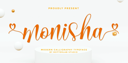 Monisha is a beautiful script font with perfectly perfect alternates. This font will exude a romantic and elegant feeling of your design. Monisha can be used for various applications, such as wedding designs, logos, invitations, posters, social media posts, and others. Features: - Additional characters encoded by PUA with a love accent - Can be used in any software, such as Adobe Photoshop, Illustrator, even Microsoft Word, PowerPoint, and others. - multilingual glyphs
 - Symposium Pro by Canada Type,
$49.95 Philip Bouwsma's Symposium Pro is a wide Carolingian script that can be set simply or with a wide range of flourishes. It takes its inspiration from the scriptoria of the twelfth century, particularly in Spain, where Christians, Muslims and Jews lived harmoniously in a brilliant culture for two centuries. As manuscripts were translated and copied to meet the Western demand for classical texts, calligraphic elements from Arabic and Hebrew spread throughout Europe, sparking a proliferation of new styles that brought the simple book hand to a higher level. Symposium Pro spans a broad range of time and space, from the court of Charlemagne to the Arabian nights and Renaissance Florence. Symposium Pro comes in four weights, ranging from Light to Bold, with each font containing over 1200 glyphs. Variations on every letter form, from swashes to subtle alterations, are plenty, with some even having up to 40 alternates. Also plenty are the embedded ornaments and flourishes, over a hundred of them. Keep that glyph palette handy for many pleasant surprises and easy setting solutions.
 - Modica Pro by Monotype,
$30.00 Modica Pro is here to expand upon the success and versatility of the original Modica typeface (2019). Modica has been compressed, condensed, narrowed, widened, and extended to a mega-family of 108 fonts that now includes small caps as well as additional language coverage. Modica Pro is a nimble typeface that can handle a multitude of applications – everything from body copy to retail fashion to corporate identities... why not put Modica Pro to task today? There are 108 fonts in this family, ranging from Hairline to Ultra weights across six widths in both roman and italic. A single variable font (included with the full family) covers all weights, widths, and italic angle with every increment in between to suit whatever style you prefer. Modica Pro has a character set that covers all Latin European languages. Key features: 1 Variable Font 9 Weights in Roman and Italic 6 Widths Small Caps Full European character set (Latin only) 650+ glyphs per font.
 - Modern Gothic by Pau Gomas Studio,
$14.99 Experimental Font designed to be used as a Display Typeface. Modern Gothic Family is inspired by Old Black Letter and Sans Serif Fonts. Its strokes have High Contrast. It has no ornaments to be readable in small sizes too. If you seek exclusive design, this font is perfect to create it.
 - Galia by Eurotypo,
$48.00 Galia is a new font with a vintage character designed by Carine de Wandeleer, inspired by the beautiful look of Victorian calligraphy, capturing all the elegance of its flourishes. Galia has a variety of ornamental swash letters; hundreds of ornamental and descending ascenders allow a beautiful interaction of strokes and combinations, avoiding overlaps or conflicts. Galia has a total of 947 characters, in OpenType format, such as Stylistics and Contextual Alternatives, Swashes, Ligatures, up to twenty stylistic games by lowercase and three in the uppercase, which allow you to mix and match pairs of letters, in addition to a wide set of ornaments perfect for interacting with the text. To this, we add a support of central European language to adjust your design. This will help your creativity and make it easier to do the impressive and elegant typographic work. All OpenType features can be accessed through OpenType compatible applications or the character map to view and copy any of the additional characters you want to paste into your favorite text editor / application. With virtually endless ways to personalize its use, Galia helps you to design invitations, greeting cards, logos, business cards, fashion magazines, food, packaging and menus, book covers and whatever your imagination!
 - ALS Zwoelf by Art. Lebedev Studio,
$63.00 The design of Zwoelf stems from a letter created by Oleg Pashchenko for the poetry book called “They Talk.” Modified in several ways, the lettering gained readability and a more neutral look. This typeface combines Modern and Gothic styles, ugliness and beauty, the horrifying and the funny. Typographers may highlight any of this. Zwoelf features elements that can be found in both Roman and Gothic styles, but has no real historical prototype. It creates coarse body copy that feels like blackletters. The type is well-suited for use with rough line graphics. Zwoelf is a good choice for short texts, headings, witchcraft potion recipes, madrigals, spells and treasure map naming.
 - Bosstangle by HakanPolatovic,
$15.00 Bosstangle,geometrical perfectness,modern and minimal font that is created for expression of various concepts.While mostly fits for headlines,displays,it is readable,it fits for short and middle lenght text. Every letter has a ratio to one another,which makes this font rational and can be used for rational systems like patterns. This font has most vibes of future,power,technology,cyberpunk,glory,supremacy etc
 - Duc de Berry by Linotype,
$29.99Duc de Berry is a part of the 1990 program Type before Gutenberg, which included the work of twelve contemporary font designers and represented styles from across the ages. Linotype offers a package including all these fonts on its web page, www.fonts.de. The design of Duc de Berry was influenced by those of typefaces created between the 13th and 16th centuries. The font was named after Duc de Berry, whose beautiful missals inspired typefaces of the 15th century. The capital letters are especially elegant and can be used either as initials or as contrast to the much more reserved lower case letters. - Sabon by Linotype,
$45.99 In the early 1960s, the German Master Printers’ Association requested that a new typeface be designed and produced in identical form on both Linotype and Monotype machines so that text and technical composition would match. Walter Cunz at Stempel responded by commissioning Jan Tschichold to design a new version of Claude Garamond’s serene and classical Roman. Its bold, and particularly its italic styles are limited by the requirements of Linotype casting machines, forcing the character widths of a given letter to match between styles, giving the italic its characteristic narrow f. The family’s name is taken from Jacques Sabon, who introduced Garamond’s Romans to Frankfurt. Sabon has long been a favorite of typographers for setting book text, due to its smooth texture, and in large part because Tschichold’s book typography remains world famous.
 - Caroolyn by Stefani Letter,
$12.00 Caroolyn is a modern and luxury serif font. This font is not only designed for Christmas needs, so you can easily customize it to your needs. You can use it to make headlines, logos, covers, posters, and other upcoming projects. This font is PUA encoded which means you can access all of the glyphs and swashes with ease!
 - Speedometer by Dharma Type,
$19.99 Speedometer is derived from Dimensions font family that is most narrow and black font for titling and logo. This Speedometer is more elegant by its contrast between the thickness of stem and thinness of the arms than Dimensions. This contrast makes more vigorous and speedy impressions too. All 6 weights and italics have upper and lower cases, accented characters and small capital glyphs that can be used with OpenType smcp feature.
 - Selfie Neue Sharp by Lián Types,
$29.00 INTRODUCTION When I started the first Selfie back in 2014 I was aware that I was designing something innovative at some point, because at that time there were not too many, (if any) fonts which rescued so many calligraphy features being at the same time a monolinear sans. I took inspiration from the galerías’ neon signs of my home city, Buenos Aires, and incorporated the logic and ductus of the spencerian style. The result was a very versatile font with many ligatures, swashes and a friendly look. But… I wasn’t cognizant of how successful the font would become! Selfie is maybe the font of my library that I see the most when I finally go out, (type-designers tend to be their entire lives glued to a screen), when I travel, and also the font that I mostly get emails about, asking for little tweaks, new capitals, new swashes. Selfie was used by several renowned clients, became part of many ‘top fonts of the year’ lists and was published in many magazines and books about type-design. These recognitions were, at the same time, cuddles for me and my Selfie and functioned as a driving force in 2020 to start this project which I called Selfie Neue. THE FONT "Selfie for everything" Selfie Neue, because it’s totally new: All its glyphs were re-drawn, all the proportions changed for better, and the old and somehow naive forms of the first Selfie were redesigned. Selfie Neue is now a family of many members (you can choose between a Rounded or a Sharp look), from Thin to Black, and from Short to Tall (because I noticed the feel of the font changed notoriously when altering its proportions). It also includes swashy Caps, which will serve as a perfect match for the lowercase and some incredibly cute icons/dingbats (designed by the talented Melissa Cronenbold, see also Selfie Neue Rounded for more!) which, as you see in the posters, make the font even more attractive and easy to use. You'll find tons of alternates per glyph. It's impossible to get tired with Selfie! Like it happened with the old Selfie, Selfie Neue Sharp was thought for a really wide range of uses. Magazines, Book-covers, digital media, restaurants, logos, clothing, etc. Hey! The font is also a VF (Variable Font)! So you can have fun with its two axes: x-height and weight, in applications that support them. Let me take a New Sharp Selfie! TECHNICAL If you plan to print Selfie Neue VF (Rounded or Sharp), please remember to convert it to outlines first. The majority of the posters above have the "contextual" alternates activated, and this makes the capitals a little smaller. I'd recommend deactivating it if you plan to use Selfie for just one word. Use the font always with the "fi" feature activated so everything ligatures properly. The slant of the font is 24,7 degrees, so if you plan to have its stems vertical, you may use Selfie with that rotation in mind. THANKS FOR READING

