10,000 search results
(0.08 seconds)
- Fabulous Rabbit by Balpirick,
$15.00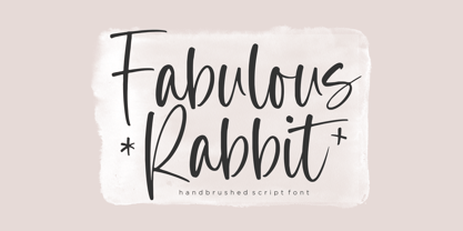 Fabulous Rabbit is a Handbrushed Script Font. Fabulous Rabbit is a cute and slim handwritten font. Whatever the topic, this font will be a wonderful asset to your font library, as it has the potential to enhance any creation. - also multilingual support Enjoy the font, feel free to comment or feedback, send me PM or email. Thank you!
 - Auguste Boutique by Balpirick,
$15.00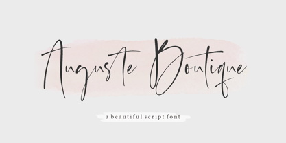 Auguste Boutique is a Modern Calligraphy Font. Auguste Boutique is a dazzling script font. Whatever the topic, this font will be a wonderful asset to your font library, as it has the potential to enhance any creation. - also multilingual support - Ligatures Enjoy the font, feel free to comment or feedback, send me PM or email. Thank you!
 - Dolphin Dolls by Balpirick,
$15.00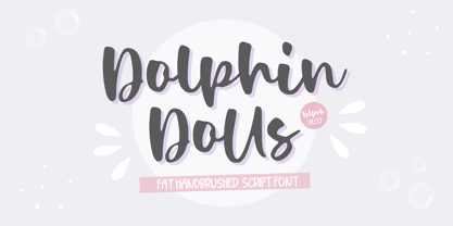 Dolphin Dolls is a Handbrushed Script Font. Dolphin Dolls is a cute and vintage styled handwritten font. Whatever the topic, this font will be a wonderful asset to your font library, as it has the potential to enhance any creation. - also multilingual support Enjoy the font, feel free to comment or feedback, send me PM or email. Thank you!
 - Donkey Monster by Balpirick,
$15.00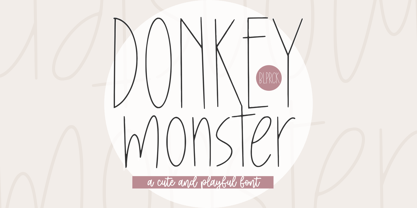 Donkey Monster is a Cute & Playful Font. Donkey Monster is a cute and slim handwritten font. Whatever the topic, this font will be a wonderful asset to your font library, as it has the potential to enhance any creation. - also multilingual support Enjoy the font, feel free to comment or feedback, send me PM or email. Thank you!
 - Picture Yourself by Linotype,
$29.99Create your own world with the Picture Yourself collection! Picture Yourself is a graphic image collection, which functions a font family instead of hundreds of EPS files. The family is made up of 24 different symbol typefaces. Designed by the collaborative effort of Karin and Peter Huschka, both living in Germany, Picture Yourself was a winner in the 2003 International Type Design Contest, sponsored by Linotype GmbH. The symbol library found in Picture Yourself offers an astounding array of high-contrast, simple forms, which may be used happily either separately or together in your layouts. Just as the fonts themselves stem from two designers working in collaboration, the imagery of the collection itself stems from two different influences. In large part, the font family was inspired by work displayed in the Frankfurt-based German Architecture Museum's 2003 Oscar Niemeyer exhibition. The photographs and sketches that were displays there inspired the first ideas for the Picture Yourself world of images. More of the typeface's design, as well as its name, were inspired by the underlying philosophy of the Beatles' music, especially the classic song from Lennon and McCartney, "Lucy In The Sky With Diamonds." In comparison with other large pictographic type collections, all of the characters in Picture Yourself fonts share the same horizon. The glyphs themselves are also drawn so that many of them can be combined with one another, creating tall or wide decorative compositions. Additionally, the proportions of the forms of the pictographs are aligned with various industry standards, in order to harmonize workflow. Picture Yourself Portraits (3:4), Landscapes (6:4), Cinema (9:4), and Panorama (12:4) each adhere to one of several photo or video formats. The Picture Yourself family of fonts can best be used with graphics applications like Adobe Photoshop or Illustrator, where different characters may be assigned to different layers, each with their own color. - Pills by UNDT,
$45.00PILLS is a modular font based on overlayed circular and square forms, the characters have been spaced mathematically. 'PILLS' can have interesting side effects, when the leading is set very close. Feelings of anxiety, loneliness and depression can be avoided by 'PILLS'. Do not exceed daily dose. - Big Dreams by Twinletter,
$12.00 Introducing the Big Dreams font. As the name implies, this font will give an extraordinary impression and an experience that will never be forgotten, if you use this font in your design. We designed this font with thorough attention to each letter so that it has the right portion if it is arranged in a word or title and if it is made into a sentence it will be easy to remember and pleasing to the eye. Not limited to that, the bold calligraphy font is designed to keep paying attention to the beauty of each letter, there are alternate options for the letters which are certainly easy for you to access, so you can automatically customize the letters you want to enhance the visual appearance of your design project. This charming font also offers the beauty of abstract typography harmony for a wide variety of design projects, including digital natural handwriting for designs, quote designs, for social media business designs, advertisements, trademarks, food and beverage promotion banners, text, posters, a signature, and all designs require handwriting or whatever design you want. ============================================================================================================ What’s Included : File font Web Fonts Standard glyphs Ligature Works on PC & Mac Simple installations Accessible in Adobe Illustrator, Adobe Photoshop, Adobe InDesign, even work on Microsoft Word. PUA Encoded Characters – Fully accessible without additional design software. Fonts include multilingual support for; Afrikaans, Albanian, Croatian, Czech, Danish, Dutch, English, Estonian, Finnish, French, German, Hungarian, Italian, Norwegian, Polish, Portuguese, Slovak, Slovenian, Spanish, Swedish Thank you for your purchase! Hope you enjoy our font!
 - Portalica by Letterhend,
$19.00 Introducing our newest typeface called Portalica - A Stylish Italic Serif font. This typeface has many alternates with swashes that can make your lettering / logotype become more interesting. The clean and neat of a serif combined with the swirl swashes makes this font one of a kind! This font perfectly made to be applied especially in logo, and the other various formal forms such as invitations, labels, logos, magazines, books, greeting / wedding cards, packaging, fashion, make up, stationery, novels, labels or any type of advertising purpose. Features : uppercase & lowercase numbers and punctuation multilingual ligatures alternates swashes PUA encoded We highly recommend using a program that supports OpenType features and Glyphs panels like many of Adobe apps and Corel Draw, so you can see and access all Glyph variations.
 - Palm Sunday by Putracetol,
$22.00 Palm Sunday - Quirky Easter Day Theme Font is a unique typeface designed to capture the playful spirit of Easter and Palm Sunday. This font is characterized by its quirky, chaotic, and variable thick-thin letterforms, which add an element of fun and intrigue to your designs. It can be used effectively either on its own or in combination with its ten charming variations. With ten distinctive variations inspired by Easter day, including eggs, bunnies, carrots, bunny ears, and flowers, Palm Sunday is the ideal choice for projects related to Easter, Pascha, and the joyous celebrations associated with the holiday. It perfectly suits children's themes, crafting projects, and any design that seeks to evoke a sense of fun, playfulness, and a vibrant, colorful aesthetic.
 - Menalde by Edignwn Type,
$12.00 The font is called "Menalde", it is slab serif display with vintage themes. The font comes with 4 style typefaces (regular, rounded, rough and textured). Uppercase and lowercase have different unique stamp textures, so you can combine the same 2 letters and not be boring . The Menalde matches applies in some designs such as the logotype, poster, label, badge, packaging, branding, and more custom design. Menalde includes : 4 style typefaces (regular, rounded, rough and textured) All-caps, numeral, symbol and punctuation Multilingual PUA Encoded Thank you for your support and choosing us.
 - Topsy Turvy by Krafted,
$10.00 Looking for a fun and versatile font to captivate your audience, clients, or guests? Trying to create the perfect contrast between your titles/headings and body copy? Maybe you’re a Beauty Influencer, Interior Designer, or run a Cooking YouTube channel - looking for a way to stand out from your competition. Maybe you feel like your birthday e-cards are missing that “something”. If you can say “yes” to any of these then hold on to your seats and get ready for a modern, fun, and delightful experience! Introducing Topsy-Turvy - A Modern Calligraphy Font. This gorgeous, fun, and elegant font can be used for a host of different content needs and projects. Use it for your headings, logos, business cards, printed quotes, invitations, packaging, resumes, and even your website or social media branding. Delight your audience, clients, or guests with this versatile, elegant font. What you’ll get: - Multilingual & Ligature Support - Full sets of Punctuation and Numerals Compatible with: - Adobe Suite - Microsoft Office - KeyNote - Pages
 - Aristide by Jonahfonts,
$29.95 There are many fonts inspired by Toulouse-Lautrec. I felt this one was needed and tried to get that loose brush-stroke appearance typical of Toulouse’s style of his famous French Cabaret posters. Aristide Bruant a dancer and comedian made famous by Lautrec’s posters can now be further immortalized with this font.
 - Aldenburg by Mozatype,
$11.00 Aldenburg is a natural brush font. Aldenburg would be perfect for sports, music festivals, quotes, special events, or anything. What’s Included : - Works on PC & Mac - Easy to use ( Installations ) - Compatibility Windows, Apple, Linux, Cricut, Silhouette, and Other cutting machines Thank you for purchasing this font. Please appreciate, if you like this. ENJOY it :)
 - Old Claude LP by LetterPerfect,
$39.00 Old Claude was drawn by Paul Shaw to simulate an old cut of the classic (Claude) Garamond type designs of the 16th & 17th centuries. The pronounced rough edges and coarse letter shapes create the effect of letterpress printing with old foundry type onto handmade paper. The companion Old Claude Expert includes small caps and old-style figures. This "antiqued" design works equally well for both text and display.
 - Quadon by René Bieder,
$25.00 Quadon was designed to fill the gap between traditional serifs and the lasting trend of using sans serif fonts for contemporary design. The result is a modern, clear and infinitely flexible interpretation of slab serif fonts. The open shapes and a large x-height keep the font legible in small sizes while the short descender supports the compact heart and strength of a slab serif. Quadon has a wide range of typographic features and alternative glyphs to create your own and unique version of it. It comes in nine different weights with matching italics. From the sensitive but sharp thinner weights to the punchy and powerful heavy weights, Quadon is well-suited for a wide range of versatile tasks.
 - Incus by VladB,
$20.00 Incus is a modern sans serif geometric font, includes upper and lower case characters, Latin, Cyrillic, Latin Eastern Europe, Turkish, Baltic and other. The Incus family consists of 6 fonts, divided into 2 subgroups (according to the type of style - St, Cut), and have the 3 types of thickness in each subgroup. Incus fonts will be useful in developing a brand, creating posters and other graphic products, and for word processing
 - Lokko by VladB,
$20.00 Lokko is a modern sans serif geometric font, includes upper and lower case characters, Latin, Cyrillic, Latin Extended symbols and other. The Lokko family consists of 8 fonts, divided into 2 subgroups (according to the type of style - St, Cut), and have the 4 types of thickness in each subgroup. Lokko fonts will be useful in developing a brand, creating posters and other graphic products, and for word processing.
 - Diskus by Linotype,
$29.99Fonts based on handwritten forms enjoyed a revival in popularity in the 1930s. Diskus was designed by Martin Wilke in 1938 and exhibits many traits of modern script and brush typefaces. The informal and energetic Diskus is a script and brush font for daily use and the capitals can be used as initials mixed with other fonts. Diskus is particularly good for titles or texts in middle to larger point sizes. - Mestizo by Volcano Type,
$35.00 Mestizo is a term traditionally used in Latin America and Spain for people of mixed heritage or descent. In some countries it has come to mean a mixture of European and Amerindian. The font Mestizo is based on a strict grid system – but combines it with ethnic symbolism. Six weights can be combined in various ways. Accius, Alerio & Amias display the basic geometric shapes, Balbo, Belus & Borba represent the playful icons.
 - Pacific Atoll JNL by Jeff Levine,
$29.00 Pacific Atoll JNL is a stylized slab serif type design based on the movie title lettering for the 1942 wartime film “Pacific Rendezvous”, and is available in both regular and oblique versions. According to Wikipedia, “…an atoll (sometimes known as a coral atoll), is a ring-shaped coral reef, including a coral rim that encircles a lagoon partially or completely. There may be coral islands or cays on the rim.”
 - Engravia by K-Type,
$20.00 Engravia is a Didone display face supplied in three varieties of engraving – Inline, Shaded and Sawtooth – plus a plain basic font. All four fonts share the same spacing and kerning, so engraved characters can be overlaid onto plain ones to produce bicolor effects. All four Engravia fonts are included in the download. The typeface was developed from K-Type’s rustic Building & Loan font, redesigned and drawn with precision outlines.
 - Quase Display by DSType,
$40.00 Quase is a very free interpretation of the types found in the “Specimen of Printing Types” by William Caslon from 1785. We didn’t want to follow any of the models introduced in the Specimens, but rather gather a series of typographic aspects that we found useful and interesting from the several sizes and styles available and then give them consistency and new proportions so they could fit our very own purpose. We wanted to start with Caslon and then transform it into an editorial typeface, hence the increase of the x-height and the radical reduction of the ascenders and descenders. Despite the Display, Headline and Text fonts we also wanted to make a single weight Poster version with, inspired by the mechanical script introduced in the Double-Pica Script, to be used in magazines or as a complementary display typeface.
 - Quase Poster by DSType,
$40.00 Quase is a very free interpretation of the types found in the “Specimen of Printing Types” by William Caslon from 1785. We didn’t want to follow any of the models introduced in the Specimens, but rather gather a series of typographic aspects that we found useful and interesting from the several sizes and styles available and then give them consistency and new proportions so they could fit our very own purpose. We wanted to start with Caslon and then transform it into an editorial typeface, hence the increase of the x-height and the radical reduction of the ascenders and descenders. Despite the Display, Headline and Text fonts we also wanted to make a single weight Poster version with, inspired by the mechanical script introduced in the Double-Pica Script, to be used in magazines or as a complementary display typeface.
 - Quase Headline by DSType,
$40.00 Quase is a very free interpretation of the types found in the “Specimen of Printing Types” by William Caslon from 1785. We didn’t want to follow any of the models introduced in the Specimens, but rather gather a series of typographic aspects that we found useful and interesting from the several sizes and styles available and then give them consistency and new proportions so they could fit our very own purpose. We wanted to start with Caslon and then transform it into an editorial typeface, hence the increase of the x-height and the radical reduction of the ascenders and descenders. Despite the Display, Headline and Text fonts we also wanted to make a single weight Poster version with, inspired by the mechanical script introduced in the Double-Pica Script, to be used in magazines or as a complementary display typeface.
 - Quase Text by DSType,
$40.00 Quase is a very free interpretation of the types found in the “Specimen of Printing Types” by William Caslon from 1785. We didn’t want to follow any of the models introduced in the Specimens, but rather gather a series of typographic aspects that we found useful and interesting from the several sizes and styles available and then give them consistency and new proportions so they could fit our very own purpose. We wanted to start with Caslon and then transform it into an editorial typeface, hence the increase of the x-height and the radical reduction of the ascenders and descenders. Despite the Display, Headline and Text fonts we also wanted to make a single weight Poster version with, inspired by the mechanical script introduced in the Double-Pica Script, to be used in magazines or as a complementary display typeface.
 - Mosherif by HansCo,
$12.00 Mosherif is a type of sherif font created with the aim of using for logo branding and print media. This font has three style that can be combined manually with one another in one word / text so that it looks unique and interesting. One example is in the first preview ( cover ), where the word "MOSHERIF" was made using three font styles ( Mosherif Regular, Mosherif Tall and Mosherif Short ). You can make it manually by making a space and remove some characters between words "MOSHERIF" becomes "M HE F" with using the font "Mosherif Tall" and fill it with "Mosherif Regular" in character "O" and "R" and "Mosherif Short" in character "S" and "I" by stacking them. By bringing the concept of vintage, clean, thick and sharp, hopefully Mosherif can provide choices for designers. Enjoy!
 - FabFours by Ingrimayne Type,
$5.00 A tessellation is a pattern in which a shape or tile fits together with copies of itself to fill the plane with no gaps or overlaps. One type of tessellation is formed with sides of center-point rotation, that is, one half of an edge is rotated 180 degrees to form the other half. If a square template is made with sides of identical center-point rotation, there are exactly four shapes that are possible. If these shapes or tiles are fit together not edge to edge but vertex to vertex, the result is a checkerboard-like pattern of tiles and voids. However, the voids have four edges formed by the four possible shapes that the tiles can have, so the voids are limited to the same four shapes that that make up the tiles. The FabFours have 22 tile families that allow a wide variety of fascinating patterns. They form one, two, three, and four tile tessellation. Eleven of the seventeen symmetry groups can be formed with these patterns. In each tile family two of the shapes have two possible orientations, one shape has four possible orientations, and one has eight, for a total of 16 tiles. Each font has two families, one on letters A-P the other on a-p. For some of the families there are also other tiles using the same edge but using triangular and hexagonal templates. To get proper results, the leading must be set equal to the point size of the font. I discovered these fabulous families and their decorative possibilities as I was working on a book about tessellations. I have not been able to find anyone else who has written about these families of four and their decorative possibilities when arranged vertex to vertex.
 - Triole 21 by KaiserType,
$40.00 "Triole 21" is the name of a gothic script font designed by Bertram Kaiser. The forms of this so called "Rotunda" script are based on the manuscripts of italian calligraphers of the late 14th century. Inspiration for this project also comes from the calligrapher Lisa Beck. The glyphs were first written with a broad-nib and then digitized. The Open-Type font is equiped with multilingual (Latin-based) alternates, ligatures and oldstyle figures for various typographical purposes. It can be used for headlines and also stays legible in smaller textsizes for longer textpassages.
 - KT Higer by Kotivoro Lab,
$18.00 KT Higer is a display font inspired by old design archives. This font Designed by Wahyu Ichsan Fauzi & Fikri Maulana Ikhfa. they focused develop Higer to a Display Headline font. This font have total 381 Glyphs and the families is still under development to be super family typeface. This font suitable with your projects such as poster, user interface, magazine, logo, apparel design, etc.
 - Peterhof by Favorite Fonts,
$17.00 Have you got a dream? I dream of visiting Peterhof. The palace and park ensemble with beautiful architecture, sculptures, and fountains. It is no less beautiful on the inside than on the outside. Huge halls, windows, columns, paintings. Everything is very refined, elegant, and beautiful. Looking at the photos, I enjoy and admire the views. They inspired me to create the "Peterhof" typeface. Elongated letters echo with tall columns and fountains. Serifs and playful glyph corners add grace to the font. It turned out to be refined, aristocratic, and at the same time mysterious and effective. I have created a whole family of "Peterhof" fonts from regular to bold italics for every taste and for every task. The "Peterhof" font will look great in headlines, advertising signs, posters, magazine pages, and prints. It can serve as the main focus of your compositions.
 - Brutal Fashion by Bogstav,
$18.00 There are a lot of things to say about fashion. I never really cared about what people meant was fashion, at any time of my life...well, not counting my teenage years!!! I was a teenager in the 1980ies and I was really into what was hot or not...but when I look at photos of myself from that time, I always wonder what kind of fashion trends I was following! :) Brutal Fashion is really not brutal in any way, but more attractive, nice, charming, handsome, delicate and graceful - with a stunning amount of handmade roughness!
 - Stiana by WDC Fonts,
$30.00 Stiana font is a venetian serif in modern design. The general idea was inspired by beautiful masterpieces of Nicolas Jensen and William Morris. Stiana holds fine, balanced readability of venetian serif, and both 21st century trends. Letterforms are expressive and bold enough to use font as display, but it also fits nicely for text. Stiana supports Western Europe, Cyrillic and Greek languages. Stiana is surely a good choice both for screen applications and print media. Its multipurpose spreads over package design, logos, headlines, body texts, stationary and back labels. Also very good for books and magazines.
 - Ambroise Std by Typofonderie,
$59.00 An exquisite Didot font in 18 series Ambroise is a contemporary interpretation of various typefaces belonging to Didot’s late style, conceived circa 1830, including the original forms of g, y, &; and to a lesser extent, k. These unique glyphs are found in Gras Vibert, cut by Michel Vibert. Vibert was the appointed punchcutter of the Didot family during this period. It is the Heavy, whom sources were surest that Jean François Porchez has been used as the basis for the design of the typeface family. In the second half of the 19th century, it was usual to find fat Didots in several widths in the catalogs of French type foundries. These same typefaces continued to be offered until the demise of the big French foundries in the 1960s. Ambroise attempts to reproduce more of what we see printed on paper in the 19th century; a more accurate representation of Didot punches. So, the unbracketed serifs are not truly square straight-line forms but use tiny transitional curves instead. The result on the page appears softer and less straight, particularly in larger sizes. The illustrious Didot family of type founders and printers Every variation of the typeface carries a name in homage to a member of the illustrious Didot family of type founders and printers. The condensed variant is called Ambroise Firmin. The extra-condensed is called Ambroise François. Ambroise Pro brought back to life: fifteen years in the making! Club des directeurs artistiques, 48e palmarès Bukva:raz 2001
 - Jacky Chan by Asd Studio,
$15.00 Introducing, Jacky Chan - Brush Font Jacky Chan font preserves all the high definition detail of the original handwritten letters. This font it truly looks realistic. Take your design to the up level with a hyper-realistic font that truly looks hand painted. Jacky Chan uses feature Bitmap Trace in Inkscape that makes way for more authentic looking fonts and is sure to grab the attention of customers and designers alike. Jacky Chan installs like any other font, and can be used in any color, on any background. What's Included? :: Uppercase & Lowercase (Regular and Italic Version) :: Numbers & Punctuation : Swashes Ligature :: Multilingual Support Enjoy our font, thank you.
 - Roberts Script by Roland Hüse Design,
$28.00 Robert's Script is a fresh brush calligraphy typeface with a smooth flow. The Family consists of two weights, Light and Regular. Its stylistic character is based on an elegant brush style. It can be used in various forms of communications. It contains OpenType Features such as Stylistic Alternates, Contextual Alternates, Standard Ligatures, Terminal Forms, Old Style Figures for numbers and Fractions. All European latin languages are covered with diacritics and special characters. For more details on the features and how to make the most out of this font, please refer to the OpenType guide at https://drive.google.com/file/d/1exEp9VcLM1rmrF9ptO2OWlQKKA-uyb4r/view?usp=sharing Cheers & Enjoy!
 - Oook by FSD,
$329.00 oook is a sans serif variable font designed to be used at very low size but it works with great personality also as display font. Uppercases and lowercase heights ratio is designed to improve readability at very very small texts. A feature that can’t be ignored in the smartphone era. With its wide eyes on letters and numbers you’ll be surprised by the improved readability of Excel or LibreOffice spreadsheets.
 - Boundary by Larin Type Co,
$15.00 Boundary This is a vintage display font inspired by signage, logos in the style of the old time. This is a great find for creating logos, various kinds of designs in vintage style. This font includes 2 font styles: regular and rough style, also it includes alternates for uppercase and lowercase. Try changing them and see how diverse it can be. Font includes: Full alphabet A-z Numbers, fractions Punctuation and symbols Alternates for Uppercase Alternates for Lowercase
 - Blackhaus by Canada Type,
$25.00Almost a half of a millennium after being mistaken for the original 4th century Gothic alphabet and falsely labeled "barbaric" by the European Renaissance, the blackletter alphabet was still flourishing exclusively in early 20th century Germany, not only as an ode to Gutenberg and the country's rich printing history, but also as a continuous evolution, taking on new shapes and textures influenced by almost every other form of alphabet available. Blackletter would continue to go strong in Germany until just before the second World War, when it died a political death at the height of its hybridization. For almost 50 years after the war, blackletter was very rarely used in a prominent manner, but it continued to be seen sparely in a variety of settings, almost as a subliminal reminder of western civilization's first printed letters; on certificates and official documents of all kinds, religious publications, holiday cards and posters, to name a few. In the early 21st century, blackletter type has been appearing sporadically on visible media, but as of late 2005, it is not known how long the renewed interest will last, or even whether or not it will catch on at all. The last few years before World War II were arguably the most fascinating and creative in modern blackletter design. During those years, and as demonstrated with the grid-based Leather font, the geometric sans serif was influencing the blackletter forms, taking them away from their previous Jugendstil (Art Nouveau) hybridizations. Blackhaus is a digitization and elaborate expansion of a typeface called Kursachsen Auszeichnung, designed in 1937 by Peterpaul Weiss for the Schriftguss foundry in Dresden. This is one of very few designs from that time attempting to infuse more Bauhaus than Jugendstil into the Blackletter forms. This is why we used a concatenation of the words blackletter and Bauhaus to name this face. The result of injecting Bauhaus elements into blackletter turned out to be a typeface that is very legible and usable in modern settings, while at the same time harking back to the historical forms of early printing. The original 1937 design was just one typeface of basic letters and numbers. After digitizing and expanding it, we developed a lighter version, then added a few alternates to both weights. The Rough style came as a mechanically-grunged afterthought, due to current user demand for such treatment. Having the flexibility of 2 weights and many alternates of a blackletter typeface is not a very common find in digital fonts. More specifically, having the flexibility of 2 weights and alternates of a 20th century blackletter typeface is almost unheard of in digital fonts. So the Blackhaus family can be quite useful and versatile in an imaginative designer's hands. - Kostel Infinity Sans by Kostelansky,
$40.00 High-quality type design. Originally designed for headline / logo use. A lot of high-quality glyphs designs in this one so be sure to view the specimen PDF as well as the glyph page. Enjoy. - Kostelansky
 - Determine by Haksen,
$18.00 DETERMINE is a strong modern sans style with upper and lowercase feel nice balanced. Its wide range of uppercase with alternates and ligatures allow versatile design options and works perfectly for headlines, logos, posters, packaging, T-shirts and much more. Font Features : Regular and Italic version Character set A-Z Ligatures in Uppercase Alternates in Uppercase Numerals & Punctuation Accented Characters Multiple Languages Supported Recommended to use in Adobe Illustrator or Adobe Photoshop with opentype feature. Ligatures feature is default setting in Adobe Illustrator or Adobe Photoshop in Uppercase character. So when you want not to use the ligatures. Open glyphs panel : In Adobe Photoshop choose tool Window Character and then please klick fi symbol In Adobe Illustrator choose tool Window Type Open Type and then please klick fi symbol If you have questions, just send me a message and I'm glad to help. Have a great day, Haksen