173 search results
(0.012 seconds)
- Oxford by Monotype,
$29.99Oxford was designed by Arthur Baker for Agfa Compugraphic in 1989. A calligraphic typeface with a slight incline, fine lines, and delicate serifs, Oxford is easily identified by its quirky lowercase b. Oxford is a functional display type for headings, announcements, and brochures that also works for setting small amounts of text, such as ad copy. - Oxford by profonts,
$41.99 profonts Oxford was originally designed by Christine Lord in 1960 and digitally re-mastered by profonts in 2009. The font contains lower case characters only. It is a multi-line display design with a continuous connecting horizontal line that combines all characters. This combination makes it special and very sporty. profonts Oxford is ideal for any design of sporting character.
 - Oxford Press by Set Sail Studios,
$17.99 Recreate authentic letterpress typography with Oxford Press, a set of chunky uppercase Serif & Sans fonts designed using real vintage metal letterpress blocks sourced from old printing companies. The Serif & Sans fonts each have two variations, 'Clean' and 'Rough'—with the latter having real, highly detailed hand-made letterpress textures applied to each letter. Each letter of the 'Rough' fonts also has an alternate texture, which can be accessed simply by switching between upper and lowercase characters. The 'Rough' fonts can make a striking impact as bold header text for posters, adverts, prints and packaging, whereas the 'Clean' versions are more suited for smaller accompanying text, cleaner designs or for applying your own textures and styles. Language Support • English, French, Italian, Spanish, Portuguese, German, Swedish, Norwegian, Danish, Dutch, Finnish, Indonesian, Malay, Hungarian, Polish, Croatian, Turkish, Romanian, Czech, Latvian, Lithuanian, Slovak, Slovenian.
 - Oxford Street by K-Type,
$20.00 Oxford Street is a signage font that began as a redrawing of the capital letters used for street nameplates in the borough of Westminster in Central London. The nameplates were designed in 1967 by the Design Research Unit using custom lettering based on Adrian Frutiger’s Univers typeface, a curious combination of Univers 69 Bold Ultra Condensed, a weight that doesn’t seem to exist but which would flatten the long curves of glyphs such as O, C and D, and Universe 67 Bold Condensed with its more rounded lobes on glyphs like B, P and R. Letters were then remodelled to improve their use on street signs. Thin strokes like the inner diagonals of M and N were thickened to create a more monolinear alphabet; the high interior apexes were lowered and the wide joins thinned. The crossbar of the A was lowered, the K was made double junction, and the tail of the Q was given a baseline curve. K-Type Oxford Street continues the process of impertinent improvement and includes myriad minor adjustments and several more conspicuous amendments. The stroke junctions of M and N are further narrowed and their interior apexes modified. The middle apex of the W is narrowed and the glyph is a little more condensed. The C and S are drawn more open, terminals slightly shortened. The K-Type font adds a new lowercase which is also made more monolinear so better suited to signage, loosely based on Univers but also taking inspiration from the Transport typeface both in a taller x-height and character formation. The lowercase L has a curled foot, the k is double junctioned to match the uppercase, and terminals of a, c, e, g and s are drawn shorter for openness and clarity. A full repertoire of Latin Extended-A characters features low-rise diacritics that keep congestion to a minimum in multiple lines of text. The font tips the hat to signage history by including stylistic alternates for M, W and w that have the pointed middles of the earlier MOT street sign typeface. Incidentally, Alistair Hall (‘London Street Signs’, Batsford, 2020) notes that when the manufacturer of signs was changed in 2007, Helvetica Bold Condensed was substituted in place of the custom design, “an unfortunate case of an off-the-peg suit replacing a tailored one” and a blunder that has happily since been rectified, though offending nameplates can still be spotted by discerning font fans.
 - New Oxford by Arthur Baker,
$12.00 - Oxnard - Unknown license

- Rokford - Unknown license

- Cotford by Monotype,
$49.99 New from the Monotype Studio, Cotford is a contemporary serif from Creative Type Director, Tom Foley. Dynamic, adaptable, and surprising—Cotford is a languid serif that ranges from delicate thins, bending and reaching like flower stems, to bold heavy weights that command the page and screen with confidence and vintage charm. And as a variable font, Cotford allows designers to explore and refine the design almost endlessly, unearthing its many visual tones and hidden secrets. Foley set out to design a soulful, contemporary serif typeface that delivers all the versatility and robustness today's designers expect. The variable font unlocks an expandsive spectrum of visual expression that allows designers to explore, tweak, and adjust the typeface until they find the perfect weight, contrast, and optical size for their project. At the same time, Cotford’s static weights follow a traditional model of 3 text and 5 display weights, making it a strong choice for brands looking for simple implementation. A pop serif for the digital age, Cotford takes you places. Cotford font field guide including best practices, font pairings and alternatives.
 - Gosford by Factory738,
$15.00 Gosford is a luxury and elegant serif font. It teases your eyes with its curves yet still able to maintain its classy composure. The variety of weights provide a range of choices that will help you find the best typographic colour. The available stylistic Ligature and Alternate offer a perfect font for anything your creativity takes you. 5 Weights (Light, Regular, Semibold, Bold, Black) Basic Latin A-Z and a-z Numerals & Punctuation Stylistic Alternates & Ligatures Multilingual Support for ä ö ü Ä Ö Ü ... OTF file format Free updates and feature additions Thanks for looking, and I hope you enjoy it.
 - BD Alm - 100% free

- BD Renaissance - Unknown license

- BD Kameron by Typedifferent,
$20.00BD Kameron has a pretty strange mix of Art Nouveau curves and modern corporate cleanness. This font works well as an identity type of an entire guidance in a hotel or restaurant with a chic approach. It could be the source for a new logo, as it could also the headline font in a magazine. - BD Retrocentric by Typedifferent,
$25.00 The BD Retrocentric font is inspired by logotypes made in the sixties and seventies. The characteristics of this font is the well balanced blend of retro and futurism.
 - BD Mother by Typedifferent,
$25.00 BD Mothers’s main characteristic is the humorous blend of fat serifs, knobby curves and the thin square inner shapes. Perfect for use on posters, CD-jackets, titles in the range of cartoon, games and music.
 - BD Megalona by Balibilly Design,
$25.00 The fundamental in creating this typeface is the implementation of our interest in typography over the past year. Inspired by the elegance, consistency, and hard work of Times New Roman pull up our minds to a daunting blank canvas and began to think about what we had to do to take this idea even further. Whatever comes to our mind and when it is poured out, it will certainly remain within the rules of the letterforms. This typeface is created by a careful approach, consisting of 28 fonts 13 weights with matching true italics forms. Feature an extended charset of over 1800 glyphs, covering 219 languages using Latin, Cyrillic (basic to extended), and Greek alphabets. Included advanced open type features like stylistic alternates, terminal form, swash, discretionary ligatures, ordinals, small caps, positional numbers, fractions, and case-sensitive forms. BD Megalona provides a range of choices that will give luxury vibes in symmetrical layouts with selective deviations, and work well in a stylish look for your typographic project. This is a complete package of problem solvers perfectly suited for body text and high-impact headlines. Advance open-type features definitely stunning on logos, branding, magazines, website, etc. BD Megalona is our ego in expression that aims to supply the necessity of design nowadays while still in the corridors of the glory of past traditions as a source of our inspiration. We would like to show you a SHORT FILM about the process of designing BD Megalona Font Family, Click Here!!!
 - BD Telegraph by Typedifferent,
$25.00 BD Telegraph is a heavy uppercase titling font with various alternatives and an architectural approach, great for logotype creation and titling.
 - BD Pankow by Typedifferent,
$25.00 BD Pankow is inspired and designed during a stay in Berlin. It’s an uppercase alphabet with alternates. Bold, rock-solid, modern and ideal for branding and titling.
 - BD Qualle by Typedifferent,
$25.00 BD Qualle is a bold, chubby and friendly fellow great for titling and headlines.
 - BD Bermuda by Typedifferent,
$25.00 BD Bermuda is an experimental geometric serif font based on the shape of a triangle.
 - BD Motra by Typedifferent,
$20.00 BD Motra is fat wide uppercase font with some variants on the small character keys. The inspiration source for this typeface is the stencil lettering on Honda’s rare Motra CT50 off-road scooter made in Japan 1982. The font usage ranges from big lettering on vehicles, cargo boxes, products, buildings with an industrial approach.
 - BD Unicorse by Typedifferent,
$25.00 BD Unicorse is a retro futuristic mixed case display font with the main characters set on the small keys and alternatives on the capital characters. It features 12 ligatures and is great for the use as headlines in magazines, logotypes on posters, games, movies or music packaging.
 - BD HitBit by Typedifferent,
$25.00 BD HitBit is a heavy uppercase display font with a technical approach, great for logotype creation and titling.
 - BD Westwork by Typedifferent,
$15.00 BD Westwork is a very condensed, bold and distinctive display typeface – great in combination and in contrast with delicate illustrations, photos and body text with and without serifes.
 - BD LoFi by Typedifferent,
$30.00 The BD LoFi typeface was originally designed on an Amiga 1200 with TypeSmith in 1997. In 2023 BD LoFi received an update with a wider language support and a variable version with a bolder look.
 - BD Schablone by Typedifferent,
$25.00 BD Schablone is a bold, human stencil with an anticipation of the digital lcd display.
 - BD Roylac by Typedifferent,
$30.00 The BD Roylac typeface has its roots in some lowercase glyphs drawn by Jacques Loison in 1972. Some of these characters are included in the use of stylistic alternates. Filed under a retro-futuristic design the font separates two filled shapes by a thin and curvy line; sometimes following to the path leaning readability and sometimes interfere with it. The font is dedicated to the BD fanboy Monsieur «Eric de Broche des Combes» aka «Roy La Combe» to his fiftieth anniversary.
 - BD Aubergin by Typedifferent,
$15.00 The typeface with a slice: BD Aubergin is somehow reminiscent of the bauhaus era but with a modern twist, great for the use in titling and giving character to your print and screen work. The variable version morphs from filled (flat) to sliced.
 - BD Megatoya by Balibilly Design,
$25.00 Overview of BD Megatoya Consists of 41 fonts, including nine upright, nine italics, nine extended, nine extended italics, all in nine weights from thin to black. 4 outline version in black weight. 1 variable with three axes (weight, width, slant). 1,470 glyphs in each font. Opentype features include small caps, stylistic alternates, ligatures, complete numeral figures, ordinal, case-sensitive forms. language support: Western European, Central European, and Southeastern European. About BD Megatoya Taking a geometric sans serif approach, we designed the letterform with details on round characters to pursue harmony and leave a slightly boxy feel to the extended style. The stylistic alternate is one of our concentrations to make them versatile yet still preserve consistency in stem and metrics to provide good readability in small text. Overall, the various treatments for each character will encourage each other to dynamic colours, flexible, and functional impressions in their application. Slicing edges The edge of the letter slice in 45 degrees will give the impression of a sparkle of light when you look at them for the first 2 seconds (our experience). This is what we did a few years ago when working on automotive branding. The word-mark logotype with slicing form gives an exclusive and different impression from its crowds. If you agree with us, does BD Megatoya deserve to be called a problem solver in branding projects? Jump over to .ss07, .ss08, .ss09, and .ss10 to find them! The Features BD Megatoya font family includes 41 great fonts in nine weights, an extended character set of over 1400 glyphs, multilingual support such as Southeastern Europe, Central Europe, Western Europe. Also advanced & useful open-type features: case-sensitive forms, small caps, standard and discretionary ligatures, stylistic alternates, ordinals, fractions, numerator, denominator, superscript, subscript, circled number, slashed zero, old-style figure, tabular and lining figure. Use BD Megatoya BD Megatoya is very suitable for branding projects and many designs purpose like advertising, posters, invitations, branding, logos, magazines, merchandise, presentations, etc. It's a FREE Get one weight from the BD Megayoya family for Free! Apply to your amazing projects and enlarge your creative tools by adding the complete BD Megatoya family to your font library.
 - BD Gitalona by Balibilly Design,
$22.00 We introduce our high-complex typeface. A wide range of serifs for text and display titles are divided into one prominent sub-family and four display sub-families. Comes shifted from serif to sans serif to fulfilling the completeness of this font family that we named BD Gitalona. In addition to these massive things, this font family is filled with an explorative and experimental decorative version that we present separately. Figure out the decorative version BD Gitalona Moxa to make the aesthetic appeal of this whole typeface! Inspiration The world of entertainment moves non-stop. One by one, figures appeared and left. We expect to create something to entertain previous trends with packaging more relevant to the present. More specifically, we admire and are inspired by some of the world's leading and top singers with a segmented nature. We imagine so many figures that can affect every viewer. However, each artist or singer has a segment because almost all of them have characteristics. The Design The basic design of this typeface begins with a transitional serif shape with sharp, shapeless corners. Then in the middle of the invention, there was an opportunity to explore it further from the readability side by adding an optical variable that can adjust the serif thickness when used together between large, medium to paragraph text sizes for editorials. The shift from serif to sans-serif with the contrast initiated by the shift of the serif family form as a different variable also makes this font richer in terms of the features it contains. Parts are expected to add to the user satisfaction with the complexity of this font. The Features BD Gitalona consists of one sub-family intended for body text with nine weights from Thin(100) to Black(900) and four other display sub-families such as Display serif, Flick, Harmony Sans and Contrast Sans. Each consists of four weights Thin(100), Regular Weight(400), Bold(700), and Black(900). And again, there are also retailed separately; the BD Gitalona Variable font, which is designed to accommodate all Subfamily in 1 font file, and BD Gitalona Moxa, an experimental typeface. A total of 700+ glyphs in each style. Advanced OpenType features functionally and aesthetically, such as Case-sensitive forms, small caps, standard and discretionary ligatures, stylistic alternates, ordinals, fractions, numerator, denominator, superscript, subscript, circled number, slashed zero, old-style figure, tabular and lining figure. Supports multi-languages including Western Europe, Central Europe, Southeast Europe, South America, and Oceania.
 - BD Barbeaux by Typedifferent,
$25.00 BD Barbeaux is a condensed typeface, chic and fashionable with a touch of Art Nouveau. BD Barbeaux Numérique version features rounded corners. The BD Barbeaux fonts are great for fashion and lifestyle related headlines in blogs and magazines.
 - BD Varicolor by Typedifferent,
$25.00 BD Varicolor is a display font with a certain twist of Swing and Charleton.
 - BD Supper by Typedifferent,
$45.00 "BD Supper" is a friendly and humorous geometric-organic sans serif typeface great for use on food packaging and in gastronomy-related topics. It features a wide selection of alternate characters to choose from. Use them as you like. With two weights regular and bold, «BD Supper» fits the needs to structure a body text with a headline and to create logotypes.
 - Cotford Variable by Monotype,
$188.99 New from the Monotype Studio, Cotford is a contemporary serif from Creative Type Director, Tom Foley. Dynamic, adaptable, and surprising—Cotford is a languid serif that ranges from delicate thins, bending and reaching like flower stems, to bold heavy weights that command the page and screen with confidence and vintage charm. And as a variable font, Cotford allows designers to explore and refine the design almost endlessly, unearthing its many visual tones and hidden secrets. Foley set out to design a soulful, contemporary serif typeface that delivers all the versatility and robustness today's designers expect. The variable font unlocks an expandsive spectrum of visual expression that allows designers to explore, tweak, and adjust the typeface until they find the perfect weight, contrast, and optical size for their project. At the same time, Cotford’s static weights follow a traditional model of 3 text and 5 display weights, making it a strong choice for brands looking for simple implementation. A pop serif for the digital age, Cotford takes you places.
 - Romford Stencil by Paula Minelgaite,
$30.79 Romford Stencil is a Brexit inspired typeface. It’s letterforms represent the idea of a union splitting apart and the stylistic differences between the upper and lower case symbolise the notion of being different from one another. Research for this typeface started off in Romford which is an area where the majority of UK voters wanted to leave the European Union, hence the name. Romford Stencil is designed to be readable for body copy and look impressive when used as a display typeface. However, the bigger it's size the better it looks, especially in all capitals.
 - Wexford Oakley by Device,
$29.00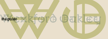
- Olyford Variable by NicolassFonts,
$148.99 Olyford Variable font is a contemporary sans serif typeface that is derived from the Olyford font family. It features a range of weights and italics. OpenType features: Access All Alternates, Stylistic Alternates (Alternative n, m, p, q, r, u), Stylistic Set 1 (Alternative K, k), Stylistic Set 2 (Alternative W), Stylistic Set 3 (Alternative t), Stylistic Set 4 (Alternative w), Stylistic Set 5 (Alternative 5), Stylistic Set 6 (Alternative ¢, $, €, ₽, ¥), Stylistic Set 7 (Alternative Đ, Ħ, Ð, ≠, ∫), Standard Ligatures, Discretionary Ligatures, Proportional Figures, Tabular Figures, Case-Sensitive Forms, Fractions, Kerning, Denominators, Numerators, Scientific Inferiors, Subscript, Superscript, Ordinals, Localized Forms.
 - BD Engraved Regular - Unknown license

- HYPD BD Bardust - Unknown license

- BD Micron Robots by Typedifferent,
$8.00 The BD Micron Robots variable dingbats font features 52 Microns – micro-tiny robot characters with 5 mutations. The variable font technology helped breathing live into the BD Micron Robots See them in action. The Muta1 version of the font shows the Micron Robots in its original shape. Muta5 is the final stage of the Micron Robots mutations. The Variable version of the Micron Robots font is a variable font and you can determine the grade of the mutation between Muta1 and Muta5 by yourself. By the way: The BD Micron Robots perfectly fit together with the BD Micron Font, also available here at MyFonts.
 - BD Micron Font by Typedifferent,
$10.00 The BD Micron Font is the first typedifferent variable font. It is a very technical looking typeface great for use in sci-fi, science and electronic music related projects. The BD Micron Font alphabet designed together with H1reber was initially created as the display typeface for the communication and visual identity of the TechnoCulture 2 festival in Fribourg, Switzerland summer 2019. The technologic yet playful looking font shall break boundaries between technology, science, fiction and art. Creating characters, hence little robots out of the shapes found in the BD Micron Font glyphs and the variable font technology helped breathing live into the BD Micron Robots which is also availabe here at MyFonts


Page 1 of 5Next page