10,000 search results
(0.259 seconds)
- Schism Three by Alias,
$55.00 Schism is a modulated sans-serif, originally developed from our Alias Didot typeface, as a serif-less version of the same design. It was expanded to three sub-families, with the thin stroke getting progressively heavier from Schism One to Schism Three. The different versions explore how this change in contrast between thick and thin strokes changes the character of the letterforms. The shape is maintained, but the emphasis shifts from rounded to angular, elegant to incised. Schism One has high contrast, and the same weight of thin stroke from Light to Black. Letter endings are at horizontal or vertical, giving a pinched, constricted shape for characters such as a, c, e and s. The h, m, n and u have a sharp connection between curve and vertical, and are high shouldered, giving a slightly square shape. The r and y have a thick stress at their horizontal endings, which makes them impactful and striking at bolder weights. Though derived from an elegant, classic form, Schism feels austere rather than flowery. It doesn’t have the flourishes of other modulated sans typefaces, its aesthetic more a kind of graphic-tinged utility. While in Schism Two and Three the thin stroke gets progressively heavier, the connections between vertical and curves — in a, b, n etc — remain cut to an incised point throughout. The effect is that Schism looks chiselled and textural across all weights. Forms maintain a clear, defined shape even in Bold and Black, and don’t have the bloated, wide and heavy appearance heavy weights can have. The change in the thickness of the thin stroke in different versions of the same weight of a typeface is called grading. This is often used when the types are to used in problematic print surfaces such as newsprint, or at small sizes — where thin strokes might bleed, and counters fill in and lose clarity, or detail might be lost or be too thin to register. The different gradings are incremental and can be quite subtle. In Schism it is extreme, and used as a design device, giving three connected but separate styles, from Sans-Didot to almost-Grotesk. The name Schism suggests the differences in shape and style in Schism One, Two and Three. Three styles with distinct differences, from the same start point.
 - Schism Two by Alias,
$55.00 Schism is a modulated sans-serif, originally developed from our Alias Didot typeface, as a serif-less version of the same design. It was expanded to three sub-families, with the thin stroke getting progressively heavier from Schism One to Schism Three. The different versions explore how this change in contrast between thick and thin strokes changes the character of the letterforms. The shape is maintained, but the emphasis shifts from rounded to angular, elegant to incised. Schism One has high contrast, and the same weight of thin stroke from Light to Black. Letter endings are at horizontal or vertical, giving a pinched, constricted shape for characters such as a, c, e and s. The h, m, n and u have a sharp connection between curve and vertical, and are high shouldered, giving a slightly square shape. The r and y have a thick stress at their horizontal endings, which makes them impactful and striking at bolder weights. Though derived from an elegant, classic form, Schism feels austere rather than flowery. It doesn’t have the flourishes of other modulated sans typefaces, its aesthetic more a kind of graphic-tinged utility. While in Schism Two and Three the thin stroke gets progressively heavier, the connections between vertical and curves — in a, b, n etc — remain cut to an incised point throughout. The effect is that Schism looks chiselled and textural across all weights. Forms maintain a clear, defined shape even in Bold and Black, and don’t have the bloated, wide and heavy appearance heavy weights can have. The change in the thickness of the thin stroke in different versions of the same weight of a typeface is called grading. This is often used when the types are to used in problematic print surfaces such as newsprint, or at small sizes — where thin strokes might bleed, and counters fill in and lose clarity, or detail might be lost or be too thin to register. The different gradings are incremental and can be quite subtle. In Schism it is extreme, and used as a design device, giving three connected but separate styles, from Sans-Didot to almost-Grotesk. The name Schism suggests the differences in shape and style in Schism One, Two and Three. Three styles with distinct differences, from the same start point.
 - Ventography Personal Use Only - Personal use only

- Momoiro by Underground,
$29.00 Momoiro is a feminine typeface family, designed for editorial use. "The first case in which appeared a fashion content in a magazine was in 1672 in the magazine Le Mercure Galant, which was a magazine of entertainment and varied content, including fashion. But the first illustrated and specialized magazine was Le Journal Des Dammes Et Des Modes, created in 1797. "(Fashion Trends, 2011). On the basis of this historical period, the creation of typography has characteristics of a Baroque type. "In this category we mainly include the types created in the Netherlands during the seventeenth century and whose protagonists are the punch makers Reinhard Voskens and Christoffel Van Dijck. Baroque typography stands out for its accentuated play of irregular axes and contrasts that permeate the text of great vividness. " Therefore it has contrast in the thick and thin strokes, Roman serifs, humanistic axis. With this typography, we are not looking for a re-reading of the baroque, but rather a current typeface with humanistic characteristics of the handwriting, with a brush as a differential. Momoiro comes in two weights plus italics to cover as much design needs as possible. It compliments from OpenType features such as ligatures, swashes, true fractions, old style numerals and stylistic sets.
 - CLIMAXED - Personal use only

- Horror - Unknown license

- Damaged - Unknown license

- Leftist Mono Serif - Unknown license

- Shpinoza MF by Masterfont,
$59.00 A practical font family with 5 weights for all your day by day design needs: headlines, body text, signage etc. High legibility at small sizes. An extended sans serif typeface with rounded endings that provides unique softness appearance without losing legibility.
 - Friendly Yellow by PizzaDude.dk,
$16.00 Friendly Yellow is my sketchy/scratchy handmade sans font. I've made several layers for you to play around with, in order to get that feel-good handmade-sketch-font-look! I've also added ligature substitution for the most common double letters
 - Editorial Comment JNL by Jeff Levine,
$29.00Editorial Comment JNL is another wood type in the Grotesk (also spelled Grotesque) style of sans serif faces. Popular in newspaper headlines as well as posters, the slightly irregular stroke widths add an old-fashioned charm to any print project. - Elle by Device,
$39.00 Elle is a geometric sans in three weights with rounded stroke terminals and circular forms. Classy, elegant and modern, with just a hint of the future. Inspired by a single-weight Typositor headline typeface from the early 1970s called Pipeline.
 - Martend by Balevgraph Studio,
$12.00 Martend elegant classic sans serif typeface with many style alternatives to choose from. This typeface is perfect for elegant logos, interior magazines, beauty products, packaging products, quotes, and more. What's Included? Uppercase, Lowercase, Numbers, Punctuation Ligatures & Alternates Multilingual support PUA encoded
 - Childos Arabic by NamelaType,
$29.00 The sibling of Childos, with with additional Arabic glyphs for more international fun. Handwritten rough sans serifs style, as well as the development of free and attractive ligature to fill the space between letters and make playful children feel designs.
 - Display Dots Two Serif by Gerald Gallo,
$20.00 Display Dots Two Serif is a display font not intended for text use. It, along with its sans counterpart were designed specifically for display, headline, logotype, branding, and similar applications. Display Dots Two Serif has an uppercase alphabet, numbers, and punctuation.
 - Pitch by Device,
$39.00 A heavy block sans in chrome and solid variants. The high lower-case x-height and short ascenders and descenders permit tight line spacing for an impactful, punchy effect. The chrome variant works well at larger sizes and in shorter settings.
 - PUJI by pororoca,
$25.00 PUJI is an experimental sans serif perfectly suited for graphic design and any display use. It could work for web, print, motion graphics etc. PUJI has the other version "PUJI narrow" which has different letter's width in "A","V","W".
 - Amphibia by Storm Type Foundry,
$53.00 On a sans-serif basis it contains trapezoid ascenders, balls & rounded ears, which may resemble the serif feel in smaller sizes, thus long reading is surprisingly easy. Amphibia is suitable for everything from contemporary poetry to branding and informational systems.
 - Invoice by MADType,
$21.00 Mixing the vertical to horizontal stroke weight ratio of a sans-serif font while adding serifs is the idea that inspired this face. The result is a typeface with unique display features that is also quite readable at text sizes.
 - Diane Amorta by Grezline Studio,
$10.00 Diane Amorta is a cute handdrawn sans serif font crafted very carefully. Diane Amorta is perfect use for a logo for branding, typography design, product packaging, invitation, quotes, t-shirt design, label poster, special events and anything that need handwriting taste.
 - Lacerika by Iwm Design,
$10.00 Introducing Lacerika font family, a versatile and sleek sans serif font designed to elevate your projects, whether you're creating a stunning website, captivating app, eye-catching brochure, or unforgettable branding materials. Unlock the potential of your creativity with Lacerika today!
 - Littera Plain by ABSTRKT,
$30.00Littera project is a modern interpretation of one of the most widespread sans serifs in USSR "TextBook font". It is not an exact revival, but an interpretation of its typographic feel executed in two different ways: Littera Plain and Littera Text. - Hujan by Ezzazebra,
$15.00 A sans-serif font that I created when long raining in my city. The shape is clean with a dynamic semi-bold stroke. It's suitable for a minimalistic, "less is more" design and useful for display and larger body text.
 - HV Harietta by Harmonais Visual,
$12.00 Harietta - a semi-geometric, clean sans serif with a retro, humanist and elegant touch.. Specially designed for simple, clean, humanist projects. The font is perfectly suitable for creating elegant, clean, retro design such as logo, packaging, social media, and more.
 - Franie by That That Creative,
$50.00 Franie is a variable geometric sans serif font family with 72 styles. Fully customize the width, weight and italic angle. This modern clean typeface is perfect for contemporary layouts for print, magazines, posters, web, social media, branding logos, or whatever.
 - Reflex Pro by RMU,
$30.00 Reflex Pro with its two styles - Regular and Solid - is a great sans serif all-caps font family, ideal for headlines, posters and signboards. The solid style makes it easy for you to fill the letters with photographs or background patterns.
 - Wonderella by Almarkha Type,
$29.00 Wonderella is a cute and casual sans serif font with an incredibly friendly feel. Whether you’re looking for fonts for Instagram or calligraphy scripts for DIY projects, this font will turn any creative idea into a true piece of art!
 - Crossten by Horizon Type,
$25.00 Crossten is a rounded sans serif type family based on geometric forms. It comes in 20 styles, 10 uprights and matching italics. Each weight includes extended language support and many opentype features. Crossten is incredibly useful for nearly any creative design.
 - Akbeatso by Koval TF,
$39.99 Akbeatso is a modern contemporary font for posters, visual identity and striking visual communications. Though Akbeatso is ready to be a text typeface. Modern sans serif with emotional contrast in stems and some irregular construction brings actual vibes to your designs.
 - Darbuka MF by Masterfont,
$59.00 A practical font family with 4 weights for all your day by day design needs: headlines, body text, signage etc. High legibility at small sizes. An extended sans serif typeface with rounded endings that provides unique softness appearance without losing legibility.
 - BigBang by Pesic,
$19.00 BigBang is geometrically monoline, modular sans serif font, square looks glyphs. It is suitable for use in the fields of architecture, urban planning, techniques, electronics, advertising, futuristic themes, film, computers, phones, video games, logos... BigBang contains Latin and Cyrillic glyphs.
 - Littera Text by ABSTRKT,
$30.00Littera project is a modern interpretation of one of the most widespread sans serifs in USSR "TextBook font". It is not an exact revival, but an interpretation of its typographic feel executed in two different ways: Littera Plain and Littera Text. - Castrade by Din Studio,
$29.00 Castrade is modern display sans font. Made for any professional project branding. Every letter has a unique and beautiful touch. Includes: - Castrade (OTF) Features: - PUA Encoded - Multilingual Support - Numerals and Punctuation Thank you for downloading premium fonts from Din Studio
 - Vartek by Inhouse Type,
$44.55 Vartek is a geometric sans-serif type family. Inspired by the "space-age" and functionalist aesthetics, Vartek is a high-contrast utilitarian design. It comes in a variety of weight and width options. Opentype features include inferiors, superiors, fractions and ligatures.
 - Tanto by Lomax Design,
$17.00 Tanto is a boxy, futuristic sans-serif that is not directly inspired by any particular typestyle, but is more of an exploration of shapes. It has a very modern feel and although very geometric, still has a character that's not robotic.
 - Coldera by Haniefart,
$12.00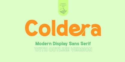 Coldera is a sans serif typeface deliberately modified to make it look beautiful, attractive and modern, available in uppercase, lowercase, ligature and alternative letters. Coldera is suitable for business brands, brochures, posters, magazines, comics, t-shirts, banners and many others.
 - Otomo by The Northern Block,
$18.00 A super wide san serif typeface inspired by event graphics for Sheffield music venues in the 1990s. Most influential work by The Designers Republic (TDR). Details include four unique styles, extended European character set, manually edited kerning and Euro symbol.
 - Regency by Studio K,
$45.00 Regency is named after the style associated with the period, which is at once elegant and luxurious. A modern classic, it is influenced by Americana and Optima and combines the style of a serif face with the simplicity of sans serif.
 - Heiders by Seventh Imperium,
$20.00 Heiders is a font family including 71 fonts with 4 sub families - Heiders Script, Heiders Sans, Heiders Handmade and Heiders Extras. Heiders contains texture options and lots of extras to make it easier for you to create your own way!
 - Aircheck JNL by Jeff Levine,
$29.00 Inspired by building signage for the old CBS broadcasting facility in Los Angeles, Aircheck JNL is a bold, wide sans serif - reminiscent of Art Deco lettering of the 1940's, and perfectly suited for headlines and titles that get attention.


