10,000 search results
(0.3 seconds)
- Heiders by Seventh Imperium,
$20.00
- Aircheck JNL by Jeff Levine,
$29.00
- Seriatim by David Thometz Design,
$24.95
- TOMO Bossa by TOMO Fonts,
$12.00
- MBF Space Habitat by Moonbandit,
$18.00
- Hanibal by Hazztype,
$20.00
- Sugar Joint by PizzaDude.dk,
$15.00
- Beginner by VladB,
$14.00
- Reform School JNL by Jeff Levine,
$29.00
- Casemark Stencil JNL by Jeff Levine,
$29.00
- Black Grotesk by ParaType,
$30.00
- Maghony by Sronstudio,
$18.00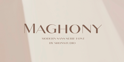
- Machi by MendozaVergara,
$14.00
- Tekanan by San Studio,
$10.00
- Shopping Basket JNL by Jeff Levine,
$29.00
- Autobahn Std by AVP,
$18.00
- Liet Display by Stanley fonts,
$9.99
- Several Mono by Mårten Nettelbladt,
$-
- Nautikka by Sea Types,
$25.00
- Antartida Rounded Essential by Los Andes,
$18.00
- Rebar by Method & Craft,
$10.00
- Plaza by ITC,
$29.99 - Cut Block by Adam Ladd,
$20.00
- Bindweed by Solotype,
$19.95 - Heldustry by URW Type Foundry,
$35.99
- Office Work JNL by Jeff Levine,
$29.00
- Zinc by K-Type,
$20.00
- HeiT ASC Traditional Chinese by Ascender,
$523.99 - Xahosch by Ingrimayne Type,
$9.95
- Mylon by Nasir Udin,
$19.00
- Navine by OneSevenPointFive,
$15.00
- Alive by Tasty Type,
$11.00
- Shinn by Red Rooster Collection,
$45.00
- Momoiro by Underground,
$29.00
- Gready PERSONAL USE ONLY - Personal use only

- Ekorre PERSONAL USE ONLY Black - Personal use only

- Patched Medium - Personal use only

- Letric PERSONAL USE ONLY - Personal use only

- CLIMAXED - Personal use only

- Bouncy PERSONAL USE ONLY - Personal use only


