10,000 search results
(0.048 seconds)
- Dare by Device,
$39.00 Dare is a bold, single-weight titling font in capitals only. It is built from flat-pen strokes, with looping bowls and sharp, incised darts. It borrows a pinch of the hand-drawn swagger of Bauer's Cartoon (designed in 1936 by H. A. Trafton), used as Dan Dare's signature logo in the British boy's comic Eagle, and also the upward-pointing serifs of machine-moderne typefaces such as Dynamo (designed by K. Sommer for Ludwig & Mayer in 1930). Suitable for book covers, magazines, branding, packaging – any place where an impactful, contemporary statement is required, but still with an undertone of 20th century tradition.
 - Bang by ITC,
$29.00Bang was designed by David Sagorski in 1993 as a playful font of spirals. It consists of two capital alphabets which can be combined like the usual capitals and small caps, although both have the same height. They differ from one another only in the decorative forms which adorn them and the highly decorated characters of one set are complemented by the slightly more reserved characters of the second. Serious this font is not, rather, with its circles and spirals, Bang is best in point sizes 12 and larger and is meant for short texts and headlines. - Future Bugler Upright by Breauhare,
$35.00 Future Bugler Upright is a non-slanted version of Future Bugler, a font based on the second logo created by Harry Warren in early 1975 for his sixth grade class newsletter, The Broadwater Bugler, at Broadwater Academy in Exmore, Virginia, on Virginia’s Eastern Shore. This font can convey several perspectives or moods. It can suggest a space-age vision of the future, or an art-deco perspective of the future as in the movie Sky Captain and the World of Tomorrow. It also communicates the idea of high performance, or extreme sports, without the grunge. Digitized by John Bomparte.
 - Linotype Syntax Serif by Linotype,
$29.00Linotype Syntax™ Serif is the serif typeface that complements Linotype Syntax™, both created by Swiss type designer Hans Eduard Meier in 2000. With this new design, Meier has at last given shape and structure to the invisible muse that inspired him in the 1950s when he conceived his monoline sans serif based on humanist or Oldstyle letterforms. The calm legibility of this workhorse text family is accented by Meier’s signature of subtle dynamic movement, making it ideal for longer texts in books and magazines. It combines harmoniously with the other Syntax typefaces, Linotype Syntax™ and Linotype Syntax™ Letter. - Pardesi by Hanoded,
$15.00 Pardesi font is named after a song from Raja Hindustani, a 1996 Bollywood movie directed by Dharmesh Darshan. The lead roles were played by Aamir Khan and Karisma Kapoor. Together they sing: 'Pardesi, pardesi, jaana nahi', meaning so much as: 'Foreigner, foreigner, don't go'. I remember this song very well, as I was backpacking through India and Nepal at the time and it was played over and over again on all long distance buses I took. Pardesi font is a fat, rounded, marker-pen font, ideal for books and posters. It comes with extensive language support.
 - Club Type by Club Type,
$37.00 Perhaps the greatest tragedy in all English history began in 1642 when, for five years, families and friends were divided by violent struggle. Respect for the monarchy was as great then as it is today; but it was squandered by Charles I and Civil War ensued. Out of Cromwell's eventual victory came a period of absolute rule just as arbitrary. In communicating the affairs of Court, Mercurius Aulicus can claim to be England's first regular newspaper, printed at Oxford and reprinted in London almost throughout the entire war. This typeface family echoes the calligraphic scripts of newspaper cartoons of the time.
 - Monotype Old Style by Monotype,
$29.99 Monotype Old Style is a nineteenth century update of Caslon Old Face with characteristics of the moderns built in. Monotype Old Style was recut by Monotype in 1901 from a Stephenson Blake & Company version. The design originated at the Miller and Richard foundry in 1860. In some respects it can be seen as transitional between old style and modern, but the spirit of the old styles predominates. By the turn of the century it had become a successful rival to the moderns. The Monotype Old Style font family is an attractive design which gives a light, airy feel to text.
 - Niveau Grotesk by HVD Fonts,
$40.00 Niveau Grotesk—the companion of Niveau Serif —is a type family of six weights plus matching italics and small caps. It was designed by Hannes von Döhren in 2013. Influenced by classical nineteenth-century faces, the fonts are based on geometric forms. Because of its straight architecture, Niveau Grotesk has a “punch” in big sizes but is very legible in smaller sizes and longer texts—in print or on screen. Niveau Grotesk is equipped for complex, professional typography with alternate letters, arrows, fractions and an extended character set to support Central and Eastern European as well as Western European Languages.
 - Boiller by Alit Design,
$9.00 Introducing Boiller Typeface 💖💖Boiller💖💖is a sans serif font that has an elegant romantic concept, supported by 736 glyphs. The Boiller font has a lot of alternative characters, from swash, ligature and of course it is also supported by multilingualism. In addition, Boiller also has 14 families from Thin to Heavy. So it can be used for body text and header text. Boiller is very suitable for design concepts that are elegant, simple, minimalist and romantic. Can be used for wedding card designs, shop signs, logotypes, promotions on Instagram and so on.
 - Valsity by Ingrimayne Type,
$9.00 Valsity is a squarish slab-serif family with five weights and two widths, each with an italics for a total of twenty members. With negligible contrast, it is almost monoline. It is for decorative uses; it is too square and lacks the contrast to make it a good choice for extensive text. Valsity began with a blending of two other squarish slab-serifs, Valgal and Kwersity, and its name reflects that ancestry. From there it took on a life of its own, often diverging from its parents.
 - Fortuita by Typographias,
$28.00 Fortuita is a versatile sans fit for text or display. The name carries some of its history as it was born from logo sketches that fortuitously grew into a type family over eight years. It comes with a tall x-height, rendering it readable at smaller sizes. It has sixteen weights, eight regular ones, and their italics, each with small caps, something you may not see very often with sans serifs. It counts with old-style numbers that can switch to its lining, small caps, or tabular versions through open-type features. The family carries a distinct personality in its design that will lend itself to its subject, all the while without becoming distracting or detracting from it.
 - Regent Pro by Storm Type Foundry,
$39.00 This modernized rustic Baroque Roman face paraphrases freely its model from the first half of the 18th century. The shape of the letters has been cleared from all unevenness and softness, but has retained its lively expression. It is deliberately rather cooler than the reverently digitized Baroque Roman type faces, since it was necessary to adjust it with regard to the visual experience of the contemporary reader. In addition, it has bold designs and aligning figures, which also considerably extends the range of its application. It is an entirely reliable text type face for the most demanding extensive works. Thanks to its calm expression and excellent legibility it is widely used when printing series of professional literature.
 - Koufiya by Linotype,
$187.99 Koufiya is designed by Nadine Chahine in 2003 as part of her MA project at the University of Reading, UK and later released by Linotype in 2007. It is the first typeface to include a matching Arabic and Latin designed by the same designer at the same time with the intention of creating a harmonious balance between the two scripts. The Arabic part is based on the Early Kufi style popular in the 7th to 10th century AD. It is characterized by a strong horizontal baseline, horizontal stacking order, clear and open counters, and a general open feeling. Though based on the earliest styles on Arabic manuscript, the design paradoxically appears quite modern and fresh. The Latin part of Koufiya recalls a Dutch influence in its shallow top arches and rather squarish proportions. Both Arabic and Latin parts have been carefully designed to maintain the same optical size, weight, and rhythm. However, no sacrifices were made to make them appear closer to each other. They are designed so that they work well together on the printed page, and to make sure that the two scripts are harmonious when they are mixed together even if within the same paragraph. The font includes support for Arabic, Persian, and Urdu. It also includes proportional and tabular numerals for the supported languages.
 - Elexis by Danielle Eneh,
$12.00 Elexis is a chunky, blocky script that will stand out in your next project. It's perfect for branding, social media posts, advertisements, product packaging, and invitations. Multilingual Support: AÀÁÂÃÄÅCÇDÐEÈÉÊËIÌÍÎÏNÑOØÒÓÔÕÖUÙÜÚÛWYÝŸỲŸÆŒßÞþ
 - Mangkualam by Essentials Studio,
$16.00 Mangkualam Is a Traditional Javanese Style Script Font Mangkualam is perfect for product packaging, branding project, megazine, social media, wedding, or just used to express words above the background.
 - Patternly by Lemonthe,
$14.00 Patternly is a stylish handwritten script font in a monoline style. It’s perfect font for wedding invitations, stationery, photography, social media posts, product packaging, greeting cards, and much more!
 - New Horizon by Aboutype,
$24.99Inscriptional capital titling face drawn for a magazine. Suitable for a variety of media if used at 30 point and above. New Horizon requires subjective display kerning and compensation. - Sunkist Splash by Lemonthe,
$15.00 Sunkist Splash is clean and beauty bouncy script font. It’s the perfect font for branding, wedding invitations, stationery, photography, social media posts, product packaging, greeting cards, and much more!
 - Chantego by Patria Ari,
$15.00 Chantego is a playful hand drawn display typeface with rough marker shapes. This font suit for apparel, branding, logo, social media posts, advertisements, product packaging, product designs, illustration, etc.
 - Witcher Knight by Essentials Studio,
$16.00 Witcher knight Is a Modern Script Font Witcher knight is perfect for product packaging, branding project, megazine, social media, wedding, or just used to express words above the background.
 - Everett Mill by Aboutype,
$24.99Outline brush script originally designed for embroidery application. Everett was designed for all media and works best at 24 point and above. Everett requires subjective display kerning and compensation. - Freshliy by Rezastudio,
$9.00 Freshliy is a Modern Handwritten Font. Freshliy is perfect for product packaging, branding project, megazine, social media, wedding, or just used to express words above the background. Support multilingual.
 - Stay Kind by Sans And Sons,
$12.00 Stay Kind is Modern Retro with Fun and Groovy Style is perfect for branding, logos, shirts, invitation, stickers, master heads, Cricut projects, social media, posters, magazine, prints and more.
 - Hexa - Personal use only

- Lidia by ParaType,
$25.00 The decorative title typeface was designed at Polygraphmash type design bureau in 1967 by Iraida Chepil. It is a decorative variant ('open', or 'engraved') of classical serif typefaces. For use in magazine headlines, title and display typography. The revised and completed digital version was designed for ParaType in 2005 by Victor Kharyk.
 - Sportlight by Kaer,
$19.00 Sportlight is a font, each letter connects with near one by middle-high line. This font is inspired by classic car emblems. You can use it in magazine headlines, badges, and posters. Font features: All-caps, numbers, punctuation, and multilanguage support. Please feel free to request to add characters you need: kaer.pro@gmail.com
 - Poacher by Sean Johnson,
$12.99 Poacher is a hand-drawn font inspired by the popular Hand Of Sean font, by the same designer. It has a looser, fun feel and is great for applications aimed at children. Great for kid’s books, classroom hand-outs, annotating sketches and notebooks. Great for use on natural, organic food / product packaging.
 - Dynatomic by PintassilgoPrints,
$24.90 A vigorous typeface suited for bold designs, Dynatomic is inspired by an amazing hand-drawn lettering of a 1964 polish movie poster designed by Andrzej Krajewski. It's a very eye-catching typeface that works surprisingly well even at not-so-big sizes, making it a great choice for a wide range of applications.
 - Florentin 2D by 2D Typo,
$36.00 Angular Old Style by Viktor Kharyk is usable as display font, for non-formal texts, especially poetry, for children books and virtual games about adventures, history, and pirates and includes some original ornament set. By stylistic it connects with Italian Renaissance, Czechian types of the first half of 20th century and cut technology.
 - Harvest Moon NF by Nick's Fonts,
$10.00The letterforms for this unusual display face were inspired by a 1930s ad for Tanguy Crepes, by an uncredited artist. Due to the ornate nature for this font, it has a limited character set, but does include all letters, numbers and punctuation for the Unicode 1252 Latin and 1250 Central European character sets. - Advertisers Gothic by HiH,
$12.00 Advertisers Gothic is bold and brash, like the city it comes from, Chicago. It was designed by the accomplished German-American matrix engraver, Robert Wiebking, for the Western Type Foundry in 1917. As its name suggests, it was designed for commercial headliner work, much as Publicity Gothic by Sidney Gaunt for BB&S the year before. See our Publicity Headline. Alternate letters ‘A’ & ‘S’ are provided. The most popular ad words “Free!”, “New!” and “Sale” (with both esses) are provided at an angle for dramatic tension. Advertisers Gothic became quite popular because it was effective. It can work equally well for a flyer advertising a non-profit event as for a magazine product ad. This font refuses to be a wimp. Use it boldly. Advertisers Gothic ML represents a major extension of the original release, with the following changes: 1. A total of 335 glyphs (compare) with added glyphs for the 1250 Central Europe, the 1252 Turkish and the 1257 Baltic Code Pages. 2. Added OpenType GSUB layout features: pnum, ornm, liga, hist & salt ˜ with total 13 lookups. 3. Added 209 kerning pairs. 4. Revised vertical metrics for improved cross-platform line spacing. 5. The most popular ad words “Free!”, “New!” and “Sale” (with both esses) are provided at an angle for dramatic tension The zip package includes two versions of the font at no extra charge. There is an OTF version which is in Open PS (Post Script Type 1) format and a TTF version which is in Open TT (True Type)format. Use whichever works best for your applications.
 - DT Skiart Subtle by Dragon Tongue Foundry,
$9.00 ‘Skiart Serif Subtle’ is now available online. Originally inspired by the san serif font ‘Skia’ by Mathew Carter for Apple. ‘Skiart’ was designed to feel more like a serifed font, but without any serifs. It took a step between sans serif and serif fonts. Next on the path towards a serif font came Skiart Serif Mini, with tiny serifs added. This was a true serif font, all be it on the small side. Skiart Serif Subtle is less of a serif than Skiart Serif Mini, in that it doesn’t have actual 'serifs' as such. It has a subtle flare where a serif might normally be found. It remains fully readable and feels as clean and normal as any of the best body copy serifs, and yet still has the strong solid bones of all the other Skiart font families. If compared to one of the more commonly used serifs like ‘Times New Roman’, the ‘Skiart Serif Subtle’ lowercase is more open with a taller x-height, increasing its readability and friendliness. The serifs are smaller and less distracting. They are not pretending to be ligatures. Where ‘Times’ makes its p q b d forms out of a barely touching oval and stem, the ‘Serif Subtle’ forms are much more firmly attached, appearing clearly as single letters. The standard setting for the a’s and g’s are round single story, feeling warmer and more inviting in the ‘Serif Mini’ font. Much more friendly than the stuffy double-storied versions in fonts such as ‘Times’ etc.
 - Rubis by Nootype,
$45.00 Rubis is a contemporary serif typeface with a sharp aspect designed for long running text. It’s a family with a serious aspect but it keeps a certain charm. The idea behind Rubis was to create a typeface with flawless curves, every letter and symbol has been designed in this idea, it can be seen in the terminals which finish the letter with an extreme fluidity. It’s a family which mixes classical influence such as the calligraphic terminaison and the sharpness of a modern typeface. The Regular and Medium are optimized for long text while the Light and Black can be useful for Title. The range of style give a good flexibility to this family. It’s an excellent family for editorial use. Rubis consists in a 10 styles family, from Light to Black with their corresponding italics. Each font includes OpenType Features such as Small Caps, Proportional Figure, Tabular Figures, Numerators, Superscript, Denominators, Scientific Inferiors, Subscript, Ordinals, Fractions and ligatures. Rubis family supports Latin and Cyrillic, all these languages are covered: Latin language support: Afar, Afrikaans, Albanian, Asturian, Azeri, Basque, Bosnian, Breton, Bulgarian, Catalan, Cornish, Corsican, Croatian, Czech, Danish, Dutch, English, Esperanto, Estonian, Faroese, Filipino, Finnish, Flemish, French, Frisian, Friulian, Gaelic, Galician, German, Greenlandic, Hungarian, Icelandic, Indonesian, Irish, Italian, Kurdish, Latin, Latvian, Lithuanian, Luxembourgish, Malagasy, Malay, Maltese, Maori, Moldavian, Norwegian, Occitan, Polish, Portuguese, Provençal, Romanian, Romansch, Saami, Samoan, Scots, Scottish, Serbian, Slovak, Slovenian, Spanish, Swahili, Swedish, Tagalog, Turkish, Walloon, Welsh, Wolof Cyrillic language support: Adyghe, Avar, Belarusian, Bulgarian, Buryat, Chechen, Erzya, Ingush, Kabardian, Kalmyk, Karachay-Balkar, Karakalpak, Kazakh, Komi, Kyrgyz, Lak, Macedonian, Moldovan, Mongol, Permyak, Russian, Rusyn, Serbian, Tatar, Tofa, Tuvan, Ukrainian, Uzbek .
 - FatmanLight - Unknown license

- Bellissima Script Pro by Sudtipos,
$79.00 While in the same vein and spirit as Burgues and Compendium, Bellissima began from an entirely different thread from those fonts. It started with Alex Trochut generously showing me a gorgeous lettering book from his grandfather’s library: Bellezas de la Caligrafía, by Ramón Stirling, 1844. Stirling was one of the Latin calligraphy pioneers who introduced a refined version of English calligraphy in Spain and made it popular in the nineteenth century. Some scans from that book served as initial basis for the caps in my Poem Script. But it was always in the back of my mind that I should do a copperplate, and the Stirling model was the perfect source. My intention was to veer away from Stirling’s exuberant ornamentation, and work within simplified forms of his ideas. As it usually is with most of my projects, Bellissima became its own bird and shaped its own flying patterns. Suddenly there were many ligatures, multiple endings and swashed connections, hundreds of alternates for both uppercase and lowercase. Bellissima has an effusive energy that appeals much beyond its sourcing. It’s intended for these modern times of appreciation for old crafty things like stationery and letterpress, where its origins help it shine brightly. Bellissima Script Pro is a complete font with almost 2000 characters full of alternates, swashes, ligatures & ornaments covering a wide palette of latin languages and Bellissima Script Redux is a random sample of glyphs totally usable with a reduced price.
 - Condell Bio by Letritas,
$9.00 Condell Bio is part of the bigger Condell family: a project that involves series of typographies and whose early conception and development began in 2006. Unlike its Poster version , with its excessive and eccentric forms, Condell Bio tries to adapt itself to a monolinear shape, but conserving at the same time the organic character of its forms and endings. In this way Condell Bio is able to expanse its typographical use fields to a vaster scale. Condell’s endings and organic strokes haven’t been conceived in a structural way but stylistically. This means that Condell’s high readability doesn’t change and its original personality and idiosyncrasy as well. Condell can be said the ideal typography for connoting the corporation and brand identity, because of its high readability; especially its “eatable” forms, who collects images of food, are easily adaptable to food industry. Condell is highly recommended for the following products groups: cleansers, dish soaps, toothpastes, all sorts of personal hygiene products (shampoos, soaps,..), industrial cleanser products and also for products which refer to its softness, volatility and smoothness. Condell’s soft forms and nice endings, inspired through spontaneous brush strokes, give to the typography a very peculiar pleasant connotation. Its Italic (10 degrees inclination) has been produced singularly and not automatically calculated by the software. Condell Bio is composed of 16 fonts: from thin to black, whose weights are in regular and italic. Each singular weight has 600 characters and is composed of 206 languages.
 - Litfass by RMU,
$30.00 Litfass is a revival which follows a turn-of-the-century German Art Nouveau font, once released by the Flinsch Foundry. To get access to all ligatures, it is recommended to activate both Standard and Discretionary Ligatures.
 - Forge by Device,
$39.00 Cast in iron and burnished by the feet of a million Londoners, this font derives from the manhole covers of England’s capital city. It evokes heavy duty machinery, metal castings and worn urban decay with gritty immediacy.
 - Merhat by SMZ Design,
$20.00 Merhat is a modern and experimental font, distinguished by its geometric and condensed structure with slightly rounded corners. Optimally simplified with distinctive accents. The font is expressive and unusual. perfect for graphic designs with an intriguing style.
 - Animal Paws by Beary,
$14.00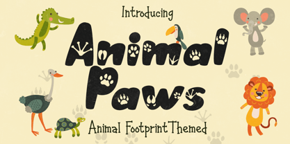 Animal Paws embodies fun, quirkiness and authenticity. This enchanting handwritten font features gorgeous animal-themed characters that will turn any creative idea into a true standout. Get inspired by its unique look and create gorgeous crafting projects!

