10,000 search results
(0.055 seconds)
- Drive Eddie by Ingrimayne Type,
$4.95 DrivEddie was an attempt to create a rough, hand-drawn typeface that was quirky but easily readable. It has a few serifs so it is almost but not quite san serif. All vertical stems are curved. For almost 25 years DrivEddie was a one-font family and one-font families often have limited applications. In 2020 I returned to this typeface to increase its possible uses by adding five new styles: italic, semibold, semibold-italic, bold, and bold-italic. I also corrected mistakes and added characters.
 - Rilke by Pelavin Fonts,
$20.00 Rilke, is the lettering used by Gustav Klimt on the 1st Vienna Secession poster in 1898 and is named for Klimt’s contemporary the poet Rainer Maria Rilke. The Vienna Secession was a group of artists whose motto was "to every age its art and to art its freedom." Their goal was to create a new style not based upon any historical influence. Its subtle curving strokes and the idiosyncratic set of the various characters create an elegant lightness which lends itself well to poetry, inscription
 - Royale Kingdom by Balpirick,
$15.00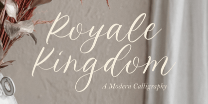 Introducing by Balpirick Studio. Royale Kingdom is a Modern Calligraphy Font that's perfect for adding a touch to your design projects! With its natural, organic feel and unique character. Crafted with care and attention to detail, this font is incredibly versatile and can be used for a range of design projects, including logos, branding, invitations, and more. Its modern, handwritten style gives it a unique character that's sure to make an impact. - also multilingual support Enjoy the font! Feel free to comment or feedback! Thank you!
 - Halokia by Locomotype,
$18.00 Introducing Holakia, a monoline script font based on the condensed style that is trendy, elegant and stylish. Supported by many OpenType features such as discretionary ligatures, swashes, contextual alternates etc. It has the potential to create interesting, beautiful and eye-catching typography combinations. Halokia is available in upright and italic versions. This font is perfect for use on packaging designs, quote prints, wedding invitations or personal logos. It is ideal for displaying something that is old-fashioned to make it look more modern and bold.
 - Berkut by Larin Type Co,
$15.00 Berkut This is a military font family inspired by the military and aviation style, including Six styles: regular, rough, printed, stencil, stencil rough, stencil printed. This font is a wide specialization, it will be an excellent option for creating projects in the military style in both modern and vintage versions. It is great for creating logos, labels, branding projects, magazines, mugs, flyers, posters and much more, and it is also perfectly readable in the text. This font is easy to use has OpenType features.
 - Salvador History by Balpirick,
$15.00 Introducing by Balpirick Studio. Salvador History is a Handbrushed Script Font that's perfect for adding touch to your design projects! With its natural, organic feel and unique character. Crafted with care and attention to detail, this font is incredibly versatile and can be used for a range of design projects, including logos, branding, invitations, and more. Its modern, handwritten style gives it a unique character that's sure to make an impact. - also multilingual support Enjoy the font! Feel free to comment or feedback! Thank you!
 - Heartfilia by RagamKata,
$14.00 Heartfilia, this font is as elegant as its name. It’s unique look makes it incredibly authentic serif font. The font gives off an elegant and classic feel, while still appearing modern and in line with the current design trends. Orchestra is a well- suited font for a high-end design, makes it more eye-catching. Orchestra will make your designs, such as invitations, posters, product package design, and many more, looks more exclusive and luxurious. Enhance your design by the elegant yet classic appearance of Orchestra.
 - Wintermint by Pink Broccoli,
$16.00 A funtastic and playful typestyle, Wintermint started as a digitization of a film typeface called Lori by LetterGraphics. This font is filled with bounce and liveliness taken from its original limited character set and fleshed out to a fully functional typeface. Flare serifs along with the occasional weird and wonderful curl gives this typeface a festive holiday vibe, but it could easily blend into a psychedelic design space, or just an all out wacky groove. Give it a spin, and see where Wintermint takes you.
 - Mandarin Whispers by Hanoded,
$17.00 In Dutch, a Mandarijn is a Tangerine. I found out that it is called a Mandarin in Australia as well! I really like Mandarins, so I thought I’d give them their well-deserved place in the spotlights by naming a font after them. The whispers part - well, that’s just because it sounded good. Mandarin Whispers is a very nice brush font, which was actually not made with a brush, but with a cheapie marker pen. It comes with all the bells & whistles, so have a ball!
 - SK Mutka by Shriftovik,
$32.00 SK Mutka is a geometric sans serif made in the style of Art Deco. Its graceful forms are emphasized by the arched structure typical for the style and spirit of Art Deco. The typeface is suitable both for decorative work and for typing because it includes uppercase and lowercase. Moreover, it supports a wide language range. SK Mutka typeface supports extended Cyrillic, Latin, as well as an extensive character set. SK Mutka is perfect for bold and classic designs, for print and web works.
 - Dosky by takoliko,
$10.00 Dosky is a groovy, retro, bubble font. It have a big and bubbly anatomy. Inspired by 70s vibe and culture. The font is perfect to create a project that have a retro feeling but have a little bit modern and modest on it. Dosky support multilingual language also came with 6 font style : Reguler, Condensed, Expanded and Oblique styles. Dosky can be used as a fun or a formal kind of project. It can easily be matched to your projects, and good for communicating your brands.
 - DT Skiart Lexiconic by Dragon Tongue Foundry,
$10.00 Apparently, Lexicon is the most expensive font in the world. ‘Skiart Lexiconic’ has been on a long growing path getting to where it is now. This font family was originally inspired by the san serif font ‘Skia’, by Mathew Carter for Apple. ‘Skiart’ was designed to feel more like a serifed font, but without any actual serifs. It took a small step between sans serif and serif fonts. Next on the path towards a serif font came Skiart Serif Mini, with tiny serifs added. This was a true serif font, although they were subtle. Then came ‘Skiart Serif Leaf’. and now... We present to you... DT Skiart Lexiconic. Having evolved from the Skiart family, we chose to give it the serifed styling of Lexicon. This is no way a copy or clone of Lexicon. It still has the basic bones of the original Skiart font, but the position, shape and size of the serifs were very much influenced by the world famous Lexicon font. DT Skiart Lexiconic is not the most expensive font in the world.
 - Rapsodia by Andinistas,
$59.00 @andinistas presents Rapsodia, an uncommon roman caps font with serif and high contrast, designed by #carlosfabiancg. Rapsodia was inspired by Stunt Roman, Speedball Textbook for Pen & Brush Lettering by Ross F. George. Rapsodia has a high and sweetened amount of contrast between thin and thick with drop-shaped finishes, reminiscent of Didot, Baskerville and Bodoni. Its artistic accent translates into Tuscan letters drawn with a flexible tip pen. In that order, Rapsodia combines the visual theatricality of an art nouveau corset, with creative historical classics such as Liza Minnelli, Gene Simmons and Freddie Mercury. Its calligraphic curlers full of Mannerist virtuosity are unnatural in Roman caps typefaces with serif. That is why its internal vein in ascending and descending flourishes protrudes with Chicano circus details like triangular diamonds located in vertical strokes. Rapsodia serves to design words and phrases in fine publications, for this reason most of its upper and lower case letters communicate feelings with classic and luxurious sensation through substitutes, ligatures and alternatives for beginning, middle or end of word, functioning as initials and terminals.
 - PF Das Grotesk Pro by Parachute,
$79.00 Das Grotesk was inspired by earlier nineteenth-century grotesques, but it is much more related to American gothic designs such as those by M.F. Benton. Due to their pure geometric structure, most grotesque typefaces tend to have a rather monotonous and lifeless appearance, thus failing to express the ideals of the modern creed. Das Grotesk on the other hand is a lively design with several distinguishable characteristics which attract attention when set at large sizes, whilst they become subtle and blend evenly at small sizes, fostering a neutral identity. This is a very legible and space-saving typeface with a narrow structure. It was designed with slanted curved ends and sheared terminals applied on several straight strokes. It has two-storey ‘a’ and ‘g’ but includes single-storey alternates. The family consists of 14 weights ranging from Extra Thin to Black (including true-italics). It provides simultaneous support for Latin, Cyrillic and Greek and is loaded with several advanced typographic features such as small caps. Download its complehensive PDF Specimen Manual for further details.
 - PF DIN Mono by Parachute,
$45.00 PF DIN Mono is the latest addition to the ever-growing set of DIN super-families by Parachute. It was based on its proportional counterpart DIN Text Pro but was completely redesigned to reflect its new identity. DIN Mono is a monospace typeface which is comprised of characters with fixed width. Traditionally, monospaced fonts have been used to create forms, tables and documents that require exact text line lengths and precise character alignment. DIN Mono, on the other hand, can prove to be more than a useful typeface for technical applications. In the world of proportionality, DIN Mono stands out as a fresh new alternative to the popular standard, particularly for publishing and branding applications. Additional care was given to the aesthetic form and its pleasing characteristics. The spacing attributes of the glyphs were redefined and legibility was further improved by revising or changing the shape of the letterforms. Furthermore, kerning was not included in order to preserve the monospace nature of this typeface. The family consists of 12 weights including true-italics. Currently, it supports Latin, Eastern European, Turkish and Baltic.
 - Wolpe Fanfare by Monotype,
$50.99 “Fanfare is such a fun typeface,” says Toshi Omagari, who revived the design for The Wolpe Collection. “It was my happiest discovery when I was digging through the Monotype archive. I came across it and had to check the designer’s name.” No wonder: Fanfare is modern, light and playful – not what you’d expect from an 80-year old design. From the original, very heavy weight design, Omagari started by creating a black weight, followed by four lighter weights for Wolpe Fanfare, preserving the character of the letterforms all the way down to a thin version. “I wanted to do more than digitize the original weight,” he says. “It’s surprisingly modern, and its skeleton, its basic structure, is so beautiful.” The new design packs more into a small space than most typefaces. It’s a natural for publication and advertising design. With displays capable of revealing fine details such as Fanfare’s subtly slanted baseline, its lovely forms will easily translate to mobile devices. With an extended European character set that includes Greek and Cyrillic language support, Wolpe Fanfare can speak in many languages.
 - Ragazza Script by Latinotype,
$79.00 Ragazza Script isn’t just another display typeface. It honors the greatest handwriting skills but in a different way. Although It doesn't represent any traditional calligraphy style, it is still part of that expressive world. With more than 1000 glyphs, and taking advantage of the Opentype features, Ragazza is full of personality. When in use, it gives a feel very close to ornamental Copperplate mixed with some kind of modern 'high-contrast' typeface. Lots of alternates, swashes and initial capitals are the spine of this face, assuring almost infinite combination possibilities. The early forms that would eventually lead to what Ragazza is today, began as a college project –around 2006– in the context of the 'Hyperfuente' exercise developed during Typography 2, chair E. Longinotti, at the University of Buenos Aires. But that seed would never stop growing. Since then a lot of work had been made to take that initial project to a professional quality level. Ragazza Script is perfect for headlines and short phrases. It is the brand new modern script, designed by Guille Vizzari and published by Latinotype.
 - Logik by Monotype,
$25.00 Logik is a futuristic square sans serif typeface. Its personality is defined by squared-off corners that you would normally expect to be rounded, this sharpness gives the glyphs an eccentricity that the eye quickly adjusts to. Sharp, incised/stylised ink traps along with slightly tapered/curved horizontals and verticals add to the character of each letterform. These subtleties combine to give Logik a distinctively futuristic aura. Logik’s main use would be for headlines, short runs of text, branding and display purposes – ideally suited for film and book titles, Logik could be widely used for sports, media and recreation purposes also. Logik comes in 7 weights (from Thin to Black) across 3 widths – Regular, Wide, and Extended. Each font covers all European Latin-based languages and includes Old Style Figures, Small Caps, and some Case-Sensitive Forms. Key features: 7 Weights in Roman and Oblique 3 Widths – Regular, Wide, Extended Small Caps Old Style Figures European Language Support (Latin) 550+ glyphs per font.
 - Grass Jelly by Yumna Type,
$10.00 Are you looking for a firm, prominent font for your design? Have a try on our unique, eye-catching display font. This is Grass Jelly, a somewhat circled display font to produce artistic, creative, fun nuances. It has thick, strong contrast lines to attract attention and to leave a strong impression for big text sizes to be easily legible. In addition, you can enjoy the available features here. Features: Multilingual Supports PUA Encoded Numerals and Punctuations Grass Jelly fits best for various design projects, such as brandings, posters, banners, headings, magazine covers, quotes, printed products, merchandise, social media, etc. Find out more ways to use this font by taking a look at the font preview. Thanks for purchasing our fonts. Hopefully, you have a great time using our font. Feel free to contact us anytime for further information or when you have trouble with the font. Thanks a lot and happy designing.
 - Bennet Display by Lipton Letter Design,
$29.00 Bennet, Richard Lipton’s spirited serif superfamily, was inspired by Moth Design’s logotype and stationery system for the North Bennet Street School in Boston. Initially modest in concept, Bennet grew to an expansive suite of 96 fonts tuned for editorial use. The three widths of Bennet’s Display and Banner sizes—Regular, Condensed, and Extra Condensed—are ideal for precise fitting of newspaper and magazine headlines. Lipton developed graded text styles for the series, offering users precise variations to help compensate for varying degrees of ink spread on different types of paper stock during the printing process. For example, because of ink absorption, the lightest grade—Bennet Text One—printed on low-quality newsprint stock will have the same gray value as the darkest grade—Bennet Text Four—on superior coated paper. (Bennet Text Two is the default grade and offered here.) Bennet also provides for a stellar reading experience in digital media, its carefully considered details vibrant yet legible on-screen.
 - Voguing by Resistenza,
$39.00 Sashay, you stay! Voguing is inspired by the movement and glamour of the ’80s/90s and New York ballrooms scene. Based on multiline strokes like our first font release Afrobeat but this time playing with the movement and direction of strokes we got a 3D effect to embrace the feeling of Voguing Art Expression. We highly recommend to combine Voguing with Nautica Sottile Modern letterforms reminding the skeleton of geometric type and serving optical contemporary elegance to this typeface presented in 3 different styles: regular, slanted and backslanted. The font includes also a set of ligatures accessible through OpenType perfect to customize your text. Bring a “10 across the board” to your layout with this new font family. Voguing is perfect for fashion, publishing, cosmetics, sports and art industries. Its eye catching effect works great for headlines, branding, magazine, social media posts, website headers, posters, ads, stationery designs and products. Check out also Dreamteam & Afrobeat
 - Elephant Party by Breauhare,
$19.99 Elephant Party playfully dances along its baseline in bold and rounded style. This warm and friendly whimsical design has lots of trunk space and is reminiscent of groovy ‘60s and ‘70s typography where letter spacing was admittedly tight, but cozy. Like snuggling up to a warm fire while toasting marshmallows. Like snuggling under a warm blanket. Like, well, you get the point. Elephant Party is an equitable font that includes a diversity of multilingual support, and will communicate your message with a funky, retro vibe and festive mood. It’ll break out into a happy dance across a wide variety of your design projects ranging from children’s books, t-shirts, posters, logotypes, product packaging, merchandise, branding and beyond. And it’ll groove across a variety of environments from print to digital media. So come on in, join the “Party”, it’s ELEPHANTASTIC! Digitized by John Bomparte.. ***Breauhare’s My Left Hand font makes a cameo appearance on the poster of Chocolola bars.
 - Bennet Text by Lipton Letter Design,
$29.00 Bennet, Richard Lipton’s spirited serif superfamily, was inspired by Moth Design’s logotype and stationery system for the North Bennet Street School in Boston. Initially modest in concept, Bennet grew to an expansive suite of 96 fonts tuned for editorial use. The three widths of Bennet’s Display and Banner sizes—Regular, Condensed, and Extra Condensed—are ideal for precise fitting of newspaper and magazine headlines. Lipton developed graded text styles for the series, offering users precise variations to help compensate for varying degrees of ink spread on different types of paper stock during the printing process. For example, because of ink absorption, the lightest grade—Bennet Text One—printed on low-quality newsprint stock will have the same gray value as the darkest grade—Bennet Text Four—on superior coated paper. (Bennet Text Two is the default grade and offered here. Additional grades are available upon request.) Bennet also provides for a stellar reading experience in digital media, its carefully considered details vibrant yet legible on-screen.
 - Delight Muffin by Nathatype,
$29.00 Delight Muffin is a display serif font in thickly designed weights for modern, friendly, and stylish design purposes. Generally, every letter of this font is in rounded shapes with a few spaces given. The top and the bottom parts of the letter are the thinnest ones with hardly invisible differences between the thick and the thin lines, which contrast the low lines. With Delight Muffin’s legibility, it is possible to use the font in various text sizes. Features: Stylistic Sets Ligatures Multilingual Supports PUA Encoded Numerals and Punctuations Delight Muffin fits for various design projects, such as posters, banners, logos, magazine covers, quotes, headings, printed products, invitations, name cards, merchandise, social media, etc. Find out more ways to use this font by taking a look at the font preview. Thanks for purchasing our fonts. Hopefully, you have a great experience using our font. Feel free to contact us for further information when you have a problem using the font. Thank you. Happy designing.
 - P22 Dwiggins by IHOF,
$24.95 Dwiggins Uncial is based on calligraphy by William Addison Dwiggins that he created for a self-penned short story, which appeared as an insert in the book-arts publication The Dolphin in 1935. This self-described “experimental uncial” lettering features rather unusual treatments of letterforms which combine manuscript calligraphy with modern idiosyncrasies. Dwiggins Extras is a set of decorative extras features 62 stencil and woodblock motifs adapted from abstract and representational Dwiggins designs. Although Dwiggins illustrated a number of books using conventional media, he is best known for his method of illustration that uses a series of hand-cut celluloid stencils or what he called “machine ornaments.” With these stencils Dwiggins (and other designers who use his ornaments) build-up repeated motifs and patterns into abstract designs and/or representational images which have a look that is uniquely Dwiggins’ own. Unlike other illustrators, Dwiggins’ style has not been commonly imitated and therefore his style is as distinctive today as it was 70 years ago.
 - Octagon Calligraphy by Slex Studio,
$18.00 Octagon Calligraphy is calligraphy font with a classic style and a touch of elegance, inspired by the handwriting of women and ancient manuscripts. Carefully designed to work together in harmony that makes it very suitable for wedding media, book covers, greeting cards, logos, branding, business cards and certificates, even for any design work that requires a classic, formal or luxurious. Try Octagon Calligraphy, enjoy the richness of OpenType features and let her fun and elegant excitement make you happy and enhance your creativity! You can use this font very easily. multilingual support and ligatures Your download will include OTF & TTF format files. If you do not have programs that support OpenType features like Adobe Illustrator and CorelDraw X Versions, you can access all alternative flying machines using Font Book (Mac) or Character Map (Windows): Do not forget to see, buy, like and share my other great products. And feel free if you have a question, please contact me : slexs515@gmail.com Thank you for purchases.!
 - Colotus by Ditatype,
$29.00 Colotus is a striking sans-serif display font that immediately captures the eye. The characters in Colotus is made in bold and solid square forms, imparting a sense of reliability and authority. However, what truly sets Colotus apart is its subtle brush detail that adds a touch of handcrafted charm. This brush detail infuses the font with a sense of artistry, creating a captivating blend of contemporary design and organic creativity. In addition, you can also enjoy the features here. Features: Alternates Ligatures Multilingual Supports PUA Encoded Numerals and Punctuations Colotus fits in headlines, logos, posters, flyers, branding materials, print media, editorial layouts, and many more designs. Find out more ways to use this font by taking a look at the font preview. Thanks for purchasing our fonts. Hopefully, you have a great time using our font. Feel free to contact us anytime for further information or when you have trouble with the font. Thanks a lot and happy designing.
 - Butterie by Krafted,
$10.00 Introducing Butterie - A Calligraphy Font Butterie, a modern calligraphy font, designed with the mix of modern and classic vibe. It’s a must have font for your classy website, for your social media branding, Pinterest banners, printed invitations, and more! Butterie Calligraphy font is a timeless font, will never go wrong for your audience, clients, guests or anyone around you! What you’ll get: Multilingual & Ligature Support Full sets of Punctuation and Numerals Compatible with: Adobe Suite Microsoft Office KeyNote Pages Software Requirements: The fonts that you’ll receive in the pack are widely supported by most software. In order to get the full functionality of the selection of standard ligatures (custom created letters) in the script font, any software that can read OpenType fonts will work. We hope you enjoy this font and that it makes your branding sparkle! Feel free to reach out to us if you’d like more information or if you have any concerns.
 - Clayden by Krafted,
$10.00 If you’re after a font for a birthday party invitation or a children’s book cover, you shouldn’t settle for something bland and generic. Instead, why not aim for a fun and lively option to set the mood? Introducing Clayden - A Playful Font. A lovely font like this can be used for invitations, branding, print, clothing, social media, web pages, and much, much more. What you’ll get: Multilingual & Ligature Support Full sets of Punctuation and Numerals Compatible with: Adobe Suite Microsoft Office KeyNote Pages Software Requirements: The fonts that you’ll receive in the pack are widely supported by most software. In order to get the full functionality of the selection of standard ligatures (custom created letters) in the script font, any software that can read OpenType fonts will work. We hope you enjoy this font and that it makes your branding sparkle! Feel free to reach out to us if you’d like more information or if you have any concerns.
 - Bennet Banner by Lipton Letter Design,
$29.00 Bennet, Richard Lipton’s spirited serif superfamily, was inspired by Moth Design’s logotype and stationery system for the North Bennet Street School in Boston. Initially modest in concept, Bennet grew to an expansive suite of 96 fonts tuned for editorial use. The three widths of Bennet’s Display and Banner sizes—Regular, Condensed, and Extra Condensed—are ideal for precise fitting of newspaper and magazine headlines. Lipton developed graded text styles for the series, offering users precise variations to help compensate for varying degrees of ink spread on different types of paper stock during the printing process. For example, because of ink absorption, the lightest grade—Bennet Text One—printed on low-quality newsprint stock will have the same gray value as the darkest grade—Bennet Text Four—on superior coated paper. (Bennet Text Two is the default grade and offered here.) Bennet also provides for a stellar reading experience in digital media, its carefully considered details vibrant yet legible on-screen.
 - Groovy by Krafted,
$10.00 Want to give your design a vintage look that still speaks to modern audiences today? Choosing the right font can do the trick. Introducing Groovy - A Vintage Modern Font. Use this unique font for web pages, social media, apps, ads, printed materials, clothing, packaging, and anything else your brand needs to stand out from the crowd. What you’ll get: Multilingual & Ligature Support Full sets of Punctuation and Numerals Compatible with: Adobe Suite Microsoft Office KeyNote Pages Software Requirements: The fonts that you’ll receive in the pack are widely supported by most software. In order to get the full functionality of the selection of standard ligatures (custom created letters) in the script font, any software that can read OpenType fonts will work. We hope you enjoy this font and that it makes your branding sparkle! Feel free to reach out to us if you’d like more information or if you have any concerns.
 - Washington Lumut by Zaki Creative,
$9.00 The Washington Lumut calligraphy is calligraphy font with a classic style and a touch of elegance, inspired by the handwriting of Italian women and ancient manuscripts. Carefully designed to work together in harmony that makes it very suitable for wedding media, book covers, greeting cards, logos, branding, business cards and certificates, even for any design work that requires a classic, formal or luxurious. Try Washington Lumut Calligraphy, enjoy the richness of OpenType features and let her fun and elegant excitement make you happy and enhance your creativity! You can use this font very easily. multilingual support and special ligatures If you do not have programs that support OpenType features like Adobe Illustrator and CorelDraw X Versions, you can access all alternative flying machines using Font Book (Mac) or Character Map (Windows): Do not forget to see, buy, like and share my other great products And feel free if you have a question, please contact me : zakicreative6@gmail.com Thank you for purchases.!
 - Die Bruecke by Hanoded,
$15.00 Die Brücke was a group of German expressionists which formed in Dresden in 1905. Members of the group include Erich Heckel, Fritz Bleyl, Ernst Ludwig Kirchner and Karl Schmidt-Rottluff. Much of the group's work was influenced by primitivism and medieval woodblock printing. Die Bruecke font was based on a printed invitation for an art exhibition from 1906. Although the font is all caps, upper and lower case glyphs differ and can be interchanged. Of course Die Bruecke comes with extensive language support.
 - Molliquam by Garisman Studio,
$20.00 Molliquam font starts from a brush stroke with a script style and also follows the times. Molliquam is very suitable for use in various media such as; packaging, logos, labels, posters, shirt design, quote of wisdom, hand-lettering, typography and many other media. - Ligature - Natural brush touch - PUA Encoded open - Support for MAC or PC - Simple installation for Adobe Illustrator, Corel Draw, Photoshop, or other software design Thanks Garisman Studio
 - Aeternus by Unio Creative Solutions,
$4.50 “Aeternus”, a new geometric Sans Serif typeface, with matching italics. The combination of several weights, provides versatility in any text usage. Developed in a range of nine weights from thin to heavy, with a matching set of italics, Aeternus has been designed to optimize the space and preserve the legibility in any text size. Use effortlessly this typeface for titling, contemporary branding, web design, UI/ UX design, clothing, large print formats. Specifications. - Files included: Aeternus Thin, Aeternus ExtraLight, Aeternus Light, Aeternus Regular, Aeternus Medium, Aeternus SemiBold, Aeternus Bold, Aeternus ExtraBold, Aeternus Heavy with corresponding italics - Formats:.otf - Multi language support (Central, Eastern, Western European Languages)
 - Cannon by W Type Foundry,
$20.00 The Cannon family is the result of combining the clean aesthetics from a classic sans neo-grotesque with a touch of a geometric design. The result is a simple but dynamic typeface with retro and technological airs. Cannon is ideal for robust advertising, bold brand identities and packaging, also suitable for high impact headlines and short texts. This type family consists of 36 variants and 9 weights (thin, extra light, light, regular, book, medium, bold, extra bold, black), matching italics for all weights and widths, matching small caps for all weights and widths, alternate characters and extended language support. We are proud to introduce: Cannon.
 - Mentha by Resistenza,
$39.00 This new script font was based on our previous font ‘Rachele’. Mentha is a very flexible script with a big set of swashes, condensed, strong and with nice loops at the end of some letter shapes. This font script was designed using small brush pens and playing with pressure and release methods. Mentha Medium has a tiny extra stroke, that helps to make this font a bit stronger and solid, specially if you need to use in a very small scale. Mentha is fresh! If you are looking for a new and original script Mentha suits your needs! We recommend to combine Mentha with Turquoise
 - Nurnberg by Vintage Voyage Design Supply,
$20.00 Nürnberg (Nuremberg in eng.) New blackletter-sans font family in modern look with contrasts elements in six widths. Impressive style with non-typical Blackletter uppercases as alternates and normal Sans as standard. In the company with good-looking lowercases and their alternates you can get outstanding result for your project. Six widths give you wide range of use. Massive Bold or Black will be really good in none-long magazine headlines, some logos or cafe/bar signs, menu's or coffeeshops. Medium or Regular is for normally (not giant) text blocks or any of accented texts. Light and Thin are good in big pt. Short word forms or numerals is just awesome.
 - Galpike by Letterhend,
$17.00 Galpike Sans is a neat and clean variable font. The typeface is versatile to blend in your design- with 9 weight, ranging from regular, medium, thin, bold, semibold, extrabold, light, extralight and black & 18 styles + variable type to touch a lot of personality. Perfect anywhere you need a right finas touches for branding, publishing, titles, book, magazine , and use on UI/UX design. Features: Variable Font uppercase & lowercase numbers and punctuation multilingual 9 weight & 18 Style PUA encoded More about variable fonts : https://creativemarket.com/blog/what-is-a-variable-font if you have any questions don't hesitate to send our email at letterhend.com/tutorials/using-opentype-feature-in-any-software/
 - Devoid by Dropper,
$35.00 Devoid is a sans serif typeface with a no frills stripped down design. The design has all the features of the neo grotesk typeface, horizontally cut endings, modern capitals, oval counters, with a bare bones appearance. The typeface comes in three subtle widths, Devoid Slim, which is spaced most narrowly, Devoid and Devoid Set, which have a wider letterspacing. There are regular, medium and bold weights with accompanying italics. The vertical metrics align across weights and widths, this allows for optical size adjustment as well as adjusting for same size text fit. Dutch designer Pier Taylor designed the typeface in 2020 for use in catalogs, lists and registers.