10,000 search results
(0.043 seconds)
- Lunaria Celesttial by Adante Creative,
$23.00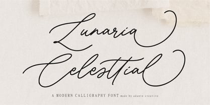 Introducing by Adante.Creative Proudly Present, Lunaria Celesttial Lunaria Celesttial is A Modern Calligraphy Font Lunaria Cellestial is perfect for product packaging, branding project, magazine, social media, wedding, or just used to express words above the background. Lunaria Celesttial also multilingual support. Enjoy the font, feel free to comment or feedback, send me PM or email.
 - Vintage Painting by Aestherica Studio,
$12.00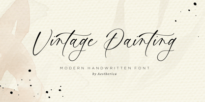 Introducing the new Handwritten Script Font by Aestherica Studio. Proudly Present, Vintage Painting Vintage Painting is perfect for product packaging, branding project, megazine, social media, wedding, or just used to express words above the background. This font includes multilingual support. Enjoy the font, feel free to comment or feedback, send me PM or email.
 - Smithrose by Sibelumpagi,
$19.00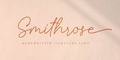 Smithrose is inspired by monoline signature letters and is a natural & modern handwritten signature font. Smithrose comes with 85 ligatures and ending swashes. Smithrose is perfect for many different projects such as logos and branding, invitation, stationery, wedding designs, social media posts, advertisements, product packaging, product designs, label, photography, watermark, special events and more.
 - Pen And Ink by Rachel Kick,
$10.00 Pen & Ink is a quirky hand-drawn font. Inspired by notetaking and classroom doodles, this font has a friendly and approachable feel that perfectly compliments artwork and social media. Mix and match uppercase and lowercase letters throughout each word to get a truly hand-drawn feel. There are also 33 swash and icon extras.
 - The Gloves by Aestherica Studio,
$12.00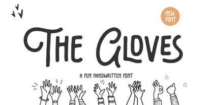 Introducing the new Fun Handwritten Font by Aestherica Studio. Proudly Present, The Gloves The Gloves is perfect for product packaging, branding project, megazine, social media, wedding, or just used to express words above the background. The Gloves also multilingual support. Enjoy the font, feel free to comment or feedback, send me PM or email.
 - Fairplex by Emigre,
$49.00 Zuzana Licko's goal for Fairplex was to create a text face which would achieve legibility by avoiding contrast, especially in the Book weight. As a result of its low contrast, the Fairplex Book weight is somewhat reminiscent of a sans serif, yet the slight serifs preserve the recognition of serif letterforms. When creating the accompanying weights, the challenge was to balance the contrast and stem weight with the serifs. To provide a comprehensive family, Licko wanted the boldest weight to be quite heavy. This meant that the "Black" weight would need more contrast than the Book weight in order to avoid clogging up. But harmonizing the serifs proved difficult. The initial serif treatments she tried didn't stand up to the robust character of the Black weight. Several months passed without much progress, and then one evening she attended a talk by Alastair Johnston on his book "Alphabets to Order," a survey of nineteenth century type specimens. Johnston pointed out that slab serifs (also known as "Egyptians") are really more of a variation on sans serifs than on serif designs. In other words, slab serif type is more akin to sans-serif type with serifs added on than it is to a version of serif type. This sparked the idea that the solution to her serif problem for Fairplex Black might be a slab serif treatment. After all, the Book weight already shared features of sans-serif types. Shortly after this came the idea to angle the serifs. This was suggested by her husband, and was probably conjured up from his years of subconscious assimilation of the S. F. Giants logo while watching baseball, and reinforced by a similar serif treatment in John Downer's recent Council typeface design. The angled serifs added visual interest to the otherwise austere slab serifs. The intermediate weights were then derived by interpolating the Book and Black, with the exception of several characters, such as the "n," which required specially designed features to avoid collisions of serifs, and to yield a pleasing weight balance. A range of weights was interpolated before deciding on the Medium and Bold weights.
 - Kardinal by Ani Dimitrova,
$30.00 Kardinal is a sans serif humanistic type family. The family has 16 weights, ranging from Thin to Black with extra drawn italics and small caps versions. The Kardinal type family is ideally suites for small text, books and magazines, branding, posters, as well as web and screen design, headlines and more. Kardinal comes in 16 styles with extended language support. All weights contain standard ligatures, proportional figures, tabular figures, old style figure, numerals and arrows, matching currency symbols and fraction. The construction of characters combines clean grotesque style and calligraphic features with humanist fragrance. Out standing for the designs are the small serifs. They are giving the letters movement and freshness, as well as contribute to a better readability in different volume texts and including lots of details that give it a unique personality. The Regular and Medium weights are perfect for body text while the italic give an interesting texture to the text. The range of styles give a good flexibility to this family. The fonts are carefully hinted and perfect for digital use.
 - Preto Semi OT Std by DizajnDesign,
$- Preto Semi is an experiment. It is an attempt to create a readable type for text point sizes (other than sans-serif and serif). Preto Semi is not a Sans with added serifs or Serif with serifs removed. The use of the serifs is redefined and used for other purpose(s). The serifs became the extension of the stroke, they help to solve the spacing problem of sans-serif types and they use the primary function of serifs – keeping the eye on the baseline and emphasize the horizontal rhythm of the lines of text. Preto Semi is intended for magazines and editorial design, as other members of Preto family. Preto is an extensive type family, which explores the function of serifs on readability and legibility. Preto consist of three subfamilies: Sans, Semi and Serif. Preto is designed for multilingual typesetting. All of the subfamilies have equal gray value but different texture which can be use to differentiate languages. Preto sub-families have two text weights and two bold styles (Regular -> Bold, Medium -> Black). Every weight has a companion Italic style as well.
 - Ulga Grid Solid by ULGA Type,
$19.00 ULGA Grid Solid is the sharp, blockier sibling of ULGA Grid and ULGA Grid Rounded. The typeface consists of three weights, regular, medium and bold, with corresponding oblique styles. Every character in the extended ULGA Grid family shares the same width. Forged from a box full of ninja throwing stars – props from the now-forgotten 1976 Japanese film, Gridzilla, Revenge of King Gridorah – the solid shapes and sharp, chamfered corners give the characters a hard, cut-from-metal feel. A versatile display typeface that can be used for a wide range of purposes including CD covers, posters, packaging, advertising, nameplates for tractors, brochures and film titles. Mix and match with ULGA Grid and ULGA Grid Rounded, use the alternatives, sneak in an oblique style to spice things up, but most of all this is a fun typeface family. But, please, don’t use the characters as throwing stars. That’s just dangerous, someone will get hurt and you’ll regret it. The character set supports Western Europe, Vietnamese, Central/Eastern Europe, Baltic, Turkish and Romanian.
 - Preto Semi by DizajnDesign,
$24.00 Preto Semi is an experiment. It is an attempt to create a readable type for text point sizes (other than sans-serif and serif). Preto Semi is not a Sans with added serifs or Serif with serifs removed. The use of the serifs is redefined and used for other purpose(s). The serifs became the extension of the stroke, they help to solve the spacing problem of sans-serif types and they use the primary function of serifs – keeping the eye on the baseline and emphasize the horizontal rhythm of the lines of text. Preto Semi is intended for magazines and editorial design, as other members of Preto family. Preto is an extensive type family, which explores the function of serifs on readability and legibility. Preto consist of three subfamilies: Sans, Semi and Serif. Preto is designed for multilingual typesetting. All of the subfamilies have equal gray value but different texture which can be use to differentiate languages. Preto sub-families have two text weights and two bold styles (Regular -> Bold, Medium -> Black). Every weight has a companion Italic style as well.
 - ITC Bradley Hand by ITC,
$40.99 ITC Bradley Hand is a calligraphy font from Richard Bradley, designed in 1995. The contours make it look as though it were written by hand with a felt tip pen on rough paper and it has all the details which give it a handwritten character. The font has a balanced, harmonious look and lends correspondence a personal touch. Bradley Hand is legible in point sizes as small as 8 and is good for headlines and short to middle length texts.
 - Pinky Style by Attype Studio,
$10.00 Pinky Style is a Lovely Craft Font display font with heart design. Fall in love with its incredibly versatile style and use it to create spectacular designs! Pinky Style is perfect for branding, logo, invitation, quotes, apparel design, product packaging, merchandise, game titles, cute style design, Book/Cover Title and more. What's Included : - Multilingual Support - Made it into separated file to make it easier to use by beginner & separated file user can use the font with software which doesn't accept open type features.
 - Grotesca Negra by MAC Rhino Fonts,
$59.00 Grotesca Negra is a charming sans serif with a flirt towards the Jugend era. Still its modern enough not to feel outdated. It is briefly inspired by a local typeface named Grotesca chupada negra, found in a Spanish edition of a type specimen book from the German Bauer type foundry. It has an angle on the horisontal strokes on many of the letters. It is one of many display face derived from book cover designs. Intended to work as a display typeface.
 - Urban Sketart by Putracetol,
$25.00 Introducing Urban Sketart. A Graffiti Style Font with 157 Ligatures. Inspired by the graffiti art on the city streets, so I made it into a font. So that it will make it easier for you to make graffiti writing or designs. There are 157 ligatures that will make this font even cooler. so enjoy it! Suitable for many design project, branding, packaging, logo, wall art, headline, template, banner, poster, and so much more! This font is also support multi language.
 - Golemi Display by Sihan Wu,
$30.00 Golemi Display is a reverse-contrast fat face font inspired by the Caslon Italian specimen from 1821. It is intentionally designed to keep its wood type feel—the overall chunky body with rounded junctures to imitate the old look. However, compared to its prototype, Golemi is redrawn to have smoother shapes with a modern look. Golemi Display is suitable for large applications, such as headlines for editorial design, branding, webpages, and environmental design. It is currently a single styled typeface disposed for extension.
 - The Antonela by Rotterlab Studio,
$15.00 The Antonela Font is inspired by classic typography and brings its own unique style to any design project. Its casual charm makes it appear wonderfully down-to-earth, readable and, ultimately, incredibly versatile The Antonela Font is perfect for various purposes such as branding, interior design, book title, printed on a t shirt, packaging, advertising, and many other stuff. Coming with a lot of language support, this font is perfect for you. Thanks for downloading, and I hope you enjoy it!
 - Balder by Linotype,
$29.99Linotype Balder is a part of the Take Type Library, winners of Linotype’s International Digital Type Design Contest. Designed by Lutz Baar, Balder is reminiscent of advertisement and poster typefaces of the 1950s and 1960s. It is composed of only capital letters, making it perfect for initials and headlines. Balder looks as though it were written with a broad tipped pen. Its light serifs at the tops of the characters and the slant of some of the strokes give Balder a dynamic feel. - Ceramika by Santi Rey,
$25.99 Ceramika is a modern tribute to Old Style typefaces. This design is inspired by the letterforms of the serif faces found in history books from the beginning of the 20th-century. Its sturdiness and generous X-Height makes it bold and compact; while the high-contrast strokes and recognisable shapes makes it extremely readable. All this makes Ceramika a really versatile font, perfect for logos, headlines and even body copy. It comes in 6 different weights and 2 styles — Standard and Italic.
 - Spiraling Down by Hanoded,
$15.00 I was listening to an Opeth album called Blackwater Park. By the time I had decided that this font needed some swirls, the band was playing a song called The Drapery Falls - which has the word ‘spiraling’ in it (see poster 2) - and the name was born. Spiraling down is a surprisingly elegant font (given its roughness). I probably wouldn’t set a whole text in it, but it will really stand out as a titling font for packaging or book covers.
 - Futhark by Deniart Systems,
$10.00 A font based on the Germanic rune divination system dating back to medieval times NOTE: this font comes with a comprehensive interpretation guide in pdf format.
 - Cowling Sans AOE by Astigmatic,
$24.95 Cowling Sans AOE is a charming Art Deco architectural style typeface. It is the cleaned-up, refined revival and elaboration of a lettering design from “Lettering for Commercial Purposes” by Wm. Hugh Gordon published in 1918. What began as a basic character set of Capitals, lowercase, and two styles of ampersand has been expanded to a full character set including unlimited fractionals, superiors & inferiors, ordinals, tabular, proportional, and oldstyle figures, and an expanded language glyph set, all with a smallcaps and Caps to Smallcap set to match. This lettering style exudes the charm of its era with every word set in it by way of the small details that set it apart from other sans typestyles.
 - Austragen by Almarkha Type,
$35.00 Introducing Austragen - Beautiful Bold Serif inspired by the famous minimalist logo, perfect for the purposes of designing templates, brochures, videos, advertising branding, logos and more. Perfect for adding a unique twist to word-mark logos, monograms or pull quotes. Austragen has 11 unique ligatures and 50 Alternate Glyphs as well as numbers and punctuation making it super fantastic. Like all of my fonts it is inspired by lettering from the good old past, but it still has a strong modern appearance. Its wide range of stylistic alternates allows versatile design options and works perfectly for headlines, logos, posters, packaging,,coffee shops, restaurants, magazine's headers, signs or gift/post cards,cafe's and weddings.
 - Single Bound by Comicraft,
$19.00 Placed in a hastily designed spaceship and launched toward Earth, SINGLE BOUND was found by a passing motorist who was astounded by this font's feats of strength and agility! As this collection of tall and handsome characters matures, you will discover more of its abilities and perhaps use them for the benefit of all mankind. Even in its secret identity, SINGLE BOUND can lift many times its own body weight and leap great distances, much like its alter ego, UP UP AND AWAY! Single Bound includes weights from Light to Heavy, with clean ("modern") and worn ("vintage") versions, support for Western & Central Europe and Vietnamese, and an available Variable Font for precise control of weight & italic.
 - Janek by Pawel Fonts,
$35.00 Janek is a semi-serif typeface inspired by old Polish signage. Rather then mimic specific style, it synthesises various inspirations. It is named after an Author of a classic Polish manual, that kickstarted this project, „Techniques of Lettering“ by Jan Wojeński. Large character set and style selection allows for richness of expression. Pointy upright and slightly decorative italic bring unique blend of aesthetics. It works well in rich text and as a striking display. Janek consists of seven italic and seven upright styles ranging from Light, to Black. With extensive language support and wide selection of features, it is suited for range of latin use cases. Janek is a contemporary throwback to the past.
 - Coriander by Adobe,
$29.00Coriander is the work of British designer Timothy Donaldson. It started out as a doodle one afternoon Donaldson was bored and uninspired. He wrote the word Coriander" and was then distracted by the sun beating through an adjacent window. He taped the writing paper up on the window as a shade. He took it down a few months later, folded it up, and stuck it in his pocket. When the piece of paper fell out of his pocket a week later, he was inspied to draw the rest of the characters, two alphabets in his sketchbook. The final digitized characters were created by Donaldson using a Wacom tablet and later refined on the screen." - Freewill by Gassstype,
$27.00 Freewill - Handmade Rough Brush Font with ligature and Multilanguage support.inspired by the famous minimalist logo, perfect for the purposes of designing templates, brochures, videos, advertising branding, logos and more. Perfect for adding a unique twist to word-mark logos, as well as numbers and punctuation making it super fantastic. Like all of my fonts it is inspired by lettering from the good old past, but it still has a strong modern appearance. Its wide range of stylistic alternates allows versatile design options and works perfectly for headlines, logos, posters, packaging,,coffee shops, restaurants, magazine's headers, signs or gift/post cards,cafe's and weddings.Best for halloween poster, horror poster, childrenbook, cartoon, comic etc
 - Bowline Script by Andrew Footit,
$22.00 Bowline Script is a classic monoline cursive script font. This family of 3 fonts has 2 weight options and a Vintage version. Bowline Script is inspired by classic cursive handwriting, the great thing about Bowline Script is its versatile use, it can be used in a retro way or a more modern, clean approach. Anchor script was created with the designer in mind by including some useful stylistic alternates and some swash elements that compliment the font. Use Bowline Script in a range of items like packaging, posters, logotypes, branding, book covers, magazines, wedding stationery and much more. You have the options to keep it clean and modern or take it back to a vintage era.
 - VLNL Tp Kurier by VetteLetters,
$35.00 VetteLetters is proud to bring you the TpKurier-family. It is cooked up by our German chef Martin Lorenz currently living in lovely Barcelona! Chef Lorenz about the TpKurier recipe: “TpKurier is the second redesign we did of Courier. The first redesign in 2000, although based on a five-unit grid, was drawn completely by hand. Six years later we designed another grid version of Courier, and the TpKurier family was born. This version is completely constructed up till its last detail. We didn't want to correct ‘mistakes’ deriving from the use of the grid, but instead make them visible (see “S”). TpKurier is based on a very simple grid, composed a proportion of four units high by two units wide. A series of other links between them make it possible to form a font from this grid. We felt it was important to consistently work within these limitations so that any unexpected asperities would help provide the font with its character. Even though it is a rough constructed typeface it was important to us to design real italic lower case letters and not just a sloped roman (see “a”, “g” or “s”). The first family published contained a serif and sans-serif version of the TpKurier, with italic and bold.”
 - Chopped Black by Tipo Pèpel,
$24.00 This typeface was inspired by the font Pabst Heavy, designed by Chauncey Hawley Griffith in 1928 for Linotype. Because of its formal characteristics, recalls the popular Cooper Black and probably was the reaction of Linotype to counter the popularity of this font distributed by the "American Type Founders" was acquired. It's a heavy typeface, ideal for headlines or for use in creating logos, rounded shapes and gestures evoke dynamism and make it perfect to highlight specific words or phrases.
 - Aesop by Fine Fonts,
$29.00 Aesop was developed from some book jacket lettering drawn by Michael Harvey for an edition of Aesop’s Fables by a master Japanese Artist. It is based upon a pen-drawn script, and is characterised by a lively sense of movement and grace. Aesop Plus, being an OpenType font, contains many alternative characters and additional ligatures which can be automatically substituted to enhance the liveliness of set text, where the application in which it is used, permits.
 - Deutschmeister by RMU,
$25.00 This crisp and constructed Ludwig Wagner, Leipzig, blackletter font in textura style had been originally designed by Berthold Wolpe. Freshly redrawn and redesigned, it adds now to the treasure trove of historic typefaces. This font contains a bunch of useful ligatures, and it is recommended to activate Discretionary Ligatures too. By typing 'N', 'o' and period plus activating Ordinals you get an oldstyle numbersign. As usual in my blackletter fonts, the # key is occupied by the 'round' s.
 - Marzo by Sudtipos,
$39.00 Marzo is a monoline, minimalist, modern typeface, that tries to take its forms to a state of natural purity, definitively elegant. Designed by Ariel Di Lisio and digitized by Alejandro Paul.
 - Coil by Brownfox,
$44.99 Coil feels comfortable like a well-worn pair of shoes. It could easily pass for an assertive industrial European sans serif of the early 1960s with its slight reverse contrast, monotonous proportions, and squared-off curves, if not for its less predictable side. What appears initially as ellipses upon closer inspection turns out to be irregular shapes, closer to an inverted egg than an oval. The s looks topsy-turvy with its higher curve that is larger than the lower. Some terminal strokes overhang the bowl (as in the a), others open flat (as in the Q, the f, the j, and the t). The resulting effect shakes up this seemingly “retro” face just to make it new. Our midcentury recollections are slightly distorted and reinterpreted by this ironic typeface making it fresh while deceptively cozy and familiar. Coil’s high x-height and even texture make it readable even in small sizes despite its tight apertures. Available in four weights with their italics, with two sets of figures, fractions, and alternates for Extended Latin and Cyrillic scripts. Designed by Vyacheslav Kirilenko and Gayaneh Bagdasaryan, 2020-21.
 - Barbou by Besnowed,
$19.99 Barbou was originally cut in 1925 by Monotype as a counterpart to Fournier, siblings that were different in design but both based on the work of Pierre-Simon Fournier. Whether by choice, accident or oversight, Fournier was preserved digitally, and Barbou was lost to history. Barbou was notably used by Stanley Morrison, in particular as the face of The Fleuron. I fell in love with Barbou when I saw it, and knew that I wanted to bring it to a new generation of designers and readers. This is a revival of Barbou, a faithful recutting with new weights, characters and many of the best features that modern font technology brings. Particular attention was paid to the original Monotype Barbou 178 specimen sheet. Originally only available in a single weight, Barbou has been recut with a variable weight, providing a large degree of flexibility between Regular and Bold. Barbou excels as a comfortable reading face for books, and the variable weight allows you to fine tune the darkness and texture of the page in a way never before possible. Barbou has a distinctive softness, and this revival of Barbou preserves much of the effect the medium of metal type had on the letterforms. This results in a subtly rounded yet defined type, elegant not worn, with the utmost attention and respect to the smallest of details. Barbou was originally cut with disparate x-heights for roman and italic, and this revival of Barbou features both the original italic, as well as a new italic redesigned at the same height as the roman. In Fournier’s time, roman and italic would not be mixed on the same line, but the type must change to meet the needs of a new generation. Barbou also features unique ligatures and alternates, old style numbers, small caps and a full Greek alphabet. Barbou is perfect for books and anywhere a comfortable reading face is required, and excels in flexibility.
 - Textus Receptus by Lascaris,
$60.00 Textus Receptus is a historical revival based on the Roman and Greek types used by Johann Bebel (and later also Michael Isengrin) in Basel in the 1520s. The Roman is a low-contrast medium-to-heavy Venetian reminiscent of Jenson or Golden Type. The unusual polytonic Greek, not previously digitized, is lighter in weight and supplied with all the ligatures and variants of the original. Yet when used without historial forms the Greek has a surprisingly contemporary feel: it’s quirky and playful as a display face, but still easily legible in running text. Bebel’s Greek extended and refined the one used for the first printed Greek New Testament, Desiderius Erasmus’ Novum Instrumentum Omne, published in Basel in 1516 by Johann Froben. The name of the font was chosen in honor of this edition, which was so influential that it was later called the Textus Receptus (the “received text”), serving as the basis for Luther’s German Bible in 1522 and much subsequent scholarship for over 300 years. Following 16th century practice, Textus Receptus contains 130 ligatures and stylistic alternates for Greek, accessible either with OpenType features or with five stylistic sets. The Greek capitals, often printed bare in early editions, have been equipped with accents and breathings for proper polytonic or monotonic typesetting. The Roman includes both standard and historical ligatures along with the abbreviations and diacritics typically employed in early printed Latin. For expanded language coverage it has the entire unicode Latin Extended‑A range and part of Latin Extended-B. The capital A is surmounted by a horizontal stroke, as in some 16th century Italian designs, and the hyphen and question mark have both modern and historical form variants. Mark-to-base positioning correctly renders fifty combining diacritics, and with mark-to-mark positioning the most common diacritics may be stacked, permitting, for example, accents and breathings on top of length-marked vowels. Numerals include old-style, proportional lining and tabular lining. For further details, please download the 31-page Textus Receptus User Guide.
 - 1769 by Almarena,
$22.00 1769® Display is an elegant and modern serif typeface inspired by the history of France and more particularly the Romantic movement (1700s and 1800s). The roundness of its characters and its numerous ligatures reflect the grace, refinement and sensitivity that were omnipresent during the 18th century. Its name refers to the birth of Napoleon Bonaparte, the fascinating or revolting emperor, the emblematic figure of this period.
 - Ticketrick by Patria Ari,
$15.00 Ticketrick is a display font with hand-drawn serifs and an unbalanced yet fun position. Crafted from hand-drawn lettering, its uppercase and lowercase height make it perfect for displays. Inspired by Halloween, Ticketrick combines serifs, hand-drawn style, and varied letter heights, making it ideal for spooky-themed products. Elevate your Halloween designs with Ticketrick, which perfect for spooky invitations, eerie banners, and chilling merchandise.
 - M Young HK by Monotype HK,
$523.99 M Young is a humanistic script design characterised by its modern, lively and youngster-like style. M Young incorporates features of the writings of felt-tip writing pen, its entry and finial points of strokes are rounded, parallel without flare. Contrast is low and the text is visible and eye-catching. It is best suited for casual and lively text, illustrations, set upright (non-slanted), non-condensed.
 - Modern Techno by Nirmana Visual,
$24.00 Introducing our cutting-edge techno font, designed to add a futuristic and sleek aesthetic to your designs. Inspired by the sleek designs of technology and the digital age, this font captures the essence of innovation and progress. Its clean and precise letterforms, along with its distinct futuristic style, make it an excellent choice for technology-based branding, gaming graphics, sci-fi posters, and digital interfaces.
 - School Trip by Epiclinez,
$16.00 School Trip is a fun and cute handwritten font. It has a playful vibe and it’s easy to read. Get inspired by its simplistic charm and use it to brighten up any creative projects Features : Basic Latin A-Z, a-z, numbers, symbols, and punctuations School Trip is supporting 66 Languages: from Afrikaans Albanian Catalan Danish to Dutch English Spanish Swedish Zulu. Accented Characters : ÀÁÂÃÄÅÆÇÈÉÊËÌÍÎÏÑÒÓÔÕÖØŒŠÙÚÛÜŸÝŽàáâãäåæçèéêëìíîïñòóôõöøœšùúûüýÿžß Thank you