10,000 search results
(0.027 seconds)
- Goudy Old Style SH by Scangraphic Digital Type Collection,
$26.00Since the release of these fonts most typefaces in the Scangraphic Type Collection appear in two versions. One is designed specifically for headline typesetting (SH: Scangraphic Headline Types) and one specifically for text typesetting (SB Scangraphic Bodytypes). The most obvious differentiation can be found in the spacing. That of the Bodytypes is adjusted for readability. That of the Headline Types is decidedly more narrow in order to do justice to the requirements of headline typesetting. The kerning tables, as well, have been individualized for each of these type varieties. In addition to the adjustment of spacing, there are also adjustments in the design. For the Bodytypes, fine spaces were created which prevented the smear effect on acute angles in small typesizes. For a number of Bodytypes, hairlines and serifs were thickened or the whole typeface was adjusted to meet the optical requirements for setting type in small sizes. For the German lower-case diacritical marks, all Headline Types complements contain alternative integrated accents which allow the compact setting of lower-case headlines. - Old Towne No 536 by Linotype,
$29.99Old Town No. 536 is a homage to the old woodtypes. These became especially popular through their use on wanted posters in Wild West films. Adrian Frutiger also designed his typeface Westside in this style. Due to its robust figures, Old Town No. 536 is particularly effective when used in headlines. It belongs stylistically to the Italienne typefaces, whose serifs are thicker than the strokes. - Bookman Old Style Paneuropean by Monotype,
$92.99The origins of Bookman Old Style lie in the typeface called Oldstyle Antique, designed by A C Phemister circa 1858 for the Miller and Richard foundry in Edinburgh, Scotland. Many American foundries made versions of this type which eventually became known as Bookman. Monotype Bookman Old Style roman is based on earlier Lanston Monotype and ATF models. The italic has been re drawn following the style of the Oldstyle Antique italics of Miller and Richard. Although called Old Style, the near vertical stress of the face puts it into the transitional category. The Bookman Old Style font family is a legible and robust text face. - Old Number Ten NF by Nick's Fonts,
$10.00 Here is a faithful revival of Gothic Number Ten, released by the Cincinnati Type Foundry in the late 1800s. Not your garden-variety sans-serif, its quirky caps will warm up your headlines. Both flavors of this font feature the 1252 Latin, 1250 Central European, 1254 Turkish and 1257 Baltic character sets.
 - Old Towne No. 536 by URW Type Foundry,
$35.00
- Goudy Old Style SB by Scangraphic Digital Type Collection,
$26.00Since the release of these fonts most typefaces in the Scangraphic Type Collection appear in two versions. One is designed specifically for headline typesetting (SH: Scangraphic Headline Types) and one specifically for text typesetting (SB Scangraphic Bodytypes). The most obvious differentiation can be found in the spacing. That of the Bodytypes is adjusted for readability. That of the Headline Types is decidedly more narrow in order to do justice to the requirements of headline typesetting. The kerning tables, as well, have been individualized for each of these type varieties. In addition to the adjustment of spacing, there are also adjustments in the design. For the Bodytypes, fine spaces were created which prevented the smear effect on acute angles in small typesizes. For a number of Bodytypes, hairlines and serifs were thickened or the whole typeface was adjusted to meet the optical requirements for setting type in small sizes. For the German lower-case diacritical marks, all Headline Types complements contain alternative integrated accents which allow the compact setting of lower-case headlines. - SF Old South Arabian by Sultan Fonts,
$9.99Historical Background Old South Arabian Script (OSA) was used before the Islamic era not only in the southwest corner of the Arabian Peninsula, but actually in the entire Peninsula. In addition, samples of OSA have been found as far as Uruk in Mesopotamia, Delos in Greece, and Giza in Egypt. Archaeological finds show that as far back as the 8th century BCE, OSA was used in trade, religious writing, and in civil records. Following the spread of Islam in Yemen, the decline of OSA began in the 7th century CE as it was gradually supplanted by Arabic script. OSA was typically known by the name of the then-dominant peoples in the Southern Peninsula. At various times, it was known as Sabaean, Qatabani, or Hadramite, among others. Although it was used for a variety of languages, OSA is most strongly associated with Sabaean. Many Peninsular languages borrowed OSA before introducing further changes of their own. Prime examples are the Thamudic, Safaitic, and Lihyanite scripts which eventually developed into independent scripts. The westward migration of the Sabaean people into the Horn of Africa introduced the South Arabian consonantal alphabet into the region. The transplanted script formed the roots of the Geez script of Ethiopia, which, in time and under presumably external influences, developed into a rich syllabary unlike any other Semitic script in history. Even a cursory examination of the letter forms of Modern Ethiopic writing reveal a striking similarity to South Arabian Script. OSA inscriptions typically reveal a dominant right-to-left directionality, although there are also many cases of alternating directions, known as boustrophedon writing. Figure 1 is a fine example of this style of writing. OSA inscriptions were discovered early in the 19th century. Soon thereafter, two orientalists, Gesenius and Rödiger, made great strides towards deciphering the script. Styles of Writing Old South Arabian inscriptions have survived primarily on stone, ceramic, and metallic surfaces. Hundreds of artifacts have been found and, to this day, continue to be discovered. Some of the best examples number of inscriptions on softer materials, such as wood and leather, have also been discovered. Although there is a significant difference between the styles of letters on the hard surfaces and those on the soft. Old South Arabian (Musnad) is composed of 29 letters , that is one letter more than the Arabic alphabet, which is between “S” and “Sh”, and names “Samekh”. Aspects of difference between Musnad and the present Arabic writing is that Musnad is written in separate letters, and the shape of the letters do not change according to its place in the word. However, some letters change according to the beginning of the writing. Musnad is either prominent, or deep. Prominent writings are for important writings and deep writings are for ordinary. The material on which the Musnad was written were stones, rocks, wood, and metal. In the course of its development the Musnad use appeared in the “Lehyanite’, “Thamudic”, “Safaitic”, pen to which many changes and amendments were made. And from it “Habashi’ writing was born. As regards his place among the Arabs of the Peninsula , when we look at the internet and its role in cultural dialogue , the Arabs of the Peninsula considered Musnad inscription which was indisputably their national writing until the dawn of Islam. It was used by people in all parts of Arabia in their homeland and abroad . It was their means of chronology and record of their glories and history.2- Features of Musnad Script: 1. It is written from right to left and vice versa. 2. Its letters are not joined. 3. Shape of letters are uniform despite their positions in the word. 4. Words are separated by vertical lines. 5. A letter is doubled in case of assertion. 6. No points and punctuations. 7. Easy to be learned by beginners. My OSA Musnad Font My design and technical work is only a treatment of the OSA Musnad as a symbol of writing. And it is possible to use in computer.. My design is not aimed at demonstrating the linguistic and intellectual structure of the Old South Arabian (Musnad). It is so simple that it could be easy to learn by learners and those who are interested in the OSA Musnad letters in computer. The basis of such importance is that it spares a lot of time and effort for researchers and students in this field. Formerly they used to write the Musnad texts either by handwriting or scan them , But now they can easily write its texts in OSA Musnad by using keyboard directly, so that they can change , amend and fulfill easily and accurately . So, we made use of speed, easiness and accuracy. And anyone interested in the South Arabian history in any part of the world can due to this design read and write OSA Musnad letters most easily. This design will also be used by historians and archeologists. , as well as specialist linguistics . The design also demonstrates the aesthetics of the Himyarit writing. About this font family Old South Arabian is An Arabic, Old South Arabian and Latin typeface for desktop applications ,for websites, and for digital ads. Old South Arabian font family contains two types: Old South Arabian and Old South Arabian serif. The font includes a design that supports Arabic, Old South Arabian and Latin languages. Old South Arabian typeface comes with many opentype features. - Old Bodoni Wide JNL by Jeff Levine,
$29.00 Old Bodoni Wide JNL is based on examples of this classic Bodoni design and contains the quirks and imperfections one might find within a wood type font.
 - Old Dreadful No. 7 by Bitstream,
$29.99Old Dreadful No. 7 is truly a unique typeface design. Bitstream’s designers and other employees all contributed individual letterforms to the character set. This typeface is definitely not recommended for long blocks of texts! David Robbins expanded his contribution of the capital I into a complete typeface, Eyeballs. - Century Old Style EF by Elsner+Flake,
$35.00 - Century Old Style Pro by SoftMaker,
$14.99 Century Old Style Pro is one of the fonts of the SoftMaker font library.
 - Large Old English Riband by Intellecta Design,
$15.90
- Saiyan Sans - Unknown license

- bell doraemon by OUBYC - Unknown license

- Covered By Your Grace - Personal use only

- Loved by the King - Personal use only

- KR Deco by Kat - Unknown license

- Ravaged By Years BRK - Unknown license

- City By The Lake by PizzaDude.dk,
$20.00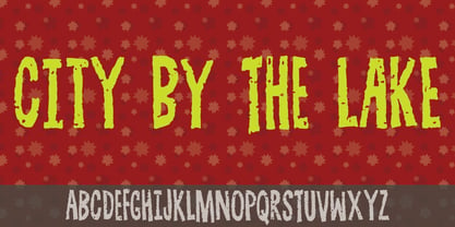
- Covered By Your Grace by Kimberly Geswein,
$5.00 Authentic markered handwriting, neat enough to read but fun enough to inject some personality into your project.
 - By George Titling NF by Nick's Fonts,
$10.00By the time that the 13th edition of the Speedball Text Book appeared in 1938, silent movies were a thing of the past; nonetheless, intrepid author Ross F. George included this typeface, originally intended for title cards, in the volume. Elegant and inviting, the occasionally quirky letterforms feature subtle diamond-shaped accents that add just the right touch of sparkle. The PC Postscript, Truetype and Opentype versions contain the complete Latin language character set (Unicode 1252) plus Central European (Unicode 1250) languages as well. - Message by Wire JNL by Jeff Levine,
$29.00 A Western Union telegram from 1951 provided the typographic inspiration for Message by Wire JNL, which is available in both regular and oblique versions. Unlike other available type fonts which emulate the ink ribbon-struck printed characters from the teletype machines, this version was redrawn to celebrate the actual type design itself. The typeface letter spacing has been equalized so that when in use, it looks much like the printed output of an old telegram messsage.
 - Stand By 4 Action by Comicraft,
$19.00 Anything could happen in the next Half Hour! Inspired by the work of Gerry Anderson, this font graces the pages of Marvel's AVENGERS and THUNDERBOLTS Each and Every Month!
 - KG Piece By Piece by Kimberly Geswein,
$5.00 A neat, upright printed handwritting font.
 - Pivnaya-Latin by Roman Type,
$28.99 ‘Пивная’ (Pivnaya) means ‘bar’ or ‘brewhouse’ in Russian. Pivnaya Latin is a display font published by Roman Type. Initially designed for a poster, the family quickly turned multi-script. In 2019, the global design community is busy celebrating the centennial of Bauhaus, silently triggering the question as to if or how the phenomenon matters in the lives we lead today, or whether it could rather be reduced to mere historic purposes. At that point, I found myself falling into the Bauhaus trap myself, preparing a typeface design workshop for a group of Lithuanian and Russian students. But by a typing error, I accidently made Google translate ‘Brauhaus’ (brewhouse) instead of ‘Bauhaus’. That is why I called this family ‘Pivnaya’ in the end. Pivnaya Latin works for: Afrikaans, Albanian, Catalan, Croatian, Czech, Danish, Dutch, English, Estonian, Finnish, French, German, Hungarian, Icelandic, Italian, Latvian, Lithuanian, Maltese, Norwegian, Polish, Portugese, Romanian, Slovak, Slovenian, Spanisch, Swedish, Turkish, Vietnamese, Zulu. Though being a decorative font, the International Phonetic Alphabet (IPA) increases usability for all kinds of purposes.
 - Boho A Gogo NF by Nick's Fonts,
$10.00 Letterforms from the 30s, inspired by Bauhaus Bold, combine with super 70s styling to create this disco-era delight. The bold characters, rendered by prismatic multilines, create striking headlines with a strong architectural feel. Both versions of this Pro Series font contain the complete Unicode Latin A character complement, along with extended ligatures and fractions.
 - Cloister Old Style B EF by Elsner+Flake,
$35.00 - Old Towne No 536 EF by Elsner+Flake,
$35.00 - Hebrew Vilna Old Style Tanach by Samtype,
$189.00 This is the classic style of Vilna font with Nikud and Taamim.
 - Ongunkan Old Hungarian Runic P by Runic World Tamgacı,
$49.99 In predator, a fantastic sci-fi movie. My version of the fantastic script used to write the alien language, adapted into Old Hungarian runic script. Other versions are Anglo-Saxon Runic and Old Turkic Runic.
 - Bauen by Tipo Pèpel,
$22.00 Bauen (worker in German) is a tribute to the Bauhaus school that has just completed its first centenary and whose ideas are still relevant. It is a geometric typeface inspired by the sans serif typefaces prevailing in those years, and whose cradle resides in the Bauhaus school. It has a wide language coverage, and a generous range of OpenType functionalities, to make it an all-rounder for our day to day, and especially for corporate use.
 - Zeno by Device,
$39.00 Bold, graphic and with a strong vertical emphasis. Built from simple geometric shapes, Zeno is similar to some of Joseph Albers’ Bauhaus experiments, though with attention paid to normalising the lettershapes to improve readability.
 - KR Down By The Sea - Unknown license

- Burt by Renegade Fonts,
$35.00 Burt is extended grotesk with condensed uppercase. Its combines modern bauhaus features with old grotesk details. And the X, what a banger! Well it actually is. That what gave the font name - buřt = sausage. Full Latin extended A support, many features, stylistic sets and alternates. All together 9 styles.
 - Stolzl Display by Inhouse Type,
$33.78 Stolzl Display is an original font family designed for headlines, titles and subtitles. Based on the combination of contrasting shapes, the harmony of form and rhythm is fundamental to the design. Inspired by Bauhaus, Stolzl represents, not just the significant influence of this “crucible of modernism”, but aims at capturing its original idealism, commitment to creativity and experiment driven philosophy. Details include six weights, Cyrillic, 480 characters, alternative glyphs, manually edited kerning and Opentype features. Named after Gunta Stölzl, the Bauhaus’s only female master, Stolzl Display is the first subfamily of the Stolzl font collection to be released this year.
 - Joe Cool by Studio K,
$45.00 Joe Cool is a bold geometric sans with minimal counters designed to achieve the maximum weight, solidity and impact on the page. Joe Cool Extended was actually created first, then it seemed like a good idea to add progressively more compact versions for added variety and versatility. See also Gravitas, my Bauhaus inspired font family which explores similar territory.
 - Hausbau by FaceType,
$8.00 Hausbau is a radical geometric font, inspired by the German Bauhaus.
 - Gravitas by Studio K,
$45.00 This font owes its inspiration to the Bauhaus, the celebrated 1920s design collective which more or less invented modernism as we know it in the applied arts: from architecture and industrial design to graphics and typography. In its day, Bauhaus typography would have been considered brutally modern. Nowadays, when unadorned sans serifs are commonplace, it still has a freshness and quirkiness that sets it apart. With this new release I've tried to recapture the zeitgeist of those pioneering days.
 - Electra by Linotype,
$40.99 Venecian Old Face fonts had a strong influence on typeface design in the 1930s and 1940s in England. Such influence is evident in the font Electra, designed by William A. Dwiggins for Linotype in 1935. Electra combines its classic roots with the Zeitgeist of the 1930s, also displaying characteristics of the Bauhaus and Art Deco styles.
 - Makeads by Sryga,
$22.00 Makeads, a typeface exuding subtle authority, brings a touch of seriousness to the creative palette. Rooted in the foundations of Bauhaus aesthetics, this font effortlessly balances boldness and sophistication. The supertight kerning and unique texture contrast strike an air of balance between formal and casual, making it an ideal choice for projects that demand a touch of gravitas. Makeads is the silent powerhouse that commands attention without raising its voice.


