10,000 search results
(0.246 seconds)
- Olyford Variable by NicolassFonts,
$148.99 Olyford Variable font is a contemporary sans serif typeface that is derived from the Olyford font family. It features a range of weights and italics. OpenType features: Access All Alternates, Stylistic Alternates (Alternative n, m, p, q, r, u), Stylistic Set 1 (Alternative K, k), Stylistic Set 2 (Alternative W), Stylistic Set 3 (Alternative t), Stylistic Set 4 (Alternative w), Stylistic Set 5 (Alternative 5), Stylistic Set 6 (Alternative ¢, $, €, ₽, ¥), Stylistic Set 7 (Alternative Đ, Ħ, Ð, ≠, ∫), Standard Ligatures, Discretionary Ligatures, Proportional Figures, Tabular Figures, Case-Sensitive Forms, Fractions, Kerning, Denominators, Numerators, Scientific Inferiors, Subscript, Superscript, Ordinals, Localized Forms.
 - Reina Neue by Lián Types,
$29.00 Hey! See Reina Neue in action here! INTRODUCTION When I designed the first Reina¹ circa 2010, I was at the dawn of my career as a type designer. The S{o}TA, short for the Society of Typographic Aficionados, described it as complex display typeface incorporating hairline flourishes to a nicely heavy romantic letterform². And it was like that; that’s what I was pursuing at that time since I was very passionate about ornaments and accolades of Calligraphy. Why? I felt that Typography, in general, needed more of them. These subtle flourishes could breathe life into letters. Maybe, I thought it was the only way I could propose something new into the field of type. However, after some years, I came across a very interesting quote: –Beautiful things don’t ask for attention– Wow! What did this mean? How could something be attractive if it’s not actually showing it. Could this be applied to my work? Sure. I think every type-designer goes through this process (aka crisis) regarding his or her career. At the beginning we love everything. We are kind of blind, we only see the big picture of a project. And that’s not because we are lazy. We actually can’t see the small mistakes nor the subtleties that make something simpler beautiful. We are not able. But, the small subtleties… They are actually everything: With experience, one puts more attention into the details and learns that every single decision in type has to be first meticulously planned. Here I am now, introducing a new Reina, because I felt there was a lot of it that could be improved, also the novelty of Variable Fonts caught my attention and I had to take that to my type library. THE FONT A thing of beauty is a joy forever Now, a decade later, I’m presenting Reina Neue. This font is not just an update of its predecessor: –A thing of beauty is a joy forever– is the first line of the poem ‘Endymion’ by John Keats, and despite the meaning of “beauty” may vary from person to person, and even from time to time (as read in the last paragraph), with Reina I always wanted to bring joy to the eye. In 2010, and now, in 2020. I believe the font is today much better in every aspect. It was entirely re-designed: Its shapes and morphology in general are much more clean and pure. The range of uses for it is now wider: While the old Reina consisted in just one weight, Reina Neue was converted into a big family of many weights, even with italics, smallcaps and layered styles. The idea behind the font, this kind of enveloping atmosphere made out of flourishes, is still here in the new Reina. This time easier to get amazing results due to the big amount of available alternates per glyph and also more loyal from a systemic point of view. However, and as read in the introduction -Beautiful things don’t ask for attention-, if none of the flourishes are activated the font will look very attractive anyway. Reina Neue is ready to be used in book covers, magazines, wedding cards, dazzling posters, storefronts, clothing, perfumes, wine labels and logos of all kind. Like it happened with the previous Reina, I hope this new font satisfies every design project around the world if used, and can be a joy forever. SOME INSTRUCTIONS Before choosing the right style for your project, hear my advice: -Reina Neue Display was meant to be used at big sizes. If you plan to print the font smaller than 72pt, I suggest using Reina Neue, not Display. Otherwise, if the font will be BIG or used on a digital platform, Reina Neue Display should be your choice. For even smaller sizes, use Reina Neue Small. This style was tested and printed in 12pt with nice results. (Note for variable fonts: Print them in outlines) -Reina Italic is not a slanted version of the roman, and this means some flourishes are different between each other. The Italic version has other kind of swirls. More conservative, in general. -All the styles of Reina Capitals have Small Capitals inside. -Reina Capitals Shine should be used/paired ONLY with Reina Capitals Black. The engraved feeling can be achieved if Reina Capitals Black and Reina Capitals Shine are used as layers, with the same word. Variable fonts instructions: -For more playful versions, choose Reina Neue VF, Reina Neue Italic VF or Reina Neue Capitals VF: With them you can adjust between 3 axes: Weight (will change the weight of the font) – Optic Size (will thicken/lighten the thin strokes and open/close the tracking) – Accolades (will modify the weight of the active flourishes). SOME VIDEOS OF REINA NEUE VF https://youtu.be/8cImmT5bpQM https://youtu.be/1icWfPmKAkg https://youtu.be/YC9GkJDL1a8 NOTES 1. The original Reina, from a decade ago: https://www.myfonts.com/fonts/argentina-lian-types/reina/ 2. In 2011, Reina received an honourable mention by S{o}TA. “Great skill is shown in the detailing, and an excellent feel for the correct flow of curves and displacement of stroke weight.” https://www.typesociety.org/catalyst/2011/ Reina was featured in the “Most Popular Fonts of the year” in MyFonts in 2011 https://www.myfonts.com/newsletters/sp/201201.html In 2012, the font was also selected in Tipos Latinos, the most prestigious competition of type in Latinoamerica. https://www.tiposlatinos.com/bienales/quinta-bienal-tl2012/resultados Also, chose as a “Favorite font of the year” in Typographica. https://typographica.org/typeface-reviews/reina/
 - Phil Yeh by Comicraft,
$19.00 Since 1985, Cartoonists Across America & The World have been promoting literacy, creativity, the arts, and other positive issues using cartoons and humor. Founder Phil Yeh and his band of artists -- including Comicraft President and First (Flying) Tiger, Richard Starkings -- create books, paint murals, take part in school assemblies, conventions, conferences and other public events for all ages throughout the world! Cartoonists Across America & The World have worked in partnership with the Center for The Book in The Library of Congress and other organizations all over the world. They have painted more than 1000 murals in 49 of the United States as well as in Canada, Mexico, Italy, England, France, Germany, Hungary, The Netherlands, China, Taiwan, Singapore, and the Cayman Islands. So we made Phil a font 'cause he's a noble soul. Avoid Extinction -- Read, Reuse, Reduce and Recycle!
 - FF Zan by FontFont,
$41.99 French type designer Albert Boton created this display FontFont in 2002. The font is ideally suited for advertising and packaging, music and nightlife as well as poster and billboards. FF Zan provides advanced typographical support with features such as ligatures, alternate characters, and case-sensitive forms. It comes with proportional lining figures.
 - FF Studio by FontFont,
$41.99 French type designer Albert Boton created this display FontFont in 2002. The font is ideally suited for advertising and packaging, music and nightlife as well as sports. FF Studio provides advanced typographical support with features such as ligatures, alternate characters, and case-sensitive forms. It comes with proportional lining and proportional oldstyle figures.
 - Fontanesi - Unknown license

- Crunchy by Mans Greback,
$59.00 Vintage handwriting font with stylistic alternate alphabet, contextual alternates, swashes, initial and final alternates, as well as ligatures and 200+ special characters.
 - Suited Horse PB by Pink Broccoli,
$19.00 An offbeat alternate caps typestyle inspired by the title screen of a 1968 Walt Disney film titled, The Horse in the Gray Flannel Suit. This playful and childish font comes with an extensive language set, a stylistic alternates feature that auto-alternates between capitals & lowercase (alt caps), as well as a contextual alternates feature that auto-alternates between sets only where double characters are typed like SS, TT, etc. The contextual alternate feature also enables a few titling word options like " the " " in " and " in the ". As noted in the quotes, when these word sets are typed with a space before and after them, it will trigger the swap when contextual alternates is on. Switching on Contextual Alternates enables automatic alternations between caps and alt caps like AlTeRnAtIoNs to create a more randomized look.
 - FF Letter Gothic Mono by FontFont,
$62.99 Italian type designer Albert Pinggera created this sans FontFont in 1998. The family has 6 weights, ranging from Light to Bold (including italics) and is ideally suited for editorial and publishing, logo, branding and creative industries as well as software and gaming. FF Letter Gothic Mono provides advanced typographical support with features such as ligatures, alternate characters, case-sensitive forms, super- and subscript characters, and stylistic alternates. It comes with tabular oldstyle and tabular lining figures. This FontFont is a member of the FF Letter Gothic super family, which also includes FF Letter Gothic Slang and FF Letter Gothic Text.
 - FF OCR-F by FontFont,
$68.99 German type designer Albert-Jan Pool created this sans FontFont in 1995. The family contains 3 weights: Light, Regular, and Bold and is ideally suited for film and tv, small text as well as software and gaming. FF OCR-F provides advanced typographical support with features such as ligatures, alternate characters, case-sensitive forms, fractions, super- and subscript characters, and stylistic alternates. It comes with a complete range of figure set options – oldstyle and lining figures, each in tabular and proportional widths. As well as Latin-based languages, the typeface family also supports the Cyrillic writing system.
 - Somia by Creativemedialab,
$22.00 Somia font is a modern, attractive and beautiful font. It has many alternates characters with nice curves that you can arrange to create a nice logo lettering or use as a poster display. Add a few alterations to it to make beautiful eye-catching words. Somia font is best for logo lettering, headlines, product packaging, t-shirt design, wedding theme, poster, book covers, wedding invitations, Christmas and more.
 - Elektrakution by Comicraft,
$19.00 SHE'S DEAD, FRANK It's the year 1991, BC (Before Comicraft) when REM were still making records and Frank Miller’s memorable run on Marvel Comics’ DAREDEVIL was just over ten years old. Comicraft’s Richard Starkings found himself working in Anaheim, California for Graphitti Designs. Graphitti had produced the first hardcover edition of Miller’s Batman tale, DARK KNIGHT RETURNS and was now putting together the sequel to Miller’s DAREDEVIL — ELEKTRA LIVES AGAIN! Richard was not engaged to letter this book, the pages of Frank’s incredible original art that came through Graphitti’s studio were already lettered by Marvel Stalwart, Jim Novak. However, there were some cover elements that needed to be added, based on the logo originally rendered by Frank’s brother, Steve. Starkings set about the task of creating an alphabet that could be used to develop Steve’s idea for the trade dress -- the cover elements, the back cover copy and credits on the interior pages. This was long before Macintosh computers and font programs made this work considerably easier, so Rich sat down with a pencil and a sheet of vellum and rendered an alphabet that could be used as the basis for the text that was needed... Those sketches have languished in a drawer for nearly thirty years, but now, finally, Comicraft’s John Roshell has dusted off those old letterforms and Elektrakuted a font based on those designs, a font we HAD to call ELEKTRAKUTION! As for Elektra; she’s dead, Frank. Features: Ten weights (Light, Regular, Bold; Rough Light, Regular & Bold; Inline, Inline Rough, Outline & Outline Rough) with upper & lowercase characters, Western & Central European accents and Greek characters.
 - Metaphora by Almeera Studio,
$15.00 Metaphora is a fancy calligraphy with many alternative styles, this font looks natural, elegant and perfect for any extraordinary project.Metaphora is suitable for various products such as invitations, product packaging, quotes, product design, crafter, labels, photography, watermarks, logos & branding and very suitable for design Valentine day, mother day, wedding, spring, christmas, etc.Everything Stylistic Altternate can be accessed using software that supports Opentype, such as Adobe Indesign, Adobe CS Illustrator, Adobe Photoshop CC, and Corel Draw.
 - Native Roast by Letterhend,
$17.00 Native Roast is a serif font with 3 layered style. You can create vintage 3D look without using any add-on, only with fonts! This font is suitable for a vintage poster, 3d type, or retro Including number and punctuation, also support multi language. This font also contain a bunch of alternates! What will you get : Native Roast Regular, Extrude & Shadow uppercase and lowercase numbers and punctuation multilingual & stylistic alteranate PUA encoded
 - Verdana by Microsoft Corporation,
$49.00The Verdana™ Family of fonts was created specifically to address the challenges of on-screen display. Designed by world renowned type designer Matthew Carter, and hand-hinted by leading hinting expert, Tom Rickner, these sans serif fonts are unique examples of type design for the computer screen. The generous width and spacing of Verdana's characters is key to the legibility of these fonts on the screen. Despite the quality of the Verdana font family at small sizes it is at higher resolutions that the fonts are best appreciated. In the words of Tom Rickner, ‘My hope now is that these faces will be enjoyed beyond just the computer screen. Although the screen size bitmaps were the most crucial in the production of these fonts [their] uses should not be limited to on screen typography. Character Set: Latin-1, WGL Pan-European (Eastern Europe, Cyrillic, Greek and Turkish). - Verdana Ref by Microsoft Corporation,
$29.00The Verdana™ Family of fonts was created specifically to address the challenges of on-screen display. Designed by world renowned type designer Matthew Carter, and hand-hinted by leading hinting expert, Tom Rickner, these sans serif fonts are unique examples of type design for the computer screen. The generous width and spacing of Verdana's characters is key to the legibility of these fonts on the screen. Despite the quality of the Verdana font family at small sizes it is at higher resolutions that the fonts are best appreciated. In the words of Tom Rickner, ‘My hope now is that these faces will be enjoyed beyond just the computer screen. Although the screen size bitmaps were the most crucial in the production of these fonts [their] uses should not be limited to on screen typography. Character Set: Latin-1, WGL Pan-European (Eastern Europe, Cyrillic, Greek and Turkish). - Gulkave by Typodermic,
$11.95 Welcome to the world of Gulkave. Introducing our bold display typeface that will take you back to the retro computing era. With its low-resolution pixel gloss, Gulkave brings a touch of nostalgia with a modern twist. It looks like a classic bitmap font, but with a unique design that sets it apart from the rest. Gulkave was crafted with utmost precision and attention to detail. Unlike traditional bitmap fonts that are made on a control grid, Gulkave was carefully designed with readability and visual balance in mind. This means that you get the perfect combination of a retro computing vibe with modern finesse and legibility. This font is perfect for creating striking headlines and titles that demand attention. Whether you’re designing for print or digital media, Gulkave is the perfect choice for any project that requires a touch of retro techno style. So why settle for a standard pixel font when you can have Gulkave? Try it out today and discover the unique and captivating design that will take your projects to the next level. Most Latin-based European writing systems are supported, including the following languages. Afaan Oromo, Afar, Afrikaans, Albanian, Alsatian, Aromanian, Aymara, Bashkir (Latin), Basque, Belarusian (Latin), Bemba, Bikol, Bosnian, Breton, Cape Verdean, Creole, Catalan, Cebuano, Chamorro, Chavacano, Chichewa, Crimean Tatar (Latin), Croatian, Czech, Danish, Dawan, Dholuo, Dutch, English, Estonian, Faroese, Fijian, Filipino, Finnish, French, Frisian, Friulian, Gagauz (Latin), Galician, Ganda, Genoese, German, Greenlandic, Guadeloupean Creole, Haitian Creole, Hawaiian, Hiligaynon, Hungarian, Icelandic, Ilocano, Indonesian, Irish, Italian, Jamaican, Kaqchikel, Karakalpak (Latin), Kashubian, Kikongo, Kinyarwanda, Kirundi, Kurdish (Latin), Latvian, Lithuanian, Lombard, Low Saxon, Luxembourgish, Maasai, Makhuwa, Malay, Maltese, Māori, Moldovan, Montenegrin, Ndebele, Neapolitan, Norwegian, Novial, Occitan, Ossetian (Latin), Papiamento, Piedmontese, Polish, Portuguese, Quechua, Rarotongan, Romanian, Romansh, Sami, Sango, Saramaccan, Sardinian, Scottish Gaelic, Serbian (Latin), Shona, Sicilian, Silesian, Slovak, Slovenian, Somali, Sorbian, Sotho, Spanish, Swahili, Swazi, Swedish, Tagalog, Tahitian, Tetum, Tongan, Tshiluba, Tsonga, Tswana, Tumbuka, Turkish, Turkmen (Latin), Tuvaluan, Uzbek (Latin), Venetian, Vepsian, Võro, Walloon, Waray-Waray, Wayuu, Welsh, Wolof, Xhosa, Yapese, Zapotec Zulu and Zuni.
 - Fried Chicken by FontMesa,
$25.00 The name of this font brings back memories of an old fried chicken restaurant in Willow Springs Illinois circa 1960’s and 1970’s, my family would all get in the car and take a long drive down to an old country road Illionis Rt 171 through a forest preserve where we’d come upon the old Willowbrook motel with a bar and restaurant next door. The restaurant was called Kegal’s, when you entered the building you had to walk through the smoky bar first to get to the restaurant, I can still see the hard wood floors with all the finish worn off from decades of foot traffic. Up until the mid 1960’s Kegal’s used to raise their own chickens behind the restaurant, back then fried chicken in the Midwest was either coated in flour or bread crumbs, Kegal’s was covered in a beautiful layer of golden bread crumbs. Before your meal arrived they’d bring a basket of dinner rolls along with crackers, bread sticks and country butter, on the side they’d serve coleslaw with a vinegar sauce, which is very common in the Midwest, the first time you try it your face puckers up like you just sucked on a lemon but you get used it over time. After waiting for what seemed like forever to a child the waitress comes out of the kitchen with a huge tray of that golden deliciousness and your mouth begins to water, in her other hand was another tray filled to overflowing with crinkle cut french fries all made by hand, I’d eat a hole handful of those french fries first then take a bite of that tender juicy farm raised chicken. Today a fine Italian restaurant occupies the old Kegal’s building and the motel is long gone, only my fond memories remain. Fast forward to 2020 and FontMesa has just made some Fried Chicken as an eight weight type font family with alternates. With the Fried Chicken slab serif font family we’ve broken some rules by removing a few of the slabs on certain letters for a unique homemade look. Fried Chicken is perfect for your next product label, t-shirt design, logo, headline or cookbook cover. Treat yourself to some good ol’ Fried Chicken today.
 - Patmos Sans by DimitriAna,
$35.00 Patmos Sans is a carefuly hand crafted sans serif font, inspired by the art of the cyrillic calligraphy, as well as the script of the Greek Orthodox art. The font contains Latin, Greek and Cyrillic alphabets and supports Central, Eastern, Western European, Baltic, Turkish, Greek and Russian languages. Patmos Sans has a variety of stylistic alternates and classes, titling altrenates, discretionary and standard ligatures and it is fully unicode-mapped (PUA encoded). The standard ligatures of the font, are 4 decorative ornaments, that you may add at the end of a word and they fit perfectly with the titling alternates. All you have to do is to make sure that ‘standard ligatures’ are activated in your application, then type "d" and a number from 1 to 4.
 - Surimi by JCFonts,
$24.00 Surimi is a condensed display typeface available in six styles. Designed to stand out with its low crossbars and its unicase alternates, this cool little family will be great for titling and logotypes. The fonts include diacritics for western European langages, tabular and proportional figures, and 4 stylistic sets : ss01 : unicase alternates (A,E,W,Y) ss02 : alternate lowercase g ss03 : alternate lowercase l ss04 : alternate W and w
 - Manic Mood PB by Pink Broccoli,
$14.00 An offbeat alternate caps typestyle inspired by the cover of a vintage LP titled, Organ Moods by Jerry Thomas. A playful and childish font from a sexy cheesecake album! Go figure. Switching on Contextual Alternates enables automatic alternations between caps and alt caps like AlTeRnAtIoNs to create a more randomized look.
 - As of my last update, I don't have direct access to databases or the internet to provide real-time or highly specific descriptions of lesser-known or proprietary fonts, such as "PetalGlyph" by Essqué...
- Magrit by Creativemedialab,
$20.00 Magrit is a bold serif display font, It has many alternates character with nice curve that you can arrange to create a nice logo lettering, or use it as a display face on a poster and add a few alterations to it to make a beautiful eye catching words. Magrit font is best for branding, logo lettering, headlines, product packaging, tshirt design, wedding theme, poster, book cover, wedding invitation, Christmas and many more
 - Shidea by Fontdroe,
$24.00 is a beautiful minimalish script, contemporary typeface with classic touch. This typeface can be used for various purposes.such as logos, wedding card, heading, t-shirt, letterhead, signage, lable, news, posters, badges etc. This minimalist beautiful typeface includes opentype features like initial, medial and terminal forms, swashes, ligatures and also has PUA encode support. Tutorials: How to access alternates in adobe illustrator CS https://www.youtube.com/watch?v=geL0Ye02Ryk How to access alternates in adobe illustrator CC 2015 https://www.youtube.com/watch?v=V25yiUh8BcE How to access alternates in Ms Word https://www.youtube.com/watch?v=HxkhZiCuwEw How to access alternates in Coreldraw X7 https://www.youtube.com/watch?v=UBVsufJjons How to access alternates in adobe photoshop CC https://www.youtube.com/watch?v=BYKXl58AdNY How to access alternates in Indesign CS https://www.youtube.com/watch?v=HgZTCxKG14Q How to access alternates in Silhouette Studio https://www.youtube.com/watch?v=l7lyv_lzPbE How to access alternates in Inkscape https://www.youtube.com/watch?v=UzLhG3qwZ0A How to access alternates in Cricut Design Space https://www.youtube.com/watch?v=DmmnoMJv8BY How to access alternates in SureCut A lot 4 https://www.youtube.com/watch?v=Ljgb6LMfaVs How to access alternates in adobe illustrator CC 2015.3 https://youtu.be/dYwHElo9Bpc Help support: fontdroe@gmail.com
 - Tulipán by Estudio Calderon,
$59.95 After Letrista Script, Calderón Estudio returns with a new contemporary and adaptable typeface. Tulipán Lovely Script is a font with three variations resulting in a subtle design that can be smooth as the fresh tulips that inspired it, markedly delineated as a tulip in full bloom, or rough as crocodile skin. Tulipán evokes the soul of vintage brush lettering. See our samples here. Features include: Tulipan Display: Stylistics alternatives, contextual alternates, swash, discretionary ligatures, standard ligatures, oldstyle figures, language support, titling alternates and 59 ornaments. Tulipan Broken: Broken effect, Stylistics alternatives, contextual alternates, swash, discretionary ligatures, standard ligatures, oldstyle figures, language support, titling alternates, small caps and 59 ornaments. Tulipan Rough: Rough effect, Stylistics alternatives, contextual alternates, discretionary ligatures, language support, cath words, 77 ornaments and free samples patterns! You will love it!
 - Noyram by Patria Ari,
$15.00 Noyram is a strong brush script typeface with stunning alternate glyphs. With so many alternative glyphs, you can make an experiment by combining regular and alternate glyphs to get cool phrase with great preview.
 - flower1 - Unknown license

- Pennyroyal Pro by Stiggy & Sands,
$39.00 A Historical Revival for Modern Typesetting Flair Pennyroyal began as a Barnhart Brothers & Spindler typeface called Plymouth Bold, first cut in 1900. What began as a straightforward rustic typestyle has been revived to include a more extensive character set. But this font wasn’t just revived, it has come alive with character and personality. Taking things further, Pennyroyal Pro adds in Unicase (stylistic alternates), Swashes (swash alternates), and a collection of grunge alternates from the original source and additional alternates included (PUA encoded). You’ll find that Pennyroyal Pro contains 1476 characters. The expanded SmallCaps option for Pennyroyal Pro gives the typestyle a more sophisticated option, while the expansive options like Unicase and Swashes allow for more uniqueness, play, and experimenting far beyond the original typeface inspiration. Opentype features include: A collection of ligatures. Smallcaps. Full set of Inferiors and Superiors. Proportional figures and Oldstyle figure sets. Unicase Capitals as Stylistic Alternates Swash Caps & Lowercase alternates Smallcap Swash Caps & Lowercase alternates Grunge Alternates for Capitals Additional Swash Alternates
 - Brume by Creativemedialab,
$16.00 Brume font is a bold, attractive and beautiful font. "Easy to read, modern and elegant look but stylist", this will be the first words that your client says to your design using this font. Comes with uppercase and lowercase. It has many alternates character with nice curve that you can arrange to create a nice logo lettering, or use it as a display face on a poster and add a few alterations to it to make a beautiful eye catching words. Brume font is best for logo lettering, headlines, product packaging, t-shirt design, wedding theme, poster, book cover, wedding invitation, Christmas and more To access alternate: In Adobe Photoshop go to Window - glyphs In Adobe Illustrator go to Type - glyphs
 - Morning Sunshine by Inumocca,
$16.00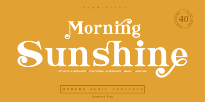 Morning Sunshine Modern Serif typeface , clear and classy characterized, OpenType feature to access Ligature, contextual alternates, stylistic alternates and swash. Really playful typeface to covering your Project, like Magazine, Branding, Poster, wedding invitations, Tshirt, Logos, and more your project design. Unique glyphs Multilingual Characters UPPERCASE Lowercase Numeric Symbol Punctuation Character Ligature Contextual Alternates Stylistic Alternates Swash inumocca _type
 - Clumsy by Gaslight,
$15.00 Clumsy is a two weight all caps handcrafted awkward font with alternates for all characters and digits. The font was inspired by a few lines of text from an old soviet book about vine. Clumsy is a good choice for small amounts of text. When Clumsy is used in OpenType applications, its Contextual Alternates feature produce a striking random-like effect on glyphs distribution, achieved by cycling through alternates. When not using the Contextual Alternates feature, you can still pick the alternates in the Glyphs palette or use the alternates available from the keyboard upper and lower case.
 - Galatia Script by Amarlettering,
$15.00 Galatia Script comes with 444+ glyphs. The alternative characters were divided into several OpenType features such as Swash, Stylistic Sets, Stylistic Alternates, Contextual Alternates. The OpenType features can be accessed by using OpenType savvy programs such as Adobe Illustrator, Adobe InDesign, Adobe Photoshop Corel Draw X version, And Microsoft Word. This Font has PUA unicode (specially coded fonts) so that all the alternate characters can easily be accessed in full by a craftsman or designer. Galatia Script Contains: - Uppercase & Lowercase - International Language & Symbols - Punctuation & Numbers - PUA Unicode - Stylistic Alternates - Stylistic Set 1-19 - Contextual Alternates - Galatia script.OTF
 - Dublin by Alan Meeks,
$45.00 Classic Celtic style of lettering with an alternative set of capitals and a few alternative lower case.
 - Kis Classico by Linotype,
$29.99Kis Classico™ is named after the Hungarian monk Miklós Kis who traveled to Amsterdam at the end of the seventeenth century to learn the art of printing. Amsterdam was a center of printing and punchcutting, and Kis cut his own type there in about 1685. For centuries, Kis's type was wrongly attributed to Anton Janson, a Dutch punchcutter who worked in Leipzig in the seventeenth century. Most versions of this type still go by the name Janson. In 1993, the Italian/Swedish type designer Franko Luin completed Kis Classico, his own contemporary interpretation of the Kis types. About the Kis/Janson story, Luin says: If you understand Hungarian I recommend you read the monograph, 'Tótfalusi Kis Miklós' by György Haiman, published in 1972 by Magyar Helikon. It has hundreds of reproductions from his Amsterdam period and from the time when he was an established printer in Kolozsvár (today's Cluj in Romania)." Kis Classico has five weights, and is an admirable version of this classic type. - Arial Nova by Monotype,
$45.99The Arial® Nova family takes Arial back to its roots. Character spacing has been adjusted and a number of subtle modifications were made to the design to return the shapes and proportions to those of the original 1982 design created for IBM's then new high-speed laser printers. Although these first Arial fonts, called "Sonora Sans" by IBM, were low-resolution bitmaps, it was apparent that the design could also be an important high-resolution digital typeface, and Arial was redrawn for Monotype's imagesetters in the late 1980s. In the process Arial evolved from its original design loosing some of its earlier personality. The restored Arial Nova family is made up of three weights of roman design of standard proportions and three weights of condensed - all with complementary italic designs. The Arial Nova family is also compatible with the fonts that Microsoft® provides in the Windows® 10 operating system. - Alta California by steve mehallo,
$18.80 Alta California became designer steve mehallo's "vector-based artist's response" to the early Apple Macintosh bitmapped font San Francisco. Alta California was developed using "sampled" wood type and letters from numerous historical sources. The name comes from the Alta California newspaper, the first daily published in California, one of a dubious Barbary Coast nature, a sheet that shaped the bias of San Franciscans and attracted its own grade of reporters, including a printing specialist who went under the nom de plume Mark Twain. Alta California's edges were meticulously redrafted by hand, with letterpress-inspired fallout and 19th century pointing hands. The final collection of rough hewn letters jump, dive, fall, zag and zig. Alta California looks great on greeting cards, food packaging, as retail signage for boutiques, vintage stores or at D.I.Y. sales, on band posters or club cards, in and around historical quarters, or for use on any ransom note that needs to evoke a wild west look and feel.
 - Mercedes1937 by scarab13,
$9.00 There is an interesting story about this vintage professional Mercedes typewriter I’ve used to make this font. My grandfather, who was a Yugoslavian partisan during the WWII captured it from a Wehrmacht command building during an attack, and he kept it in a perfect shape for so many years. After I inherited it, I wanted to share it’s uniqueness (as well as it’s story). I’ve intentionally kept it in it’s original condition - I haven’t replaced the ribbon that was some 34 years old (or more) before sampling the font, and it turned out really nice. One more important thing - I have used ONLY it’s original set of characters (Latin with some Balkan-based letters). With it’s untouched originality and uniqueness it fits to our modern culture perfectly. There are no compromises here - there are no popular @,#,$ and other characters you would expect in a font. You will get EXACTLY what’s on this genuine “Mercedes” typewriter with so much soul.
 - The Flying Hollander font, created by the prolific German type designer Manfred Klein, is an artistic and whimsical typeface that carries a unique charm and character. Known for his eclectic and wide...
- Journey by Fenotype,
$35.00 Journey is a smooth and elegant vintage script family of four weights and a matching ornament set. Journey is packed with Alternate characters that let you easily create headlines, logos & posters with a custom-made feeling. Journey has a minimum three alternatives to every basic letter: To activate the alternates click on Swash, Stylistic or Titling Alternates in any OpenType Savvy program or manually choose from even more alternate characters from the Glyph Palette. For the best price purchase the Complete Journey Family.
 - Situgintu by FallenGraphic,
$15.00 Situgintu Calligraphy has lots of alternate characters, swashes and ligatures. It has also a bunch of tails with different shapes and widths to give the logotype or sports look to your design. You can design beautiful, elegant and diverse typographic elements with it. It’s well suited for logos, lettering artwork, t-shirt designs, editorial illustrations to name a few. Features : -PUA Encoded 100% Acessibility -Stylistic Alternates -Standard Ligatures -Stylistic set SS01-SS07 If you don’t have a program that supports OpenType features such as Adobe Illustrator and CorelDraw X Versions, you can access all the alternate glyphs using Font Book (Mac) or Character Map (Windows).To Access Alternate Characters Click The Link Below: How to access alternates in Adobe illustrator CS https://www.youtube.com/watch?v=geL0Ye02Ryk How to access alternates in Adobe illustrator CC https://www.youtube.com/watch?v=V25yiUh8BcE How to access alternates in Ms Wordhttps://www.youtube.com/watch?v=HxkhZiCuwEw How to access alternates in Coreldraw X7 https://www.youtube.com/watch?v=UBVsufJjons How to access alternates in Indesign CS https://www.youtube.com/watch?v=HgZTCxKG14Q How to access alternates in Adobe Photoshop CC https://www.youtube.com/watch?v=BYKXl58AdNY

