10,000 search results
(0.044 seconds)
- Luxoorea by Almarkha Type,
$25.00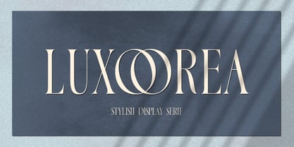 Introducing Luxoorea – Stylish Display Serif inspired by the famous minimalist logo perfect for the purposes of designing templates, brochures, videos, advertising branding, logos and more.
 - Delaproza by Almarkha Type,
$29.00 Introducing Delaproza – Modern Serif font inspired by the famous minimalist logo perfect for the purposes of designing templates, brochures, videos, advertising branding, logos and more.
 - Grandma by HVD Fonts,
$19.00 Grandma is a lovely hand-drawn serif font. It is perfect for greeting cards, children's books and everything that should have a handmade, kind feeling.
 - Coupon Clipper JNL by Jeff Levine,
$29.00Coupon Clipper JNL is a fun, playful, casual sans serif font that evokes some of the lighthearted typography of the late 50s and early 60s. - Latin by Wooden Type Fonts,
$15.00 A revival of one of the popular wooden type fonts of the 19th century, suitable for text or display, short ascenders and descenders, serifs triangular.
 - Revij Anovik by Stringlabs Creative Studio,
$29.00 Revij Anovik is a unique and modern decorative serif font. This playfully conceptual typeface font will look truly outstanding in a wide range of contexts.
 - Girls Girls Girls by Comicraft,
$19.00Yeah, Baby! You wanted the World’s Greatest Comic Book Fonts and we gave them to you! They're Sexy DropCaps! They're Saucy Dingbats! GIRLS!GIRLS!GIRLS! - Cardboard Cutouts JNL by Jeff Levine,
$29.00Cardboard Cutouts JNL is a blocky sans serif font re-drawn from some old "kiddie" stencils from the 1950s or 1960s acquired by Jeff Levine. - Sangira by Almarkha Type,
$29.00 Introducing Sangira - Modern Ligature Serif inspired by the famous minimalist logo, perfect for the purposes of designing templates, brochures, videos, advertising branding, logos and more.
 - Glamorez by Almarkha Type,
$35.00 Introducing Glamorez - Luxury Display Serif inspired by the famous minimalist logo perfect for the purposes of designing templates, brochures, videos, advertising branding, logos and more.
 - Lemos by Goodigital13,
$20.00 hand drawn brush who make the typeface looks very instant and messy. Uses for film title, cover album, logo, clothing, invitation, event, labels, poster, etc.
 - Kurilian by Wooden Type Fonts,
$15.00 A very unusual type based on wooden type designs of the 19th century, lacking lower case which may not have been designed for this font.
 - Garash Script by Dharma Type,
$14.99 Very decorative script inspired by old lettering in Eastern Europe. Eye-catching for picture books, toys for children. There is another font which called Garash.
 - FS Kim by Fontsmith,
$80.00 Unconventional beauty FS Kim is bold and intriguing – exuberant and unmissable, but playing a supporting role when needed. This typeface shines brightest as a display font, and is perfect for applications across fashion, theatre, cultural projects and pretty much any brand that wants to make a statement. While FS Kim is dramatic, it’s incredibly versatile, too, and works to showcase content in a stylish, striking way. This font makes you look, and makes you curious – perfect for brands and publishers that relish unconventional beauty. A playful text version While FS Kim’s text version is more constrained than the display, the strength and playfulness remain. Modifications for the text version include larger x-heights, longer ascenders and descenders, wider proportions and spacing, longer and more defined serifs and a lower contrast. “The overall idea is that it’s not an optical size,” Radoeva explains. Text and display maintain a strong connection that mean they can be used together. A display with a twist The calligraphic starting point helped to create familiar forms, while a contemporary display feel is achieved through short wedge serifs, with bold touches added through the font’s exaggerated forms and details. FS Kim’s narrow proportions, short ascenders and descenders, and tighter spacing make the font suitably compact for display use. The overall aesthetic feels bold and sharp, but closer inspection reveals that all the corners are softened. Decorative inlines In an unusual twist, FS Kim’s display version was first drawn using a broad-nib pen to create familiar forms and elegance while still breaking from serif traditions and making it all about standout character. There are also two additional styles, based on the Regular and Black with inlines – in uppercase, figures and symbols. The inline brings an extra option for an even stronger, more decorative display use.
 - Hero fire by Alit Design,
$23.00 Hero Fire is a dynamic and bold typeface that embodies the essence of a powerful superhero. The characters are meticulously crafted with strong serifs, exuding strength and resilience. The design seamlessly blends classic typography with iconic superhero elements, making it a distinctive and impactful choice for display purposes. Illustrations: The typeface is adorned with illustrations inspired by the superhero universe. Each character is meticulously detailed, featuring elements such as: Fire: Flame motifs gracefully intertwine with certain characters, adding a touch of intensity and energy. Swords: Sharp and sleek sword illustrations are incorporated into select characters, symbolizing heroism and the strength to overcome challenges. Skulls: Subtle skull designs enhance the edginess of the typeface, capturing the essence of a fearless and bold superhero. Shields: Protective shields are cleverly integrated into specific characters, emphasizing the font's ability to safeguard and endure. Wings: Majestic wing illustrations accompany certain characters, representing the freedom and soaring spirit of a superhero. Characteristics: Bold and Strong: Hero Fire commands attention with its bold and robust characters, making it perfect for headlines and attention-grabbing text. Serif Display: The typeface features classic serifs that add a touch of sophistication, making it suitable for both modern and traditional designs. Versatile Usage: Hero Fire is designed for versatility, lending itself well to various design applications such as posters, comic books, branding, and more. Usage Recommendations: Hero Fire is particularly well-suited for projects that require a strong and impactful display font. Its superhero-themed illustrations make it a perfect choice for comic book titles, movie posters, gaming graphics, and any design where a bold and dynamic aesthetic is desired. Embrace the power of Hero Fire to infuse your designs with a heroic and captivating spirit!
 - FS Kim Variable by Fontsmith,
$349.99Unconventional beauty FS Kim is bold and intriguing – exuberant and unmissable, but playing a supporting role when needed. This typeface shines brightest as a display font, and is perfect for applications across fashion, theatre, cultural projects and pretty much any brand that wants to make a statement. While FS Kim is dramatic, it’s incredibly versatile, too, and works to showcase content in a stylish, striking way. This font makes you look, and makes you curious – perfect for brands and publishers that relish unconventional beauty. A playful text version While FS Kim’s text version is more constrained than the display, the strength and playfulness remain. Modifications for the text version include larger x-heights, longer ascenders and descenders, wider proportions and spacing, longer and more defined serifs and a lower contrast. “The overall idea is that it’s not an optical size,” Radoeva explains. Text and display maintain a strong connection that mean they can be used together. A display with a twist The calligraphic starting point helped to create familiar forms, while a contemporary display feel is achieved through short wedge serifs, with bold touches added through the font’s exaggerated forms and details. FS Kim’s narrow proportions, short ascenders and descenders, and tighter spacing make the font suitably compact for display use. The overall aesthetic feels bold and sharp, but closer inspection reveals that all the corners are softened. Decorative inlines In an unusual twist, FS Kim’s display version was first drawn using a broad-nib pen to create familiar forms and elegance while still breaking from serif traditions and making it all about standout character. There are also two additional styles, based on the Regular and Black with inlines – in uppercase, figures and symbols. The inline brings an extra option for an even stronger, more decorative display use. - Lektorat by TypeTogether,
$35.00 Florian Fecher’s Lektorat font family is one for the books, and for the screens, and for the magazines. While an editorial’s main goals are to entertain, inform, and persuade, more should be considered. For example, clear divisions are necessary, not just from one article to the next, but in how each is positioned as op-ed or fact-based, infographic or table, vilifying or uplifting. From masthead to colophon, Lektorat has six concise text styles and 21 display styles to captivate, educate, and motivate within any editorial purpose. Magazines and related publications are notoriously difficult to brand and then to format accordingly. The research behind Lektorat focused on expression versus communication and what it takes for a great typeface to accomplish both tasks. In the changeover from the 19th to 20th century, German type foundry Schelter & Giesecke published several grotesque families that would become Lektorat’s partial inspiration. Experimentation with concepts from different exemplars gave birth to Lektorat’s manifest character traits: raised shoulders, deep incisions within highly contrasted junctions, and asymmetrical counters in a sans family. After thoroughly analysing magazine publishing and editorial designs, Florian discovered that a concise setup is sufficient for general paragraph text. So Lektorat’s text offering is concentrated into six total styles: regular, semibold, and bold with their obliques. Stylistic sets are equally minimal; an alternate ‘k, K’ and tail-less ‘a’ appear in text only. No fluff, no wasted “good intentions”, just a laser-like suite to focus the reader on the words. The display styles were another matter. They aim to attract attention in banners, as oversized type filling small spaces, photo knockouts, and in subsidiary headings like decks, callouts, sections, and more. For these reasons, three dialed-in widths — Narrow, Condensed, and Compressed — complete the display offerings in seven upright weights each, flaunting 21 headlining fonts in total. If being on font technology’s cutting edge is more your goal, the Lektorat type family is optionally available in three small variable font files for ultimate control and data savings. The Lektorat typeface was forged with a steel spine for pixel and print publishing. It unwaveringly informs, convincingly persuades, and aesthetically entertains when the tone calls for it. Its sans serif forms expand in methodical ways until the heaviest two weights close in, highlighting its irrepressible usefulness to the very end. Lektorat is an example of how much we relish entering into an agreed battle of persuasion — one which both sides actually enjoy.
 - Vimland Black - Personal use only

- Cimero Pro - 100% free

- SUNCUT - Personal use only

- Argillites - Personal use only

- Chilly Medium - Personal use only

- GodOfWar - Unknown license

- SF Intellivised - Unknown license

- Peninsula - 100% free

- Reactor Sans - 100% free

- Tresdias - Unknown license

- LT Anomaly - 100% free

- October Crow - 100% free

- Hetilica - Personal use only

- DARK PLACE_DEMO - Personal use only

- CapitalisTypOasis - Unknown license

- Dark Theater - Unknown license

- Roosevelt - Unknown license

- Yellow Magician - Unknown license

- Bebas - Unknown license

- Kanna-W4 - Personal use only

- Fireye GF 3 - Unknown license

- Crimson Petal - Personal use only

- Geometry Soft Pro Bold N - 100% free


