10,000 search results
(0.018 seconds)
- Uni Sans by Fontfabric,
$29.00 Important! There is a whole new redesigned version (remake) of Uni Sans called Uni Neue . The Uni Sans font family includes 14 weights - seven uprights with seven italics. It is characterized by excellent legibility in both - web & print design areas, well-finished geometric designs, optimized kerning, excellent web-font performance and legibility etc. Inspired by the classic grotesque strong typefaces like DIN and Dax - Uni Sans has his own unique style in expressed perfect softened geometric forms. The font family is most suitable for headlines of all sizes, as well as for text blocks that come in both maximum and minimum variations. Uni Sans font styles are applicable for any type of graphic design in web, print, motion graphics etc and perfect for t-shirts and other items like posters, logos. PDF Specimen also available - click here .
 - Golden Decades by Dharma Type,
$19.99 Back to the basics. In the last ten years, type design has been confronting chaotic scene. The font market is flooded with a mixture of wheat and chaff and typography becomes increasingly complex. But one golden straight path exists. The path began from the industrial revolution, passing through swiss style, now we walk along the path as a matter of course. It is sans-serif. The decades from the Swiss style, namely "less is more age" to the contemporary basic style "Less, but better age", we call it golden decades. In those decades, type design met modernism. Go back to a theory in the golden decades, we redesigned new geometric, minimal sans-serif. Less is more and better. We added cool and calm spices to the modernism in the golden decades. As a result, letterform has a contemporary, sharp, and neutral atmosphere, and geometric rounded bowls and counters create a nice rhythm. Golden Decades consists of 8 weights and their matching Italics for a wide range of usages. Farther, Golden Decades is supporting international Latin languages and basic Cyrillic languages including Basic Latin, Western Europe, Central and South-Eastern Europe. Also, Golden Decades covers Mac Roman, Windows1252, Adobe1 to 3. This wide range of international characters expands the capability of your works. Lowercase "a" has OpenType stylistic alternate for advanced typography.
 - Tanamera by Jolicia Type,
$19.00 Introducing Tanamera: Your Portal to Psychedelic Nostalgia Product Description: Unleash the vibrant energy of the '60s and '70s with Tanamera, the ultimate psychedelic type display font that channels the essence of retro vintage style. Whether you're designing a groovy poster, an album cover, or revamping your branding, Tanamera is your ticket to a kaleidoscopic journey through time. Key Features: 1. Psychedelic Vibes: Tanamera captures the essence of a bygone era, where peace, love, and creativity reigned. Its mesmerizing swirls and curves will transport you to the heart of the psychedelic revolution. 2. Vintage Aesthetic: With carefully crafted glyphs that pay homage to the fonts of the past, Tanamera adds an authentic touch of nostalgia to your projects, effortlessly embodying the essence of the retro era. 3. Endless Customization: Tanamera comes with a variety of alternates and ligatures, providing you with endless possibilities to create unique and eye-catching typography that stands out from the crowd. 4. Versatile Usage: Whether you're designing for print or digital media, Tanamera adapts seamlessly to various applications, from posters, branding, and advertising, to websites and social media. 5. High-Quality Craftsmanship: Crafted with precision and attention to detail, Tanamera is a high-quality font that ensures crisp, sharp lines and smooth curves, making it perfect for both small and large-scale projects. 6. Easy to Use: Tanamera is user-friendly and compatible with popular design software, ensuring a smooth and hassle-free integration into your creative process. Why Choose Tanamera? Tanamera is not just a font; it's a portal to the past, a gateway to a world of vibrant colors, free-spirited expression, and boundless creativity. It's your chance to infuse your designs with the unmistakable energy and style of the psychedelic era, creating a visual experience that captivates and enchants your audience. Let Tanamera be your guide to reviving the past while embracing the future. Elevate your design projects with this captivating font, and watch as your creations come to life with the magic of retro vintage style. Get Tanamera today and embark on a journey through time that will leave a lasting impression on anyone who sees your work.
 - Thwaites by Eyad Al-Samman,
$20.00 ‘Thwaites’ typeface is fully dedicated to one of my best Canadian friends who I do cherish and value highly. This great and industrious Canadian friend is ‘James Douglas Thwaites’ who lives along with his good-natured family in British Columbia, Canada. For me, James is like a source of inspiration and I do consider him as an ideal in my life. Our strong friendship has started since 1999 and I hope that it will endure just to the last moment of my life. Sometimes I see him as the writer and poet that I learn a lot from, sometimes I see him as a devoted religious minister that I try to understand more about his teachings, and other times I see him as the educator that I strive to imitate verbatim in my life. When I want to talk more about this Canadian friend, I will not be able to give him his due in full. Thus, I will instead mention some excerpts of his biography that he wrote himself saying that: “James D. Thwaites is a self-accomplished man. Having worked in various fields including restaurant management and cleaning, he has achieved his goals of being a full-time teacher, past-time writer, and volunteer religious minister for the Christian Congregation of Jehovah's Witnesses. His personal and academic pursuits have led him to be published in various magazines, newspapers, self-published books, and websites, including his now defunct ‘poetryofthemonth.com’ website. He continues to learn and augment the craft of writing while working primarily in early literacy and delayed literacy learners, teaching reading and literature to a wide age range of students. He views his religious endeavors as an extension of his academic ones. He teaches others both as a public speaker and in one-on-one situations, teaching about the benefits of submission to God and to His teachings. His future goals include expanding his ministry and continuing his writing.” The name ‘Thwaites’ itself comes from Great Britain and originated from the last Viking raids upon England, being an Anglicized version of a Scandinavian term meaning—depending on the source material—either "a place that is difficult to approach" or "a small thicket of trees." Another recitation mentions that ‘Thwaites’ can be described also as an English surname but one of pre 7th century Norse-Viking origins. It may be either topographical or locational, and is derived from the word "thveit", meaning a clearing or farm. As a locational surname it originates from any one of the various places called "Thwaite", found in several parts of Northern England and East Anglia to the south. The various modern spelling forms include Thwaite, Thwaites, Thwaytes, Thoytes, Twaite, Twatt, Twaites, Tweats and Twite. The name, although often appearing unique to outsiders, can often be found within other famous names like Braithwaite, Goldthwaites, or Misslethwaites. With various spellings, some families not including the ‘e’ or the ‘s’ at the end, Thwaites and its derivations—although not exceedingly common—is a name found worldwide. ‘Thwaites’ typeface is simply a sans-serif streamlined, stylish, and versatile font. It is designed using a combination of thick and thin strokes for its +585 characters. Its character set supports nearly most of the Central, Eastern, and Western European languages using Latin scripts including the Irish language. The typeface is appropriate for any type of typographic and graphic designs in web, print, and other media. It is also absolutely preferable to be used in the wide fields related to publication, press, services, and production industries. It can create a very impressive impact when used in headlines, posters, titles, products’ surfaces, logos, medical packages, product and corporate branding, and also signage. It has also both of lining and old-style numerals which makes it more suitable for any printing or designing purposes. ‘Thwaites’ typeface is really the cannot-miss choice for anyone who wants to possess unique artistic and modern designs produced using this streamlined typeface.
 - Selfie Neue Rounded by Lián Types,
$29.00 INTRODUCTION When I started the first Selfie back in 2014 I was aware that I was designing something innovative at some point, because at that time there were not too many, (if any) fonts which rescued so many calligraphy features being at the same time a monolinear sans. I took inspiration from the galerías’ neon signs of my home city, Buenos Aires, and incorporated the logic and ductus of the spencerian style. The result was a very versatile font with many ligatures, swashes and a friendly look. But… I wasn’t cognizant of how successful the font would become! Selfie is maybe the font of my library that I see the most when I finally go out, (type-designers tend to be their entire lives glued to a screen), when I travel, and also the font that I mostly get emails about, asking for little tweaks, new capitals, new swashes. Selfie was used by several renowned clients, became part of many ‘top fonts of the year’ lists and was published in many magazines and books about type-design. These recognitions were, at the same time, cuddles for me and my Selfie and functioned as a driving force in 2020 to start this project which I called Selfie Neue. THE FONT "Selfie for everything" Selfie Neue, because it’s totally new: All its glyphs were re-drawn, all the proportions changed for better, and the old and somehow naive forms of the first Selfie were redesigned. Selfie Neue is now a family of many members (you can choose between a Rounded or a Sharp look), from Thin to Black, and from Short to Tall (because I noticed the feel of the font changed notoriously when altering its proportions). It also includes swashy Caps, which will serve as a perfect match for the lowercase and some incredibly cute icons/dingbats (designed by the talented Melissa Cronenbold) which, as you see in the posters, make the font even more attractive and easy to use. You'll find tons of alternates per glyph. It's impossible to get tired with Selfie! Like it happened with the old Selfie, Selfie Neue Rounded was thought for a really wide range of uses. Magazines, Book-covers, digital media, restaurants, logos, clothing, etc. Hey! The font is also a VF (Variable Font)! So you can have fun with its two axes: x-height and weight, in applications that support them. Let me take a New Selfie! TECHNICAL If you plan to print Selfie Neue VF (Rounded or Sharp), please remember to convert it to outlines first. The majority of the posters above have the "contextual" alternates activated, and this makes the capitals a little smaller. I'd recommend deactivating it if you plan to use Selfie for just one word. Use the font always with the "fi" feature activated so everything ligatures properly. The slant of the font is 24,7 degrees, so if you plan to have its stems vertical, you may use Selfie with that rotation in mind. THANKS FOR READING
 - Cubio Mono by R9 Type+Design,
$38.00 Cubio™ Mono is a new monospaced geometric sans serif inspired by the hexagonal silhouette of isometric cubes. We applied this angular form through all aspects of Cubio™ type design from the overall look of letters and icons down to the small details such as the end of each letter stem and hexagonal dotted lines. This font family comes in 3 weights/styles: 300 (Regular), 500 (Medium), and 700 (Bold). With over 1,500 glyphs, Cubio™ Mono not only supports most Latin-based languages, but also features an extensive set of UX/UI icons, and patterns. Cubio™ Mono is a versatile typeface for both digital and traditional designs. Perfect for packaging design, logo design, print design, store signages, UX/UI web & apps designs. Cubio™ Mono packed with features such as case-sensitive marks, punctuations and math symbols. It also comes with an extensive set of box/compartment drawing glyphs to help you create a unique modern design without even using the line tools. We designed the Cubio™ Mono font system with your convenience in mind. It comes with two sets of hexagonal dotted line and icon positions (Mid Cap Height and Mid X-Height ), so you don’t have to use the baseline shift command to set them to the perfect spots. To find out more about Cubio™ Mono Opentype features and type specimen, please visit www.r9typedesign.com
 - Allrounder Antiqua by Identity Letters,
$40.00 Timeless Renaissance looks, gently updated. For novels and billboards alike. Allrounder Antiqua is an old-style serif member of the Allrounder superfamily. A timeless typeface based on classical proportions, Allrounder Antiqua is perfectly suitable for advanced book and editorial design well as packaging and branding. True: its main purpose is to set flawless body copy and to generate an evenly textured page—but its refined shapes work fantastically in display applications, too. Some details, such as the small and sharp bowl of the lowercase a, are fully appreciated in large sizes only. If you need a sophisticated serif typeface for packaging, food, fashion, consumer goods, or lifestyle branding, Allrounder Antiqua is up for it. It's also apt as an outstanding corporate typeface, be it for a more conservative venture or the latest hipster start-up. This classy serif typeface comes in four weights with corresponding true italics. Just like its sans-serif counterpart, Allrounder Grotesk, Allrounder Antiqua is equipped with plenty of Opentype Features like small caps, six sets of figures, case-sensitive forms, superiors, fractions and many ligatures. You will find alternate letters with swashes within this extended character set, as well as all the accented glyphs necessary to support more than 200 Latin-based languages. Historical Background The (French) Renaissance-influenced typeface started as Moritz Kleinsorge's graduation project within the "Expert Class Type design" course of the Plantin Institute for Typography, located in the famous Museum Plantin-Moretus in Antwerp, Belgium. There, Moritz Kleinsorge decided to create a revival of Robert Granjon's "Ascendonica Romain", described as "a beautiful face; typical of Granjon's mature style" in the inventory list of available material. "To touch punches and matrices cut by Robert Granjon back in 1567 was an invaluable inspiration", Moritz explains. Over time, the typeface moved away from being a true revival. Rather, it evolved into a Granjon-inspired typeface. That typeface is now available as Allrounder Antiqua. Perfect Pairing: Allrounder Antiqua + Allrounder Grotesk Allrounder Grotesk is the ideal complement to Allrounder Antiqua. They both share common vertical metrics and a common color. This allows you to pair both typefaces within the same layout—even within the same paragraph—without creating visual disruption. Head over to the Family Page of Allrounder Grotesk to get more information about this typeface. Design Trick: Bilingual Design With the Allrounder Superfamily Combining Allrounder Grotesk with Allrounder Antiqua is an ideal approach for bilingual designs, wherein both languages get the same emphasis yet are distinguished with two different typefaces. It's also best practice to set headlines in a different typeface than the body text if they harmonize with each other. Allrounder Grotesk and Allrounder Antiqua provide you with the perfect pair for this purpose.
 - Das Riese by Intellecta Design,
$22.90 Das Riese, a type specimen by the most productive Brazilian type foundry, Intellecta Design, is a mix of victorian and art deco influences. A beautiful display type for tiling with uppercases only. It's shadows and volumes refer to pre-modern age whereas its surface to last century 20's. This heavy sans serif strokes characters have a particular appearance, a parallel line texture that reminds Bifur, typeface created in 1929 by A. M. Cassandre. The sideways absence of volume at some leaning letters right side in addition to the patchy darkness of shadows support its handmade design. A type full of historical references designed to small titles printed in big sizes. It's impossible not to think about posters when you look at Das Riese strong face. - (source Slanted Magazine #8)
 - Seebad by Linotype,
$29.99Silvan Kaesar designed Seedbad after observing the unique sign lettering along the shores of Lake Geneva's bathing area. Seebad's four different settings represent the cutting edge new style of Swiss design, which spans the bridge between modern and contemporary. Containing geometrically forms, Seebad has a narrow base. Some characters (the lowercase t", for example) display unicase, even uncial-like tendencies. If you are looking for a face to spice up your layouts with an ultra-modern, cutting-edge flair, while not sacrificing copy length, Seebad is the face for you! The four fonts making up the Seebad family are all included in the Take Type 5 collection, released by Linotype GmbH in 2003." - East Anglia - 100% free

- pks-masry - 100% free

- Sea Dreams - 100% free

- Chinese Rocks Free - Unknown license

- Futurex Slab - Unknown license

- Futurex Metal-gear Bold - Unknown license

- D-block A by AType,
$19.95The history of this font is those. Once I assorted the old children's books which have stayed from times of my childhood. On one of them I have seen a trade mark of a printing house consisting of two Russian letters "L" and "B". From they were begun also with my font. And though finally from these letters a little that remained, elements of these letters can be seen in font D-block B. - HS Loxy Gold by Helipad Space,
$21.00 Introducing, HS Loxy Gold! A Stencil Bold Display Font with the strong touch. It looks heavy and boldy that can be used for all your project needs.This font can be used at any time and on any project. So, HS Loxy Gold Font can't wait to give its touch to all your design projects such as magazine, book, poster design, printing, personal branding, promotional materials, logotype, product packaging, etc. Thank You HS
 - Hounslow by Device,
$29.00 Hounslow is closely related to Acton in structure, and takes the latter’s simple block construction into the third dimension. Three variants – open, solid and shadow – can be freely mixed in one setting for effect. Originally designed solely in the italic variant, an upright was added by request. A further unreleased set with a range of line weights was later commissioned by the New York Times magazine, and used extensively in their television supplement.
 - Symbolic Prophecy by Hanoded,
$15.00 I am not one for prophecies of impending disaster and all that, don’t worry! I just liked the name and it seems to suit this handmade font quite well. Symbolic Prophecy was made with a broken bamboo satay skewer and Chinese ink. I quite like using broken satay skewers, as they give a fantastic ‘random’ effect. Use Symbolic Prophecy for your posters, your product packaging and, just maybe, a sign about the end of times… ;-)
 - Heath Notted by YuliusParyadi,
$11.00 Heath Notted is suitable for display like poster, halloween, witch theme. We created it inpired by the night, because some times night is not always just dark, but sometimes it's beautiful. Heath Notted is includes: - full set uppercase and lowercase letter; - numerals; - large number of punctuations; - ligatures, and swash. Please add this font as your favorit, hit like button, or follow me. I'll very happy for that and aprreciated it. Thank you!
 - Vulnerable by Gian Studio,
$12.00 Vulnerable is an elegant script typeface inspired by a vintage type specimen I found some time ago at an art fair. Thin to thick contrasting lines and elegant curves make Beginta the perfect font for this type of logo and display purposes. Hope you enjoy it Feel free to contact me if you have any questions or concerns you may have and I will get back to you as soon as I can.
 - Booden by Lithographe,
$36.00 Booden is a name not to boo but to use in display type situations. but as texts funtion s to be read its functionality ges beyond a Cyber-tech font single weight single time use. it can be used for branding purposes or any type of editorial text because of its readability. Be it a logo, or a Title headliner, web or print booden typeface can certainly entertain your need for simple variation.
 - Encrypted Wallpaper by Characters Font Foundry,
$- With Encrypted Wallpaper you can create your own decorative wallpaper that you can still read. The forms of the font are perfect for creating wallpaper, background patterns and decorative elements. The human eye needs time to decypher the cryptic forms back into a font. Women can decypher Encrypted Wallpaper much faster than men. So all you guys out there, if you don't want to look like a fool, don't show this to your wife.
 - Opulence by Ogle Studio,
$14.00 Opulence is a font designed to show the world you mean business. Inspired by Times New Roman, this contemporary serif typeface is perfect for business cards, logos, presentations and web. Crafted to promote a modern, clean and elegant solution for your projects. Not only is it a solid, bold choice for a title, it also shows its strength a subtitling and body text. Opulence contains 187 beautiful characters with latin and western language support.
 - Pisak by Cuda Wianki,
$20.00How many times have you been looking for a handwritten yet not childish font without result? We have a nice solution for you-our brand new PISAK! :) Thanks to extra thin condensed letters PISAK is easy readable and ideal for text writing. Its subtle irregularity makes it warm and friendly good for unoficial designs. If you like the shape of the letters but you need a more official and regular version see our Lalalo font. - Morelife by Ronny Studio,
$17.00 Morlife is a solid & solid typeface with a unique form of the 90s era. This typeface is perfect for event posters, magazine covers, hipster fashion brands, t-shirts, totes, quotes, or stylish text overlays onto any background image. Files include: TrueType (.ttf) Open type (.otf) Features : Lowercase & Uppercase numbers and punctuation multilingual alternates PUA encoded Please contact us if you have any questions. Enjoy Crafting and thanks for supporting us! :) Thank you
 - Mogista Couture by Mordex Studio,
$18.00 Mogista Couture is a bold vintage-style serif font with strong character and soft features. Mogista Couture comes with binder alternatives and to help you create something spectacular every time. This font is PUA encoded, which means you can access all the glyphs and sweeps easily. This font is perfect for fashion design projects, logo designs, branding designs, wedding designs, product packaging designs, advertisements, products, labels, photography, social media and other products.
 - Aron by Artisticandunique,
$12.00 Aron - Sans Serif Font Family - Multilingual supports - 6 Style Aron Sans serif font family, with is geometric structure and 6 styles, helps you create many alternatives in your creative projects. It is also assertive about being a highly readable font with different weights in creating striking and powerful titles. Ideal for books and magazines, editorials, headlines, websites, logos, branding, advertising and more. If you have a question, please contact me. Have a good time.
 - The Maggie Nut by Hydric Design,
$10.00 The Maggie Nut is a font with a retro style made to make your designs look more attractive. The Maggie Nut has 2 styles, namely Light (shining) and Regular, It will be very easy to use and will save you time on designing. The Maggie Nut also has many opentype features such as ligature, and alternate. This will be very suitable for use as a logo, poster, packaging, merchandise, social media & greeting cards.
 - Collected Catchwords JNL by Jeff Levine,
$29.00 For those designers looking for nothing more than a library of familiar catchwords and phrases re-drawn from vintage source material, look no further. Collected Catchwords JNL gathers up ninety-three of them, picked from the dingbat typeface library of Jeff Levine Fonts and placed into one convenient font file. "Free", "Sale", "As Advertised", "Dollar Days", "Look", "New" and dozens of other icons of print advertising are no more than a keystroke away.
 - Hi Barbie by Areatype,
$21.00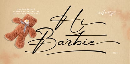 Hi Barbie, modern handmade script. It features dynamic and pretty swashes and can be used for many purpose, such as titles, signatures, logos, wedding invitations, letterhead, signage, labels, newsletters, posters, badges, and more. Files included: Hi Barbie Regular Numerals & Punctuation Stylistic Alternates & Ligatures PUA Encoded Characters Thanks so much for looking, I really hope you enjoy it and please don't hesitate to drop me a message if you have any issues or queries :)
 - Scriptease by ITC,
$29.99Scriptease is the temperamental creation of Phill Grimshaw, based on the forms of copperplate typefaces. At the same time, the playful forms display a variety of Rococo elements. Richly ornamented with vivacious swirls, especially on the capitals, the forms of this font dance across the paper. The capitals can also be used as initials combined with other alphabets. Scriptease looks as though it were made for the light, carefree side of life. - Mighty Origin by Handpik,
$13.00 Hello, this time we would like to introduce a new product. namely "Mighty Origin", a Serif display font that has a classic, feminine, and elegant style wrapped with a beautiful Alternate stylist. The Mighty Origin font is perfect for various projects like logos & branding, invitations, stationery, wedding designs, social media posts, advertisements, printed quotes, product packaging, product designs, labels, photography, watermarks, special events or anything else. Feature Uppercase Lowercase Numeral Functional Ligature Alternate Multilingual
 - Linotype Atomatic by Linotype,
$40.99Linotype Atomatic is part of the Take Type Library, selected from the contestants of Linotype’s International Digital Type Design Contests of 1994 and 1997. German artist Johannes Plass designed his font in one strongly-crafted weight. Linotype Atomatic seems to mirror the fast pace and technology of modern times. The slight lean to the right gives an impression of speed and movement. Linotype Atomatic is intended exclusively for headlines in larger point sizes. - AT Bountys Rounded by Alandya TypeFoundry,
$18.00 AT Bountys Rounded is stylish and beautiful sans serif font with variable file. It will look perfect in photography designs, watermarks, social media posts, advertisements, logos, branding, and various other projects. The main strokes contain small breaks simulating modulated variations on the letterforms, these details are more present on large body sizes. All font versions contain Latin and Cyrillic encoding characters and also ligatures, case-sensitive forms, fractions, oldstyle and finally tabular figures.
 - Umidus Font by Softulka,
$10.00 Umidus font - Trippy wavy liquid decorative font, which works perfectly for bold titles, Festival posters, as a graphic element for bright T-shit or hoodies, or even backgrounds! This weird and ugly font likes an experiment with spacing and different deformation. Please, don't hold back on your bold modern ideas! ------------------- You will receive: - 3 OTF files (3 font styles: plane black, transparent outline, black with highlights) - ATTENTION! font comes WITHOUT any photos, textures, or effects.
 - Ad Words by Outside the Line,
$19.00 Just in time for the sale season. Ad Words is a font of words you would use if you did retail ads. Some words in script, some print, some bold, some not. Plus 2 starbursts. Enlarge the starbursts and then reverse one of the words out of it… like Now! Win! or Free! Other Outside the Line fonts work with this one, check out Architectural Lettering Regular and Bold, Plz Print or Plz Script.
 - Baby Master by Sulthan Studio,
$8.00 Baby Master is a cute and fresh font created by our font designer Pig Master. It is equipped with upper and lower case letters and is completed with punctuation and multi-lingual support. Baby Master has two separate styles, along with additional separate doodle and swash files. This cute Baby Master can be used for various purposes such as titles, logos, correspondence, wedding invitations, letterheads, signage, labels, bulletins, posters, badges, Branding, greeting cards, and more.
 - Hello Rough by Good Java Studio,
$19.00 Introducing Hello Rough Hello Rough is the perfect font for all your classical and minimalism designs. The main font file is equipped with ordinary characters. Everything is made with the natural handdrawing. So you can be sure they will work well together! It is suitable for you to use in making t-shirt design, quote, label, packaging, logo type, or long writing. Because we have compiled kerning and matrices that are tailored to your needs.
 - Volare by Gatype,
$15.00 Volare latest style letters are perfect for wall displays, social media post logos, advertisements, product packaging, product designs, labels, photography, watermarks, invitations, stationery, and any project that turn creative idea into a true piece of art. These fonts include: OTF files. Displayed fonts: Uppercase, Lowercase, Numbers, Symbols, Accents, Styles, Swashes and Ligatures also Multilingual Support Enjoy the font, feel free to comment or feedback, send me a PM or email. Thank You!


