10,000 search results
(0.043 seconds)
- SF Cosmic Age Condensed - Unknown license

- SF Zero Gravity Condensed - Unknown license

- SF Planetary Orbiter - Unknown license

- SF Cosmic Age - Unknown license

- SF Burlington Script SC - Unknown license

- SF Espresso Shack - Unknown license

- SF Synthonic Pop Condensed - Unknown license

- SF Groove Machine Extended - Unknown license

- SF Synthonic Pop - Unknown license

- SF Wasabi Condensed - Unknown license

- SF Port McKenzie - Unknown license

- SF Zero Gravity - Unknown license

- SF Port McKenzie Outline - Unknown license

- SF Burlington Script SC - Unknown license

- SF Groove Machine Upright - Unknown license

- SF Espresso Shack Condensed - Unknown license

- SF Chromium 24 - Unknown license

- JustTall by OneSevenPointFive,
$10.00
- Design Or Die by Type-Ø-Tones,
$40.00
- Local Printer JNL by Jeff Levine,
$29.00
- Standard Poster by ParaType,
$25.00
- Tuzonie by Aah Yes,
$9.95 - Nouveau Boutique JNL by Jeff Levine,
$29.00
- Wanax Demo - Unknown license

- Dispute - Unknown license

- Bruce 1490 by Intellecta Design,
$26.90
- Cloverdale JNL by Jeff Levine,
$29.00 - FF TradeOne by FontFont,
$30.99
- Fashioniqa by Timurtype,
$14.00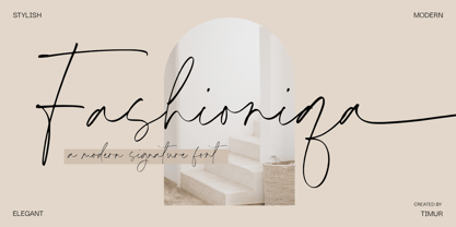
- Delightica by Timurtype,
$14.00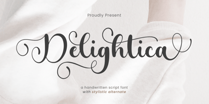
- FP Dancer Serif by Fontpartners,
$29.00
- Fayte by That That Creative,
$15.00
- Kaufmann by URW Type Foundry,
$35.99
- Hobo by Linotype,
$29.99 - Bomdia by Timurtype,
$14.00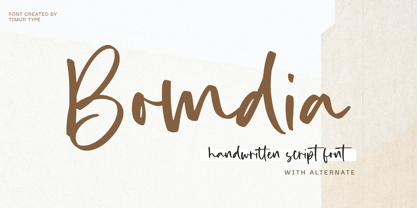
- Flomic by Sergey Melnikov,
$24.00
- Johnend by Georg John,
$30.00
- FF Mulinex by FontFont,
$41.99
- Black Isometric by Funk King,
$10.00
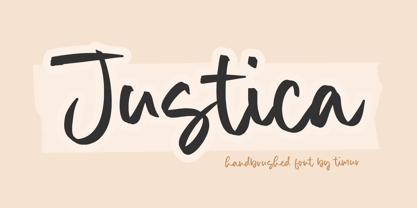
- Justica by Timurtype,
$14.00