10,000 search results
(0.147 seconds)
- Soda Syrup by Kitchen Table Type Foundry,
$10.00 At home, we don’t drink soft drinks at all. Maybe sometimes, when one of the kids has a birthday party, but we normally don’t have a stash of the stuff. We have cordial, or, as wel call it in Holland: limonadesiroop (‘Lemonade Syrup’). There you go, another font name xplained! Today Syrup was made with a marker pen and a lot of paper! It comes with a frizzy, sticky goodness to give your designs that extra kick.
 - MFC Arkena Monogram by Monogram Fonts Co.,
$19.95 The source of inspiration for MFC Arkena Monogram is a specimen from the 1917 “Strong’s Book of Designs”. This popular lettering style has been incorporated into numerous film type foundries of the past, but lacked digital permanence. We’ve expanded the original All Capitals glyphset to include smallcaps to make monograms, have added numerals and included unique ornamentation for basic titling typesetting. Download and view the MFC Arkena Monogram Guidebook if you would like to learn a little more.
 - Momotaro by Hanoded,
$20.00 Momotarō is a Japanese legend about a boy who came to earth inside a giant peach. He was found by a childless woman and grew up to be a hero. I'm in a Japanese mood - mainly because lately I have been working with brushes and ink a lot. Momotaro font is a very detailed brush font. It doesn't come with a hero inside a giant peach, but it does give your design work that extra oomph, ahh and wow.
 - Afterword JNL by Jeff Levine,
$29.00 At the end of the 1931 gangster film “The Public Enemy” a hand lettered card offers up an afterword on the demise of Tom Powers (James Cagney’s character in the film) and how a “public enemy” is neither a man nor a character but a problem society must deal with. The text is in an Art-Deco influenced sans serif, and has been digitally recreated as Afterword JNL, which is available in both regular and oblique versions.
 - Alfrere Sans by Greater Albion Typefounders,
$12.50 Alfrere Sans is a clean Sans Serif display family inspired by a well-known 1950s television caption. The family of seven faces have been designed for independent use, but they also have an extra feature. All faces have identical metrics and can be overlaid with each other, to yield an unending range of multi-colored lettering effects. Bring a touch of the 50's to your next poster design. Better yet, explore the world of multi-colored overlaid typefaces....
 - Vegetables by Edyta Demurat,
$28.00 This is a modern icon set with geometric shapes. A tasty set for the creation of the visual identity of shops, restaurants or bars. Thanks to its simplicity it will be perfect for printed and online materials. Baobaby Studio prepared an entire delicious set specially for you. Apart from “Vegetables”, our offer also includes Dairy, Bread and Confectionery, Meat and Seafood and Fruits. Everything in one style. Mix and match as you see fit. Bon appetit!
 - Fruits by Edyta Demurat,
$28.00 This is a modern icon set with geometric shapes. A tasty set for the creation of the visual identity of shops, restaurants or bars. Thanks to its simplicity it will be perfect for printed and online materials. Baobaby Studio prepared an entire delicious set specially for you. Apart from “Fruits”, our offer also includes Dairy, Bread and Confectionery, Vegetables and Meat and Seafood. Everything in one style. Mix and match as you see fit. Bon appetit!
 - ITC Woodland by ITC,
$29.99ITC Woodland is the work of Japanese designer Akira Kobayashi. It is based on Kobayashi's hand lettering with a flat brush or square-edged pen. I wanted to design each weight to act its own part," says the designer. "The light version tends to look almost fading in small sizes, but the heavy weight is as black as Cooper Black." The cheerful ITC Woodland is ideal for graphics, greeting cards, correspondence, and other applications requiring a light touch. - Altrincham by URW Type Foundry,
$39.99 Back when shop window decoration was done with a brush, every window designer had his own style. In this vein the sans serif Altrincham was created. But even as a text font, it has stood the test of time, since it is very easy to read even in smaller point sizes, thanks to its relatively large x-height. With the Altrincham Condensed and Altrincham Wide Bold two other fonts have been created to perfectly complement the font family.
 - Emily Lime Brush by Emily Lime,
$16.00 This brush script is what you call real. Designed using a pentel brush pen on paper, it captures all the nuances of real lettering. Texturized streaks are inconsistent, just as you would expect in real life. This font has tons of personality but it doesn't yell at you like many brush scripts can. Emily Lime Brush is an easy choice that can cover many design projects. Designed to be straight-forward & easy to use. Multilingual support.
 - Hopferian by 2D Typo,
$28.00 This font has been developed based on the engraving by the German artist Daniel Hopfer (1470-1536) listing the Latin ABC. While creating the font I tried to preserve the archaism and certain imperfection characteristic for the prototype to accentuate its charm. Fanciful convolution on the serif make it a bit fairy-tale like and cheerful. The font is also available with decorated dots as in the original version. All the letters in the font are capital.
 - Dairy by Edyta Demurat,
$28.00 This is a modern icon set with geometric shapes. A tasty set for the creation of the visual identity of shops, restaurants or bars. Thanks to its simplicity it will be perfect for printed and online materials. Baobaby Studio prepared an entire delicious set specially for you. Apart from “Dairy”, our offer also includes Bread and Confectionery, Vegetables, Meat and Seafood and Fruits. Everything in one style. Mix and match as you see fit. Bon appetit!
 - Addie by Jim Godfrey Design,
$19.95 This typeface is a monoline geometric script, meaning it has some qualities of scripts but is based on geometric shapes like ovals, circles, rectangles, etc. It is decorative and versatile and works well for projects that need to look both elegant or a little whimsical. There are 26 ligatures and 28 alternate glyphs that allow some of the letterforms to curl to the left or the right. Addie has been designed for use as a display typeface.
 - Clone Rounded PE by Rosetta,
$70.00 Clone Rounded is a retrofuturist typeface by Lasko Džurovski from Macedonia, fusing the vintage look of CRT monospaced forms with the organic mutability of a multi-weight, proportional family fit for reading. This lovechild of cyber-culture and genetic font modification takes inspiration from coding, technology, and architecture. Its quasi-monospaced design gives a nod to the quirkiness of engineered fonts but bends enough to never sacrifice a natural reading experience. Biomechanical morphology augmenting a laboratory-built frame.
 - Cindie 2 by Lewis McGuffie Type,
$49.00 Cindie 2 is an update of the optical type Cindie Mono. It retains the monospace-stacking system of the original, but some letters have been redrawn. It also now includes a lowercase and Cindie 2 has a script accompaniment (which isn’t mono and should be used with Contextual Alternates turned on!). Good for posters, branding and headlines, Cindie 2 has 26 monospaced widths which will fit any job. Cindie 2 also comes as a Variable Font.
 - Santa Story by Yoga Letter,
$14.00 "Santa Story" is a special Christmas font but can be used for any type of work. This font has a unique design with ornate lettering santa equestrian. This font is very easy to use, because it has been specially designed and there is also a guide on how to use it in the preview. "Santa Story" is equipped with uppercase and lowercase letters, alternative uppers, swash and titling, alternates, ligatures, numerals and punctuations, as well as multilingual support.
 - Big Caslon CC by Carter & Cone Type Inc.,
$35.00 The three largest sizes of type made by the Caslon foundry are strangely unlike the famously consistent text faces cut by William Caslon. Perhaps they were the work of other hands—or of the master in a funky mood. Caslon’s text types have often been revived, but the display sizes, forceful and a touch eccentric, had no digital version until Matthew Carter’s Big Caslon. With striking Italics and rich design features , this typeface shines at BIG sizes.
 - Zest Pro by DBSV,
$20.00 About family “ZestPro” Creativity and creative zest. Used to try to beat past records to add zest for monotonous jobs… Zest means something like mirth, ardor, enthusiasm, appetite, deliciousness, delight… Zest is a food ingredient that is prepared by scraping or cutting from the rind of unwaxed citrus fruits such as lemon, orange, citron, and lime. This series is composed and includes ten fonts with 631 glyphs each, with true italics, and supports of course: Latin, Greek & Cyrillic.
 - Orbitens by Maulana Creative,
$11.00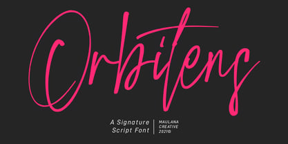 Orbitens is a fancy signature script font. With gel pen stroke, slanted and Unique Upper and lower characters with a bit of ligatures. To give you an extra creative work. Orbitens font support multilingual more than 100+ language. This font is good for logo design, Social media, Movie Titles, Books Titles, a short text even a long text letter and good for your secondary text font with sans or serif. Make a stunning work with Orbitens font. Cheers, MaulanaCreative
 - Bread And Confectionery by Edyta Demurat,
$28.00 This is a modern icon set with geometric shapes. A tasty set for the creation of the visual identity of shops, restaurants or bars. Thanks to its simplicity it will be perfect for printed and online materials. Baobaby Studio prepared an entire delicious set specially for you. Apart from “Bread and Confectionery”, our offer also includes Dairy, Vegetables, Meat and Seafood and Fruits. Everything in one style. Mix and match as you see fit. Bon appetit!
 - Astomia Duslons by Maulana Creative,
$12.00 Astomia Duslons is a fancy casual handwritten script font. With light pen contrast stroke, fun character with a bit of ligatures. To give you an extra creative work. Astomia Duslons font support multilingual more than 100+ language. This font is good for logo design, Social media, Movie Titles, Books Titles, a short text even a long text letter and good for your secondary text font with sans or serif. Make a stunning work with Astomia Duslons. Cheers, Maulana Creative
 - MFC Petworth Monogram by Monogram Fonts Co.,
$19.95 The source of inspiration for MFC Petworth Monogram is a specimen from the 1917 "Strong's Book of Designs". This popular lettering style has been incorporated into numerous film type foundries of the past, but lacked digital permanence. We've expanded the original All Capitals glyphset to include smallcaps to make monograms, and have added numerals and basic punctuation for extended basic typesetting. Download and view the MFC Petworth Monogram Guidebook if you would like to learn a little more.
 - Isbellium Pro by No Bodoni,
$35.00 Isbellium is a sans serif version of Dick Isbell’s Americana type, designed in 1967 and the last type cut in metal by the American Type Founders Co. (ATF). Isbellium retains the large x-height, open character, wide stance and elegance of Americana, but with a quieter voice and polite authority. Isbellium is a display face with broad Latin support along with small caps, fraction support and other typographic niceties are included in the ten font family.
 - LiebeMenuLettering by LiebeFonts,
$19.90 LiebeMenuLettering is a collection of commonly used words and phrases found in restaurant signage and menus. Every phrase has been hand-lettered to give your menus or dinner invitations the handmade but professional look they deserve. The most frequently used restaurant terms from four different languages (English, Italian, French, and German) are included in this single font and can be used in any text or graphics application. Combine LiebeMenuLettering with our popular LiebeMenu and LiebeCook fonts.
 - Rocky Mountain Spotted Fever - Unknown license

- Swollen - Unknown license

- Plague Master by Hanoded,
$15.00 I admit: I had a bit of a crazy week when I thought up an drew this font. I broke my arm during kickboxing training on monday, leaving me in a cast - unable to do most everyday things, like getting a good night's sleep (try sleeping with a humongous cast on your arm). Thank goodness, it is my left arm, so I can still draw letters and use my laptop. So… this font has been made entirely using one arm! It is a bit of a horror font - it sort of sums up my mood right now. Glyphs have very little spacing, adding to the evil look of Plague Master. Comes with a lethal amount of diacritics.
 - Teacup by Hanoded,
$15.00 I remember a tea ceremony I attended in Fukuoka, Japan. The teahouse was set in a small, but beautiful garden and the whole idea of the ceremony was to appreciate the view from the porch. I thought the tea was quite bitter, but the view was unsurpassed. From time to time these memories pop up and I have to use them - that is why I named this font Teacup. Teacup is a slightly eroded all caps font, made entirely by hand with a Japanese marker pen and some high quality textured paper. It comes in a romantic open style and a more solid closed style. Teacup is filled to the brim with diacritics.
 - Radical Fortune by Hanoded,
$15.00 One day my kids asked me: ‘would you rather be healthy and poor or super rich and sick?’ Without a doubt I answered: ‘healthy and poor’. Having money is nice, but it is not what life is about. At least, that is what I believe. Radical Fortune is a font I made after a period in my life that could have ended with a really nice sum of money in my hands - but which I didn’t take. I had to give up too much of myself and that just didn’t feel right. I made Radical Fortune to keep me from thinking too much - and, symbolically, I used a really old and cheap marker pen to draw out the glyphs!
 - P22 CoDependent by IHOF,
$24.95 P22 CoDependent is a revival of the Independant typeface from 1930 created by Dutch designer Johannes Nicolaas Coenraad Collette along with Jos Dufour from Belgium. Independant was released in metal by the Belgian division of the Amsterdam Type Foundry in commemoration of the 100th anniversary of the independence of Belgium from the Netherlands. Despite the name, the two fonts contained in the set, Regular and Shadow, are not codependent upon each other. They can be used alone, but together they can create a dynamic two-color option. There have been other fonts inspired by and revived directly from Independant, but this version adheres the original design with the added consideration of how the shadow version will overlap.
 - Cherritt by Greater Albion Typefounders,
$9.95 We think of Cherritt as a 'bullnosed' serif face, because of its rounded off serifs. What that phrase may not convey is the friendly, approachable nature of this large family of faces. The design was originally inspired by traditional draftsmens' hand-drawn serif lettering, but has been given a precise geometric flavor that suits it for work owing its inspiration to any era, from Victorian times through to the purely modern. They are ideal for headings and poster work, but also for setting small volumes of text. Four weights are included in the family, as well as wide, expanded and condensed forms, true small capitals and openface forms. All family members embody extensive OpenType features.
 - Urbanregent by Kenn Munk,
$26.00The font is largely undesigned, but is bound together by a thick connected band which forms the word-blocks. At the same time, parts of Urbanregent are very designed, glyphs have been re-designed to reflect changes in the way we speak and write. The exclamation mark is louder and more manic, because people tend to write two or three exclamation marks after each other anyway. The full stop is more stopping and the hyphen kicks you on to the next word. Kenn Munk's fonts are generally hard to use - Urbanregent is no exception, but a tip would be to start each word with a capital letter. Because Every Word Is Important. - Brute Sans by Wiescher Design,
$15.00 »Brute Sans« is a classic Sans typeface that looks like it has been designed by a chainsaw. »Brute Sans« looks really crude only in big sizes, the smaller the font gets the more it looks like any other Sans typeface. »Brute Sans« prints very fast, because there are no curves to compute, but that is just a side effect. »Brute Sans« is the typeface you should use if you need a really different look, since Sans typefaces tend by design to look very similar. This one is different. I always wanted to do this font, but then other projects crept up so I pushed »Brute Sans« to the end of the line. Enjoy!
 - Waters Titling by Adobe,
$35.00Waters Titling is the work of lettering artist Julian Waters, a multiple master typeface of classical calligraphic roman capitals. This broad-tipped pen design is related to other historically-based titling alphabets but offers a wider range of weights and widths, making it extremely versatile for movie titles, book jackets, posters, banners, calendars, etc. Waters Titling is based on the timeless Roman monumental inscription forms of almost 2000 years ago, but also has a touch of contemporary vigor and flair. The design displays a strong calligraphic thick/thin stroke weight contrast and flowing, subtly bracketed serifs. In lighter weights, Waters Titling is elegant and delicate, while the bolder weights offer a more substantial sparkle. - Nifty Script by URW Type Foundry,
$49.99 The “Ultimate Script”? Not yet, but we’re working on it! Just think: Loads of ligatures, contextual variations and stylistic alternates, coupled with easy use…Just what you’ve been looking for all this time? Well, here it is with all of its typographic power. The perfect partner for you: Technically adept, but still good-looking! What more do you want? Die „Ultimative Schreibschrift“? Noch nicht, aber wir arbeiten dran! Man denke nur an: Mengen an Ligaturen, kontextbezogenen Varianten und stilistischen Alternativen, gekoppelt mit leichter Handhabung…Genau das, was Sie die ganze Zeit gesucht haben? Na denn, hier ist es in all seiner typographischen Mächtigkeit. Die perfekte Partnerin für Sie: Technisch versiert, aber auch gut aussehend! Was wollen Sie mehr?
 - My Left Hand by Breauhare,
$35.00 My Left Hand is exactly what it is...well, not my actual flesh-and-blood left hand but my actual handwriting, and I know that it really is My Left Hand because people tell me all the time, "You're left-handed!" When I hear people say that, it always reassures me that I am left-handed, in case I am ever doubtful about it. Five of the last eight U.S. presidents have been left-handed, so we're in good company, no matter which political party you're a fan of. This font has an appealing rough look at large sizes, but at smaller sizes it looks smooth as silk. Digitized by John Bomparte.
 - Guhly by Ingo,
$35.00 A modern Sans Serif — prosaic, designed geometrically, beautiful in large sizes All the dimensions of the font are based on Factor 10. The general principle of construction leads to slim forms and nearly equally wide characters. So the font appears very solid but is actually difficult to decipher in longer texts. Along with the ”normal“ Guhly Regular there are also the two versions Guhly Light and Guhly Bold, whereas in each only the vertical strokes [Guhly Light] or horizontal [Guhly Bold] have been changed in strength. The result is a very individual decorative effect which slightly reflects old circus and western scripts. The lower case characters in the version Guhly Book are, therefore, optimized to be suitable for longer texts in smaller font sizes — because after all, sometimes you should read a bit more than just the headline… The design of a shampoo bottle stands behind the creation of this sans serif display font. Prominent, clearly constructed forms with circular arcs define its appearance. This is a font primarily designed for use with capital letters — for all sorts of advertising purposes, headlines and titles. But lower case letters also belong to a good functional font; so, of course, Guhly includes them and ligatures for the more ”critical“ letter combinations as well as stylistic alternates for the letters K (or k), V (v) and o. As a decorative “encore”, the Guhly family also contains the “normal” weight in two variants: on the one hand the Guhly Cutout – these are letters without counter, as if the letters were cut out and the internal surfaces fell out; and on the other hand the Guhly stencil – as the name suggests, a stencil font with the typical bars that give a stencil the necessary cohesion.
 - Stylized Deco JNL by Jeff Levine,
$29.00 In their book "Lettering of Today" by W. Ben and Ed C. Hunt, an Art Deco "thick and thin" alphabet with some stylized characters (which leaned a lot toward a calligraphic style) stood out from the rest. This is now available as Stylized Deco JNL, in both regular and oblique versions.
 - Allektra by Hackberry Font Foundry,
$24.95Allektra is a humanist sans serif with a modern feel. It is not as whimsical as many of my fonts, but there are many special dingbats for bullets, and so on. It has oldstyle numbers and the small caps versions have lining numbers and small caps numbers. The Fat version is especially interesting and useful. - Moi Non Plus by Hanoded,
$15.00 Moi Non Plus is a wonderful, handwritten font. It has a somewhat chaotic look, but is stylish nonetheless. The name was taken from a famous Serge Gainsbourg song called 'Je t'aime - moi non plus', which caused a bit of a scandal when it was released in the '60's, due to its overtly sexual content.

