10,000 search results
(0.026 seconds)
- Mells Butter by Forberas Club,
$17.00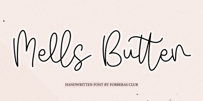 Mells Butter is a Handwritten Script font that will make your designs look classic, Farmhouse, Boho, and Feminine. It is a great font for events, Wedding Project, signature, album covers, logos, branding, magazines, social media posts, advertisements, but it also works great for other projects. Add it to your fonts’ library, and it will enhance your creativity!
 - Charlotte Serif by ITC,
$29.99Although designer Michael Gills was influenced by 18th century French type designer Pierre-Simon Fournier, Charlotte is best described as a modern roman typeface. Its clean cut style, accentuated by a strong vertical stress and unbracketed serifs, exudes an authoritative tone, guaranteeing its effectiveness for almost all text setting applications, but especially where a formal unmannered appearance is desired. - Meatball by Parkinson,
$25.00 Meatball is a fat and happy display font based on some lettering on a mid-20th century poster for the movie Bringing Up Baby. The lettering for the names of the stars, AudryHepburn, Cary Grant and Charles Ruggles, was the basis for Meatball. The sample was all caps and as it evolved, a lower case started to appear, etc.
 - Dance Lesson JNL by Jeff Levine,
$29.00 Dance Lesson JNL is a reinterpretation of the popular "Latin Bold" typeface. The font's name is a reference to the Latin dance craze of the 1950s, when the Cha-Cha, Meringue, Tango, Mambo and even the "Chalypso" - a hybrid of Cha-Cha and Calypso rhythms had everyone moving to the beat of Central and South America.
 - Obscura by Rook Supply,
$17.00 Obscura is a powerful and gritty grunge font that every designer should have in their font arsenal. Each letter has a ton of rough texture, which will add a whole new layer of detail to your design project and give it a bit more of an modern edge. Try it out for everything from album covers to food labels.
 - Psycho Killer by Hanoded,
$15.00 Psycho Killer is a song by the Talking Heads. It is also one of my favorite songs, so I figured I'd name a font after it. Psycho Killer is a script font; it contains some messy glyphs and gives the overall impression of a hastily scribbled note. Psycho Killer comes with alternates and a bagful of diacritics.
 - Dudek PRO by Hotniedog Studio,
$22.00 Dudek is a highly functional font family. Styles from thin to black with italics for each one, allows to create wide and consistent design systems. I wanted Dudek to be soft and simple. Not too much geometrical, but also not calligraphic in detail. Dudek can help in every day jobs and wide multilingual support leaves no one behind.
 - Pencil by Ingrimayne Type,
$9.95 Imagine that you had a bunch of pencils of various sizes and you wanted to make a set of letters with them. You would probably come up with something similar to one of these three typefaces. It is caps only, but some of the characters on the lower-case keys are different from those on the upper-case keys.
 - Weltschmerz by Hanoded,
$15.00 Weltschmerz, world-weariness… I love the sound of it, so I chose this name for my new font. Weltschmerz font is a hand made Jugendstil typeface which was modeled on a 1910 poster from Austria. Weltschmerz is a classy typeface, a little melancholic, but with a positive uplift in the end. Weltschmerz comes with extensive language support.
 - Elaya Script by Mans Greback,
$59.00 Elaya Script is a formal and flowing script typeface. Silky and smooth curves, but with a straight and rigid backbone. Perfect for logotypes and titles of a project to emit friendly earnestness. The font contains OpenType functions such as alternates and ligatures. It supports all European Latin-based languages and has all necessary punctuation and symbols.
 - Macro Print by Gustav & Brun,
$12.00 Macro Print is a display font available in a regular and a bold version. But it does not stop there. To create a unique, hand-printed feeling there are two sets within each version, therefore using the same letter twice in a headline will make the font look original and authentic. Yep, it is hand-drawn.
 - Blue Thunderbird by Cyberian Khatru,
$15.00 This font is meant evoke Native American art of the South-West US. The examples of this art that I've seen are very geometric, using rectangles and triangles to create all the images. This font isn't meant to be an authentic example of native American art, but is inspired by such. http://homepage.mac.com/baronvoncruzer/cyberiankhatru/bluethunderbird.htm
 - Ancora by FAEL,
$20.00 I’m happy to announce the complete version of Ancora, a typeface I designed back in 2013. Ancora is a sans serif typeface with a distinctive style, inspired by the imagery in the production of the famous Port wine, such as boats, barrels, grapes, and bottle labels. Use Ancora for magazines, packaging, posters, stamps, brands and logos a new taste.
 - Sandwich Market by Forberas Club,
$16.00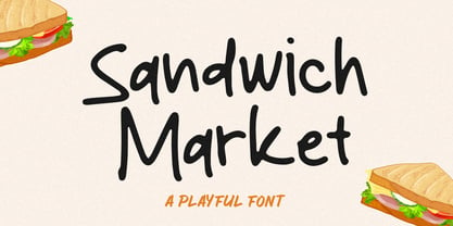 Sandwich Market is a Handwritten Script font that will make your designs look classic, Farmhouse, Boho, and Feminine. It is a great font for events, Wedding Project, signature, album covers, logos, branding, magazines, social media posts, advertisements, but it also works great for other projects. Add it to your fonts’ library, and it will enhance your creativity!
 - Fatigue by Typesthetic Studio,
$13.00 Heroic is a bold and playfull handwritten brush font. This font is very unique because sometimes it can look fierce like in modern street art graffiti if with capital letters, but sometimes it can look cute if it is included with the lowercase letters. As a result, this font can matches a wide pool of designs.
 - Uncial Romana ND by Neufville Digital,
$29.60 There are many Uncial types in the type catalogues around the world, but most of them have a rough and stiff appearance. The Roman Uncial ND by Ricardo Rousselot stands out for the realism of its strokes, which look as if they are handwritten, bringing freshness and authenticity to its applications. Uncial Romana is a Trademark of BauerTypes SL
 - Trivette by Greater Albion Typefounders,
$12.00 Trivette is an ‘All Capitals’ calligraphic display face, where all upright strokes are rendered as curves and where everything approaching the vertical are rendered in threes. That’s probably as clear as mud, but the results combine charm and legibility with a decorative period air. Recommended for poster work where a sense of dignified fun is important.
 - Yulia Khaira by Jehansyah,
$20.00 Yulia khaira This beautiful script font is perfect for all design needs, will keep it simple but look special, plus several alternatives that support your design, make sure you don't miss it, and it's your favorite font supported by PUA encoded, which is easy to access include : Yulia khaira latin numeric punctuation Alternate 400+ Thank you very much
 - Ebdus by AdultHumanMale,
$12.00 Ebdus is a thin, modern, lightweight font, occasionally a little gawky and tall, sometimes a little plump and rounded. The font is available in 5 weights from Thin to Heavy but they all lean towards all things anorexia. It looks as good in copy as it does in headlines, it’s perfect for an angry letter to an uppity android.
 - Laurel by Fenotype,
$25.00 Often in typography, a standout appeal is required – but preferably without compromising on clarity and legibility. Laurel font family by Fenotype is where the best of both worlds meet – an edgy display letter yet easily legible and appropriate for a wide range of use cases. Brand identities, packaging, posters or editorial – choose Laurel for a touch of unique flair.
 - On The Ground by Fascination Workshop,
$10.00 On the Ground is a picture font made from drawings of found objects. These object were found on the ground while walking around different cities in the United States. The font uses varying drawing styles (from detailed to pictographic) but they all have a similar irregularity, unifying the characters. Perfect for animations, signs, greeting cards, posters, etc.
 - Gamos by Letterara,
$12.00 Gamos comes from Greek which means marriage. Add some love in an instant. The font comes decorated with small embellishments, such as hearts. Making it the perfect font for Valentines Day designs, but also Christmas, Weddings, Anniversaries, Birthday cards, table numbers, header menus, display’s, logos, slider blogs, custom addresses, stamps, packaging, greeting cards, and much more!
 - Anegra by Sohel Studio,
$16.00 Anegra - is a Modern elegant Sans-serif typeface with Unique alternative , multilingual support with perfect kerning. This typeface is perfect for an elegant & luxury logo , classy editorial design, women's magazine, fashion brand , cosmetic brand, fashion promotion , modern advertising design, invitation card, art quote, home decoration , book/cover titles, special events, Tote bag, T-shirt, Advertising and much more.
 - Relisha by Sohel Studio,
$16.00 Relisha - is a Modern Elegant Serif typeface with Unique alternative , multilingual support with perfect kerning. This typeface is perfect for an elegant & luxury logo , classy editorial design, women's magazine, fashion brand , cosmetic brand, fashion promotion , modern advertising design, invitation card, art quote, home decoration , book/cover titles, special events, Tote bag, T-shirt, Advertising and much more.
 - Ramston by Katatrad,
$29.00 Ramston is a humanist sans serif typeface of 20 fonts in total — a normal and a condensed width in 5 weights with matching italics. The condensed version is designed for space-saving typography but with high legibility in mind. Ramston is an ideal font family for display, print, corporate identity, mobile devices, magazine cover, signage, and web design creation.
 - Polanix by Outerend,
$25.00 This unique geometric design will make your projects stand out from the crowd! If you're looking for a futuristic but with an edgy twist, "Polanix" could be the one. The interesting deformation of its variable version also works great with animation, game design and film/TV credits & titles as well as interface, app and web designs.
 - MTF Dear Santa Pro by Miss Tiina Fonts,
$9.00 If you’re writing Santa a letter, use this adorable, handwritten childlike font! Dear Santa PRO not only gives you inspiration on how to start the letter, but it also has neat and original characters. This typeface duo also comes with some cute Christmas doodles to complement your writing. Have fun, and create something spectacular this Christmas!
 - Picadyll by T4 Foundry,
$21.00 Picadyll is a sanserif that flirts with the 1920s Art Deco tradition but adds a modern touch. The sober letter design brings old movie posters and packaging to mind. Picadyll is a sophisticated and fun font from Swedish type designer Bo Berndal and the T4 font foundry. It is an OpenType creation, for both PC and Mac.
 - Dahlia Regictik by Letterena Studios,
$10.00 Dahlia Regictik – Luxury Serif Font, from Letterena, is a Luxury serif font, suitable for any projects such as: logos, branding projects, homeware designs, product packaging, mugs, quotes, posters, shopping bags, t-shirts, book covers, name card, invitation cards, greeting cards, label, photography, watermark, special events, and all your other luxury and beautiful projects that need a Luxury serif taste.
 - FF Milo Slab by FontFont,
$68.99 FF Milo Slab is not just the sans with slabs attached. It has undergone a wide range of careful adjustments from increased contrast, longer ascenders and descenders and modified glyphs in the heavier weights. All these changes amount a typeface that feels enough like Milo but also can stand on its own as a new and fresh typeface.
 - Hoogy by Wildan Type,
$12.00 Introducing new typeface! Hoogy- A modern sans serif with beautiful swash. It has unic construction for the future style. Hoogy Font look clean, luxury, unic, elegant but still has funny taste. Perfectly used for product presentation, elegant logo design, packaging or invitation cards or heading text. Features Two style/ Numbers & Punctuation / Extensive Language Support/ligature and alternate
 - Gradl Initialen ML by HiH,
$12.00 Max Joseph Gradl designed Art Nouveau jewelry in Germany. At least some of his designs were produced by Theodor Fahrner of Pforzheim, Germany -- one of the leading manufacturers of fine art jewelry on the Continent from 1855 to 1979. I don't know if he designed for Fahrner exclusively, but every example I found was produced by that firm. I assume it was also the same M.J, who edited a book, Authentic Art Nouveau Stained Glass which was reissued by Dover and is still available. For an artist as accomplished as Gradl was, he is very tough to research. There just does not seem to have been much written about him. The jeweler is visible in most of his typeface designs. They exhibit a sculptural quality as if they were modeled in clay (or gold) rather than drawn on paper. His monograms, especially, reflect that quality. Those shown in plates 112 through 116 in Petzendorfer actually appear to have been designed specifically for fabricating in the form of gold or silver pendents. Of the initial letters that came out of Germany during this period, these by Gradl seem unusually open and lyrical. They seem to be dancing on the page, rather than sitting. Please note that Gradl designed only the decorated initials. All other characters supplied were extrapolated by HiH, including the accented initials. Orn.1 (unicode E004) is based on a jeweled gold clasp designed by Gradl (please check out Gallery Image on Myfonts.com). Also included are an art nouveau girl’s face, a swan and the face from Munch’s “Scream”, from scans of old printer’s ornaments. Gradl Initialen M represents a major extension of the original release, with the following changes: 1. Added glyphs for the 1250 Central Europe, the 1252 Turkish and the 1257 Baltic Code Pages. Added glyphs to complete standard 1252 Western Europe Code Page. Special glyphs relocated and assigned Unicode codepoints, some in Private Use area. Total of 341 glyphs. Both upper & lower case provided with appropriate accents. 2. 558 Kerning Pairs. 3. Added OpenType GSUB layout features: salt, dlig, ornm and kern. 4. Revised vertical metrics for improved cross-platform line spacing. 5. Refined various glyph outlines. 6. Alternative characters: 16 upper case letters (with gaps in surrounding decorations for accents above letter). 8. Four Ornaments: face1, face2, swan and orn1 (silhouette of Gradl clasp) The zip package includes two versions of the font at no extra charge. There is an OTF version which is in Open PS (Post Script Type 1) format and a TTF version which is in Open TT (True Type)format. Use whichever works best for your applications.
 - Shout by HiH,
$12.00 Shout is a “Hey, Look at ME” font. It is an attention-getting font for posters, flyers and ads. Its lineage includes the Haas Type Foundry’s 19th century advertising font, Kompakte Grotesk, which Jan Tschichold (1902-1974) dryly described as “extended sans serif” and which graphic designer Roland Holst (1868-1938) would have disapprovingly referred to as a “shout,” as opposed to the quiet presentation of information that he believed was the proper function of advertising. In 1963 Letraset released what appears to be an updated variation in multiple weights designed by Frederick Lambert called Compacta. Shout draws heavily on Compacta, as well as other similar fonts of the 50s and 60s like Eurostile Bold Condensed and Permanent Headline. In weight, it falls about halfway between Compacta Bold and Compacta Black, but with a relatively heavier lower case that is not so easily pushed around by the upper case. After all, one can shout while sitting down. Shout is the first font released with our new encoding, as noted in the All_customer_readme.txt. The Euro symbol has been moved to position 128 and the Zcaron/zcaron have been added at positions 142/158 respectively. Otherwise, Shout has our usual idiosyncratic glyph selection, with the German ch/ck instead of braces, a long s instead of the Greek mu and our usual Hand-in-Hand symbol. There are also left and right glyphs of a big mouth ]ing (135/137) and left and right glyphs of an angry man shouting (172/177). Please use Shout with discretion. Folks get tired of being yelled out. After awhile, they stop listening. Shout ML represents a major extension of the original release, with the following changes: 1. Added glyphs for the 1250 Central Europe, the 1252 Turkish and the 1257 Baltic Code Pages. Add glyphs to complete standard 1252 Western Europe Code Page. Special glyphs relocated and assigned Unicode codepoints, some in Private Use area. Total of 355 glyphs. 2. Added OpenType GSUB layout features: pnum, ornm, liga, hist & salt. 3. Added 266 kerning pairs. 4. Revised vertical metrics for improved cross-platform line spacing. 5. Revised hyphen, dashes & math operators. 6. Minor refinements to various glyph outlines. 7. Inclusion of both tabular & proportional numbers. Please note that some older applications may only be able to access the Western Europe character set (approximately 221 glyphs). The zip package includes two versions of the font at no extra charge. There is an OTF version which is in Open PS (Post Script Type 1) format and a TTF version which is in Open TT (True Type)format. Use whichever works best for your applications.
 - Solantra by Stephen Rapp,
$44.00 Solantra is a solidly crafted handwritten script. I’ve long felt that beautiful writing is more pleasing to the eye than the more attention grabbing swashes and flourishes. That being said, both have their role in design and Solantra has a large slice of each. Solantra combines vintage style handwriting with all its quirks and English Roundhand of that same era. The result is a solid setting script filled with charm and personality. With default Adobe Illustrator settings for Ligatures and Contextual Alternates active, the vintage charm is in full display. Want to add more flair? There are loads of more embellished letters inside the full version. Solantro takes into account how scripts are actually written so that connections from letter to letter are more fluid and rhythmic than the average script font. In natural script/handwriting most letters end at the bottom right and move up to connect with the next. Some letters like o, v, and w, however; end at the top right. Rather than force these letters to dip down and go back up they should ideally connect from that upper right point. This is accomplished through a series of alternate letters and ligatures with extensive contextual feature programming. So, for example, you might get one version of a ligature in the middle of a word and a different one at the beginning or end of that word. Solantra also takes into account another often overlooked feature of natural handwriting. When you write you inevitably pick your pen up from the paper at times. This is often just to reposition the hand, but in the days of writing with dip pens this was also needed to attain a fresh supply of ink. Having these occasional breaks in connections makes the writing less static and more rhythmic. While the Basic versions are limited to a standard character set and several ligatures and alternates for better settings of text, the full pro versions contains 1292 glyphs and an abundance of features. Even with numbers there are options like Oldstyle numbers, fractions, and ordinals. Central European language support is included as well as some select ligatures that use accents. To see more on the technical aspects and instructions on using Solantra, please check out the user’s guide in the Gallery section. **Note: The Pro versions of Solantra which do not have the word “Basic” attached to the title, have everything in them. So if you license a Pro version there is no need to get the Basic versions.
 - We The People by K-Type,
$20.00 This typeface is extrapolated from the ‘We the People’ calligraphy of the handwritten US Constitution Preamble which employed a style based on German Text and Square Text exemplars from George Bickham’s penmanship copy-books, the most celebrated being The Universal Penman published in 1743. The original Constitution document was transcribed onto parchment by Jacob Shallus, a Pennsylvania Assistant Clerk, over a weekend in 1787. Shallus’s biographer, Arthur Plotnik (The Man Behind the Quill, 1987), notes that he was paid $30, a modest monthly wage at the time. He also suggests that the calligraphic headings, ‘We the People’ and ‘Article’, may have been inserted by Shallus’s 14 year old trainee son, Francis, “The manner in which the ‘Article’ headings are squeezed into the space Shallus allowed for them suggests a second hand—and perhaps not a very experienced one.” The unconventional backslant of the headings would seem to support this contention, and at the end of the document there is perhaps a novice’s inconsistency in the structure of the letter n between that used for ‘done’ and those used for ‘In Witness’. However, one has to admire the elegant swagger of the wavy t, h and l which the K-Type font extends to the b, f and k. Also, the simpler, Schwabacher-style W, an enlarged version of the lowercase w, is a little less flamboyant than the capital W from the German and Square texts in Bickham’s manuals. For designers using OpenType-aware applications, the typeface includes some Alternates, including a Bickham-style W, the letters t, h and n with added flourishes, two simpler forms of the A, and a few roman numerals for numbering articles. Also some ornamental flourishes and a round middle dot/decimal point. Punctuation marks are drawn in square, calligraphic style, but an alternative round period/full stop, for use with currency and numerals, is available at the period centered position (though placed on the baseline), accessed by Shift Option 9 on a Mac, or Alt 0183 on Windows. The full phrase, ‘We the People’, has been placed at the trademark keystroke and can be accessed by Option 2 (or Shift Option 2) on a Mac, or Alt 0153 on Windows. For designers who find the backslant awkward or unpleasant, the licensed typeface also includes two additional fonts which have a vertical aspect that may be more conducive to graphic design layouts. ‘We The People Upright’ and ‘We The People Upright Bold’ both retain the distinctive style, and the heavier weight is only slightly emboldened, just enough to add some punch.
 - Revla Slab by Eclectotype,
$40.00 The Revla family just keeps expanding! This is Revla Slab. It has the same exuberant charm as its siblings ( Revla Sans and Revla Serif ) with a touch more chunk. OpenType contextual alternates make for text that is lively and bouncy, without the monotony of obviously repeating letterforms. It’s shamelessly fun, but pretty serious at the same time. The range of weights can be used to maintain an even colour across different sizes - use lighter weights for bigger sizes and vice versa. OpenType features include automatic fractions, ordinals, contextual alternates (which along with the pseudo-randomness, help maintain a nice tight fit with minimal glyph collisions), standard and discretionary ligatures (OK, only one discretionary ligature, but it’s a belter!), and case-sensitve forms. Obviously, in sharing a common skeleton, it will work well with other members of the Revla Superfamily, particularly Revla Sans.
 - KG Primary Penmanship by Kimberly Geswein,
$5.00 I come from a family of educators- my mom, husband, stepmom, brother-in-law, and sister are all currently teaching and I have taught in the past. This font was created after speaking to several elementary school teachers who were struggling to find just the right font to use on worksheets and projects in their classroom. They liked many features of other fonts, but needed small things altered in order to make a "perfect fit" for their class. Hand-drawn by me, this font hopefully addresses several of those issues. As penmanship styles vary across the globe, I am sure this font will not work in every classroom. But hopefully this style will work for many teachers to give their early readers a highly legible, neat, accurate font. It is best used with kerning turned on to allow for accurate letter spacing.
 - Kewl Script by Sudtipos,
$59.00 Kewl is the result of being caught in the afterimage of one design project while conceptualizing another one. Just before finishing the final tests on Mrs Blackfort, the first of what became a long series of Charles Bluemlein fonts, some of the letters began morphing differently in my mind. The idea was to go on the heavier and more playful side, but with a South American sign letterer’s twist, rather than just good handwriting. I did some sketching, took some notes, then got busy with other projects. Some of that stuff eventually seeped into Candy Script and, to a lesser extent, the Whomp font. But it was only a matter of time before I got back to the original concept and finished it. Kewl is ideal for food packaging, book and music covers, magazines, and window splashes. Illustrations by Catriel Martinez.
 - Gutter Pigeon by PizzaDude.dk,
$17.00 Gutter Pigeon is not your every-day Ransom-kind-of-font! The prices of making it was really simple: I only used my phone and computer. I took pictures of letter from newspapers, magazines, bookcovers, candybars, movieposters, roadsigns, etc. In the beginning, It was easy to find new letters. But as I had the initial letters, it became quite a search for the missing letters. Not a hard job, you may think - but this font has 8 different versions of each letter! That's 26 lowercase glyphs and 26 uppercase glyphs...8 times! That's more than 400 glyphs! And on top of that comes numbers and punctuation! Go crazy with Gutter Pigeon! Actually, that is not very hard, because the font automatically cycles through the 8 different versions of each letter while you type! Upper- and lowercase in a wild mix!
 - Acton by Device,
$29.00 Acton is a deceptively simple, grid-based design. Though derived from a 2 by 3 arrangement of blocks, it uses white spaces to allow for more complex shapes – for example as the R – where the underlying 3 by 5 arrangement is apparent. It also departs from this strict grid-based logic for characters such as the the T, L, f and r, whose cross-bars are shorter than they would otherwise be in order to promote optical evenness. No elegant solution could be found for the V, which in geometric fonts can appear very similar to the U, lacking as it does the cross-bar that can differentiate a square A from the capital form of the n. However, the resultant diagonal retroactively proved useful on the lower-case e and a, characters that otherwise would have more uninteresting design solutions.